Custom Labels for Sewing Projects to Elevate Your Brand
Custom labels for sewing projects do more than identify the maker. They affect how a finished piece feels in the hand, how it survives washing and wear, and whether it reads as a thoughtful retail item or a one-off craft project. That difference sounds subtle until you compare two nearly identical garments and notice how the label changes the entire impression.
The label also sits inside a wider packaging system. If the garment arrives in clean tissue, a sturdy mailer, or a branded box, the label needs to match that standard rather than sit apart from it. A small woven tag can do real work here: it can carry the brand name, size, care instructions, or origin details without adding clutter elsewhere on the product. For small brands, that kind of compression matters because every square centimeter has to earn its place.
There is another reason labels matter. Buyers often decide whether an item feels trustworthy before they read a description or inspect a seam allowance. A label that sits straight, feels appropriate for the fabric, and survives the first wash quietly signals that the maker handled the details with care. That signal is stronger than any polished product photo.
What custom labels for sewing projects really change
In practical terms, a label changes three things at once: perception, utility, and durability. Perception is obvious. A crisp label tells the buyer the item was designed as a product, not assembled by accident. Utility is less visible but just as important. The label can mark size, care, fiber content, or brand name in a place the customer will actually find later. Durability is the hidden test, because labels that fray, peel, or crack after a few wash cycles damage the product more than a missing label ever could.
Custom labels for sewing projects are especially useful when the rest of the packaging is already doing work. A simple shirt with a good neck label and a clean hang tag can feel more finished than a more complex garment with no brand marks at all. That is why many makers treat labels as part of the product development stage, not as a late-stage decoration. The best time to decide on label construction is before cutting begins, not after the first sample has already been sewn.
Label placement matters just as much as artwork. A woven label stitched into a neck seam feels different from one tucked into a side seam or exposed on an external hem. A label that is technically beautiful can still feel wrong if it sits where the skin rubs or where a fold makes it bulky. For babywear, athletic pieces, and soft knit tops, the hand feel is often the deciding factor. On denim jackets, tote bags, and heavier canvas goods, structure can work in your favor.
There is also a commercial angle. Retail buyers, craft fair customers, and repeat online shoppers all use cues to judge whether the item belongs in the same tier as mass-produced alternatives. A label does not create quality on its own, but it does make quality legible. That is a surprisingly important distinction.
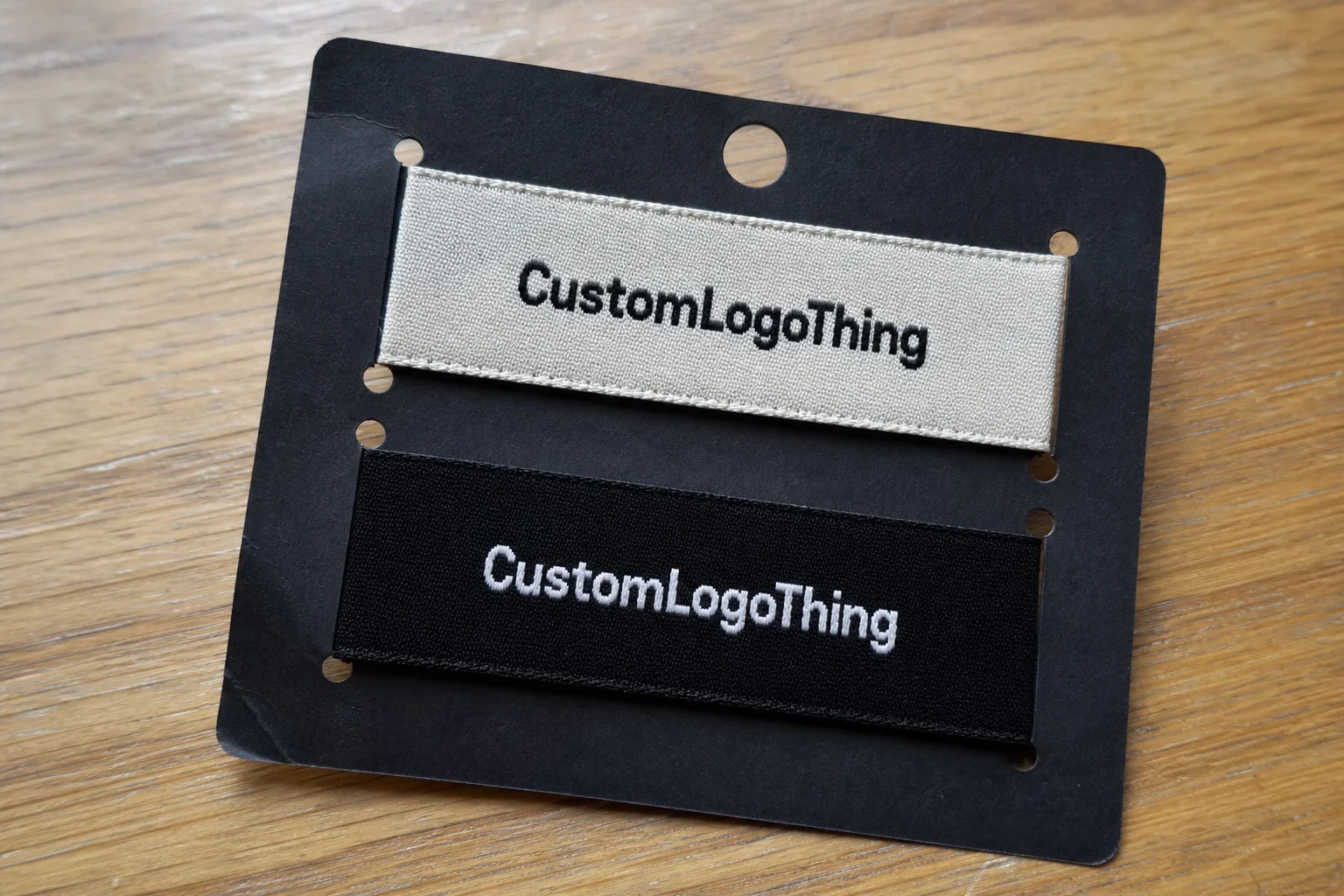
How woven, printed, and heat-applied labels work
Most buyers compare three constructions first: woven, printed, and heat-applied. Each one solves a different problem, and none of them is universally best. The right answer depends on the fabric, the wash cycle, the design detail, and how visible the label needs to be.
Woven labels are made on a loom from threads that form the artwork itself. That makes them durable and tactile. They are usually the strongest choice for brand labels that need to feel premium and last through regular washing. Woven construction handles logos, icons, and short lines of text well, but extremely thin strokes and tiny type can become muddy if the design is too crowded. For denim, outerwear, bags, and other structured goods, woven labels are often the most dependable option.
Printed labels place the design onto a base material such as satin, cotton, or polyester. They are useful when the artwork includes fine text, small legal copy, gradients, or multiple colors that would be difficult to reproduce in woven threads. They also tend to have a smoother hand feel. That matters on garments where comfort is part of the product promise. The tradeoff is longevity: printed labels can look excellent, but the ink or transfer process needs to be matched carefully to the fabric and washing conditions.
Heat-applied labels bond to fabric with temperature and pressure instead of stitching. They reduce sewing steps and keep the profile low, which is helpful for minimalist branding or performance wear. They can also work on seam-sensitive items where extra stitching would create bulk. The catch is that application has to be controlled. If the press temperature, pressure, or dwell time is off, adhesion suffers. On a small run, that can mean a few failed pieces; on a larger order, it becomes a real cost.
For a clearer comparison, these are the patterns that usually show up in small-batch work:
| Label type | Typical feel | Best use case | Indicative small-batch price | Practical notes |
|---|---|---|---|---|
| Woven | Textured, structured | Jackets, totes, denim, premium branding | $0.22-$0.55 per unit at 500 pieces; $0.08-$0.18 at 5,000 pieces | Strong durability, but tiny text can lose clarity |
| Printed satin or polyester | Smooth, soft | Apparel, baby items, lightweight garments | $0.15-$0.40 per unit at 500 pieces; $0.06-$0.14 at 5,000 pieces | Good for detailed art and care copy; surface wear depends on substrate and wash load |
| Heat-applied | Flat, low profile | Performance wear, minimal branding, seam-sensitive items | $0.20-$0.60 per unit at 500 pieces; $0.09-$0.22 at 5,000 pieces | Application settings matter; test before committing to a full run |
For quality checks, buyers should think in practical rather than abstract terms. A label should be checked for edge finish, readability after folding, color accuracy against the approved proof, and how it behaves when stitched into the actual garment. If the product will move through retail packaging or a mailer, transit stress matters too. ISTA testing logic is useful here because vibration, compression, and abrasion can expose weak points before the labels reach customers: ISTA.
Choosing materials, folds, and finish details
Material selection drives both look and function. Satin has a smooth surface and soft hand, so it works well when comfort is a priority. Cotton reads more natural and can suit brands that want an artisan or understated feel. Woven polyester usually gives the best mix of clarity, strength, and repeat-wash performance. None of those choices is abstract once the label is on a garment; each one changes how the buyer experiences the product.
Fold style changes the way the label sits and how much of it is visible. A center fold is common for neck labels and hanger loops because it tucks cleanly into a seam. An end fold is useful when the sides need to disappear into construction. A loop fold gives a neat, finished look for labels that need to project slightly from the garment. A straight cut is easier for exposed placements or cases where the edges will be covered by stitching. The fold should be chosen with the garment in hand, not just from a spec sheet.
Backing is another decision with real consequences. Heat seal backing reduces sewing time, but it is not always the best choice for stretch fabrics or high-friction items. Iron-on options can be practical in small batches, although they still require a proper press cycle if you want dependable adhesion. Sew-in labels remain the safest and most forgiving option for many garments because the attachment is familiar and durable.
Finish details influence whether the label feels deliberate or improvised. Thread color, border treatment, edge sealing, logo scale, and the amount of negative space all shape the final impression. A label with too much contrast can shout; a label with too little disappears. The middle ground is not always obvious, which is why physical sampling is more useful than staring at a PDF for the tenth time.
If the project also includes inserts, care cards, or outer cartons, keep the same design logic across the system. That does not mean every surface has to look identical. It means the visual language should be coherent. When labels, hang tags, and packaging all seem to come from the same decision set, the brand feels intentional rather than assembled from separate purchases.
For brands that track responsible sourcing, paper components can be aligned with FSC-certified materials where appropriate. Their chain-of-custody framework is a useful reference if the surrounding packaging includes paper-based inserts or packaging boards: FSC.
The strongest label usually does one job well. If it tries to carry too much text, too many colors, and too many promises, it starts to look like a compromise instead of a finish.
Planning the order: artwork, dimensions, and care copy
Start with the actual use case. A neck label for a cotton tee is not the same brief as a side-seam label for a tote bag or a soft label for children’s wear. The intended placement determines the dimensions, fold, backing, and how much text can fit without becoming cramped. If the product flexes often, the label needs to be kinder to the fabric. If the product is structured, the label can carry a little more visual weight.
Once the placement is clear, set the maximum size early. A logo that looks balanced on screen can become awkward once fold allowances and stitch margins are added. A 40 mm label may be fine in theory and too wide in practice after seam bulk is accounted for. That gap between digital mockup and physical reality is where many problems begin.
Artwork should be supplied as clean vector files whenever possible. Small type, overly thin lines, and compressed imagery can disappear when the label is woven, printed, folded, or sewn. If the label needs care instructions, size marking, or origin details, keep the wording practical and legible. A label is not the place to write copy that only works under perfect lighting and a magnifying glass.
It also helps to proof against the actual fabric. A design that looks balanced on a flat screen can look crowded on a rib knit, noisy on a textured weave, or too stark on a dark background. Testing the layout against the garment catches problems that a digital proof cannot show. That is especially true for labels meant to sit close to the skin or near high-movement seams.
For small brands, this step protects the whole launch schedule. A label that fits the garment improves product packaging consistency, reduces the chance of rework, and keeps the sewing line moving. One mistake at this stage can ripple into cut-and-sew, packing, and fulfillment. That is more expensive than most first-time buyers expect.
Cost, MOQ, and unit pricing for small-batch orders
Label pricing is shaped by a handful of predictable variables: size, construction, number of colors, fold style, backing, and whether the job needs special sampling or proofing. Setup work matters more on small orders because the same pre-production effort gets spread across fewer pieces. That is why a quote for 300 labels can look very different from a quote for 3,000.
MOQ means minimum order quantity. In practice, a lower MOQ gives flexibility but usually raises unit cost. A higher MOQ lowers unit cost but only makes sense if the brand can use the inventory without tying up cash in unused stock. Many small brands overestimate how much label inventory they will burn through in a season. The result is a drawer full of obsolete labels and a new design order sooner than expected.
When comparing quotes, ask what is included. Proofing, artwork adjustment, folding, cutting, packaging, and shipping can all sit inside or outside the headline price. A quote that looks low at first glance may end up more expensive once the missing line items appear. The landed cost is the number that matters, not the first one you see.
| What to ask | Why it matters | Typical risk if ignored |
|---|---|---|
| Does the quote include proofing? | Proofs catch layout and color issues before production | Unexpected revision charges or delays |
| Is folding or cutting included? | Finishing often affects labor cost | Unit price looks lower than the real cost |
| Are shipping and packaging included? | Freight changes landed cost quickly | Budget overruns on the final invoice |
| Is a sample available? | Useful for first runs and delicate fabrics | Full run approved from a screen-only proof |
For a practical benchmark, custom labels for sewing projects often land around $0.10-$0.40 per piece at moderate volume, depending on material, construction, and coverage. Small first runs can sit above that range, especially if the label is wide, heavily detailed, or involves additional finishing. At 500 pieces, unit pricing can be noticeably higher than at 5,000 pieces because the fixed work has nowhere else to go.
If labels are one part of a broader release, it is worth aligning them with the rest of the package system at the same time. Matching them with Custom Packaging Products can reduce last-minute artwork changes and keep the brand presentation consistent from label to box to insert.
Production process and lead time from proof to delivery
The workflow is straightforward, but each step affects the schedule. A supplier quotes the job, reviews artwork, sends a proof, waits for approval, moves to production, finishes the labels, and packs them for shipment. If the first proof needs revisions, the timeline shifts immediately. That is normal, but it should be planned for rather than discovered late.
For many orders, proof approval is the real starting line. After that, standard production often takes about 10 to 15 business days. A new material spec, high order volume, or complex finishing can extend that window. Shipping is separate and should be treated as such, especially if the labels are tied to a launch, a trade show, or a seasonal drop with a fixed ship date.
Seasonal work deserves extra buffer. Holiday collections, spring launches, and first-time product releases tend to expose scheduling mistakes because every stage is already under pressure. If labels need to arrive before cutting or sewing begins, the order should go out early enough to allow for one revision and still leave transit time. Tight schedules leave no room for sample iteration, and sample iteration is often where the best decisions are made.
Thinking like a packaging buyer helps here. The label is not an isolated component. It is part of a chain that includes fabric intake, sewing, finishing, inspection, packing, and delivery. If one step slips, the rest move with it. That is why label delays often show up as production delays even when the labels themselves are not the only problem.
For products shipped in heavier retail packaging or mailers, transit testing can be useful before launch. Vibration, compression, and abrasion can create wear patterns that only show up after handling. Labels that look pristine in the workroom can arrive scuffed if the rest of the packout is too tight or too rough.
Common mistakes that make labels look cheap or fail early
The first mistake is overcrowding. Too much text in too little space reduces clarity fast, especially once the label is folded or sewn into a seam. If the buyer has to squint, the layout has already failed. It is usually better to leave out one line of copy than to compress everything until nothing reads well.
The second mistake is weak contrast. Light gray on white, pale gold on satin, or thin lettering on a busy textile can look elegant on screen and disappear in real use. Readability should outrank decoration. A label is a working component, not a poster.
The third mistake is ignoring wear conditions. Knit fabrics stretch. Zippers rub. Tote bag seams twist under load. Babywear gets washed often. A label that is technically correct but physically wrong will show problems fast: buckling, fraying, edge curl, or a scratchy hand feel. Those failures are not cosmetic only. They change how the whole garment is experienced.
Placement is another common blind spot. A label sewn across a bulky intersection can feel much heavier than the same label placed on a flatter section. That difference can matter more than the logo itself. In many cases, a smaller label in a better location performs better than a larger one in the wrong spot.
Best practice: approve a physical sample against the actual fabric before the full run. That check costs far less than replacing inventory and reveals issues that no digital proof can show. It also lets you compare the label against the broader packaging system before anything ships.
What to prepare before requesting a quote
If the goal is an accurate quote, send the essentials together. A logo file, label dimensions, fold preference, garment type, target quantity, and any care or size copy will give the supplier enough information to price the job without guessing. Gaps in the brief almost always become delays in the proof stage.
Fabric type helps too. A label for a heavyweight canvas tote is a different specification from a label for a soft knit baby tee or an athletic base layer. The supplier needs to know whether the label will sit inside a seam, attach to a lining, or remain soft enough for comfort-focused wear. That context influences material and finishing choices more than most buyers expect.
Ask for a sample if the design is new, the fabric is delicate, or the label will be used across multiple products. Those are the jobs where small differences in stiffness, edge finish, or print clarity can create major problems. If the artwork is simple and the construction has already been approved on a similar item, the process can move faster.
For brands with several SKUs, the cleanest approach is to send the full picture in one pass. Include artwork, size limits, quantity range, target delivery date, and any packaging requirements. That helps the supplier quote accurately and flag production risks early. It also keeps custom labels for sewing projects from turning into a string of revisions that slow down the rest of the line.
Which custom sewing labels work best for garments that get washed often?
Woven labels are usually the safest choice for repeated washing because the design is built into the structure of the label. Printed options can also work well if the substrate is suitable and the wash conditions are not extreme. The real decision comes down to how the label handles heat, agitation, and friction over time.
How much space do I need for custom labels for sewing projects?
Measure the placement area on the actual garment, not just the pattern file. Fold style and seam allowance reduce usable space quickly, and thick fabrics take up more room than flat mockups suggest. If the label must include both a logo and care copy, keep the layout disciplined and avoid trying to fit everything into one small panel.
Are woven labels better than printed labels for small clothing brands?
Woven labels are stronger when you want durability and a textured, premium feel. Printed labels are better when the artwork needs finer detail, more color variation, or a softer hand against the skin. The better option depends on the fabric, the wear cycle, and how visible the label needs to be.
What drives the cost of custom labels for sewing projects?
Cost is usually shaped by size, construction, number of colors, fold style, backing, and quantity. Smaller runs carry a higher unit price because setup and proofing are spread across fewer labels. Shipping, packaging, and revision charges can also change the real landed cost.
How far ahead should I order labels before a product launch?
Order early enough to cover proofing, revisions, production, and shipping, especially if the labels are part of a seasonal or first-time release. A buffer of several weeks is safer than a tight deadline, because one artwork change or sample adjustment can move the schedule. Standard production after approval often takes about 10 to 15 business days, but the full timeline depends on the order and the supplier.
Custom labels work best when they are treated as part of the product, not an afterthought. If the dimensions fit the garment, the materials fit the wear conditions, and the proof is checked against the real fabric, the label adds value without drawing attention to itself. That is usually the mark of a good finish: it feels obvious only after it has gone wrong.