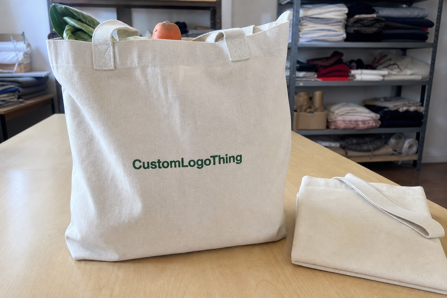
Custom Logo Things
Custom Logo Labels: How to Order Labels for Apparel
Custom logo labels do more than identify a garment. They shape the first tactile impression, influence how polished an item looks folded on a shelf, and often determine whether the brand feels intentional or merely printed on. In apparel, that small strip of fabric, film, or transfer material can carry more weight than a hangtag because it stays with the product through wear, washing, storage, and repeated handling.
The same idea shows up across branded packaging, package branding, and retail packaging: the first physical cue sets expectations. A clean label does for a T-shirt what a well-printed carton does for a cosmetic set or a pair of shoes. It signals that the brand paid attention before the customer even reads the name.
What custom logo labels are, and why they stand out on the rack
In apparel, custom logo labels are the brand marks sewn in, heat applied, printed, or attached as part of the garment itself. That can mean a woven neck label, a printed care label, a satin side label, a heat transfer mark, or a loop-style label visible on the outside. Each one solves a different problem. Some are built for softness. Some are built for durability. Some are designed to be seen immediately.
The label often carries more perceived quality than the hangtag. A hangtag disappears once the item is purchased. The label remains through every wash and fold cycle, so the buyer keeps interacting with it long after the retail moment is over. If the edges are clean, the artwork reads clearly, and the material feels appropriate for the garment, the product feels more considered. If the label scratches, curls, or looks generic, the whole piece can feel cheaper than the fabric and construction actually are.
That is why the label choice should follow the garment type. Soft knits and kidswear usually need a gentler hand feel. Premium basics often benefit from a smooth woven or satin finish. Workwear can handle a heavier label with stronger contrast and better abrasion resistance. Outerwear may call for a more structured construction, especially if the brand wants the mark visible on the exterior rather than hidden at the neckline.
A good apparel label should survive the same realities as the garment itself: friction, laundering, folding, storage, and repeated handling. If it cannot do that, it is decoration, not branding.
The main label families are straightforward. Woven labels give a finished, premium look and are common on mid-range and higher-end apparel. Printed labels are softer and better for small text or detailed care information. Satin labels are smooth and light, which makes them popular for close-to-skin items. Heat Transfer Labels remove the sewn-in feel entirely, which is useful for performance wear and children's products. Loop-style labels work well when a brand wants a visible mark on the outside without adding bulk inside the neckline.
The right option depends on comfort, wash performance, production method, and the role the label plays in the full presentation. In some lines, the label is mostly functional. In others, it becomes part of the product story in the same way a hangtag, insert card, or outer carton supports retail packaging.
Label types, materials, and placement choices
Material choice is where many buyers make their first real mistake. Damask is the standard reference for fine woven labels because it can hold detail well while staying relatively soft. Taffeta is lighter and usually more economical, but it has a flatter, slightly crisper feel. Satin is smooth and reflective, which makes it useful for premium apparel, although that sheen can look out of place on rugged pieces. Cotton twill feels natural and familiar, which is why it shows up on heritage, workwear, and organic lines. Printed substrates, including nylon, polyester satin, and some care-label films, are the better route when text needs to stay sharp at very small sizes.
Placement changes the reading experience just as much as material does. A center-back neck label is the most familiar and easiest to find. A side-seam label feels more discreet and can be more comfortable on fitted garments. A hem label or external brand tab gives a stronger visual cue, especially on streetwear. Waistbands and outer cuffs are practical places for activewear, while outer-loop branding is common on hoodies, sweaters, and other items where the label functions almost like a signature.
| Label type | Feel | Best use | Typical unit cost at scale | Notes |
|---|---|---|---|---|
| Woven damask | Soft, detailed, structured | Premium basics, fashion tops, midweight garments | $0.09-$0.24 | Good balance of detail and durability |
| Taffeta woven | Light, slightly crisp | Budget-conscious runs, basic tees, uniforms | $0.06-$0.16 | Useful when cost matters more than texture |
| Satin printed | Smooth, slippery, soft | Loungewear, lingerie, kidswear, close-to-skin items | $0.07-$0.18 | Readable and gentle, but less rugged than woven |
| Cotton twill | Natural, matte, sturdy | Workwear, heritage brands, organic lines | $0.08-$0.20 | Feels more textile-like than synthetic labels |
| Heat transfer | Flat, no sew-in bulk | Performance wear, children's garments, minimal branding | $0.12-$0.35 | Best when comfort and low irritation are priorities |
Finish details matter more than many buyers expect. Fold style changes how the label sits: end fold, center fold, loop fold, Manhattan fold, and straight cut all behave differently on the garment. Edge treatment matters too, because a rough cut can irritate skin even if the artwork is perfect. Thread color or ink color should be selected against the fabric, not just against the logo file on a screen. A dark label on a dark garment may look elegant in a proof, but in production it can disappear faster than intended.
If the line uses other assets such as custom printed boxes or inserts, the label should feel like part of the same system. That does not mean everything needs to match exactly. It does mean the typography, spacing, and finish should sit comfortably in the same packaging design family. Brands that treat labeling as isolated from the rest of the presentation usually end up with a product that feels assembled rather than built.
Process and turnaround: from artwork to finished rolls
The production path is usually predictable, provided the artwork is clean and the spec is complete. It starts with artwork review. The supplier checks whether the logo is vector-based, whether the text will still read at label size, and whether the line weights are strong enough for the chosen construction. If the file arrives as a low-resolution JPEG or PNG, expect delays. Tiny labels magnify weak artwork very quickly.
Next comes spec confirmation. This is where size, material, fold style, color count, placement, and quantity should all be locked down. A vague request like “make it premium” is not a usable spec. A better request looks like this: 40 mm by 20 mm woven damask, double-end fold, two colors, center-back neck placement, 2,500 pieces, soft hand, muted black-and-cream palette. The more precise the input, the fewer revisions later.
If a sample is needed, it usually happens before bulk production. A woven or printed strike-off can reveal whether the logo is too tight, whether a color needs more contrast, or whether a fold hides the artwork in an awkward way. For labels that must survive rough distribution or extended warehousing, it is also worth thinking in terms of the same handling discipline used for shipping cartons and other packaging. Transit testing guidance from ISTA transit testing standards is useful if labels are being packed with finished goods and shipped through multiple touchpoints.
Once the proof is approved, bulk production begins. Standard runs often take 10-15 business days after proof approval. More complex orders, special materials, or larger quantities can move to 15-20 business days or longer. Sampling can add 3-5 business days. If the buyer changes artwork after approval, the clock resets. That is not a supplier trick; it is simply how production works when equipment, material, and inspection are already scheduled.
Final packing should not be treated as an afterthought. Labels are usually rolled, folded, or cut and banded based on the application method. If they are going into broader branded packaging programs with cards, inserts, or custom packaging products, ask how they will be boxed and labeled for inventory. Good packing reduces confusion on receipt and makes the next production step easier.
For brands that care about sourcing, substrate choice can matter beyond appearance. If the packaging program includes paper components, FSC-certified paper basics are worth understanding, especially when labels, cartons, and hangtags are being specified together under one package branding plan.
One practical detail buyers miss: approval checkpoints are not all equal. A layout proof can still be adjusted. A strike-off can often still be tweaked. Once bulk production starts, the design is effectively locked. That is why the cleanest quote process includes a proof cycle, one final sign-off, and a clear note about what can still change.
Cost, pricing, MOQ, and what drives your quote
Pricing for custom logo labels comes down to size, material, color count, quantity, and finishing complexity. Small labels with simple artwork are cheaper because they use less material and less machine time. Labels with fine detail, multiple colors, specialty folds, or custom packaging add-ons cost more because they require more setup and more inspection. If you want a clean quote, send the exact size, intended garment, artwork file, placement, and quantity. Every missing detail becomes a follow-up question, and follow-up questions slow the process down.
MOQ, or minimum order quantity, is another point buyers should understand clearly. Lower quantities usually cost more per label because setup cost is spread over fewer pieces. Once volume rises, the unit price drops. In practice, a 500-piece run can feel relatively expensive per label, while 2,500 to 5,000 pieces often lands in a more efficient range. For many apparel lines, the sweet spot is enough quantity to keep unit cost sane without creating inventory that sits too long.
| Order profile | Likely MOQ | Price behavior | Best fit |
|---|---|---|---|
| Simple woven label | 500-1,000 pcs | Lowest setup burden, better price at 2,500+ | Core apparel lines, repeat orders |
| Satin or printed label | 500-1,000 pcs | Moderate pricing, fast to spec if artwork is clean | Soft garments, care labels, kidswear |
| Heat transfer label | 300-1,000 pcs | Higher unit cost due to process complexity | Performance wear, minimal branding |
| Special finish or custom packaging match | 1,000+ pcs | Higher upfront setup, better consistency across line | Premium launches, coordinated retail packaging |
Typical pricing ranges are not exact because they depend on the spec, but they are useful as a sanity check. At common production volumes, a straightforward woven label may sit around $0.09-$0.24 per unit. Satin or printed labels can come in lower or around the same range depending on size and color count. Heat transfer and specialty constructions usually cost more, sometimes materially more, because the process is more exacting and the tolerance for error is lower.
Small details move the quote. Metallic thread, custom edge finishing, extra folds, stitched-on loops, or unusual dimensions all add labor or setup time. Rush service also adds cost because the order has to interrupt the normal production queue. If a buyer wants the lowest possible price, the practical answer is usually simple artwork, standard dimensions, a common material, and a quantity high enough to absorb setup.
A clean quote is not just about price. It is about removing uncertainty. If the supplier has to guess whether the label will be sewn into a heavyweight hoodie or a delicate tee, the quote may come back padded to cover the risk. Precise specs lower friction and help the production team make the right choice the first time.
Step-by-step: choose the right label spec for your garment
Start with the garment itself. Fabric weight, stretch, wash frequency, and where the label will sit should drive the decision. A thick hoodie can tolerate a more structured woven label. A silk blouse or fitted tee needs something softer and flatter. A child-sized garment needs to avoid scratchy seams and bulky edges. A performance piece often needs a label that disappears into the construction instead of competing with it.
Then build the spec in a practical order. Size first. Material second. Fold style third. Color count fourth. Attachment method fifth. That sequence keeps the decision grounded in production reality instead of aesthetics alone, which is where many label orders go off the rails. A brand may fall in love with a finish that looks good in a mockup but works badly once it is sewn into a small neckline.
Artwork should always be checked at actual size. A logo that feels balanced at 1200 pixels wide can become cramped at 35 mm wide. Tiny details, thin strokes, and long taglines are the usual culprits. If the logo needs simplifying, do it early. It is far easier to trim a design on screen than to discover after production that the brand name is illegible under normal retail lighting.
Test the label against the garment color and texture before final approval. Dark fabrics can swallow subtle thread colors. Highly textured knits can distort the edges of a label. Glossy finishes can look wrong against matte garments. This is where a proof, a strike-off, or even a placement mockup earns its keep. Packaging teams do this instinctively with product packaging and shelf mockups; apparel buyers should be just as disciplined with labels.
Think about the whole presentation, not just the label. If the line includes hangtags, stickers, folding cartons, or branded bags, the label should not fight the rest of the system. Consistent typography and color logic across the garment, the insert, and the outer pack make the brand feel more coherent without forcing everything into a rigid template.
For buyers working across multiple SKUs, standardizing a few label rules helps. Keep one primary woven construction for core items. Use a softer printed label for close-to-skin garments. Reserve heat transfer for items where comfort is the priority. That mix gives the brand flexibility without creating chaos in production or inventory.
Common mistakes that lead to scratchy labels or weak branding
The biggest mistake is choosing on appearance alone. A label can look beautiful on a proof and still feel rough in the garment. Thread density, backing, fold style, and edge treatment all influence wearability. If the spec ignores skin contact, the label may irritate customers, especially on necklines and side seams that sit against bare skin.
Another common error is trying to cram too much into too little space. Tiny labels do not support long brand statements, multiple lines of text, and dense legal copy without sacrificing readability. If the logo gets reduced to a blur, the branding is weaker, not stronger. Better to prioritize the brand mark and move the care information to a separate label or care component.
Color mismatch is a repeat problem. Screen color and physical thread or ink are not the same thing, and assuming they will be close enough is risky. Black thread can go charcoal in certain constructions. Off-white can read warmer or cooler depending on the fabric. If brand color matters, ask for a physical proof or strike-off before approving bulk.
Skipping a wear test is another expensive shortcut. A label that looks fine on day one can curl, fray, or stiffen after repeated washing. That matters on apparel because customers actually live in these products. If the garment is sold as premium, the label should hold up to that promise. If the garment is a workwear item, the label should survive abrasion and regular laundering without losing shape.
Labels fail quietly. They do not usually break in a dramatic way; they slowly stop looking intentional. That is why wear testing matters as much as visual approval.
There is also a branding mistake that shows up in mixed programs. If the label looks polished but the rest of the presentation is inconsistent, the brand feels fragmented. Think of it the same way you would think about packaging design for a consumer line. The label, hangtag, carton, and outer shipper all need to pull in the same direction. A well-made label cannot carry a weak product presentation by itself.
What to do next before you request samples or a quote
Before asking for samples or pricing, gather the basics in one file. Include logo artwork, approximate size, garment type, preferred placement, quantity, and any hard requirements such as soft hand feel, washable construction, or a specific fold style. If you are not sure what material you need, say so. A good supplier can narrow the options quickly if the inputs are clear.
It usually pays to compare two or three constructions instead of one. A woven option, a printed option, and a heat transfer option can reveal tradeoffs that are hard to see on a spec sheet. One may be softer. Another may read better at a small size. A third may be cheaper at the quantity you actually need. That comparison often saves more money than haggling over a single quote line.
Ask for a proof that shows both artwork placement and real material behavior. A flat digital mockup is useful, but it cannot show edge softness, sheen, or how a fold changes the visible area. A physical sample or strike-off gives the buyer a better read on quality and helps avoid preventable rework later. This is especially useful for brands that are also balancing product packaging, folded presentation, and shelf impact.
If your line will move through multiple departments, make sure everyone is aligned before approval. Design should confirm the logo. Production should confirm the placement. Purchasing should confirm the quantity and delivery window. Packaging should confirm how the labels will be kitted, boxed, or paired with hangtags and retail packaging components. That is the cleanest way to keep the order from drifting once it enters production.
At the end of the process, the best label is the one that fits the garment, the brand, and the budget without creating friction downstream. If the spec is clear, the proof is honest, and the construction matches the fabric, custom logo labels do exactly what they should do: make the product feel complete the moment it is picked up.
Frequently Asked Questions
What are custom logo labels used for on clothing?
They identify the brand and make a garment feel finished and retail-ready. Depending on the construction, they can also carry care details, size information, fiber content, or origin details. The best label choice balances branding impact with comfort and wash durability, which is why custom logo labels are more than decoration.
Which label material is best for soft everyday apparel?
Soft woven, satin, or printed options usually work well for tees, loungewear, and children’s clothing. If the garment sits close to the skin, prioritize smooth hand feel and low edge irritation. For heavier items, a sturdier woven label can still look premium without feeling flimsy.
How much do custom logo labels usually cost?
Price depends on size, material, color count, quantity, and finishing details. At common production volumes, simple woven labels often land around $0.09-$0.24 per unit, while satin, printed, and heat transfer options vary based on the spec. Higher quantities usually lower the unit cost because setup is spread across more labels.
What is a normal turnaround time for custom clothing labels?
Turnaround depends on proof approval, production load, material availability, and whether samples are needed. Simple orders can often move in 10-15 business days after approval, while more complex runs may take 15-20 business days or longer. A clear spec and fast approval cycle usually shorten the overall timeline.
How do I prepare artwork for custom logo labels?
Use clean vector artwork when possible so the logo stays sharp at label size. Keep the design simple enough to read once it is reduced to the final dimensions, and provide exact colors, placement preferences, and any text that must appear on the label. If the last step is still unclear, pause and resolve it before production so the final custom logo labels match the garment instead of fighting it.