Custom mini Champagne Bottle Labels look straightforward until they hit a real bottle. Then the small problems show up fast: a seam lands in the wrong place, the shoulder steals usable space, type that looked clean on screen turns fuzzy in print, and condensation starts working against the adhesive. On a full-size bottle, you can sometimes hide a few imperfections. On a 187 ml or 200 ml bottle, the label is under a microscope.
That is why these labels need a separate buying process. They are used for wedding favors, tasting kits, minibar bottles, branded gifts, retail promotions, and event giveaways where the bottle is small but the presentation still has to feel deliberate. The label is not just identification. It carries the visual weight of the entire package.
The buyer who gets the best result usually treats fit, stock, adhesive, finish, and proofing as one decision instead of five unrelated ones. That matters even more when the bottle is chilled, handled by guests, or packed alongside other branded items such as Custom Labels & Tags and Custom Packaging Products.
What Custom Mini Champagne Bottle Labels Change on the Shelf
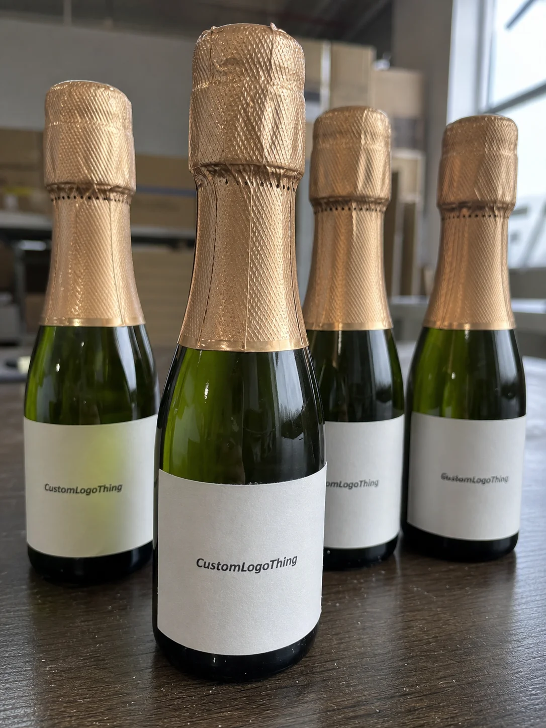
A miniature bottle changes the label conversation immediately. On a standard wine bottle, a few millimeters of slack can disappear into the glass. On a mini bottle, those same millimeters can show every flaw. A label that is slightly too tall can creep into the shoulder. A label that is too wide can overlap a seam or buckle near a curve. A label that is too glossy can throw back so much light that the smallest text becomes harder to read.
The use case matters as much as the bottle shape. A hotel minibar bottle needs to look clean and durable. A wedding favor needs to feel elegant rather than improvised. A tasting kit needs the branding to survive shipping, refrigeration, and repeated handling. A gifting program needs the label to support the larger packaging story, not fight it. That is why custom Mini Champagne Bottle Labels are not just smaller versions of standard bottle labels.
The geometry is different. Many mini sparkling wine bottles have a sharper shoulder, a shorter straight panel, and a tighter curve radius than full-size formats. The usable label area is usually smaller than the artwork canvas suggests. The bottle seam also becomes more visible because the label sits so close to it. Add cold storage and the problems compound. Condensation can soften paper stock, weaken marginal adhesives, and make edge lift more likely.
For buyers, the first decisions are usually these:
- Exact label dimensions based on the bottle shape, not a generic template.
- Material choice for dry handling, chilled display, or removable use.
- Finish level, from matte to gloss, metallic, or soft-touch.
- Order volume and whether a low MOQ is worth the higher unit cost.
- Proofing method, especially if the artwork includes tiny text, a barcode, or foil accents.
That is the real job of the label. It is a fit problem, a print problem, and a presentation problem at the same time.
How the Labeling Process Works on Mini Bottles
The workflow starts with measurement. Not guesswork. A supplier needs the bottle diameter, the straight panel height, the shoulder transition, and any taper that changes where the label can sit. After that comes dieline selection or a custom dieline, then artwork placement and proof preparation. Printing should be the last step, not the first.
Placement matters just as much as size. On a mini champagne bottle, the brand mark usually needs to sit on the most visible flat portion of the bottle, with enough clearance so the label does not crawl into the shoulder or land directly on a seam. If the label is off by even a small amount, the eye catches it faster than it would on a larger bottle. A proof should cover both artwork and placement logic, not just color.
Digital proofs help expose weak points early. Tiny fonts that seem acceptable on a monitor often become muddy in print. Metallic accents can overpower small copy. Full-bleed backgrounds can look elegant, but they also make edge alignment and trimming less forgiving. If the label includes a barcode or QR code, check the quiet zone and module size carefully. On a small bottle, those elements can fail fast if they are forced too close to the edge.
A good mini bottle label does not fight the bottle shape. It settles into it, so the viewer notices the brand first and the geometry second.
Application method changes the workflow too. Very small runs are often hand-applied, which gives flexibility but demands a careful operator. Larger event orders are often supplied in roll format for faster, more consistent placement. If the bottles will be packed in custom printed boxes, review the label and carton together so the opening reveal, color palette, and finish all support the same visual story.
Cost Drivers, Pricing Tiers, and MOQ Basics
Pricing for custom mini champagne bottle labels depends on more than quantity. Size is the first lever. Smaller labels use less substrate, but the savings can be offset by tighter die cutting, more careful placement, or a higher rejection risk if the bottle shape is tricky. Stock choice is the second lever. Paper is usually cheaper than film, but film often performs better in cold or damp settings. Finish adds another layer. A matte varnish is generally less expensive than foil stamping or soft-touch lamination.
Order size matters because setup costs are spread across more labels as volume rises. A run of 250 labels can look affordable until proofing, cutting, and shipping are added. A run of 2,500 labels often lowers the unit cost materially because the setup gets distributed more efficiently. Still, low-MOQ orders have a place. Event planners, wedding buyers, and hospitality teams sometimes value speed and flexibility more than the lowest possible unit price.
Here is a practical pricing lens for buyers comparing options:
| Order Size | Typical Unit Range | Best Fit | Cost Notes |
|---|---|---|---|
| 250-500 labels | $0.45-$0.90 | Weddings, samples, one-off events | Setup and proofing weigh more heavily on unit cost |
| 1,000-2,500 labels | $0.22-$0.48 | Small retail programs, hospitality, recurring events | Better balance between flexibility and price |
| 5,000+ labels | $0.10-$0.28 | Higher-volume branded packaging programs | Best value if artwork and bottle specs stay stable |
These are working ranges, not fixed quotes. A short-run label with foil, a custom cut, and cold-resistant adhesive will land above a plain paper label with a standard rectangle shape. If the job needs exact color matching or a second proof round, the price rises again. Buyers often save money by keeping the structure simple and putting budget into one strong detail instead of four weak ones. That is usually smarter than over-specifying a short-run order.
MOQ deserves a clear discussion. Some suppliers quote a low minimum for event buyers. Others open a better price only after the order reaches a certain quantity. Ask for pricing at two or three quantities, not one. That shows where the value curve actually changes. It also helps you decide whether to order just enough for the event or enough to cover a reprint cushion, a retail pilot, or a second use.
Material, Adhesive, and Finish Choices That Hold Up
Material choice is where a lot of mini bottle projects win or fail. Paper labels still have a place, especially for dry handling and short-lived applications. They are familiar, easy to print on, and often cost less. But paper can struggle on chilled bottles, cold rooms, or ice buckets. If the bottle sweats, paper may cockle, soften, or lose edge integrity. For mini champagne bottles that will be refrigerated, a film-based stock is often the safer choice.
BOPP is a common option because it resists moisture better than paper and stays flatter under handling. Clear or white film can both work, depending on the design. A clear label looks clean on glass and can disappear into the bottle, but it usually needs a white underprint if the artwork includes pale colors or fine text. White film gives stronger contrast and is easier to read when the design is light or detailed. Vinyl has more niche uses and is usually selected when extra conformability or durability is needed, though it is not the default choice for premium beverage presentation.
Textured specialty stocks can look excellent for luxury gift packaging, but they should be used carefully on mini bottles because tactile materials sometimes make small type harder to read at a glance. A label that feels expensive but reads poorly has not done its job.
Adhesive choice deserves the same attention as the stock. For cold bottles, look for an adhesive rated for damp or refrigerated surfaces. For short event use, a stronger permanent adhesive may be fine if the label is not intended to peel off later. For reusable containers or display bottles, removable adhesive can be the better call, but it should be tested before the full run. A label that peels cleanly in theory may still leave residue on a glossy finish.
Finish changes how the label reads under light. Matte tends to look restrained and works well for text-heavy labels. Gloss adds shine and visual punch, but can create glare under event lighting. Soft-touch gives the label a more tactile, high-end feel, though it costs more and may not suit every design. Foil accents work best when the artwork is sparse and the label needs one clear focal point. On a tiny bottle, too much embellishment can make the design feel crowded instead of premium.
If sustainability is part of the brief, ask about FSC-certified paper options and how the label stock fits into the broader paper and recycling conversation. Packaging buyers are increasingly expected to make those calls deliberately, not casually. For a reliable industry reference on packaging practices and materials, the Institute of Packaging Professionals is a useful starting point.
Bottom line: the best substrate is not the most decorative one. It is the one that stays flat, stays legible, and survives the conditions the bottle will actually see.
Artwork Specs and Proofing Details That Save a Run
Artwork on a small label lives or dies by scale. The file may look polished at full size, then collapse into clutter once it is reduced to the real print size. That is where print buyers and designers often miss each other. A mini bottle label needs type that survives distance, not just type that looks elegant in a mockup. If the label is meant to be read during an event, keep the hierarchy simple. Brand name first. Secondary details second. Anything that does not help the reader should be questioned.
The practical file specs matter. Vector logos are better than raster files for sharp edges. Images should be high resolution at final size, not stretched after the fact. Bleed should extend beyond the cut line. Safe margins should keep text away from the edge so trimming does not clip it. If the design uses a clear label, the white underprint needs to be mapped precisely or the artwork may disappear against the glass. That issue shows up most often in pale colors, metallic inks, and thin type.
Color management is another point where assumptions cost money. A design that looks balanced on a backlit monitor may print darker, flatter, or more saturated than expected. Small labels exaggerate color shifts because there is less visual space to absorb them. If brand accuracy matters, ask for a proof against the actual bottle style and check it under the lighting where the bottles will be seen. Event lighting can be harsher than office lighting, and cold storage can make colors feel different again.
Barcode and QR placement deserves special scrutiny. On a mini label, those elements can crowd the artwork fast. A code that scans in a PDF may fail if it is shrunk too much, placed on a curve, or printed with weak contrast. If the code matters operationally, test it on a sample bottle. Do not assume the digital proof tells the whole story.
Good proofing is not about catching every theoretical issue. It is about finding the few problems that actually matter on this bottle, in this use case, under these conditions. That is the difference between a clean run and a correction order.
Production Steps, Timeline, and Turnaround Expectations
Label production follows a predictable path, but buyers often underestimate how much time disappears between steps. The sequence usually looks like this: artwork prep, proof review, revisions if needed, file or plate setup, printing, finishing, trimming or die cutting, inspection, and packing. If the project uses foil, specialty coatings, or a custom shape, each step adds friction. Together, those delays can turn a simple order into a deadline problem.
Standard digital label jobs are often faster than jobs that need foil or complex finishing. A clean short run may be ready in roughly 12 to 15 business days after proof approval, while more involved projects can stretch to 15 to 20 business days or more. Rush orders are possible in some cases, but they depend heavily on file readiness and production capacity. A late proof approval can erase the time advantage quickly.
The most common delays are not mysterious. They are usually basic: missing bottle dimensions, low-resolution artwork, a poor dieline fit, or a last-minute change after the proof is already in motion. The best buyers send a complete request from the start. Quantity, bottle size, finish preference, delivery date, and placement details should all be on the table before the quote goes out. If the order is tied to an event, build in time for shipping and application tests before the first bottle is needed.
For products that will travel, especially in bundled sets or custom printed boxes, it helps to think about shipment stress as part of the label spec. The International Safe Transit Association publishes packaging test methods used to evaluate drop, vibration, and compression risks. Their guidance at ista.org is useful if the label is part of a larger packed kit rather than a single shelf bottle.
A practical planning rule helps here: leave room for one reprint window. That sounds cautious because it is. But a label that arrives early, gets tested, and still performs is cheaper than one that arrives late and forces a last-minute compromise.
Common Mistakes That Ruin Fit, Readability, and Adhesion
The first mistake is designing from the artwork canvas instead of the bottle. Those are not the same thing. A design that fills a rectangle beautifully may fail once it wraps onto a curved mini bottle. Measure the straight label panel, not just the total bottle height. Leave edge clearance. Check the seam location. Verify that the shoulder does not steal usable space from the label face.
The second mistake is making the type too small. Tiny bottles tempt designers to cram in more information than the surface can support. Resist that. If the label is read from arm's length during an event, body copy should stay simple. Use strong contrast, keep the brand name dominant, and let secondary details fall away if they do not help the customer make a fast read. On small retail packaging, clarity usually beats density.
The third mistake is ignoring cold conditions. A label that performs well on a dry table may fail in a chilled bucket. Moisture, frost, and hand contact all change the equation. Testing matters. If the bottle will be stored cold, packed in ice, or handled after refrigeration, ask for a stock and adhesive combination that has been checked under those conditions. For shipping, carton tests and conditioning can matter as much as print quality.
The fourth mistake is skipping the preflight checklist. Check bleed. Check the safe area. Check the orientation. Check whether metallic or white ink elements remain readable at the final size. If the label includes a barcode or QR code, print it at true size and scan it on the actual bottle mockup. A good packaging team treats this step as non-negotiable.
Here is a short checklist that catches most problems before they become expensive:
- Confirm the exact bottle dimensions, including taper and shoulder.
- Review a physical or scaled proof on the actual bottle style.
- Test the chosen stock in cold or damp conditions.
- Keep type size readable after wrapping the label around the curve.
- Verify finish, adhesive, and application method together.
Buyers who skip these checks usually pay twice: once for the labels, and again for the correction run.
Next Steps: Measure, Request, and Approve Before Ordering
The fastest route to a clean result starts with real measurements. Record the bottle diameter, the usable label panel height, the seam position, and any taper that affects the wrap. If the bottle is a 187 ml or 200 ml format, do not assume it shares the same panel as a standard champagne bottle. It usually does not. The smaller the format, the more exact the fit needs to be.
Then gather the rest of the quote inputs before contacting a supplier: artwork files, target quantity, finish preference, application method, delivery date, and whether the labels are going on chilled bottles or dry bottles. That makes pricing comparisons much cleaner. It also reduces the number of proof revisions, which is where a lot of delays begin.
If the labels are tied to weddings, luxury gifts, or a visible launch, ask for a sample proof or a short test run before full production. That is especially useful if the design depends on color accuracy or a specialty finish. The proof should be judged against the actual bottle, not just a screen mockup. Screens forgive more than glass does.
For buyers building a broader packaging program, mini bottle labels should be treated as part of the same system as cartons, sleeves, tags, and other branded components. The stronger the fit between those pieces, the more deliberate the final presentation feels. That is the difference between a bottle that looks decorated and one that looks designed. If you want the label to do its job, custom mini champagne bottle labels need to be approved against the real bottle, not just the concept.
How do I size custom mini champagne bottle labels for 187 ml bottles?
Measure the straight label panel, not just the total bottle height, because the shoulder curve cuts into usable space. Leave a safe margin on all sides so the label does not lift at the edges or wrap awkwardly around the seam. Before production, ask for a proof on the exact bottle style you are using.
What material is best for mini champagne bottle labels in cold storage?
A moisture-resistant film such as BOPP is usually the safer choice if the bottles will be chilled or placed on ice. Pair it with an adhesive rated for cold, damp surfaces so the edges stay down. If the label needs to come off later, request a removable adhesive and test it first.
How much do custom mini champagne bottle labels usually cost?
Price depends on quantity, label size, stock, finish, and whether the shape needs custom cutting. Unit cost usually falls as volume rises, but setup and proofing make very small runs more expensive per label. Ask for pricing at two or three quantities so you can see where the value improves.
How fast can custom mini champagne bottle labels be produced?
Turnaround depends on proof approval, material availability, and finish complexity. Simple digital jobs are often faster than orders with foil, specialty coatings, or custom shapes. Build in time for shipping and application testing, especially if the labels are tied to an event deadline.
Do mini champagne bottle labels need waterproof lamination?
Not always, but moisture resistance matters if the bottles will be chilled or displayed on ice. A film stock or protective finish can help prevent smudging and preserve color in wet conditions. For one-time event bottles, choose the level of protection that matches the real handling and storage conditions, then approve custom mini champagne bottle labels against the actual bottle.