Custom perfume labels do more than name a scent. They decide, in a few seconds, whether a bottle feels elegant, trustworthy, and worth picking up, or whether it looks like the label will wrinkle the first time it meets oil, moisture, or a busy retail shelf. For brands that also need Custom Labels & Tags or broader Custom Packaging Products, the label is usually the first piece of package branding a shopper notices, and it has to work hard.
That is the practical side of fragrance packaging: the label has to survive handling, curve cleanly around glass, and still look sharp under bright store lighting or on a bathroom counter where condensation and perfume residue are part of normal use. A mockup can look polished and still fail in production. The real test is whether the label stays flat, legible, and aligned after printing, shipping, and application.
What Custom Perfume Labels Need to Do on the Shelf
The odd thing about perfume packaging is that it can fail visually long before the product itself has a chance to impress. The fragrance may be excellent, but if the label lifts at the seam, wrinkles over the shoulder, or looks washed out under retail lighting, the bottle reads as lower quality. In a category where price and perception are tightly linked, that is enough to change how a shopper responds.
A perfume label has three jobs. It identifies the fragrance clearly. It signals the brand position, whether that means clean minimalism, boutique luxury, or a more fashion-forward aesthetic. And it has to hold up against the realities of glass packaging, curved surfaces, oils from fingers, and the occasional burst of condensation from chilled displays or bathroom storage.
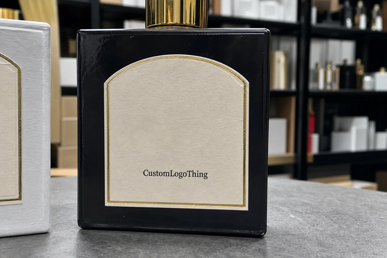
Design details matter more on perfume bottles than they do on larger cartons. Type that reads comfortably on a carton can disappear on a 10 ml or 30 ml bottle. Small logos need to be scaled for the bottle, not for the screen. Borders need breathing room. If the bottle is unusually narrow, the label should be built to fit the actual viewing distance, because shoppers rarely hold fragrance at a desktop-like distance.
A fragrance label should signal luxury in a glance, not ask the shopper to work for it.
Finish choices also influence perceived value. Matte tends to feel restrained and modern. Gloss pushes color and gives more visual energy. Clear labels create a minimal, almost floating effect on glass, but they expose every registration issue and every weak line of artwork. Foil can lift the perceived price point quickly, though on a small bottle it needs restraint. Too much shine, and the label starts competing with itself.
From a buyer’s point of view, the real question is not whether the design looks good on a monitor. It is whether the label supports the brand story in a retail environment where a shopper may compare several bottles in under ten seconds. Strong custom perfume labels do that work fast. Weak ones force the product to recover from the packaging before the fragrance has even been opened.
There is also a difference between a premium look and an expensive-looking mistake. A crisp two-color label on the right stock can outperform an overbuilt design with too many effects. In fragrance, clarity often reads as confidence. Clutter usually reads as compromise.
Materials and Finishes That Fit Fragrance Packaging
Material choice is where many projects succeed or fail. Basic paper labels can work for certain applications, but perfume is a tougher category than it looks. Oil exposure, alcohol, frequent handling, and glass curvature push the label system harder than a dry goods product ever would. If the bottle will move through retail channels or be handled frequently, polypropylene and polyester usually outperform paper.
Polypropylene is popular because it gives a clean print surface, resists moisture, and can hold up well under normal retail handling. Polyester is stronger and more durable, which helps when the bottle has a sharper curve, a narrower shoulder, or a greater risk of scuffing during shipping and shelving. Some vinyl-style stocks also have a place here, but the adhesive and finish have to match the bottle shape and the intended look. Material alone is never the full answer.
Adhesive choice matters just as much. A standard permanent adhesive is often the safest default for fragrance bottles sold through retail packaging channels. If the glass is slick, frosted, heavily curved, or likely to be exposed to condensation, a stronger bond is usually the better path. Removable adhesives sound flexible, but for perfume they can be risky unless the label truly needs to come off later without residue or edge lift.
Finishes are not decoration in the superficial sense. They alter both handling and appearance. Matte reduces glare and can make a label feel more editorial or understated. Gloss makes saturated color feel richer. Soft-touch creates a tactile contrast against glass that many premium brands like because it immediately changes the perceived hand-feel of the bottle. Foil adds brightness and a luxury signal. Spot UV can highlight a logo or fragrance name without covering the whole label in shine. Clear labels are effective for minimal packaging, but they punish sloppy artwork because every color shift and every placement issue shows.
If the label will be tested for shipping, think beyond the shelf. Lab conditions do not predict everything. A fragrance line should survive packaging, distribution, and a little rough handling, so a practical buyer will often ask for application testing and, in some cases, transit-style checks aligned with ISTA guidance from ISTA testing standards. For paper-based choices, FSC-certified stocks can also matter if the brand wants to show a clearer sustainability position through FSC certification.
- Paper: better for lower-risk applications, short runs, or secondary packaging.
- Polypropylene: a strong all-around choice for glass perfume bottles.
- Polyester: better for durability and harsher handling conditions.
- Clear film: best when the design needs a clean, minimal look and precise alignment.
In practice, the best material is the one that fits the bottle, the artwork, and the use case. A stock can feel premium in a sample book and still fail on a curved bottle if the adhesive is wrong or the finish cannot handle perfume oil. That is why material selection should be treated as a production decision, not just a visual one.
Process and Timeline for Ordering Perfume Labels
A clean ordering process starts with measurements, not artwork. Before the design is finalized, the bottle’s usable label area needs to be defined clearly. That means measuring the wrap width, visible height, shoulder curve, seam line, and the distance from the sprayer or cap hardware. On narrow bottles and sample vials, a difference of even a few millimeters can change how the final label sits.
Once the dimensions are known, the supplier can build or confirm the dieline. That template keeps the artwork inside the real printable area. It matters especially for clear labels, custom shapes, and bottles with unusual curves, because a design that looks balanced on a screen can become cramped or misaligned once it is wrapped around glass. A dieline is not a formality. It is the boundary between a polished label and a reprint.
The production flow usually follows a predictable sequence: quote request, specification review, artwork check, proof, approval, production, finishing, inspection, and shipment. Some projects move quickly if the artwork is print-ready and the bottle spec is complete. Others slow down because of open questions about finish, exact sizing, or legal copy that needs to fit into a very small space. Fragrance labels are especially sensitive to late changes because every SKU variation adds another approval step.
Lead time depends on more than print speed. Specialty finishes such as foil or spot UV add setup time. Complex die cuts do too. A small order with multiple scent variants can take longer than one larger run if each SKU needs a separate proof cycle. In many cases, a straightforward label job can move in roughly 12 to 15 business days from proof approval, but that assumes clean files and no late revisions. If a physical sample or press proof is needed, add more time.
Rush orders are sometimes possible, but the fastest path is usually the simplest one: complete specs, final artwork, one decision maker, and a clear launch date. The more back-and-forth there is, the more the schedule stretches. That pattern shows up across fragrance packaging, custom printed boxes, and other branded components. The press does not care about a launch calendar that changes every afternoon.
Buyers often underestimate how much time can be lost after the proof stage. If artwork is still being edited once the supplier has queued production, the schedule can slip by days without anyone noticing until the ship date moves. Treating approval as a production gate instead of a casual design review saves time and reduces avoidable errors.
Cost, Pricing, MOQ, and Unit Cost Factors
Pricing is shaped by more variables than most buyers expect. Size, shape, material, adhesive, finish, print coverage, and quantity all affect the final number. Two labels that look nearly identical in a mockup can still price very differently if one uses clear film, foil accents, and a Custom Die Cut while the other is a simple rectangle on polypropylene.
MOQ, or minimum order quantity, changes the math too. Lower quantities carry a higher unit cost because setup, press preparation, and finishing are spread across fewer pieces. Larger runs generally drop the per-label price because those fixed costs are absorbed more efficiently. For a buyer comparing options, the useful question is not just the sticker price; it is the total cost of a launch-ready run, including the risk of reprints if the label does not fit or hold up.
| Order Type | Typical Unit Cost | Best Fit | Notes |
|---|---|---|---|
| Small run, simple print | $0.18-$0.35 | Testing, short launches, boutique lines | Usually paper or polypropylene with limited finishing |
| Mid-volume, standard retail | $0.08-$0.22 | Core fragrance SKUs | Better value when quantity rises and artwork stays stable |
| Special finish or custom shape | $0.28-$0.60 | Premium or gift-ready bottles | Foil, spot UV, or clear film can push pricing up |
Specialty effects cost more because they add steps. A foil layer, layered print, or unusual die cut increases setup complexity. Multiple scent variants also raise cost if each version needs separate files or artwork changes. In a fragrance line with five or six SKUs, those small differences add up quickly, especially when the bottle sizes are similar but not identical.
When comparing quotes, ask what is included. Material, adhesive, finish, proof type, setup, file correction, and shipping should all be clear. If one quote looks much cheaper, check whether it assumes a simpler stock or excludes proofing work. A slightly higher unit cost can still be the better buy if the label stays flat on curved glass, resists oils, and avoids reprints. In retail packaging, a delayed launch can cost more than the difference between bids.
There is another cost that does not show up on the invoice: time spent correcting artwork that was sized too loosely or specified too late. A label that needs to be reworked three times usually costs more than one that was measured properly from the beginning. That is why the cheapest quote is often not the cheapest outcome.
For some brands, the label is only one piece of the total system. The bottle, carton, insert, and outer shipper all contribute to the shelf impression. That is why many teams plan labels alongside Custom Packaging Products rather than treating them as an isolated line item.
How to Measure Bottles and Prepare Artwork Correctly
Accurate measurement is the difference between a label that looks built for the bottle and one that looks pasted on. Start with the usable panel, not the overall bottle size. The usable panel is the flat or gently curved space where the label can sit without hitting the shoulder, base radius, or sprayer hardware. On many perfume bottles, that usable space is smaller than it first appears.
Measure the wrap width, the visible height, and any curvature that could change how the label lands. Also note seams, embossing, frosted sections, and molded details in the glass. Those features can interfere with adhesion or make a label appear crooked even when it is technically centered. If the bottle has a pronounced taper, it is worth confirming whether the label should be slightly narrower at one edge to avoid edge stress.
Artwork should be built from the dieline, not guessed from a generic template. That matters especially for narrow labels, transparent films, and shapes that need to fit a specific contour. Bleed, safe area, and trim need to be set correctly so small shifts in production do not cut off text or logos. Vector logos are best. If raster images are used, 300 dpi at final size is the practical baseline for print clarity.
Color expectations should be discussed early if the design uses metallics, clear areas, or very light type. Gold foil is not the same as a gold ink simulation. Transparent labels reveal the bottle color underneath, which can alter contrast. White ink may be needed to keep a logo readable on glass. Those details are easy to miss on a monitor and expensive to fix later.
One habit that saves a lot of trouble is checking the design at actual size. A fragrance name, notes panel, or legal text block that looks fine in layout can become tiny once the label is scaled to fit the bottle. If the shopper has to lean in to read the name, the packaging is working against the purchase. That is a bad outcome for a category that depends so heavily on quick shelf recognition.
- Measure the bottle’s usable panel, not the full silhouette.
- Confirm the label shape against a real dieline.
- Keep important copy inside the safe area.
- Test small text at true size before approval.
Good artwork prep also makes the rest of the launch cleaner. The supplier can quote faster, proof faster, and print with fewer surprises. That is true for custom perfume labels and for most other product packaging pieces too.
Common Mistakes That Damage Label Performance
One of the most common mistakes is choosing a stock because it looks premium in a sample book. That is a shallow test. A paper that feels elegant in the hand may still soften, lift, or scuff once it meets perfume oil, repeated touching, or the pressure that comes with curved glass application.
Another mistake is trying to do too much on a very small bottle. Heavy foil, dense copy, script fonts, and multiple decorative borders can make the label hard to read. On a 15 ml or 30 ml bottle, the design needs clarity first. If the logo is oversized or the typography is crowded, the product can look less credible, not more luxurious.
Skipping application testing is a real risk. Round bottles, frosted glass, chilled display cases, and oily formulas all create conditions that a flat sample cannot predict. A label may apply cleanly in the office and fail in real use because the adhesive behaves differently on the actual bottle finish. Testing one label on the real bottle is cheap insurance, especially when a run has to be printed before a launch date.
Poor contrast is another issue that shows up quickly in retail packaging. Light gray text on a pale bottle or metallic type with too little edge definition can vanish under store lighting. The result is a bottle that is technically branded but not easy to shop. That is a poor trade for fragrance, where the purchase is emotional but still highly visual.
Placement errors can also undermine the whole line. If the label sits too high, too low, or slightly off-center, the bottle starts to look unfinished. That is especially costly for gift-ready or boutique fragrances, where the buyer expects the package to feel deliberate from every angle. Small misalignment is one of the easiest ways to reduce perceived value without anyone naming it directly.
Honestly, many label problems come from treating the label as a graphic-only project instead of a packaging system. The glass, adhesive, finish, and print method all need to work together. If one part is off, the whole bottle feels less complete.
Next Steps for a Cleaner Quote and Faster Production
If you want a cleaner quote, gather the basics before you ask for pricing. Bottle dimensions, quantity, number of scent variants, finish preference, target launch date, and any required compliance text should all be ready. That lets the supplier quote the job accurately and reduces the back-and-forth that slows down approvals.
Ask for a mockup or proof early. That one step catches sizing issues, margin problems, and readability concerns before production starts. It is especially useful if the line uses frosted bottles, curved shoulders, or a clear-label effect where alignment matters a lot. A proof is not just paperwork; it is the cheapest place to find a mistake.
For fragrance packaging, I would strongly recommend testing one label on the actual bottle before approving the full run. A real bottle tells you more than a digital file ever will. You can see how the adhesive grabs, how the finish looks under light, and whether the typography remains readable at arm’s length. If the design needs tweaking, it is far cheaper to find out then.
Once the artwork is final, the material is selected, and the proof is approved, place the order early enough to leave room for application, assembly, and launch prep. That kind of schedule discipline matters whether you are producing custom perfume labels, updating retail packaging, or coordinating a larger branded packaging rollout. It also protects the launch from the kind of last-minute fix that usually costs more than the original problem.
What material works best for custom perfume labels on glass bottles?
Polypropylene or polyester usually performs better than basic paper because they handle oil, alcohol, moisture, and normal handling more reliably. The best choice still depends on bottle shape, finish, and whether the brand wants a matte luxury look, a clear minimal label, or a more standard retail appearance.
How much do custom perfume labels usually cost?
Pricing depends on size, quantity, stock, finishing, and shape, so two quotes can look very different even when the labels seem similar. As quantity rises, the unit cost usually falls, while foil, spot UV, custom die cuts, and multiple SKUs push the price up.
How long does the perfume label production process take?
Lead time depends on proofing, artwork readiness, finishing complexity, and the number of revisions needed before approval. Clean files and straightforward specs move faster; specialty finishes, custom shapes, or sample requests usually add time.
Do perfume labels need special adhesive?
Yes. Fragrance bottles are often slick, curved, or exposed to oils and condensation, so a standard adhesive may not hold as well as a stronger permanent option. Unless the application requires easy removal, a permanent adhesive is often the safer default.
What should I check before ordering custom perfume labels in bulk?
Verify bottle measurements, artwork size, label placement, finish choice, quantity, and whether the design is still readable at actual size. It also helps to test one label on the real bottle and confirm the proof before you approve the full run.
For most brands, the cleanest result comes from treating custom perfume labels as part of the whole package system, not as a last-minute add-on. When the label, bottle, finish, and artwork all line up, the product feels more credible on shelf and much easier to launch well.