Buyer Fit Snapshot
| Best fit | custom soap boxes with embossing branding for packaging buyers comparing material specs, print proof, MOQ, unit cost, freight, and repeat-order risk where brand print, material, artwork control, and repeat-order consistency matter. |
|---|---|
| Quote inputs | Share finished size, material target, print colors, finish, packing count, annual reorder estimate, and delivery region. |
| Proofing check | Approve dieline scale, logo placement, barcode or warning zones, color tolerance, and any recyclable or compostable wording before bulk production. |
| Main risk | Vague material claims, crowded artwork, or missing packing details can create delays even when the unit price looks attractive. |
Fast answer: Custom Soap Boxes with Embossing Branding: Dieline, Finish, Proof, and Buyer Review should be specified like a repeatable production item. The safest quote includes material, print method, finish, artwork proof, carton packing, and reorder notes in one written spec.
What to confirm before approving the packaging proof
Check the product dimensions against the actual filled item, not only the sales mockup. Ask for tolerance on folds, seals, hang holes, label areas, and retail display edges. If the package carries a logo, QR code, warning copy, or legal claim, reserve that space before decorative graphics fill the panel.
How to compare quotes without losing quality
Compare board or film grade, print process, finish, sampling route, tooling charges, carton quantity, and freight assumptions side by side. A lower quote is only useful if the supplier can repeat the same color, closure quality, and packing count on the next order.
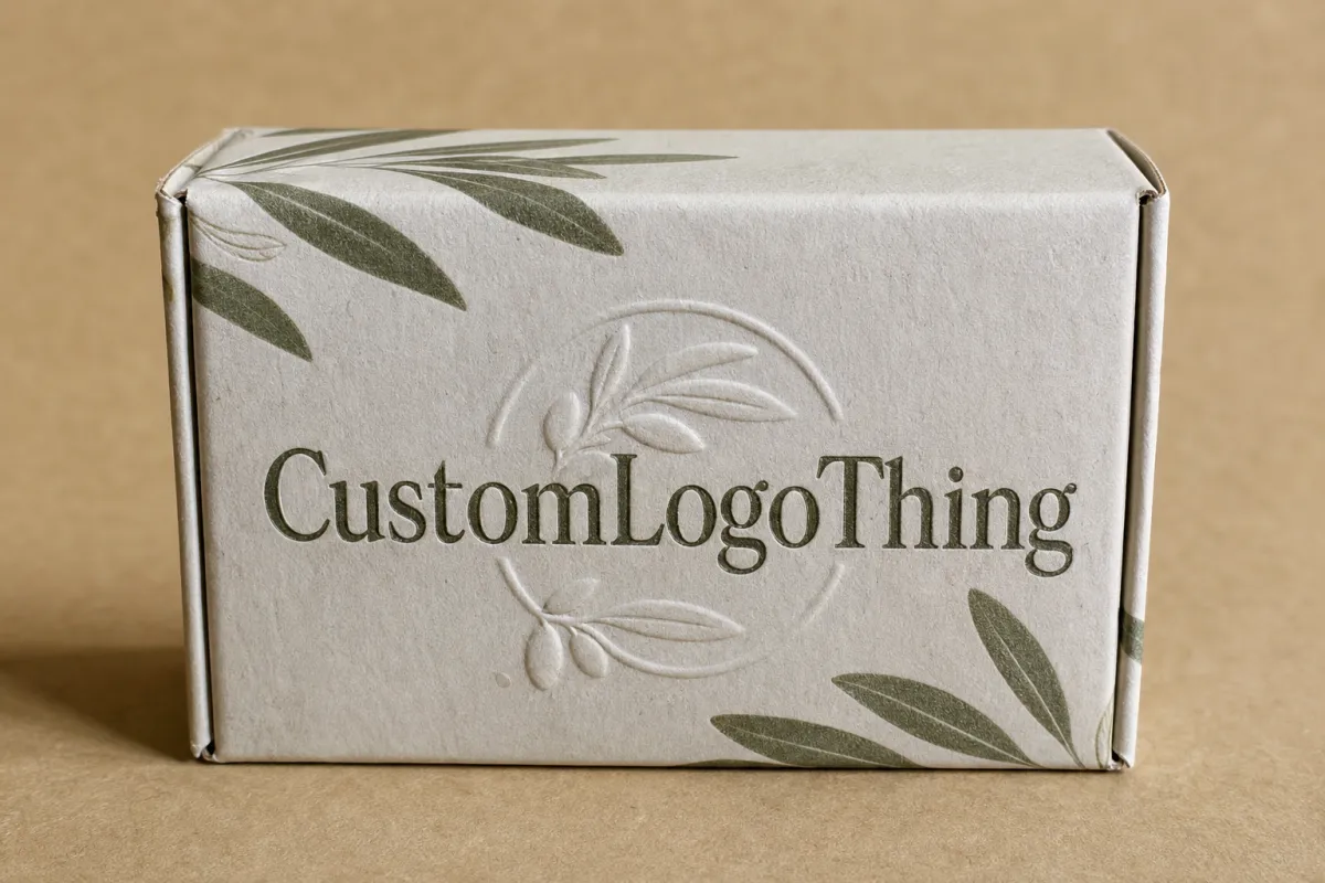
A soap bar can be chemically simple and commercially stubborn. If the box does not make a shopper pause, the shelf usually moves on. That is why Custom Soap Boxes with embossing work so well. They turn a flat carton into something people can feel before they decide the brand deserves attention.
Most buyers do not study every panel. They react to shape, texture, contrast, and the small shadows that appear when light hits raised paperboard. In retail packaging, that tiny interruption matters more than a long paragraph on the back panel. A clean embossed logo can make a modest bar feel artisan, a basic cleanser feel giftable, and a private-label soap line feel deliberate instead of generic.
For brands comparing Custom Printed Boxes and broader product packaging choices, embossing lands in a useful middle ground. It feels premium without demanding a flood of ink or a loud graphic system. It can also support package branding across cartons, sleeves, and inserts when the same raised mark appears in more than one place. If you are building a soap line and need more than one carton style, the Custom Packaging Products catalog is a practical place to compare formats, finishes, and structural options.
What Custom Soap Boxes with Embossing Signal on Shelf
On a crowded shelf, texture often does more work than copy. A shopper scanning a row of bars may spend two or three seconds on the whole bay. That is not enough time to absorb a story. It is enough time to notice a raised mark, a sharp shadow, or a paper surface that feels more considered than the cartons next to it.
That is the real advantage of embossing. It adds depth without adding noise. You do not need heavy ink coverage or flashy effects to create presence. A raised logo, a subtle border, or a small pattern can communicate care, restraint, and quality in a way flat print often misses. For natural soap, the effect can feel earthy and handcrafted. For a luxury bath line, the same technique can read as refined. For a gift set, it can move the box from ordinary retail packaging into something people want to hand over.
Think about the shelf under typical store lighting. A plain kraft carton can disappear if the palette is muted. Add a blind emboss, though, and the light catches the raised area. The eye sees movement. The hand follows. That matters for brands selling through boutiques, spas, hotels, and direct-to-consumer channels where tactile branding carries more weight than mass-market noise.
On soap packaging, the first sale often happens before the customer reads the ingredients. Texture does that work.
Embossing also strengthens recognition when the same motif appears across multiple touchpoints. A carton may carry the full brand lockup, a sleeve may repeat a small icon, and an insert may echo the same raised line work. That repetition matters. People remember shape and touch faster than they remember copy blocks. In practice, consistent embossing can make a small brand feel much larger and more established than its order volume suggests.
For brands investing in branded packaging, this is not decoration for decoration’s sake. It is a purchase signal. A raised mark implies that something was considered, tooled, approved, and pressed into place on purpose. That level of finish can matter more than many buyers expect, especially when the soap itself competes in a category where labels, scents, and bar shapes can all look similar from ten feet away.
How Embossing Works on Soap Packaging
Embossing is simple in theory and fussy in production. A metal die presses the paperboard upward, creating a raised area. Debossing does the opposite: it pushes the design inward. The result can be subtle or pronounced, but the mechanics stay the same. The artwork has to survive pressure, paper stretch, board memory, and alignment across the run.
The artwork stage matters more than most first-time buyers expect. A file that looks crisp on screen can fail once it meets a press. Thin serifs, hairline borders, tiny decorative flourishes, and very tight spacing often flatten or distort. Clean vector shapes work better. So does a logo with enough visual weight to remain readable after the paperboard gets compressed. As a rule, the simpler the emboss area, the cleaner the result.
Material choice matters just as much. Thicker paperboard usually holds detail better than lightweight stock. A common range for folding cartons is around 14pt to 18pt board, or roughly 300gsm to 400gsm, depending on the substrate and coating. Coated surfaces often show cleaner edges. Uncoated or highly fibrous boards can still look excellent, but the depth may read softer and the raised detail may not stay as crisp around fine edges. If you are using recycled board, ask for a sample. Recycled fibers can vary enough to change how sharply the emboss lands.
Common emboss styles
Blind embossing uses no ink or foil over the raised area. That restraint is exactly why it feels premium. It is popular for natural, botanical, and artisan soap lines because the impression reads understated rather than loud.
Foil embossing combines a raised impression with metallic foil. Gold, silver, copper, and matte-pigment foils can create stronger contrast, which helps the logo stand out on crowded retail packaging. This is often the better choice if your box has darker tones or needs stronger shelf visibility from a distance.
Debossing pushes the image inward. It can be elegant on thicker stock and is often useful when a brand wants a quieter look or when the raised area would be vulnerable to rub marks.
Combination finishes pair embossing with foil, soft-touch coating, or restrained spot color. Used carefully, the result can look more expensive than adding extra graphics. Used carelessly, it becomes clutter. The best combination is the one that clarifies the brand story, not the one that just piles on effects.
Structure changes the result too. A tuck-end carton, a sleeve, and a rigid setup box do not behave the same way under pressure. Sleeves can show crisp embossing on a long uninterrupted panel. Folding cartons need more care around scores and glue flaps. Rigid cartons can support deeper impressions, but the economics change fast. When a supplier quotes embossed soap boxes, the box style and emboss location are part of the real specification, not side notes.
If the soap will ship through ecommerce instead of sitting only on a shelf, packaging validation matters too. The ISTA test procedures are widely used to evaluate how well packaging holds up through distribution, vibration, drops, and compression. For sourced paperboard, the FSC chain-of-custody system is the reference many brands use when they want certified material from responsible forestry. Those are not marketing fluff. They are the kinds of checks that help a package perform and sell.
Cost, Pricing, MOQ, and Quote Factors
Embossing is not expensive in the abstract. It becomes expensive when the run is too small, the artwork is too complicated, or the quote hides tooling in a way that makes comparison messy. The main cost drivers are easy to name: die creation, setup time, stock choice, print coverage, finishing method, and total quantity. The tricky part is how those factors interact.
For a small order, fixed costs dominate. A simple emboss die may start around $75-$200, while more complex or larger dies can run higher. Add setup, proofing, and sample time, and a 500-piece order can feel disproportionately expensive. At 5,000 pieces, the same tooling spread across the run becomes much easier to absorb. That is why embossing usually makes more sense once you have a stable box size and a design you expect to reorder.
As a rough planning range, a plain folding carton might land around $0.18-$0.30 per unit in a medium run, depending on size, print coverage, and board. Add embossing and the number may move to roughly $0.24-$0.42 per unit, again depending on how many emboss locations you want and whether foil or special coating is included. Small runs are a different story. A short order can jump much higher on a per-box basis because the setup cost gets spread over fewer pieces. That is normal, not a warning sign.
Use those numbers as planning guides, not promises. Paperboard pricing, labor, tooling, and freight move around. A supplier in one region may quote differently from another because they are buying board on a different schedule or running a different press line. The important part is the structure of the quote, not the exact decimal.
Here is the practical way to read a quote: ask whether the supplier has separated tooling, print, and finishing. If those items are bundled, you cannot see whether the premium is coming from the die, the board, the foil, or the labor to register everything correctly. A clean quote helps you make tradeoffs. Maybe you keep the emboss on the front panel and remove foil. Maybe you hold the print to one color and spend the money on a better board. Those choices matter more than a headline price alone.
| Option | Visual Effect | Best Fit | Typical Cost Impact |
|---|---|---|---|
| Blind emboss | Subtle raised texture with no added color | Natural soap, artisan brands, minimal packaging design | Lower add-on cost; strongest value in medium to larger runs |
| Foil emboss | Raised shape with metallic or pigment contrast | Gift sets, premium retail packaging, darker cartons | Medium to higher add-on cost due to foil and registration |
| Deboss | Recessed detail pressed into the board | Heavy board, understated luxury, reduced rub risk | Similar to emboss in tooling, depends on depth and stock |
| Emboss plus soft-touch | Matte tactile surface with a raised mark | Premium branded packaging with a calm, upscale feel | Higher finish cost, but strong perceived value |
Moqs also shape the decision. Many suppliers will prefer orders in the 1,000-3,000 piece range for embossed cartons because the setup becomes more efficient there. If your launch is smaller, ask whether they can share tooling across future runs or keep the design modular so a reorder is cheaper. That is one reason a buyer should think beyond the first batch and into the next three replenishments.
One more detail: if the design uses multiple emboss locations, the price tends to climb faster than many people expect. A single centered logo is manageable. A logo plus border plus side-panel detail can quickly add tooling complexity and press time. In packaging design, restraint often delivers better value than trying to emboss everything at once.
Production Steps, Process, Timeline, and Lead Time
A good production flow feels boring in the best possible way. It means the supplier has already checked the artwork, the dieline, the emboss file, and the board before anybody spends money on a bad sample. The work usually moves through a predictable sequence.
- Brief and specification review - Confirm box dimensions, soap weight, quantity, finish preferences, and the brand mood.
- Dieline setup - The structural layout is built so the carton, tuck flaps, and glue areas are all in the right place.
- Artwork proofing - Print layers, bleed, and emboss layers are checked separately, not as one flat image.
- Emboss die creation - The tooling is made and matched to the selected board.
- Sampling or press proof - A physical sample confirms depth, placement, and alignment.
- Production - Printing, embossing, die cutting, folding, and gluing happen in sequence.
- Inspection and packing - Random cartons are checked for registration, clean edges, and finish consistency.
- Shipping - Finished cartons move to the warehouse, fulfillment center, or bottling line.
Lead time is the sum of those stages, not just the press time. That distinction matters. A quote that promises fast production may still need a week for approval, several days for tooling, and more time if a revised sample is needed. First orders often run longer because the sample stage catches issues that would be far more expensive to fix later. Reorders are usually faster because the tooling already exists and the artwork is already approved.
A realistic planning window for embossed folding cartons is often 12-20 business days after final proof approval, depending on complexity, stock availability, and queue position at the press. If the order includes foil, special coating, or multiple finishing steps, the schedule can stretch. If the board is in stock and the artwork is simple, some repeat runs can move faster. Shipping adds its own clock, especially when the boxes are moving across regions or have to arrive before a retail reset.
That is why production time and lead time should never get lumped together. Production time is the manufacturing portion. Lead time includes everything that happens before and after it. A buyer who understands that difference can build better launch calendars and fewer emergencies.
For projects that must survive distribution, not just look attractive in a mockup, testing has a role. ISTA methods can be used to validate how cartons handle vibration, shock, and compression. For boxes going into ecommerce, that can save a brand from learning too late that a beautiful carton buckles once it rides with heavier items. A sample that looks perfect on a desk is not the same as a package that survives a shipping lane.
Key Design Factors That Make Embossing Look Premium
Embossing looks expensive when the design gives it room to breathe. It looks cheap when the mark is too fine, too crowded, or too close to folds. The goal is not just to raise paper. It is to make the raised area readable, deliberate, and aligned with the rest of the box.
Scale comes first. A logo that is too small will collapse under pressure, especially if the letters have thin strokes or narrow internal spaces. Larger, bolder marks survive better. If your logo is intricate, a simplified emboss version may perform better on the carton than the exact digital master. That is not a compromise. It is packaging discipline.
Typography matters more than many brands realize. Sturdy letterforms, wider spacing, and open counters give the die room to work. A condensed serif that looks elegant on a website may disappear once it is pressed into 350gsm board. A cleaner lockup with fewer fragile details often produces a more premium physical result. In retail packaging, clarity beats cleverness when the box is viewed from a few feet away.
Contrast is a finishing tool. A matte or soft-touch surface makes embossed areas easier to read because the raised texture catches light differently. Heavy gloss can work, but it tends to reduce the tactile surprise. If the brand palette is busy, embossing may get lost. If the palette is restrained, the raised mark can carry the whole package branding system on its own.
Placement choices that change the effect
Front-panel embossing is the most direct option. It gives the shopper an instant cue and usually offers the strongest branding impact. Side-panel embossing is quieter and can work well on soap sleeves or cartons with a clean front face. Top-flap details create a more interesting unboxing moment because the customer discovers the texture only after picking up the box.
There is also structural balance to consider. A mark placed too close to a fold or score will lose crispness. Corners can compress. Glue areas can distort. Keep the emboss away from the weakest points in the structure, and the final impression will look cleaner. If the carton uses die cutting for windows or cutouts, make sure the emboss does not compete with the cut line. One effect should support the other.
Some of the best soap boxes use almost no visual clutter at all. A single raised emblem. A light border. A small botanical pattern in blind emboss. Those choices feel controlled, and control tends to read as quality. Loud design can sell. So can restraint. But if the brand wants premium credibility, embossing usually works better as a sharp accent than as an all-over effect.
Color also shifts the read. A pale board with a blind emboss can feel quiet and hand-finished. A dark stock with foil emboss can feel more formal and giftable. Neither is automatically better. The right choice depends on the soap itself, the retail environment, and whether the box needs to whisper or announce itself from six feet away.
Common Mistakes That Make Embossing Look Weak or Costly
The fastest way to lose the effect is to ask too much of it. Fine details, thin lines, and tiny type all look attractive in concept art. On the press, they are often the first things to collapse. If a logo needs a microscope to read before embossing, it will probably need one after embossing too.
Another common issue is stock mismatch. Very light board can flatten after the impression is made, especially if the board has little fiber memory. Overly soft or highly textured paper can also blur the edges of the die. That does not mean textured stock is bad. It means the die, depth, and board need to be matched with more care. A supplier should be able to tell you whether the chosen stock is likely to hold a crisp impression or whether the design should be adjusted first.
Skipping the physical sample is a bigger mistake than many buyers admit. A digital proof cannot show depth. It cannot reveal whether the emboss sits too close to a fold. It cannot tell you whether the raised area feels premium or just slightly dented. Once you have a sample in hand, you can judge the actual experience, not a render. That is especially useful when the soap packaging is meant to support a higher price point.
Over-finishing is another trap. A carton with embossing, foil, multiple inks, heavy gloss, and several graphic layers can lose the very distinction the emboss was meant to create. The box starts to feel busy. The eye does not know where to stop. Strong branded packaging often comes from editing, not stacking every available effect onto one surface.
File prep also causes avoidable delays. If the dieline is messy, the bleed is missing, or the emboss layer is mixed into the print layer, quotes slow down and revisions multiply. In practical terms, that means more emails, more proof cycles, and more time. Clean files do not just help the supplier. They protect your schedule and your budget.
Two other failures come up often in custom printed boxes:
- Too little clearance - The emboss sits too close to scores, trim edges, or glue flaps.
- Too many logo versions - Different marks across box sides create inconsistency and weaken recall.
Both are avoidable. Both are expensive when they reach production. A little discipline at the mockup stage saves far more than a rushed correction on press.
Expert Tips and Next Steps for Ordering Better Soap Boxes
The best quote requests are specific. They do not ask for “premium packaging” in the abstract. They give the supplier enough information to build a carton that can actually be manufactured, shipped, and reordered.
Start with a clean brief. Include the soap weight, the box dimensions, the target quantity, the finish you want, the launch date, and the price range you can defend internally. If you want embossed logos, say whether the emboss should be blind, foil-backed, or paired with a soft-touch coating. If you need recycled or FSC-certified board, say that early. If the box must be tested for ecommerce shipping, mention that too.
Then ask for an actual sample or press proof. The gap between a nice digital render and a physical carton is large. You need to feel the depth, check the alignment, and decide whether the emboss reads as premium or merely technical. A sample also tells you something else: whether the paperboard choice supports the brand story. A kraft stock may feel earthy and honest. A coated white board may feel cleaner and more controlled. The wrong stock can make the best design look ordinary.
Compare quotes on the same basis. If the board, finish, tooling, and quantity are not matched, the lowest number is not the best number.
That is the biggest buyer lesson. A quote for embossed soap cartons only makes sense if the comparables are identical. Match stock, finish, dimensions, emboss location, and run size. Ask the supplier to separate setup, tooling, and unit cost. Then compare the total value, not just the first line item.
If you are planning a broader product line, it helps to keep the system modular. One box size for the hero bar, one sleeve for limited editions, one insert for sets. That approach keeps the tooling pool manageable and makes reorders easier. It also helps a brand scale without redesigning every carton from scratch. If you need other formats, the Custom Packaging Products page can be used as a reference point for matching structures and finishes before you lock the soap line spec.
Good packaging often looks simple because the decision-making behind it was not simple. A raised logo only feels effortless when the supplier, board, die, and artwork were all aligned before production started. That is the part buyers do not always see, but they absolutely pay for when it is missing.
So the action list is straightforward: confirm the dimensions, approve the dieline, request the sample, compare the quote line by line, and build enough buffer for shipping and retail rollout. Do those five things well and the packaging becomes a selling tool rather than a problem to fix later.
There is one more practical point worth saying plainly. If the soap line is still changing every few weeks, hold off on embossing until the shape, label copy, and box size settle. Tooling is easiest to justify when the spec is stable. If the brand is ready to repeat the same carton for the next run, embossing earns its keep fast.
Frequently Asked Questions
What materials work best for custom soap boxes with embossing?
Thicker paperboard usually holds raised detail better than lightweight stock, especially when the logo has clean edges and moderate depth. Coated or smooth surfaces tend to give the crispest impression, while soft, fibrous, or highly textured papers can mute the effect. That does not make specialty board a bad choice; it just means you should ask for a sample before committing to a full run. If your brand uses recycled board, test it early because fiber content can vary from batch to batch. A board that looks great in a spec sheet may behave differently once the die meets the press.
Does embossing increase the price of custom soap boxes a lot?
It usually adds tooling and setup cost, so smaller orders feel the increase most. A fixed die fee spread across 500 cartons will raise the per-unit price far more than the same fee spread across 5,000. That is why embossing often makes better financial sense once the box size and artwork are stable. If the supplier also adds foil, special coating, or multiple emboss areas, the quote will climb further. The safest way to compare options is to ask for the tooling, printing, and finishing as separate line items so you can see where the cost is actually coming from.
Is blind embossing or foil embossing better for soap packaging?
Blind embossing is usually the better fit for natural, artisan, or minimalist soap brands because it feels quiet and tactile rather than loud. Foil embossing works better when the carton needs more contrast, more shelf pop, or a stronger premium signal from a distance. Dark cartons often benefit from foil because the metallic or pigment finish makes the raised area easier to notice. The right choice depends on your color palette, your shelf setting, and how much visual force the brand needs. A boutique soap line may not need foil at all. A giftable set in a busy retail aisle might.
How long is the turnaround for custom soap boxes with embossing?
The timeline depends on artwork approval, die creation, sampling, production, and shipping. A first order often takes longer because the sample stage can uncover registration problems, board issues, or emboss placement errors that need correction before full production starts. A realistic planning window is often 12-20 business days after final proof approval, though simple repeat runs can be faster if the tooling already exists and the artwork is unchanged. Add more time if you need special board, foil, or shipping validation. If the cartons must handle ecommerce transit, testing against ISTA methods can also affect the schedule.
What should I send when requesting a quote for embossed soap boxes?
Send the box dimensions, quantity, stock preference, finish goals, and the exact emboss locations you want. Include print-ready artwork if you have it, or at least a clean logo file and a clear note about your launch timing and budget range. If you want FSC-certified material, say so early. If you need matching product packaging across more than one carton style, mention that as well so the supplier can keep the system consistent. The more precise the brief, the easier it is to compare quotes without hidden setup surprises. For brands that want the shelf to do part of the selling, custom soap boxes with embossing deserve that level of detail from the start.

