A dad hats logo placement guide is mostly about avoiding the proof that looks fine on a laptop and comes back stitched too high, too wide, or pushed too close to the seam. On a soft, unstructured crown, a few millimeters can change the whole read of the cap.
The problem is not just centering. Dad hats flex, break in, and settle differently from structured caps, so the best placement is the one that still reads well after the crown relaxes. That is why placement, size, stitch density, and a real sample check matter more than most first-time buyers expect.
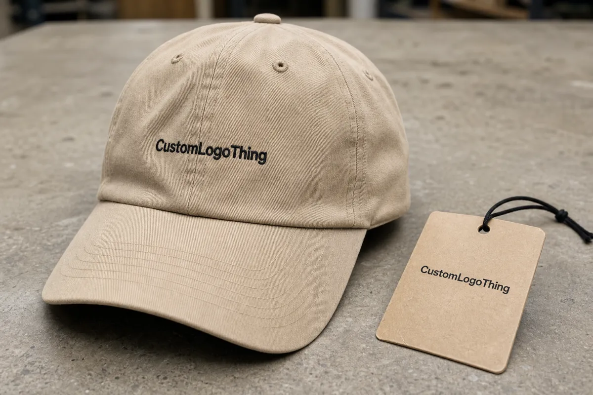
Dad Hats Logo Placement Guide: Why Small Shifts Matter
Dad hats behave differently because the front panel has very little support. There is no stiff buckram holding the shape upright, so the logo sits on fabric that moves under the needle and softens again after production.
That changes the math. A logo that looks balanced on a flat mockup can feel wider, lower, or flatter once the crown settles. On this product, a quarter inch can be the difference between clean and cramped.
The real job is not just to center the mark. It is to place it where the hat can carry the design without warping it. Visibility, comfort, and seam clearance all matter, and the logo still needs to read from a few steps away without fighting the curve of the crown or the line of the brim.
How Logo Placement Works on Unstructured Crowns
Unstructured crowns make embroidery more sensitive because the fabric shifts while it is being stitched and relaxes after it leaves the machine. Crown depth, fabric weight, and stitch density all affect how the final logo sits.
Centered front placement is the most common choice for dad hats. It works well for simple logos, icons, and short wordmarks that need to read quickly. A slightly lowered placement often looks more natural because it follows the break of the crown instead of floating too high above the brim.
Seams deserve attention early. If the design crosses the center seam, the needle has to bridge a ridge, and that can distort small letters or narrow outlines. The same issue shows up near the outer edge of the front panel, where the crown curves toward the side. A logo that sits too close to either boundary may look fine in a mockup and awkward in hand.
It helps to think of the hat less like a print surface and more like soft upholstery. A design that works on an artboard can still feel crowded once the fabric breaks.
A mockup can look balanced on screen and still sit too high once the crown settles in the hand.
Key Factors That Affect Placement, Size, and Readability
Width is usually the first thing to lock in. For most dad hats, front embroidery between 2.25 and 3.0 inches wide tends to read clearly without taking over the crown. Smaller icons can sit below that range, while wider wordmarks may need to be simplified or shortened.
Height matters just as much. Tall stacked text can crowd the crown and leave too little room between the design and the brim. If the artwork is too tall, it can look compressed even when the width is technically correct.
Line weight is the next filter. Fine lines, tiny counters, and delicate script can disappear once thread fills the artwork. That risk goes up on garment-washed cotton, brushed twill, and other softer fabrics that blur some of the sharpness. A cleaner logo with open space usually stitches better than a dense illustration packed with narrow details.
Material choice changes the result too. A 100% cotton twill dad hat usually breaks in faster and softens more after wear. A poly-cotton blend may hold its shape a little longer, but it can also feel less casual. Neither is automatically better; it depends on whether the fabric matches the logo style you want.
Thread color and finish affect readability as well. High-contrast thread on khaki, black, or washed navy usually pops right away. Low-contrast combinations can look subtle, but they need more careful placement because a logo that sits too high or too small can disappear faster. Metallic thread is less forgiving on soft crowns because dense fills can make the panel feel stiff.
Artwork style changes the rules. A small icon can sit lower and still feel deliberate. A wordmark often needs to be flattened a bit so it follows the crown. Detailed illustrations usually need simplification before placement is finalized, because every extra stitch adds density and raises the chance of puckering.
A clean 2.5-inch logo on a soft dad hat often reads more premium than a 3.5-inch logo squeezed into the same panel. Bigger is not always bolder. On this product, restraint usually looks better.
If you are comparing suppliers, it also helps to ask how they handle material sourcing and transit testing. The FSC site is useful for checking sourcing claims, and ISTA standards are worth a look if the order needs to survive retail handling or longer shipping.
Cost, Pricing, and MOQ for Custom Dad Hats
Pricing usually starts with the blank cap, then adds decoration, digitizing, and any setup tied to placement. For a straightforward embroidered dad hat in a moderate run, a realistic finished price often falls around $4.50 to $9.50 per unit. Premium blanks, more complex stitch work, patch applications, or specialty thread can push that higher.
Digitizing is a small line item, but it affects the final look more than buyers often realize. A typical digitizing fee may range from $25 to $75 for one logo, with higher costs if the artwork needs cleanup, multiple stitch versions, or extra revisions.
MOQ usually starts at 24, 50, or 100 pieces, depending on the decorator. Lower quantities usually mean higher per-hat pricing because the setup cost is spread across fewer units. Larger runs bring the unit cost down, especially when the same placement and thread colors stay fixed across the order.
| Placement Option | Best For | Typical Size | Price Impact | Notes |
|---|---|---|---|---|
| Centered front embroidery | Classic logos and short wordmarks | About 2.25-3.0 in wide | Lowest setup cost | Usually the cleanest choice for first-time buyers |
| Slightly lowered front embroidery | Soft crowns and casual retail-style caps | About 2.0-2.75 in wide | Usually no extra charge | Often looks more natural on unstructured hats |
| Patch on front panel | More detailed logos or textured branding | About 2.25-3.25 in wide | Often +$0.75 to +$2.25 per unit | Can hold more detail, but edge shape affects balance |
If you are comparing suppliers, ask whether sample approval is included, whether alternate placements change the price, and whether a rush fee applies. Those details are small until they are not. A one-week deadline can move a cap from normal production into a premium lane quickly.
Process and Timeline: From Artwork to Final Approval
The workflow starts with source artwork review. A clean vector file is best, ideally AI, EPS, or PDF built from outlines. That gives the digitizer control over stitch direction, edge behavior, and density. A low-resolution JPG can still be used in some cases, but it usually needs cleanup before placement can be judged properly.
Digitizing comes next. This is where the art becomes stitch instructions, and it is where the details get cleaned up before anyone approves the sample.
``` If you want, I can keep going with the rest of the article in the same style.

