A Ribbed Winter Hats logo placement guide starts with one simple fact: ribbed knit moves. A logo that looks centered on a flat mockup can shift once the hat stretches on a head, and that change is enough to affect balance, readability, and perceived quality.
For buyers, the decision is not just where the logo goes. It is whether that spot still works after the hat is worn, folded, packed, and handled in production. Cuff height, fold depth, yarn weight, and decoration method all change the usable logo window.
Material also matters. Acrylic is usually the most predictable. Wool blends can feel softer but may move more after steaming or washing. A little elastane improves stretch and narrows the safe placement range. On ribbed hats, the fabric spec is part of the placement spec.
Ribbed winter hats logo placement guide: why knit shifts logos
Ribbed knit is not flat fabric. The ribs compress and expand, so the visual center can drift even when the hat is technically measured correctly. That matters most on snug styles and tall cuffs, where a small shift changes how the logo sits against the fold.
Proportion is the other issue. A logo that feels balanced in artwork can look wider once the texture breaks up the shape. Thin text, fine outlines, and delicate spacing are the first to suffer. Bold shapes, thicker strokes, and simple icons hold up better on ribbed surfaces.
The cuff changes everything. A deep fold gives more room for decoration, but it also gives more room for error because a small fold adjustment changes the visible placement. A shallow cuff is easier to read, but the usable area is tighter. That tradeoff drives most decisions.
Three details usually decide whether the placement works:
- Cuff height: taller cuffs allow more decoration area, but they are more sensitive to placement shifts.
- Fold depth: deeper folds can push the logo upward visually once the hat is worn.
- Hat size: one-size-fits-most still means different stretch behavior across styles and suppliers.
Construction matters too. A tight 1x1 rib feels denser and can hold detail differently than a looser 2x2 rib. Heavier gauge knits usually support embroidery better, while loose knits can let thread sit unevenly. The same artwork can look strong on one beanie and soft on another, even when the color and price are close.
The practical rule is simple: prioritize how the logo reads in motion, not just how neat it looks on a table.
How placement works on ribbed beanies and cuffs
The common placement zones are center front, above the cuff, on the cuff, side placement, and back placement. The right zone depends on the decoration method and how much visual weight the logo needs. Embroidery gives a built-in look, patches sharpen edges, woven labels stay subtle, and knit-in graphics are bold but less flexible for fine detail.
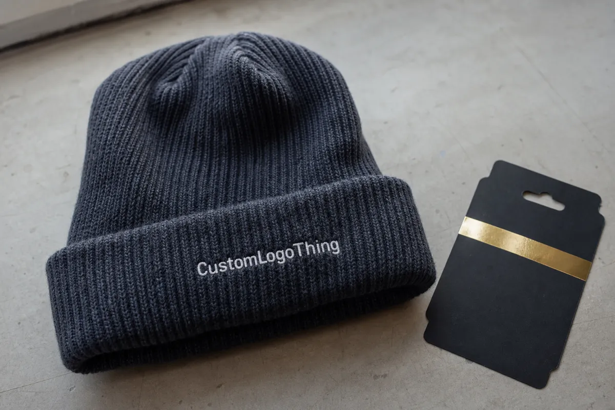
Center front works best for compact logos. On ribbed beanies, a mark around 2.5 to 3.5 inches wide often reads cleaner than a wider design that tries to span too much of the front panel. If the logo gets too wide, the ribs can distort letter spacing and make the mark feel stretched.
Above-cuff placement is useful when the cuff is thick or the front panel is short. It can keep the logo clear of the fold line and preserve visibility. On-cuff placement puts the mark at eye level, but the fold can interrupt tall artwork if the logo is not sized carefully.
Side placement works best for small marks, woven labels, or secondary branding. It is usually not the right spot for a complex emblem unless the goal is subtlety. Back placement is less common, but it can work for sponsor marks, compliance details, or secondary identity on retail programs.
Rib depth affects legibility. On tight ribbing, thin lines can sink into the texture. On looser ribbing, text may look uneven because the stitch valleys break up the letterforms. For that reason, a simple icon with thicker strokes often reads better than a detailed badge. If you need more detail, patches or woven labels usually hold the design more cleanly than direct embroidery.
Darker hats create another decision point. Black thread on charcoal ribbing can disappear at retail distance, while high-contrast thread improves visibility but also makes placement errors easier to spot. The goal is not the perfect color match; it is the best balance of visibility and tolerance for knit texture.
Here is the practical test: if the logo does not read clearly from 6 to 8 feet away, simplify it before production.
| Decoration method | Typical unit cost | Setup or sample cost | Best use case | Tradeoff |
|---|---|---|---|---|
| Flat embroidery | $1.10-$2.75 | $35-$85 digitizing | Simple logos, clean center front placement | Small text can fill in on textured knit |
| Patch applique | $1.40-$3.50 | $45-$120 tooling or sample | Sharper edges, better detail retention | More visible as an added component |
| Woven label | $0.65-$1.60 | $30-$75 setup | Subtle branding, side placement | Less impact from a distance |
| Knit-in graphic | $1.80-$4.25 | Often higher first-run setup | Bold coverage, retail knit programs | Less flexible for small runs |
A useful outside reference for shipping and pack-out testing is the ISTA test standard library. For buyers who need packaging claims to be traceable, the FSC site is the cleanest place to check chain-of-custody basics. Those references are not decoration guides, but they help when packaging is part of the order.
Cost, pricing, and MOQ for ribbed beanie logo decoration
Pricing usually comes down to stitch count, thread colors, patch material, placement complexity, and whether the art needs digitizing or tooling. A simple centered logo stays lower in cost. A wrap, seam-crossing design, or multi-layer patch raises the price quickly. That is normal production math, not hidden markup.
MOQ depends on the decoration method. Embroidery is often the easiest path at lower quantities, and many suppliers can handle 24 to 50 pieces for a straightforward logo. Patches often begin around 50 pieces because the setup cost makes more sense in a small batch. Woven labels can also work at lower quantities, while knit-in graphics usually make more sense at 100 pieces or more.
Total spend is easy to misread. A low unit price can become expensive if the proof needs multiple revisions. A higher unit price can still save money if it avoids a rejected sample or a remake. The cheapest line item is not always the cheapest order.
Include these six basics in a quote request to keep pricing accurate:
- Hat style and fabric weight.
- Hat and cuff colorway.
- Preferred placement zone.
- Vector artwork, ideally AI, EPS, or SVG.
- Quantity split by color or size.
- Target delivery date.
If the art is not clean, expect extra time for digitizing or redraws. If the logo has tiny type, the supplier may need to simplify it for production. That is a practical adjustment for textured knit, not a sign that the artwork failed.
For budgeting, treat setup as a fixed cost and decoration as the variable. Once setup is paid, unit price usually falls as quantity rises, which is why a 50-piece order can look dramatically more expensive per hat than a 250-piece order even when the decoration is identical.
Production steps and lead time from artwork to delivery
Production usually begins with file review. The team checks whether the logo can actually be placed on the chosen hat style, not just whether it looks good in a folder. Then comes digitizing or patch setup, followed by a mockup. After approval, the order moves into sample making or bulk production depending on the complexity and risk tolerance.
A typical lead time for ribbed Beanies with Logos is 12 to 18 business days after proof approval for standard orders. Simple embroidered runs can move faster. Custom patches, complex placements, or sample-first programs can push the timeline to 20 to 30 business days. Peak season can add more delay, so build extra room if the order ties to a launch, event, or holiday drop.
Two issues slow orders most often: missing artwork details and slow approvals. If the file is low resolution, the team has to redraw it. If the proof goes through multiple revision rounds, the ship date moves. A clean order with fast feedback can save several days.
For launch or retail programs, a buffer of 5 to 7 business days is a practical safeguard. It is much easier to absorb a small delay than to explain why the beanies are right but still in transit.
Ask for three proof views before approval: flat, on-head, and close-up. Flat shows proportion, on-head shows balance, and close-up shows whether the stitching, border, or patch finish is too heavy for the knit. If any one view looks off, the placement deserves another pass.
Step-by-step placement checklist before you approve proofs
Start with the actual hat spec, not a generic beanie template. Measure cuff height, front panel height, and the usable logo window on the exact style you are ordering. A hat that looks roomy in a stock photo can be much tighter once the cuff folds and the ribbing stretches.
Next, check how the logo reads flat and on-head. Flat proofs help with proportion, but they do not show the full wear state. If the mark is technically centered but looks heavy on one side when worn, ask for a second placement option before approval.
Then verify safe margins around seams, folds, and rib channels. A logo too close to the fold can disappear when the cuff shifts. A logo too close to the side seam can bend with the knit and look crooked. The best placement has breathing room, not just exact measurements.
Quality control teams usually check thread tension, edge coverage, and color contrast under natural light. Thread that is pulled too tight can pucker the ribbed knit. Patch edges that are not fully sealed can lift after wear. Colors that look good indoors may vanish outside, where the hat will actually be seen.
Before you sign off, check four basics:
- Size: does the logo fit the front panel without crowding?
- Contrast: does the thread or patch color stand out enough?
- Placement: is the mark centered relative to wear, not only the flat pattern?
- Detail: are small letters and fine outlines still readable?
If the supplier can show a photo sample on the exact beanie style, ask for it. A real product proof catches texture issues that a line drawing will miss, especially on darker colors where stitching can sink into the fabric.
Common mistakes that make ribbed beanie logos look off
The biggest mistake is oversizing the logo. More inches do not automatically mean more impact. On ribbed beanies, oversized marks often fight the front panel proportions and make the hat look top-heavy. A slightly smaller, cleaner mark usually reads better.
Thin details are the second problem. Tiny type, hairline strokes, and delicate outlines may look elegant in a vector file and then collapse into the knit. If the design depends on tight interior spaces to make sense, it needs simplification before production.
Another common miss is ignoring seam structure. A proof can look centered while sitting partly over a seam, rib channel, or fold transition. That is how you get a slightly crooked look that is hard to explain but easy to notice.
The smooth-mockup trap is just as common. A flat beanie mockup says little about how ribbed knit will behave in production. It is technically a preview, but not a reliable one.
Red flags to catch before production:
- Logo width exceeds the usable front panel by more than about 10 to 15 percent.
- Text is smaller than roughly 0.20 inches in cap height.
- Decoration sits too close to a fold, seam, or cuff edge.
- Multi-color art uses too many thread changes for the mark size.
If two or more of those show up, stop and rework the art or placement. It is cheaper to solve the problem on paper than after the hats are finished.
Expert tips and next steps for a cleaner order
Simplify the artwork early. That does not mean making the logo bland. It means removing details that will disappear on ribbed knit so the strongest version of the brand survives production. Thickening thin lines and enlarging small type usually helps more than adding another thread color.
If the placement is new, order a small test run first. Twenty-five to fifty pieces is often enough to see whether the logo reads cleanly on the exact hat style. Once the placement works, lock the size and position for the larger production run.
For buyers under deadline, the order of operations matters:
- Collect the exact hat spec.
- Choose embroidery, patch, woven label, or knit-in artwork.
- Request pricing with quantity and delivery date.
- Send vector artwork and placement preference together.
- Review the first proof before production starts.
That sequence reduces back-and-forth and keeps the order moving. If the goal is branded winter headwear for retail, events, or staff kits, a clear placement plan is what keeps the result looking deliberate instead of improvised.
The most reliable Ribbed Winter Hats logo placement guide is the one that respects the material. Get the hat spec, choose the decoration method that matches the amount of detail, and approve a proof that reflects real ribbed knit behavior. That gives the logo the best chance to land centered, readable, and intentional.
Where is the best logo placement on ribbed winter hats for a clean look?
Center front usually works best for a compact logo and a consistent cuff height. Above-cuff placement is safer for taller artwork, while side placement works better for subtle branding. The cleanest result is the spot that stays visually centered after the knit stretches on a head.
Is embroidery or a patch better for ribbed winter hats logo placement?
Embroidery is best for simple logos that need a stitched look. Patches are better when you want sharper edges, stronger visibility, or more detail than embroidery can hold. On heavier ribbing, patches can read cleaner because they are less affected by fabric texture.
How big should a logo be on a ribbed winter hat?
Most logos should stay compact enough to fit the front panel without crowding the ribs. Bigger is not always better; oversized marks can look clumsy once the hat is worn. The safest size is the one that stays readable from a short distance without wrapping into the side seams.
What affects the cost of ribbed winter hats logo placement?
Stitch count, thread colors, patch type, and placement complexity are the main pricing drivers. Low quantities usually cost more per piece, especially if the decoration needs setup or digitizing. A simple centered logo is usually cheaper than a multi-location or highly detailed decoration plan.
How long does production take for ribbed beanies with logos?
Lead time depends on artwork readiness, proof approval speed, and whether a sample is needed first. Straightforward orders move faster; custom placements, detailed artwork, and busy seasons add time. Build in extra buffer if the beanies are tied to an event, launch, or holiday deadline.


