Buyer Fit Snapshot
| Best fit | Debossed Logo Packaging Sleeves projects where brand print, material claims, artwork control, MOQ, and repeat-order consistency need to be specified before quoting. |
|---|---|
| Quote inputs | Share finished size, material target, print colors, finish, packing count, annual reorder estimate, ship-to region, and any compliance wording. |
| Proofing check | Approve dieline scale, logo placement, barcode or warning zones, color tolerance, closure strength, and carton packing before bulk production. |
| Main risk | Vague material claims, crowded artwork, missing packing details, or unclear freight terms can make a low unit price expensive after revisions. |
Fast answer: Debossed Logo Packaging Sleeves: Design, Cost & Process should be specified like a repeatable production item. The safest quote records material, print method, finish, artwork proof, packing count, and reorder notes in one written spec.
Production checks before approval
Compare the actual filled-product size with the drawing, then confirm tolerance on folds, seals, hang holes, label areas, and retail display edges. Reserve space for logos, QR codes, warning copy, and material claims before decorative graphics fill the panel.
Quote comparison points
Review material grade, print process, finish, sampling route, tooling charges, carton quantity, and freight assumptions side by side. A quote is only useful when the supplier can repeat the same color, closure quality, and packing count on the next order.
Debossed Logo Packaging Sleeves: Design, Cost & Process
A debossed mark has a quiet authority that ink alone rarely matches. The logo sits below the surface, shadow does most of the visual work, and the sleeve starts to feel like a finished object rather than a printed wrap. That is a big part of why debossed logo packaging sleeves are used so often for cosmetics, apparel, subscription boxes, gourmet food, and gift packaging where the outer layer is handled before the product is even reached.
For a packaging buyer, debossed logo packaging sleeves usually make sense when the brand wants restraint instead of volume. The look is composed, tactile, and direct, which suits modern branded packaging programs that rely on material quality and close attention to detail rather than loud decoration. A sleeve like this does not need to shout to be noticed.
The real decisions sit in the material, the artwork, the tool, the budget, and the schedule. Those choices decide whether debossed logo packaging sleeves come out crisp and deliberate, or soft, shallow, and underwhelming. Teams comparing sleeve concepts with cartons, labels, and inserts can also use our Custom Packaging Products page to line up the options side by side.
Debossed Logo Packaging Sleeves: What They Are
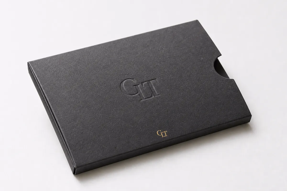
At a practical level, debossed logo packaging sleeves are wraps made from paperboard or specialty stock that are pressed so the logo sinks into the surface. The impression can be blind debossed, with no ink or foil in the recess, or paired with printed color, foil, or varnish if the brand wants a stronger contrast. The sleeve is doing more than decorating a box; it is setting the tone the moment the package is picked up.
That tactile shift matters more than most people expect. A customer may not describe the finishing method in technical terms, yet they will still feel the difference between a flat printed mark and a well-controlled impression. For many debossed logo packaging sleeves, the surface treatment becomes the message, especially where the brand language already leans toward calm, clean presentation. In that setting, the sleeve helps define the whole product packaging experience before the carton is opened.
I have been on enough sample reviews to know this part by heart: when the impression is right, people stop talking about finish specs and just hold the piece a little longer. A bright color can grab attention quickly, but a deboss can keep it there because the eye follows the shadow and the hand registers the texture. That is why debossed logo packaging sleeves show up so often in retail packaging for skincare, fashion, candles, tea, chocolate, and premium gifting. The effect is subtle, but subtle does not mean weak. A clean impression on the right stock can look sharper than a busy full-coverage print job.
The format also gives the brand flexibility. Sleeves can sit over a plain carton, a tray, or a rigid box without changing the core structure underneath. That opens the door for seasonal launches, limited editions, and refreshes where the company wants a different presence without rebuilding the entire pack. In that sense, debossed logo packaging sleeves provide a strong visual return without asking the system to become more complicated than it needs to be.
The strength of the style comes from restraint. The surface is not crowded, so the eye catches depth through light and shadow instead of through saturation and noise. That is one reason debossed logo packaging sleeves often read as more premium than a busy layout, even when the print budget is modest. The result suggests care in alignment, handling, and finishing, and that is exactly what a careful customer notices first.
How Debossed Logo Packaging Sleeves Are Made
The production process for debossed logo packaging sleeves is straightforward on paper, yet the details decide the final result. A metal die or engraved tool presses the logo into the board with controlled pressure, creating a recessed impression that can be shallow and refined or deeper and more tactile. A cleaner die gives a cleaner edge. Careful setup keeps the finished sleeve aligned with the approved artwork instead of drifting away from it.
Blind debossing and debossing with print or foil are not the same treatment, even though both create depth. Blind debossing leaves the mark as pure form, so the effect depends on light, angle, and touch. Adding print or foil changes the visual order, because the graphic is seen first and the depth is felt afterward. Both can work for debossed logo packaging sleeves, though they solve different brand needs. Blind deboss usually feels quieter. Foil with deboss usually feels more ceremonial.
Material behavior is where first-time projects often run into surprises. Smoother, heavier boards usually hold the sharpest impression because they resist crush and support the edge of the die. Textured stocks can be beautiful, but they tend to soften small details, especially when the logo uses narrow stems, small counters, or dense line work. If the artwork is intricate, debossed logo packaging sleeves may need a simplified version of the mark so the impression stays legible after press and finishing.
Registration needs real care as well. The die has to land exactly where the artwork expects it to land, and the sleeve has to be built with the grain direction, wrap direction, and panel structure in mind. If the grain works against the impression, the board can crack, spring back, or warp. A proper proof should show the relation between the logo, the fold lines, and the seams, because a sleeve that looks perfect on a flat file can behave differently once it is wrapped around the carton.
That is why experienced buyers ask to see a physical sample before approving production. Screens do not show how the board reacts under pressure, and a flat rendering cannot tell you whether the impression feels delicate or crushed. With debossed logo packaging sleeves, the goal is not simply depth. It is controlled depth. A small logo can still feel luxurious when the die is sharp and the substrate supports the mark, while oversized or overly detailed art can lose clarity fast.
A clean deboss usually comes from disciplined setup, not force. When the board is right and the artwork is disciplined, debossed logo packaging sleeves feel crisp without looking pushed.
Cost, Pricing, MOQ, and Quote Factors for Debossed Logo Packaging Sleeves
Pricing for debossed logo packaging sleeves depends on familiar variables: die tooling, sleeve size, stock choice, finish complexity, quantity, and how much of the panel is being pressed. Tooling is usually the first cost to account for, because a custom die or engraved plate has to be made before the run can begin. After that, the per-unit price is shaped by setup time, press time, handling, and the amount of board being processed.
MOQ matters more than many buyers expect. The setup cost for debossed logo packaging sleeves does not disappear just because the order is small, so short runs can carry a much higher unit price. Once quantities rise, the same setup is spread across more pieces, which usually brings the per-unit cost down to something easier to work with. For very small projects, I often suggest comparing a debossed sleeve with a print-only sleeve or a label-based approach to see whether the tactile effect is worth the premium.
Here is the kind of quote detail that helps avoid confusion later:
- Exact sleeve dimensions and wrap direction
- Board thickness or stock specification
- Imprint size and placement
- Blind deboss, foil, print, or a combination
- Single-sided or double-sided treatment
- Quantity target and overage allowance
- Proofing expectations and revision count
- Requested turnaround window
A complete quote for debossed logo packaging sleeves should also make clear what is not included. Tooling, sample rounds, or finishing steps may be excluded from the first number you see, which is where many comparisons go off track. A low quote only means much if the spec is the same on both sides and the assumptions match.
To make the budget conversation easier, here is a practical view of common pricing drivers. These are working ranges, not fixed rules, because stock and artwork complexity move quickly.
| Option | Typical Cost Impact | Best Fit | Notes |
|---|---|---|---|
| Blind deboss on standard board | Lowest tooling and press complexity | Clean brand marks, restrained retail packaging | Often the most cost-effective premium look |
| Deboss plus one-color print | Moderate increase | Branded packaging with visual guidance | Needs tighter registration and proof control |
| Deboss plus foil | Higher setup and finishing cost | Luxury or gift packaging | Foil can hide fine depth if the design is too busy |
| Deep deboss on specialty stock | Higher press time and testing | Premium presentation sleeves | May require stronger board and more sample rounds |
On larger production runs, a common working range might land around $0.20-$0.70 per unit for the sleeve itself, while tooling or setup can add a separate one-time charge that may run from about $120-$450 depending on complexity. Smaller orders often sit higher, sometimes near $0.80-$2.00 per piece, because die cost and press setup are divided across fewer sleeves. Those figures are broad guides, not promises, and debossed logo packaging sleeves with unusual board, larger coverage, or multiple finishing steps can move outside that range quickly.
If you are comparing suppliers, do not stop at the line item total. Ask what board is included, how deep the impression can realistically go, whether sample proofs are billed separately, and whether the quoted lead time assumes stock is already on hand. That matters a great deal for debossed logo packaging sleeves, because a low quote can hide a thinner stock or a shallow impression that will not support the presentation you had in mind.
For a broader view of packaging terminology and production context, the Institute of Packaging Professionals is a useful industry reference when you are aligning packaging design choices with manufacturing reality.
Process and Lead Time for Debossed Logo Packaging Sleeves
The production flow for debossed logo packaging sleeves begins well before anything reaches the press. Dieline and artwork prep come first, then stock selection, proofing, die creation, press setup, production, finishing, inspection, and final packing. That sequence sounds simple, yet every step can influence the quality of the impression. If the artwork is built on the wrong dieline, the die will not sit where it should. If the stock is not approved early, the press team may need to retest the depth.
Proof approval is usually where time starts to disappear. A clean deboss depends on accurate setup, and that setup should be checked against real dimensions, not only a mockup on a screen. For debossed logo packaging sleeves, the proof should show line weight, placement, and the relationship between the logo and any fold or seam. If the logo sits close to a panel edge, the sample needs even more attention because the board can respond differently at that boundary.
Typical lead time varies with complexity, though a straightforward run on stocked material may move in about 12-15 business days after proof approval. If the job needs special-order paperboard, multiple sample rounds, or a deeper-than-normal impression, the schedule can stretch to 3-5 weeks or longer. That is manageable when the launch date is planned honestly. It becomes a problem when the sleeve is treated like a last-minute accessory instead of a production component.
There are a few common pressure points:
- Special-order stock that must be sourced before production begins
- Logo artwork with very fine strokes or small text
- Unusually deep impressions that need test pulls
- Last-minute revisions after the proof is already approved
- Complex combinations like print, foil, and deboss in one layout
Simple logos, in-stock board, and fast approvals can shorten the schedule noticeably. That is the upside. The caution is that a rushed order tends to raise risk more than it saves time. With debossed logo packaging sleeves, a day saved at the proof stage can turn into a week lost if the impression ends up too shallow, the board is too soft, or the die has to be rebuilt. A calmer production timeline usually gives you a better result and less stress across the whole project.
Teams that care about shipping performance should think beyond the sleeve on its own. If the package needs to survive transit, any layered structure should be checked against standard handling expectations such as ISTA test methods, and if the board is sourced from certified fiber, FSC is the right place to verify the chain-of-custody framework. That matters when debossed logo packaging sleeves are part of a broader sustainability or protection story.
Key Design Factors That Affect the Final Debossed Look
Logo shape is the first thing I look at. Wide strokes, clear geometry, and balanced spacing usually deboss more cleanly than tiny details, thin serifs, or dense textures. That is why debossed logo packaging sleeves often look strongest when the mark is simplified a little for the physical process. Digital artwork may contain more detail than the board can responsibly hold, and that gap needs to be resolved before production starts.
Substrate choice changes the appearance more than many teams expect. Matte, coated, uncoated, recycled, and lightly textured stocks all respond differently under pressure. A smoother board can carry a sharper edge, while a rougher or more open surface can soften the logo and make the recess less distinct. If the brand cares about sustainability, a well-specified FSC-certified board can still look refined, although the impression depth may need to be moderated so the fiber structure does not flatten. That is one reason debossed logo packaging sleeves depend so heavily on real samples rather than assumptions.
Depth is another place where restraint usually wins. More depth is not automatically better. A deep impression can look rich on a flat sample, then distort the sleeve or increase the risk of cracking once the board is wrapped around a carton or tray. For many debossed logo packaging sleeves, the sweet spot is enough depth to catch the light and provide a clear tactile feel, but not so much that the panel loses its structural poise.
Fit and structure matter because a sleeve does not exist alone. It has to wrap, align, and sit squarely on the package beneath it. A mark that looks elegant on a white board proof may shift once the sleeve is scored, folded, and glued. That is why packaging teams should think about the full system, not just the logo treatment. The sleeve, the carton, and the insert need to read as one piece of package branding, not as three unrelated decisions.
Brand language is the last filter, and maybe the most revealing one. If the rest of the system uses soft-touch coating, muted inks, and careful spacing, a blunt deboss can feel exactly right. If the brand leans lively and graphic, the sleeve may need a stronger printed companion so the tactile element does not feel detached. Good debossed logo packaging sleeves fit the brand story the way a good sleeve fits the carton: cleanly, with very little excess.
As the design gets finalized, it helps to compare the sleeve against other parts of the line, including custom packaging products such as rigid boxes, inserts, and branded wraps. That keeps the visual language consistent across the shelf and the unboxing experience.
Common Mistakes to Avoid With Debossed Logo Packaging Sleeves
One of the biggest mistakes is choosing stock that is too thin or too soft. If the board cannot resist pressure, the logo can crush the surface instead of creating a clean, controlled impression. That is especially risky with debossed logo packaging sleeves because the effect depends on edge sharpness. A crushed impression looks tired, not premium.
Overly detailed artwork causes trouble as well. Tiny lines, tight spacing, and small text often blur once the die meets the sheet. The issue is not that debossing is weak; it is that the substrate has limits. For debossed logo packaging sleeves, a simplified mark usually performs better than a crowded one, and the savings in production frustration are real. Honest artwork editing early in the process can prevent multiple sample rounds later.
Alignment mistakes happen more often than people admit. If the sleeve has a wrap seam or a critical fold, the deboss should be positioned with that structure in mind. Otherwise the mark can feel off-center even when the file was technically correct. I have seen otherwise solid debossed logo packaging sleeves lose impact because the logo sat too close to a score line or collided with a printed design block.
Another trap is approving a proof without seeing the real stock. A digital render cannot show how a specific paperboard will respond to pressure, and a printer’s screen view will not reveal whether the surface texture hides the detail. That is why physical samples matter so much. They show whether the impression is too shallow, whether the board rebounds, and whether the tactile effect is noticeable in hand. With debossed logo packaging sleeves, the sample is not a formality; it is the decision point.
Budget mistakes are just as common. Tooling, revisions, and sample rounds need to be planned up front, because otherwise the project can drift beyond the original estimate. Teams sometimes focus only on the unit cost and forget that setup and refinement are part of the real spend. A well-managed debossed logo packaging sleeves project should leave room for proof adjustments, especially if the logo is new or the stock is unfamiliar.
The honest version is simple: the best results usually come from making fewer choices, not more. The cleanest sleeves often use one strong idea, one disciplined material, and one carefully reviewed impression. That is where debossed logo packaging sleeves tend to look expensive instead of merely embellished.
Expert Tips and Next Steps for Debossed Logo Packaging Sleeves
Start with the package experience, not the decoration. Ask what the sleeve should communicate in the hand, on the shelf, and during unboxing before deciding how deep the impression should be. That question keeps debossed logo packaging sleeves from turning into a style exercise with no clear purpose. If the goal is calm luxury, the treatment should stay quiet. If the goal is shelf visibility, the deboss may need help from print or foil.
Requesting a side-by-side sample comparison is one of the smartest moves a brand can make. A shallow impression and a deeper impression can look similar on a screen, yet feel very different in person. For debossed logo packaging sleeves, the tactile read often decides whether the sleeve feels premium or merely stamped. A good sample comparison makes that judgment easier and less subjective.
Before asking for a quote, build a clean spec sheet. Include the artwork files, sleeve dimensions, quantity, stock preference, finish notes, and the target launch date. That is the fastest path to meaningful pricing on debossed logo packaging sleeves, and it reduces the back-and-forth that slows most custom projects. If you already know whether the sleeve needs to coordinate with a carton, tray, or gift wrap, say so early.
It is also worth comparing debossing against embossing, foil, and print instead of treating it as the default premium choice. Each effect solves a different problem. Embossing lifts the image. Foil adds brightness and contrast. Print gives color and clarity. Debossed logo packaging sleeves win when the brand wants tactile depth without visual clutter, but that should be a deliberate choice rather than a habit.
For teams building a wider packaging program, pairing the sleeve with matching custom packaging products helps keep the retail story consistent across launches. That consistency matters because a sleeve, a box, and an insert should feel like one family. If you are planning a full product packaging update, the sleeve is often the easiest place to introduce a tactile detail without changing every structure in the line.
My practical advice is straightforward: gather the dieline, prepare vector art, confirm quantity and timing, request a sample or prototype, and review the finished sleeve against the real package before you approve production. That sequence keeps debossed logo packaging sleeves grounded in reality, which is where the best packaging decisions are made. When the board, the die, and the schedule are aligned, the final result looks intentional, and that is exactly what good packaging should do.
If you want a packaging treatment that feels refined without trying too hard, debossed logo packaging sleeves remain one of the strongest options in modern branded packaging. They work because they rely on tactility, shadow, and material quality rather than loud decoration, and that combination rewards careful planning every time.
The cleanest takeaway is pretty simple: keep the artwork disciplined, choose a board that can hold the impression, and approve a real sample before you commit to the run. If those three pieces are in place, debossed logo packaging sleeves will usually deliver the kind of quiet, premium finish that does the heavy lifting without looking like it tried too hard.
FAQ
What material works best for debossed logo packaging sleeves?
Heavier paperboard or a similarly sturdy stock usually gives the cleanest impression because it resists crush and holds the edge detail better. Uncoated or lightly coated surfaces often show the tactile effect more clearly, while very rough textures can soften fine logo lines.
Are debossed logo packaging sleeves good for short runs?
Yes, although the per-piece price usually rises on small quantities because tooling and setup costs are spread across fewer sleeves. For very small runs, it helps to compare debossed logo packaging sleeves with print-only or label-based branding to see which option gives the best value.
How deep should a deboss be on packaging sleeves?
The best depth is usually enough to create a clear tactile and shadow effect without flattening the board or distorting the sleeve. A sample proof is the safest way to judge depth because the right result depends on stock thickness, logo detail, and press pressure.
How long does the production process usually take?
Lead time depends on artwork approval, die creation, stock availability, and how complex the debossed area is. Simple designs on in-stock materials move faster, while special papers, deeper impressions, or multiple proof rounds can add time.
Can you combine debossing with foil or printed color?
Yes, but the artwork should leave enough space so each effect reads clearly and the registration stays precise. Combining finishes works best when the brand wants both tactile depth and a stronger visual contrast, rather than using every effect at once.


