Buyer Fit Snapshot
| Best fit | Die Cut Box Branding projects where brand print, material claims, artwork control, MOQ, and repeat-order consistency need to be specified before quoting. |
|---|---|
| Quote inputs | Share finished size, material target, print colors, finish, packing count, annual reorder estimate, ship-to region, and any compliance wording. |
| Proofing check | Approve dieline scale, logo placement, barcode or warning zones, color tolerance, closure strength, and carton packing before bulk production. |
| Main risk | Vague material claims, crowded artwork, missing packing details, or unclear freight terms can make a low unit price expensive after revisions. |
Fast answer: Die Cut Box Branding: Board, Finish, Dieline, and Unit Cost should be specified like a repeatable production item. The safest quote records material, print method, finish, artwork proof, packing count, and reorder notes in one written spec.
Production checks before approval
Compare the actual filled-product size with the drawing, then confirm tolerance on folds, seals, hang holes, label areas, and retail display edges. Reserve space for logos, QR codes, warning copy, and material claims before decorative graphics fill the panel.
Quote comparison points
Review material grade, print process, finish, sampling route, tooling charges, carton quantity, and freight assumptions side by side. A quote is only useful when the supplier can repeat the same color, closure quality, and packing count on the next order.
Die Cut Box Branding: Design, Cost, and Process Tips
See how die cut box branding turns a plain carton into a stronger shelf signal with structure, print, finishes, and timing that stay on budget and get noticed.
A plain carton can hold the product. It can survive a warehouse, a truck, and a few rough hands on the line. That does not mean it says much about the brand inside. Die cut box branding changes that. A window, a shaped opening, a smarter silhouette, or a reveal built into the unboxing moment can change how people read the product before they even touch it. First impressions are rude. They happen fast and without asking permission.
I have watched teams obsess over print coverage and color count, then get their best reaction from the structure itself. That is the real power of die cut box branding: it works in the hand, on the shelf, and during the open. Good packaging makes the product feel considered. Better packaging makes the brand feel worth remembering.
For Custom Logo Things, the real question is not whether a box can be customized. It is whether the structure, materials, and finishing choices actually support the brand without turning the job into an expensive circus. Strong die cut box branding keeps shelf appeal, production reality, and brand consistency in the same lane. That sounds basic, but a lot of packaging misses that part.
Why die cut box branding grabs attention fast
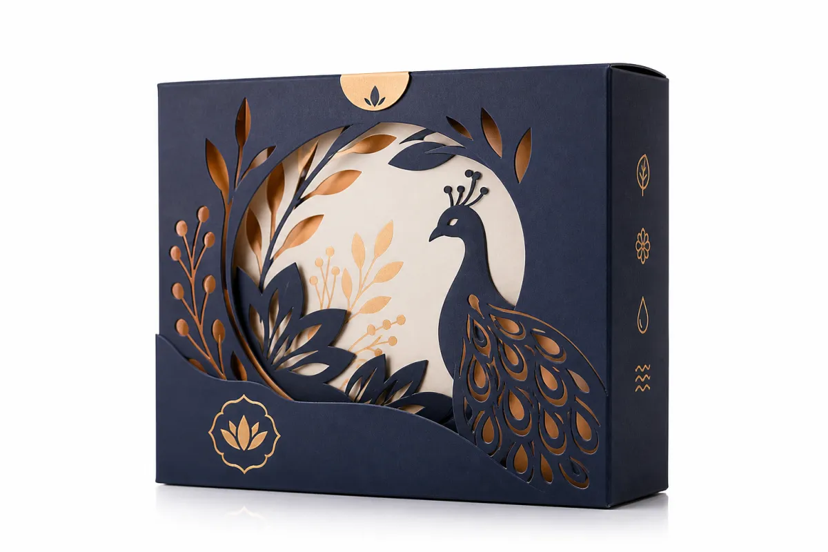
Retail shelves move at speed. Shipping cartons do too, just with more tape and fewer compliments. In both settings, die cut box branding stands out because the shape starts doing part of the communication. A window can show color, texture, or product form. A unique opening can make the pack feel giftable. A folded reveal can turn a basic open into a small moment with some personality.
People do not read packaging as a flat poster first. They notice edges, cut lines, openings, and contrast. A crisp die cut, a visible product edge, or a structural break across the panel creates rhythm. When that rhythm supports the logo, copy, and imagery, die cut box branding can make a modest product feel premium without piling on decoration just to fill space. That is the nice part. The packaging does not need to scream to be effective.
Buyers usually want packaging that solves several problems at once. A window can build trust for food, cosmetics, or craft products. A locking tab can cut down on tape. A built-in handle can make carrying easier. Those are not side notes. In die cut box branding, they become part of the message. A useful structure does double duty, and that is hard to beat.
A box should not shout just because it can. The strongest packaging usually looks calm, feels deliberate, and gives the product a better stage.
Die cut box branding also helps a brand stay memorable. Shoppers may not remember every printed detail, but they remember a distinctive opening, a cutout that frames the product, or a carton that feels different from the stack next to it. In crowded categories, that memory matters more than most slide decks admit. People forget copy. They remember the moment their thumb found the tab and the pack opened cleanly.
One detail gets ignored far too often: structure can signal price level before anyone reads a line of copy. Clean die cut windows, precise folds, and balanced panel proportions usually suggest care. That is often enough to make the item feel gift-ready. Quiet, yes. Cheap-looking, no. That is the advantage of die cut box branding.
And yes, a box can go too far. I have seen overworked packaging that felt like it was trying way too hard. The result was not premium. It was busy. A strong die cut detail should support the product, not make the whole thing look like a prototype that never got edited.
How die cut box branding works from dieline to delivery
Every decent package starts with a dieline. It is the flat blueprint that maps folds, glue tabs, trim lines, perforations, and cutouts before artwork enters the conversation. In practice, die cut box branding depends on that blueprint as much as it depends on the graphics. A beautiful design on a bad structure is still a bad package. Pretty, but bad.
The workflow usually starts with product dimensions, fill weight, and channel requirements. A cosmetic carton, a candle box, and a mailer for a fragile accessory all need different structural logic. The team then chooses board grade, print method, and special features such as a window, hand hole, or insert. Artwork placement, proofing, and sampling come after that. Each step changes how die cut box branding will look once the carton is folded and filled.
Artwork placement is where a lot of first-time buyers get humbled. What looks centered in a flat file can shift once the box folds. Logos, product claims, and patterns need room for glue areas, panel breaks, and fold lines. Ignore those realities and the branding starts drifting all over the finished box. Careful die cut box branding keeps the visual story intact from the screen to the shelf.
Structure matters as much as print. A locking tab changes how the box opens. A reverse tuck or straight tuck changes shelf behavior. A cut window exposes the product and can reduce the need for a paragraph of front-panel copy nobody wanted to read anyway. Even a small flap adjustment can shift the feel from flimsy to polished. That is why die cut box branding is part design and part engineering.
When the product is shipping instead of sitting pretty on a retail shelf, the box also has to survive transit. That means testing matters. Industry groups such as ISTA publish packaging test guidance that helps teams match carton strength to real shipping conditions. If the packaging does not arrive intact, the branding is just a very expensive memory. Practical enough for die cut box branding, unfortunately.
By the time the carton reaches the customer, the dieline is invisible. The result is not. If the closure lines up, the window is clean, and the folds sit square, the package reads as trustworthy. That trust is part of the branding whether anyone says it out loud or not. Good die cut box branding is visible, but its best work often stays hidden in the structure.
One more thing: a good sample is not a formality. It is the first real answer. I have seen brilliant-looking flat artwork fall apart in the sample stage because a flap opened awkwardly or a logo sat too close to a crease. Catching that early saves money and embarrassment. Both are nice to avoid.
Key factors that shape die cut box branding
Material choice sits near the top of the list. A 14pt or 18pt SBS folding carton board gives a smooth surface for high-detail graphics, while 350gsm C1S artboard can work well for retail presentation with a clean printed face. If the box needs more crush resistance, E-flute or B-flute corrugated may be the better fit. The board affects print sharpness, feel, durability, and price, so it shapes the entire direction of die cut box branding.
Structural features change the story too. Windows show product color or texture. Finger notches make opening easier. Handles improve carry comfort. Interlocking closures cut down on glue or tape. Each feature changes the customer experience, and each one changes how the packaging is built. The form factor is part of the brand message, not just a production note. That is exactly how die cut box branding earns its place.
Print method matters for both appearance and consistency. Offset printing handles fine detail and rich solids very well, especially on smoother boards. Digital printing can be practical for lower quantities or fast revisions. Flexographic printing is common in corrugated work and can be a smart choice for straightforward graphics at larger runs. The right method depends on color targets, quantity, and substrate. For die cut box branding, the method should fit the design, not bully it.
Finishing is where brands decide whether they want polished or premium. Matte aqueous coating keeps glare down and gives a softer look. Gloss coating makes color pop. Soft-touch lamination adds a velvety feel that people often read as higher-end. Foil stamping, embossing, and spot UV can each create a highlight, but they also add setup steps and cost. In careful die cut box branding, finish should support the story, not shout over it.
Distribution conditions deserve more attention than they usually get. A box headed for a boutique shelf does not take the same abuse as one moving through parcel networks or warehouse stacking. Humidity, compression, and vibration all affect performance. If the carton is going through a rougher route, the structure may need stronger board, better creasing, or a more practical finish. Sustainable board choices can matter too, and certifications such as FSC help brands support responsible sourcing. That is one reason many teams ask how FSC-certified materials fit into their die cut box branding goals.
Another factor is the rest of the visual system. If the box is the only branded item, it carries more of the load. If it sits next to inserts, labels, and hang tags, the full package family needs to stay aligned. A carton that echoes the same typography and color logic as Custom Labels & Tags can strengthen the presentation across the board. Brand consistency like that is what keeps die cut box branding from feeling crowded and random.
Honestly, too many teams chase novelty before they settle the practical pieces. A strong window or unusual flap is only useful if the logo stays readable, the carton still assembles cleanly, and the product fits without stress. The best die cut box branding looks confident because the structure was right before anyone got excited about embellishment. That is the boring truth. It also happens to be the profitable one.
| Box Option | Typical Use | Relative Cost | Notes |
|---|---|---|---|
| Standard folding carton | Retail items with simple presentation needs | $0.18-$0.32 per unit at 5,000 pieces | Best for clean print, straightforward folds, and strong brand consistency |
| Window die cut carton | Products that benefit from visibility or texture cues | $0.24-$0.42 per unit at 5,000 pieces | Window film, extra tooling, and more complex cutting usually increase setup cost |
| Premium rigid-style presentation box | Gift sets, specialty launches, and higher perceived value products | $1.10-$2.80 per unit at 2,000 pieces | Higher material and assembly cost, but strong shelf signal and unboxing experience |
| Corrugated mailer with branded die cut detail | E-commerce and ship-ready packaging | $0.45-$1.20 per unit at 3,000 pieces | Good balance of protection and visual branding; often tied to transit performance needs |
Die cut box branding cost and pricing factors
Price usually comes down to a few predictable drivers: dieline complexity, tooling, board selection, print coverage, finishing, and order quantity. A standard structure with simple print can stay relatively controlled. Add multiple windows, unusual cut paths, or premium finishing and the quote climbs, because more setup and handling are involved. That is normal in die cut box branding. No drama required.
Tooling is one of the first places cost moves. A custom cutting rule, special window shape, or unique closure often requires dedicated setup. Small changes matter too. A rounded corner may sound minor, but if it needs a different die or slows production, the price shifts. Buyers often miss this because they are looking at art instead of manufacturing. In die cut box branding, the physical cut is part of the bill.
Quantity has a huge effect on unit price. A 2,500-piece run spreads setup costs across fewer cartons, so the per-unit number will be higher than a 10,000-piece run of the same structure. That does not mean the larger run is always the right move. It does explain why suppliers ask for several quantities in the quote. It shows where the break points sit in the economics of die cut box branding.
Finishing can be sneakily expensive. Spot UV, foil, embossing, and soft-touch lamination all add steps, materials, or process controls. A simple aqueous coating is often the easiest budget choice, while foil on a large area usually pushes cost up fast. The trick is not to strip the design down to a sad beige box. It is to choose one or two elements that do the heavy lifting and let the rest stay restrained. That is how die cut box branding can look premium without becoming an overbuilt spec sheet.
Sampling deserves room in the budget too. A digital proof helps, but it cannot replace a physical sample when fit, print alignment, and opening behavior matter. One sample round may cost a bit more up front, yet it often saves more by catching a problem before production. For new launches especially, that is money well spent in die cut box branding.
If you want a cleaner comparison, ask suppliers to split the estimate into structure, print, finish, and assembly. That makes it easier to see what is driving the number. It also keeps you from comparing one supplier's all-in price against another supplier's half-explained quote. Clear pricing is one of the simplest ways to keep die cut box branding honest and manageable.
If a quote feels vague, ask what is built into it. Structure, cutting, coating, and hand assembly can change the final number more than most teams expect.
I usually suggest clients look at a pricing ladder instead of staring at a single number. A standard carton may sit near the low end, a windowed version may add a modest premium, and a fully finished presentation carton can move much higher. That makes tradeoffs easier to discuss internally. It also keeps die cut box branding grounded in business terms instead of design wishful thinking.
The other sneaky cost driver is rework. One wrong measurement can kick a project back to dieline revisions, new proofs, and another round of approvals. That kind of delay is rarely cheap. The cleaner the brief, the cleaner the spend. Pretty simple, really.
Die cut box branding process and timeline
The process usually starts with discovery and spec gathering. Product dimensions, fill weight, desired quantity, shipping channel, target retail environment, and a rough budget all belong on the table early. The more exact the inputs, the fewer surprises later. In die cut box branding, accurate specs are not paperwork. They are the schedule.
Next comes dieline development. A packaging engineer or supplier creates the flat layout, positions folds and cuts, and confirms how the structure will behave once assembled. This stage often needs a few revisions if the product fit needs adjustment. A small change in panel depth or flap size can affect closure quality and print layout. That is why early approvals matter so much in die cut box branding.
After the dieline is approved, the artwork team places logos, patterns, barcodes, claims, and finish notes on the template. This is the moment to check fold lines, safe zones, and glue areas with real attention. A flat mockup helps because it shows how the graphics will appear on the finished carton. I like to see marketing, operations, and production review the same file together so nobody signs off on a version that only works in one department's imagination of die cut box branding.
Typical timeline milestones
A simple carton project often moves through a familiar rhythm: one to three business days for initial spec review, two to five business days for dieline creation or revision, a few days for artwork placement and proofing, and then production after final approval. Once production begins, the run can often finish in roughly 10 to 15 business days, depending on quantity and finish. More complex jobs take longer, especially when specialty coatings or multiple sample rounds are involved. That is normal for die cut box branding.
Delays are usually easy to explain once you have seen enough projects. Missing product measurements force dieline revisions. Late copy changes trigger new proofs. Finishes that need special scheduling add queue time. If the sample exposes a fit problem, the whole schedule can slide. None of that is rare, which is exactly why a realistic buffer matters in die cut box branding.
Where delays usually happen
Most delays come from decisions, not machines. One department waits on another, a regulatory line was never actually final, or someone decides to change the structure after seeing the first sample. The cleanest projects lock product dimensions, print content, and finish goals before the first proof goes out. That keeps die cut box branding moving with fewer expensive resets.
If the launch needs to move quickly, keep the design focused. A single-board carton with one coating and no special tooling can move much faster than a fully customized presentation box. That does not mean fast projects have to look cheap. It means the decisions are disciplined. A smart team knows where to spend time and where to simplify. That discipline pays off in die cut box branding.
For brands that want to see how structure, print, and finishing play out in actual product examples, our Case Studies page is a useful place to compare packaging choices. The pattern shows up fast: the projects that run best are tied to the product, the channel, and the launch date from the start. That is the practical side of die cut box branding.
And if a supplier tells you the sample is optional, ask for the reason in plain language. Sometimes that is fair. Sometimes it is just a shortcut. I usually prefer the sample anyway, because paper and reality have a funny relationship.
Common mistakes in die cut box branding
The first mistake is designing before the product dimensions are fully confirmed. Even a small change in width, depth, or height can affect closure, fit, and shipping performance. If the box is too tight, assembly slows down. If it is too loose, the product shifts or feels less premium. In die cut box branding, the structure has to fit the product before the artwork gets too far along.
The second mistake is ignoring fold lines and cut paths. A logo can look perfect on screen and still land across a seam in the wrong place once the box is built. Large gradients, repeating patterns, and long copy blocks are especially vulnerable. Good flat planning prevents this, but only if someone actually checks the dieline carefully. That discipline matters a lot in die cut box branding.
The third mistake is chasing finishes that fight the board or the product category. A soft-touch coating may feel elegant on a premium cosmetic box, but it may not suit a product that gets handled roughly or stored in humid conditions. A heavy foil treatment can look flashy in a mockup and awkward in a restrained brand system. The finish should reinforce the product story, not steal the whole show. Practical judgment matters in die cut box branding.
The fourth mistake is forgetting about assembly and fulfillment. A carton can look gorgeous in a presentation and still become a headache if it takes too long to build, needs too much tape, or folds in a way that confuses line workers. Packaging that slows down the operation can cost more than it saves in design appeal. Real die cut box branding should help the workflow, not fight it.
The fifth mistake is approving final art without a physical proof or sample. Flat files are useful, but they cannot show how a window frames the product or how a fold changes the logo. A sample tells the truth quickly. That is why experienced packaging teams almost always want at least one hands-on check before sign-off. It is a small step that protects the bigger investment in die cut box branding.
There is one more problem I see all the time: brands add too many ideas at once. Window, foil, emboss, bright spot color, intricate pattern, special insert, and a unique closure can sound exciting in a meeting. The final carton may just feel crowded. Strong packages usually pick one hero move and let the rest support it. That restraint is often what makes die cut box branding feel premium instead of noisy.
Another quiet mistake: using the same structure for every SKU just because it is easy. Easy can be fine. Easy can also be lazy. If the product line has different weights, flavors, or price points, the carton should probably reflect that instead of pretending every item needs the same shell.
Expert tips and next steps for die cut box branding
Start with a one-page brief. Include product dimensions, fill weight, quantity, target channel, budget range, finish goals, and the single brand moment you want the box to create. The brief does not need to be fancy. It needs to be clear. Cleaner input makes it easier to shape die cut box branding that actually holds together in production.
Ask for a dieline and a flat mockup before artwork is finalized. That lets the design team see how the graphics sit on the structure instead of guessing from memory. If the box has a window, ask the supplier to show the cutout area clearly. If it uses an unusual closure, review the opening sequence step by step. Those small checks make a big difference in die cut box branding.
Compare at least two structural options with the same artwork. A small shift in box style can change cost, assembly time, and customer experience more than expected. A standard tuck carton might be the most efficient choice for one product, while a windowed carton creates better shelf appeal for another. That kind of comparison turns die cut box branding into a practical decision instead of a guess.
If you need to stay within budget, focus on one hero element. That might be a window, a textured coating, a fold reveal, or a clean foil accent. You do not need every enhancement to make the package work. A simple structure with one memorable detail often beats an overloaded design. That is one of the easiest rules to follow in die cut box branding.
Think beyond the box too. Labels, inserts, sleeves, and hang tags can carry supporting information or seasonal messaging, while the carton handles the main brand story. If you need a coordinated secondary piece, our Custom Labels & Tags page can help extend the same visual branding across the package set. Used well, that creates consistency without forcing every message onto one panel. It helps a lot in die cut box branding for launches with multiple SKUs.
Finally, review samples with marketing, operations, and fulfillment together. Marketing cares about shelf signal. Operations care about speed and fit. Fulfillment cares about whether the carton survives the real workflow. When all three groups agree, the odds of a smooth launch improve fast. That cross-check is one of the smartest habits in die cut box branding.
For teams still refining the look, a quick pass through our packaging examples can help. The goal is not to copy someone else's structure. It is to spot the relationship between product category, board choice, finish, and customer expectation. Once that pattern is clear, die cut box branding gets much easier to plan.
One last practical move: build a short checklist before approval. Confirm dimensions, confirm the dieline, confirm the finish, confirm the sample, and confirm the launch date. That five-step sanity check saves more projects than flashy design ever will. Not glamorous. Very effective.
What strong die cut box branding delivers
Strong packaging does more than hold a product. It frames value, guides the open, and shapes how customers remember the brand later. When the structure, print, and finish work together, die cut box branding can improve shelf presence, sharpen recognition, and make a product feel more deliberate without wasting material or budget.
The best projects are rarely the most complicated ones. They are the ones where the board matches the product, the cut supports the story, the artwork respects the folds, and the schedule gives everyone enough room to approve the right sample. That is the practical middle ground where die cut box branding usually performs best. It feels premium because it was built carefully, not because it tried to do everything.
If you are planning a launch, start with the product, then the structure, then the visuals. Keep one clear brand message at the center, and let the rest of the packaging choices support it. That approach tends to keep costs in check while still improving the unboxing experience and customer perception. Done well, die cut box branding is not just a packaging upgrade. It is a cleaner way to make the product easier to notice, easier to trust, and easier to remember.
The actionable move is simple: pick one structural feature that serves the product, then build the rest of the package around it. Window, handle, tuck style, or reveal - choose the one thing that earns its keep. Everything else should support that choice. That is how the package stops being decoration and starts doing real work.
What is die cut box branding?
It is the use of custom-cut box structure, print, and finishing to support a brand story instead of relying on graphics alone. The shape, opening style, and surface finish all work together to create the first impression, and it works best when the structure matches the product, the audience, and the selling environment.
How much does die cut box branding cost?
Cost depends on dieline complexity, board type, print coverage, finishing, quantity, and whether special tooling is needed. Custom windows, unusual cuts, and premium finishes usually increase setup cost and unit price. Request quotes at several quantities so you can see how setup costs change the per-box number.
How long does a die cut box branding project take?
The timeline usually includes spec gathering, dieline creation, artwork placement, proofing, production, and shipping. Simple projects move faster when dimensions, files, and approvals are ready early. Special finishes, structural revisions, or multiple sample rounds add time, so plan a buffer before launch.
What materials work best for die cut box branding?
Folding carton board works well for retail presentation, while corrugated is better for heavier products or ship-ready packaging. Smooth surfaces help with fine type, detailed graphics, and crisp color reproduction. Choose the board based on product weight, moisture exposure, stacking needs, and brand positioning.
What should I send for a die cut box branding quote?
Send product dimensions, quantity, fill weight, branding goals, and the intended sales or shipping channel. Include logo files, color references, finish preferences, and any structural ideas you already have. Ask the supplier what file format they prefer so the quote process moves faster and fewer details get missed.


