Buyer Fit Snapshot
| Best fit | Die Cut Sleeve Boxes With Logo projects where brand print, material claims, artwork control, MOQ, and repeat-order consistency need to be specified before quoting. |
|---|---|
| Quote inputs | Share finished size, material target, print colors, finish, packing count, annual reorder estimate, ship-to region, and any compliance wording. |
| Proofing check | Approve dieline scale, logo placement, barcode or warning zones, color tolerance, closure strength, and carton packing before bulk production. |
| Main risk | Vague material claims, crowded artwork, missing packing details, or unclear freight terms can make a low unit price expensive after revisions. |
Fast answer: Die Cut Sleeve Boxes With Logo: Design, Cost, and Fit should be specified like a repeatable production item. The safest quote records material, print method, finish, artwork proof, packing count, and reorder notes in one written spec.
Production checks before approval
Compare the actual filled-product size with the drawing, then confirm tolerance on folds, seals, hang holes, label areas, and retail display edges. Reserve space for logos, QR codes, warning copy, and material claims before decorative graphics fill the panel.
Quote comparison points
Review material grade, print process, finish, sampling route, tooling charges, carton quantity, and freight assumptions side by side. A quote is only useful when the supplier can repeat the same color, closure quality, and packing count on the next order.
Die cut sleeve Boxes with Logo do one thing extremely well: they make ordinary packaging look deliberate. Not expensive in a fake way. Deliberate. That distinction matters. People notice shape, contrast, and logo placement in seconds. They are not studying your box under a lamp. They glance, make a judgment, and keep moving.
For buyers, the sleeve is often the smart middle ground. You get more branding space, a cleaner shelf appearance, and a better unboxing moment without rebuilding the whole package from zero. That is why sleeves show up on launches, gift sets, seasonal collections, subscription kits, and retail mailers that need more presence than a plain carton can deliver.
If you are comparing Custom Packaging Products, sleeve formats deserve real attention. They can deliver a large share of the visual impact of a custom rigid box at a more manageable cost, especially when the inner carton already handles structure and protection.
The catch is simple. A sleeve only works when the fit is right, the artwork respects the die lines, and the brand story fits the format. Mess those up and you get a box that looks like it lost an argument with the production floor. Get them right and a basic package can read as premium without wasting budget.
Die Cut Sleeve Boxes With Logo: Why a Thin Wrap Changes Everything
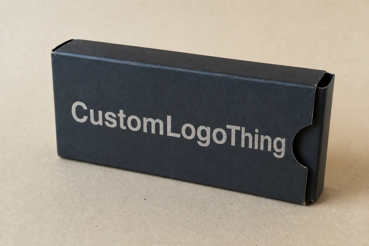
A sleeve is a printed wrap that slides over a box, tray, or mailer. The base package stays in place, and the outer layer handles branding, messaging, and visual hierarchy. Simple idea. Strong effect. The result can change how the product feels before anyone opens it.
Die cut sleeve Boxes with Logo work because they create structure without forcing you into a full custom rigid build. A well-fitted sleeve can make a stock carton look intentional. A skincare set, candle bundle, food gift box, or promotional kit can move from plain to retail-ready with one extra printed component. No drama. Just better packaging decisions.
That matters most when the product itself is not especially flashy. A sturdy shipping-style box can protect the item just fine, but it rarely sells the experience. A sleeve does more than decorate. It frames the logo, gives the layout room to breathe, and signals what the brand wants the customer to feel before the box is opened.
There is also a practical side that buyers appreciate after the first reorder. Sleeves are easier to update than the whole package. Limited editions, holiday sets, influencer kits, and promo bundles can use fresh artwork without changing the base box. That usually keeps production simpler and lowers the risk of sitting on obsolete inventory.
A sleeve is not filler. It is a controlled way to buy attention without paying for a brand-new box structure every time the campaign changes.
For brands working through Custom Packaging Products, sleeves make sense when the inner container already does the protective work. Let the base box handle the heavy lifting. Let the sleeve carry the brand voice, the color, and the logo placement that customers actually notice.
That said, sleeves are not a cure-all. If the product is heavy, fragile, or likely to shift in transit, the structure underneath still has to be right. A gorgeous sleeve cannot rescue a weak tray. Packaging math is rude like that.
How Die Cut Sleeve Boxes With Logo Work
The setup is straightforward, but the tolerances are not. A sleeve is die-cut from a flat sheet into a shape that folds around the base package. Depending on the design, it may be open-ended, glued into a loop, folded with tabs, or built with locking features that hold it steady during packing and shipping.
The die-cutting step is where precision starts to matter. A steel rule die presses the flat sheet into the final outline, including fold lines, windows, cutouts, and locking points. If the measurements are loose, the sleeve can bow, shift, or leave visible gaps. If it is too tight, packers fight it during assembly. Neither outcome helps the brand, and both slow production.
Most sleeves include a few core parts:
- Outer sleeve: the printed wrap that shows the logo and graphics.
- Base box or tray: the structure underneath, often a carton, mailer, or insert tray.
- Cutouts or windows: openings that reveal the product, texture, or color beneath.
- Seams and glue points: the areas that keep the sleeve closed or aligned.
- Fold lines and tabs: structural details that control how the sleeve assembles.
Print and finish choices shape the final result more than many buyers expect. Offset printing gives tighter color control at scale. Digital printing can be the better choice for short runs or urgent launches. Matte coating, gloss varnish, soft-touch lamination, foil, embossing, and spot UV all change how the logo reads in hand and under retail lighting.
Logo placement needs more thought than it usually gets. A sleeve wraps around corners and seams, which means a logo can get split awkwardly if the dieline is not planned well. Good designs give the logo room on the main panel, then use the side and back panels for supporting content. Cramped logos tend to look cheap. A logo with proper negative space usually looks like it belongs to a brand that knows what it is doing.
For a clean retail system, many brands pair a sleeve with a standard carton from Custom Packaging Products instead of forcing every job into a fully custom box. That keeps pricing easier to compare, reorders easier to manage, and future dimension changes easier to absorb. Product measurements do change. Not by much, but enough to make a bad dieline annoying fast.
One more practical detail: the sleeve is only as good as the data behind it. Exact dimensions, exact board spec, and exact artwork placement matter more than polished mockups. A beautiful render cannot make a misfit sleeve fit.
Key Cost, Pricing, and MOQ Factors to Know
Cost depends on more than print area. The biggest drivers are board type, size, print coverage, finish selection, die complexity, and order quantity. If a quote looks unusually low, read the spec line by line. The savings are usually hiding in what was quietly removed from the build.
Minimum order quantity matters a lot with sleeves. Smaller runs cost more per unit because setup, tooling, and press prep are spread across fewer pieces. Larger runs lower the unit cost, but they also tie up more cash in inventory. That tradeoff is normal. The real job is ordering enough to make the math work without filling a warehouse with sleeves nobody wants to touch for six months.
Material choice can swing pricing more than some buyers expect. Standard paperboard is usually the most budget-friendly. Kraft stock works well for a natural or handmade look, though color shifts a bit on uncoated surfaces. Heavier board adds stiffness and improves hand feel, but it also raises cost and can change how the sleeve folds during assembly.
Here is a practical pricing view for common sleeve setups. These are typical ranges, not promises. Final numbers depend on size, coverage, and finishing choices.
| Material / Format | Typical Use | Approx. Cost at 5,000 Units | Strengths | Tradeoffs |
|---|---|---|---|---|
| Standard paperboard sleeve | Retail cartons, kits, general product launches | $0.18-$0.32 each | Good print quality, efficient to produce, broad compatibility | Less tactile presence unless you add finishing |
| Kraft sleeve | Natural, handmade, eco-positioned brands | $0.20-$0.36 each | Warm look, strong shelf differentiation, good for minimalist branding | Colors can print darker or less vivid than on coated stock |
| Heavier SBS or artboard | Premium retail packaging, gift sets, luxury feel | $0.26-$0.45 each | Cleaner rigidity, better hand feel, more premium presence | Higher material cost and sometimes more waste in converting |
| Sleeve with foil or embossing | Premium launches, hero SKUs, seasonal campaigns | $0.35-$0.75 each | Stronger shelf impact, better logo emphasis, more perceived value | Tooling and setup increase, especially for small runs |
Special folds, windows, and cutouts can add hidden cost. Every extra opening creates another place for the die to misbehave or the packer to slow down. Oversized logos can also push you into extra finishing steps if you want the artwork to hold up at large scale. Revision cycles cost money too. A late dieline change usually costs more than people want to admit.
One thing I tell buyers to do: compare quotes using the same exact spec. Same dimensions. Same stock. Same finish. Same quantity. Same structure. Otherwise, you are comparing sales language instead of actual numbers. If one vendor comes in cheaper, make sure they are not quietly quoting thinner board or leaving out a finish you assumed was included.
For brands building broader packaging programs, a structured quote request saves time. Pull one spec sheet, then send it to all vendors. If you need help narrowing options, start with the format, then compare print and finishing choices through Custom Packaging Products.
For sustainability claims, the FSC standard is worth checking if you plan to market the pack as responsibly sourced. Review that framework at fsc.org. For transit testing, ISTA procedures matter when sleeves travel inside shipper systems and need to survive compression, vibration, or drop stress; the testing organization is here: ista.org.
One caution: not every “eco” claim belongs on packaging unless the supply chain supports it. Recycled content, FSC-certified fiber, and reduced material use are different claims with different evidence requirements. Good packaging teams verify first, then print the claim. The reverse order is how people end up rewriting cartons.
Process and Timeline for Ordering the Right Sleeve
The ordering process is standard enough, but each step has a point where people get sloppy. Start with exact product dimensions. Not approximate. Exact. Then confirm the dimensions of the base carton, tray, or mailer the sleeve will wrap around. If the base packaging is not locked, the sleeve cannot be die-cut accurately.
After that comes the dieline. This flat artwork template shows fold lines, glue points, trim edges, and safe areas. If the dieline is wrong, the whole job is wrong. Beautiful artwork cannot save a sleeve that crosses the seam or puts the logo across a fold. The press does not care how polished the mockup looked in a slide deck.
Typical production steps look like this:
- Measure the inner package and confirm the final dimensions.
- Build or review the dieline with the supplier.
- Place artwork on the dieline and check bleeds and safe margins.
- Approve a flat proof or structural sample.
- Print, finish, convert, and assemble the sleeves.
- Ship and receive before launch, not after marketing has already started talking about it.
Delays usually happen for predictable reasons. Vague measurements are one. Missing bleed is another. Color references that were never clearly stated can slow everything down too. The biggest headache is structural change after proofing. Once the sleeve shape changes, the artwork often needs another pass. That means time, and time means cost.
Lead times vary by print method and finish. Simple digital sleeves can move faster, especially for short runs. Custom die tooling, foil stamping, embossing, and larger offset runs add more time. A realistic planning window for many projects is often 10-15 business days after proof approval for straightforward jobs, and 15-25 business days or more for more complex builds. Shipping time sits on top of that.
If the launch date is fixed, the packaging schedule should be fixed first. Designing under pressure usually turns into expensive packaging very quickly.
Before production starts, ask for a structural sample or a flat mockup. Then test it with the real base package. Check the seam location. Check how the sleeve slides on and off. Check whether the product label, barcode, or compliance copy stays visible where it needs to be. A five-minute fit test can save a five-thousand-piece headache.
Logistics matters too. If the packaging arrives a week before the product, great. If it lands after the warehouse already started fulfillment, that becomes a problem nobody wants to explain. Build in receiving time and contingency time. Packaging schedules should respect the shipment calendar, not fight it.
For larger programs, the sequence matters almost more than the design. Lock dimensions first, proof second, print third. Teams that skip that order end up paying to rush jobs that were never ready to rush. That is avoidable, which makes it more annoying than tragic.
Step-by-Step Guide to Designing the Sleeve Around the Logo
Start with the brand message, not the graphics. Premium, earthy, technical, playful, seasonal, or giftable. Pick one. That choice should control the typography, color density, finish, and how much of the surface the logo owns. Packaging that tries to say everything usually says nothing useful.
The main panel should usually carry the logo and the strongest product promise. Side panels can support ingredients, benefits, QR codes, usage notes, or legal copy. The back can hold a longer message if the sleeve format needs it. A clean hierarchy matters more than decorative clutter. People read a strong layout faster than a busy one.
Design around the structure. Not around wishful thinking. Fold lines, trim edges, and seams need breathing room. If the logo straddles a fold, it may look distorted or unbalanced once the package is assembled. Leave safe margins. Keep key text away from the die edge. And do not place tiny text near a seam unless you enjoy complaints from prepress and production.
Finishes should support the logo, not wrestle it. Foil can make a mark feel more premium, but it can also look loud if the design already has heavy color coverage. Embossing adds tactile interest and works best when the logo needs physical emphasis. Soft-touch lamination can make the box feel richer in hand, though it is not ideal for every brand or every budget. Gloss can make bold color pop, but on some products it reads too shiny for its own good.
Typography does more work than most teams realize. If the logo is small, the supporting type has to stay clear. If the logo is large, the rest of the layout needs to calm down. You want a strong reading path, not a visual argument. The eye should know what matters first, second, and third. That hierarchy matters even more in die cut sleeve boxes with logo because the surface is narrow and wraps around a form.
Test readability at distance. A design that looks clever on a monitor may fall apart on shelf, in a retail display, or in an unboxing video. Ask three practical questions: Can someone spot the brand from six feet away? Does the logo stay legible at arm's length? Does the sleeve still look clean when photographed in mixed lighting? If the answer is no, simplify the layout.
Color choice deserves discipline too. High-contrast palettes make logos stand out. Low-contrast palettes can look elegant, but they need enough separation to survive printing and real-world lighting. On kraft stock, muted colors usually read better than pale ones. On coated board, you have more room for stronger saturation. Neither is automatically better. The material decides a lot of that for you.
If you want a system that feels polished across SKUs, use one consistent placement rule for the logo and one consistent finish rule for the range. That makes the line feel intentional. It also helps when you order more Custom Packaging Products later, because the packaging system is easier to scale when the design logic is repeatable.
There is one more design habit that saves money: keep the artwork modular. If the logo, product name, and campaign copy can move without rebuilding the whole file, you can reuse the structure for future runs. That is better for operations and better for the budget. Fancy is fine. Reusable is better.
Common Mistakes That Make Sleeve Packaging Look Cheap
The fastest way to make a sleeve look weak is to crowd it. Oversized logos that fight with every other element usually end up looking louder, not stronger. White space is not wasted space. It is the frame that lets the logo read with confidence.
Another common problem is a mismatch between board, finish, and brand story. A very glossy sleeve on a natural product line can feel off. A thin sleeve on a premium item can feel flimsy. A kraft pack with muddy colors can look accidental instead of deliberate. Material and message have to agree.
Fit problems are the giveaway most buyers notice immediately. If the sleeve shifts, bows, or leaves visible gaps, the package reads as lower quality even if the print itself is excellent. That is why dimension control is not a back-office detail. It is part of the brand experience.
Too many die features can also backfire. Windows, tiny tabs, and multiple lock points can make the design harder to produce and less forgiving during assembly. You are not building a puzzle for the factory. You are building a packaging system that needs to run cleanly across batches.
Skipping proofing is another classic mistake. A screen mockup is not a substitute for a printed sample. Screen color lies. So does scale. The fold line may look fine on a monitor and terrible in hand. The logo may feel balanced in a file and awkward once wrapped around the seam. If the order matters, test it before you commit.
- Do not place critical text on fold lines.
- Do not assume a digital preview shows true color.
- Do not approve dimensions before testing the actual base carton.
- Do not add features that do not improve fit or sales.
- Do keep the logo readable at real viewing distance.
There is also a waste issue. Overcomplicated sleeves can use more board than necessary and create more scrap in converting. That is not just a sustainability problem. It is a cost problem. Cleaner structures are often easier to justify financially and easier to explain to buyers who want lower material use. If your brand claims environmental responsibility, that claim should sit on a sensible structure, not a decorative mess.
For packaging programs that need better durability or transit testing, check the relevant standards instead of guessing. ISTA testing and ASTM-style distribution thinking help reduce surprises in transit. That is where packaging stops being art and starts doing logistics work.
Another issue shows up after launch: nobody can reorder the same sleeve because the original spec was never documented clearly. Keep the final dieline, stock name, finish callouts, and approved artwork in one place. Future you will be grateful. Current you may not be, but future you will be.
Expert Tips and Next Steps for a Better Order
Here is the practical checklist I would use before sending a sleeve job to production: measure the base box, confirm the product weight, define the print area, and decide whether the sleeve is meant for retail display or mailer use. Those four decisions eliminate a lot of avoidable back-and-forth.
Ask for a dieline early. Do not wait until artwork is almost done. The dieline controls where the logo can sit, how much bleed you need, and whether there is enough room for the content you want to include. If you design before you see the structure, you are guessing. Packaging punishes guesswork.
Compare at least two quotes on the same specification. Same board. Same size. Same finish. Same quantity. That is the only honest way to see whether pricing is competitive. If one quote is lower by a large margin, check whether the supplier changed stock thickness, removed a finish, or assumed a smaller print area.
File prep matters more than most teams admit. Send vector logo files if you have them. AI, EPS, and print-ready PDF files are the safest choices. If color matters, note the Pantone references or brand color targets before pricing starts. A vague “make it pop” note is not a color spec. It is a shrug.
Keep one person responsible for approvals. Packaging projects slow down when three people are editing the same proof and nobody owns the final sign-off. A single approval path keeps the schedule honest and reduces expensive confusion. Set the deadline for sign-off before production begins. Surprising everyone later is not a strategy. It is a delay.
If you are ordering die cut sleeve boxes with logo for a premium brand promise, spend the extra time on the sample. A flat sample or structural mockup is cheap compared with a full production rerun. Check fit, color, seam placement, and how the logo looks under the lighting your customers actually see.
One more practical point: build your packaging around reorder reality. A sleeve that is easy to reprint, easy to update, and easy to store usually serves the business better than a complicated one that wins a design meeting and loses in operations. That is boring advice. It is also the profitable kind.
For shoppers exploring Custom Packaging Products, the best next step is usually not “pick the fanciest version.” It is “lock the dimensions, compare the quote, and test the fit.” Good packaging is a set of small correct decisions, not one dramatic one.
Die cut sleeve boxes with logo can absolutely lift a product, but only if the sleeve fits, prints cleanly, and matches the brand’s actual position in the market. Measure first, quote carefully, proof before production, and order only after the fit, print, and budget all line up. That sequence is not glamorous, but it is how packaging avoids becoming an expensive lesson.
FAQs
How much do die cut sleeve boxes with logo usually cost?
Price depends on quantity, board thickness, print coverage, and finish choices like foil or embossing. Small runs usually carry a higher unit cost because setup is spread across fewer pieces. For many standard jobs, you may see a broad range from about $0.18 to $0.75 per sleeve depending on complexity. The safest way to compare is to request the same size, same stock, and same finish from every vendor.
What material is best for die cut sleeve boxes with logo?
Paperboard works well for lightweight retail products and usually keeps pricing efficient. Kraft suits natural or eco-focused branding, but it changes how colors and logos read because the surface is more muted. Heavier products may need stronger stock or a sturdier inner box so the sleeve does not bend or bow during handling.
How long does the production process take for sleeve boxes?
Simple digital jobs can move faster, while custom dies, special finishes, and larger quantities add lead time. Proof approval is often the biggest schedule risk, so review the dieline and artwork quickly. A realistic planning window is often 10-15 business days after approval for straightforward work, and longer for more complex builds plus shipping.
Do I need a separate box with die cut sleeve boxes with logo?
Usually yes, because the sleeve wraps around an existing base box, tray, or mailer. The sleeve adds branding and visual structure, while the inner package handles protection and product holding. If you want the outer package to carry the full structure by itself, ask whether a rigid box or a custom carton is a better fit for the product.
What files should I send for a logo sleeve order?
Vector files are best, especially AI, EPS, or print-ready PDF formats. Include bleed, safe margins, and Pantone or color references if brand color matters. Send the exact box dimensions too, because the die line should be built around the real product, not a guess. That saves time and reduces the chance of a bad fit.
Once the size, artwork, and finish are locked, die cut sleeve boxes with logo become much easier to buy well. That is the whole point: a simple packaging layer that looks intentional, fits properly, and does its job without turning into a production headache.


