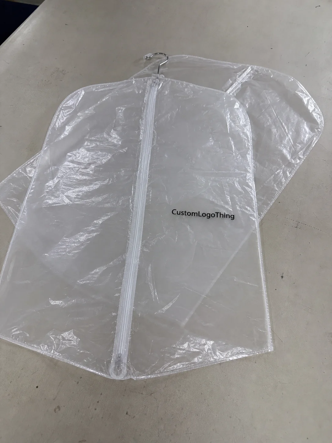
Buyer Fit Snapshot
| Best fit | Eco Poly Mailers Design Branding projects where brand print, material claims, artwork control, MOQ, and repeat-order consistency need to be specified before quoting. |
|---|---|
| Quote inputs | Share finished size, material target, print colors, finish, packing count, annual reorder estimate, ship-to region, and any compliance wording. |
| Proofing check | Approve dieline scale, logo placement, barcode or warning zones, color tolerance, closure strength, and carton packing before bulk production. |
| Main risk | Vague material claims, crowded artwork, missing packing details, or unclear freight terms can make a low unit price expensive after revisions. |
Fast answer: Eco Poly Mailers Design Branding: Film, Print, MOQ, and Carton Packing should be specified like a repeatable production item. The safest quote records material, print method, finish, artwork proof, packing count, and reorder notes in one written spec.
Production checks before approval
Compare the actual filled-product size with the drawing, then confirm tolerance on folds, seals, hang holes, label areas, and retail display edges. Reserve space for logos, QR codes, warning copy, and material claims before decorative graphics fill the panel.
Quote comparison points
Review material grade, print process, finish, sampling route, tooling charges, carton quantity, and freight assumptions side by side. A quote is only useful when the supplier can repeat the same color, closure quality, and packing count on the next order.
Most brands fixate on logo size, and I understand why. Everyone wants the mark to read from across a warehouse aisle, and after enough packaging reviews in Shenzhen, Dongguan, and Ningbo, logo anxiety starts to look like a standard line item in the project brief. But on a Tuesday morning in our Shenzhen facility, I watched a client’s beautifully styled mailer fail its first print test because the linework was too thin, the ink coverage was too heavy, and the flap area had been treated like a footnote. That’s the real lesson behind Eco Poly Mailers design tips: printability, durability, and shipping function come first, and branding follows behind with purpose.
If you’re using custom mailers for apparel, accessories, or lightweight soft goods, Eco Poly Mailers design tips help you create packaging that looks sharp, ships cleanly, and avoids wasting material or budget. I’ve seen brands spend $4,800 on a first run because they designed a pretty PDF instead of a production-ready file, while a properly prepared order in a 2.5 mil recycled polyethylene film can often move through production in 12-15 business days from proof approval. Beautiful on screen, costly in the factory. A good mailer is a moving billboard, a first-touch brand moment, and often the only packaging your customer remembers long enough to talk about, which is both flattering and mildly terrifying.
Eco Poly Mailers usually refer to mailers made with recycled content, mono-material recyclable film options, or lower-impact material choices that reduce waste without turning shipping costs into a slow burn. The strongest eco poly Mailers Design Tips don’t trade on guilt; they guide you toward right-sized dimensions, fewer ink passes, and layouts that make the package cheaper to ship and easier to produce. That balance matters because branding, compliance, production limits, and freight all show up on the final invoice whether anyone planned for them or not, and in a typical 5,000-piece order even a $0.03 change in unit cost adds $150 to the total before freight leaves the port.
Eco poly mailers design tips: what they are and why they matter
Eco poly mailers are plastic shipping mailers made with materials that aim to lower impact compared with standard virgin plastic. That can mean recycled polyethylene, recyclable mono-material structures, or films engineered to use less resin overall, often in thicknesses like 2.5 mil or 3.0 mil depending on the product weight. Not every supplier uses the same specification, and not every sustainability claim deserves a standing ovation. I’ve had buyers ask for “eco” mailers when they really meant “anything that won’t embarrass the brand,” and those are two very different sourcing briefs once you’re talking to a converter in Dongguan or a film supplier in Jiangsu.
The branding job is simple and messy at the same time. Your mailer is the first thing a customer sees before the product even appears, and if the order ships from a facility in Shenzhen or Huizhou, that first impression has already been made before the parcel ever reaches a local fulfillment center. It tells them who you are, whether you care about details, and whether the box-less delivery feels intentional or cheap. In my experience, a clean mailer with one strong logo and a smart message does more for brand memory than a crowded print layout with six slogans and a QR code nobody asked for. Honestly, I think restraint is underrated because it lets the product and packaging feel like they belong together instead of fighting for attention.
Eco poly mailers design tips also need to respect the environmental angle without drifting into greenwashing. Less ink coverage can lower material use during printing, right-sized mailer dimensions reduce void space, and smarter artwork can cut down on test failures. That sounds dry until you realize every failed rerun means more film, more freight, and more money. I once negotiated a reorder for a DTC apparel brand that saved about $1,200 on a 10,000-piece run just by shrinking the blank border and dropping a second ink color, which reduced the total print area by nearly 8%. The client called it “tiny design changes”; the factory called it “finally, thank you.”
Here’s the part most people skip: good design balances brand appeal, regulatory honesty, and production reality. If a supplier says a recycled mailer is printable only in one to three colors, don’t expect a full-bleed photographic layout to turn elegant under factory lighting. It won’t. The factory won’t care about the mood board, the deck title, or the font choice on slide 14. I say that with love, but also with a little bit of bruised soul from watching polished presentations fall apart the moment a flexographic press gets involved in Guangzhou or a gravure line starts counting registration marks.
For product planning, I always recommend pairing eco poly mailers design tips with the broader packaging plan. If you need cartons, inserts, or labels too, review Custom Packaging Products alongside your mailer specs so everything feels like one system instead of a random pile of branded pieces. A mailer designed with a 350gsm C1S artboard insert card or a 4" x 6" thermal label in mind will behave differently than one planned in isolation, and that kind of coordination usually saves a second round of approvals.
“The best mailers are the ones customers barely notice for the wrong reasons. They notice because it feels polished, ships cleanly, and doesn’t arrive looking like it wrestled a forklift.”
How eco poly mailers design tips affect print and performance
Printing on film is not the same as printing on paper, and that’s where many brands get humbled. Flexographic and gravure-style production methods have limits on line thickness, color density, and registration. During a visit to a converter in Dongguan, an operator showed me how a logo that looked crisp in Illustrator turned muddy because the smallest text was under 5 pt and the negative space between letters was too tight. Classic rookie behavior, and yes, I’ve watched agencies make that mistake with six-figure packaging budgets. The worst part is they usually discover it after someone says, “It looked fine on my laptop,” which is a sentence that has caused more factory headaches than I can count.
Eco poly mailers design tips should account for film texture, opacity, and recycled content. A recycled polyethylene film may have more speckling or a slightly softer base tone than virgin film, and a 2.8 mil matte recycled bag will hold ink differently than a glossy 2.5 mil virgin bag from the same plant. That changes how white, red, or black prints appear. A PMS red on screen can look warmer or duller on actual film, especially if the film itself is not especially bright. If you want precision, ask for a physical sample or a printed proof, not just a PDF that lives in a monitor world. I remember one run where the brand team approved a “bright white” logo from a screen mockup, then gasped when it printed as more of a soft cream on a natural-toned recycled film. That was not a design failure so much as a physics lesson.
Durability matters too. Seal strength, tear resistance, and flexibility all interact with design. Heavy ink coverage can make a mailer feel stiffer in certain areas, and overdesigned artwork sometimes complicates consistent production. I’m not saying ink ruins everything. I’m saying a giant dark panel across the entire front can increase printing complexity and make the bag look less eco-friendly even when the material is improved. That irony never gets old. It also never gets cheaper, which is less funny but much more relevant to procurement, especially when a 20,000-piece run moves from $0.11 per unit to $0.13 per unit because the ink coverage forces slower press speeds.
There are practical placement rules that separate a functional mailer from a headache. Keep the logo away from the seam, leave room for the adhesive flap, and don’t put a barcode where tape or creasing will ruin scanning. QR codes can work well, but they need enough quiet space and a size that survives transit abrasion; for a 6" x 9" mailer, I generally want at least a 0.25" quiet zone around the code and a print size no smaller than 0.75" square. For shipping labels and handling icons, think about where a carrier, sorter, or warehouse worker will actually touch the bag. Design for friction, not fantasy. I know that sounds a little blunt, but blunt is better than watching 20,000 bags come back from a fulfillment center because the scan zone was buried under a decorative pattern.
Prototype approval is where the expensive truth shows up. I’ve watched a client fall in love with a blue-on-gray design in a digital proof, only to discover the print looked flat on a matte recycled film sample. That bag cost them a week of delay and about $380 in extra sampling fees because they wanted “just one more tweak.” One more tweak is always somehow three more emails. And somehow one of those emails always arrives at 6:47 p.m. with the subject line “urgent small change,” which is my personal definition of a factory-flavored prank.
If you want to sanity-check whether your artwork is being prepared correctly, ask the supplier for the production method, minimum line weights, and recommended color count before finalizing the layout. That one conversation can save you from a box of mailers that look great in theory and strange in reality. For shipping stress testing and parcel handling standards, I also like referencing ISTA guidelines, because a package that fails transport tests is just expensive confetti.
Key factors in eco poly mailers design tips: branding, materials, and cost
Branding hierarchy comes first. Decide what should hit the eye in the first three seconds. Is it the logo? The brand promise? A short tagline? A sustainability message? You do not need everything shouting at once. The strongest mailers often use one bold brand mark, one secondary line, and enough white space to make the whole thing feel intentional. That restraint reads more premium than decorative chaos, and it’s usually easier for a factory in Guangzhou or Foshan to reproduce without grumbling about registration drift.
Material selection is where eco poly mailers design tips become more technical. Recycled polyethylene is common because it can perform well while using post-consumer or post-industrial content, depending on the spec. Recyclable mono-materials may fit some waste streams better, but you still need to verify local recycling guidance rather than assume a logo on the bag means the world is fixed. Compostable claims need even more scrutiny, because not every compostable film belongs in the same industrial system. I’ve seen a buyer proudly order “compostable” mailers and then discover the end customer had no access to the right disposal program. That’s not sustainability. That’s optimism with a freight bill.
Ink and color strategy can change your price fast. Fewer print colors usually cost less, and a cleaner design often looks better on film anyway. Full-coverage dark backgrounds use more ink and can dull the eco feeling. A light base with one strong color and black copy often delivers a better balance. If you’re running a launch with tight margins, this is where eco poly mailers design tips can literally save you money on every unit, especially if your quote drops from $0.15 per unit for 5,000 pieces to $0.09 per unit once you move to 20,000 pieces with a simplified two-color layout. I’ve had brands fight to keep a full-bleed background because they loved the mood, then later admit the unit savings mattered more than the mood once the CFO started asking questions. Funny how that happens.
Now the part everyone asks for: price. Small runs cost more per bag because setup, plates, and proofing are spread across fewer units. Larger runs drop sharply. Here’s a rough example from a recent sourcing conversation I had with a client comparing two sizes and two print options from a factory in Dongguan:
| Order Spec | Approx. Unit Price | Setup / Plate Cost | Notes |
|---|---|---|---|
| 5,000 pcs, 1-color print, 2.5 mil recycled film | $0.18/unit | $120 | Good for small drops, higher per-unit cost |
| 10,000 pcs, 2-color print, 2.5 mil recycled film | $0.11/unit | $180 | Better value if sales velocity is predictable |
| 20,000 pcs, 2-color print, 3.0 mil film | $0.09/unit | $220 | Lower unit cost, heavier film, better transit resistance |
Those numbers are not universal. They depend on size, ink count, country of origin, freight terms, and whether your supplier is quoting FOB or delivered pricing. A quote from Uline, EcoEnclose, or a local converter can land very differently depending on custom print, lead time, and shipping zone. I’ve had quotes that looked 20% cheaper until freight from overseas added another $640 to the shipment, and a 7,500-piece order out of Shenzhen suddenly became less attractive than a domestic run in California. Surprise! The ocean was not free, and apparently neither is optimism.
Hidden costs show up in art revisions, special finishes, rush schedules, and shipping from offshore suppliers. I once watched a brand spend an extra $295 on revised plates because their internal legal team changed the sustainability statement after proof approval. That’s why eco poly mailers design tips should be discussed early, before anyone locks a launch date or promises a retailer date they can’t actually support. Once the retailer calendar is in motion, everyone suddenly becomes very passionate about a two-millimeter shift in copy.
If you need to compare mailers against other packaging formats, take a look at Custom Poly Mailers and compare structure, print area, and unit economics before choosing your final SKU. A 10" x 13" bag with a 1.5" flap can behave very differently from a 14" x 19" shipping mailer, and the math changes again if you’re adding labels, tissue, or a folded insert printed on 350gsm C1S artboard.
Step-by-step process for eco poly mailers design tips
Step 1 is defining the use case. Apparel, accessories, lightweight boxed goods, returns, and subscription shipments all behave differently. A pair of socks needs a different mailer strategy than a boxed candle or a hoodie with a hangtag, and a shop shipping from Los Angeles will often prioritize different transit strength than a brand fulfilling from Dallas or New Jersey. You want the bag to fit snugly without overstuffing, because stretched film can stress seams and make your packaging look sloppy before it even leaves the warehouse. I always tell brands that “barely fits” is not the same as “well designed,” even though people love to pretend those two things are cousins.
Step 2 is choosing the right dimensions. This sounds easy until you actually measure product thickness, folding method, and insertion allowance. I’ve seen brands order a 9 x 12 inch mailer for items that needed a 10 x 14 inch spec once the poly bag, tissue, and insert card were added. Half an inch of optimism is not a sizing strategy. Good eco poly mailers design tips start with real product measurements, not wishlist math, and that means measuring the folded stack at the factory table, not just from a product sheet. Honestly, I think measuring twice beats redesigning a whole order because someone forgot the tissue wrap.
Step 3 is building artwork with production rules in mind. Use vector logos. Keep line weights strong enough to print cleanly. Leave safe zones around the edges, seam, and adhesive flap. Limit the color palette where possible. A design with one or two spot colors often reproduces more consistently than a complicated gradient that looks great in Adobe and questionable on film. If you want the mailer to feel polished, simplicity usually wins, especially on recycled films sourced from plants in Zhejiang or Guangdong where the press operators want clean separations and predictable ink density.
Step 4 is requesting a dieline or template from the supplier before you finalize anything. This is not optional if you care about getting the print area right. The dieline shows seal areas, fold locations, and print-safe space. I’ve seen a brand place its logo dead-center on a section that got partially hidden by the flap fold. Beautiful mistake. Useless result. The designer nearly cried, the project manager laughed because what else can you do, and the factory quietly printed exactly what was on the file.
Step 5 is review. Digital proofs are useful, but physical samples matter when color, gloss, or texture are part of the decision. A matte recycled film can make dark greens look softer and whites look less stark. If you are comparing options from suppliers like EcoEnclose or a local converter, ask for side-by-side samples. Better yet, compare them under warehouse lighting, not just under office LEDs that make everything look expensive. I’ve had more than one “premium” sample fall apart under fluorescent lighting. Harsh? Yes. Helpful? Also yes.
Step 6 is timeline control. Give yourself checkpoints for artwork review, plate making, production, packing, and freight. A simple mailer order may move in 12 to 15 business days after proof approval, but custom sourcing, recycled-content availability, or shipping delays can add time. A supplier in Shenzhen might quote 12 business days for printing and packing, while ocean freight to Los Angeles can add 18 to 24 more days depending on routing. The more moving parts, the more you need a buffer. I’ve had a client schedule a promo drop one week too early and then act shocked when the bags arrived on day 18 instead of day 10. Shock is not a logistics plan. Neither is “we thought it would be fine.” That phrase has probably financed half the rush fees in packaging.
A clean workflow usually looks like this:
- Confirm product size and shipping weight.
- Request supplier specs and dieline.
- Build artwork in vector format.
- Send proof for prepress review.
- Approve sample or digital proof.
- Schedule production and freight.
Keep the process boring. Boring is profitable. Boring means your eco poly mailers design tips are doing their job, and the only drama is whether the customer tears the mailer open with scissors or their teeth, and please, scissors.
Eco poly mailers design tips: timeline, approvals, and production risks
Production timing deserves more respect than it gets. Artwork prep might take a day. Proofing might take two or three exchanges. Sampling may add another week. Production can take anywhere from a few business days to a couple of weeks, and freight can easily become the longest part if your supplier is overseas. People love to say “fast turnaround” like all factories live inside a magic trick. They do not. They live inside calendars, line schedules, raw material availability, and the occasional machine maintenance issue that no one had the nerve to put in the sales email.
Complex artwork, multiple proof revisions, or special recycled material sourcing can stretch the schedule. If the supplier needs to match a particular recycled film grade or custom tint, that can add sourcing time. When I negotiated with a converter on a large apparel launch, we shaved unit cost by changing the bag width from 10 inches to 9.5 inches, but we added four extra days because the new film roll had to be rescheduled on the line. Lower cost, longer wait. That trade happens all the time. My advice? Decide which one matters more before the order is half-approved and everybody is suddenly using the phrase “soft launch” like a shield.
Supplier location matters too. Domestic vendors may offer quicker communication and shorter transit, while offshore factories may offer better unit pricing and larger capacity. A facility in Ohio can ship faster to the Midwest, and a plant in Guangdong may have a better price on 25,000 units, but neither option is best in a vacuum. It depends on your launch calendar, volume, and how much back-and-forth your team can handle. If your internal approvals are slow, a domestic supplier can still become late. If your team is decisive, an offshore supplier can work just fine. The real issue is usually not geography; it’s whether someone owns the timeline and has the nerve to say, “We need a yes by Thursday.”
Approval bottlenecks are the silent killer. One missed email on a color proof can delay an entire shipment. One executive deciding the logo is “too small” after approval can create a new plate order. One legal note on sustainability language can send the file back to square one. I’ve seen a retail rollout slip by nine days because three teams were reviewing the same bag and nobody owned the final yes. Elegant chaos. Very expensive. If that sentence feels uncomfortably familiar, you are not alone.
Build buffer time into seasonal promotions, retail launches, and subscription restocks. If your sale goes live on the first Monday of the month, the bags should not arrive that morning. They should arrive with enough room for customs delays, a damaged carton, or a shipping carrier having a terrible day. That is not pessimism. That is experience, plus a little scar tissue from too many launch calls that started with “we’re fine” and ended with someone asking if overnight freight could be arranged by lunch.
For sustainability standards and material context, I also point brands to the EPA’s packaging and waste guidance at EPA recycling resources and the FSC site when paper components are involved at FSC. Even if your mailer is plastic, your supporting inserts, labels, or shipper boxes may not be, and that’s where a 350gsm C1S artboard insert or FSC-certified paper tape can affect both the claim and the cost.
Common mistakes to avoid with eco poly mailers design tips
The first mistake is tiny text. If your return address, legal line, or slogan is too small, it may disappear on flexible film or get distorted in transit. I usually want critical copy large enough to survive a warehouse scan and a tired human eye, which means keeping key copy above 5 pt and often closer to 6.5 pt for recycled film. Hairline graphics are another trap. They look stylish in a Figma file and then vanish when the print hits textured or recycled film. It’s a deeply annoying little betrayal, like buying a “clear” container and discovering it turns foggy the second you breathe near it.
The second mistake is designing a heavy, ink-packed layout that fights the eco message. If the bag is covered wall-to-wall in dark ink, your “sustainable” look starts feeling less credible. You may also see cost creep from the extra print coverage, especially on 10,000-piece or 20,000-piece runs where every additional color pass adds time. A cleaner layout often improves both aesthetics and economics. That is one of the easiest eco poly mailers design tips to apply, and it’s also one of the easiest ways to stop a production manager from rubbing their temples in silence.
The third mistake is ignoring the seam, adhesive flap, or barcode placement. These are not decorative zones. They are structural and operational. If you cover the flap with a logo, then later the bag gets folded in the warehouse, the customer may never see that brand element anyway. If you bury a barcode in a weak location, a carrier may have trouble scanning it. Small layout errors cause irritating downstream problems. And yes, the warehouse team will notice, even if they don’t say anything until the third pallet.
The fourth mistake is using vague sustainability claims. “Eco-friendly” sounds nice until someone asks what it actually means. Is it recycled content? Is it recyclable in a specific facility? Does the claim apply to the film, the ink, or the whole bag? I always push clients to verify material specs and keep claims honest. The FTC does not care that the copy sounded cute on a mood board, which is rude but consistent.
The fifth mistake is forgetting that dark recycled films can dull colors. A white logo may still print cleanly, but brighter brand colors often need adjustment. Red may shift. Green may mute. Black can look stronger than expected. Always ask for a printed sample, especially if your brand uses a color-critical palette. Once a cosmetics brand I worked with approved a proof without sampling, they received 15,000 bags that made their soft pink logo look dusty rose under warehouse LEDs. Not terrible. Not what they wanted either. They kept the run, but I could tell the packaging manager still winced every time one came off the line.
- Avoid text under 5 pt unless it is truly nonessential.
- Keep critical logos away from seams and folds.
- Limit color count when possible.
- Verify sustainability claims with actual specs.
- Request a physical sample for recycled or textured films.
Expert eco poly mailers design tips you can apply right away
Use one bold brand color plus black or white. That setup usually prints cleaner, looks more premium, and keeps the design focused. A simple layout with strong contrast is easier for factories to reproduce consistently, whether the order is running through a converter in Guangzhou or a smaller shop in Suzhou. If you want a visual cue that feels intentional, use space and alignment instead of piling on more graphics. Space is not wasted. Space is confidence.
Keep the front side simple and use the back for care instructions, QR codes, or a sustainability statement. That split keeps the first impression clean while giving you room for practical information. I like this approach for apparel brands because the front can stay branded and the back can carry a note about returns, recycling, or social links. Just make sure the QR code is large enough and has enough quiet space around it to scan quickly. I’ve seen beautifully designed codes fail because someone tucked them too close to a fold line, which is a frustratingly preventable mistake.
Ask suppliers for material specs, test reports, and proofing guidance before you buy. EcoEnclose is one reference point for sustainable mailers, and Uline is useful for comparing general packaging formats, but neither replaces a real discussion about your artwork, volume, and shipping route. Ask about film thickness in mils, recycled content percentage, adhesive type, and whether the bag structure fits your product weight. That checklist matters more than pretty marketing language, and it saves a ridiculous amount of backtracking later. If a supplier quotes a 2.5 mil film, for example, and your product needs a 3.0 mil bag with reinforced side seals, that difference should be settled before plate making, not after the first carton lands in your warehouse.
Order samples from at least two vendors and compare seal quality, film feel, and print clarity side by side. Put them on a table under the same light. Fold them. Press the adhesive. See which one feels less flimsy. I’ve done this with clients who insisted two bags were “basically the same” until one started tearing at the corner after the third fold. They stopped calling it basically the same after that, which was satisfying in a very nerdy, packaging-person kind of way.
Design for shareability, but do it with restraint. A short message like “packed with care” or “thanks for choosing better packaging” can make the mailer feel intentional. A tiny internal joke or a clever return reminder can also create a better customer moment. Just don’t cram in five marketing lines and a poem. Good eco poly mailers design tips create a package that feels human, not loud. In fact, a little personality goes a long way if it feels like a person wrote it rather than a committee with too many opinions and a caffeine problem.
Here’s a practical comparison I use with smaller brands deciding how far to push the layout:
| Design Style | Print Complexity | Typical Cost Impact | Best For |
|---|---|---|---|
| Logo-only front, simple back | Low | Lower setup and cleaner production | Startups, apparel, subscription brands |
| Two-color brand layout | Moderate | Balanced cost and stronger branding | Growing DTC brands |
| Full-coverage custom artwork | High | Higher ink and proofing complexity | Campaigns, premium drops, limited editions |
If you want a package that looks designed instead of decorated, the quiet version usually wins. That is the kind of result eco poly mailers design tips are meant to produce, especially when the artwork is paired with a practical insert card, a clean returns note, or a label spec that stays consistent across the line.
FAQ
What are the best eco poly mailers design tips for small brands?
Start with a simple logo-first layout and keep the color count low to control cost. Choose a mailer size that fits your product without a lot of empty space, such as a 9 x 12 inch or 10 x 14 inch format depending on folded apparel depth. Request a supplier dieline before designing so you avoid seam and flap issues.
How do eco poly mailers design tips change when using recycled material?
Recycled film can look slightly different than virgin plastic, so adjust color expectations. Use stronger contrast and avoid ultra-fine detail that can blur on textured surfaces. Always review a printed sample because recycled content can affect color consistency, especially on matte 2.5 mil or 3.0 mil film.
How much do custom eco poly mailers usually cost?
Price depends on size, film thickness, print colors, and order quantity. A 5,000-piece run may sit around $0.18 per unit, while a 20,000-piece run with simpler art may drop closer to $0.09 per unit. Adding special finishes, rush production, or complex artwork increases the price.
How long does it take to produce custom eco poly mailers?
Typical lead time includes artwork setup, proof approval, production, and shipping. Simple jobs often move in 12 to 15 business days from proof approval, while offshore freight can add another 18 to 24 days. Build in buffer time before launches so one delayed proof does not wreck the schedule.
What makes a good sustainable design for eco poly mailers?
A good design uses less ink, fits the product well, and communicates the brand clearly. Material claims should match real specs, not just marketing language, and the structure should fit the shipping route and product weight. The best designs look polished while still supporting efficient production and shipping.
Eco poly mailers design tips are not about making a bag look trendy for one launch. They are about building a packaging system that prints cleanly, survives transit, and doesn’t waste money on avoidable mistakes. I’ve spent enough time on factory floors in Shenzhen, Dongguan, and Guangzhou, in proofing rooms under fluorescent tubes, and on supplier calls at 7:15 a.m. to know that the best results usually come from simple decisions made early: the right size, the right film, the right artwork, and the right expectations. If you want packaging That Actually Sells, use eco poly mailers design tips like a production plan, not a mood board. Start by locking the dieline, confirming the print method, and approving a physical sample before the first full run rolls. That one habit will save you a lot of money, and a fair bit of headache too.