Buyer Fit Snapshot
| Best fit | Edge Protectors with Brand Print projects where brand print, material claims, artwork control, MOQ, and repeat-order consistency need to be specified before quoting. |
|---|---|
| Quote inputs | Share finished size, material target, print colors, finish, packing count, annual reorder estimate, ship-to region, and any compliance wording. |
| Proofing check | Approve dieline scale, logo placement, barcode or warning zones, color tolerance, closure strength, and carton packing before bulk production. |
| Main risk | Vague material claims, crowded artwork, missing packing details, or unclear freight terms can make a low unit price expensive after revisions. |
Fast answer: Edge Protectors with Brand Print: Material, Print, Proofing, and Reorder Risk should be specified like a repeatable production item. The safest quote records material, print method, finish, artwork proof, packing count, and reorder notes in one written spec.
Production checks before approval
Compare the actual filled-product size with the drawing, then confirm tolerance on folds, seals, hang holes, label areas, and retail display edges. Reserve space for logos, QR codes, warning copy, and material claims before decorative graphics fill the panel.
Quote comparison points
Review material grade, print process, finish, sampling route, tooling charges, carton quantity, and freight assumptions side by side. A quote is only useful when the supplier can repeat the same color, closure quality, and packing count on the next order.
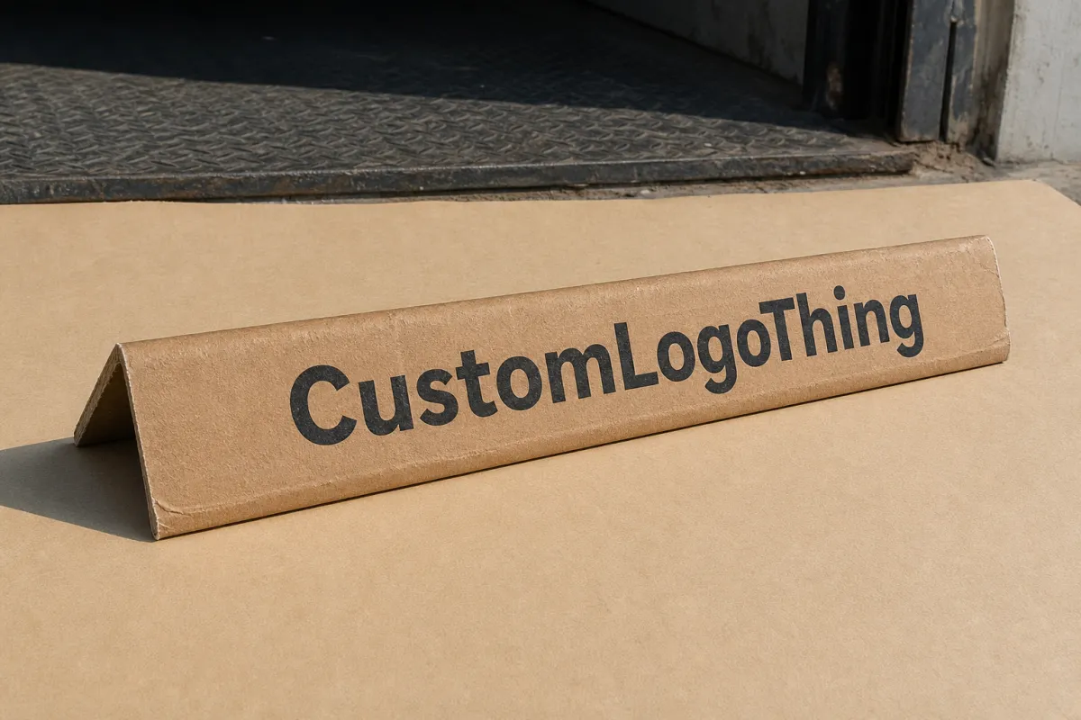
Edge protectors with brand print get noticed fast. They sit at the corners, which is where the load shows its shape and where people notice handling quality in a split second. On a dock, that matters. A printed edge protector keeps pressure off the corners, helps the pallet hold together, and gives the shipment a cleaner face. Not flashy. Just useful.
That usefulness is the point. Edge protection is not only about preventing crush damage. It can also reinforce brand identity, cut down on warehouse mix-ups, and make freight look deliberate instead of improvised. For Custom Logo Things, that combination is the real value: packaging that still does the job after straps, stretch wrap, and a rough ride.
A printed edge protector has two jobs: hold the load together and carry a message that still reads after wrap, straps, and handling.
Buyers usually discover this in practical ways. A plant ships to a distributor, the distributor receives mixed product lines, and suddenly a plain brown pallet corner is not enough to tell one lane from another. Or a retail-facing shipment arrives looking neat, and the branded corners make the whole pack feel more controlled. That is not decoration. That is packaging working on two levels at once.
Why edge protectors with brand print stand out on the dock
Docks are brutal on detail. People scan labels, check film tension, look for crushed corners, and make decisions quickly. Edge protectors with brand print stand out because they sit on the edge of the load, where the eye naturally lands. Even if cartons are covered, the corners still show.
Plain protective angles only need to spread pressure and help a pallet keep its shape under straps, stretch wrap, and stacking load. Printed versions still do that. They just add a second layer of communication. A logo, product family name, handling cue, or simple graphic system can make a pallet easier to identify and easier to trust. The shipment looks planned. That sounds basic because it is.
That small shift pays off in three places. In the warehouse, it helps reduce mix-ups. In transit, it makes pallets easier to sort and receive. At the customer end, the unboxing experience starts before the carton is opened. A branded corner can signal care before anyone cuts the film.
From a buyer's perspective, the other advantage is efficiency. The branding surface is already part of the packaging system. No extra label. No loose insert. No decorative add-on pretending to be functional. You are using a compression-resistant component that already belongs in the pack and giving it a second job.
That also helps consistency. If every pallet leaves with the same printed corners, the outbound stream feels tighter and easier to manage. One shipment can carry a warehouse mark, another a product line name, and another a logo plus handling note. The visual language stays aligned across all of it. That matters for manufacturers shipping to distributors, fulfillment centers, and retail partners who all handle freight a little differently and still expect a clean result.
There is a practical downside to ignore. If the printed corner is hidden under wrap, buried by overhang, or placed on the wrong face, the branding value drops fast. Pretty artwork does not help if nobody can see it. Warehouse reality always wins.
How the print and structure work together
To understand edge protectors with brand print, separate the structure from the message. The structure does the hard work. Most protectors use layered paperboard or recycled fiberboard formed into an angle that resists compression at carton corners, case stacks, bundled loads, and odd-shaped freight. The legs and thickness are chosen to absorb force and spread strap pressure so the outer packaging is less likely to crush or distort.
Construction choices usually include laminated layers for extra rigidity, consistent angle forming for better fit, and board grades matched to load weight, stack height, and transit conditions. Thickness often lands somewhere around 0.080 to 0.250 inch, depending on the application, with heavier loads needing more stiffness and better compression strength. If the shipment is tall or tightly strapped, that strength matters as much as the artwork. Maybe more.
The print layer sits on top of that structure, and the method changes both the look and the production flow. Flexographic printing works well for repeat orders and simple graphics, especially one- or two-color marks that need reliable consistency. Digital printing fits shorter runs, multiple SKUs, and quick artwork changes without plate costs. Offset printing can make sense when a smoother, more polished finish is needed on preprinted liners or sheets before converting, especially when the visual presentation supports the brand better.
Color strategy matters too. Not every packaging surface needs full process art. A strong logo in spot color, a controlled CMYK panel, or a single-color mark often reads better at warehouse distance than a crowded full-panel design. The reason is simple: the protector is narrow, often partly wrapped, and sometimes seen from a bad angle. If the design tries to do too much, it disappears into the load.
Placement is part of the engineering, not just the art. The printed face should match how the pallet sits on the dock, how the wrap is applied, and which side usually faces outward in shipping. If the protector ends up hidden by wrap or turned inward by pallet orientation, even strong artwork will do very little for visibility. Copy needs to sit where forklift operators, receivers, and downstream handlers can actually read it after the load is finished.
That is where clean print finishing and disciplined layout pay off. A sharp edge, solid ink holdout, and correct panel mapping help the printed surface survive handling without looking smeared or awkward. The goal is not to turn a corrugated angle into a billboard. The goal is to make the protector readable, durable, and aligned with the load path so the packaging stays functional first and branded second.
For teams that want a practical reference point on distribution testing, the ISTA site is a solid place to start. It frames the real question behind any protective packaging choice: will the pack survive the actual distribution cycle, not just the clean sample on the table?
One more reality check. Print method and board grade are not separate decisions. A heavy ink flood on the wrong substrate can slow drying, scuff in transit, or add cost without improving visibility. Good packaging design keeps those tradeoffs in the open from the start.
Key factors that affect appearance, performance, and fit
Size comes first. Edge protectors are not one-size-fits-all, and the wrong leg length can create more headaches than protection. A protector for standard boxed pallets may need a different profile than one used on drums, bundled building materials, or long irregular loads. Too short, and it misses the edge. Too long, and it becomes awkward to place and gets in the way of wrap, straps, or pallet overhang.
Thickness and angle consistency come next. A protector with a consistent bend keeps its shape better and is easier to apply by hand or with semi-automated equipment. For heavier shipments, thicker board can improve compression resistance, but only if the dimensions still match the product footprint. In real life, a well-fitted 1.5-inch or 2-inch leg with the right board grade often beats a heavier piece that was never sized correctly.
Moisture deserves more attention than it usually gets. Paper-based protectors perform well in dry conditions and can lose rigidity in humidity, cold-chain storage, or export lanes where condensation shows up like an uninvited guest. That does not make Printed Edge Protectors a bad choice for those environments. It means the substrate, coating, and storage conditions need to be reviewed together. Good print on weak board still fails. Strong board stored badly can fail too.
Branding choices should reflect the same reality. A heavy ink flood may look impressive in a proof, but it can be slower to dry, harder to scuff-proof, or simply more expensive depending on the print method and substrate. A simple logo, narrow accent bar, or clear handling note often does more for recognition than a busy full-panel layout. That is where restraint helps both cost control and readability.
Handling on the floor matters too. If staff apply the protector by hand, the design should be obvious from a reasonable distance and easy to orient. If the program uses automated or semi-automated application, the dimensions and print placement need to match the machine feed and the way the load is indexed. The spec should describe what happens in production, not just what looks good in a mockup.
One useful rule for branding teams: keep the message simple. A protector can carry a logo, a product family name, a handling arrow, a recycling cue, or a part number, but not every face needs to do everything. Too much information on a narrow angle turns into noise fast. Clear spacing and one focal point usually perform better, especially under warehouse lighting or after the load has moved through a few hands.
If sustainability is part of the sourcing conversation, paper origin matters too. Many procurement teams want to know whether the board is recycled, recyclable, or sourced from responsibly managed forests. In those cases, FSC-certified paperboard can support a documented sourcing story, though the right certification still depends on the customer policy, region, and actual supply chain requirements.
A few practical questions are worth answering before artwork gets locked:
- What is the exact load size, including overhang and wrap path?
- Will the protector sit under straps, film, corner boards, or all three?
- How much of the printed face stays visible after packaging is complete?
- Does the warehouse need part numbers, handling marks, or just the logo?
- Will the product sit in dry storage, refrigerated space, or mixed humidity?
Those details affect appearance and performance more than most first-time buyers expect. A protector that looks perfect on screen can fail in the field simply because the print area, board grade, or size did not match the real load.
Another practical scenario: a buyer may approve a logo proof that looks clean, then discover on the floor that the printed face is only visible on one side of a four-way pallet after wrap is applied. That is not a design win. That is a missed use case. The safest specs account for how the load is actually turned, staged, and shipped.
Process, timeline, and production steps
The cleanest production path starts with a clear brief. In most cases, that brief should include the load dimensions, pallet pattern, expected annual volume, print intent, preferred artwork format, and any handling requirements that matter on the floor. The more specific the input, the fewer rounds of back-and-forth later. For custom packaging, vague instructions just burn time.
A typical workflow looks like this:
- Discovery and sizing review
- Artwork intake and file check
- Structure confirmation and print layout planning
- Digital proof review
- Physical sample or short pilot run, if needed
- Production and finishing
- Packaging and dispatch
Each step has a job. Discovery confirms the protector actually fits the load. Artwork review checks whether the logo, text, or graphics still work at the intended scale. Structure confirmation makes sure the board gauge and angle shape can handle the shipment. Proofing catches copy, color, and placement issues before a full run starts. Sampling matters even more when the load is high value, the print area is narrow, or the brand team wants to compare two or three visual directions.
The files themselves matter more than many non-print teams realize. Vector artwork is usually the safest starting point because logos scale cleanly and do not blur when resized for production. Brand colors should be supplied clearly, along with approved typography and the exact wording for handling messages or product names. If the job uses digital printing or flexographic printing, a dimensioned layout or dieline helps keep artwork from drifting during conversion.
Lead time depends on how much needs approval and how new the job is. A repeat order with confirmed dimensions and existing plates or layouts may move quickly, often within 7 to 12 business days after approval depending on plant schedule. A fresh custom size, new print setup, or first-time artwork review can take longer, commonly 12 to 20 business days or more once sampling and revisions are included. None of that is unusual. The mistake is pretending a rush order will behave like a reorder.
Delays usually show up in the same places. Missing artwork files. Late color changes. Revised dimensions after proofing. Uncertainty about pallet count. The print team may be ready, but if the load spec changes after tooling or setup planning begins, the schedule gets pushed back. A good supplier will call that out early instead of letting the job drift into avoidable rework.
For buyers comparing packaging programs, transit performance against recognized test methods is a useful benchmark. Teams often use ISTA packaging protocols or compression-related ASTM methods to judge whether the structure is actually doing its job under realistic conditions. The point is not to make the purchase feel academic. The point is to avoid mistaking a cosmetic sample for proof of field performance.
If you want a practical example of how packaging decisions are usually explained, our Case Studies page is a useful companion piece. It shows how different packaging elements solve real handling and presentation problems without turning the conversation into design theater.
One more point on production timelines: first-time artwork almost always takes longer than buyers expect. That is normal. Proofing, plate work, substrate confirmation, and sample approval all exist for a reason. Skipping them tends to create expensive confidence later, which is a poor trade.
Cost, pricing, and quote planning
Pricing for edge protectors with brand print comes down to a handful of variables: material grade, protector size, print coverage, number of colors, order quantity, and shipping weight. A narrow one-color protector on standard board will usually price differently from a wider board with multiple print zones or a premium finish. Short runs also tend to carry higher unit costs because setup charges get spread across fewer pieces.
Volume matters a lot. In many programs, the unit price improves once the order moves from a short pilot into a repeat production range. That is why it makes sense to request quotes at two or three quantity tiers. A buyer may find that 2,500 pieces work fine for testing, while 10,000 pieces give a much better balance between unit cost and inventory efficiency. Neither option is magically right. The answer depends on storage space, forecast certainty, and how often the print changes.
Comparing quotes gets easier when the details are normalized. One supplier may look cheaper on the estimate, but the price might exclude freight, sample development, or a print method that adds lead time. Another may charge a little more and include tighter tolerances, better proof support, or a more dependable repeat setup. The quote should be read like a packaging spec, not just a dollar amount.
Custom branding can also replace other spending. A printed edge protector may reduce the need for separate stickers, tertiary labels, or extra handling cards. It may help warehouse staff identify pallets faster, which cuts down on re-labeling and rework. It can even support a more polished unboxing experience without adding another packaging layer inside the shipper. Those are soft savings, but they matter because labor is expensive and mistakes cost more than people want to admit.
| Print approach | Best fit | Typical setup profile | Indicative unit cost behavior | Practical notes |
|---|---|---|---|---|
| Flexographic printing | Repeat orders, simple logos, handling marks | Plate or setup cost up front | Often efficient at higher volumes; broad market ranges may land around $0.18-$0.35 per unit on standard sizes | Strong repeatability, good for stable brand systems and straightforward color work |
| Digital printing | Short runs, multiple SKUs, quick artwork changes | Lower setup, faster art changes | Commonly higher per unit on short runs; broad ranges may sit around $0.30-$0.70 per unit depending on coverage | Useful for pilot programs and frequent graphic changes |
| Offset printing on liners | More polished presentation, larger artwork areas | More prepress coordination | Can be attractive on stable programs; pricing varies widely with finishing and volume | Often chosen when a cleaner brand identity is a priority |
| Plain structural board | Pure protection, no print requirement | Lowest design complexity | Usually the lowest direct unit cost | Good benchmark if the team wants to compare the value of branding against a no-print baseline |
Those ranges are planning figures, not a quote. A 36-inch protector for a heavy pallet load may price very differently from a short corner angle used on retail-ready bundles. Board grade, color coverage, and freight distance all move the final number. The safest move is to ask for pricing at multiple quantities and compare the delivered total, not just the ex-works piece price.
For sourcing teams, one more question is worth asking: does the print method support future repeatability? If the brand is likely to reorder the same spec over and over, the setup cost may be easier to justify. If the artwork changes often, digital printing may save more money overall because the program avoids repeated plate costs and reduces the risk of obsolete inventory.
If the supplier cannot explain what is included in the quote, the quote is not complete. That sounds harsh. It is also true. Freight, tooling, sample development, and artwork revisions all belong in the conversation before approval, not after the invoice lands.
Common mistakes to avoid with branded edge protectors
The biggest mistake is treating the protector like a billboard. That instinct usually comes from marketing, not from warehouse reality. Once artwork gets too busy, readability drops and practical information such as handling arrows, product family names, or pallet codes gets buried. A branded protector should be visible, not cluttered.
Another common error is approving the print before the actual load dimensions are confirmed. A design that looks balanced on a mockup can shift badly once the final size is set. If the protector is too narrow, the logo may get cut off or pushed into the wrong panel. If it is too tall, the printed area may disappear under wrap or straps. Rework at that point wastes time and material. Everyone loves that kind of surprise. Nobody, actually.
Color expectations cause trouble too. A brand team may expect screen-accurate output, but paperboard, ink system, and print method all shape the final result. CMYK art can look strong, but it may not match the same way across all substrates. A solid spot color may be the better choice for a logo that needs consistency from reorder to reorder. The right answer depends on the visual target and the print process, not on hope.
Placement problems are easy to miss during approval and hard to forgive in production. If a logo sits on the face that gets buried under wrap or turned toward the pallet center, the branding benefit drops fast. The same thing happens if the print lands where strapping is likely to crease it or where forklift contact may scuff it. Strong art cannot fix a bad placement decision.
Some buyers also underestimate moisture and storage conditions. A protector that performs in a dry sample room may behave differently in a humid warehouse, a refrigerated dock, or a shipment moving through mixed climates. The board can soften, the print can scuff, and the angle can lose stiffness if the substrate is wrong for the environment. That is why structure and graphics need to be reviewed together instead of treated like separate purchases.
There is a quieter mistake too: not documenting the approved spec. Without a clear record of dimensions, print area, color targets, and artwork files, every reorder turns into a small scavenger hunt. One person remembers the old version, another remembers the revised version, and the plant has to guess which one matters. A simple specification sheet prevents most of that mess.
The cleanest branded packaging programs are usually the simplest ones: one load, one approved size, one defined print area, and one clear reorder record.
Another failure mode shows up after the first successful run. The team changes the carton size, the pallet pattern, or the wrap sequence, but nobody updates the protector spec. Then the print lands in the wrong place and everyone acts surprised. The packaging did not break. The assumptions did.
If a team wants fewer headaches, the answer is usually not more decoration. It is tighter coordination between the structural spec, the print system, and the actual distribution path. That is where edge protectors with brand print prove their value: they are easy to overlook until the first time a shipment arrives looking neater, easier to identify, and better protected than the plain version did.
Expert tips and next steps for a stronger packaging program
Start with the logistics problem, not the artwork. Ask what the protector has to stop: corner crush, strap cut-through, pallet shift, or simple visual confusion in the warehouse. Once that is clear, the print layer can support the job instead of getting in the way. That order keeps the packaging useful and stops design from outrunning function.
A second habit pays off fast: choose one clear message per face. A logo on one face, a handling cue on another, and a product family mark on a third can be plenty. Trying to cram every possible message into the same piece weakens the design. A wide-open unprinted area can matter just as much as the printed space because it improves contrast and helps the brand mark read at distance.
Build a spec sheet early. Include finished dimensions, board or substrate notes, print area, color target, artwork version, pallet count, and approval contact. That document becomes the memory of the program. Without it, people fall back on email threads and old PDFs, which are terrible at staying accurate.
Ask for a sample or a short pilot run before committing to a large order, especially if the product is high value or the shipment is visible to end customers. A pilot can expose problems with legibility, wrap coverage, scuff resistance, or fit that a proof will never show. If the pilot passes, the larger rollout gets a lot less risky.
For teams managing several product lines, consistency matters as much as the individual design. A common format for edge protectors, even when the logo or product name changes, makes the outbound stream easier to recognize. Procurement, production, and distribution all benefit when the packaging language stays predictable. Small standardization wins tend to pile up.
Here is a practical sequence I recommend for buyers who want a clean result without endless back-and-forth:
- Measure the actual load and pallet pattern.
- Collect vector artwork, color targets, and approved wording.
- Request quotes at two or three quantity levels.
- Confirm the print method and expected lead time.
- Review a proof or pilot before full production.
- Save the final spec so reorders stay consistent.
That process is not complicated. It just prevents the usual misfires. It also helps the packaging team talk in terms production can use: dimensions, tolerances, coverage, timing, and handling requirements. Those are the details that decide whether the final pack feels easy or frustrating on the floor.
For Custom Logo Things, the opportunity is straightforward. Use edge protectors with brand print to keep the load protected, make the pallet easier to identify, and present the shipment with a sharper visual finish that still respects freight reality. If the structure is right, the print is restrained, and the spec is documented, the result can be practical and memorable at the same time.
One practical takeaway: if the protector cannot be seen after wrap and staging, the brand print is too ambitious. Trim the artwork, confirm the visible face, and lock the spec before the first run. That is how you get packaging that looks intentional and still survives the lane.
What are edge protectors with brand print used for in packaging?
They reinforce corners and edges during storage and transit while carrying brand or handling information on the load. That makes pallets easier to identify in the warehouse and helps the shipment look more organized when it reaches a customer or distributor. They work best when the print is planned around how the load is wrapped, strapped, and handled.
Do edge protectors with brand print affect protection performance?
The print itself should not change protection if the structure, thickness, and material grade stay the same. Performance depends on compression strength, fit, moisture resistance, and how well the protector is applied. If artwork or coating changes the substrate too much, the design should be reviewed again before production.
How much do branded edge protectors usually cost?
Pricing depends on material, size, number of print colors, run quantity, and any setup or tooling charges. Short runs usually cost more per piece, while larger volumes often bring the unit cost down. The most accurate way to budget is to request quotes at several order levels and compare the full delivered cost.
What files do I need for custom printed edge protectors?
Vector logo files are best because they scale cleanly and hold detail during print setup. You should also provide brand colors, approved wording, and any placement notes for the faces of the protector. A dimensioned spec or dieline helps avoid artwork that looks good on screen but fails when folded into the final shape.
What is a normal lead time for edge protectors with brand print?
Lead time depends on whether the design is a repeat order, a new print setup, or a custom size that needs approval. Proofing and sample approval can add time, especially if color or placement changes are requested. The fastest path is to confirm dimensions, artwork, and quantity early so production can move without back-and-forth delays.
For teams trying to balance protection, presentation, and repeatability, edge protectors with brand print are a practical way to add value without adding unnecessary packaging complexity.

