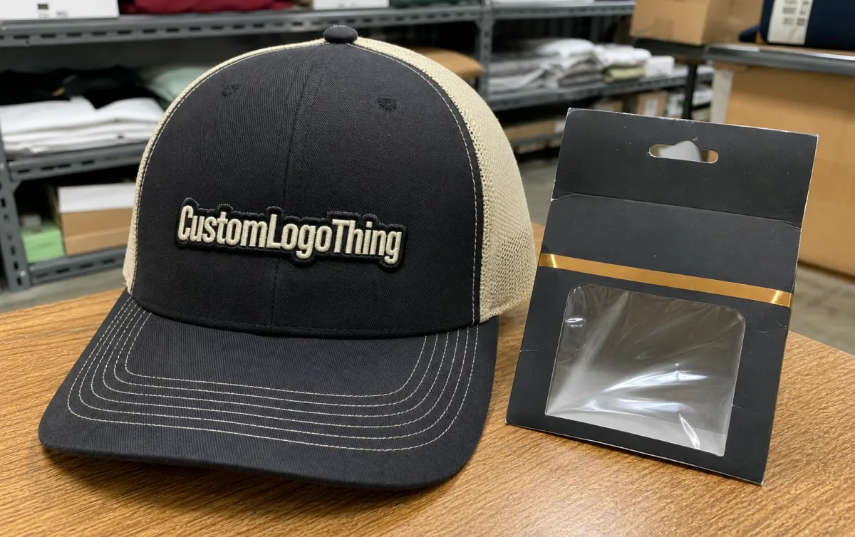
The electronics trucker caps Digital Proof Checklist is where a merch order either stays under control or starts drifting. A logo can look centered and finished on a screen, then run into a curved front panel, mesh back, seam lines, thread tension, and a bill that changes the way the design reads once it is made.
That gap matters in electronics because logos often carry small type, thin strokes, device icons, or compliance marks that do not give much room for error. A proof is more than a preview. It is the first chance to see whether the artwork can survive the move from flat file to production-ready headwear.
Employee programs, trade shows, dealer kits, and launch merch all depend on the proof for budget and timing too. A weak proof can trigger rework, and rework tends to bring extra charges, slower shipping, or a compromise nobody wanted. Strong approvals stay close to the actual spec: blank, decoration method, logo size, and deadline all need to line up.
electronics trucker caps digital proof checklist: what to catch before approval
Use the checklist as a production filter. Before a single cap gets decorated, four questions should already be answered: Is the blank correct? Can the factory place the logo where the proof shows it? Does the decoration method fit the artwork? Will the order ship in the promised window?
If the proof misses any of those points, it is incomplete, no matter how polished it looks. Technical logos are less forgiving than simple wordmarks. A small symbol that seems fine in a mockup can turn unreadable once it is reduced to cap scale.
- Artwork file: vector art is safest; clean raster files can work if detail is limited.
- Placement: front panel, side panel, back arch, or closure area.
- Decoration method: embroidery, woven patch, PVC badge, print, or mixed methods.
- Cap spec: structured or unstructured front, mesh type, crown height, and closure style.
- Timeline: proof due date, revision window, production start, and ship target.
A proof should read like a production instruction sheet, not a marketing image. If the only thing on it is a logo floating on a cap mockup, ask for more detail. Buyers should be able to tell from the proof what will be made and what has already been approved.
There is another reason to slow down here. Cap orders often look inexpensive until the first correction appears. A placement change, a second proof round, or a method switch can add more cost than expected. A useful checklist catches issues before decoration starts.
How digital proofs translate flat artwork to a 3D trucker cap
The supplier starts with your file, maps it to a cap template, and adjusts for the shape of the front panels. That sounds simple, but a trucker cap is three-dimensional, and the seams, curvature, mesh, and stiff brim all change how the logo sits in space.
Digital proofing works because it shows proportion and placement. It is not a perfect simulation. Screen color can drift, thread reflects light differently from ink, and a foam front can change the profile of the logo more than a cotton front. Proofs work best as decision tools, not as promises of exact visual equivalence.
That distinction helps buyers read the image more intelligently. A structured five-panel cap gives a different visual field than a six-panel cap. A taller crown leaves more room for a large logo but can also make the design feel farther from the brow. A low crown pulls the graphic down and can make a layout feel crowded.
- Five-panel vs. six-panel: the panel layout changes seam placement and front width.
- Structured vs. soft front: structure supports embroidery better and holds shape in photos.
- Crown height: taller crowns leave more room for bold branding; lower crowns feel more compact.
- Bill shape: flatter bills read more technical; curved bills feel more casual and worn-in.
- Back closure: snapback, strap, and hook-and-loop all change the back view and fit feel.
The decoration method changes what the proof needs to protect. Embroidery adds texture and depth, but it can compress thin lettering. Woven patches hold tighter detail. PVC badges create a harder-edged, more industrial look. Screen print keeps the surface flat and usually suits simple artwork or lower-cost programs better.
If the logo is detailed, the first method you chose may not be the right one. Sometimes the cleanest approval comes after simplifying the art or switching to a different decoration type. That is less glamorous than a perfect mockup, but it is how a design survives production.
The blank matters too. A similar-looking cap can still have a different crown depth, seam layout, or panel stiffness, and that changes how the art lands on the front. If the proof uses a substitute blank, ask whether the structure, fit, and material weight match the quote.
Specs that change the final look: fit, fabric, and decoration method
Many proof approvals go sideways because the buyer focuses only on the logo. The blank does more than most people expect. A firmer structured cap holds a logo differently than a soft front panel. A brighter mesh color can make the same artwork look louder, sharper, or more corporate.
Check the blank line by line: crown height, front panel material, mesh style, bill curve, sweatband, and closure. A shift in any one of those can change how the cap sits on the head and how it reads in photos. A taller crown creates a stronger canvas for large graphics. A lower crown compresses the image and can make a layout feel crowded even when the art looked balanced on screen.
Small text needs extra scrutiny. Once a logo drops to roughly 2.5 to 3.5 inches wide, thin typography starts to fail more often. That failure is not always dramatic. Sometimes the letters are still there, but they lose enough clarity that the brand message becomes harder to read from a normal viewing distance.
| Decoration method | Detail retention | Typical cost impact at 500 units | Best use case |
|---|---|---|---|
| Embroidery | Strong on bold shapes, weaker on tiny text | About $0.65-$1.75 per cap add-on | Clean logos, texture, premium feel |
| Woven patch | Better small-detail retention than embroidery | About $0.80-$2.20 per cap add-on | Technical marks, tight icons, multi-color art |
| PVC or rubber badge | Crisp edges and raised surface | About $1.10-$2.50 per cap add-on | Industrial, high-tech, or rugged branding |
| Screen print | Flat coverage with less texture | About $0.25-$0.60 per cap add-on | Simple marks and lower decoration cost |
Those numbers are working ranges, not promises. Price moves with stitch count, patch size, thread complexity, blank quality, and order volume. If a supplier quotes far outside those ranges, the reason usually comes back to one of those variables.
One more point matters here: the proof has to reflect the exact blank being priced. A cap can look nearly identical while still having a different fit or seam structure. On headwear, that difference is not cosmetic. It changes the final shape enough to affect how the logo sits and how the cap feels when worn.
Pricing, MOQ, and unit-cost levers for proofed cap orders
Proofed cap pricing usually breaks into a few parts: the blank, the decoration method, the setup, and the quantity. Small orders carry more overhead per unit because the prep work is spread across fewer caps. Larger runs usually bring the unit price down, but only if the artwork and method stay simple enough to scale cleanly.
MOQ drives a lot of the conversation. A low minimum sounds flexible, yet it often comes with a higher per-cap cost or a more limited set of decoration options. Higher quantities can unlock better pricing, but only when the artwork does not force extra labor. A dense stitch file, a multi-layer patch, or a custom back label can cancel part of the savings.
Decoration complexity is the biggest pricing lever after volume. A simple one-color embroidery logo is usually cheaper than a full-color woven patch with a custom shape. If the same art can be simplified without hurting recognition, the quote often improves fast. Sometimes one removed stitch column does more for price than a larger order size.
Blank selection affects cost too. A standard foam-front snapback is usually easier to source than a premium fabric or a specialty closure. Odd colors, special mesh, and branded inside labels can push the order into a custom lane. That may be worth it for a premium launch, but it should be intentional rather than accidental.
Shipping and proof timing also matter. A rush proof can be painless, but a rush production schedule usually isn't. If the order needs a tight delivery window, ask early whether the supplier can reserve capacity before approval. Waiting until the proof is signed off often leaves less room to recover from a revision.
Proof process and turnaround: from upload to production
The process usually begins with artwork upload and a quick review of file quality. Clean vector files move faster because the supplier can size and place them without rebuilding the art. If the file is low resolution or the lines are too thin, the proof stage slows down while the design gets cleaned up or simplified.
Next comes placement and method selection. That stage decides whether the logo sits centered, offset, or on a secondary location such as the side or back. It also determines whether embroidery, patch work, print, or a hybrid approach will hold the detail well enough to approve.
Once the proof is drafted, revisions usually focus on size, position, color match, or decoration method. Good revisions are specific. “Make it bigger” leaves too much open. “Increase front mark width by 0.25 inch and move it up 0.125 inch” gives the factory something useful to execute.
Turnaround depends on both the supplier and the complexity of the order. Simple proofs can come back quickly, while technical designs with several decoration layers may take longer. The approval clock starts to matter once production slots are being held. A delayed response can move an order back a day or more even when the art is already finished.
The cleanest workflow keeps one person responsible for approval. Multiple voices slow things down and often create mixed notes. If one stakeholder wants a larger logo and another wants a quieter look, the proof cycle can stretch out fast. A single decision-maker keeps the order moving.
Common proof mistakes that create reprints or delays
The biggest mistake is approving a proof before checking the blank. A cap can look close enough on screen and still be wrong in the hand. Crown height, mesh type, and panel shape all affect fit and final appearance. Once production starts, the wrong blank becomes an expensive problem.
Another common miss is overlooking small text. Device names, model numbers, and compliance marks often look fine in the file but disappear at production size. If the logo includes tiny lettering, ask for a closer view or a second method before approval. Catching that issue on the proof is much easier than explaining it after the first sample.
Color mismatch also causes trouble. Screens display color in their own way, and thread or patch materials rarely match a digital file perfectly. Exact Pantone matching may still vary once the material and lighting change. The proof should make that tradeoff clear enough that nobody thinks the final cap will look like a monitor.
Approval notes can create delays too when they are vague or contradictory. “Looks good” is fast, but it leaves little room if anything is off. Clear notes help: confirm size, placement, decoration method, and any special instructions in plain language. If one detail needs a change, list only that change so the supplier does not have to guess what stayed approved.
Skipping a final review is the easiest way to create reprints. A proof with the right logo but the wrong closure, blank, or side placement still creates a problem in production. The best check is short and practical: verify the product, verify the art, verify the method, and verify the timeline before signing off.
Next steps for a cleaner cap approval workflow
Use the proof as a control point, not a formality. Read the blank, the method, the sizing, and the turnaround before you approve anything. If something feels unclear, ask while the order is still in proof stage. That is the cheapest place to make a correction.
A simple approval routine helps. Keep the artwork file, the quote, and the proof open side by side. Compare them line by line, then confirm that the cap spec matches the brand use case. When the job involves multiple stakeholders, gather all feedback before sending a single response.
Orders move faster when the proof is treated like the final instruction set. Clear notes, a clean file, and a realistic method choice reduce the back-and-forth. The goal is not just to approve a picture. The goal is to approve a cap that can be made correctly the first time.
FAQ
What should I check first on a trucker cap proof?
Start with the blank, then confirm placement, decoration method, and logo size. If any one of those is off, the rest of the proof does not matter much.
Are digital proofs exact?
No. They show placement and proportion well, but color, texture, and surface feel can still change in production.
Which decoration method handles detail best?
Woven patches usually hold tight detail better than embroidery. PVC badges also keep crisp edges, while embroidery works best on bolder artwork.
Why does the cap style matter so much?
Panel layout, crown height, and structure all change the way the logo sits on the front. The same art can look very different on a soft front versus a structured cap.
What causes most proof delays?
Unclear artwork, vague revision notes, and late approval are the usual culprits. A clean file and one decision-maker shorten the process quickly.


