Embroidery beanies for brand drops work because the format is small, close to the face, and easy to read in a photo. A good one does not need much to feel intentional. It just needs a clean logo, a knit that can handle the stitches, and a shape that sits well once it is actually worn. In practice, that usually means a 12-gauge or 7-gauge body, one embroidery location, and a stitch count that stays in the 4,000-8,000 range so the design does not fight the fabric.
The strongest versions are usually the quietest. Tight artwork, a reasonable stitch count, and a body that supports the logo instead of stretching it out. That often looks better than a louder design trying to carry too much detail. You can usually see the difference as soon as you compare the sample to the render. A simple 1-color cuff mark in 40 wt polyester thread tends to come out cleaner than a crowded crest with thin type and too many thread changes.
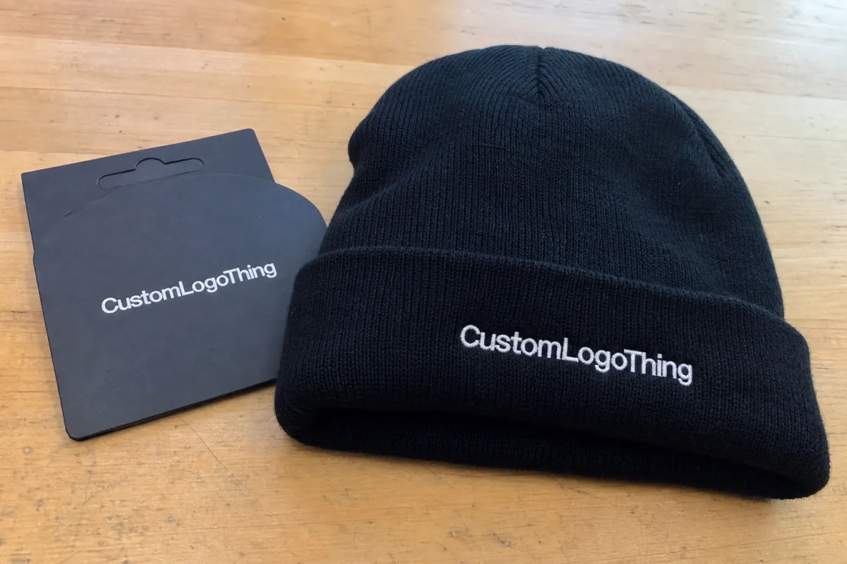
Why embroidered beanies feel premium on launch day
A beanie lands right where people look first: around the face, near the eyes, and in the middle of a photo frame. That gives it more presence than most merch. Hoodies get hidden under jackets. Totes vanish off-camera. A beanie stays visible, especially in cold-weather launches where people are wearing fewer layers. If the stitch density and thread contrast are right, a centered cuff logo can still be readable from 6-10 feet away.
Embroidery adds texture, and texture makes a product feel made with care. Print can work on knit goods, but it usually does not give the same depth. Stitching catches light, lifts slightly off the fabric, and feels built into the piece instead of sitting on top of it. On paper that sounds small. In hand, it changes the whole read. A 40 wt polyester thread in a satin stitch will usually give a sharper edge than a heavy fill on a loose rib knit, and that difference shows up the moment someone folds the beanie or pulls it on.
There is also a practical reason these pieces keep working after launch week. People wear beanies in real life, not just for the campaign. They end up on commutes, at events, in mirror selfies, on dogs, over bad hair days. A clean embroidered mark keeps appearing long after the feed slows down. That is why the better drops stay simple. The product has to hold up after the hype fades, and it has to do it without the logo puckering, cracking, or losing shape.
"A beanie is small real estate. If the logo is fighting the knit, buyers feel it before they can explain why."
The premium effect also depends on restraint. A big logo on a small front panel can look pushed. A tidy cuff mark, by contrast, can make the whole release feel more considered than the price suggests. The piece does not need to shout. It just needs to look like someone made a few good decisions on purpose. That usually comes down to one strong mark, one placement, and a yarn base dense enough to hold the stitches without warping.
That is why embroidered beanies keep showing up in brand drop plans. They are compact, visible, and still affordable enough to produce at scale without feeling generic. The real challenge is not finding a beanie. It is choosing one that carries the mark cleanly, whether you are sampling 100 pieces or placing a 1,000-unit launch order.
How embroidery works on knit beanies
The process starts with artwork, not thread. A logo that looks crisp on a screen still has to be translated into stitch structure. That translation is digitizing, and it is where a lot of projects either get smarter or get wrecked. Thin lines may need to be thickened. Tiny type often has to come out. Complex crests usually need to be simplified before they can survive on a flexible knit surface. Most suppliers will ask for vector artwork first, then build a stitch file for a multi-needle machine such as a Tajima, Barudan, or ZSK setup.
Flat mockups help, but they are not enough. Knit fabric stretches. Cuffs curve. The front panel shifts depending on gauge and yarn density. What looks balanced on a screen can tilt, close up, or lose legibility once the thread starts pulling against the body. A looser 7-gauge knit usually needs more simplification than a tighter 12-gauge body, especially when the logo uses small type or thin line art.
The knit matters just as much as the logo. A tighter gauge gives the embroidery a more stable base. A looser rib can swallow detail and soften the edges more than you want. Cuffed beanies are usually the easiest place to embroider because the folded area creates a flatter field. Slouch styles can work too, but they are less forgiving when the logo needs to carry a lot of visual weight. With looser knits, shops often add a lightweight cutaway backing and a water-soluble topping so the stitches do not sink into the yarn.
Most embroidery on beanies falls into a few stitch families:
- Satin stitch is a good fit for letters, short strokes, and edges that need to stay crisp.
- Fill stitch covers larger shapes, though heavy fills can make the knit feel stiffer than planned.
- Outline stitch works best for tiny marks or simple logos that need clarity more than coverage.
Stitch count is a practical limit, not a bragging right. On beanies, a logo that lands somewhere in the 4,000-8,000 stitch range often wears better than one pushed much higher. More stitches can mean more detail, but they also add density, stiffness, and a better chance that the front panel starts feeling like a patch. If the logo depends on fine type or multiple thread colors, simplify it early. That is cheaper before quoting than after sampling.
A stitched sample is not busywork. It is the first real look at how the piece behaves. Thread sheen, tension, fabric stretch, and logo size all change once the embroidery is physical. A sample shows whether the mark feels centered, whether the cuff sits right, and whether the logo still reads when the beanie is worn instead of laid flat. A workable sample flow is artwork cleanup, digitized proof, thread match, stitch-out sample, then pre-production approval. Expect 3-7 business days for the first sample and 18-22 business days after approval for bulk production, depending on quantity and color complexity.
What changes the look and hand-feel of a branded beanie
Four specs do most of the work: yarn type, gauge, cuff depth, and crown shape. If those are off, the logo has to make up for it, and that usually ends badly. A chunky acrylic body can feel warm and substantial, but it may blur the edges of fine embroidery. A tighter knit gives the stitches a more stable surface, which usually improves readability and makes the piece feel more refined. For premium drops, many teams choose 100% acrylic for consistency, recycled acrylic when sustainability is part of the story, or wool blends when they want a softer, more elevated hand.
Material choice changes the customer experience too. Acrylic is common because it is affordable, predictable, and easy to produce in volume. It also holds color well. Recycled acrylic or blends can help with sustainability messaging, though they sometimes come with a slightly different hand-feel and a modest price bump. Wool or wool blends push the product into a higher-end lane, but they also raise care expectations and can make sizing feel a little less forgiving. If the fabric is organic cotton or includes organic yarn, GOTS is the certification to ask for. If the beanie uses recycled yarn, GRS is the stronger signal. For safety and chemical control on finished goods and trims, OEKO-TEX Standard 100 is common. WRAP and BSCI are widely used for factory social compliance checks.
Color is another place where teams overcomplicate things. A tonal thread choice often looks more expensive because it is quieter. Contrast thread gives faster recognition and reads better from a distance. Multi-color logos can work, but only if the artwork earns it and the thread changes do not make the mark feel busy.

