Embroidery for retail hat brands works because it makes a cap feel finished, not just branded. A clean stitched logo can push a hat out of promo territory fast, especially when the crown holds its shape and the placement feels deliberate. The opposite happens just as quickly: a logo that sits too low, stitches too tight, or drifts off center can make an otherwise good cap look rushed. Most of the difference comes down to small production choices people do not notice until the sample is in hand.
That is why embroidery keeps showing up on premium basics, golf and outdoor lines, heritage-inspired collections, and seasonal drops. It gives more perceived value than flat print on most caps, and it ages better when the blank, thread, and construction all pull in the same direction. A retail hat has to do more than photograph well. It needs to hold its shape on a shelf, read clearly from a few feet away, and still feel worth the price after it has been handled a dozen times.
Embroidery for Retail Hat Brands: Why It Wins on Shelves
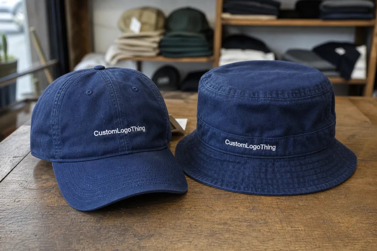
Retail buyers usually judge a hat in seconds. They notice the crown shape, visor curve, stitch quality, and whether the branding feels intentional or just dropped on top. Embroidery helps because it adds texture and depth without cluttering the design. On a structured cap, especially a six-panel style with a firm front, even a simple logo can look polished once it is stitched cleanly.
The strongest retail caps usually stay restrained. One or two colors, a readable silhouette, and placement that fits the brand do more than crowded artwork ever will. A rugged outdoor label may want a stronger front hit. A lifestyle brand may do better with tonal stitching or a smaller side mark. The choice is not about adding more decoration. It is about picking the right amount of detail for the story the hat needs to tell.
Buyers also look at how embroidery photographs. Stitch texture catches light in a way print does not, which helps on ecommerce product pages and in wholesale line sheets. That matters more than teams expect. If the hat looks solid in a flat-lay and still feels good in hand, it is much easier to sell through without leaning on discounts.
- Best fit: premium basics, outdoor and golf styles, heritage brands, and limited retail releases.
- Best look: bold logos, clean type, simple shapes, and limited thread colors.
- Main risk: tiny text or thin details that will not survive stitching on curved fabric.
Embroidery Process: From Artwork to Sewout
Embroidery is a production process, not a direct upload. It usually starts with vector artwork, then digitizing, then a sewout or sample, then approval, then bulk production. Each step can change the final hat more than a first-time buyer expects, which is why clear specs matter. A clean art file saves time, but a clear production brief saves money.
Digitizing translates the logo into stitch instructions. The digitizer decides stitch direction, density, underlay, pull compensation, trims, and how the needle exits each shape. Those choices determine whether the embroidery sits cleanly on the cap or starts to bunch, pucker, or close up. Fine serif type, hairline icons, and tight internal spacing are common trouble spots. They may look elegant on screen and fail once they become stitches. That is not just a file problem; it is often a scale problem.
For retail hats, a practical art package includes the vector logo, approximate placement, target size in inches or millimeters, thread color direction, and the cap style being decorated. If the brand is strict about color, include Pantone references and ask for the closest available thread match. If the cap has a small profile, say so up front. A design built for a high-crown foam trucker will not always behave the same on a soft unstructured dad hat.
The sewout is the check that protects the run. It shows how the stitches actually sit, where the logo pulls, and whether the size needs to change. Skipping that step is one of the fastest ways to approve a run that looks fine in proof and wrong in production. If the sample is off, the bulk order will repeat the same problem hundreds or thousands of times.
A sewout is not a formality. It is the point where the design stops being theoretical and starts behaving like a real product.
Shipping and packaging can shape the final experience too. If hats are going into cartons, then into retail distribution, or moving through ecommerce fulfillment, the supplier should pack them so the brim and crown keep their shape. Transit testing standards from organizations such as ISTA are useful when rough handling is part of the trip. If sustainability claims matter to the brand, carton sourcing through groups like FSC can be part of the conversation as well.
Pricing, MOQ, and Unit Cost for Retail Hat Orders
Pricing for embroidered retail hats usually breaks into four parts: the blank cap, digitizing, decoration, and finishing. Sometimes packaging, labels, and freight sit inside the quote, and sometimes they do not. That is why comparing two prices without comparing the exact spec can be misleading. One quote may include thread trims, carton packing, and label application while another leaves those costs out.
For straightforward retail embroidery, the decoration add-on on larger runs often lands around $0.90-$1.80 per cap. A more complex logo, heavier stitch count, or multi-placement layout can move that higher quickly. 3D puff embroidery usually adds another $0.40-$0.90 depending on size, shape, and how much foam is needed to build the profile. Small runs usually cost more per unit because the setup is spread across fewer pieces. There is no real way around that.
Digitizing is usually a one-time fee for a design, often in the $25-$100 range for a standard logo. If the art needs cleanup, multiple sizes, or several placement files, the cost can rise. Some suppliers roll the fee into the unit price for larger runs. Others separate it. Either approach works if the buyer knows what is included.
Minimum Order Quantity depends on the blank, the decoration method, and the supplier’s production system. A simple embroidered run on a common cap style may be possible at a lower MOQ, while puff, multiple placements, or unusual closures often push the minimum higher. Buyers sometimes expect a boutique quantity with a factory price. That rarely holds up. Setup has a real cost, and the smaller the order, the more visible that cost becomes.
| Option | Typical Add-On Cost | Best For | Watch-Out |
|---|---|---|---|
| Flat front embroidery | $0.90-$1.80 | Simple logos, clean retail basics | Tiny text can close up |
| 3D puff embroidery | $1.40-$2.70 | Bold marks on structured caps | Not friendly to fine detail |
| Multi-placement embroidery | $2.50-$4.00+ | Premium branding, side and back hits | Costs climb quickly |
Unit cost only tells part of the story. For a retail line, the full landed cost should include sample fees, revisions, freight, packaging, polybags if used, and any label or barcode work required by the account. A hat that looks attractive at first quote can lose margin once those pieces are added. That is usually where buyers realize the blank choice matters just as much as the embroidery itself.
Hat Styles, Stitch Count, and Placement Choices
Hat style changes how embroidery behaves. A structured six-panel cap gives the design more support, while an unstructured dad hat lets the fabric move more, which can soften the look. Curved visors, low profiles, and seam placement all affect where a logo can sit without distortion. What looks balanced on a flat mockup may shift once the cap is on a head.
Stitch count matters because it affects both cost and finish. More stitches can add richness, but too many in a small area can make the design dense and heavy. A simple wordmark may need very little stitch work to read well. A detailed illustration can need simplification before it becomes production-friendly. The goal is not to max out the count. It is to get the design to read cleanly at retail distance.
Placement usually comes down to front, side, back, or a mix of those locations. Front embroidery carries the brand. Side placement can feel more refined and is useful when the front needs to stay quiet. Back hits can help with detail, but they are easy to overdo. The cleanest retail programs tend to choose one focal point and keep the rest of the cap quiet.
- Structured caps: better for larger logos and puff embroidery because the front panel holds shape.
- Unstructured caps: better for smaller, softer branding that can follow the fabric naturally.
- Multi-placement layouts: useful when the brand wants premium detail, but they raise cost and approval time.
Thread, Backing, and Color Decisions That Change the Look
Thread choice changes the personality of the hat more than most people expect. A matte thread can feel subdued and work well for heritage or outdoor brands. A slightly brighter thread can give a logo more pop in store lighting and on camera. The thread is a small detail, but it can shift the whole read of the product.
Backing matters too. It supports the stitches on the inside, helps control distortion, and influences how the embroidery sits on the cap. A lighter backing may be enough for a small flat logo. A denser design or puff area may need more support to keep the front smooth. If backing is too soft, the embroidery can move. If it is too heavy, the cap can feel stiff in the wrong way.
Color decisions should be made with the blank in mind, not separately from it. A cream cap changes how white thread reads. A dark green cap can make a navy logo disappear from a distance. Good color choices account for contrast, store lighting, and how the product will be photographed. When the palette is tight, the hat looks more intentional. When the palette is loose, it usually looks like a sample that never got edited.
Many retail buyers also ask about tonal embroidery. It can be a strong choice when the brand wants something quiet but still premium. The downside is simple: tonal work can disappear if the contrast is too low or the stitching is too fine. That is why a good sample matters more than a color swatch sheet.
Timeline: Sampling, Approvals, and Production Steps
Most embroidery timelines start with artwork review and digitizing, then move into sample making, approval, and bulk production. A straightforward order can move quickly once the file is ready, but revisions are where schedules usually stretch. If the design is not production-ready, the calendar will show it.
The sample stage is where a buyer should slow down. Check the logo size, placement, stitch density, thread color, and how the embroidery sits on the crown. If the cap will be sold in a store, put it next to other products and look at it from a few feet away. That test catches more problems than staring at a screen ever will.
Once the sample is approved, the factory can run the bulk order with fewer surprises. Good suppliers will still flag issues if the fabric lot changes, the thread batch differs, or the cap structure shifts during production. Those checks take time, but they protect the final result. A clean approval now is faster than fixing a full run later.
- Artwork review: confirm size, placement, and any color references before digitizing starts.
- Sample approval: check the physical sewout, not just a digital mockup.
- Bulk production: lock the spec, then keep revisions out of the line unless there is a real issue.
Common Mistakes Retail Buyers Make With Embroidered Caps
One common mistake is treating embroidery like print. Thin lines, tiny letters, and crowded detail often look fine in artwork and fail in thread. A second mistake is ignoring the cap blank. The same logo can behave very differently on a structured snapback than it does on an unstructured dad hat. The blank is part of the design, not just a carrier for it.
Another problem is approving from a mockup alone. Digital proofs are useful, but they do not show how thread, backing, and fabric interact. A sewout catches the real issues: pull, puckering, spacing, and the way the cap sits after stitching. It is a cheap step compared with reworking a finished order.
Buyers also lose money by underestimating landed cost. A quote that looks attractive can change once packaging, freight, labels, and sampling are added. The margin on a retail program depends on the full picture, not the unit decoration price alone. That is usually where the best buyers slow down and ask for the complete spec sheet.
- Too much detail: fine art often needs simplification before it can be stitched cleanly.
- Wrong blank: the cap shape should support the design, not fight it.
- Premature approval: approving from a mockup alone is asking for surprises later.
Retail-Ready Decisions That Hold Up in Production
The best retail hat programs are usually the ones that make a few smart decisions early and stick to them. They choose a cap body that fits the brand, keep the logo readable at real-world distance, and allow enough room in the schedule for sampling. The result is not flashy. It is dependable, which is what retail usually rewards.
Simple tends to age well. A crisp logo on a solid blank can still look current after the trend cycle moves on. That does not mean every hat should be minimal. It just means the strongest designs are often the ones that do one thing well. In production, clarity beats complexity more often than teams expect.
Good retail embroidery also respects how the hat will live after it leaves the factory. It needs to ship well, hang cleanly, photograph cleanly, and still feel sturdy when someone picks it up in store. If a hat can do all of that without looking overworked, the design is doing its job.
FAQ
What logo types work best for embroidered retail hats? Clean wordmarks, simple icons, and bold shapes usually stitch best. Thin lines and tiny text can work only if they are scaled and digitized carefully.
Is 3D puff embroidery a good retail choice? Yes, when the brand wants a stronger, more dimensional look on a structured cap. It is less suited to fine detail or soft unstructured styles.
Why does a sewout matter so much? It shows how the embroidery actually behaves on the cap. That is the easiest way to catch size, placement, and pull issues before bulk production.
Can a small order still make sense? It can, especially for a test drop or limited release. The unit price will usually be higher, so the margin math needs to be clear from the start.
What should buyers send first? A vector logo, the cap style, target placement, desired size, and any thread color direction. If the brand is strict on color, include Pantone references too.

