Matte poly mailers look premium until the warning label tells a different story. A label that curls, wrinkles, prints too softly, or lands crooked on a fold makes the whole package feel improvised. That matters for fitness brands because apparel buyers notice presentation fast. Leggings, tees, hoodies, and sets all arrive in a shipping format that can either reinforce the brand or make it look one step away from a warehouse bin.
The packaging problem is not hard in theory. In practice, it is a stack of small decisions that need to agree with each other: the film finish, the mailer size, the adhesive, the label stock, the warning copy, and the packing flow. If one piece is off, the package looks off. The math is unforgiving because customers compare your mailer to the last polished brand they ordered from, not to a supplier spec sheet.
Why matte finishes make warning labels look wrong fast
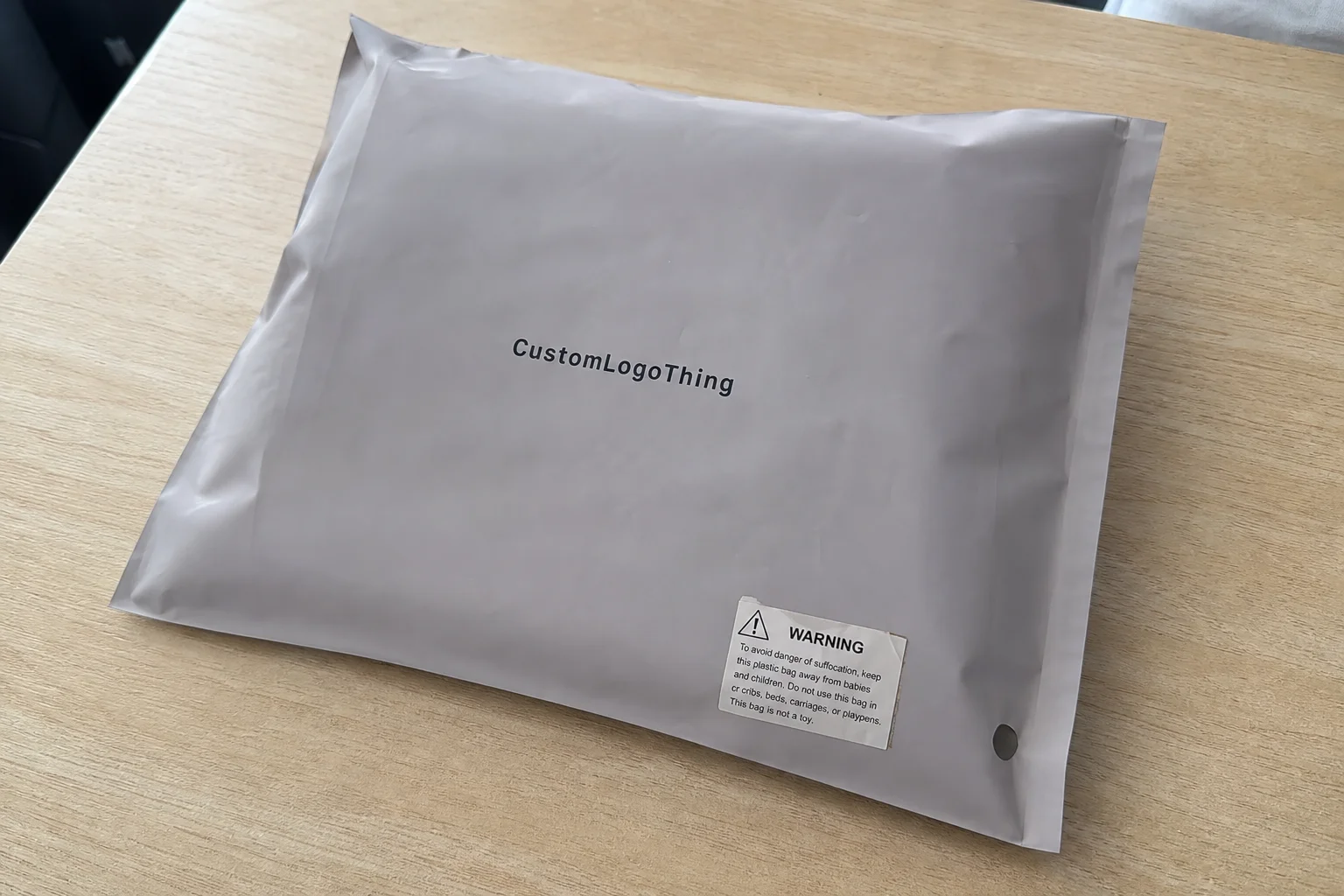
Matte poly mailers are popular for activewear because they reduce glare, hide scuffs, and photograph better than glossy film. They also feel less disposable. That makes them a smart fit for fitness brands that spend money on product styling and want the outer packaging to match.
The catch is contrast. Matte surfaces mute shine, which is good for the bag but unforgiving for a weak label. A label that might pass on gloss can look muddy on matte if the ink is too light or the face stock is too soft. Small type gets even harder to read once it is printed on a curved or flexing surface.
Most problems do not show up during mockup review. They show up once the package goes through real handling: packed by hand, stacked in cartons, shifted in transit, and exposed to warm or cold warehouse conditions. A label that looked flat on a desk can lift at one corner after a few hours of friction. Once that happens, the package starts to look like compliance was added as an afterthought. That is a poor fit for a brand trying to charge premium prices.
A matte bag hides scratches. It does not hide a bad label spec.
That is why the packaging stack should be treated as one system. The mailer, the warning label, and the artwork all need to work together. If the warning copy is supposed to be functional, keep the design simple enough that the message stays readable at arm’s length. Save the decorative work for the branded surface of the bag.
How the guide works in practice
A useful way to think about a matte poly mailer setup is in three layers. First is the film itself, which controls the look, the surface feel, and some of the abrasion resistance. Second is the mailer structure, meaning the size, seal area, thickness, and whether the bag is blank or printed. Third is the warning label, which may need suffocation language, handling instructions, retailer-specific copy, or shipping identifiers depending on the channel.
Adhesive choice carries more weight than many buyers expect. A pressure-sensitive label that works fine on coated paper does not always behave the same on flexible plastic. If the bag flexes during packing or sits in less-than-ideal storage conditions, weak adhesive can start to curl. Heat, humidity, and cold all matter. So does rub resistance. A label does not just need to look right on approval day. It needs to survive the trip out the door.
Warning copy is where brands often drift into guesswork. Some retailers require a specific suffocation warning. Some lanes want a different format. Some markets use their own compliance wording. If there are multiple destinations, keep those versions organized from the start rather than asking a packing team to sort it out live. Version confusion is expensive because it creates both mispacks and reproofs.
Contrast should be treated as a functional requirement, not a decorative choice. A clean white label with enough margin and a legible font usually performs better than a styled label that looks good in a render. If the label needs to sit on a dark bag, ask for a reserved print panel or a label face that gives the text enough separation from the background. For the packaging components themselves, start with the right product family from Custom Poly Mailers and pair it with the right finish on Custom Labels & Tags.
Specs that matter for gym apparel, leggings, and hoodies
Mailer size comes first. A folded tee, a pair of leggings, and a hoodie do not behave the same way in transit. A size that works for slim apparel can feel cramped once thicker fleece or a boxed set is involved. If the mailer is too tight, the seal rides over a bulge, the label lands on a crease, and the final package looks overfilled. That is the kind of detail customers notice without being able to name it.
For activewear, the most useful spec conversation usually starts with film thickness, opacity, and seal strength. In Custom Poly Mailers, a common range is around 2.5 to 4 mil, depending on the product weight, shipping abuse, and how much stiffness the brand wants in hand. Thicker film can help the bag feel sturdier, but thicker is not automatically better. It adds cost, and in some cases it adds stiffness without solving the actual problem.
Matte finish is usually worth the extra spend when the brand wants fewer visible scuffs, a softer look, and less glare in product photography. That said, matte surfaces can show fingerprints and pressure marks differently than gloss. The packaging team should see the real material under real lighting before approving a production run. Rendered color and physical color are not the same thing.
Labels deserve the same level of scrutiny. Ask about the face stock, the adhesive temperature range, and whether the label is meant for flexible plastic or a more rigid surface. If the bags will be packed in a warm room, held in cooler storage, or moved through a high-friction fulfillment line, test the label on the exact mailer film. A sample sheet is not enough. The surface interaction is the whole point.
For transit testing and general packaging validation, ISTA provides a useful reference frame. It is especially relevant if the bags will face stacking, drop risk, or longer freight lanes. If the package stack includes recycled-content claims or sourced paper components elsewhere in the order, FSC is the certification many buyers already understand.
If you are comparing options for the same product drop, focus on use case rather than marketing copy.
| Option | Best for | Typical unit impact | Notes |
|---|---|---|---|
| Blank matte mailer + pressure-sensitive warning label | Test runs, smaller orders, frequent copy changes | Lowest setup cost; labels usually add a small per-unit amount | Useful when the warning text may change |
| Printed matte poly mailer with applied warning label | Branded DTC apparel drops | Moderate cost with better shelf and unboxing appeal | Common balance of presentation and flexibility |
| Custom-printed warning text on bag | High-volume programs with stable compliance text | Higher setup cost, lower labor per unit | Use only if the wording is locked for the long term |
Cost, MOQ, and unit price levers
Pricing is usually driven by five variables: bag size, film thickness, print coverage, label quantity, and how many versions of warning copy are needed. Custom artwork adds another layer, but the bigger swing often comes from version control. One mailer spec with one label version is easy to manage. Three label versions across two bag sizes is where cost and errors begin to multiply.
MOQ changes the economics quickly. Smaller minimums help a brand test a new drop, a new size run, or a new channel without overcommitting inventory. The tradeoff is a higher unit price. That penalty is normal. It reflects setup time, material waste, and the fact that smaller orders spread fixed costs over fewer pieces. Once the spec stays consistent across repeats, pricing usually improves.
There are hidden costs that rarely appear in a first quote. Rush proof changes can trigger a reproof fee. Mixed label versions can slow packing. Freight is often left out of early comparisons even though it still lands on the bill. Rework is another quiet cost. A cheap bag that needs relabeling, repacking, or replacement is not cheap. It is just a future expense with nicer branding.
For buying decisions, compare landed unit cost, not just factory price. Include freight, label application labor, spoilage allowance, and any replacement terms if the adhesive or print comes in wrong. If a supplier cannot explain those pieces clearly, the quote is incomplete. That is a warning sign, not a minor omission.
A practical frame for fitness brands looks like this:
- Test run: expect higher per-unit cost, but lower risk.
- Repeat order: expect better pricing if the spec stays unchanged.
- Complex label rules: expect extra setup or application cost.
- Long freight lanes: expect landed cost to matter more than headline price.
One more point that buyers often underweight: labor. If a warning label needs to be applied by hand, the cost is not just the sticker. It is the time needed to place it correctly, verify the orientation, and keep the result consistent across thousands of units. For a small batch, that labor may be acceptable. For a larger run, the economics change quickly.
Production steps and turnaround timeline
The cleanest projects move in a straight line: spec sheet, artwork proof, sample review, production, labeling, packing, and shipment. That order matters. Skipping steps does not really save time. It just moves the problem downstream, where it becomes harder and more expensive to fix.
Proofing usually takes longer than buyers expect. That delay is rarely about the PDF itself. It is about confirming the warning text, checking label placement, checking how the matte finish affects readability, and making sure the package still looks clean once the label is overlaid. If there is a barcode, retailer instruction, or compliance mark, those details need to be settled before the run starts.
For timing, a straightforward order often looks like this: one to three business days for proofing, several days for sample approval if a physical sample is needed, then roughly 10 to 15 business days for production once artwork is final. Freight and fulfillment prep sit after that. When a vendor promises a much shorter schedule, ask what part of the process they are skipping. Usually it is testing or review, and that is not efficiency. That is risk.
Larger brands and retailers may ask for distribution validation, especially if the package has to tolerate stacking, drops, or temperature shifts. A simple test plan modeled on ISTA practices can prevent a reprint that shows up after the inventory is already booked in. The point is not to over-engineer every mailer. The point is to avoid discovering a weak adhesive after 8,000 units are sealed.
Case Studies are useful because they show how a spec behaves in a real order rather than in a render. That difference matters more than most buyers want to admit.
Step-by-step ordering checklist for a first run
Start with the garments, not the mailer. Measure the folded dimensions for leggings, tees, hoodies, and sets after they are packed the way fulfillment will actually pack them. A flat garment measurement does not tell you what the bag needs to contain. If the size data is wrong at the beginning, every later decision is built on a bad assumption.
Next, choose the bag size and finish. Matte usually works best for activewear brands that want a softer visual and less shine in product photos. Then lock the warning label location. The packing team should not be deciding, order by order, whether to place the label over a seam, over a graphic, or too close to the seal line. That decision belongs in the spec.
Request a proof that shows the exact warning text, label dimensions, placement, and any contrast treatment. If the label is going on a dark bag, ask how readability is being protected. A white label face, larger type, or a reserved print panel can solve the issue. Guesswork cannot. A label that is technically present but hard to read is a bad outcome in both compliance and brand terms.
Before signing off on production, run one physical sample through the real packing flow. Pack it, tape it, stack it, and move it through the same conditions the finished order will face. A sample that looks perfect in a studio can fail once it sits next to cartons, thermal printers, and moving hands. That is where the weak spots show up.
- Measure packed garment dimensions.
- Choose bag size with seal room.
- Confirm warning copy for each channel.
- Check label adhesion on actual mailer film.
- Approve one physical sample before the run.
Keep the first order simple if you can. One bag size, one finish, one warning version, one approved label placement. Complexity should be added only when there is a real reason for it, not because someone wants the artwork to feel clever. The more variables you add, the more likely you are to create a problem that only appears after inventory is in motion.
Common mistakes that trigger reprints or complaints
The first mistake is using a label stock that behaves well on paper but lifts on matte film after a normal temperature swing or some warehouse friction. That kind of failure usually shows up at the worst time, after the shipment has left your control and the customer or retailer is the one opening the bag.
The second mistake is choosing a mailer that is too small. Overstuffing stretches the seal and forces the label onto a crease. Once the package is bulging, the warning label stops looking intentional. It starts looking like damage control.
The third mistake is changing the warning language late in the process. A legal tweak, a retailer-specific requirement, or a channel update may be legitimate. Still, once the proof is approved, a wording change can trigger a new proof cycle and a schedule slip. Small text edits can create outsized delays.
The fourth mistake is skipping real handling tests with actual folded garments. This is how brands discover the bag fits the sample but not the hoodie, or the label sits straight until the mailer is packed and the corner buckles. The test is boring. It is also much cheaper than a reprint.
Another recurring issue is overdesign. Heavy graphics on a warning label can make compliance text harder to scan. If the label is there for shipping and safety, clarity should win. Branding belongs on the mailer face or inside packaging, not inside the warning block.
Finally, some teams approve a spec without writing down what “approved” means. That usually leads to a later argument about label size, finish, or placement. If no one can point to one master proof, the order is already vulnerable.
Expert tips and next steps before you reorder
Use one simple spec sheet for every reorder. Include bag size, film thickness, matte finish, label size, label stock, warning copy, and approved placement. If the same order has to be explained in three different ways, the spec is not locked. It is drifting.
Ask for a label adhesion test on the exact mailer material you plan to ship with, not a generic sample. Flexible plastic behaves differently than paperboard, and different adhesives respond differently under heat, cold, and pressure. A vendor that can test the actual combination is helping you reduce returns and rework. A vendor that cannot should be treated with caution.
Keep one approved master proof and one physical sample in the office or fulfillment area. That gives operations, design, and packing the same reference point. It also cuts down on the classic “I thought we used the other version” dispute. Packaging teams lose time to version confusion more often than they lose it to printing defects.
Before you reorder, compare at least two quotes on the same exact spec. Ask for landed cost, timeline, and replacement terms in the same format. If one quote looks cheaper but is vague about freight or defect handling, the price is not really lower. It is just less complete.
For brands that want a cleaner packaging stack, start with the right system from Custom Packaging Products, then match the mailer to the label rule set. That is the practical way to keep presentation high and compliance from feeling bolted on. The best fitness brands matte poly Mailers Warning Label guide is not a style exercise. It is a spec discipline exercise.
FAQ
Do fitness brands need warning labels on matte poly mailers?
Often yes, especially if the shipping lane, retailer, or destination market requires a suffocation or handling warning. The exact wording depends on the channel, so the label text should follow the destination rule set rather than a generic template.
What label material sticks best to matte poly mailers?
A pressure-sensitive label with an adhesive designed for flexible plastic usually performs best. The real test is whether it still holds through warehouse heat, cooler storage, and abrasion during transit, so sample it on the actual mailer film before approval.
How much do warning labels add to unit cost on custom mailers?
Usually not much per unit, but setup, label stock, and application labor can move the total more than the sticker itself. The number that matters is landed unit cost after freight, spoilage allowance, and any rework risk are included.
What is a realistic turnaround time for custom matte poly mailers with labels?
Expect proofing first, then production, then shipping. A straightforward run often needs a few business days for proofing and roughly 10 to 15 business days for production after artwork is final, though changes to warning copy or placement can extend that timeline.
How should a fitness brand size a matte poly mailer for hoodies or leggings?
Measure the folded garment after packing, not just the garment flat size. Leave enough room for a clean seal and flat label placement, or the bag will look overfilled and the warning label will be forced onto a crease.