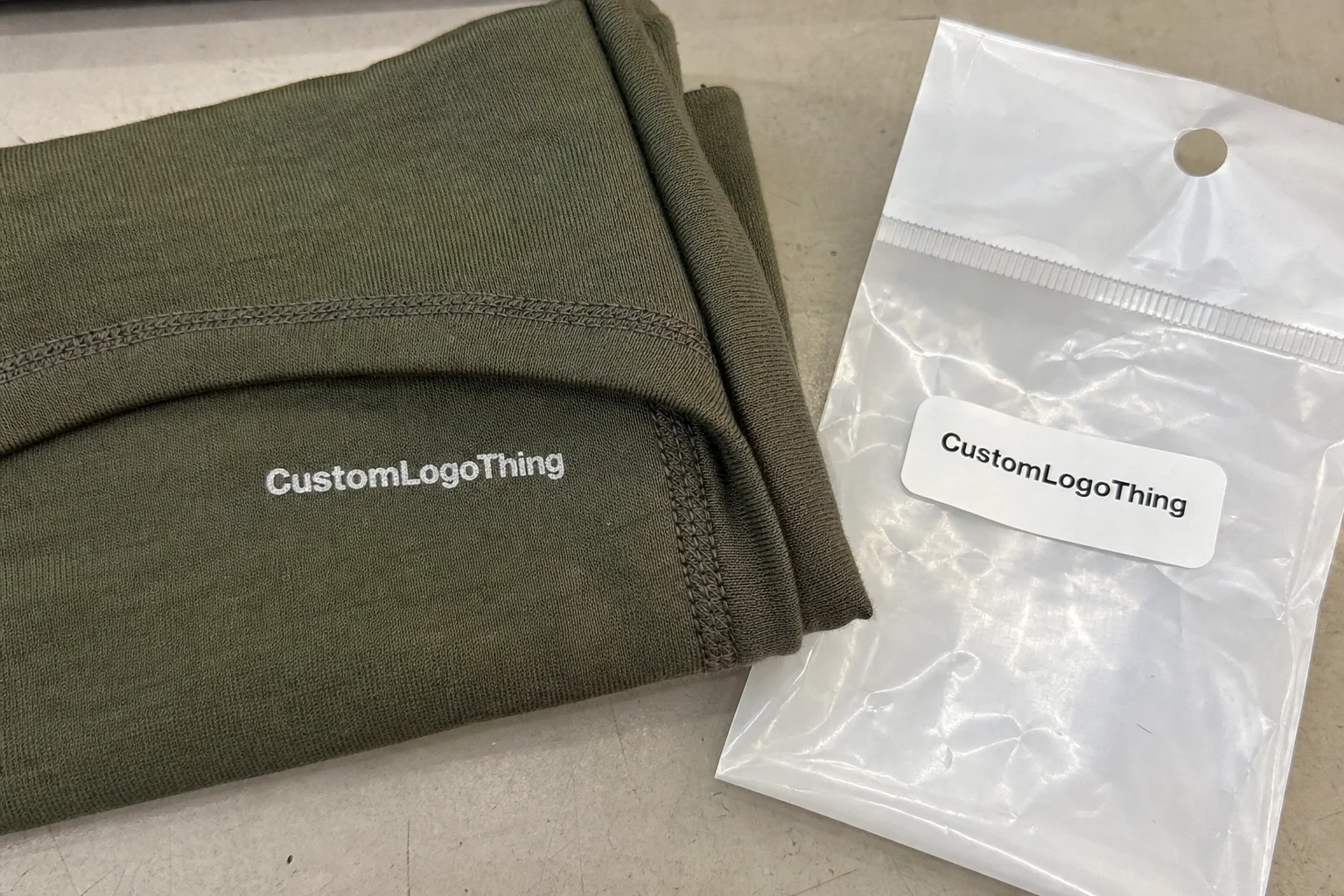
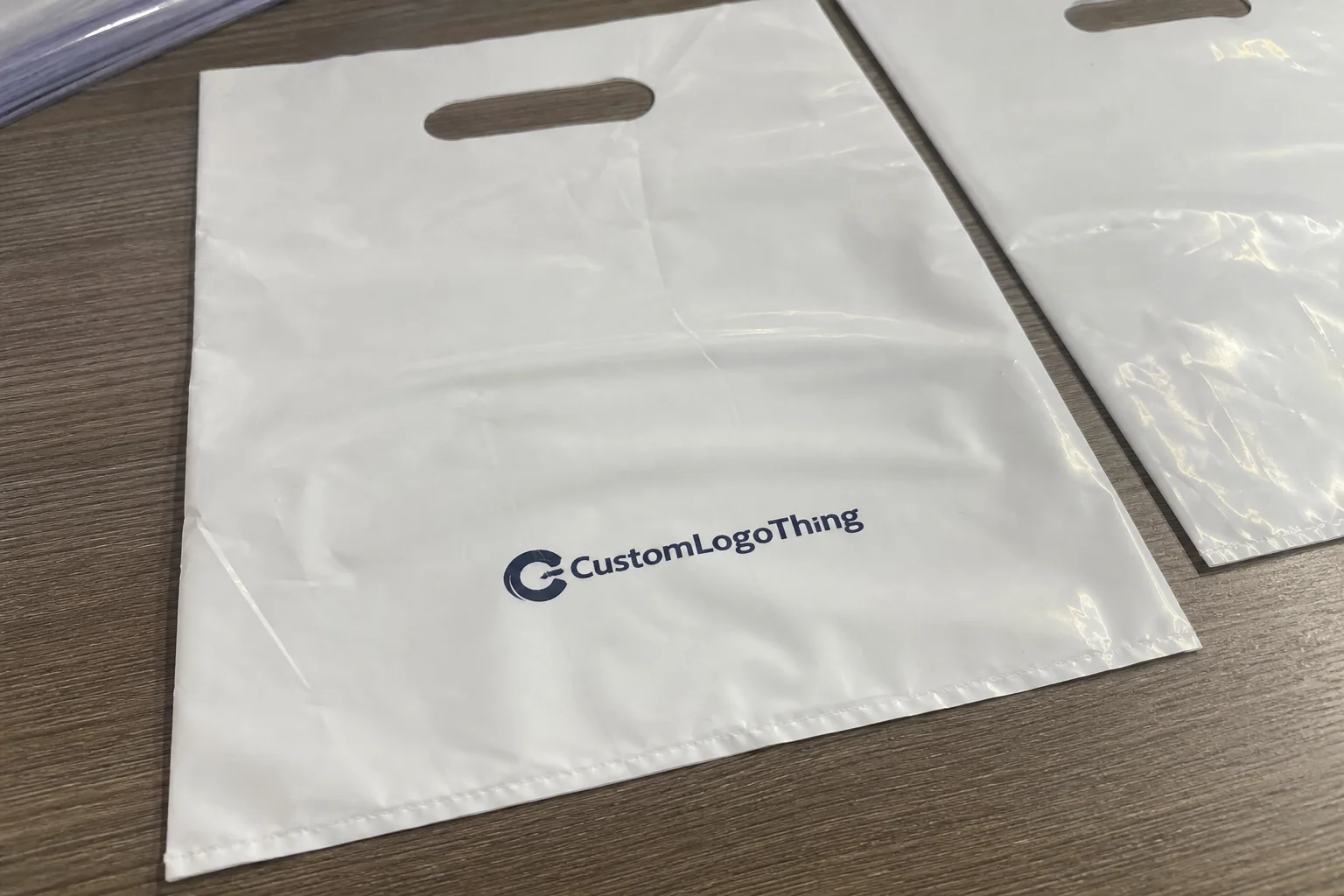
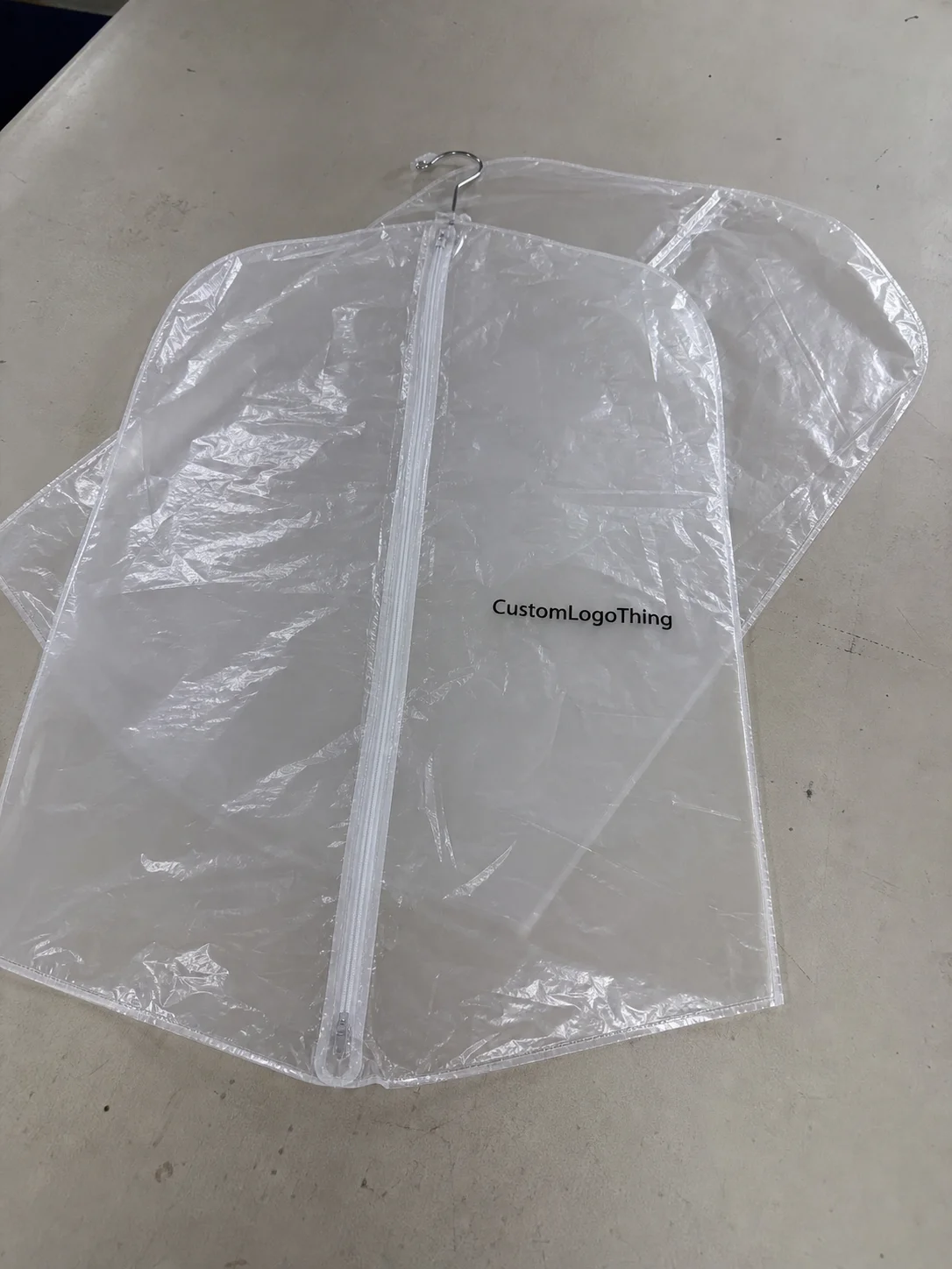
Waterproof packaging gets a lot of credit it does not always deserve. A sealed poly mailer can keep out rain, dust, and some warehouse moisture, but that alone does not prevent mis-sorts, scuffed labels, or the kind of handling confusion that turns into returns. For beauty samples and apparel, the warning label is often the part that decides whether the shipment is treated correctly once it leaves the packing table.
That is the core idea behind a beauty samples Waterproof Apparel Mailers warning label guide: the outer bag, the label, and the packout have to work as one system. Beauty samples can include liquids, fragrance, droppers, sachets, or fragile vials. Apparel is lighter and usually less breakable, but it still needs moisture protection, size identification, and a clear handling message. The wrong label does not just look off-brand. It creates friction in the warehouse and uncertainty in transit.
Buyers often focus first on the mailer material, then discover the label is where the real problems start. That sequence is understandable. Waterproof Poly Mailers are simple enough to compare by thickness and size. Labels are where adhesive chemistry, surface energy, print durability, and placement all start to matter. Ignore that layer and you can end up with a package that is weather-resistant on paper but weak in practice.
Why warning labels matter more than the mailer itself
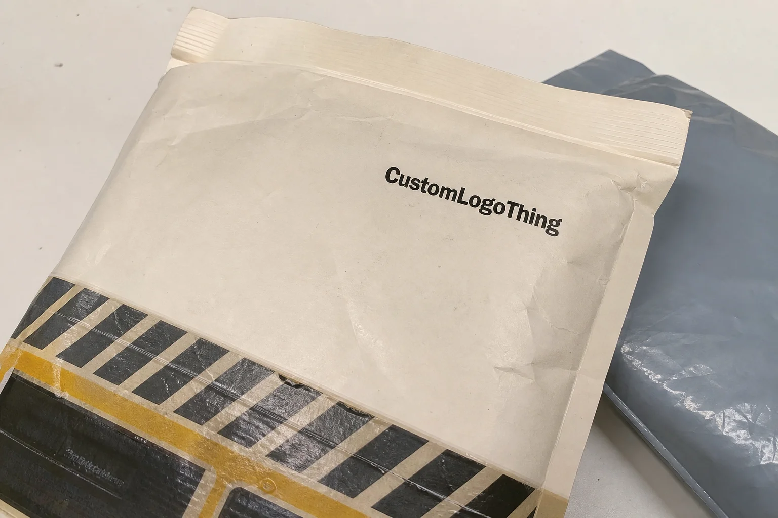
A waterproof outer bag protects against moisture. It does not tell a sorter whether the contents are fragile, liquid, scented, or sample-based. That distinction matters more than many brands expect. If the message is unclear, the package may still be handled too roughly, stacked in the wrong place, or opened by a team that was not prepared for what was inside.
In packaging terms, a warning label includes any printed notice that communicates handling risk or product condition. That may be Fragile, Keep Dry, Do Not Crush, Sample Contents, or a similar short instruction. It is not primarily for decoration. It exists so the people touching the parcel can make a fast decision without hunting for extra context.
A waterproof mailer handles weather. A warning label handles behavior. Those are different problems, and the second one is usually the more expensive one when it goes wrong.
For beauty samples and apparel, the strongest packaging setups usually combine three elements: a moisture-resistant mailer, an interior packout that protects the product, and a label that communicates what the shipment needs. If one of those pieces fails, the entire shipment becomes less predictable. The label matters because it reduces ambiguity at the exact point where packages are being moved quickly.
The message should be short. Long explanations rarely survive a busy warehouse floor, and they do not improve compliance much anyway. In most facilities, the people handling the bag are looking at it for seconds, not minutes. High contrast, simple wording, and consistent placement will beat clever copy every time.
For brands that ship mixed kits, sample bundles, or seasonal apparel orders, the label should be designed with the content risk first and the artwork second. That approach avoids labels that look polished but do little operationally.
How waterproof poly mailers work with beauty and apparel packaging
Most waterproof apparel mailers are made from polyethylene film, commonly in the 2.5 mil to 3.0 mil range for standard retail use. They typically use sealed side seams and a pressure-sensitive closure strip. That structure is light, flexible, and resistant to rain and dust. It also costs less to ship than a rigid carton, which explains why apparel brands rely on it so heavily.
Beauty samples are less forgiving. A sample pack may contain a small bottle, a tube, a fragrance vial, or a carded sample. Some of those items can leak if the inner seal is weak. Others can transfer scent or stain if they are not contained properly. The outer mailer helps protect against the environment outside the package, but it does not stop leakage inside the package.
Apparel is simpler, but not trivial. A garment can be ruined by moisture, crease damage, or mold risk if the packout is sloppy and the parcel sits wet for too long. It can also be misidentified if the size, return note, or special handling instruction is missing. In practice, the mailer and the label have to be treated as one unit.
That is why a beauty samples waterproof apparel Mailers Warning Label guide should start with the shipment’s real risks. If the contents are fragile, liquid, scent-sensitive, or mixed, the label should reflect that. If the bag is being used for a simple T-shirt shipment, the message may be minimal or unnecessary. Not every package needs the same degree of warning, and over-labeling can dilute attention.
Material choice also affects the look and function of the package. A matte white poly mailer often gives strong contrast for labels and a cleaner retail presentation. Darker or glossy mailers can look sharper on shelf, but they can also make labels harder to read if the contrast is not planned carefully. Clear overlays can work in some cases, but they are not the best choice when the background beneath them is busy or dark.
For buyers comparing formats, it helps to think about the whole packout instead of the shipper alone. If you need a deeper product-side comparison, the Custom Poly Mailers page covers common mailer options, and broader packout components are grouped under Custom Packaging Products. When the label itself is part of the system, Custom Labels & Tags is the more relevant place to look.
For sustainability-minded programs, paper inserts, secondary cartons, and recycled content claims deserve careful review. Resources from FSC and recycling guidance from the EPA are useful references when the packaging mix includes fiber-based components.
Key spec factors that affect label performance, durability, and placement
The adhesive is usually the first place to look when a label fails. Poly mailers are slick, and a label adhesive designed for paper cartons may peel early on film. Pressure-sensitive adhesives formulated for low surface energy materials usually perform better on polyethylene. That is not an abstract spec detail. It affects how many relabels you need, how often a label lifts at the corner, and how much rework the packing line absorbs.
Print method matters too. Digital labels work well for short runs or message changes. Flexographic and thermal-transfer systems can make more sense at higher volume. If the warning will see friction during transit, the ink and finish need enough abrasion resistance to survive sorting, stacking, and delivery. A scuff-resistant topcoat or matte overlaminate costs more, but it prevents the label from looking damaged before the parcel is even opened.
Size and contrast are functional, not decorative. A warning label that is too small, too detailed, or printed in low-contrast colors is easy to miss. In a warehouse, the package may be viewed under poor lighting and at an angle. A simple hierarchy—warning first, support text second—usually performs better than a busy layout with decorative type and extra copy.
Placement is one of the most common failure points. Avoid seams, closures, folds, and any area that bends sharply when the mailer is filled. If the warning crosses a flap or zipper area, it can wrinkle, peel, or distort the message. Keep it on the flattest visible panel and leave enough margin so the label does not crowd the edge or interfere with scannable information.
The substrate also changes the decision. A white label on a dark bag is usually easy to read. A clear label can disappear on a busy print or dark surface. Direct printing on the mailer can look cleaner, but it is less flexible if the message changes. For a lot of buyers, the only honest answer is to test the label on the actual bag, not on a sample sheet.
- Best adhesion: low surface energy adhesive matched to poly film.
- Best legibility: bold type, high contrast, short wording.
- Best protection: scuff-resistant print and flat-panel placement.
- Best workflow: one or two standard label sizes across product lines.
Standardizing the label structure makes training easier and reduces the risk of the wrong message reaching the wrong shipment. That is often where the operational savings show up first.
Step-by-step process and timeline for designing the right warning label
The cleanest process starts with the contents. List what is actually in the mailer, then identify the real risks. A beauty sample kit with fragrance and glass has a different profile from a folded apparel item with a size card. If the package does not need a warning, do not add one just to make the bag look more serious.
After that, set the message hierarchy. The main warning should be the first thing the eye catches. Supporting text can follow, but it should stay short. A label that says Fragile, Keep Dry, and Sample Pack gives a quicker read than a paragraph of instructions. The longer the message, the more likely it is to be ignored.
Then confirm the format. A 9 x 12 inch mailer does not give the same visual room as a 12 x 15.5 inch mailer, and a separate label gives more freedom than a direct print. That choice affects artwork size, barcode placement, bleed, and the amount of white space around the warning. If the layout feels crowded during proofing, it will feel worse on the production line.
Proofing should happen on the actual material. Paper proofs are useful for checking copy, but they do not tell you whether the adhesive grips slick film or whether the print survives friction. Ask for a sample or mockup and test it on the real mailer. Check adhesion, legibility, and whether the label holds after the bag is filled, flattened, and handled.
A realistic timeline often looks like this:
- Artwork and content review: 1 to 3 business days.
- Sample or proof production: 3 to 5 business days.
- Testing and approval: 1 to 3 business days.
- Final production: often 7 to 15 business days, depending on quantity and print method.
- Shipping: usually 2 to 5 business days in standard domestic lanes.
That timeline shifts with artwork readiness, material availability, and how many revisions the buyer requests. Still, it is a useful planning range for teams trying to avoid late-stage compromises. The earlier the contents and message are defined, the easier it is to keep the system consistent.
Cost and pricing considerations for custom warning labels and mailers
Price depends on more than size. For warning labels, the biggest cost drivers are adhesive type, material, print coverage, finish, and quantity. For mailers, thickness, bag size, print colors, and whether the artwork is one-color or fully custom all affect the quote. Short runs are useful for testing, but they usually carry a higher per-unit cost.
As a working reference, a custom Printed Poly Mailer at 5,000 pieces may land around $0.18 to $0.32 per unit, depending on size and print coverage. A separate custom warning label may add roughly $0.03 to $0.09 per label depending on stock and adhesive. Those are practical ranges, not fixed quotes. Market conditions, shipping terms, and artwork complexity can move them in either direction.
Volume usually lowers unit cost. Standardizing one or two label sizes across product lines reduces setup friction and waste. That matters most when the brand ships recurring kits or repeat apparel orders. A dozen one-off variations may look flexible, but they usually cost more to manage than a smaller approved system.
| Option | Best For | Typical Cost Impact | Flexibility |
|---|---|---|---|
| Direct print on mailer | High-volume repeat shipments with one fixed warning | Lower ongoing labor, but more setup planning | Low if the message changes often |
| Separate pressure-sensitive label | Mixed SKUs, seasonal kits, changing warnings | Moderate label cost plus application time | High |
| Multi-message label set | Brands shipping different contents from one line | Higher artwork management, lower wrong-message risk | Very high |
| Simple one-color warning label | Lean operations focused on clarity | Lowest print cost among label options | Moderate |
There are hidden costs too. Color matching, special finishes, rush production, multiple versions, and the labor to apply labels by hand all add up. A lower unit price does not always mean a lower total cost. If a stronger label reduces returns, re-pack labor, and customer service follow-up, it may be the cheaper option overall.
Common mistakes that weaken protection and create avoidable returns
The most common mistake is vague wording. A label that says “Handle With Care” sounds polite, but it does not tell the sorter what action to take. If the package contains liquid, say so. If it must stay dry, say that. If it is a sample pack, identify it clearly. Ambiguity weakens compliance because it forces the handler to guess.
Adhesive failure is another frequent problem. The label may look perfect at packing, then lift in transit because the adhesive was chosen for cardboard instead of film. That issue is easy to miss during a short internal inspection, which is why substrate testing matters so much. If the adhesive cannot hold on the actual bag surface, the label has not been specified correctly.
Moisture can damage the label even if the mailer survives. A waterproof outer bag does not guarantee the label stock will hold up to humidity, condensation, or abrasion. If the parcel sits in a warm truck or on a damp dock, weak inks can smear and weak finishes can discolor. The shipment may arrive dry, but the warning can become unreadable.
Placement errors also create problems. A label that straddles a seam, overlaps a barcode, or gets wrapped around a closure is more likely to wrinkle or peel. Over-warning is another subtle issue. If every shipment is covered in notices, workers start to ignore them, and the most important instruction loses force. A focused label system usually works better than a cluttered one.
Beauty samples and apparel also behave differently inside the bag. If liquids, fragrance, and garments are packed together without inner separation, scent transfer and abrasion become more likely. The outer mailer cannot fix a poor internal packout. The label should support the structure of the shipment, not substitute for it.
Expert tips for cleaner packing workflows and better delivery outcomes
Standardization pays off quickly. Most packing teams do better with a small approved library of messages than with a custom label for every SKU. One message for liquids, one for fragile samples, and one for apparel returns is usually easier to train and easier to audit.
Use visual hierarchy aggressively. The first read should be the risk, not the branding. High-contrast ink, bold type, and a plain background make a label easier to read in a warehouse than a decorative layout packed with extra graphics. If the label needs to coexist with a barcode, leave a clean zone around the code so scanning is not affected.
Test the label and mailer together under real conditions. A desk check can catch spelling or alignment errors, but it does not replace friction, stacking, and humidity. Internal audits help, yet transit stress is what shows whether the system is actually ready. That kind of testing aligns better with real parcel handling than a paper-only approval process.
For beauty samples, use sealed inner bags or secondary pouches when leakage or scent transfer is a possibility. For apparel, use tissue, inserts, or compartmented packouts if presentation and separation matter. Those small pieces reduce mess and make the opening experience feel controlled. The warning label then becomes a clean signal instead of a patch for a weak packout.
A practical QC checklist helps keep the system honest:
- Verify the correct mailer size and closure.
- Confirm the warning label sits on the flattest visible panel.
- Check that the adhesive has fully bonded to the film.
- Make sure barcode, address, and warning do not overlap.
- Inspect a finished sample after light rubbing and handling.
That is the kind of routine that turns a beauty samples Waterproof Apparel Mailers Warning Label guide from a design concept into a packing standard. It is not glamorous work, but it reduces the number of packages that arrive looking tired, confused, or incomplete.
Next steps: how to request the right spec, sample, and production plan
Start with a shipment audit. Identify which orders need moisture protection, which ones need a handling warning, and which ones need explicit sample identification. Then gather dimensions, expected volume, artwork files, and any compliance or brand requirements before requesting quotes. A complete brief usually gets a more accurate recommendation and saves a surprising amount of back-and-forth.
If the warning message may change by season or product line, say that early. Separate labels usually make more sense for a changing workflow than direct printing on the mailer. If the message is permanent and the volume is high, direct print can be more efficient. The right answer depends on how often the packout changes and how much flexibility the operation needs.
Request a production sample and test it with your actual contents. That matters most when you ship liquids, fragrance, delicate garment pieces, or mixed retail kits. Review adhesion, legibility, scuff resistance, and how the label looks after the bag is compressed and handled. The goal is not a pretty proof. The goal is a package that behaves correctly after it leaves the dock.
When comparing vendors or internal spec options, ask for a clear breakdown of material, print, label format, and turnaround so you can compare like with like. If needed, build the system from both sides at once using Custom Labels & Tags and Custom Poly Mailers. That gives the shipping team one packaging language across the shipper, the handling note, and the product presentation.
If the structure is simple, the substrate is tested, and the message is chosen with care, the beauty samples waterproof apparel mailers warning label guide becomes a working tool rather than a decorative one. That is where fewer complaints, fewer re-packs, and better delivery outcomes usually start.
FAQ
What should a beauty samples waterproof apparel mailers warning label include?
Use the clearest risk-based message available, such as Fragile, Keep Dry, Sample Contents, or Do Not Crush. If the package moves through multiple handling stages, a simple icon can help, but the wording still needs to be short enough to read in a few seconds.
Should warning labels be printed on the mailer or applied separately?
Printed-on graphics work well for high-volume shipments with one fixed message. Separate labels are better when the warning changes by product, season, or packout. The right choice depends on volume, design complexity, and how often the message changes.
Will a waterproof mailer protect the label from moisture too?
Not always. The mailer and the label can react differently to humidity, condensation, and abrasion. A waterproof outer bag does not guarantee the adhesive or print will hold up, so the label stock and adhesive need to be matched to slick film surfaces and transit wear.
How do I reduce unit cost without hurting label durability?
Simplify the design, limit the number of print colors where possible, and standardize one or two label sizes across product lines. Volume planning helps as well, because larger runs usually lower setup and per-piece cost over time.
What is the best way to test a new warning label system?
Run a production sample and apply it to the actual mailer material. Then ship test packs through normal handling conditions, not just desk checks. Review adhesion, legibility, scuff resistance, and how the label performs after delivery.