The phrase five panel Caps Logo Placement guide sounds simple. Then the logo leaves the screen and lands on a curved front panel with seams, crown height, and decoration limits. On a mockup, everything looks neat. On the cap, the same art can sit too low, drift toward a seam, or read wider than intended. That gap is where avoidable rework begins.
Five-panel caps are popular because the front panel gives branding a broad, readable face. Yet the panel is not forgiving. A logo can be technically correct and still look awkward if the placement is off by a few millimeters, the artwork is too detailed, or the decoration method does not suit the crown.
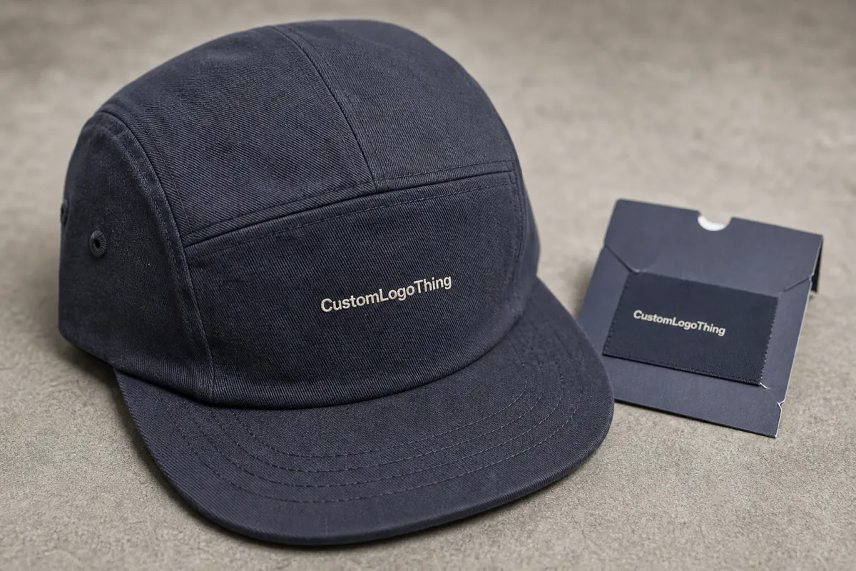
A centered file is not the same thing as a centered cap. The crown decides what people actually see.
That difference matters.
Five panel caps logo placement guide: why the front panel punishes bad layout
A five-panel cap is built to show one uninterrupted front surface. That makes it ideal for wordmarks, simple icons, and compact brand marks. It also makes mistakes easy to spot. With fewer seams breaking up the crown, there is less visual cover for a logo that is too large, too low, or too close to the edge.
For buyers, placement affects more than style. It changes how easy the cap is to decorate, how many proof rounds the order may take, and whether the logo fits the chosen process. The same artwork can look tight on a structured cap and loose on an unstructured one because the crown supports the logo differently. Why guess when the cap itself is already telling you the usable space?
The real question is not only where the logo should sit. It is how much room the front panel truly offers once seam clearance, curvature, and decoration method are included. A digital mockup often hides those limits, so the panel can look generous on a screen and feel cramped once stitch paths, patch borders, or print edges are added.
Five-panel construction rewards marks that read fast. Wide lockups, tiny taglines, and stacked copy usually suffer unless the cap is large or the artwork is simplified. That does not ban detail. It just means the front panel should be treated like a small signboard, not a billboard.
Useful rule: if a logo needs multiple lines, fine linework, and small text to make sense, it may be better to split branding across the front and another placement instead of crowding the panel.
How front-panel construction changes the usable logo zone
The front panel is the main decoration area, but the usable zone is smaller than the outline suggests. Crown height, seam tension, and fabric stiffness all change how much safe space is available. The top edge usually tightens first, and side seams can reduce usable width faster than many buyers expect, especially on lower-profile caps.
Construction style matters. A structured five-panel cap holds the front face upright and gives embroidery or patches a more stable surface. An unstructured cap is softer and can flex more with wear, which may make the logo feel less fixed. Neither is wrong; they just handle decoration differently.
Decoration method changes the equation again. Flat embroidery works well for crisp logos and moderate detail. Puff embroidery adds dimension but needs more space and simpler artwork. Woven patches preserve fine detail better than stitches in many cases. Leather and PVC patches create a stronger premium signal. Direct print stays closest to the source file if the cap fabric and finish accept it cleanly.
Cap decoration is not just scaled apparel decoration. A cap is read from straight on, at an angle, and while the wearer is moving. Balance, contrast, and height all matter at once. A logo that looks perfect in a flat approval sheet can still lose impact if it sits too close to the visor or floats too high above the natural sightline.
There is also a difference between technically centered and visually centered. A logo placed exactly in the middle of the panel can still feel low if the brim pulls attention downward. In many cases, a slightly raised position reads cleaner because it keeps the mark away from the visor and closer to the strongest viewing area.
Practical observation: buyers often focus on width first and ignore vertical placement, yet vertical placement is usually what people notice first on a cap.
And that is why templates matter.
Placement factors that affect size, shape, and readability
Size should start with the panel, not the artwork. Many weak orders begin with a logo designed for another surface and forced onto a cap without trimming. The cap should define the safe area first, then the artwork should fit inside it.
For many five-panel caps, a front logo in the 2.25 to 4.25 inch width range is common, but the final answer depends on crown height, panel width, and how much breathing room is needed near the seams. A narrow icon may need extra height to feel intentional. A wordmark may need to shrink slightly to avoid hugging the sides.
Thin lines and small type are the first things to disappear. Embroidery is especially unforgiving. Once the stitch path gets too tight, letters can fill in or collapse. As a working threshold, text under roughly 0.12 inch in height can become risky for standard embroidery, and textured fabrics make that harder. Woven patches can preserve detail better, but they still have limits if the art is overcomplicated.
Fabric choice changes the read of the same logo. Cotton twill usually gives the sharpest stitch definition. Canvas can handle texture well but feels more rugged. Nylon, washed finishes, and brushed surfaces can soften edges and reduce crispness. The file does not change, but the final impression can.
Dark caps need more visual contrast than many buyers expect. Dark thread on dark fabric can disappear from a few feet away, especially under indoor lighting. If the brand mark depends on subtle tone-on-tone decoration, that should be a deliberate decision, not a default setting.
- Leave at least 3 to 5 mm of clearance from seam lines, patch edges, and top binding.
- Keep fine text away from the center seam unless the decoration method can bridge it cleanly.
- Use stronger letterforms on dark, heathered, or heavily textured caps.
- Check the logo from straight on and from a slight angle before approving placement.
If a supplier provides a placement template, use it. If they do not, ask for one before approving art. That template is the fastest way to compare vendors without relying on attractive but inaccurate renderings.
Why trust a polished mockup when the template gives you the real frame?
Artwork setup that avoids unnecessary proof rounds
Clean files save time. Vector artwork is still the best starting point: AI, EPS, or editable PDF work well. Include the intended colors, preferably with Pantone references if the brand already uses them, and note whether the logo should feel bold, understated, or premium.
- Confirm the cap style before placing the artwork, because structured and unstructured five-panel caps behave differently.
- Measure the decoration zone on the blank or a vendor template instead of guessing from a catalog image.
- Build at least two placement options so the buyer can compare centered, raised, and slightly reduced versions.
- Check contrast on the actual cap color before approval, not after sampling.
- Request a sample or sew-out if the order is important enough that one bad run would matter.
That last step is often the cheapest insurance in the order. Digital proofs do not show stitch density, patch thickness, or how a logo sits against the crown under real light. A physical sample exposes those issues quickly. It also shows whether the logo is too stiff for the panel or whether the patch border competes with the design.
It helps to separate artwork approval from production approval. A design can look good on screen and still fail once stitches are laid down or a patch is cut. For embroidered jobs, a sew-out or sample board catches missing detail and thread-fill issues. For patches, edge quality and border thickness matter as much as the art.
Packaging can affect the final experience too. If the caps ship in cartons or with inserts, ask about packaging, banding, and whether the hats will be boxed individually. Small details like that can protect the shape and make the order feel more finished.
Cost, pricing, MOQ, and quote variables
Price depends on more than the logo. Cap base cost, decoration method, stitch count, patch material, placement complexity, and order quantity all influence the quote. Two orders with the same artwork can land in very different price bands if one uses a simple flat embroidery setup and the other needs a custom patch with edge finishing.
MOQ is another lever. Some factories set lower minimums for stock caps and higher minimums for custom colorways, special fabric, or premium trims. A buyer asking for a small run may still get a good result, but the per-piece price often rises because setup time is spread across fewer units. That is normal, not a penalty.
Rush timing can also change the number. Faster production may require shifting lines, paying for priority handling, or narrowing material choices. If the deadline is fixed, it is better to say so early. A clear timeline usually saves more money than a late emergency.
Quotes also move when the art is hard to sew or cut. Dense embroidery, tiny lettering, or multi-layer patches add labor. A cleaner logo often produces a cleaner quote. That is one reason placement and artwork simplification matter before pricing ever starts.
Process, timeline, proofing, and turnaround
The process usually starts with the cap style, then the artwork, then the proof. A good supplier will confirm the crown shape, decoration method, and placement zone before sampling. That order matters because a design approved too early can still fail once production begins.
Proofing should answer a few basic questions. Is the logo centered where the eye expects it? Is the size balanced against the crown? Does the method suit the detail level? If any of those answers is vague, another proof round may be worth it.
Turnaround depends on sample approval, material availability, and queue length. Stock caps and simple embroidery move faster. Custom materials and complex patch builds take longer. A buyer who needs a launch date should work backward from the delivery date and leave room for one revision.
Simple truth: the fastest orders are the ones that decide early.
Common mistakes, quality checks, and practical rules
The most common mistake is trying to use a logo that was never meant for a cap. Long taglines, fine gradients, and thin scripts often look polished in a presentation and fragile in production. The cap is not asking for less brand identity. It is asking for a version that survives the medium.
Another mistake is placing the mark too low. The visor competes for attention and can make the front art feel heavy. A logo that looks balanced in a flat file can feel dragged downward once the cap is worn. Raising it a little often solves the problem without changing the design.
Then there is overcomplication. Too many colors, too much detail, and too many tiny elements create a crowded front panel. Would a simpler version say the same thing faster? In cap decoration, faster reading usually wins.
Quality checks should be practical. Compare the art against the cap template, inspect the sample under bright light, and view it from a few feet away. If the logo only works at arm's length, it is too delicate for everyday wear. If it reads cleanly from a short distance, it is probably in the right zone.
Keep one rule in mind: the cap is a 3D object, not a flat print sheet. That sounds obvious, but it is where many orders go wrong. The best logo placement respects the crown, the seam lines, and the way people actually see the hat in motion.
FAQ
Where should a logo sit on a five-panel cap? Usually high enough to clear the visor visually, but low enough to feel anchored on the front panel. The exact point depends on crown height, cap structure, and decoration method.
What decoration method is best for small details? Woven patches and direct print usually preserve detail better than standard embroidery. For stitched looks, simplify the art before production starts.
Can dark-on-dark decoration work? Yes, but only when the brand wants a subtle finish. It should be a deliberate choice, because low contrast can disappear quickly in real-world lighting.
Do I need a sample? If the order matters, yes. A sample or sew-out is the fastest way to catch sizing, placement, and finish issues before they become expensive.


