Trucker Caps Logo Placement: Why the Front Panel Matters
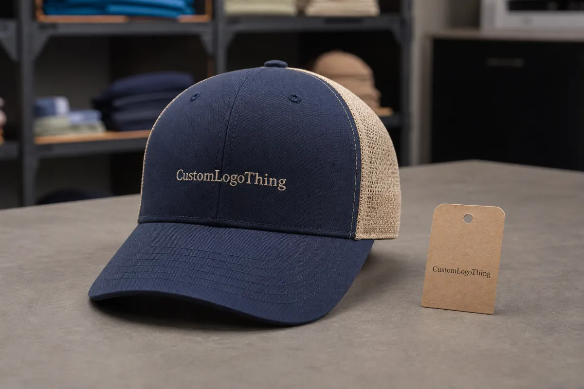
A logo can be centered on paper and still read high, low, or cramped once it lands on a foam front panel. That is why a trucker Caps Logo Placement guide matters before approval. A trucker cap is not a flat surface: the crown curves, the brim pulls the eye downward, and the mesh back changes how the front panel is perceived in wear.
For buyers, the front logo is doing the same job a carton face or label panel does on packaging. It has to be visible quickly, legible at normal viewing distance, and balanced enough to hold up after repeated wear. A placement that looks technically correct can still fail if it crowds seams or sits too close to the brim curve.
Placement is not only about centering. It is about proportion, panel shape, and decoration method working together. A bold embroidered wordmark, a fine printed badge, and a patch all behave differently on the same blank. The same artwork can look clean on one cap and cramped on another.
A cap front is curved and mobile. Treat it like a flat artboard and the logo can drift visually even when the measurements are right.
That gap between measured and perceived is the reason placement needs to be checked on the actual cap style, not just on a digital mockup.
How Front Panel Shape Changes the Final Look
Most placement issues start with the front panel. A structured trucker cap holds its shape better, while an unstructured front can sag and shift as it is worn. Foam fronts are common because they create a smooth decoration area, but they also make placement errors more obvious if the logo sits too close to the brim curve.
Seams matter more than many buyers expect. A centered logo on screen can read slightly off once the cap is sewn and curved, especially if the artwork crosses a seam or sits near the point where the front panel meets the mesh. The eye notices that shift immediately.
Flat artwork also changes on a curved surface. Wide logos can feel stretched from side to side, while tall logos can appear compressed if the crown is shallow. The better approach is to think in terms of the blank’s real profile, not the rectangle shown in a layout file.
As a rough starting point, many trucker blanks allow a front logo in the 4 to 4.75 inch wide range and about 1.75 to 2.5 inches tall, but the exact window depends on the cap style, crown height, and decoration method. A low-profile cap will not tolerate the same size as a taller foam-front style.
Common placement zones
- Center front - the standard choice for brand visibility and repeat orders.
- Left of center - useful when the logo needs to avoid a seam or the buyer wants a softer look.
- Lower front - works for compact artwork, but it can crowd the brim.
- Above the brim - often better for patches or small marks that need space around them.
The decoration method changes the final effect too. Embroidery gives a raised, classic finish, but very small letters and hairline details can disappear. Patches create a framed look and are more forgiving for detail-heavy logos, though they add another production step. Printing can hold finer elements, but it still needs controlled placement so the image does not drift on the panel.
Larger is not always better. If a logo crowds the seams or pushes into the mesh transition, it often looks less premium, not more visible. A slightly smaller mark with clean margins usually reads better from five or six feet away.
Production Steps, Proofing, and Lead Time
Placement is not final until the artwork has been translated into a cap-ready proof. The usual starting point is a clean vector file, followed by a placement mockup and a decision on decoration method. If the logo is being embroidered or turned into a patch, the file often needs simplification so the finished piece stays sharp at cap scale.
Proofing is where the real decision gets made. The mockup should confirm logo width, height, distance from the brim seam, and whether the mark needs to move slightly up or down for balance on that crown profile. A cap that looks centered on a 2D board can sit oddly once the front panel curves, so the proof should show the real silhouette instead of a generic rectangle.
QC checks should be practical: stitch density, edge cleanup, thread tension, patch border thickness, color match to the approved reference, and whether the logo still reads from several feet away. If a run includes 3D puff embroidery, the team also needs to confirm that the foam does not crush the letter shapes or push the logo too close to the brim.
Lead time usually shifts because of artwork revisions, decoration complexity, and sample approval. A simple one-color embroidery run often moves faster than a multi-color patch program with extra setup. If the artwork needs stitch-count adjustments or a revised placement, that can add days before production starts. For a straightforward order, one to two weeks is common once the proof is approved; more complex programs can take longer if the sample needs another round.
For larger programs, ask how cartons will be handled after decoration. If the order is headed to retail or field distribution, it can be worth checking whether packed cartons are tested against recognized transport methods such as those published by ISTA. That is less about the cap artwork itself and more about protecting finished goods after they leave production.
A clear approval on the proof is the cheapest insurance. Once caps are in production, a placement change is rarely a small tweak; it can mean rerunning decoration, reworking patches, or holding the order while someone checks alignment again.
Cost, Pricing, and MOQ Factors That Change Your Quote
Pricing on Custom Trucker Caps comes down to setup, decoration method, and quantity. The cap body matters, but the biggest cost change usually comes from how the logo is applied. More thread colors, denser stitch counts, shaped patches, and special finishes all push the quote upward.
MOQ plays a big part in unit price. A small run of 24 or 48 caps carries more setup cost per piece because proofing, digitizing, and machine prep are spread across fewer units. Once an order moves into the 100 to 250 range, the per-cap price often drops, though the exact break depends on cap style and art complexity.
| Decoration method | Typical use | Usual pricing effect | Best fit for |
|---|---|---|---|
| Flat embroidery | Simple logos, clean text, bold shapes | Usually the lowest setup burden | Teams, promotions, repeat reorder programs |
| 3D puff embroidery | Thicker raised lettering and bold initials | Higher stitch and setup cost | Large front marks with strong visual impact |
| Sewn patch | Detailed logos, badge-style branding | Often more expensive because of patch construction | Retail, lifestyle branding, fine-line artwork |
| Direct print | Fine detail and lighter visual weight | Can be efficient, but depends on process | Graphic marks with small type or gradients |
Placement can affect pricing too. If the logo has to be enlarged to clear the seams, or if the front panel requires a larger decoration field than usual, stitch count or print area goes up. That matters most with embroidery, where every added inch can change machine time. A dense logo around 7,000 to 9,000 stitches will cost more than a compact mark that stays much lighter.
Patch work has its own cost pattern. A woven patch with a clean border can be efficient for detail, but a custom-shaped embroidered patch with merrowed edges, heat seal backing, or extra border stitching adds labor. Buyers often compare only unit price, but total landed cost is the better number: decoration, packaging, sampling, and rework risk.
Quote accuracy improves when the buyer sends the right information upfront: vector artwork, preferred placement, cap style, color references, and target quantity. If the caps also need hang tags or insert cards, choosing FSC-certified paper stock can be part of the packaging conversation for retail programs.
Artwork Sizing Rules That Keep Logos Clean
Size is where buyers usually start, but the smartest rule is simple: the logo should be readable from a few feet away without fighting the cap shape. On a trucker front, that means enough width for recognition while leaving margin around seams and the brim curve. A logo that is too wide can look forced; one that is too small can disappear under the structure of the cap.
Vector art is the safest starting point because it scales cleanly and holds sharp edges better than a flattened image file. That matters for tiny text, thin outlines, and internal cutouts. In embroidery especially, fine details can close up once the needle path is digitized, so what looks neat on screen may not survive on the finished cap. If a design depends on thin counters or tight letter spacing, it often needs to be opened up before approval.
Placement-specific limits are worth checking before approval. Small type should stay away from the brim curve, and badges or patches need enough border space to avoid feeling squeezed. If the art sits too low, it can run into the visual weight of the bill. If it sits too high, it can look floaty on a shallow crown. The sweet spot is usually the one that feels balanced in a full-size mockup.
Simple artwork often wins on trucker caps because the hat already brings texture, structure, and contrast. A clean wordmark or emblem usually reads better than a crowded lockup with too many tiny parts. For repeat programs, the production-safe version is often the better business choice because it is easier to keep consistent.
Do not trust screen scale alone. Print the mockup at actual size, hold it at arm’s length, and compare it to a cap blank or sample photo. That quick check catches proportion problems earlier than a production run does. If the client can review a sewn sample, even better; a cap in hand exposes placement flaws that a screen preview hides.
Common Mistakes That Throw Off Cap Placement
The most common error is assuming every trucker cap has the same front depth. They do not. A logo that sits perfectly on one style can look squeezed or too high on another, even if both are labeled trucker in the spec sheet. That is why placement needs the actual blank, not just the decoration area dimensions.
Another easy mistake is ignoring seam layout. A graphic may be centered in the file, but once it is placed on a sewn front panel, the seam can pull the eye slightly left or right. The result is a logo that feels off-center even though the numbers were right. Buyers notice that immediately on uniforms or retail merchandise where consistency matters.
Detail overload causes its own problems. Tiny text, ultra-thin lines, and delicate icons are risky on embroidery and can look muddy on a patch if the border is too tight. If the artwork has to survive wear and handling, it needs to be tougher than the original screen design. A logo that looks good at poster size can fail at cap size simply because the cap does not give it enough room to breathe.
Approval mistakes are common too. Some buyers sign off on a mockup without checking the actual silhouette, then react later when the real cap has more curve or a different crown height than expected. The fix is simple: verify the exact cap style, request a front-view proof, and confirm whether the artwork is being shown on the same crown profile that will be produced.
Brand consistency can slip on reorders as well. If one run uses a wider logo and the next run uses a taller one, a team or event rollout ends up with caps that do not match. Lock down the exact placement measurement, decoration method, and approved artwork size so every reorder follows the same spec.
Next Steps to Lock In a Clean Cap Run
If you are using a trucker caps logo placement guide to move a real order forward, the next step is to narrow the decision set. Choose the decoration method first, confirm the placement on a mockup, and check that the logo size matches the distance people will actually view it from. That keeps the order grounded in wear, not just in the art file.
Before requesting a quote, gather the basics: vector artwork, color references, preferred cap style, target quantity, and any brand rules that must be matched exactly. If the caps are part of a retail program, ask for a sample or digital proof before the run is released. A little extra review up front usually costs less than correcting a batch later.
For future reorders, document the exact placement measurement, decoration method, and approved artwork dimensions. Those details remove guesswork from the next order and help keep the look consistent across different production dates and shipment sizes.
That is the real purpose of a good trucker Caps Logo Placement guide: fewer surprises, cleaner approvals, and caps that look deliberate from the first wear. If the placement works on the mockup, survives the production method, and still reads well in hand, the run is probably in the right zone.
Where should a logo sit on trucker caps for the best visibility?
The most common placement is centered on the front panel, slightly above the brim seam so the logo reads cleanly when worn. If the cap has a shallow front, the design may need to be lowered or narrowed to avoid crowding the curve and the seam line.
How big should trucker caps logo placement be on the front panel?
The logo should be large enough to read from a short distance, but not so wide that it touches seams or bends awkwardly over the crown. A full-size mockup is the safest way to confirm whether the shape feels balanced on the actual cap blank.
Is embroidery or a patch better for trucker caps logo placement?
Embroidery works well for simple logos and gives a classic raised finish. Patches are often better for detail-heavy artwork or when the buyer wants a more defined, badge-like appearance with a framed edge.
What affects the cost of custom trucker caps with logo placement?
Decoration method, stitch count, patch construction, cap style, and quantity all influence unit price. A tighter MOQ usually raises the per-cap cost because setup work is spread across fewer hats.
How long does production usually take for custom trucker caps?
Lead time depends on artwork approval, sample needs, decoration method, and current production load. Simple orders move faster when the artwork is ready and the placement is approved without revisions.

