Fleece Lined Beanies Artwork Proof Checklist for Wine Shops
Why Wine Shops Need a Cleaner Beanie Proof Before Production
A wine shop or tasting room can make good choices early in the buying process - a warm fleece-lined beanie, a winter gift set plan, staff uniform use, club pickup weekends, local delivery shifts - and still end up disappointed because the artwork approval was too casual. A fleece lined beanies Artwork Proof Checklist for Wine shops is not decoration paperwork. It is the last practical quality-control step before yarn, thread, patches, labels, and packaging become inventory.
The problem is rarely that a production team cannot sew. More often, the proof was approved without enough scrutiny. Delicate winery crests, thin grapevine line art, tiny appellation copy, script lettering, and low-contrast thread colors can look graceful in a PDF, then soften or disappear once they are stitched onto ribbed knit fabric and stretched over a head.
An artwork proof should act like a production map. It needs to show the finished logo size, placement, decoration method, thread or material colors, cuff position, folding notes, patch shape, label details, and any construction details tied to the fleece lining. If the proof only shows a logo floating on a generic cap outline, it is not giving the buyer enough information to approve the job with confidence.
Wine retail has its own visual pressure. A beanie may sit near carefully designed labels, gift boxes, reserve bottles, printed tasting notes, or polished club inserts. If the embroidery looks bulky or the patch lands too low on the cuff, the merchandise can feel disconnected from the rest of the brand.
Buyers do not need to know every stitch term to review a proof well. They do need a steady checklist and a willingness to slow down for five minutes. Scale, spelling, contrast, cuff behavior, and comfort are small checks before production; after production, they become expensive regrets.
How Artwork Proofs Work on Fleece-Lined Knit Beanies
A design mockup sells the idea. An artwork proof confirms the build. That distinction matters because fleece-lined knit beanies are not flat paper, smooth cotton caps, or printed bottle labels. They stretch, fold, compress, and cast shadows around the cuff.
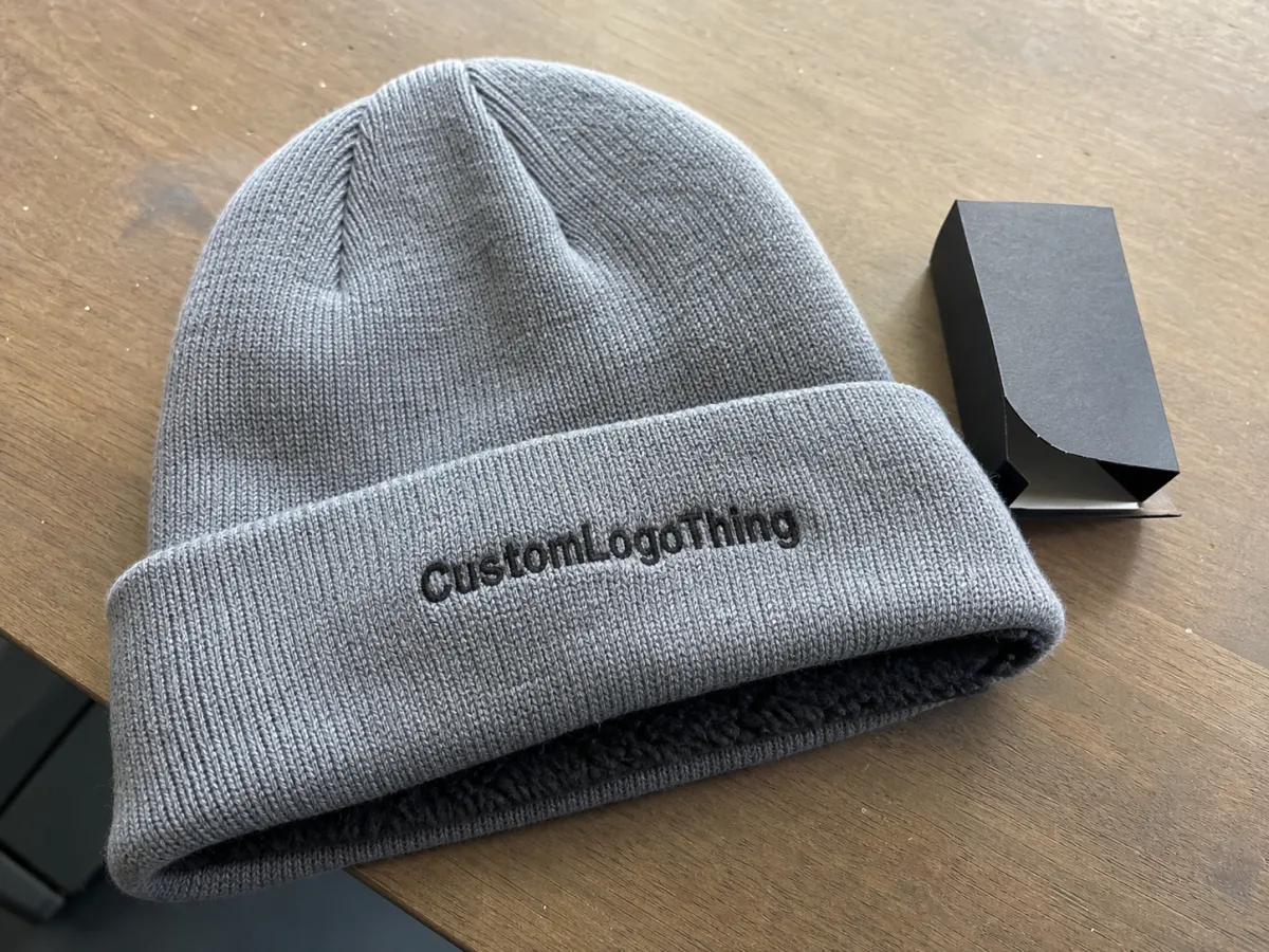
Common decoration methods include direct embroidery, woven patches, faux leather patches, PVC patches, and sewn labels. Direct embroidery works well for clean marks, block lettering, initials, and simple icons. Woven patches can hold more fine detail than embroidery in many small-format applications, especially for crest work or small type. Faux leather patches bring a warm giftable feel, although debossed lines need enough width and depth to read. PVC patches suit bold outdoor branding, but they may feel less traditional for premium wine retail. Sewn labels are useful for subtle branding, size markings, care information, or secondary copy.
Fleece lining adds comfort and warmth, but it changes the proofing conversation. It can increase seam bulk, affect how the cuff turns, and limit where a patch sits cleanly. A thick fleece-backed cuff may not fold like an unlined acrylic beanie. The proof should show where the decoration will sit when the beanie is worn, not only when it lies flat on a table.
Knit structure matters too. Ribbed acrylic, wool blends, recycled yarns, and cuffed constructions stretch differently. A 2.25-inch-wide estate mark may look crisp in the art file, then spread slightly once the fabric is under tension. Embroidery digitizing converts artwork into stitches, using satin stitches, fill stitches, underlay, trims, and thread paths. If the letters are too tight or the stitch count is too dense for the area, small tasting-room copy can become a knot of thread rather than readable branding.
Wine brands often use refined marks: estate names, bottle icons, crests, serif type, vineyard rows, script typography, and established dates. Those details can be beautiful, but the proof has to translate them into textile reality. The right checklist keeps brand accuracy and production limits in view at the same time.
The Logo, Color, and Placement Details to Check First
Start with the details that cause the most expensive mistakes. Confirm logo orientation, finished decoration width and height, cuff placement, distance from the fold edge, and whether the mark is centered, left chest-style, or offset. A centered logo on a flat proof may not look centered after the cuff is folded and stretched, so ask whether the proof reflects the beanie as it will actually be worn.
Color needs extra attention because textile color does not behave like ink. Pantone references help, but embroidery thread has sheen. Woven patches have texture. Faux leather absorbs and reflects light differently from yarn. Knit color can make thread appear warmer, duller, or darker than it looks on a bottle label or printed tasting menu.
Burgundy thread on black knit may look elegant in a close-up proof and nearly invisible in staff photos. Gold on cream can look premium or washed out, depending on thread sheen and lighting. Forest green on charcoal often needs a brighter thread than the brand guide suggests. Tonal branding can be beautiful, but it should be chosen deliberately, not discovered after the cartons arrive.
Check every word. Estate names, appellations, tasting room locations, established dates, accent marks, and small legal-style lines are all easy to miss during a quick approval. In many production workflows, approval confirms both layout and spelling. After approval, changes may require new digitizing, new patch setup, remake charges, or a shifted delivery date.
Ask for a simplified logo version if the original artwork is too detailed. That is not the same as cheapening the brand. It may mean removing tiny secondary copy, thickening a border, opening the space between letters, enlarging an icon, or using a cleaner one-color mark. In many cases, simplified merchandise artwork looks more premium than full label art forced into a 2.5-inch embroidery field.
Proofing rule: if you cannot read it at arm's length on the proof, do not expect customers to read it on ribbed knit fabric during a busy tasting event.
Process and Timeline: From Artwork Upload to Approved Proof
The usual sequence is simple on paper: submit logo files and beanie specs, confirm the decoration method, receive an art review, approve digitizing or patch setup, review the proof, request revisions if needed, approve the final proof, and then move into sampling or bulk production. The proof stage should be treated as a production checkpoint, not a quick email reply between other tasks.
Good files shorten the process. Vector artwork such as AI, EPS, or editable PDF is best because the art team can scale the logo, separate colors, and prepare stitch or patch artwork cleanly. Pantone references help with thread matching. Brand guidelines reduce close-but-wrong decisions. Prior embroidery photos are useful because they show what your team already liked or disliked. If you know the preferred cuff height, patch shape, retail tag placement, barcode label, or individual packaging requirement, send that early.
Simple logo proofs can often be prepared faster than detailed crest layouts, although timing depends on artwork quality and decoration method. A clean one-color icon may need only basic setup. A multi-color woven patch with border type, grapevine detail, and custom backing may require more review. Missing files, unclear color notes, or internal debate over which logo version to use can create more delay than the actual proofing work.
A physical pre-production sample is worth considering for larger orders, premium wine club merchandise, resale programs, or designs with small type, unusual placement, or multiple decoration components. Samples add time and cost, but they answer questions a screen cannot: cuff bulk, stretch, thread shine, patch stiffness, label comfort, and how the beanie looks under actual retail lighting.
Lead times vary by supplier, order size, decoration method, season, and shipping plan. As a practical planning range, a straightforward decorated beanie order may need several weeks after final proof approval, while custom patches, samples, specialty packaging, or peak holiday demand can stretch that timeline. If the beanies are tied to a release weekend, winter market, holiday gift set, or club pickup, work backward from the in-hand date and leave room for at least one revision.
Cost, MOQ, and Quote Factors Hidden Inside the Proof
The artwork proof often reveals cost drivers before production begins. Decoration size, stitch count, patch complexity, number of thread colors, custom labels, hang tags, and individual packaging can all move the quote. A proof is not only a visual document; it is also a cost-control tool.
MOQ means minimum order quantity. It is shaped by blank beanie availability, decoration setup, material purchasing, and the labor required to run the job efficiently. Small runs may be possible, but the unit cost is usually higher because setup labor is spread across fewer pieces. Larger quantities often lower unit cost, though not always enough to justify buying inventory that may sit through the next season.
For embroidery, cost drivers include larger logos, dense fill areas, higher stitch counts, metallic thread, additional thread colors, and complex digitizing. A simple 2-inch one-color logo is usually efficient. A 3.5-inch crest with dense fill, tiny letters, and five thread colors may cost more and still look less clean.
Patch and label pricing has its own variables: woven detail, faux leather thickness, deboss depth, merrowed borders, adhesive or sew-on backing, custom shapes, and sewing time. Standard patch shapes are usually easier to price and produce than intricate vineyard silhouettes. If the proof shows a complicated patch outline, ask whether a standard rectangle, oval, arch, shield, or rounded square would improve production and reduce cost without weakening the look.
| Decoration option | Best use | Typical cost impact | Proof detail to verify |
|---|---|---|---|
| Direct embroidery | Simple logos, initials, clean icons | Often efficient at 48-144 pieces, but stitch count can raise cost | Finished size, thread colors, small text, stitch direction |
| Woven patch | Crests, small lettering, refined retail looks | Setup and sewing add cost, but fine detail can improve | Patch size, border, backing, thread density, edge finish |
| Faux leather patch | Giftable wine club merchandise | Material and debossing affect price; custom shapes add labor | Deboss depth, contrast, corner radius, stitch placement |
| Sewn label | Subtle branding, secondary copy, care or size notes | Usually modest per unit, with setup for custom woven labels | Fold type, label location, comfort against fleece lining |
Price ranges depend heavily on quantity and decoration, but decorated fleece-lined beanies commonly move from budget-friendly staff pieces into higher retail-gift territory once custom patches, specialty yarns, hang tags, or individual packaging are added. A careful proof review helps decide where the money should go. More stitches are not automatically more premium. Sometimes the cleaner choice is a smaller mark, fewer colors, and better contrast.
Review the quote and proof together. The lowest unit cost is not helpful if the beanie loses the premium feel people expect from a winery, bottle shop, or specialty retail program.
Common Proofing Mistakes That Make Beanies Look Less Premium
The most common mistake is approving the proof at screen size without checking real decoration dimensions. A refined wine shop logo can look oversized, cramped, or oddly placed if nobody confirms that the embroidery is 2.25 inches wide rather than 3.25 inches wide. One inch is a major difference on a folded cuff.
Small text is the next trouble spot. Vineyard names, tasting room addresses, wine regions, and slogans may need to be removed, enlarged, or moved to a woven label. Direct embroidery has limits. Depending on thread, fabric, and digitizing, very small letters can close quickly, especially on ribbed knit.
The fold deserves its own check. If the cuff height changes, or if the proof does not account for the turned edge, the logo can sit too low, too high, or partly distorted when worn. A patch that looks centered on an unfolded beanie may land awkwardly once the cuff is turned to its final height.
Color and contrast mistakes are easy to approve too quickly. Dark red thread on black knit, cream thread on oatmeal yarn, or metallic gold used for fine lettering can reduce readability. Staff uniform beanies usually need stronger contrast than retail gift beanies because customers see them from several feet away. Gift beanies can be quieter, but the mark still needs enough presence to feel intentional.
Fleece lining adds one more layer. Bulky lining and seam construction can affect how flat a patch sits, how the cuff folds, and whether a sewn label feels comfortable against the forehead. If comfort is part of the product promise, the proof and sample should respect that.
Internal approval can create problems too. If one person manages wine labels, another manages tasting room retail, and a third approves staff apparel, collect comments before final signoff. A fleece lined beanies artwork proof checklist for wine shops works best when it catches brand concerns while changes are still inexpensive.
Factory-Floor Tips for Reviewing a Beanie Proof Like a Pro
Print the proof at actual size if possible. If not, measure the logo width on screen and compare it with a ruler. A 2.5-inch patch on a cuff has a different presence than a 3.5-inch patch, especially on smaller beanie sizes or tighter rib knit.
Review the design from three distances. First, look close enough to inspect stitching, borders, and small type. Second, hold it at arm's length, like a customer seeing it on a retail shelf. Third, step back several feet, like guests noticing staff during an outdoor tasting or curbside pickup. If the mark only works at one distance, adjust the proof.
Look for production-friendly simplification. Clean outlines, bolder type, fewer tiny gaps, and enough space between letters help embroidery and woven threads hold shape. A skilled digitizer can improve artwork, but thread cannot behave like a laser printer. General textile quality practices and ASTM test methods can guide material expectations, while distribution testing groups such as ISTA help brands think about shipping performance for packed goods.
Ask direct technical questions before approval:
- What is the finished decoration width and height?
- Is the logo embroidered, patched, debossed, or sewn as a label?
- Are thread or patch colors matched to Pantone references?
- Will the fleece lining affect placement, fold thickness, or label comfort?
- Does the proof show the beanie folded as it will be worn?
- Will a sample be provided before bulk production, and is there a sample approval deadline?
Keep one person responsible for final proof signoff, but have brand and retail stakeholders review first. That keeps feedback organized. A good manufacturer would rather clarify an uncertain note early than produce a full run of beanies that almost match the intended brand look.
For sustainability claims, be careful with language. If you are using recycled yarn, FSC-certified paper hang tags, or plastic-free packaging, ask for documentation before printing claims on tags, belly bands, or product pages. The FSC is a useful reference for paper and forest-based packaging claims, but certification depends on the actual material and supply chain, not just the appearance of the tag.
Next Steps Before You Approve the Final Beanie Artwork
Before approval, gather the final logo file, confirm the exact beanie style, verify the fleece lining, review decoration size, check thread or patch colors, proofread every word, and compare the layout against brand guidelines. This is the practical heart of a fleece lined beanies artwork proof checklist for wine shops.
Decide the use case before you sign off. Staff uniform beanies may need strong contrast and easy logo recognition from 6-10 feet away. Retail beanies or wine club gifts may call for subtler decoration, softer color, custom tags, or a more giftable finish. Neither direction is wrong. The mistake is trying to serve both goals without saying so.
Note packaging needs early. Individual polybags, hang tags, belly bands, size stickers, kraft sleeves, barcode labels, or bundled presentation for tasting room shelves can affect packing labor and delivery timing. If beanies are going into holiday kits with bottles, candles, corkscrews, or tasting cards, confirm carton size and presentation before the final packout plan is locked.
Save the approved proof, digitized embroidery file, patch file, color notes, beanie style number, order specs, and packaging instructions. Reorders are much cleaner when nobody has to rebuild the job from memory. If the first run sells through, those records help keep the second run consistent in color, placement, and feel.
A good beanie proof does not need to be complicated. It needs to be specific. Confirm the actual size, the actual placement, the actual material colors, the actual fold, and the words customers will see. That final pass is what helps the finished beanies feel warm, wearable, and properly aligned with the label people already trust.
FAQ
What should a wine shop check first on a fleece lined beanie artwork proof?
Start with decoration size, logo placement on the cuff, spelling, thread or patch colors, and whether the proof shows the beanie folded the way it will actually be worn. Then check small brand details such as script lettering, vineyard icons, estate names, and location text, because those elements are most likely to lose clarity on knit fabric.
Can small wine label artwork be embroidered on fleece lined beanies?
Sometimes, but wine label artwork often needs simplification. Tiny serif type, fine borders, grapevine lines, and detailed crests may not stitch cleanly at beanie size. A simplified logo, woven patch, or sewn label can preserve the premium look better than forcing a detailed label design into direct embroidery.
How does fleece lining affect the artwork proof for custom beanies?
Fleece lining adds comfort and warmth, but it can also change cuff bulk, seam behavior, and how flat a patch or embroidery area sits. The proof should confirm placement on the actual beanie construction, not just show the logo floating on a generic knit cap shape.
What file type is best for a wine shop beanie proof checklist?
Vector files such as AI, EPS, or editable PDF are best because they let the art team scale the logo, separate colors, and prepare embroidery or patch artwork cleanly. If only PNG or JPG files are available, send the highest-resolution version possible and expect that the logo may need cleanup or redrawing before proofing.
Does changing the proof affect beanie cost or lead time?
Yes, revisions can affect both cost and lead time if they change stitch count, patch size, color count, setup work, or require a new sample. Small proof edits are usually easier to handle before approval, while changes after final approval can delay production or add remake costs.


