Buyer Fit Snapshot
| Best fit | freight cartons with logo for packaging buyers comparing material specs, print proof, MOQ, unit cost, freight, and repeat-order risk where brand print, material, artwork control, and repeat-order consistency matter. |
|---|---|
| Quote inputs | Share finished size, material target, print colors, finish, packing count, annual reorder estimate, and delivery region. |
| Proofing check | Approve dieline scale, logo placement, barcode or warning zones, color tolerance, and any recyclable or compostable wording before bulk production. |
| Main risk | Vague material claims, crowded artwork, or missing packing details can create delays even when the unit price looks attractive. |
Fast answer: Freight Cartons with Logo: Branding That Travels Well should be specified like a repeatable production item. The safest quote includes material, print method, finish, artwork proof, carton packing, and reorder notes in one written spec.
What to confirm before approving the packaging proof
Check the product dimensions against the actual filled item, not only the sales mockup. Ask for tolerance on folds, seals, hang holes, label areas, and retail display edges. If the package carries a logo, QR code, warning copy, or legal claim, reserve that space before decorative graphics fill the panel.
How to compare quotes without losing quality
Compare board or film grade, print process, finish, sampling route, tooling charges, carton quantity, and freight assumptions side by side. A lower quote is only useful if the supplier can repeat the same color, closure quality, and packing count on the next order.
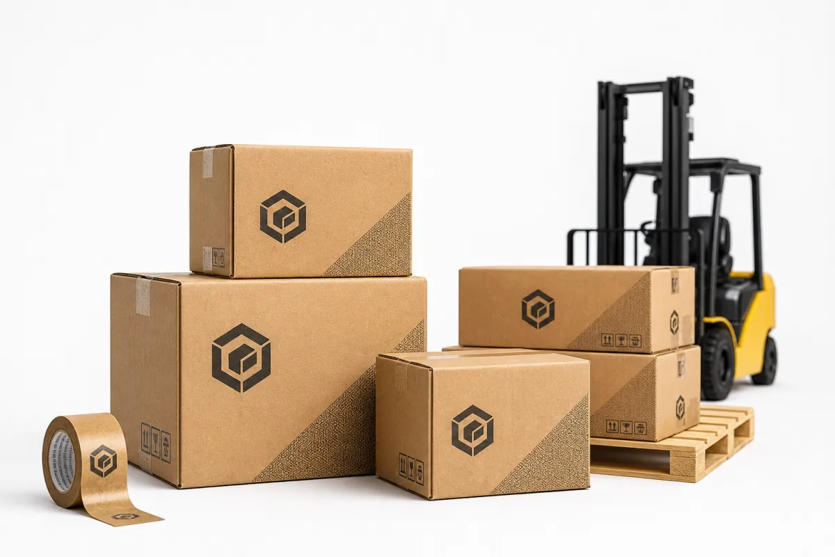
A plain brown shipper and freight Cartons with Logo do not read the same on a receiving dock. One disappears into the stack. The other tells the warehouse crew, the buyer, and the distributor that someone thought through the outer package, the handling route, and the brand impression before the carton ever left the plant.
That difference carries more weight than a lot of teams expect. A logo on a freight carton is not just decoration. In day-to-day shipping, freight cartons with logo help protect products through rough handling, pallet wrap, transfer points, and cross-dock movement while also making the shipment easier to identify and more polished to receive. For some buyers, that first visual impression matters before the box is even opened.
The practical side matters just as much. The carton has to survive compression, moisture, abrasion, carrier labels, and the occasional hard lift from a pallet jack or conveyor transfer. If the branding looks good but the carton collapses under load, the design missed the mark. If the structure is strong but the branding looks careless, the shipment still feels unfinished. The best freight cartons with logo handle both jobs well, which is why they deserve a careful spec.
Once you understand the board grade, the print method, the route the carton will travel, and the way your team handles shipments, the decision gets a lot easier. Cost, durability, and presentation can sit in the same conversation instead of fighting each other. That is the real work behind freight cartons with logo: knowing where the money goes, what usually goes wrong, and how to plan a carton that holds up in the field.
Freight Cartons with Logo: Why They Matter
Picture two pallets arriving at a dock. One is wrapped in a plain carton with handwritten marks and mixed labels on the outside. The other uses freight cartons with logo that are printed cleanly, easy to identify, and consistent from panel to panel. The contents may be identical, yet the second shipment already looks organized before anyone cuts the tape. That matters in B2B shipping, wholesale distribution, and retail replenishment, where the outer carton often becomes the first visible touchpoint for your brand.
From a packaging buyer's point of view, freight cartons with logo occupy a useful middle ground. They are not display boxes, and they are not meant to be decorative in a fragile, cosmetic sense. They are working shipping containers. Still, they carry brand signals. A simple logo, a product line name, or even a disciplined one-color mark can tell a receiving team that the carton belongs to a known program and should be handled as part of a repeatable system.
That brand signal does more than make the shipment look tidy. It helps with identification. In a busy warehouse, clear branding can reduce sorting mistakes, make return freight easier to recognize, and help teams separate internal transfers from customer-facing shipments. When people move dozens or hundreds of cartons every hour, freight cartons with logo cut down on guesswork. The result is not just better presentation; it is often better handling discipline.
Many buyers underestimate how early the brand message starts. A logo on a freight carton often influences perception before the product is even opened. If the carton looks intentional, the shipment feels intentional. That is especially true for wholesale customers, distributors, and retail receiving departments that see the carton before they ever see the product itself. In those moments, freight cartons with logo are quietly doing sales support work.
A freight carton earns its keep when it still looks organized after a rough route, not just when it looks good on a sample table.
Consistency is another reason they matter. A brand that uses the same carton spec, the same logo placement, and the same board grade across multiple shipping runs looks more controlled and usually creates fewer downstream surprises. If you are shipping palletized goods, replacement parts, apparel, food service items, or subscription inventory, freight cartons with logo can turn a basic supply item into a repeatable brand asset. That is not flashy, but it is valuable.
The job is not just to print a logo and call it finished. The job is to build a shipping container that can take abuse, maintain readable graphics, and still present the brand cleanly when the carton reaches its destination. That balance is where good packaging work shows up.
How Freight Cartons with Logo Work in Shipping
Before anyone talks about ink or artwork, the carton structure has to make sense. Most freight cartons with logo are built from corrugated board, and the board choice changes how the box performs under load. A standard single-wall carton might use B-flute or C-flute depending on the product, while heavier or longer-haul freight often calls for double-wall board such as BC-flute. The flute profile matters because it affects crush resistance, print surface, and how well the carton survives stacking.
In real shipping environments, board grade is usually discussed in terms like 32 ECT, 44 ECT, or burst strength. Those numbers are not marketing fluff. They say something about how the carton behaves when stacked, handled, and compressed during transit. If freight cartons with logo are going through palletized freight, I would rather start with the strength requirement and then build the decoration plan around it than reverse that order and hope the print survives a weak box.
Printing method is the next major decision. Flexographic printing is common for freight cartons with logo because it is efficient, durable, and well suited to one- or two-color branding on corrugated board. Digital printing helps with shorter runs, more detailed graphics, or projects that need less setup. Litho-lamination is the premium route when the outer surface needs a smoother, more presentation-driven look, though that usually makes more sense for retail-ready packaging than for rough freight. Different jobs, different tools.
For shipments that face vibration, compression, and repeated handoffs, it helps to think in terms of test standards instead of assumptions. The ISTA test procedures are a good reference point for understanding distribution hazards, and similar ASTM methods help teams compare performance more objectively. If your freight cartons with logo need to survive a less forgiving route, testing is not a luxury; it is a practical insurance policy against weak packaging choices.
Logo placement deserves more thought than it usually gets. A carton that is palletized on a 4-way pallet will lose some panel visibility once stretch wrap, strapping, and neighboring cartons enter the picture. If the carton is shelf-facing, a wide panel may be visible; if it is returned through reverse logistics, the top and side panels may matter more. The best freight cartons with logo are designed around the real use case, not around a blank digital dieline.
Print limits matter too. Large solid areas of ink can scuff. Very thin type may break up on rough board. Barcode zones need contrast and enough quiet space. Handling icons need room to breathe. If the branding tries to do too much on a corrugated surface, it can look muddy once the carton is folded, taped, and stacked. That is why strong freight cartons with logo usually keep the artwork clear, bold, and easy to read from a few feet away.
- Single-color flexo works well for simple, high-volume branding.
- Digital print fits shorter runs and more detailed art.
- Litho-lam is best when surface appearance matters more than abrasion resistance alone.
- Board strength should be chosen before graphic ambition.
- Label space must stay clear for shipping and compliance marks.
Key Factors That Shape Freight Cartons with Logo
Material choice comes first because it sets the ceiling for everything else. If you need freight cartons with logo to hold heavier products, survive longer routes, or stack high on a pallet, you may need a stronger corrugated grade, a double-wall structure, or a carton with better moisture resistance. Recycled content also matters, especially for brands that want a lower environmental footprint without giving up integrity. The challenge is that more recycled fiber can affect stiffness, so the specification has to be balanced rather than assumed.
If sustainability is part of the brief, look for fiber sourcing and chain-of-custody credentials that can be verified. FSC-certified options are widely used in corrugated packaging, and the FSC system is one of the most recognized references for responsible forest management. For many buyers, that is not just a branding point; it is also a procurement filter. A carton can be functional and responsible at the same time, which is exactly why freight cartons with logo are often evaluated alongside material sourcing requirements.
Size matters just as much as board grade. A carton that is too large wastes corrugated material, takes up extra pallet space, and may crush more easily because the contents can shift. A carton that is too tight can burst at the seams or distort the logo placement. For freight cartons with logo, the usable print area is tied directly to the carton dimensions, fold lines, and where the glue seam lands. If the artwork crosses a seam awkwardly, the final result can look off by a surprising amount.
Brand consistency is another major factor. Many companies want exact color matches, but brown kraft board, white-lined board, and coated surfaces each behave differently. A deep red or a light gray may look crisp on a white liner and flatter on kraft. If your brand standards are strict, freight cartons with logo may need a white underlay, a different print method, or a simplified palette to stay visually close to the approved color. That is normal, not a failure of the printer.
Shipping conditions can change the spec more than people expect. Long-haul freight, humid climates, cold-chain environments, and repeated touchpoints all put different stress on the outer box. Moisture can weaken a carton faster than most buyers think, and rough carrier handling can damage a printed surface before the product is ever opened. For that reason, the best freight cartons with logo are chosen with the route in mind, not just the product weight.
Compliance also Shapes the Final carton. Shipping marks, GS1 labels, handling icons, carton counts, and destination information all need space. If the branding crowds these elements, the outer carton becomes harder to process. Buyers sometimes want an oversized logo on every panel, but on busy freight cartons, restraint is often the smarter move. Good freight cartons with logo leave enough room for operations to function without covering up the brand story.
One practical way to think about the spec is to ask five questions:
- How heavy is the packed carton?
- How high will it be stacked?
- Will it face humidity, dust, or rough transport?
- Where do labels, barcodes, and tape need to go?
- How much brand visibility is really needed on arrival?
If you answer those honestly, freight cartons with logo become much easier to specify. Most of the expensive mistakes happen when teams start with the logo and only later ask whether the carton is strong enough for the shipment.
Freight Cartons with Logo: Cost and Pricing Factors
Pricing for freight cartons with logo is rarely about one number. It is a mix of board grade, carton size, print method, color count, order quantity, and setup requirements. A simple one-color logo on a standard corrugated shipper can be economical at scale, while a multi-panel design with several colors and specialty surfaces can move into a very different cost bracket. The smartest way to budget is to treat performance as the first decision and decoration as the second.
Setup costs matter more on short runs. Flexographic printing often needs plates, and those plates carry a one-time cost that gets spread across the order. Digital printing may reduce or eliminate plate costs, but the unit price can be higher on very large runs. Litho-lamination usually brings a more premium appearance, but it also adds material and process cost. If you are buying freight cartons with logo for a seasonal program, a launch, or a low-volume channel, that setup math can change the entire recommendation.
Order quantity is another major lever. A run of 500 cartons will almost always cost more per unit than a run of 5,000, even if the carton structure stays the same. Storage also matters. Freight cartons with logo are bulky, so if you order too aggressively, you may save a few cents per unit and then give it back in warehousing costs. In practice, people forget that cartons occupy cubic space long before they save money on the freight line.
Artwork complexity is not free either. Heavy coverage, exact color matching, multiple panels, and special inks can push the price up. A simple one-color logo may only need a modest setup. A full-coverage graphic, a product photo treatment, or a large back-panel design may require more press time, tighter registration, and more QC attention. That is why some of the most effective freight cartons with logo are also the simplest.
Here is a practical comparison that buyers can use as a starting point. These are broad ranges, not fixed quotes, because carton size, quantity, and shipping conditions can move the numbers quickly.
| Option | Typical Use | Approx. Unit Cost | Setup / Notes |
|---|---|---|---|
| Plain corrugated freight carton | Internal shipping, utility freight, no branding needs | $0.85-$1.80 | Lowest decoration cost; strongest focus on structure only |
| One-color flexo printed carton | High-volume outbound freight with a simple logo | $0.95-$2.10 | Plate cost usually applies; durable and efficient for repeat runs |
| Two-color flexo or short-run digital print | Distributor-facing cartons, moderate branding detail | $1.20-$3.20 | Better for clearer brand presentation or shorter quantities |
| Litho-laminated freight carton | Premium presentation, retail-ready outer packaging | $2.40-$5.50 | Higher visual quality; usually chosen when appearance is a major priority |
The hidden costs are often the ones buyers feel later. Freight to your facility can be meaningful if the cartons are large and the order is heavy. Storage space can become a real budget item. Revision cycles after artwork approval can delay the run and force rush charges. If you need to change a logo after plates are made, that mistake gets expensive quickly. For freight cartons with logo, proofing discipline saves more money than most people realize.
My usual budgeting sequence is simple:
- Choose the strength and construction first.
- Choose the print method second.
- Choose the number of colors and coverage last.
That order keeps the package honest. A carton that fails in transit is never cheap, no matter how good the artwork looked in the proof. Well-planned freight cartons with logo let the brand show up without inflating the spec beyond what the freight lane really needs.
Process and Timeline for Freight Cartons with Logo
A clean project usually starts with the carton specification, not the artwork. You define the product dimensions, packed weight, stacking requirements, and shipping conditions first. Then you build the carton size and board grade around those needs. Once that is settled, freight cartons with logo can move into the creative stage with much less risk of rework. That sequence saves time and avoids the classic problem where a perfect-looking design no longer fits the approved box.
From there, the process usually moves into dielines, artwork setup, and proofing. If the carton is simple and the logo files are ready, this stage can move quickly. If the artwork needs cleanup, color adjustment, or layout changes to fit the panels, the schedule stretches. For many freight cartons with logo projects, a realistic timeline from final approval to production is often 12 to 15 business days, though complex specs, sampling, or busy production calendars can push that longer.
Sampling is where good projects are separated from expensive surprises. A plain digital proof can show where the graphics go, but it cannot fully show board behavior, fold quality, or how the logo looks after tape, labels, and wrap are applied. I like to see a sample whenever possible, especially if the carton will be used for a high-value product or a channel that cares about presentation. Freight cartons with logo are easiest to approve when you can test them in real warehouse conditions.
What slows a job down the most? Usually the same four things: unclear artwork, late logo changes, unconfirmed dimensions, and slow approval cycles. If the buyer, operations team, and branding team are not aligned, the carton can spend days sitting in review limbo. With freight cartons with logo, the fastest projects are the ones where everyone agrees early on what the carton must do, what it must not do, and how much visual detail is realistic.
A practical planning sequence looks like this:
- Confirm product dimensions and packed weight.
- Define shipping conditions and stack height.
- Select board grade and carton style.
- Place the logo and shipping marks on the dieline.
- Approve artwork proof or sample.
- Schedule production and inbound freight.
If the deadline is tight, the carton design usually needs to be simpler. Fewer revisions, fewer colors, and a more forgiving print method all help. I have seen buyers try to force a complex design into a short window, and the result is usually stress for everybody involved. The better move is to let logistics drive the timing and let freight cartons with logo follow the schedule that the production floor can actually support.
One more practical point: if your cartons are tied to a product launch, a warehouse move, or a seasonal freight peak, build a cushion into the timeline. Printing and corrugate supply can both tighten up at busy times. A two-week margin is often more useful than a polished apology after the truck is already late.
Common Mistakes with Freight Cartons with Logo
The biggest mistake is designing for the mockup instead of the route. A carton can look excellent on a screen and still fail in the field. If the board is too light, the logo is the least of your problems. If the carton is too large, the product shifts and the corners suffer. If the stack load is underestimated, the outer graphics may look fine on day one and crushed by day three. Freight cartons with logo should always be judged by performance first.
Another common issue is oversizing the branding. Buyers sometimes want the logo stretched across every panel, but the reality of pallet wrap, strapping, and shipping labels hides more of the carton than the design mockup suggests. A logo that gets covered by tape or buried under a label does not help much. The better solution is often a cleaner, more visible placement on the panels that actually remain exposed. That is why freight cartons with logo usually benefit from a layout that respects the handling path.
Low-resolution artwork creates another headache. Tiny type, thin strokes, and overly detailed graphics can turn muddy on corrugated board, especially on kraft surfaces. Flexographic printing can reproduce a very solid logo, but it is not the best place for microscopic detail. If the file is weak, the printed carton will be weak. That is true even when the carton structure itself is excellent. For freight cartons with logo, clean vector files almost always outperform a screenshot or a compressed image.
Moisture and abrasion are easy to ignore from an office chair. They are much harder to ignore after the cartons spend a night in a damp trailer or get rubbed repeatedly during transport. Ink scuff, tape pull, corner damage, and condensation can all make a good-looking carton seem tired before it reaches the customer. If the route is humid, cold, or rough, the carton spec should reflect that. The outer box is not just a sign of brand identity; it is a working container, and freight cartons with logo need to survive the actual conditions.
Skipping the sample stage is the mistake that catches people most often. On screen, the logo can look centered, bold, and balanced. On the folded carton, the seam may shift the eye point or the tape line may interrupt the graphic. A sample reveals things that a PDF will not. When buyers skip that step, they sometimes discover too late that the final carton does not look the way the team expected. With freight cartons with logo, a sample is usually cheap compared with a full production correction.
Here are the warning signs I watch for most closely:
- The logo sits too close to a fold or seam.
- Shipping labels will cover the brand mark.
- The board grade is too light for the stack load.
- The artwork uses too many colors for the budget or schedule.
- No one has checked how the carton looks after tape and wrap.
Each of those issues is fixable if you catch it early. Each becomes more expensive once the press is running. That is the basic discipline behind durable freight cartons with logo: design for the handling reality, not just the marketing screen.
Expert Tips and Next Steps for Freight Cartons with Logo
My first recommendation is always the same: start with the performance spec, then add branding. That keeps freight cartons with logo grounded in the shipping lane instead of the mood board. If the carton needs extra compression strength, moisture resistance, or stack performance, handle that first. A smart logo on a weak box is still a weak box.
Next, keep a clean logo zone on two or three panels if you can. That gives the carton a better chance of being recognized after palletizing and handling. A large exposed side panel is useful, but a smaller side repeat can help when part of the carton gets hidden. In busy warehouses, that kind of redundancy pays off. It also makes freight cartons with logo easier to read from multiple angles.
I also recommend coordinating early with operations, procurement, and branding. Operations can tell you where labels and tape really land. Procurement can help you understand lead times and minimum quantities. Branding can tell you how much visual flexibility exists around the logo. When those three groups are aligned, freight cartons with logo tend to move through approval faster and perform better after they arrive.
Testing should never be optional if the shipment matters. A sample can be stacked, taped, wrapped, and labeled the way the real carton will be handled. That is where you find out whether the logo remains visible, whether the carton keeps its shape, and whether the print survives normal warehouse friction. If the package will move through demanding freight conditions, the test is worth the time. Strong freight cartons with logo are built from feedback, not guesses.
If you are planning the next order, I would keep the next steps simple:
- Measure the product and packed load.
- Confirm shipping conditions and stack height.
- Gather high-resolution logo files or vector art.
- Review a dieline before production starts.
- Request a sample or proof and check it in real handling conditions.
- Ask for pricing at more than one quantity break.
That sequence gives you the best chance of getting freight cartons with logo that are both practical and presentable. It also keeps the decision anchored in real shipping behavior, which is where carton design earns or loses its value.
Strong packaging programs usually respect both the truck dock and the brand team. If you get the board grade right, choose a sensible print method, and keep the logo clear without crowding the carton, freight cartons with logo can travel well, look organized, and do a lot more work than a plain box ever could.
FAQ
What are freight cartons with logo used for in shipping?
They protect products during freight while turning the outer carton into a visible brand touchpoint at receiving docks, warehouses, and retail entry points. They are especially useful when shipments are handled repeatedly and the carton becomes part of the customer, distributor, or internal operations experience. In practical terms, freight cartons with logo help people identify the shipment faster and make the presentation look more intentional.
Are freight cartons with logo more expensive than plain cartons?
Usually yes, because printing adds setup, ink, or plate costs, but the difference depends heavily on quantity, print method, and how much of the carton is branded. In larger runs, the per-unit gap can shrink enough that freight cartons with logo become a sensible part of the packaging budget rather than a luxury line item.
Which print method is best for freight cartons with logo?
Flexographic printing is common for high-volume freight cartons because it is efficient and durable for simple logo work. Digital printing can fit shorter runs or more detailed artwork, while litho-lamination is often chosen when presentation matters more. The right choice depends on volume, board type, and how much visual detail you expect from freight cartons with logo.
How long does it take to produce freight cartons with logo?
Timing depends on artwork readiness, sample approval, print method, and production load, so planning starts with accurate specs and finished files. The fastest projects are the ones where carton size, logo placement, and quantity are approved early with minimal revision cycles. For many freight cartons with logo jobs, a realistic production window is often around 12 to 15 business days after final approval, though that can change with complexity.
What should I check before ordering freight cartons with logo?
Confirm carton dimensions, board strength, shipping conditions, print placement, and whether labels, tape, or pallet wrapping will cover the branding. Ask for a sample or proof so you can confirm logo scale, color visibility, and how the carton performs under real handling. If you want freight cartons with logo to do the job properly, this is the point where small details save large headaches later.
Final Takeaway
If you need freight cartons with logo to do more than just look branded, start with the route, the load, and the handling reality, then choose the print style that fits what the box actually has to survive. That means matching board strength to the freight lane, keeping artwork clean enough to read after tape and wrap, and leaving room for labels and compliance marks so the carton still works in operations. Get those pieces right, and the logo becomes part of a package that earns its keep instead of getting in the way.


