Buyer Fit Snapshot
| Best fit | to branded paper bag design decision review for packaging buyers comparing material specs, print proof, MOQ, unit cost, freight, and repeat-order risk where brand print, material, artwork control, and repeat-order consistency matter. |
|---|---|
| Quote inputs | Share finished size, material target, print colors, finish, packing count, annual reorder estimate, and delivery region. |
| Proofing check | Approve dieline scale, logo placement, barcode or warning zones, color tolerance, and any recyclable or compostable wording before bulk production. |
| Main risk | Vague material claims, crowded artwork, or missing packing details can create delays even when the unit price looks attractive. |
Fast answer: To Branded Paper Bag Design Decision Review: Film, Closure, Print, and Fulfillment should be specified like a repeatable production item. The safest quote includes material, print method, finish, artwork proof, carton packing, and reorder notes in one written spec.
What to confirm before approving the packaging proof
Check the product dimensions against the actual filled item, not only the sales mockup. Ask for tolerance on folds, seals, hang holes, label areas, and retail display edges. If the package carries a logo, QR code, warning copy, or legal claim, reserve that space before decorative graphics fill the panel.
How to compare quotes without losing quality
Compare board or film grade, print process, finish, sampling route, tooling charges, carton quantity, and freight assumptions side by side. A lower quote is only useful if the supplier can repeat the same color, closure quality, and packing count on the next order.
A guide to branded paper bag design gets interesting quickly, because the bag often does more visible work than the item tucked inside it. One customer carries it past the register, another notices it on the train platform, and then it keeps moving through a car, an office, a hallway, or a closet like a small traveling sign that never quite stops advertising.
The trouble starts when a bag looks polished in a mockup and loses its presence the moment it enters daily use. Thin stock can sag, weak handles can distort the silhouette, and print that looks sharp on screen can turn muddy on the wrong paper. I have seen that happen more than once, and it is never a pleasant surprise. At that point the bag is not doing brand work anymore. It is just revealing every compromise the project made too early.
For buyers at Custom Logo Things and anyone comparing options, the right guide to branded paper bag design is not about making the loudest package in the room. It is about getting the balance right so the bag still looks intentional after it has been carried, stacked, reused, and noticed by people who were not supposed to be paying attention in the first place.
That means giving real weight to the details that change how the bag performs: size, paper weight, handle style, color count, finish, and order volume. Miss those details and even a strong logo can feel awkward. Get Them Right and the bag becomes a steady brand cue that keeps working long after checkout.
If you want to see how different packaging choices behave after production, the Case Studies page is a practical place to start. Real bags tell the truth faster than renderings do.
Guide to branded paper bag design: why it gets noticed
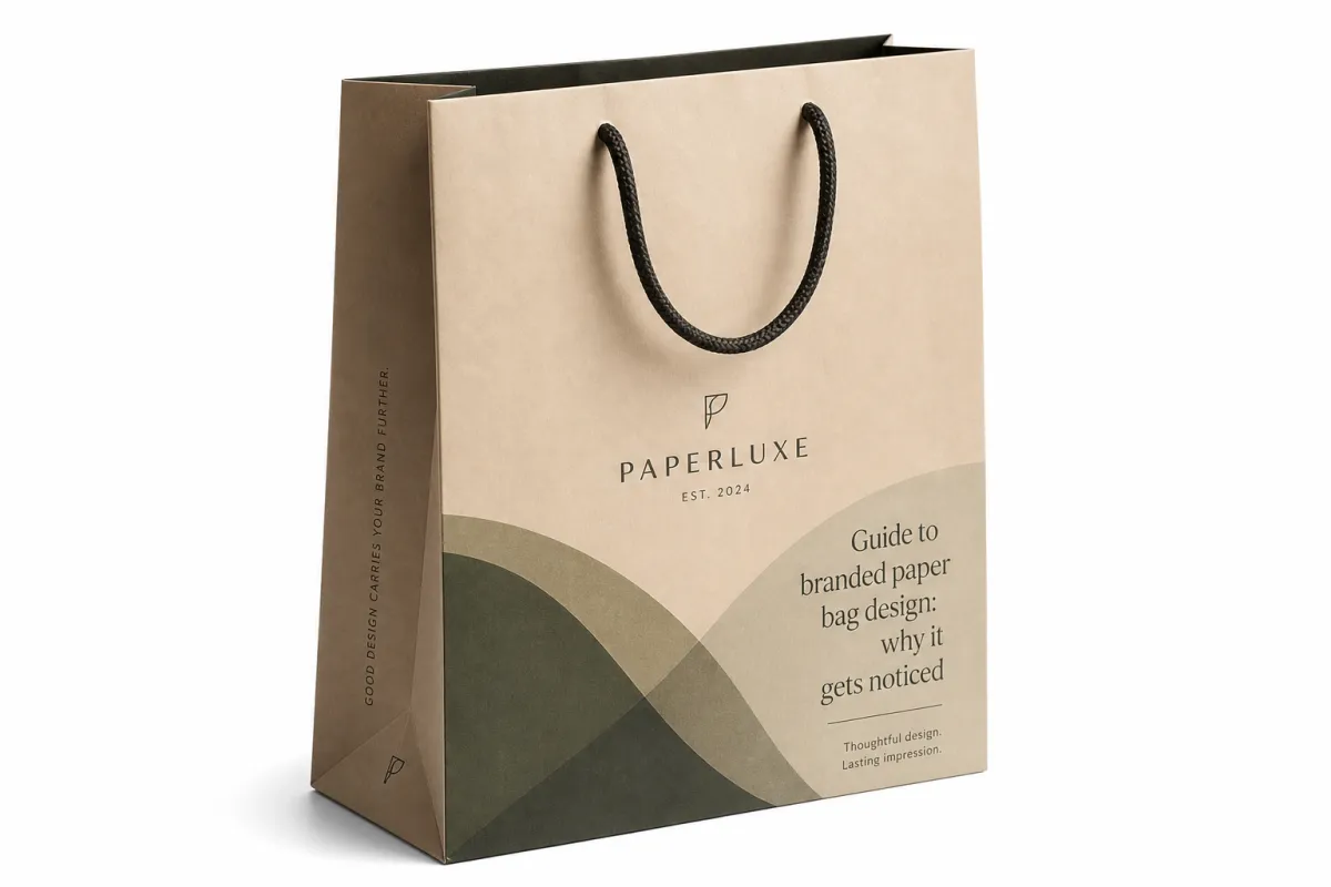
A strong guide to branded paper bag design starts with a simple fact: people often see the bag more times than they remember the purchase itself. Retailers, event teams, gift brands, and hospitality businesses keep returning to paper bags for that reason. The bag is not only packaging. It is a public object that keeps showing up after the transaction is over.
On a shelf or in a polished presentation file, almost any paper bag can look neat. Real life is less polite. Customers pinch the top edge, drop the bottom against a seat, swing the handles a little too hard, and keep the bag around because it is too nice to throw away. If the print is delicate or the layout only works from one perfect angle, the design stops doing its job as soon as it leaves the counter.
That is why this guide to branded paper bag design matters. A good bag has to carry the product, carry the brand, and survive ordinary handling. Those jobs can pull against each other. A larger logo can improve visibility, yet if it crowds the handle area or lands too close to a fold, the bag starts looking rushed. Heavy graphics can feel premium, though too much ink on light kraft stock can make the whole piece feel flat and muddy.
The smarter question is not, "How do we make this look expensive?" It is, "What should this bag communicate from three feet away, and will it still communicate that after someone has used it twice?" That line of thinking usually leads to cleaner typography, stronger contrast, and fewer decorative choices that do not earn their place.
In real use, the bag also acts as a visual memory cue. Shoppers who keep seeing the same color family, logo placement, or paper texture start linking that package with the brand itself. That matters because recognition grows without forcing attention. A disciplined visual system usually does more work than a crowded one, even if the crowded version looks clever for a minute.
A paper bag design is doing its job when it still looks deliberate after the customer has carried it, folded it, and set it down like a temporary problem.
Good paper bags also send a small but meaningful trust signal. A flimsy bag makes people wonder about the product. A tidy, well-built bag suggests the brand pays attention. That is why the best guide to branded paper bag design is never only about decoration. It is about how the bag behaves in a customer’s hands and how long that behavior holds up.
Guide to branded paper bag design process and timeline
A practical guide to branded paper bag design should always include the workflow, because most delays happen before production begins. The process usually starts with a brief: what product goes inside, how the bag will be used, how many pieces are needed, and how much the budget can handle. If that part stays vague, every later step takes more time than it should.
The next step is the dieline. That is the flat template showing panel sizes, folds, glue areas, handles, and safe zones. If the artwork is built on a random rectangle instead of the actual dieline, the result is predictable. Logos sit too close to a fold, copy disappears into the gusset, or the front panel looks smaller than the layout assumed. Nothing mysterious there. Just avoidable setup problems.
From there, solid vendors move into digital proofing. This is where dimensions, colors, and placement get checked before a sample is made. A careful proof phase protects the budget. A rushed one creates expensive rework later. In a strong guide to branded paper bag design, this stage is where mistakes should be caught, not politely passed through.
Sampling often follows if the quantity or print method justifies it. A sample lets you check structure, ink coverage, handle feel, and how the bag behaves once it carries weight. The first sample is not always perfect, and that is fine. What matters is whether the supplier can make sensible corrections before the full run starts.
Realistic timing often looks like this:
- Brief and dieline selection: 1-2 business days if the spec is clear.
- Artwork preparation and proofing: 2-4 business days for clean files, longer if the logo needs rebuilding.
- Sample creation: 3-7 business days depending on size and print method.
- Production: often 7-15 business days for straightforward runs, more for larger quantities or specialty finishes.
- Shipping: depends on lane, carton count, and destination, so do not guess.
Those ranges move around. A one-color kraft bag can move quickly. A foil-stamped, rope-handle, full-color bag with a custom size will not. Anyone promising the same timeline for both is selling optimism, not a manufacturing plan.
Projects usually slip in three places: artwork arrives late, files are low resolution, or the bag size changes after quoting. That last one causes the most irritation because size changes affect material usage, print area, carton count, and freight all at once. One small revision can ripple through the entire estimate.
Good communication matters more than people like to admit. A dependable supplier should point out structural problems early instead of waiting until approval to mention that the logo sits in the wrong place. A solid guide to branded paper bag design is really a guide to fewer surprises.
Guide to branded paper bag design cost, pricing, and MOQ
Cost is where a lot of projects get misunderstood. A proper guide to branded paper bag design needs to separate design choices from production costs, because the artwork is only one part of the bill. The bigger price drivers are stock, size, print coverage, finishes, handles, and setup.
Paper weight matters. A 210gsm kraft bag costs less than a 350gsm coated bag, but it also carries less visual weight and usually feels less premium in the hand. Print colors matter too. One-color printing is often simpler and cleaner. Four-color process, flood coats, metallic inks, and specialty finishes add steps, and each added step adds cost. That is manufacturing, not anyone being difficult.
MOQ changes the math fast. Lower quantities tend to carry a higher per-bag price because setup costs are spread across fewer units. If you only need 500 bags, the quote can look surprisingly high. If you need 5,000 or 10,000 bags, the unit price usually drops enough to make stronger material choices possible. A useful guide to branded paper bag design should always ask about volume before talking about style.
There are also costs buyers forget until they appear on the invoice. Freight is one. Sample charges are another. Plate or setup fees can apply depending on the print method. Rush charges show up when the schedule gets tight. Reprints happen when artwork is approved before it is ready. None of that is theoretical; it is the quiet part of packaging procurement.
| Option | Typical spec | Approx. unit cost at 5,000 pcs | Best for | Tradeoff |
|---|---|---|---|---|
| Basic kraft carry bag | 250gsm kraft, 1-color print, twisted paper handles | $0.18-$0.28 | Retail, promotions, food service | Simple look, limited premium feel |
| Coated premium bag | 300gsm art paper, 2-4 color print, matte lamination | $0.32-$0.55 | Gift packaging, boutique retail | Higher setup and finishing cost |
| Recycled kraft bag | 300gsm recycled stock, minimal ink coverage | $0.24-$0.38 | Sustainability-led brands | Texture can affect color consistency |
| Luxury rope-handle bag | 350gsm board, foil or embossing, rope handles | $0.55-$1.10 | Luxury retail, premium gifting | Looks strong, but pricing climbs fast |
Those ranges are working estimates, not promises. A smaller bag, a larger bag, or a heavier handle can shift the price in a meaningful way. The useful way to read a quote is not by unit cost alone. Read it as total landed cost, including freight, setup, sampling, and the risk of doing the job twice if the artwork is not resolved cleanly.
From a packaging buyer's perspective, the cheapest quote is not always the smartest one. A cleaner one-color layout on a better stock can outperform a noisy full-coverage design that costs more and feels less certain in use. That is the sort of tradeoff this guide to branded paper bag design is meant to make visible.
For sourcing decisions tied to recycled fiber or responsible forest management, the FSC standards and certification framework is worth reviewing. For transit durability and shipping abuse testing, the ISTA testing resources offer a useful reference point, especially if bags are packed in cartons and sent to multiple locations.
Guide to branded paper bag design: key factors that shape the result
The structure of the bag sets the rules. A serious guide to branded paper bag design starts with size, gusset depth, bottom construction, and handle attachment. Those details sound routine until the artwork gets clipped by a fold or the handles hide half the logo. After that, everybody notices them.
Dimensions change proportion. A tall narrow bag asks for a different layout than a wide gift bag. A large front panel leaves room for a strong logo, while a slim panel forces restraint. If the panel gets overcrowded, the design feels tense. That is rarely the mood a brand wants to project.
Contrast matters more than decoration in most real settings. Bags are seen quickly, often from a distance or while someone is walking. A dark logo on dark kraft stock can disappear even if it looked stylish in the proof. Good guide to branded paper bag design work checks visibility from the customer's point of view, not just from a designer's monitor under ideal light.
Safe margins deserve more attention than they usually get. Leave breathing room around the logo, especially near the top fold and the handle area. A bag with too little white space feels cramped. The eye needs somewhere to rest, or the layout starts looking like a flyer that got folded into a shape it never wanted.
Material choice changes the way color behaves. Kraft stock brings warmth and texture, but it can dull pale tones. Coated paper gives sharper edges and more consistent print, though it usually costs more. Matte lamination softens the look. Gloss can brighten color and improve scuff resistance, but it changes the brand feel. Recycled textures can look honest and modern, while also making fine type harder to read. That is the tradeoff, and it is worth facing directly.
Brand goals should drive the direction. A premium label usually needs restraint, rich paper, and controlled print coverage. A playful retail brand can handle bolder color blocks and more assertive typography. A sustainability-led brand may prefer natural kraft, minimal ink, and visible fiber texture. A gift-ready brand may want rope handles, a tidy closure, and a finish that feels good in the hand.
The best guide to branded paper bag design does not chase a single "best" look. It matches the bag to the use case. That is the real job.
Guide to branded paper bag design workflow
Here is the part buyers often skip until it costs them: the workflow. A disciplined guide to branded paper bag design should treat the process as a series of checks, not one big approval moment. That keeps the job moving and lowers the chance of a costly surprise.
Start with the use case. Retail carryout bags need different strength and graphics than trade show bags, event giveaways, or gift packaging. A boutique bag may prioritize finish and feel. A food-service bag may prioritize grease resistance and quick handling. A shipping insert bag has to survive distribution without turning into a wrinkled apology. Same category, different job.
Next, audit the brand assets. Check logo files, font licensing, color codes, image resolution, and any rules about minimum size or clear space. If the logo only exists as a low-res JPEG, stop there. Do not drag it into production and hope the printer fixes it. Vector artwork is the standard for a reason.
Then build the layout on the actual dieline. Not a fake rectangle. Not a rough guess. The real template. That is where the front panel, back panel, gusset, and handle zones live. A good guide to branded paper bag design uses the dieline to place artwork where the customer's eye naturally goes.
After that, check the design at real viewing distance. Hold the mockup at arm's length. Shrink it on screen. Print it if needed. A design that reads perfectly at 27 inches on a designer monitor can fail badly when viewed while walking out of a store. That is a basic usability check, not branding theory dressed up in a suit.
Finish with a proof review that covers the structure, color, handle placement, and handling in the real world. The front panel is not the only panel that matters. If the bottom board sags or the side gusset cuts through the typography, the bag will look rough no matter how polished the logo is.
If the supplier is worth working with, they will ask questions before printing. They will want to know whether the bags need to stack flat, whether the ink must match an existing brand standard, whether the inside print matters, and whether the bag will live indoors or outdoors. Those questions save money. They are useful, not bothersome. Frankly, if a vendor does not ask them, that is a little worrying.
Guide to branded paper bag design mistakes to avoid
There are plenty of ways to ruin a bag, and most of them start with too much confidence. A careful guide to branded paper bag design should point out the common mistakes before they eat the budget. The first one is visual clutter. Logo, slogan, website, QR code, social handles, product claims, and a sustainability statement can all fit somewhere on the surface. That does not mean they belong there.
Too much messaging turns a bag into a floating brochure. People do not study every inch of a carry bag. They glance. If the layout asks for homework, the design has already lost. The better move is to choose one main message and let the rest stay quiet unless the bag has enough panel space to support them without strain.
Wrong sizing is another easy failure. A logo too close to a fold can disappear. A design that sits too low can get hidden behind the customer's hand. A bag that is too large for the product can look wasteful and raise the cost for no reason. That is why a guide to branded paper bag design should always tie artwork to the real product footprint.
Ignoring stock and print method creates ugly color shifts. Some inks behave beautifully on white coated paper and poorly on brown kraft. Some metallic effects look rich in theory and blotchy in production. Fine lines can vanish. Small text can fill in. Dark backgrounds can scuff. That is not the printer being dramatic. That is material behavior doing exactly what it does.
Skipping the sample is a classic rookie move, especially when the design uses small type, foil, or heavy coverage. A sample is cheaper than a reprint. That sentence belongs on every purchasing desk. The same goes for ignoring handle strength. A beautiful bag that tears during normal use is a bad bag, full stop.
There is also the budget trap. Buyers sometimes choose the lowest quote, then pay again for artwork fixes, shipping surprises, or a second run. The original savings vanish fast. A better guide to branded paper bag design treats the bag as a system: design, production, shipping, and use. Not a line item with a nice picture attached.
Guide to branded paper bag design tips for stronger results
Sometimes the best improvements are the least glamorous. A practical guide to branded paper bag design should encourage restraint. Fewer colors often feel more premium. One strong logo and a disciplined palette can beat a crowded layout that tries too hard to show how creative it is.
Put the strongest brand mark where people see it first. Usually that is the front panel, centered or slightly above center, depending on handle placement and bag proportion. If the bag has side panels, use them only when the space actually improves the story. Blank space is not wasted space. On a strong bag, it is part of the design.
Choose finish based on use, not ego. Matte can feel understated and expensive, though it may show dirt more easily. Gloss can resist scuffs better in some retail settings, though it changes the tone of the brand. Soft-touch lamination feels good, but it adds cost and may not make sense for short-life promotional bags. In a real guide to branded paper bag design, the finish has to earn its place.
Think about the inside and the gussets only if the budget can support them. Interior printing can be memorable, especially for gift bags and premium retail, but it is easy to overdo. A nice surprise inside a bag is one thing. Turning the whole job into a print budget sinkhole is another.
Test the bag the way a customer will. Load it with product. Carry it. Set it down. Fold the top if needed. Stack it with other bags. See whether the ink scuffs, the handles dig in, or the layout still looks clean after the first rough handling. That real-world test catches more than software mockups ever will.
Here is a rule that holds up: if the design still looks good after being used like a normal paper bag, it was designed well. If it only looks good in the mockup, it was designed for approval, not for use. A guide to branded paper bag design should favor the second test every time.
One more point matters if you are comparing suppliers: ask how they handle revisions. A good vendor will give you a clear proof cycle, explain what is fixed versus what can still move, and tell you when a change affects price or schedule. That kind of communication is worth real money because it saves more than it costs.
Guide to branded paper bag design: next steps that actually help
If you want a cleaner result, start with a spec sheet. That sounds dull because it is, and that is exactly why it works. A strong guide to branded paper bag design begins with the facts: bag size, quantity, stock, handle style, print colors, finish, packaging format, and target delivery date. When those details are clear, quotes are easier to compare and revisions move faster.
Request a dieline and a digital proof before approval. Then compare the artwork against the real brand assets, not a memory of the logo from six months ago. Check spacing, contrast, line thickness, and what happens near folds and handles. Small errors hide well in a proof and become obvious in production.
If the order size justifies it, ask for a sample. A physical sample shows you more than a screen ever will. You can feel the stock, check handle strength, and see whether the print stays crisp or turns muddy. For a larger order, that is cheap insurance. For a smaller order, it can still be worth it if the design is complicated.
Compare vendors on total value. Unit cost matters, yes. So do setup fees, sample costs, turnaround, shipping, and how clearly revisions are handled. A low sticker price with poor communication is not a bargain. It is a future problem wearing a sales badge.
Make the final call only when three things line up: the design, the pricing, and the timeline. If one of those is off, the project is not ready. The cleanest guide to branded paper bag design is one that helps you avoid half-finished decisions dressed up as approvals.
For a brand that wants the bag to work as marketing, packaging, and customer experience at the same time, that discipline matters. Start with the product size, match the paper stock to the print method, keep the artwork readable at a glance, and verify the sample before the full run. That sequence sounds simple because it is, but it is also the part that keeps a bag from looking good only on a screen. Follow that order, and the bag has a much better chance of doing its job in the hand, on the street, and in the customer's memory.
How much does branded paper bag design usually cost?
Design cost depends on whether you need original artwork, dieline setup, or just print-ready file preparation. Production pricing is usually driven more by size, paper stock, print colors, finish, and MOQ than by the design file itself. A simple one-color layout is often cheaper to run than a full-coverage design, but the final quote still depends on the whole build.
How long does branded paper bag design take from proof to delivery?
Simple orders can move quickly if the artwork is ready, the proof is approved fast, and the bag spec does not change midstream. Custom sizes, sample rounds, specialty finishes, or a busy production schedule can stretch the timeline. In most cases, the proofing stage controls the pace more than the machine speed.
What file format should I send for branded paper bag design?
Vector files are best for logos and line work because they stay sharp at any size. Printers usually want editable artwork, clear color specs, and text converted or outlined so nothing shifts unexpectedly during production. If you are not sure, send the cleanest source file you have and ask the supplier what they need before finalizing the proof.
What is the best bag size for branded paper bag design?
Pick the size based on the product footprint first, then leave room for handles, folding, and visual breathing space. A bag that is too tight looks cheap fast, while a bag that is too large wastes material and can raise unit cost. The right size is the one that fits the product without making the package feel awkward.
Should I use full color or a one-color print for branded paper bag design?
One-color printing often delivers a cleaner, more premium look and usually keeps costs lower. Full color makes sense when the artwork needs photography, gradients, or a heavier graphic style. If you are trying to balance cost and impact, a strong single-color system is often the smarter move.
Can a guide to branded paper bag design help with sustainability goals?
Yes, if the design choices support the goal instead of just dressing it up in green language. Recycled kraft, FSC-certified fiber, minimal ink coverage, and right-sized bags can all reduce waste and improve the story. The key is to make the sustainability claim match the actual build, not just the label on the mockup.


