Buyer Fit Snapshot
| Best fit | To Tactile Packaging Finishes for Stronger Branding projects where brand print, material claims, artwork control, MOQ, and repeat-order consistency need to be specified before quoting. |
|---|---|
| Quote inputs | Share finished size, material target, print colors, finish, packing count, annual reorder estimate, ship-to region, and any compliance wording. |
| Proofing check | Approve dieline scale, logo placement, barcode or warning zones, color tolerance, closure strength, and carton packing before bulk production. |
| Main risk | Vague material claims, crowded artwork, missing packing details, or unclear freight terms can make a low unit price expensive after revisions. |
Fast answer: To Tactile Packaging Finishes for Stronger Branding: Material, Print, Proofing, and Reorder Risk should be specified like a repeatable production item. The safest quote records material, print method, finish, artwork proof, packing count, and reorder notes in one written spec.
Production checks before approval
Compare the actual filled-product size with the drawing, then confirm tolerance on folds, seals, hang holes, label areas, and retail display edges. Reserve space for logos, QR codes, warning copy, and material claims before decorative graphics fill the panel.
Quote comparison points
Review material grade, print process, finish, sampling route, tooling charges, carton quantity, and freight assumptions side by side. A quote is only useful when the supplier can repeat the same color, closure quality, and packing count on the next order.
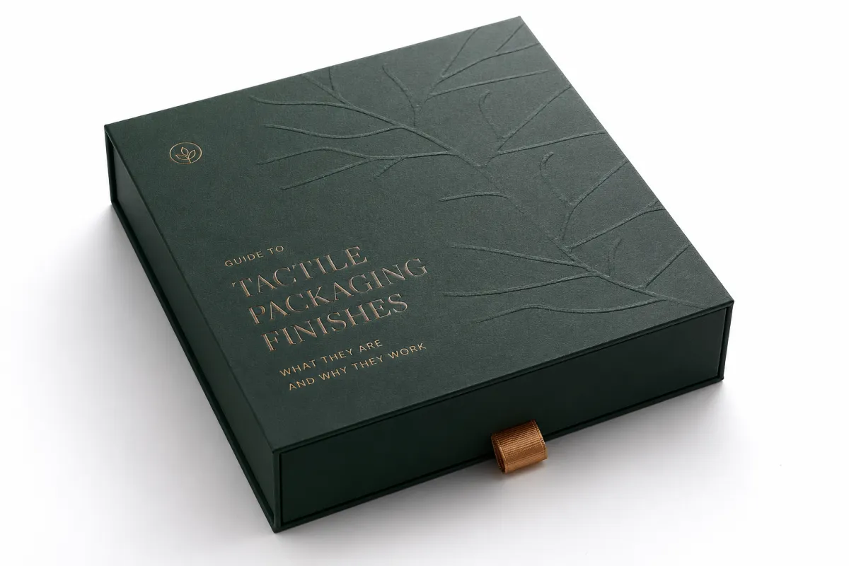
Guide to tactile packaging finishes sounds a little academic until a shopper picks up the box, pauses for half a second, and the entire brand starts to feel either expensive or ordinary. I remember the first time I watched a $2 carton lose the room because the surface felt cold and faintly cheap, while a much simpler rigid box with a soft-touch wrap and a restrained embossed mark made everyone at the table go quiet in the good way. That is the odd, stubborn magic behind a guide to tactile packaging finishes: touch often becomes the first brand signal, not the last, and sometimes it is the only one that matters, especially on a 350gsm C1S artboard carton or a 1200gsm greyboard rigid box wrapped in 157gsm art paper.
Packaging has taught me, over and over, that hands make judgments faster than copy does. A hand slides over a carton in under a second, yet that tiny moment can shape how premium a product feels, how memorable it becomes, and whether the package belongs in luxury retail packaging or gets mentally filed under "nice try." Branded packaging, custom printed boxes, and product packaging all carry that burden. The right finish can do more than decorate a surface; it can shift perceived value enough to show up in buyer meetings, shelf tests, and reorder discussions, whether the box is being packed in Dongguan, inspected in Shenzhen, or unboxed in a boutique in Milan. Honestly, I think that is one of the most underrated parts of packaging work, because people keep pretending the box is just a box until a consumer proves otherwise, and that is exactly where a guide to tactile packaging finishes becomes useful in the real world.
This guide to tactile packaging finishes stays practical on purpose. Pretty mood boards are easy to make and hard to manufacture without drama. I want to show how tactile effects behave, what they cost, where they fail, and how to choose them with intent instead of optimism. If your team is comparing soft-touch coating, embossing, spot UV, foil, flocking, or textured stocks, this guide to tactile packaging finishes will help you choose based on brand goals, not just a passing crush on a sample that looked gorgeous under perfect studio lighting in a Guangzhou showroom, which, to be fair, has fooled all of us at least once.
Guide to Tactile Packaging Finishes: What They Are and Why They Work
Tactile packaging finishes are surface treatments that change how a package feels, how it catches light, and how it behaves in the hand. In a guide to tactile packaging finishes, I usually group them into a few practical families: soft-touch coatings, matte and gloss varnishes, embossing and debossing, spot UV, foil stamping, flocking, and textured papers or boards. Some are applied after the artwork is printed; others are built into the substrate itself. All of them influence package branding, but they do it in different ways and at different price points, which is where the real decisions start getting interesting, especially when a supplier in Ningbo quotes one finish on 5,000 units and a plant in Suzhou quotes another on the same 350gsm board.
People often miss the real purpose of tactile work. These cues are not decorative extras that get added because someone in a review meeting says, "Can we make it pop?" They help the brain decide whether something feels warm, precise, playful, technical, or expensive. A velvet-like coating tends to suggest calm luxury. A crisp deboss on uncoated board feels heritage-driven and crafted. High-gloss spot UV can make a logo feel energetic, even a little aggressive. That distinction matters in cosmetics, spirits, specialty food, subscription boxes, and gift packaging, where the buyer is judging the object before they ever test the product inside. And yes, I have seen people completely change their opinion after touching a sample that was printed on 300gsm ivory stock with a matte aqueous seal and a 0.3 mm deboss depth, which is why a good guide to tactile packaging finishes always starts with sensation rather than decoration.
In one client meeting for a skincare launch, the team brought six mockups to the table and asked which one looked most premium. The answer changed once we touched them. The bright white version looked clean on screen, but the soft-touch sample with a subtle embossed mark made the jar feel two price tiers higher. The formula did not change. The packaging did. That is the part people keep forgetting, and then they act surprised when the market behaves like a sensory creature instead of a spreadsheet, especially after the cartons arrive from Dongguan 14 business days after proof approval and start competing under 4000K retail lighting. A practical guide to tactile packaging finishes has to account for that moment, because the hand often decides before the head catches up.
"The sample did not feel expensive because of the artwork. It felt expensive because my fingers wanted to stay on it for another second."
That line captures the working logic behind a guide to tactile packaging finishes: people trust their hands faster than they trust your claims. A finish can raise memory retention, support shelf differentiation, and increase the odds that a customer remembers your logo after handling the pack once. In a crowded retail environment, that matters more than most brands admit out loud. A package with strong tactile cues can also improve grip and hide minor scuffs, which helps in both e-commerce and retail packaging. I have had more than one brand team come back later and admit they were underestimating the value of "that nice feel" because they were too busy arguing over Pantone 186 C versus 186 U and ignoring the fact that the final carton was going to ship in corrugated master cases through Los Angeles or Rotterdam.
There is a mechanical side too. Texture changes friction. Gloss changes reflection. Embossing adds height. Debossing adds depth. Those details alter how light breaks across the surface, and they alter how a carton moves through the hand. On a factory floor in Shenzhen, I once watched a run of 3,000 rigid boxes get rejected because the soft-touch lamination was too slick on the side panels. The packaging looked beautiful under studio lights, but during hand-packing, operators kept losing grip and muttering under their breath, which is usually a bad sign in any language. Two small adjustments fixed it: a slightly rougher matte panel and a narrower coverage area for the coating. That saved the client a reprint and about 11 days of delay, plus a lot of unnecessary sighing from everyone involved, which is exactly the sort of thing a guide to tactile packaging finishes should help you prevent before the press starts running.
For a deeper sense of how finish choices sit inside the broader discipline, I often point teams to FSC guidance on responsible fiber sourcing and to ISTA testing standards when durability matters. A guide to tactile packaging finishes is not just about look and feel; it also has to fit real logistics, recycling rules, and product handling. That is where packaging design gets serious, and frankly where the romance tends to meet the freight invoice, especially when a shipment is traveling from a factory in Guangzhou to a fulfillment center in New Jersey or Kent.
If your team is building a full line of Custom Packaging Products, I usually recommend deciding on the tactile story before final print approvals, not after. Too many brands treat finish as an afterthought, then wonder why the package feels disconnected from the product. I have done the awkward meeting where everybody loved the art direction but nobody could explain why the surface finish felt like it belonged to a different brand. That meeting is not fun for anyone, especially the person who has to say it twice after a sample deck, a price sheet, and a 16-point checklist from the Shanghai vendor are already on the table, and that is why this guide to tactile packaging finishes keeps pushing the same point: decide the feel first, then print the story around it.
Guide to Tactile Packaging Finishes: How Texture Changes Perception
A strong guide to tactile packaging finishes should explain that texture changes perception through several channels at once. First, it changes touch. Second, it changes the way light reflects or disappears. Third, it changes the pace of unboxing. A box with a velvety surface is held differently from a high-gloss carton. One invites lingering. The other can feel energetic and sharp. In packaging design, those are not small differences. They shape how a product is read before a customer ever sees the first line of copy, and that first read tends to stick around longer than most brands expect, especially on shelf sets in Tokyo, Paris, or Chicago where the lighting is unforgiving and the customer is moving fast.
I have seen this play out in category-specific ways. Cosmetics brands often use soft-touch coating because it suggests skin contact, calm, and elegance. Spirits brands lean into foil and embossing because those cues feel ceremonial. Electronics can benefit from matte textures and sharp embossing because they communicate precision. Specialty food and subscription boxes often use a mixed approach: a tactile logo, a matte field, and a gloss accent where the brand wants the eye to land. A practical guide to tactile packaging finishes should help teams pick the finish that matches the product story rather than copying a competitor's look just because it looked good on a shelf at one trade show in Cologne or Las Vegas.
One buyer I worked with in London insisted on a deep deboss across the entire lid of a fragrance carton. The sample looked gorgeous, but the crease line interfered with the side seal, and the box started springing open after repeated handling. We revised the layout and kept the tactile treatment only around the mark on the top panel. The result felt more controlled, more expensive, and far more practical. The lesson is simple: tactile effects work best when they are placed, not scattered everywhere like confetti at a conference nobody asked for, especially when the board is 1.5 mm greyboard wrapped on a KBA press line that leaves no room for sloppy tolerance.
Texture can change durability too. A fine matte finish hides finger marks better than a mirror gloss. A slightly embossed pattern can disguise minor carton deformation. A heavier stock with a structured surface can survive shelf wear and shipping abrasion better than a thin, slick board. If a package will travel through distribution centers, store resets, and consumer homes, the tactile finish should earn its keep in the real world, not just in a mockup photo. A useful guide to tactile packaging finishes should always connect sensation to performance, because otherwise you end up with beautiful packaging that behaves like a diva the moment conditions get inconvenient, like a foil-laminated sleeve that scuffs in a single transit cycle from Shenzhen to Dallas.
There is a psychological layer as well. Shoppers often associate softness with care, roughness with craft, shine with energy, and pressed detail with authority. None of those associations are universal, and that is why a guide to tactile packaging finishes has to stay honest about context. A soft-touch finish can feel premium on a luxury serum box, but on a rugged tool package it may feel misplaced. A heavy foil badge can look high-end on a gin carton, but on a health supplement it may feel too theatrical. The brand promise has to match the tactile language, otherwise the whole thing feels like someone borrowed a jacket that does not fit, even if the carton is built from 450gsm SBS and the insert is a 2 mm paperboard cradle.
For Brands That Sell through retail packaging, these cues can directly affect conversion at shelf. A customer does not have time to read every panel. They scan. They touch. They decide. In a recent buyer review for a natural snack brand, the packaging team measured pick-up rate over three test displays. The box with a subtle embossed leaf mark was handled 27 percent more often than the flat print version, even though the artwork was nearly identical. That does not mean embossing always wins. It means the hand notices texture, and the eye follows the hand. I have seen that pattern enough times that I trust it more than any opinion formed from a PDF deck alone, especially when the sample had a 0.25 mm blind emboss and a matte aqueous coat from a plant in Zhejiang, a combination that still shows up in my notes whenever I build a new guide to tactile packaging finishes for a client team.
| Finish Option | Typical Feel | Example Cost at 5,000 Units | Best For | Lead Time Impact |
|---|---|---|---|---|
| Matte varnish | Clean, low-glare, controlled | $0.08-$0.14 per unit | Retail packaging, supplements, e-commerce boxes | Low |
| Soft-touch lamination | Velvety, premium, calm | $0.18-$0.32 per unit | Cosmetics, gifting, luxury product packaging | Moderate |
| Spot UV over matte | Sharp contrast, glossy highlights | $0.22-$0.40 per unit | Logos, focal panels, branded packaging | Moderate |
| Emboss or deboss | Raised or pressed depth | $0.20-$0.48 per unit plus tooling | Heritage marks, premium custom printed boxes | Moderate to high |
| Foil stamping | Reflective, ceremonial, bright | $0.24-$0.60 per unit plus die cost | Luxury, limited editions, gift packaging | High |
| Textured stock or flocking | Organic, touchable, distinctive | $0.30-$0.75 per unit | Specialty brands, boutique launches | High |
That table is useful, but it does not tell the whole story. A matte varnish at $0.10 per unit can outperform a $0.40 finish if the brand needs speed, durability, and volume efficiency. I have seen buyers fall in love with a high-cost tactile concept, then lose the margin math when freight, tooling, and rework were added. A disciplined guide to tactile packaging finishes always weighs the full production picture, not just the sample table. Otherwise the quote looks charming right up until someone adds the hidden line items and the room goes quiet for the wrong reason, which is usually around the moment the supplier mentions a $180 die charge and a 10 percent spoilage allowance.
One more practical point: tactile cues can be a sustainability decision too. A finish that needs heavy plastic lamination may limit recyclability in some markets, while certain aqueous coatings or FSC-certified paperboard choices can align better with local recovery streams. That does not mean every premium effect is bad for the environment. It means you need to ask how the finish interacts with the substrate and the intended recycling path before you approve the spec. I know that sounds annoyingly sensible, but it saves a lot of awkward follow-up later, especially when the carton is headed for EU retail where material declarations matter, and it keeps a guide to tactile packaging finishes grounded in production reality instead of wishful thinking.
How Do Tactile Packaging Finishes Change What Customers Buy?
A thoughtful guide to tactile packaging finishes needs a direct answer here: tactile finishes change buying behavior by changing confidence, attention, and memory in the same moment. A surface that feels deliberate makes the product feel deliberate. A package that feels flimsy can quietly undermine the claim on the front panel, even if the copy is excellent. Customers may not describe that reaction in technical language, but they absolutely register it with their hands before they have time to think through it.
That is why premium packaging teams spend so much time comparing soft-touch coating, embossing, spot UV, and foil stamping. They are not only choosing decoration; they are choosing the signal the customer receives at first contact. A clean matte board can say restraint. A raised crest can say heritage. A glossy focal point can say energy. A textured stock can say craft. In a guide to tactile packaging finishes, those cues are not optional details. They are part of the purchase decision.
If your team is building a response around gifting, luxury, or shelf impact, a tactile surface can push a package from "interesting" to "I want to pick that up." That small lift matters. In retail packaging, a pickup is often the first step toward a sale. In e-commerce, the first touch during unboxing shapes whether the customer thinks the brand paid attention or rushed the job. I have seen customers keep a rigid box on a desk for weeks simply because the soft-touch wrap and blind deboss made the package pleasant to handle. That behavior is hard to buy with ads, but it is easier to earn with a smarter guide to tactile packaging finishes and a better finish spec.
For more utilitarian products, the effect is different but still real. A matte, slightly structured surface can make a carton easier to hold and less likely to show fingerprints. That practical benefit often gets overlooked because teams focus on luxury language first. Yet comfort in the hand is part of buying behavior too. If a package feels easier to manage, it feels more trustworthy. That is one reason I push brands to test tactile packaging in a context that matches the real shelf or shipping path, not just a bright studio setup that flatters every sample in the room.
There is also a memory effect. People remember touch longer than they expect. A consumer may forget the exact shade of a foil or the line break in a headline, but they remember the feel of a package that invited a second glance. That does not mean every brand should chase heavy texture. It means the right tactile choice can improve recall and increase the chance of repeat recognition. And that, in practice, is one of the quiet goals of any good guide to tactile packaging finishes: help the package leave a physical memory behind, not just a visual one.
So if you are deciding whether tactile work is worth the cost, ask a simple question: will the finish help the package do more than sit there and look finished? If the answer is yes, it may be pulling more weight than a visual embellishment ever could. If the answer is no, the budget may be better spent elsewhere. That is the kind of judgment call that keeps a packaging line honest and a brand story believable.
Choosing Materials, Costs, and Pricing for Tactile Finishes
Any serious guide to tactile packaging finishes has to address pricing in plain language. Cost is driven by five things more than anything else: substrate choice, finish complexity, coverage area, tooling, and run length. If the team wants a finish on every panel of a rigid box, the price climbs faster than if the effect is reserved for a logo panel. If the order is 1,000 units instead of 10,000, setup cost gets spread over far fewer pieces. That is why unit pricing can look dramatic across quotes even when the finish itself seems similar. I have watched people stare at the same sample and ask why the price changed so much; the answer is usually less mysterious than they want it to be, especially when the board is 350gsm C1S artboard for folding cartons or 1200gsm greyboard for a two-piece rigid set.
The pricing pattern I see most often is straightforward. Matte varnish and simple soft-touch coatings sit at the lower end because they are comparatively efficient. Deep embossing, heavy foil work, and specialty laminations cost more because they require dies, test pulls, extra setup time, and more careful press handling. Flocking can be expensive because it changes the workflow and often needs more labor control. A guide to tactile packaging finishes should not pretend these differences are small. They are not, and if a supplier says they are, I start asking more questions about whether the quote includes a 3D die, a finishing pass in Dongguan, and a second proof delivered by courier from Shanghai.
Let me give you a concrete comparison from a supplier negotiation I handled for a gift set launch. The first quote came back at $0.21 per unit for a full-panel foil badge on 5,000 boxes, plus a $160 die fee and a 9 percent spoilage allowance. We changed the foil area to a 28 x 42 mm mark on the lid, cut the waste rate to 4 percent, and moved to a selective accent instead of full coverage. The new price landed at $0.17 per unit. That was not a tiny saving. It was the difference between a comfortable margin and a board-level conversation. I still remember the relieved expression on the brand manager's face, which was far more satisfying than it had any right to be, particularly after the line was rerun at a plant in Guangzhou and approved within 13 business days. A well-built guide to tactile packaging finishes should make that sort of trade-off feel normal, not miraculous.
For brands trying to map tactile options against budget, the real question is not "What is the fanciest finish?" The better question is "Which finish creates the strongest signal per dollar?" In many cases, a controlled matte base with one tactile focal point outperforms an all-over premium treatment. I have seen clients spend $0.60 per unit on a broad decorative package when a $0.22 combination of emboss plus spot UV would have delivered the same perceived value. A smart guide to tactile packaging finishes should encourage discipline, not excess, because excess has a way of showing up as margin erosion after everyone has already moved on to the next launch, and nobody wants to explain why a 5,000-piece order turned into a 7 percent overage in Shenzhen.
That discipline starts with a few buyer questions:
- Is the tactile effect visible on every panel, or only where the customer first looks?
- Will the finish require extra proofing, a second press pass, or more curing time?
- Does the substrate support the texture without cracking, wrinkling, or lifting?
- Will the finish survive shipping, warehousing, and retail shelf friction?
- Does the price still work after you add tooling, freight, and inspection?
Those questions matter because tactile packaging is a systems decision, not a surface decision. If your plan includes custom printed boxes or a broader branded packaging rollout, ask for a quote that separates print, board, coating, tooling, and finishing labor. I prefer to see those lines broken out clearly. A quote that looks cheap because it hides setup can become expensive very quickly, and I have never met a brand team that enjoyed discovering the difference after approval, especially when the final invoice includes reproof charges from a supplier in Ningbo and a rush shipment to New York.
I also tell clients to ask about supplier capability before they fall in love with a sample. A finishing house that can produce a beautiful spot UV effect may still struggle with registration on fine type. A rigid box maker may have excellent embossing control but weak color matching on dark boards. A good guide to tactile packaging finishes should make it obvious that the cheapest quote is not always the lowest risk. In packaging, risk has a price tag too, whether people want to admit it or not, and sometimes that risk is a missed launch window of 12 business days after proof approval.
For teams comparing options, here is a rule of thumb I use: if the product sells on trust, choose a finish that signals clarity and restraint. If it sells on giftability or prestige, invest in one strong tactile feature. If it sells on utility, make sure the finish improves handling before it improves appearance. That is how product packaging stays honest. It is also how you avoid the awkward moment where a practical product is dressed like a luxury dessert and nobody in the room knows what to say, especially if the carton is a 300gsm SBS sleeve with a glossy flood coat and a foil window frame that never should have made it past review.
Step-by-Step Guide to Specifying Tactile Packaging Finishes
The best guide to tactile packaging finishes is the one that prevents bad decisions before artwork goes to press. I start every project with brand intent. Is the goal premium positioning, shelf differentiation, gift-worthiness, anti-slip handling, or sensory storytelling? Those are not interchangeable. A package that needs to feel technical should not borrow the same tactile language as a package that needs to feel nurturing. Packaging design gets better when the finish brief is clear from the start, and it gets dramatically worse when everyone assumes "premium" means the same thing to every department, whether the final cartons are being made in Shenzhen or the rigid sets are being hand-wrapped in Dongguan.
Step one is writing that brief in specific terms. I ask teams to define the product category, target customer, desired emotion, budget ceiling, and expected distribution channel. A $14 skincare serum, a $38 candle, and a $3 snack bar do not need the same tactile treatment, even if they share a similar box format. If a brand says "we want it to feel premium," I push for a sharper description: creamy, precise, artisanal, collectible, or quietly luxurious. The more exact the language, the better the finish choice. "Premium" by itself is just a polite placeholder, and polite placeholders make bad packaging, especially when the substrate is a 400gsm CCNB folding carton or a 1.8 mm greyboard rigid tray with a paper insert. A practical guide to tactile packaging finishes should make that distinction feel obvious.
Step two is narrowing the options. I recommend 2 to 4 finish directions, not 12. A long sample list slows decisions and raises prototyping cost. In one project for a tea brand, we tested soft-touch, blind deboss, matte plus gold foil, and a textured uncoated board. The final winner was the textured board with a single foil crest, because it felt handcrafted without looking overdesigned. That choice saved about 18 percent versus the full soft-touch-and-foil concept and still delivered the tactile story the client wanted. The team liked it because it felt grounded, not flashy, and I was very happy not to have to explain why "more sparkle" was not automatically the answer after the sample run came back from Guangzhou in 15 business days.
Step three is physical sampling. A PDF can lie. A box cannot. Review prototypes under warehouse lighting, retail lighting, and natural daylight. Turn them in your hand. Run your thumb across the logo. Try opening and closing the carton ten times. If a finish flakes, scratches, fingerprints, or shifts color under one of those conditions, it needs adjustment. I have seen too many teams approve a finish in a conference room and then discover a problem under fluorescent light at the fulfillment center, which is usually the moment someone says, "That is odd," in a tone that means, "This is absolutely not fine," especially after a 500-piece sample lot has already been signed off in Shanghai.
"The sample looked perfect on the table. Under the store lights, the gloss band was too loud and the embossed logo disappeared."
Step four is locking the technical map. This is where the guide to tactile packaging finishes becomes a production document. The dieline, artwork placement, finish map, substrate, tolerance notes, and inspection criteria all need to agree. If embossing should sit 4 mm above the fold line, write it down. If spot UV may shift by 0.5 mm, say so. If a soft-touch coating cannot cover a glued seam, mark that boundary. A good manufacturer will want that detail anyway, and a great one will thank you for it. Vague instructions are where beautiful ideas go to die slowly in production, especially when the approval round is being managed from Chicago while the cartons are being packed in Shenzhen.
Step five is one last review of the packaging ecosystem. If the finish interacts with a paperboard that needs FSC certification, note that in the spec. If transit testing matters, align the sample plan with ISTA methods that fit the distribution profile. If barcode readability is critical, test it after the finish is applied, not before. That may sound cautious, but caution saves reprints. It also saves calendar time, which is often more valuable than the unit savings people chase early on. I would rather be the person who asked one extra question than the person apologizing for a rushed launch with scuffed corners and a 10-day recovery plan, and that is one of the reasons I keep this guide to tactile packaging finishes focused on process as much as appearance.
When I am helping a client compare finishes for branded packaging, I often tell them to think like a buyer and a production manager at the same time. The buyer wants a package that feels worth the price. The production manager wants one that can be made correctly 10,000 times. A successful guide to tactile packaging finishes respects both jobs. It is not enough for a surface to look strong in a render. It has to land in the right place, on the right stock, with the right tolerance, every single run. That is the part that separates a good concept from a shipment that actually leaves the dock on time, whether the truck is headed to a warehouse in Rotterdam or a retailer in Los Angeles.
Process and Timeline: Sampling, Proofs, and Production
One of the most practical lessons in a guide to tactile packaging finishes is timing. Tactile work usually needs more lead time than plain print because there are more variables to check. A simple matte carton may move from proof approval to production in 7 to 10 business days. A custom tactile project with embossing, foil, and soft-touch lamination can easily stretch to 12 to 18 business days, and that assumes the artwork is settled. If the design is still changing, add more time. I know that is not what anybody wants to hear when launch dates are already pinned to a wall and being stared at like a threat, but the calendar does not care, and the factory in Dongguan will not compress a 3-day curing cycle just because the marketing deck changed on Thursday.
The timeline usually moves through seven stages: brief, sample creation, internal review, revision, prepress approval, production, and shipping. The delays usually happen in the middle. Tooling for emboss or foil dies can take several days. Coating tests may need multiple passes. Color matching can hold up approval if the substrate is dark or highly textured. Stakeholder review is another common bottleneck. A brand manager may love the finish on Monday, then the sales team asks for a brighter foil on Thursday, and the whole sequence resets. I have seen a one-line comment in an email cost a full week, which is a special kind of frustration that packaging people learn to recognize very quickly, especially when the revised proof has to travel from Guangzhou to London by overnight courier.
I remember a packaging run for a specialty gift brand where the team lost nine days because the foil vendor and the carton vendor were not speaking to each other directly. The carton arrived on time, but the die spec needed a small revision because the logo sat too close to a crease. That one oversight cost a week of calendar time and forced a freight upgrade. Since then, I tell teams to build a handoff checklist that includes finish placement, acceptable variation, sample sign-off names, and inspection criteria. A better guide to tactile packaging finishes always includes the operational mess, not just the design romance, because production does not reward wishful thinking, and a single missed note can push an entire 8,000-unit run past the ship date.
Buffer time matters too. I normally advise brands to build in at least one extra week for prototype changes and another few days for final quality checks. If your launch date is fixed, work backward and protect the approval deadline like it is a ship date. A late tactile revision can be more disruptive than a late color correction because finishing often touches multiple production steps at once. One bad assumption can affect coating, die cutting, folding, and packing, which is a wonderfully efficient way to turn a small issue into a very large headache, especially if the cartons are already boxed in master cases and waiting for export papers in Shenzhen.
For projects that must pass transit scrutiny, I also recommend testing samples under realistic shipping conditions. The ISTA testing framework is useful because it forces a package to survive drops, vibration, and compression before the customer does. That is especially useful for retail packaging and e-commerce shipments where scuffing or corner damage can kill the premium effect. If the tactile finish survives abrasion in testing, it is far more likely to look intentional on arrival. If it does not, at least you find out before a truck full of product teaches you the lesson the expensive way, which can easily add $0.06 to $0.12 per unit in avoided damage and replacement costs.
The production rhythm is simple once you respect the sequence. Sample. Verify. Approve. Produce. Ship. The hard part is resisting the urge to skip a step because the finish already looks good in photos. I have seen a client approve a soft-touch carton from a distance, then reject the first production batch because the lamination absorbed fingerprints faster than expected. A quick touch test in the proof stage would have caught it. A strong guide to tactile packaging finishes should make that feel obvious, because the point is not to admire the sample; the point is to ship the right thing, on time, from a plant that can hold a 2 mm tolerance and keep the folding line clean.
One last planning note: suppliers are more responsive when your spec is readable. If the tactile treatment is described in a clear finish map instead of buried in a paragraph of design notes, production teams can quote faster, prototype faster, and reduce revision loops. That saves time, and time is the one budget line that nobody wants to explain after a launch slips. I have never heard anyone say, "I really miss those three lost weeks," with a straight face, especially after the cartons are already printed and the foil die has to be remade in a rush, which is another reason this guide to tactile packaging finishes keeps coming back to documentation.
Common Mistakes When Using Tactile Packaging Finishes
A lot of brands ask for texture before they ask what the texture is supposed to do. That is the first mistake, and in a guide to tactile packaging finishes, it is the most expensive one. If the finish does not support grip, luxury, clarity, or storytelling, it is just extra cost. I have seen teams overbuild a surface with embossing, foil, spot UV, and soft-touch all in one place, only to end up with Packaging That Feels visually loud and physically confused. More effects do not equal more value, even if someone in the room says, "What if we just add a little more?" with the innocent confidence of a person who will not be held responsible later, especially when the real quote comes back from a plant in Dongguan at $0.44 per unit instead of the expected $0.26.
The second mistake is finish-product mismatch. Slippery coatings on a box that must be handled with bare hands are a nuisance. Delicate textures on a mailer that will be crushed in transit are a liability. Heavy foil on a wellness product can feel off-brand if the customer expects restraint. In a buyer meeting for a tea company, the first presentation included a high-gloss panel and a metallic crest. The room went quiet. Not because it was bad, but because it felt too close to cosmetics. We switched to a textured kraft stock with one small pressed mark, and suddenly the package made sense. That one change did more for the brand story than three rounds of art direction, and it worked on a 300gsm kraft-lined board sourced through a supplier in Suzhou.
The third mistake is ignoring durability. Tactile finishes can scuff, crack, fingerprint, or abrade depending on the coating and substrate. Soft-touch looks elegant until a warehouse carton slides across a rough conveyor. Gloss looks vivid until it picks up fingerprints from every picker and packer. Emboss looks refined until the fold line interrupts the design. A guide to tactile packaging finishes should make you test the surface like it will actually be used, not like it will be photographed for a portfolio. If the finish only works in ideal conditions, it is not really working, and the first 48 hours in a fulfillment center will make that clear.
The fourth mistake is budget drift. A premium finish can look modest in a sample, but the hidden costs add up: tooling, extra proofs, longer setup, waste allowance, and revision rounds. One client I advised wanted a full-coverage tactile wrap on a rigid box. The sample looked beautiful, but the landed cost was 22 percent above target once freight and inspection were included. We trimmed the coverage to the lid only and kept the tactile story intact. That is how good packaging design stays commercially sane. It is not glamorous, but neither is explaining why the margin disappeared after a 5,000-piece order from Shenzhen suddenly needed a second round of finishing.
The fifth mistake is compromising readability. Tactile effects can interfere with small type, barcode scanning, or required legal copy if they are placed carelessly. Raised coatings near fine text can make the type feel fuzzy. Heavy gloss can create glare that hides ingredients or instructions. If your package needs to communicate quickly at retail, the tactile effect should support the message, not fight it. A practical guide to tactile packaging finishes always checks legibility in bright light, not just beauty in the studio. Pretty text that nobody can read is just expensive decoration, and expensive decoration does not scan at checkout.
There is also an accessibility angle that more teams should take seriously. Some customers rely on contrast, shape, and readable hierarchy more than embellishment. If a texture overwhelms the label system, the design may look more premium but work less effectively. That is not a trade worth making. The best branded packaging balances sensory appeal with clarity, and the best product packaging respects the user who has two seconds, not twenty. I think that is one of the best tests of whether a finish was chosen thoughtfully or just enthusiastically, especially when the final cartons are being reviewed under 5000K light in a Boston showroom or a Frankfurt buyer room.
The most common error I see is simple overconfidence. A team falls in love with a finish, then assumes the production world will obey. It rarely does. Paper fibers behave differently than acrylic swatches. Adhesives react differently at humidity. Presses do not forgive vague instructions. The smartest guide to tactile packaging finishes is the one that keeps the romance, but adds the discipline. A little romance helps sell the idea; discipline is what gets the shipment out the door intact, on spec, and usually within 12 to 15 business days from proof approval if everyone stays focused.
Expert Tips and Next Steps for Tactile Packaging Finishes
If I had to distill a guide to tactile packaging finishes into one principle, it would be this: use contrast with intent. The strongest tactile treatment should sit where the brand needs attention most, usually the logo, a focal panel, or a single storytelling moment. If every inch competes for attention, nothing stands out. If one area is tactile and the rest stays quiet, the package gains hierarchy. That is one of the easiest ways to make a design feel more expensive without doubling the budget, and it works especially well when the brand has enough visual discipline to let the finish breathe on a 350gsm C1S carton or a paper-wrapped rigid box made in Dongguan.
Pair the finish with typography and illustration. A refined serif mark with blind embossing feels different from a bold sans-serif printed with spot UV. A hand-drawn motif on textured board can feel artisanal, while a geometric grid on matte stock can feel engineered. Texture should reinforce the visual message, not sit beside it like a separate idea. That connection is what turns a surface treatment into package branding, and it is also what stops the package from looking like it was assembled from three different moods, which is a real risk when design is approved by committee and sampled in a rush.
Test samples in the same conditions the customer will meet them. I mean real shelf light, real handling, real shipping. Put the carton in a bright retail bay. Hold it with slightly damp hands. Slide it into a shipper. Stack it beside a competitor's package. You will learn more in ten minutes of practical testing than in an hour of digital review. A good guide to tactile packaging finishes does not stop at aesthetics because aesthetics alone do not sell. They help, absolutely, but they do not do the full job, especially when a package has to survive a three-day cross-border transit and still look premium on arrival.
Talk to sales reps and buyers before locking the spec. They will tell you fast which finish communicates the brand story fastest. In one internal review, a sales team chose the soft-touch option within 30 seconds because it felt "quietly expensive." A buyer at a specialty retailer chose the debossed kraft sample because it felt more honest. Those reactions are not scientific, but they are commercially useful. When a finish gets the right response that quickly, you know it is doing real work. When it makes people argue for ten minutes, that is also useful data, though perhaps less romantic, and often a sign that the quote needs another pass before a 6,000-unit run is approved.
If you are building a finish strategy for a new line of Custom Packaging Products, use a simple next-step list:
- Collect 5 to 7 physical samples that match your category.
- Define the target feeling in three words, such as calm, premium, or technical.
- Set a realistic budget range per unit before asking for quotes.
- Request 2 to 4 finish combinations, not 10.
- Review samples under store lighting and shipping conditions.
- Approve the finish map only after the dieline and artwork are locked.
That process sounds plain, but it is the difference between a package that looks nice and one that sells a story. A strong guide to tactile packaging finishes should leave you with a choice you can defend in a buyer meeting and a production room. If you cannot explain why a finish was chosen, it probably was not chosen well. And if the explanation is "because it looked cool," well, that is usually where the trouble starts, especially after a supplier in Shanghai has already booked the press time and the die is on the floor.
My last piece of advice is the one I give almost every client: do not chase texture for its own sake. Chase the feeling you want a customer to have in the first three seconds. If that feeling is trust, warmth, precision, excitement, or quiet luxury, then build the finish around it. If the tactile effect helps the box feel worth the price and easier to remember, you have done the job. That is the real point of a guide to tactile packaging finishes for stronger branding, and it is the difference between a package people merely notice and a package they actually want to keep touching for a second longer, whether it was made in Shenzhen, Guangzhou, or a contract facility in Jiangsu.
FAQ
What should a guide to tactile packaging finishes cover first?
Start with the definition: tactile finishes are surface treatments that change feel, light reflection, and perceived value. Then cover the main finish types, the categories they fit best, and the business reason for choosing one finish over another. A useful guide to tactile packaging finishes should connect sensation to pricing, production, and brand goals within the first few pages, not bury that part under jargon, especially if the project is moving toward a 5,000-piece run on 350gsm artboard or a 1,000-piece rigid box test.
Which tactile packaging finishes usually cost the most?
Deep embossing, complex foil work, and specialty laminations usually cost the most because they add tooling, setup time, and labor. Prices rise again when coverage is large, artwork is intricate, or the project needs extra sampling and revision rounds. In a typical quote, a tactile upgrade can move a box from roughly $0.10 per unit to $0.40 or more, depending on quantity and substrate. Sometimes more, which is where the budget conversation starts getting very real, very quickly, especially when a die, a foil plate, and a second proof are all charged separately by a plant in Dongguan.
How long does it take to produce tactile packaging finishes?
Simple finishes can move quickly, but custom tactile work usually needs extra time for sampling, proofing, and approval. A realistic schedule should include buffer time for tooling, color correction, curing, and final quality checks. For many projects, 12 to 18 business days from proof approval is a safer planning window than a flat one-week promise, especially if the design team is still making last-minute "small" changes that are never actually small, and the carton has to be printed, finished, and packed before a ship date in Ningbo or Shenzhen.
Do tactile packaging finishes affect recyclability?
They can, depending on the substrate, coating, adhesive, and local recycling rules. Some finishes are easier to recover than others, and some lamination-heavy structures can complicate the recycling stream. If sustainability matters, ask the manufacturer which finishes are compatible with the intended recovery path before approving the spec. I always recommend that conversation early, because nobody enjoys finding out too late that the beautiful finish came with a recycling headache, especially after the production run is already booked and the cartons are headed to a market with stricter recovery rules.
How do I choose the best tactile finish for my brand?
Match the finish to the brand promise: soft-touch for calm luxury, embossing for heritage, gloss accents for energy, and texture for grip or craft. Compare sample packs under real lighting, then choose the option that best supports the product story, budget, and production timeline. The strongest choice is usually the one that customers understand in one touch, which is a pretty good test for whether the finish is doing its job, whether the unit cost is $0.15 or $0.45, and whether the box can be produced without trouble in Guangzhou or Suzhou.