Buyer Fit Snapshot
| Best fit | Brand Corrugated Mailer Boxes for Stronger Sales projects where brand print, material claims, artwork control, MOQ, and repeat-order consistency need to be specified before quoting. |
|---|---|
| Quote inputs | Share finished size, material target, print colors, finish, packing count, annual reorder estimate, ship-to region, and any compliance wording. |
| Proofing check | Approve dieline scale, logo placement, barcode or warning zones, color tolerance, closure strength, and carton packing before bulk production. |
| Main risk | Vague material claims, crowded artwork, missing packing details, or unclear freight terms can make a low unit price expensive after revisions. |
Fast answer: Brand Corrugated Mailer Boxes for Stronger Sales: Film, Print, MOQ, and Carton Packing should be specified like a repeatable production item. The safest quote records material, print method, finish, artwork proof, packing count, and reorder notes in one written spec.
Production checks before approval
Compare the actual filled-product size with the drawing, then confirm tolerance on folds, seals, hang holes, label areas, and retail display edges. Reserve space for logos, QR codes, warning copy, and material claims before decorative graphics fill the panel.
Quote comparison points
Review material grade, print process, finish, sampling route, tooling charges, carton quantity, and freight assumptions side by side. A quote is only useful when the supplier can repeat the same color, closure quality, and packing count on the next order.
If you are trying to figure out how to brand Corrugated Mailer Boxes, the first decision is not the logo file. It is the board, the print method, and the path the box will take after it leaves the warehouse. A carton can look excellent on a screen and still disappoint in production if the liner is wrong, the fold lines are crowded, or the ink method cannot hold fine detail. Packaging has to survive trucks, conveyor belts, doorsteps, and the brief but intense judgment that happens the moment a customer lifts the lid.
Corrugated mailers earn their keep in a narrow window. They protect the product, frame the brand, and tell the customer whether the order was handled with care. A plain box can still move product, but it rarely adds meaning. A branded mailer does something subtler. It makes the purchase feel considered, which matters more than many companies admit. Multiple packaging and consumer studies have linked presentation with perceived value, and perceived value shapes whether people remember the brand or mentally file the shipment away before the recycling bin closes.
That is why the best packaging programs treat the box as part of the product, not as a shipping afterthought.
Why Corrugated Mailer Boxes Are a Branding Opportunity
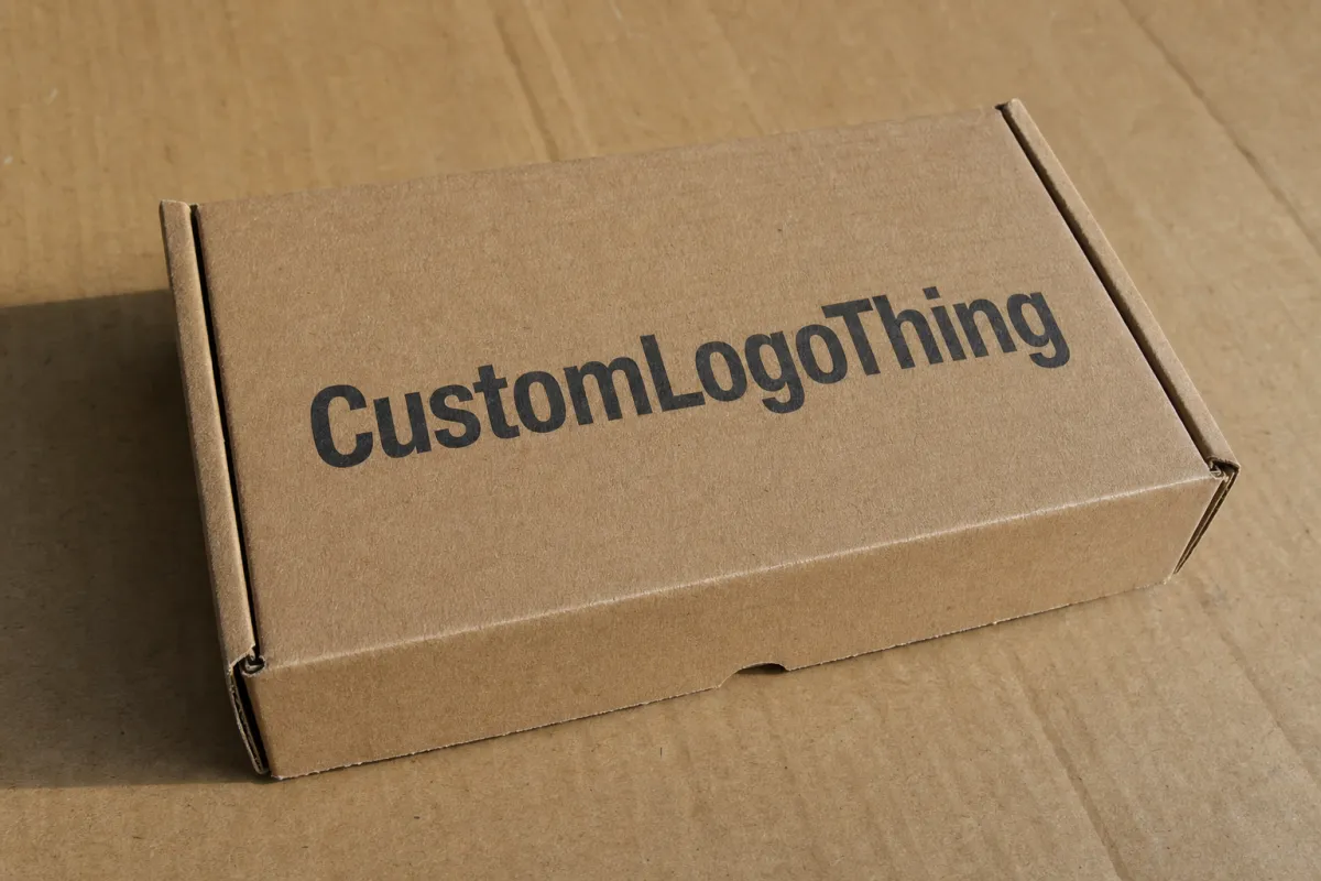
Corrugated Mailer Boxes usually use a single-wall construction with fluted medium between two linerboards. That structure gives them a useful balance of strength and weight. E-flute is popular when a brand wants a smoother print surface and a compact, polished look. B-flute brings a little more crush resistance and a sturdier feel. Both can work. The better choice depends on product weight, shipping stress, and the tone you want the package to strike when it lands on a customer’s desk, kitchen table, or office reception counter.
The branding value shows up in places that are easy to overlook. A mailer is photographed before it is opened. It sits in the corner of a social post. It may be stacked beside other purchases in a fulfillment center or passed around an office before the contents are even revealed. That outer panel is doing marketing work before the product gets a chance. The box becomes a signal. Polished print and thoughtful structure suggest the brand handled the whole order with discipline. A tired, generic carton sends the opposite message, even if the product inside is excellent.
A mailer box is not just a container. It is a quiet sales rep that arrives before the product does.
Subscription kits, cosmetics, apparel, wellness products, accessories, and small electronics all benefit from the same basic truth: the opening experience can shape repeat behavior. A customer may not remember the exact corrugated spec, but they do remember whether the package felt intentional. That does not require expensive embellishment. A strong logo, a disciplined color system, and a clean interior message often do more than full coverage graphics that try to impress by volume.
Compare the effect to storefront design. A cluttered window can sell one visitor and confuse the next. A clear one works harder because the eye knows where to land. Mailer boxes behave the same way.
If you are comparing packaging formats, look at the system rather than the box in isolation. Our custom packaging products page is a useful place to compare mailers with inserts, cartons, and retail-ready structures. For heavier products or shipments that need extra impact protection, custom shipping boxes may be the better structural choice. The right packaging program matches presentation to product risk instead of forcing one format to do every job.
How to Brand Corrugated Mailer Boxes Without Wasting Budget
Printing on corrugated board is not the same as printing on coated paperboard. The liner color changes the result, and the print method changes it again. White-lined board gives the cleanest color reproduction and the strongest contrast for fine type, subtle gradients, and crisp logos. Natural kraft shifts the look warmer and more organic, but it darkens some inks and softens tiny details. Brown kraft can work beautifully for a sustainable or handcrafted identity, yet the design has to respect the board color instead of trying to overpower it.
The print process matters just as much as the liner. Flexographic printing is common for corrugated mailer boxes because it handles larger quantities efficiently and delivers a durable finish for logos, patterns, and simple text. Direct digital print makes more sense for shorter runs, frequent artwork changes, or many SKUs with different messaging. Litho-lam, where a printed sheet is laminated onto corrugated board, sits at the premium end of the spectrum and is used when image quality and surface refinement matter more than cost and lead time. Sleeves, labels, and internal printed elements can also carry branding without turning the entire outer carton into a large print job.
That flexibility is useful. Branding does not have to cover every panel to work. One strong hero face, a repeat pattern on the lid, a message inside the flap, and a QR code on a side panel can create more recognition than a cluttered layout with too many fonts and too many claims. Packaging becomes more persuasive when it is selective. The customer should understand the brand quickly, not work to decode it.
Think of branding in layers:
- Recognition through logo placement, repeatable colors, and a layout that is easy to recognize from a distance.
- Expectation through copy that hints at quality, category, or use case without overexplaining.
- Unboxing flow through the way the exterior, interior panels, and inserts work together.
- Repeatability through artwork that can be reprinted without rebuilding the whole package every time.
Shipping performance still has to be part of the conversation. Ink coverage, board color, and fold lines all change how the finished box looks after transit. Packaging teams often validate with standards such as ISTA procedures and compression checks like ASTM D642 because the package has to survive actual distribution, not just a mockup review. The ISTA testing framework is a practical reference when a box needs to be both visually strong and physically reliable. Sustainability claims need equal care. If a supplier says a mailer contains recycled fiber or certified material, ask for documentation instead of treating the statement as decoration.
That last point matters more than most marketing decks admit. A recycled-content claim that cannot be backed up can create more risk than value, especially in regulated categories or for brands that market themselves around environmental responsibility.
Key Factors: Cost, Materials, and Print Choices
Budget control usually comes down to four variables: board grade, box size, print coverage, and quantity. After that, the cost picture changes with finishing, insert requirements, die-line complexity, and whether the design uses one side or both sides of the box. A small mailer with a one-color logo can be dramatically cheaper than a larger carton with full exterior coverage, inside printing, and a custom insert. The more the box has to communicate, the more disciplined the rest of the design needs to be.
Minimum order quantity changes the math quickly. A new die, a fresh plate set, or setup for a different structure spreads fixed costs across the run. A 500-piece order often carries a much higher unit price than a 5,000-piece order even when the box itself is nearly identical. The key question is not only which quote is lowest. It is which volume lands in a range that keeps margin healthy while avoiding excess inventory. Buyers who are launching a seasonal line, for example, may be better off with a smaller pilot run and a reprint later rather than sitting on boxes that no longer match the campaign.
| Branding Method | Best Use | Typical MOQ | Indicative Unit Cost | What It Does Well | Tradeoffs |
|---|---|---|---|---|---|
| One-color flexo print | Simple logo, clean shipping look, repeat orders | 1,000-5,000+ | $0.35-$0.80 | Efficient, durable, easy to reorder | Limited detail, fewer visual effects |
| Two-color flexo print | Stronger brand identity, cleaner presentation | 1,000-5,000+ | $0.45-$1.10 | Better contrast and more flexible layouts | Color matching still depends on board and ink choice |
| Digital direct print | Short runs, multiple SKU versions, testing new artwork | 250-1,000 | $0.90-$2.20 | Fast artwork changes, useful for small pilots | Higher unit cost, less economical at scale |
| Litho-lam premium build | High-impact presentation, retail-ready mailers | 500-2,000+ | $1.50-$4.00 | Sharp graphics, refined surface quality | More setup, longer lead times, higher cost |
| Labels or printed sleeves | Pilots, frequent promotions, variable campaigns | 100+ | Box cost plus $0.25-$0.90 | Flexible and easy to update | Can feel less integrated than direct print |
These figures are directional, not a quote sheet. A 6 x 4 x 2 inch mailer with one-color print on natural kraft is a very different job from a 12 x 10 x 4 inch premium carton with full exterior coverage and an interior message. Still, the table shows where the money usually goes. Board grade, print coverage, and finish often matter more than a single line item because they change both appearance and shipping performance.
Material choice controls how much design freedom you really have. White-lined corrugated board supports bright graphics, tiny text, and tighter contrast. Kraft board creates a warmer tactile feel, but it can absorb ink and reveal scuffing more easily, especially in heavy dark areas. If the goal is a premium look, an aqueous coating or a carefully selected matte finish may improve the final result. If the goal is utility, clean print and a strong layout usually outperform decoration that does not help the customer. Many brands would get better results by spending on better board and tighter print control than by chasing effects that do not change perception.
Companies that ship a range of products often save money by choosing one structure that can do more than one job. That reduces inventory sprawl, cuts reorder complexity, and keeps the brand system consistent. A mailer that fits a family of products is usually more valuable than a flashy one-off box that only works for a single SKU.
Production Steps, Process, and Timeline for Branded Mailers
Branded corrugated mailers follow a predictable production path, but delays usually show up when the artwork stage is treated like a finishing touch. It is not. The process starts with a brief that defines dimensions, product weight, shipping method, target look, print method, and any sustainability requirements. From there, the supplier or designer creates or confirms the dieline, the flat template that shows folds, flaps, glue areas, and safe zones. That dieline is the map. If the map is wrong, the art will fail even if it looks excellent on a monitor.
Artwork placement and proof review come next. This stage deserves close attention because panel sizes, logo position, barcode or QR placement, and fold interaction all affect the final result. The mistakes tend to be familiar: text too close to a crease, a logo crossing a glue area, or a solid color running across a seam in a way that makes the assembled box look uneven. Even a small change to the structure after the proof stage can force another round of artwork edits.
Sampling adds time, and that time is usually well spent. A printed sample shows how the ink behaves on the liner, how the color reads in natural light, and whether the logo still looks balanced after the box is cut, folded, and closed. On a screen, the design may appear centered and precise. On actual board, the same design can look cramped or too small. A sample catches that before the full run exists in the wrong form.
A practical timeline often looks like this:
- Brief and dieline confirmation: 1-3 business days for a straightforward job.
- Artwork and proof review: 2-5 business days, depending on revision rounds.
- Sampling: 5-10 business days for a printed or structural sample.
- Production: often 10-20 business days after approval, depending on method and quantity.
- Freight and receiving: varies by lane, packaging, and destination.
Those ranges can stretch when the order needs new tooling, multiple ink passes, or fine color matching. They can also shrink when the structure is already approved and the job is a reorder. The safest approach is to align packaging approval with inventory planning well before launch. Packaging should support the launch date, not become the reason the date slips.
Fast-moving product lines benefit from splitting the process into design time, proof time, and manufacturing time. That separation keeps everyone honest. Marketing focuses on appearance, operations focuses on stock, and procurement focuses on pricing and repeatability. A clean workflow gives each group a checkpoint instead of letting assumptions pile up.
Step-by-Step: How to Brand Corrugated Mailer Boxes Well
The most reliable way to approach how to brand corrugated mailer boxes is to treat the package as part of the product system, not as a side project for the design team. Start with the message. Should the box feel premium and restrained, playful and colorful, eco-minded and natural, or subscription-friendly with a repeated opening ritual? That decision shapes the liner color, the type choices, the copy, and the interior finish.
Once the brand direction is clear, match the structure to the product. A heavier item with some fragility may need a stronger board grade or a different flute profile than a lightweight apparel shipment. A cosmetic kit may depend on color accuracy and presentation, while a hardware accessory may care more about stack strength and legible labeling. Design and engineering should move together. When they do not, the project often ends up with a pretty box that ships badly or a sturdy box that feels dead on arrival.
Build the layout around the dieline
Artwork should always be built against the actual dieline, not a generic template. That means respecting folds, tuck flaps, dust flaps, glue tabs, and the surfaces that disappear during assembly. The main logo belongs on the most visible exterior panel, but the secondary panels still matter because they show during handling and unboxing. Short copy, a small graphic system, product care instructions, or a QR code can live on those surfaces without crowding the design.
The strongest mailer designs are often the most controlled ones. A single panel can carry the brand mark, while the side panels repeat a limited visual language that reinforces recognition. Too many fonts, too many callouts, and too many competing messages make the package feel anxious. A good mailer looks resolved. It seems decided.
Use the interior with purpose
The inside of the box is part of the customer experience, not leftover space. A simple one-color interior print, a short thank-you line, or a restrained pattern can make the package feel more thoughtful without turning it into a production problem. If budget is tight, the exterior should get the first priority. The interior is often the best place to add warmth later, because it can improve the reveal without changing the whole structure.
That tactic also helps with future versions. A modest exterior can stay stable while the interior message changes for seasonal launches, promotional runs, or loyalty offers. The result is a package that stays recognizable while still leaving room for updates.
Review a physical sample under real light
Screen color is not board color. Many projects stumble right there. Kraft liner warms up reds and can mute pale colors. White liner usually gives better contrast, yet the final result still shifts based on ink load and print method. A sample checked under warehouse light, daylight, and office light tells you whether the logo still reads the way it should in the places it will actually be seen.
Ask for a sample that uses the same print method and board specification you plan to reorder. That turns the sample into a useful reference instead of a one-off demonstration. If the sample works, document it. Save the dieline, board spec, approved files, and finish notes together so the next reorder does not have to be rebuilt from memory.
Lock the spec for repeat orders
The final step is documentation. Packaging programs stay healthy when the specification is easy to repeat. Record the exact dimensions, board grade, flute type, print colors, approved files, finish, and any special instructions for the converter or printer. If the product lineup changes often, leave room for modular updates rather than rebuilding the box from scratch each time. That is the difference between a packaging system and a one-time project that everyone has to relearn.
For a subscription brand, that can mean keeping the outer structure fixed while refreshing the interior art for each season. For a hardware company, it may mean holding the same box and changing only a panel label or sleeve as SKUs shift. Either way, the spec should make the next order easier than the first.
Common Mistakes That Make Mailer Boxes Look Cheap
Overloading the box is the fastest way to make it feel less premium. Too many messages on the outer panels create visual noise, and visual noise reads as hesitation. A mailer does not need to explain the entire brand story from every angle. It needs one clear idea, one strong hierarchy, and enough restraint for the product to feel valuable before the lid opens.
Weak contrast causes trouble too. A pale logo on brown kraft may disappear once the box is folded or photographed, and a dark background can look blotchy if the board and ink combination are not suited to each other. Low-resolution artwork is just as risky. Corrugated board exposes sloppy file prep in ways a flat digital mockup often hides. If the edges are soft in the proof, they will not become crisp once printed.
Ignoring the interior is another common mistake. Customers notice when the outside looks polished and the inside feels unfinished. That does not mean every box needs full wrap coverage or expensive print on every panel. It means the opening sequence should feel intentional. A small message, a pattern, or a simple logo on the inside flap can close that gap without adding much complexity.
Designs that ignore the print process usually age badly. Tight registration, metallic effects, heavy solids, and tiny text can all work, but only when the method supports them. A buyer who approves a concept without checking how the board, ink, and conversion steps behave may end up with color shift, blurred edges, or uneven repeat runs. The expensive-looking box is usually the result of disciplined decisions, not extra ornament.
There is also a quieter failure mode: choosing a box that photographs well but stacks poorly. That mistake shows up in warehouses long before the customer sees it. If a carton scuffs easily or crushes at the corners, the branding story starts to unravel in transit.
Expert Tips for Better Unboxing, Lower Waste, and Easier Reorders
A simple spec sheet is one of the most useful tools a packaging team can build. It should list the board type, dimensions, flute, print colors, finish, approved files, and reorder notes. That sheet reduces version confusion, especially when design, procurement, and fulfillment all touch the job. It also makes supplier comparisons cleaner because every quote is based on the same assumptions.
Another practical habit is to build around one strong hero panel. Let that panel carry the main branding, and let the other panels support the experience with quieter elements. The box usually looks better and costs less that way than if every surface tries to shout at the same level. The package still feels complete, but it has room to breathe.
Brands That Ship often should test small changes instead of redesigning the entire box at once. A new interior message, a lighter ink load, or a simpler pattern may improve response without increasing waste. If you track returns, repeat orders, social mentions, or direct customer comments, the packaging signals become easier to read. The box can either support the experience or interfere with it, and the difference usually shows up in the data.
Modularity helps as the business grows. A mailer style that works across several products keeps inventory lean and speeds up reorders. That matters for subscription programs, seasonal businesses, and product lines that change quickly. If every SKU needs a unique box, the supply chain becomes more fragile and the warehouse has to manage too many separate parts. A flexible mailer strategy can cut overproduction while keeping the brand recognizable.
For brands that want examples before they lock the spec, real jobs are worth studying. Our real packaging case studies page shows how different structures and print choices solve different presentation problems. Seeing finished work often clarifies the tradeoffs faster than a quote sheet ever will.
One more practical note: if a supplier promises a premium effect, ask for the sample to match the intended board, ink, and finish, not a generic approximation. A lot of packaging trouble starts with a proof that looked perfect because it was produced under different conditions.
Here is the sequence I would use for most buyers: gather the product dimensions, define the brand goal, choose the board and print method, request a sample, compare quotes at several volume levels, and document the approved spec in one reusable file set. That process keeps the package aligned with the product and makes the next reorder easier. It is the cleanest path I know for anyone learning how to brand corrugated mailer boxes without turning packaging into a recurring headache.
Frequently Asked Questions
How do you brand corrugated mailer boxes on a budget?
Use one- or two-color printing, keep the artwork centered on the most visible panels, and let the board color do some of the visual work. Natural kraft can look strong with simple graphics when the logo, spacing, and typography are controlled with care.
Special finishes should earn their place. A clean logo, a short message inside the lid, and a disciplined layout often do more for customer perception than a more complicated surface treatment that adds cost without adding clarity. For many small brands, a well-spaced one-color box feels more confident than a crowded full-print design.
What print method works best for corrugated mailer box branding?
For simple, high-volume branding, flexographic printing is usually the most efficient choice because it is durable and economical on repeat runs. It handles logos, patterns, and straightforward text well.
If the design needs richer visuals, finer detail, or a more refined retail look, litho-lam is often the better option. Digital direct print can also be a smart choice for short runs or many SKU versions, especially when you want to test artwork before committing to a larger order.
How long does branded corrugated mailer box production take?
Timeline depends on artwork approval, sample review, and whether the order needs a new size or tooling. A straightforward repeat order can move quickly once the spec is locked, while a first-time custom mailer usually needs more time for proofing and sample sign-off.
As a planning range, many jobs need about 10-20 business days for production after approval, plus shipping time. If the launch date is fixed, build extra room into the schedule so packaging does not become the bottleneck.
What MOQ should I expect for custom branded mailer boxes?
MOQ varies by supplier, print method, and structure, but setup costs usually make lower quantities more expensive per box. Short runs may be possible with digital print or simpler construction, while traditional setup methods often make more sense at higher volumes.
Ask for tiered pricing at several quantities, such as 500, 1,000, 2,500, and 5,000 units. That makes it easier to see where the unit cost improves enough to justify a larger run and where inventory risk starts to outweigh the savings.
Should I brand the inside and outside of corrugated mailer boxes?
Branding both sides can create a stronger unboxing experience, but the inside should be reserved for messages customers will actually notice. If the interior print is too busy, it can feel like filler instead of part of the product story.
If budget is limited, prioritize the outside first, then add a simple interior message, pattern, or logo on the next version. That staged approach keeps the box useful, protects margin, and still gives you room to improve the packaging over time. For many brands, that is the most practical answer to how to brand corrugated mailer boxes in a way that supports sales without creating waste.
The most useful starting point is simple: lock the board color, choose the print method, and define the single panel that carries the main brand message. Once those three decisions are set, the rest of the package becomes much easier to approve, price, and repeat.


