Buyer Fit Snapshot
| Best fit | Brand Your Packaging projects where brand print, material claims, artwork control, MOQ, and repeat-order consistency need to be specified before quoting. |
|---|---|
| Quote inputs | Share finished size, material target, print colors, finish, packing count, annual reorder estimate, ship-to region, and any compliance wording. |
| Proofing check | Approve dieline scale, logo placement, barcode or warning zones, color tolerance, closure strength, and carton packing before bulk production. |
| Main risk | Vague material claims, crowded artwork, missing packing details, or unclear freight terms can make a low unit price expensive after revisions. |
Fast answer: Brand Your Packaging: Quote Scope, Sample Proof, MOQ, and Lead Time should be specified like a repeatable production item. The safest quote records material, print method, finish, artwork proof, packing count, and reorder notes in one written spec.
Production checks before approval
Compare the actual filled-product size with the drawing, then confirm tolerance on folds, seals, hang holes, label areas, and retail display edges. Reserve space for logos, QR codes, warning copy, and material claims before decorative graphics fill the panel.
Quote comparison points
Review material grade, print process, finish, sampling route, tooling charges, carton quantity, and freight assumptions side by side. A quote is only useful when the supplier can repeat the same color, closure quality, and packing count on the next order.
How to Brand Your Packaging: Practical Steps and Tips
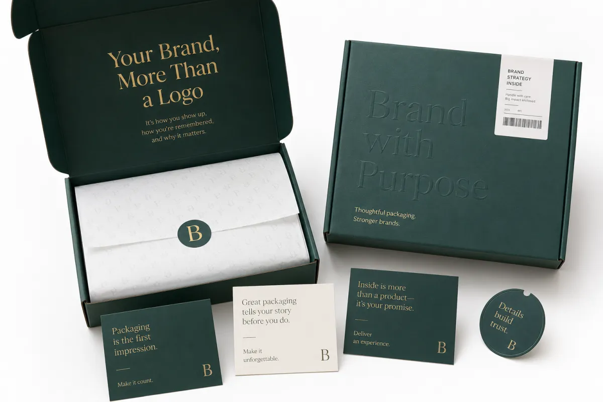
Knowing how to Brand Your Packaging is less about slapping a logo on a carton and more about choreographing the first 30 seconds a customer spends with your product. I remember watching a plain kraft mailer feel noticeably more premium after a converter in Shenzhen tightened the logo lockup by 3 mm, switched to one black ink color, and added a matte aqueous coating on a 350gsm C1S artboard outer wrap. The box cost barely changed - about $0.03 more per unit on a 10,000-piece run - which was almost annoying, honestly, because it proved the difference was not money. It was judgment. Results like that are why I keep telling teams that how to brand your packaging is a system, not a decoration pass. And if you are trying to make packaging feel premium, practical, and consistent across channels, that system matters whether the product ships in a mailer, sits on a retail shelf, or arrives as a gift set.
Structure, substrate, print method, inserts, tape, and opening sequence all need to work together. I have seen a beauty client spend heavily on a rigid setup box from Dongguan, then overlook the inside tray and tissue, and the first reveal looked unfinished even though the outer carton was excellent. I have also seen a simple mailer with a single-color mark, a sharp typography choice, and FSC-certified board feel more deliberate than a six-color pack carrying too many claims. That contrast sits at the center of how to Brand Your Packaging: you are building brand identity in layers, not just applying artwork. A lot of people think the logo is the whole story. It is not. It is barely chapter one.
How to Brand Your Packaging: What It Really Means
Packaging branding is the visual and tactile language that tells a customer who you are before they read a product description. It includes the box structure, the paperboard or corrugated grade, the finish, the print method, the seal, the insert, and even the order in which the customer sees each surface. If you are learning how to brand your packaging, start by separating three jobs: the outer pack creates expectation, the product label carries compliance and item-level information, and the interior components carry the emotional reveal. I know that sounds tidy on paper, but in production it usually looks like a pile of samples, a few frantic emails, and somebody muttering, "Why is the barcode suddenly tiny?"
That distinction matters because branded packaging is not the same as custom packaging, even though people use those terms interchangeably. Custom packaging might mean a made-to-size mailer or an insert that fits a jar within 1.5 mm of tolerance. Branded packaging means the whole experience carries the same message, from the shipping carton to the inner sleeve. Product packaging can be highly functional and still feel generic; package branding is what turns that functional object into a recognizable asset a customer remembers on the shelf or in a porch delivery. That difference matters more than most decks admit. I have seen a $3 rigid box feel forgettable, while a $0.22 corrugated shipper felt like a brand statement. Strange, yes. Common, also yes.
I remember a cereal client that came to us with a bright, busy retail packaging concept that looked great on screen and lost all discipline on press. The fix was not more color. We cut the palette down to two spot colors, moved the logo 8 mm higher on the panel, and changed the stock from uncoated news-style board to a smoother SBS sheet with a 350gsm caliper. That small set of decisions did more for how to brand your packaging than a thousand mood-board images would have done. Honestly, I think this is why packaging can be so humbling: your favorite design rarely survives contact with the actual substrate without a little discipline.
"The box looked expensive only after we stopped trying to make it loud." That was a buyer at a subscription-snack meeting in Chicago, and he was right. A restrained layout, a matte finish, and one strong logo placement often do more work than five decorative effects. I wish more teams would tattoo that on the inside of a sample carton - metaphorically, please.
Brand recognition, repeat purchases, and perceived value all rise when the pack feels intentional. A customer opening a shipping carton from homeware brands, skincare lines, or boutique coffee roasters notices the same three things every time: contrast, consistency, and finish quality. If your brand uses kraft, the print contrast has to survive the brown substrate. If you use a white top sheet, your color target should be checked against a physical drawdown, not just a monitor. That is practical how to brand your packaging work, not branding language floating free of production reality. One comparison I use constantly: a design that looks 10% better on screen can look 40% worse on the line if the ink and board are fighting each other.
For teams that want a grounded benchmark, I often point them toward ISTA test methods for transit testing and FSC certification for responsible paper sourcing. Those standards do not replace design thinking, but they keep the conversation anchored to materials, shipping stress, and chain-of-custody details instead of vague opinions. And vague opinions, I have found, are astonishingly expensive, especially once a 2,400-unit pallet is already booked on a freight lane from Ningbo to Los Angeles.
One more distinction helps during planning: a box can be custom without feeling branded, and a branded box can still be standard size. I have seen a 12-count candle ship in a common RSC carton with a one-color flexographic logo and a tightly written insert, and it looked more premium than a special-shape carton that had no hierarchy at all. If you want how to brand your packaging to land properly, think in terms of customer memory, not novelty alone. The memorable thing is usually the thing that behaves with confidence.
How Branding Moves From Artwork to Finished Pack
The production path matters because a strong design can fall apart quickly if the artwork is not built for the actual material. The process usually starts with a dieline, then prepress, proofing, print, converting, die cutting, folding, gluing, and final packing. On a corrugated line, ink laydown behaves very differently than on a 350gsm C1S paperboard sheet, and the stretch of the substrate can shift a logo by 0.5 to 1.0 mm if the operator is not watching carefully. That is why how to brand your packaging needs production thinking from day one. Design without process is just a pretty suggestion.
Rigid Setup Boxes add another layer of risk. I once sat with a supplier in Guangzhou who had a beautiful foil stamp on the lid panel, yet the wrap line was pulling the paper 2 mm off-center because the board density was inconsistent. The design was fine; the conversion was not. A different project on a paper mailer had the opposite problem: the logo was crystal clear, but the customer barcode sat too close to the edge, and the scanner failed one in every eight reads during warehouse intake. Good how to brand your packaging work assumes both visual quality and machine readability. It also assumes someone will test the thing before launch, which sounds obvious until a deadline is on fire and everyone is suddenly very spiritual about "risk."
Proofs and sample runs are where real corrections happen. A press proof catches color shifts, while a physical sample shows whether embossing crushes fine type, whether spot UV reflects too aggressively under retail lighting, and whether a QR code still has enough quiet zone around it. If your pack will be shipped through rough handling, I also recommend checking transit performance against a recognized test route such as ISTA 3A or a similar lab protocol. The goal is not lab theater; it is to know whether your Custom Printed Boxes and inserts will survive the route from pallet to porch. I have seen a pristine sample get annihilated by a simple corner drop test. Nothing quite cures optimism like cardboard dust on a conference table.
Timelines are where many teams get surprised. A simple one-color corrugated run can move in 7 to 10 business days after proof approval if stock is on hand, but a more typical custom carton takes 12 to 15 business days from proof approval, and rigid boxes with foil, embossing, and custom inserts often need 18 to 28 business days once tooling, sampling, and assembly are added. If you need a product launch date fixed, bake in time for design approval, die creation, and a second sample. I have seen more than one launch slip because a team treated packaging like a final-week task instead of a production schedule. Packaging has a nasty habit of acting like a final-week task and a six-week task at the same time.
When I advise a brand on how to brand your packaging, I usually ask for three files before anything else: editable vector artwork, a locked dieline, and a content sheet with barcodes, legal lines, and any FSC or recycling marks. If those pieces are clean, prepress can spot trouble early, and the run is much less likely to hit delays at the folding carton or corrugator stage. This also makes life easier for the person on the plant floor who has to make the file and the real object agree with each other. That person deserves snacks and a correctly labeled PDF.
For a useful shop-floor rule, think about how each substrate handles your brand assets:
- Corrugated board: best for bold type, strong contrast, and simple graphics that survive flute texture.
- White SBS or coated paperboard: better for fine detail, small text, and richer four-color imagery.
- Rigid setup board: ideal for premium closure mechanics, foil, emboss, and heavier insert systems.
- Pouches and labels: good for flexible SKUs, but they need careful attention to adhesive, seal lines, and shelf readability.
Key Factors That Shape a Strong Package Brand
Strong package branding starts with the identity system, not the finishing room. Logo placement, color palette, typography, iconography, photography style, and tone of voice should all live in one spec before the first carton is printed. I like to tell teams that how to brand your packaging becomes easier once you decide what the customer should feel in hand: calm, technical, playful, premium, durable, or fast-moving. That emotional decision tends to save more money than the later "let's make it pop" debate that always eats up an afternoon.
Color is usually the first place people overspend mentally. A brand can work beautifully with one spot color and black if the hierarchy is disciplined. I have watched teams chase seven process colors for a carton that only needed one saturated green and a deep neutral, and the result was muddy under warehouse LED lighting. I have also seen a luxury skincare line use soft-touch lamination, warm gray type, and a tiny gold foil icon, and the pack felt more upscale than a louder competitor with twice the ink coverage. If you want to master how to brand your packaging, start with contrast and legibility before you think about decoration. And yes, "more color" is not the same thing as "more premium." It can actually be the opposite.
Material choice shapes perception faster than most marketing decks admit. Kraft suggests honesty and utility; coated paperboard suggests polish and image sharpness; corrugated speaks to shipping resilience; rigid board signals ceremony; and a pouch usually says convenience and portability. Finish choices matter too. Foil stamping adds reflected light, embossing creates a tactile cue, spot UV highlights selected areas, and soft-touch lamination reduces glare while giving the surface a velvety hand feel. A lot of package branding work is really the art of matching the material to the brand promise and the shipping path. I have a bias here: if the material and the message disagree, the customer can feel it in about half a second.
Cost is never just a unit price. The layout size, the print method, the number of inks, the finish complexity, and the run quantity all affect the quote. For example, a one-color flexographic print on standard corrugated can be far cheaper than a four-color litho-laminated carton with a soft-touch coat and foil stamp. Setup charges matter too, especially on smaller runs where plate making or die creation can add a visible bump. If your team is learning how to brand your packaging, ask for cost broken into three parts: structural setup, decoration, and assembly. That split tells a much cleaner story than a single sticker price that looks friendly until freight and finishing crash the party.
Product type and shipping method should also influence the design. A glass serum bottle needs cushioning and likely a tighter insert system than a dry snack pouch. A retail packaging sleeve can tolerate a more decorative approach than a fulfillment carton that gets stacked six high on a pallet. Brands often forget that the same box might be seen in a warehouse, on a doorstep, and on a boutique shelf, so the design has to hold up in each setting. That is where practical how to brand your packaging thinking keeps the whole system honest. The pack is not living one life. It is living three.
Here is a comparison I use with startup teams and growing brands when they are choosing between common options:
| Option | Typical Unit Cost at 5,000 | Best For | Tradeoff |
|---|---|---|---|
| One-color flexo corrugated mailer | $0.15-$0.28 | Shipping boxes, subscription packs, simple brand marks | Limited detail and fewer premium effects |
| 4-color printed paperboard carton | $0.42-$0.88 | Retail packaging, cosmetic sleeves, shelf-facing products | Higher setup cost and more color control needed |
| Rigid setup box with foil | $1.20-$3.50 | Gift sets, luxury electronics, premium launches | Longer lead time and more assembly labor |
| Custom label and tape system | $0.04-$0.18 | Early-stage brands, test runs, lower-volume SKUs | Less structural impact, more reliance on discipline |
Those numbers are planning ranges, not quotes, and freight can move them by 8% to 15% depending on route and carton count. For example, a 5,000-piece corrugated run out of Foshan can land at $0.15 per unit before domestic freight, while a similar run from Puebla or Ho Chi Minh City may shift after export carton and ocean handling are added. Still, the table helps a team see where the money is going before a sales rep starts adding special effects. In practice, the smartest how to brand your packaging decisions are the ones that give the customer a clear message without spending money on areas they never touch or notice. I have yet to meet a shopper who said, "I adored the inside liner no one could see."
If you want to see how real brands handle these tradeoffs, browse the practical examples in our Case Studies library and compare them with the component range in our Custom Packaging Products catalog. The pattern becomes obvious fast: strong brands repeat the same visual rules across three or four pack types instead of reinventing the look every time. Repetition is not boring here. It is recognition, especially when the same icon, paper finish, and logo spacing appear on a mailer, a shelf carton, and a gift sleeve.
How do you brand your packaging step by step?
Audience and product research comes first. Before any dieline work, I want to know where the product is sold, who opens it, how often it is reordered, and what emotional note the pack should hit in the first five seconds. A skincare box for a clinical brand should not behave like a playful candy carton, and a warehouse-shipped home goods kit should not pretend it is a jewelry box. If you are serious about how to brand your packaging, begin with use case, channel, and audience behavior. A package designed for a founder's approval is not automatically a package designed for a customer's hands.
Message hierarchy comes next. Write one primary message, two supporting messages, and one proof point, then keep the rest off the panel. I have seen teams cram seven claims, three QR codes, and a half-page ingredients list onto one side of a box, and the result was visual noise at 3 feet away. Good hierarchy does the opposite: it tells the eye where to go first, second, and third. If your audience sees the logo at 2 meters, the product name at 1 meter, and the claim at 30 cm, the package reads naturally. If every element is shouting, nobody hears anything. That is true for packaging and most family dinners.
Structure and material selection should follow the message, not the other way around. A startup might choose a standard mailer with a custom insert because it keeps tooling down and the lead time around 10 to 12 business days. A premium launch might justify a rigid setup structure with a 2-piece lid and base, especially if the unboxing sequence matters. The package should match the customer journey. If the product ships from a fulfillment center, then stacking strength, seal performance, and return handling matter as much as print quality. How to brand your packaging gets practical here. A beautiful box that caves in during transit is just an expensive complaint.
Artwork build needs discipline. Use the dieline as a working tool, not a background image. Keep safe zones, bleed, fold lines, and barcode quiet zones clean. A barcode usually needs a clear margin around it, and the font files should be outlined or packaged with the job so prepress does not substitute a missing face. If the pack uses metallic ink, specify it separately; if there is a white underprint on dark kraft, call that out in the file notes. That kind of clarity saves hours in correction loops. It also saves your own sanity, which is underrated in packaging work.
Sample review is where the truth shows up. Ask for a physical sample before mass production, and check the same things every time: trim accuracy, closure fit, ink consistency, fold memory, and label adhesion. A sample can reveal a 1 mm shift that looks tiny on screen but huge on a shelf. I have had clients discover that a lovely pale gray logo vanished once the box was handled under fluorescent lights in a New Jersey warehouse, which is why the sample stage should never be treated as a formality. It is one of the main answers to how to brand your packaging correctly. Paper does not care about your optimism; it only cares about physics.
Preproduction approval locks the moving parts together. Confirm the color target, the dieline version, the finish, the carton count, the pallet pattern, and the replenishment plan. Do not approve a pack until someone signs off on both the print proof and the assembly sample. If the project uses custom printed boxes for multiple SKUs, keep one master spec sheet so the brand does not drift between sizes. It is far easier to keep one system consistent than to repair six inconsistent pack versions later. And yes, someone will eventually ask why the blue is slightly bluer on the mid-size box. They always do.
Launch planning is the final piece. Coordinate packaging arrival with production fill dates, warehouse intake, and ship windows. A common mistake is finishing cartons two weeks after the fill line starts, which creates inventory drift and rush freight charges. If the timeline is tight, prioritize the hero SKU first, then let secondary sizes follow once the visual system is proven. That is the sort of rollout discipline I have seen work on cosmetics, specialty food, and small appliance programs alike. The brands that do this well look calm. The brands that do not look like they are negotiating with a storm.
Simple workflow checklist
- Confirm audience, channel, and product dimensions.
- Choose one primary message and one accent color.
- Build the dieline and place the logo system.
- Select substrate, coating, and finishing method.
- Review a physical sample under warehouse-style lighting.
- Approve prepress files, then lock the launch date.
If you follow that order, how to brand your packaging becomes a repeatable process instead of a scramble. That repeatability matters because every new SKU should feel like it belongs to the same family, even if the box size changes by 20 mm or the closure style shifts from tuck end to rigid lid. Consistency does not mean sameness. It means the family resemblance is obvious.
How to Brand Your Packaging Without Blowing the Budget
Budget control starts with restraint. The fastest way to overspend is to add one decorative idea after another until the carton is carrying four inks, two foils, a soft-touch coat, embossing, and a custom insert that only adds value for a portion of the audience. For many brands, the cleanest path in how to brand your packaging is one strong logo placement, one smart finish, and one substrate choice that feels coherent with the price point of the product. The expensive-looking box is not always the expensive box.
I have seen brands save real money by standardizing box sizes across three SKUs and changing only the insert. That can reduce tooling, simplify inventory, and make reorders far easier to manage. I have also seen a candle brand cut its unit price by nearly 20% simply by moving from a custom die-cut carton to a stock mailer with a branded sleeve. The end result still looked deliberate because the typography and color discipline were strong. In practical terms, that is what how to brand your packaging looks like on a budget. Fewer variables. Better decisions. Less panic.
Hidden costs deserve attention. Plate changes, die creation, sample rounds, special coatings, foil tooling, freight, and small-batch setup fees can add up faster than anyone expects. A team might budget for $0.25 per unit and then discover the real landed cost is $0.41 once the second proof, pallet freight, and assembly labor are included. Honest quoting matters, and so does asking for the exact run size tied to each price break. The best packaging partners break these costs out clearly, not vaguely. If they hand you a quote that feels like a magic trick, ask for the trick. There usually is one.
Here is a straightforward way to think about spend levels:
- Lean: one-color print, standard board, no special finish, common carton size.
- Balanced: two inks, improved paper quality, one coating, branded insert.
- Premium: foil, emboss, soft-touch, custom structure, matched interior reveal.
For startups, the smartest move is often to design for multiple pack sizes from one visual system. That means the logo placement, typography scale, and color rules stay fixed while only the dieline changes. If you are doing a first run of 1,000 to 3,000 pieces, keep the artwork simple and the structural variation minimal. Then batch reorders so setup fees are spread over a larger number of units. That is a very direct answer to how to brand your packaging without losing margin. And yes, a one-color box can still look beautiful if the typography is doing its job.
Premium effects should be reserved for moments the customer actually touches or sees up close. A foil mark on the lid of a rigid box can be worth every cent because the hand lands on it immediately. A foil mark hidden on a shipping carton may not justify the extra setup. Too many teams confuse visible luxury with effective luxury, and those are not the same thing. If the customer only sees the outer shipper in a courier van, save the premium detail for the inner reveal. Spend where the eye lingers, not where nobody looks.
Common Mistakes That Make Packaging Feel Off
The first mistake is crowding too much onto one panel. I have opened cartons where the brand tried to fit the logo, six claims, a QR code, recycling language, two illustrations, and a product story into one face, and the result felt loud from 5 feet away and tiring at arm's length. Good hierarchy is a discipline. If you are learning how to brand your packaging, leave room for the eye to breathe and keep the panel load intentional. White space is not wasted space. It is structure.
The second mistake is mismatching materials and finishes. A luxury-looking layout on flimsy stock usually feels cheap because the hand detects the weakness before the eye forgives it. I once reviewed a rigid box with gorgeous foil and a weak board wrap, and the corner crush was visible after a single sample drop of 18 inches. The opposite can fail too: a strong corrugated board with bad print calibration can look dull and accidental. Package branding works best when material and message agree. If they do not, the pack feels like it is telling two different stories at once.
The third mistake is ignoring production reality. Dark substrates can swallow small type, coated papers can shift color under different lighting, and certain adhesives can fail after a hot freight lane. QR codes need enough contrast. Barcodes need clean quiet zones. White ink sometimes needs an underlay to stay visible on kraft. These are not tiny details; they are the difference between a good concept and a pack that performs on the line and in the customer's kitchen. That is why how to brand your packaging should always include a production review. I have watched a beautiful pack get rejected because the code would not scan. Nothing kills confidence quite like a warehouse scanner throwing a fit.
The fourth mistake is branding only the outer shell. Tape, inserts, inner print, tissue, and the first reveal matter just as much as the lid panel. I remember a DTC snack brand that had a lovely outer mailer but plain brown inserts and no interior message, so the opening felt like a standard shipper until the very last second. Once we added a simple one-color inner flap message and a printed insert card, the unboxing experience changed immediately. The customer journey is physical, not just visual. People feel the difference before they can explain it.
The fifth mistake is skipping consistency checks across SKUs. A teal box, a green sleeve, and a blue insert might all be "on brand" in theory, but if the colors do not share the same tone family, the line looks pieced together. I recommend building a master spec sheet for typography, color values, substrate choices, and finish rules before any second SKU goes live. If you need examples of clean rollouts, the project stories in our Case Studies section show how repeated choices build recognition faster than one-off packaging experiments. Customers do not usually say, "I love your master spec sheet." They say, "I recognized this immediately." That is the goal.
One more simple check saves trouble: hold the sample under warehouse LEDs, retail spots, and daylight near a loading dock. I have seen a deep red box look rich in a studio and brownish under LED panels 12 hours later. A sample that passes only in one light source is not finished. Real how to brand your packaging work survives the actual environment. The actual environment is picky, which I suppose is fair because your customer lives there too.
Expert Tips and Next Steps for a Stronger Rollout
One of the best shortcuts I have picked up on factory floors is to test the brand colors under the same lighting your warehouse uses. A warm 3000K bulb, a neutral 4000K panel, and daylight by a dock door can make the same ink read three different ways. If a brand wants consistency, I ask for physical color targets, not just digital swatches. That habit alone can save days during approval, and it sharpens how to brand your packaging in ways the customer actually feels. A monitor is not the same thing as a carton. I wish more budgets reflected that fact.
Another practical move is to build a packaging spec sheet that lists artwork files, substrates, dimensions, finishes, ink requirements, closure style, and approved suppliers in one place. I have seen teams lose an afternoon because one person had v7 of the dieline and another had v9. That is enough to shift a barcode, move a legal line, or change a fold direction by a few millimeters. A spec sheet keeps the system clean and helps procurement, design, and production speak the same language. It also reduces the chance that a random desktop file becomes "the final file," which is a sentence no packaging team should ever have to hear again.
If the brand is growing, start with one hero SKU and one secondary SKU, not six versions at once. Prove the packaging system in production first, then extend it once the color, board, and finish combo has survived a real run. This reduces risk, especially if you are using custom printed boxes, inserts, or a special closure that requires manual assembly. It is a much better path than overcommitting before the first pallet reaches the warehouse. I know the temptation to launch everything at once is strong. I have felt it. It is usually a bad idea wrapped in enthusiasm.
Here is the sequence I recommend most often:
- Audit the current pack and photograph it in three lighting conditions.
- Pick one improvement to prototype, such as a tighter logo lockup or a better finish.
- Request samples from two suppliers so you can compare board feel and print clarity.
- Review freight, setup, and assembly labor before final approval.
- Roll the system out to the next production run only after the sample passes inspection.
That process works whether the product is a retail packaging sleeve, a subscription mailer, or a high-touch gift set. If you are still deciding how to brand your packaging, start small, document what works, and let the system earn its way into the next SKU. I would rather see a brand execute one clean idea well than chase five effects that never quite match. Good packaging is not loud for its own sake. It is clear, repeatable, and a little hard to ignore.
My last piece of advice is simple: ask for samples early, keep the files tidy, and never treat the first shipment as the final test. A package is not branded only when the mockup looks right on a screen; it is branded when the board folds cleanly, the logo reads at three distances, and the customer remembers the feeling of opening it the next day. That is the real work of how to brand your packaging, and it is worth doing carefully. It is also one of the few areas in marketing where a millimeter can absolutely ruin your afternoon.
Frequently Asked Questions
How do you brand your packaging on a small budget?
Use one or two print colors, standard box sizes, and a single strong logo placement instead of full-surface decoration. A one-color corrugated mailer or a simple sleeve can still look intentional if the type scale is clean and the hierarchy is disciplined. Save premium finishes for the hero product, not every SKU, and plan reorders early so setup fees are spread across more units. If I had to boil it down, I would say: choose one thing to do well and resist the urge to decorate every inch like it is auditioning for attention. A $0.15-per-unit mailer at 5,000 pieces can carry a brand if the typography is sharp and the board is decent.
What is the cheapest way to brand shipping boxes?
A one-color flexographic print on corrugated board is often one of the most economical ways to add branding at scale. Custom stickers, tape, and stamped marks can also create a branded look when full box printing is not practical. Keep artwork simple, use common carton sizes, and avoid extra tooling if your volume is below a few thousand pieces per run. In plain English: if the box already does the job, do not force it into evening wear. A standard RSC in Shenzhen or Foshan with a black one-color logo often lands faster and cheaper than a full litho wrap.
How long does branded packaging usually take to produce?
Simple printed packaging can move quickly if artwork is ready, but sampling, revisions, and supplier lead times still add days or weeks. A common estimate is 12 to 15 business days from proof approval for a standard carton run, while complex finishes, rigid boxes, and custom structures usually take longer because they need more setup, proofing, and finishing steps. The safest approach is to build time for design approval, sample review, and freight so the launch date is not at risk. A lot of teams underestimate this by about one full meeting's worth of optimism.
What files do I need to brand my packaging correctly?
Provide editable vector artwork, often in AI, EPS, or PDF format, so the printer can keep edges sharp and colors consistent. Include dielines, logo usage rules, font files or outlined text, and any barcode or regulatory content that must print exactly. Ask for a prepress checklist from the converter so nothing critical is missed before production starts. If the file is a mess, the package usually follows suit. Paper, as it turns out, has no patience for chaos, and a converter in Dongguan will usually spot a missing bleed margin before the brand team does.
Which packaging materials print best for branding?
Smooth paperboard and coated stocks usually give the sharpest results for fine detail, small text, and vibrant color. Corrugated and kraft can still look excellent, but they work best with simpler graphics and stronger contrast. The best material depends on the product, the shipping method, and the brand look you want customers to feel in hand. I usually tell teams to choose the substrate that best supports the story, not the one that simply looks prettiest in a sample drawer. A 350gsm C1S artboard often beats a cheaper sheet when you need a crisp logo and clean type at shelf distance.
How do I keep branded packaging consistent across multiple SKUs?
Build one master spec sheet with color values, typography rules, finish choices, dieline versions, and approved suppliers, then apply it to every size. Keep the logo placement, margin rules, and insert style consistent so the line feels related even when the dimensions change. That is the most reliable way to keep how to brand your packaging aligned across the whole product family. Consistency is the quiet part of branding that does the heavy lifting, especially when one SKU ships from Ningbo and another is packed in California.
What should I check before approving a final packaging run?
Review the physical sample under warehouse lighting, confirm barcode readability, inspect fold lines and glue points, and verify the finish against the approved target. Then make sure the carton count, pallet pattern, and freight timing match the launch calendar. A final approval only matters if the pack can survive production, storage, and delivery with the same look you signed off on. If anything feels off, pause and fix it. A one-day delay is cheaper than a warehouse full of regret, and a reprint after launch is usually the most expensive lesson in the room.


