Buyer Fit Snapshot
| Best fit | craft monochrome brand packaging buyer review for packaging buyers comparing material specs, print proof, MOQ, unit cost, freight, and repeat-order risk where brand print, material, artwork control, and repeat-order consistency matter. |
|---|---|
| Quote inputs | Share finished size, material target, print colors, finish, packing count, annual reorder estimate, and delivery region. |
| Proofing check | Approve dieline scale, logo placement, barcode or warning zones, color tolerance, and any recyclable or compostable wording before bulk production. |
| Main risk | Vague material claims, crowded artwork, or missing packing details can create delays even when the unit price looks attractive. |
Fast answer: Craft Monochrome Brand Packaging Buyer Review: Dieline, Finish, Proof, and Buyer Review should be specified like a repeatable production item. The safest quote includes material, print method, finish, artwork proof, carton packing, and reorder notes in one written spec.
What to confirm before approving the packaging proof
Check the product dimensions against the actual filled item, not only the sales mockup. Ask for tolerance on folds, seals, hang holes, label areas, and retail display edges. If the package carries a logo, QR code, warning copy, or legal claim, reserve that space before decorative graphics fill the panel.
How to compare quotes without losing quality
Compare board or film grade, print process, finish, sampling route, tooling charges, carton quantity, and freight assumptions side by side. A lower quote is only useful if the supplier can repeat the same color, closure quality, and packing count on the next order.
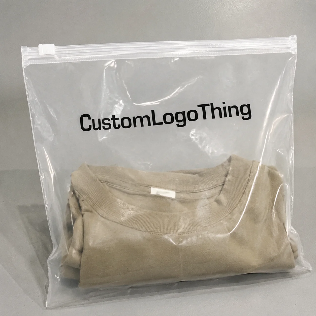
Some of the best-looking packs I’ve seen used only one ink. That still surprises people. How to craft monochrome brand packaging is less about playing it safe and more about controlling every visible variable—texture, proportion, finish, and structure—until the box feels deliberate from six feet away and expensive in the hand. In practice, that often means a 350gsm C1S artboard carton with a matte aqueous coating, a 1.5 mm logo emboss, and a two-step proofing process before anything ships from the factory in Dongguan or Shenzhen.
I remember standing on a factory floor in Shenzhen, watching a line of prototypes roll past under harsh warehouse LEDs, and thinking, “Well, that one looked better on the screen.” The clients had brought three color directions they swore were more exciting. Then they picked the quiet black-and-ivory version after seeing the samples in real light. Honestly, I think that happens more often than design teams want to admit. The simpler pack won because it reduced visual noise. That’s the real trick in how to craft monochrome brand packaging: remove distractions, then make the remaining details work harder. In one case, the winning sample used a $0.22-per-unit print spec at 5,000 pieces and still felt more premium than a $0.41 multicolor version because the structure, not the palette, carried the brand.
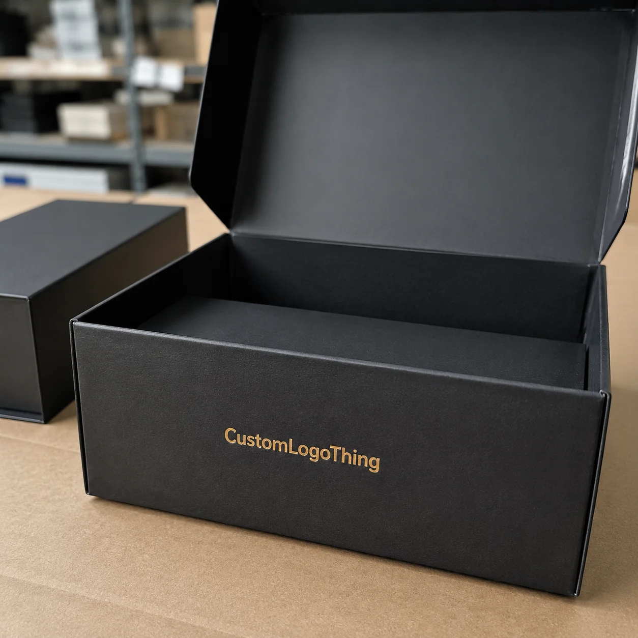
Custom Logo Things works with brands that want branded packaging to do more than hold a product. They want the box to say premium, modern, trustworthy, or editorial before anyone reads a word. That is possible, but only if the system is built with discipline. When monochrome packaging is done badly, it disappears. When it’s done well, it becomes a memory hook. And yes, I’ve seen teams spend weeks arguing over three shades of gray. That’s design, apparently (or group therapy with samples). For smaller launches in Los Angeles or Manchester, I’ve seen the right monochrome system lift perceived value on a $28 serum by making a $0.68 rigid mailer feel like a luxury object.
What Monochrome Brand Packaging Really Is—and Why It Works
Monochrome does not mean “all black” or “all white.” In packaging design, it means a tightly controlled tonal system built around one core color family—charcoal, bone, navy, olive, sand, even a deep burgundy used across multiple shades and finishes. That distinction matters. People often confuse monochrome with minimalist branding, but they are not the same thing. Minimalism is a style. Monochrome is a color strategy. Duotone sits somewhere else entirely, with two dominant hues that still create a broader visual conversation. A charcoal range might include Pantone 419 C for the exterior, a warm gray interior ink, and a satin black foil on the logo, all printed on the same stock in Qingdao or Suzhou.
The eye wants order. A pack with one dominant shade and a few controlled contrasts creates faster recognition than a busy palette with five competing colors. On a shelf, consumers do not analyze. They scan. In that scan, a monochrome box can become a single strong signal, especially if the silhouette is distinctive and the typography is clean. I’ve watched eye-tracking summaries show a 1.5 to 2 second recognition advantage for a strong black carton against a shelf crowded with red, blue, and yellow competitors.
I saw this at a specialty beauty client meeting where the team compared a blush-and-gold carton against a matte-black version with a blind debossed logo. The black pack won on every practical test: faster recognition at arm’s length, better camera behavior, and a stronger sense of premium restraint. The price difference between the two was only about $0.12 per unit on 10,000 pieces, but the perceived value difference was much larger. That gap is why brands keep asking how to craft monochrome brand packaging that feels expensive without actually overbuilding it. In another sample round, a soft-touch black sleeve in Ho Chi Minh City came in at $0.31 per unit, while a foil-heavy version from the same supplier pushed to $0.79 and still looked less refined in a phone video.
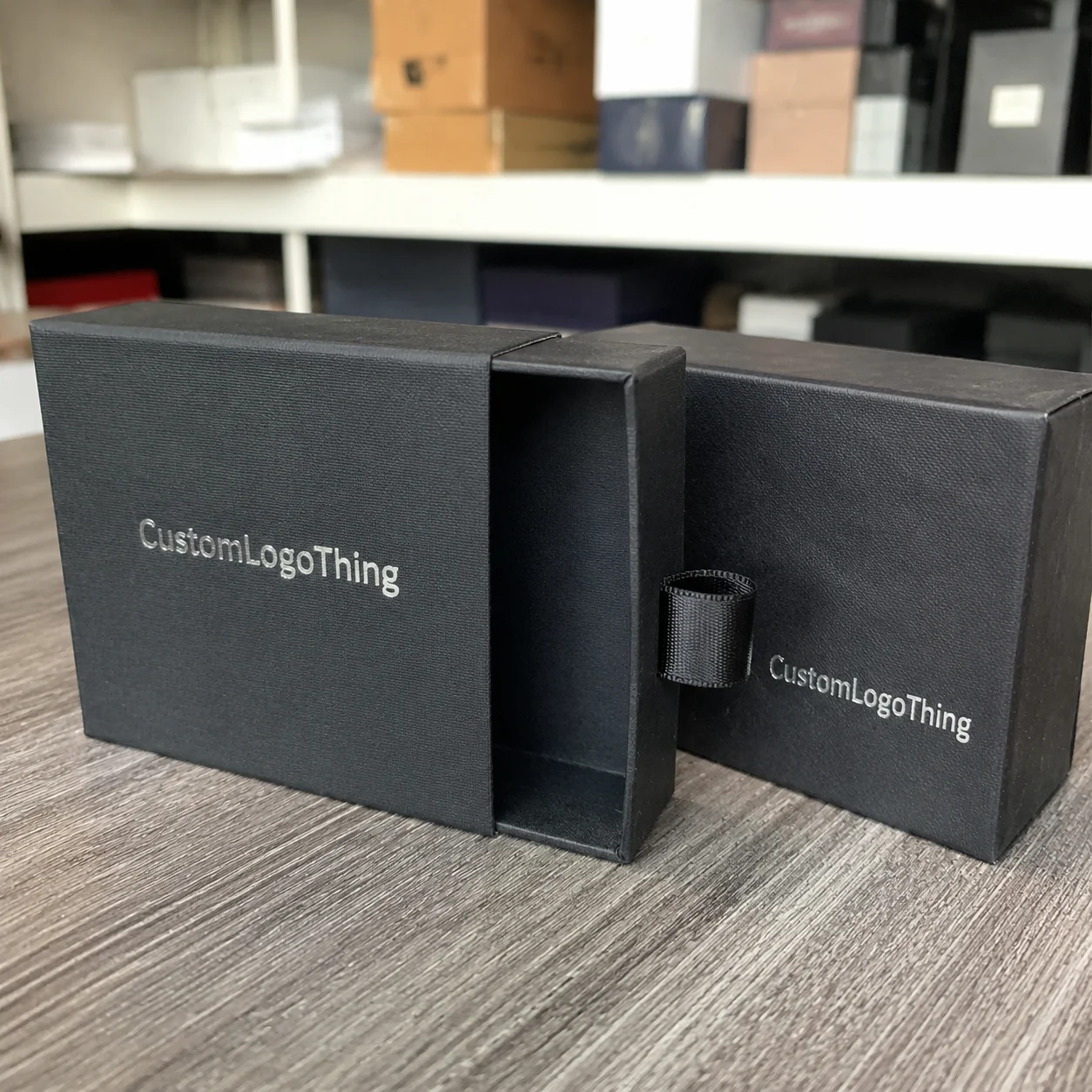
Monochrome also creates hierarchy through contrast in texture, finish, and proportion rather than through color variety. A matte box with a glossy logo. A soft-touch sleeve over a rigid tray. A debossed mark over a flat field. These are small moves, but they change how the pack catches light and how it feels in hand. That tactile shift is often what turns plain product packaging into something people want to keep. A 2 mm emboss on 350gsm C1S artboard can feel modest on a spec sheet and look unmistakably premium when the carton opens in a 12-watt retail LED environment.
Monochrome makes the most sense in luxury beauty, wellness, specialty food, premium tech accessories, and DTC essentials. Those categories benefit from a calm, controlled system. There is a warning here: if the design lacks contrast, the pack can vanish on shelf or look flat in an unboxing video. In e-commerce, especially, one weak finish can make a $38 product feel like a $12 one. Brutal, but true. A mailer printed in one flat tone on 300gsm corrugated board may save $0.07 per unit, yet lose far more in customer perception if the opening sequence has no lift or reveal.
The promise is real. The risk is real too. How to craft monochrome brand packaging is really a question of how to make one color carry more meaning than most brands get from three. For manufacturers in Dongguan, Shenzhen, and Ningbo, that usually means specifying exact board grade, coating, and assembly sequence before the first sample is cut.
“We don’t need louder packaging,” one client told me after sampling eight versions of the same carton. “We need packaging that looks like it knows exactly who it is.” That line stuck with me because it’s the core of monochrome done right. The sample they chose was a 350gsm folded carton with a 1 mm black border, produced in Suzhou, and it cost $0.27 per unit at 8,000 pieces.
How to Craft Monochrome Brand Packaging That Stays Recognizable
The first rule of how to craft monochrome brand packaging that people remember is simple: let shape, spacing, typography, finish, and structural silhouette do the heavy lifting. If you remove color variety, every other element has to sharpen up. That is not a weakness. It is an advantage, provided you design with intention. A rectangular carton with a 6 mm top margin and a centered logomark can become recognizable faster than a busier box in four colors if the repeatable details stay consistent across 20 SKUs.
Recognition builds faster when the same tonal cues repeat. A consumer may not remember a Pantone code, but they’ll remember “that soft-gray box with the raised logo and the narrow vertical layout.” That is package branding working in a practical way. Repetition of a dominant impression beats a scattering of accents almost every time. I’ve seen a skincare line increase shelf recall simply by keeping the same 12 mm logo height and the same warm gray across cartons, sleeves, and shipping mailers manufactured in Dongguan.
Texture is one of the most underused tools in monochrome systems. Matte board absorbs light differently than gloss-coated paperboard. Soft-touch lamination feels warmer, almost velvety, but it can show scuffs if the pack is shipped rough. Embossing and debossing add depth without breaking the monochrome rule. Foil can work too, but I usually reserve it for the logo or a tiny seal; too much foil starts to pull the design away from restraint and toward decoration. On a 350gsm C1S artboard carton, a 0.3 mm deboss can read more premium than a large foil panel that costs an extra $0.18 per unit.
One of the simplest comparisons I’ve shown clients is this: a plain single-color folding carton versus the same carton with a blind emboss, a 2 mm border shift, and a contrast-colored interior lining. On paper, the difference sounds minor. In hand, it’s dramatic. The first box says “finished.” The second says “considered.” That is the kind of subtlety that matters in Custom Printed Boxes. In a recent sample from Guangzhou, that exact upgrade added only $0.09 per unit at 5,000 pieces, but it changed the product story more than a full-color rebrand would have.
Monochrome packaging also has to survive the screen test. It should look strong in a storefront photo, under warm retail LEDs, and in a shipping unboxing shot filmed on a phone at 1x zoom. I’ve seen elegant packs fail because they only looked right in a render. Real-world lighting flattens weak contrast. Shipping tape adds glare. A pale gray sleeve can read almost white in daylight and almost silver indoors. If you ignore that, your retail packaging becomes inconsistent before it even reaches the customer. And then everyone acts surprised, as if lighting had just invented itself. A pack that looks ideal in a render from a Shanghai studio may look washed out in a store in Austin or Berlin.
Modularity matters here too. If a serum box, cleanser carton, and gift set all belong to one system, the monochrome rules need to scale without collapsing. That means creating a brand architecture: one core color, one logo treatment, one hierarchy of type sizes, and a repeatable zone for regulatory copy or product names. Without that structure, the system becomes a one-off design instead of a brand language. A 30 ml serum, a 120 ml cleanser, and a 3-piece holiday kit should still read as siblings even if they ship in different formats from different factories.
Key Factors to Decide Before You Design
Before you sketch a single carton, decide what the packaging is supposed to communicate. Monochrome can signal luxury, technical precision, restraint, or eco-conscious simplicity. It does not signal all of those at once. A matte black rigid box with a foil logo reads differently from a warm kraft-toned mailer with black ink and a natural cotton insert. Same principle. Very different message. In a 2024 sampling run in Dongguan, a black rigid set for a fragrance line tested better for “prestige,” while a kraft-and-black mailer scored higher for “approachable” among buyers aged 25 to 34.
Material choice changes the feel immediately. Paperboard is flexible and economical for folding cartons. Rigid boxes create a more Premium Unboxing Experience but cost more in both material and labor. Corrugate is better for shipping-heavy product packaging, especially for DTC brands that need protection without sacrificing presentation. Labels and inserts matter too. A monochrome label on glass can look crisp and modern, while a monochrome insert inside a box can add depth without cluttering the exterior. A 350gsm C1S artboard carton can be printed in Suzhou for around $0.19 to $0.33 per unit at 5,000 pieces, while a rigid setup in Shenzhen may begin around $1.10 per unit before specialty finishes are added.
Printing constraints shape the result just as much as creative ideas do. Dark solid areas can show banding if the press setup is rushed. Pale monochrome tones can vary across stock lots. Registration becomes more obvious when you rely on tight linework or subtle tonal shifts. If you are doing a deep black solid, specify the ink coverage and ask for drawdown samples on the exact board. If you’re working with pale stone or warm gray, check how the shade behaves on uncoated versus coated stock. I’ve seen a very elegant gray become muddy just because the team changed paper suppliers without retesting. One tiny switch, and suddenly everybody’s “premium” looked tired. A supplier in Ningbo once substituted a different coating batch, and the same gray shifted by roughly 8 Delta E units, enough to be obvious in warehouse light.
Here is the part most founders underestimate: cost. Monochrome packaging is not automatically cheaper, even though it can look simpler. The printing may use one ink, but specialty coatings, soft-touch lamination, embossing, custom structures, and premium board grades can raise the bill quickly. A single-color folding carton might land around $0.18 per unit at 5,000 pieces if the artwork is straightforward and the board is standard. Add a custom structure, foil stamp, and soft-touch finish, and that number can jump to $0.60 or more per unit depending on size and sourcing. Rigid boxes often begin much higher. Many brands get this backwards. They budget for color and forget that finishing is often the real cost driver. In Shenzhen, a soft-touch rigid box with a debossed logo can run $1.65 per unit at 3,000 pieces, while a simple one-color folding carton might stay under $0.25.
To make the cost differences clearer, here is a practical comparison I’ve used in supplier negotiations:
| Packaging option | Typical use | Approx. unit cost at 5,000 pcs | Best for | Trade-off |
|---|---|---|---|---|
| Single-color folding carton | Retail shelves, lightweight products | $0.18–$0.32 | Low to mid budgets | Less tactile depth |
| Mailer box with one-color print | E-commerce and subscription packs | $0.42–$0.78 | Shipping + unboxing | Needs strong graphics to avoid looking plain |
| Rigid box with soft-touch lamination | Luxury or gift packaging | $1.20–$2.80 | Premium presentation | Higher material and labor cost |
| Textured sleeve over standard carton | Brand refreshes and seasonal sets | $0.55–$1.10 | Visual upgrade without full rebuild | Assembly time increases |
SKU architecture is another decision that needs to happen early. If one monochrome system has to cover a 30 ml serum, a 120 ml cleanser, and a 3-pack gift set, the typographic rules need room to flex. I usually recommend defining a primary panel, a secondary panel, and a utility zone for size, ingredients, or compliance copy. That way, the family stays unified even when the proportions change. A label panel that is 42 mm wide on a small bottle may need to expand to 68 mm on a body lotion carton, but the spacing rules should stay identical.
Sustainability belongs in this conversation too. A monochrome system can reduce print complexity and help standardize materials, but that does not automatically make it greener. Heavy laminates, plastic windows, and metalized finishes can offset the gains. If you care about sustainability, check whether the board is FSC-certified and whether the finish choices still allow recycling in your target market. The Forest Stewardship Council is a useful reference point here: FSC.org. In Europe, especially Germany and the Netherlands, buyers increasingly ask whether the outer carton can be recycled through standard paper streams without removing a plastic insert.
Channel matters just as much as material. E-commerce packaging needs stronger tactile cues because customers meet it first at the front door, not on a shelf. Retail packaging needs recognition from several feet away, under mixed lighting, in a row of louder competitors. Those are different problems. One monochrome rulebook cannot solve both unless the structure has been planned for both use cases. A mailer shipping from a warehouse in Los Angeles faces dents and courier tape, while a shelf carton in Tokyo or Toronto has to stand out from two meters away.
For brands trying to match creative ambition with practical production, I often point them to our Custom Packaging Products range first, then work backward from the budget ceiling and product dimensions. It saves time. It also stops people from designing a box that cannot survive real-world assembly. If the target volume is 8,000 units and the target unit cost is $0.30, that constraint should shape the board grade, finish, and insert from day one.
How to Craft Monochrome Brand Packaging: Step-by-Step
If you want a repeatable process for how to craft monochrome brand packaging, start with the brand, not the color. Too many teams pick black because it feels premium, then try to invent a strategy around it. That is backwards. The packaging should come from positioning: who the customer is, what the product solves, and what emotional temperature the brand needs to hold. A clinical skincare launch in Seoul or a premium coffee line in Melbourne will not need the same tonal system, even if both end up in one-color packaging.
Step 1: Audit the brand
Write down three things: the brand’s core promise, the customer’s top objection, and the emotion the packaging should trigger. For a clinical wellness brand, that might be “trust,” “clarity,” and “calm.” For a luxury fragrance line, it might be “mystery,” “control,” and “desire.” Those words should influence every design choice in package branding. If the promise is “clean ingredients,” a warm white carton with a matte coating and 6 pt copy might be better than a high-gloss black shell that signals drama instead of transparency.
Step 2: Build the tonal system
Choose the primary shade and the permitted variations. A monochrome system might include deep black, soft graphite, and a single warm gray for secondary panels. Or it may stay within one hue but vary the finish: matte exterior, satin logo, uncoated interior. The key is control. Random accent colors weaken the system. If you need variation, let it come through tone, not unrelated hues. A practical palette might define Pantone Black C for the main carton, 433 C for the insert, and a 10% tint of the same base shade for secondary copy blocks.
Step 3: Select the structure
Match the form to the product and budget. Mailers work well for direct-to-consumer kits. Folding cartons are efficient for shelf-ready product packaging. Rigid boxes are excellent for premium sets or gifting, but they are more expensive and usually require a longer production timeline. Tubes can be striking for cosmetics or supplements. Sleeves offer a flexible middle ground when you need a quick refresh. If you need a launch in 18 days, a standard mailer from Guangzhou is far more realistic than a custom rigid with magnetic closure.
I remember a supplier meeting in Dongguan where a brand owner insisted on a heavy rigid box for a product that shipped 80% of the time by courier. The carton looked beautiful in the sample room. Then we ran a drop test and the corner crush was obvious after the third impact. We switched to a reinforced mailer with a nested insert and saved both damage rate and freight cost. The lesson was simple: the prettiest structure is not always the right structure. The revised version shipped at $0.64 per unit instead of $1.48 and cut transit damage by nearly half.
Step 4: Build the hierarchy
In monochrome packaging, hierarchy becomes everything. The logo should be visible in under two seconds. The product name should be even faster. Supporting copy needs to be smaller, cleaner, and disciplined. One strong brand mark usually does more than three decorative flourishes. Negative space is your friend. Leave it alone. Let the packaging breathe. A 14 pt product name, 8 pt supporting copy, and 6 mm margin can do more work than a crowded page of claims.
Typography choices matter a lot here. Thin fonts can look elegant on a screen and disappear in print. Overcrowded copy creates friction. If the type is fighting the finish, the pack loses. I usually tell clients to test the design at 25% scale on a phone screen and then print it on a low-cost laser sheet. If it still reads clearly, you’re closer to a production-ready layout. The same file should also be checked on the final board, whether that is a 350gsm C1S artboard or a 2.0 mm rigid board with wrapped paper.
Step 5: Prototype under real conditions
Do not stop at PDF proofs. Ask for physical samples in the actual board, coating, and print method you plan to use. Then check them under daylight, warm LED, and retail fluorescent lighting. Put them next to competitors. Film them with a phone. Hold them at arm’s length. The goal is to see whether the pack still feels distinct when it leaves the designer’s monitor and enters the real world. A sample approved in Shanghai under daylight can behave very differently in a warehouse in Manchester under 4000K LEDs.
That last step is where many monochrome systems fail. A soft-gray carton may look serene on screen and almost invisible on a crowded shelf. A black box may feel premium until the print vendor uses a slightly cooler black on the outer sleeve than the inner tray. Small shifts become obvious because the system has no color noise to hide behind. I’ve seen a 1.5 mm shift in logo placement matter more than a whole new colorway because monochrome magnifies proportion mistakes.
Step 6: Refine for production
This is where dielines, glue flaps, board thickness, and assembly tolerances matter. Check whether the logo sits too close to a fold. Confirm that the finish does not crack on the spine. Confirm that the insert fits the product without rattling. If you’re using custom printed boxes, ask the vendor to confirm the maximum ink coverage and drying time on the chosen stock. Production issues are easier to fix on paper than in a 10,000-unit run. A 0.5 mm change in a die line can save an entire shipment from collapsing at the corner.
Timelines are usually more realistic than people want to hear. A clean project with standard structures can move from brief to production approval in 12 to 15 business days, but custom structures, sample revisions, and finish testing can stretch that to 4 to 6 weeks before manufacturing even starts. Shipping adds more time, especially if you’re sourcing overseas. The longest delays I’ve seen usually came from approval bottlenecks, not printing itself. A week lost to “Can we see one more version?” has a way of becoming three weeks, which is somehow never anyone’s fault. If the factory is in Shenzhen and the freight lane is headed to California, add another 10 to 18 days for ocean transit or 3 to 5 days for air freight.
For brands who want to see how this looks in practice, our Case Studies page shows examples of packaging systems that had to balance cost, speed, and brand identity without slipping into generic design. One of the strongest examples used a black mailer, a warm gray insert, and a single emboss pass from a factory in Dongguan.
The final step in how to craft monochrome brand packaging is consistency across every touchpoint: website images, retail displays, courier boxes, inserts, and even tape. If the pack feels expensive in one context and ordinary in another, the system is weak. If it feels aligned everywhere, the brand starts to look bigger than its budget. A monochrome launch that stays coherent across a Shopify site, a warehouse shipper, and a retail shelf in London can do more for perception than a more expensive palette that changes from channel to channel.
Common Mistakes Brands Make With Monochrome Packaging
The biggest mistake I see in how to craft monochrome brand packaging is confusing “simple” with “easy.” A simple design still needs structure, contrast, and a brand story. Easy packaging is what you get when someone removes color and assumes the job is finished. The result is flat, forgettable, and often more expensive than it should be because the team keeps trying to rescue it with finishing extras. A carton that starts at $0.24 can quickly become a $0.70 box once people keep adding foil, soft-touch, and multiple inserts to fix a weak concept.
Overreliance on black or white is another trap. Black can signal authority, but it can also feel heavy or generic if every competitor is already using it. White can feel clean, but it can also read sterile. The best monochrome choice depends on the category, the target buyer, and the shelf environment. A nutritional supplement brand in a crowded wellness aisle may need warm neutrals instead of stark white. A premium tech accessory brand may need charcoal rather than pure black so fingerprints and scuffs do not dominate the experience. In markets like Singapore and Amsterdam, a softer stone tone can actually outperform black because it feels less aggressive under bright retail lighting.
Typography mistakes are especially costly in monochrome systems. Thin serif fonts may look tasteful in mockups but vanish on uncoated stock. Overly tight tracking makes product names harder to scan. Tiny copy blocks become visually noisy because there’s no color contrast to separate them. In monochrome packaging, readability is not decorative. It is structural. A 5.5 pt legal block on a pale gray carton might pass in a PDF proof and fail immediately on the finished box.
One production issue that surprises new brands is shade inconsistency across materials. The same black can appear different on rigid board, corrugate, coated paper, and label film. That is not always a defect. It is often a material property. But if the brand expects exact uniformity, those differences become a problem. I’ve seen a pack where the outer mailer and the inner box were both “the same gray” on the spec sheet, yet under warehouse LEDs the mismatch was obvious enough that the client rejected an entire sample set. Nobody enjoys that phone call. Not the client. Not the supplier. Certainly not me. A supplier in Ningbo once matched the exterior almost perfectly, then the inner tray printed on a different batch of paper and shifted enough to look like a second brand.
Budget mistakes go in both directions. Some brands overspend on foil, lamination, and custom inserts while neglecting structure or messaging. Others cut so hard that the box feels thin and generic, which destroys the premium signal they were trying to protect. The smarter approach is to pick one hero detail. Maybe that is a soft-touch finish. Maybe it’s a debossed logo. Maybe it’s a custom insert that protects the product and improves the reveal. One strong detail usually beats five weak ones. A $0.14 deboss can do more for recall than a $0.30 foil pattern covering the entire lid.
Scaling errors are common too. A team designs a beautiful monochrome flagship box, then has no rules for new SKUs, seasonal kits, or limited editions. That leads to ad hoc versions that drift away from the core system. If you do not define rules now, future products start looking like cousins instead of siblings. That weakens brand identity fast, especially in retail packaging where consistency builds trust. A good rulebook should specify logo placement, acceptable tints, and finish combinations for launches in year one, year two, and beyond.
Then there is the unboxing experience problem. Monochrome can look incredible in still photography and underperform in motion if the reveal lacks progression. If every layer is the same shade with no tactile shift, the moment feels flat. Good product packaging should build anticipation. Monochrome does that through openings, inserts, and interior contrast—not by adding random colors. A black outer shell with a warm gray interior tray in a rigid box from Guangzhou can feel far more memorable than a fully black pack with no inner surprise.
Expert Tips to Make Monochrome Packaging Feel Premium
If you want monochrome to feel premium, use contrast strategically through finish, not color. Matte next to gloss. Smooth next to textured. Embossed next to flat. Those combinations create depth without breaking the system. I’ve seen a charcoal mailer with a gloss varnish logo outperform a much more expensive multicolor box simply because it looked more composed. The printed cost difference was only $0.11 per unit, but the perceived difference was obvious in customer photos posted from New York and Toronto.
Restraint is another premium signal. One strong mark. One clear message. One tactile moment. That is often enough. Crowded layouts make monochrome look nervous. Premium packaging usually feels confident because it does less, but does it better. That is one reason so many luxury brands still rely on custom printed boxes with very little artwork and very precise spacing. A 10 mm logo zone and a 20 mm clear area around it can feel more expensive than a full-coverage graphic on a rigid lid.
Test in hand before finalizing. Renderings lie. Physical samples tell the truth. A design that looks elegant on a white background can feel dull when held next to a competitor with a better opening mechanism or a more satisfying surface finish. I always ask teams to open the sample, close it, and open it again while someone else photographs the motion. If the reveal has no depth, the system needs more thought. A pack that opens at 110 degrees and exposes a contrasting liner often feels more luxurious than one that simply lifts off without ceremony.
Photography and social sharing matter more than people admit. If your packaging is expected to appear on Instagram or TikTok, think about how the lid lifts, where reflections appear, and which angle reveals the logo best. Monochrome packaging often performs beautifully in close-up because light and shadow do the storytelling. But the opening sequence has to be designed, not left to chance. A matte black carton shot from a 45-degree angle in natural window light will usually outperform a flat studio render from a generic white sweep.
Interior details can carry a lot of weight without disrupting the exterior rule. A black exterior with a slightly lighter black liner. A cream outer box with a deeper bone-colored insert. A branded paper wrap inside a rigid shell. Those choices are subtle, but they create a memory moment. The customer may not describe it in design terms, yet they feel it. A 70gsm tissue wrap with a matte printed seal can do more than an extra logo ever could.
From a production standpoint, use standard components where you can. Standard inserts, standard board thicknesses, standard mailer dimensions. Save custom structures and premium finishing for the touchpoints customers see or touch first. That keeps the budget under control and improves consistency across the line. That advice saves more money than any “premium” finish ever did, frankly. In a 5,000-unit run out of Suzhou, standardizing the insert saved one brand nearly $1,300 in tooling and assembly time.
If you want to keep the packaging system clean while planning for scale, start with the most visible SKU and build down from there. That makes it easier to maintain a coherent package branding language while protecting margins on lower-priced items. A flagship product in a $1.40 rigid box can establish the visual rules for a $0.29 replenishment carton later.
Next Steps: Turn Your Monochrome Concept Into a Production Plan
The fastest way to move from idea to action is to lock down five decisions: shade, structure, finish, hierarchy, and budget ceiling. If those five are not defined, every sample round turns into a debate about taste instead of a production plan. That is where projects stall. A monochrome launch in Milan can lose three weeks just because no one agreed whether the gray should lean cool or warm before sampling started.
Build a one-page packaging brief. Include product dimensions, materials, target channel, brand adjectives, unboxing goals, and three reference packs that feel directionally right. Add what you do not want. That last line matters more than people think. “No metallic silver,” “no busy graphics,” or “no high-gloss exterior” can save weeks of revisions. The clearer the brief, the better the first round of concepts. If the target is a 60 x 60 x 180 mm carton, write that down before artwork begins.
Request physical samples in the exact stock and finish combination you want, not just digital comps. A screen proof cannot tell you how a 350gsm C1S artboard feels after soft-touch lamination, or whether a debossed logo on coated stock holds detail after die-cutting. Ask for the real thing. Then compare it against competitor packs in a real environment, not a studio photo. A sample from a factory in Dongguan with the final board and finish will tell you more than five meetings in a conference room.
For production, gather the files early: dieline, logo files in vector format, copy deck, Pantone or CMYK references, finish callouts, and an approval timeline. If a vendor does not have the full set, the job slows down. If the copy changes after sampling, the schedule slips. In my experience, the quietest projects are the most organized ones. A complete file set can cut back-and-forth by 30 to 40 percent and keep a 12- to 15-business-day approval window intact.
There is also a practical supply-chain question. If you know future launches are coming, document the rules now so the monochrome system can repeat across new SKUs without starting from zero. That is the real payoff of how to craft monochrome brand packaging: once the rules are set, the system becomes repeatable, scalable, and easier to defend in front of finance. It also makes sourcing from multiple cities—Shenzhen for rigid boxes, Ningbo for corrugated mailers, Suzhou for folding cartons—much less chaotic.
When you are ready to move from concept to quote, use Packaging Suppliers That can show the difference between a nice render and a production-ready build. A thoughtful partner will discuss board grade, finish tolerance, and assembly time, not just the artwork. That is the standard I’d want for my own brands. A good supplier should be able to quote a 5,000-piece run within 24 to 48 hours and flag whether your chosen finish adds $0.06 or $0.16 per unit before sampling even starts.
And if you take nothing else from this, remember the core idea: how to craft monochrome brand packaging is not about making everything the same shade. It is about making one shade carry a full brand system with enough contrast, discipline, and tactile intelligence to sell the product before the lid is even lifted. Done well, a monochrome pack from Shenzhen or Guangzhou can look more exacting than a full-color box that cost twice as much.
FAQ
How to craft monochrome brand packaging without making it boring?
Use texture, finish, and hierarchy to create contrast instead of adding extra colors. Limit the layout to one focal point and one supporting message so the design feels intentional. Test under real lighting, because subtle details often disappear in flat digital mockups. A matte carton with a 1 mm emboss and a satin logo often feels more dynamic than a full-color box printed in a rush.
What is the best color for monochrome brand packaging?
There is no single best color; it depends on the brand position, audience, and sales channel. Black often signals luxury and authority, while white suggests cleanliness and modernity. Muted neutrals or brand-specific tones can feel more distinctive than classic black or white. In practical terms, a warm gray used across a carton, sleeve, and insert can be more recognizable than pure black in a crowded aisle.
How much does monochrome packaging cost compared with full-color packaging?
Single-color printing can be cheaper, but specialty finishes, premium boards, and custom structures can raise the total cost. Rigid boxes and embossed details usually cost more than basic folding cartons or mailers. The smartest budget approach is to spend on one high-impact detail rather than several small upgrades. At 5,000 pieces, a one-color carton may cost $0.18 to $0.32, while a soft-touch rigid box can run $1.20 to $2.80 depending on the factory and finish.
How long does it take to develop monochrome packaging?
A basic project can move from concept to production quickly if the structure is standard and revisions are limited. Custom boxes, sampling, and finish testing add time, especially when multiple materials are involved. The longest delays usually come from artwork revisions, structural changes, and approval bottlenecks. A realistic schedule is often 12 to 15 business days from proof approval to production sign-off, with another 2 to 4 weeks if you need custom tooling or new inserts.
How can I make monochrome packaging stand out on a crowded shelf?
Use strong silhouette, legible typography, and a clear focal point that can be recognized from a distance. Differentiate with tactile finishes, contrast in sheen, or a distinctive opening mechanism. Check the packaging next to competitors in real conditions, not just on a white background. A box with a 2 mm border shift and a blind deboss can stand out more effectively than a louder palette if the shelf environment is already saturated.