Buyer Fit Snapshot
| Best fit | create branded packaging identity sticks for packaging buyers comparing material specs, print proof, MOQ, unit cost, freight, and repeat-order risk where brand print, material, artwork control, and repeat-order consistency matter. |
|---|---|
| Quote inputs | Share finished size, material target, print colors, finish, packing count, annual reorder estimate, and delivery region. |
| Proofing check | Approve dieline scale, logo placement, barcode or warning zones, color tolerance, and any recyclable or compostable wording before bulk production. |
| Main risk | Vague material claims, crowded artwork, or missing packing details can create delays even when the unit price looks attractive. |
Fast answer: Create Branded Packaging Identity Sticks: Dieline, Finish, Proof, and Buyer Review should be specified like a repeatable production item. The safest quote includes material, print method, finish, artwork proof, carton packing, and reorder notes in one written spec.
What to confirm before approving the packaging proof
Check the product dimensions against the actual filled item, not only the sales mockup. Ask for tolerance on folds, seals, hang holes, label areas, and retail display edges. If the package carries a logo, QR code, warning copy, or legal claim, reserve that space before decorative graphics fill the panel.
How to compare quotes without losing quality
Compare board or film grade, print process, finish, sampling route, tooling charges, carton quantity, and freight assumptions side by side. A lower quote is only useful if the supplier can repeat the same color, closure quality, and packing count on the next order.
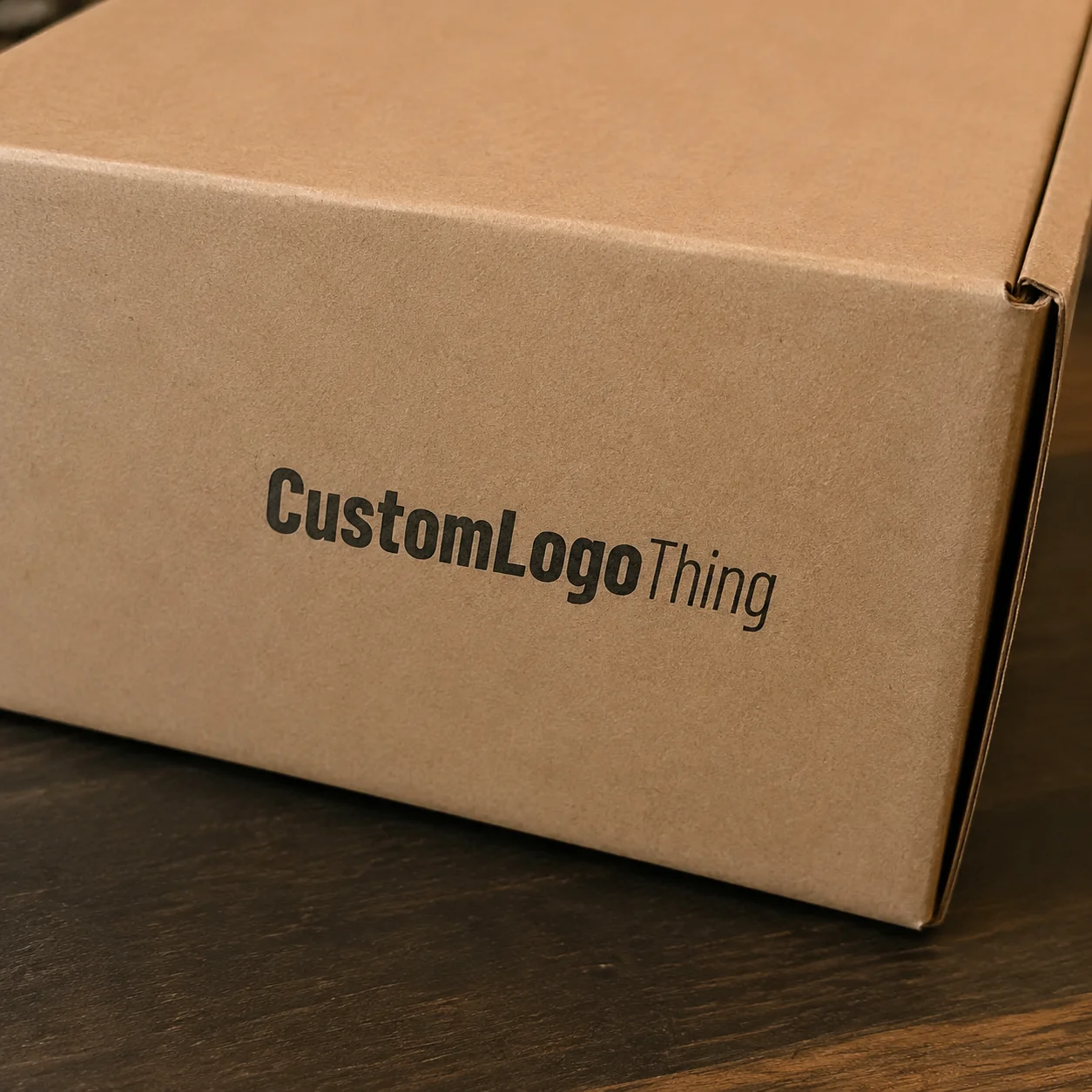
Two products can sit at the same price point and still feel like they live in different worlds. One box reads as deliberate and expensive to open. Another feels like it was rushed out of a backup file five minutes before proofing. That gap is why people ask how to Create Branded Packaging identity without spending money on packaging art that looks polished in isolation but falls apart in the real world.
Branded packaging is not a logo pasted on a box. It is the system of visual and tactile cues customers recognize before they even read the product name. If you are trying to figure out how to create branded packaging identity that sticks beyond a single launch image, start with consistency, not flash. Most brands still treat each component as a separate design project and end up with a fragmented presentation, then wonder why conversions, repeat buys, and returns feel inconsistent. I have seen that pattern in beauty, food, supplements, and giftable products alike. The packaging looks “finished” in the deck, then gets a little weird once the first samples land. This piece breaks down what packaging identity means, how it is built, what drives cost, and how to keep the whole system repeatable without turning it into a budget sink.
How Do You Create Branded Packaging Identity That Sells?
From a buyer’s point of view, packaging has one job before checkout is finished: reduce doubt. Clear packaging identity lowers friction, especially when price competition is tight and the buyer has limited trust data. Weak packaging does the opposite. It creates hesitation, and hesitation is often the exact moment a shopper exits to compare options.
That is why how to create branded packaging identity matters for product packaging, retail packaging, and D2C shipping across the board. The box, sleeve, tissue, insert card, tape, and label all speak before customer support or social proof can intervene. Related touchpoints build a feeling of reliability. Randomly styled pieces create a subtle but expensive sense of confusion, even when each piece is not technically bad. In my experience, that confusion is often harder to spot than a defect because it does not look broken. It just looks a little off.
The core misconception is this: a logo is not identity. A sharp print file is not identity. A beautiful mockup is not identity. How to create branded packaging identity is the discipline of building a repeatable language that holds up across structures, vendors, and reorder cycles without turning into visual drift. That repeatability is what separates a brand system from a one-off launch.
Good packaging identity usually does three jobs at once:
- It makes the brand recognizable within seconds, even at arm’s length.
- It reinforces the product’s price position rather than fighting it.
- It keeps new SKUs, seasonal drops, and replenishment batches aligned to one system.
That is simple in theory. Production makes it harder. Ink, finishes, stock, and structural choices all shape how it reads in hand. Once how to create branded packaging identity is clear, coordination gets easier because everyone has constraints and a shared target instead of improvising from taste. And yes, sometimes the most useful move is to tell the team no. Gonna sound blunt, but that one word saves a lot of ugly packaging.
For practical examples of formats and finishing options, browse the Custom Packaging Products page. If you want to check how one identity holds across categories, the Case Studies page gives better insight than any mood board that ignores reorder reality.
What Branded Packaging Identity Actually Means
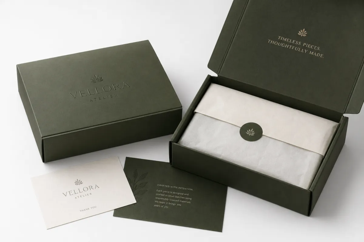
How to create branded packaging identity starts by defining what belongs in the system, and it goes well beyond a color chip and a logo mark. The system includes color, typography, stock, structure, finish, inserts, and the order in which someone opens and interacts with the package. One weak component can weaken the whole story, even if the hero panel still looks expensive.
Branding is the message. Packaging identity is the proof point. A brand can declare itself premium, playful, minimal, or technical forever; packaging decides whether those words mean anything in physical reality. A premium claim paired with flimsy board, inconsistent spacing, and chaotic interior print undermines itself before the product is even unwrapped. That mismatch is where trust leaks away.
In practical terms, how to create branded packaging identity means designing a language that scales across formats:
- Shipping cartons for outer layer protection and first-encounter authority.
- Retail boxes that survive shelf competition with clear visual hierarchy.
- Tissue paper and wraps that support the unboxing rhythm.
- Labels and tape that reinforce recognition without drowning the packaging in print density.
- Insert cards and notes that keep messaging consistent through the post-open moment.
Common failure starts when teams build one standout box and improvise every supporting piece. You get a clean outer carton, a loud thank-you card, a kraft mailer, and a glossy sticker that all look fine one-by-one. Together they resemble a collage from multiple campaigns. That is packaging randomness, not identity.
Packaging identity also shifts trust dynamics. In categories like gifts, beauty, wellness, and premium household products, buyers evaluate value from the outside in, then confirm internally. Ordered, intentional execution creates a subconscious expectation of similar quality inside. That expectation is not magical; it is pattern-based behavior. Humans do this fast. Sometimes within a second or two, which is wild but true.
For teams trying to figure out how to create branded packaging identity without overthinking every pixel, set a few non-negotiables: logo placement logic, color limits, typography order, stock family, and finish rules. Apply those across every SKU. The intent is straightforward. The execution is where discipline shows.
“If the packaging cannot be reproduced consistently, it is not an identity yet. It is a one-off design exercise.”
How the Packaging Identity Process Works From Brief to Print
The process for how to create branded packaging identity performs best when it is boringly organized. Great packaging teams rely on checkpoints, version control, and clear approvals, not on mood swings and emergency changes from senior stakeholders who review files at 11:58 p.m. I have watched those late-stage changes add days, then costs, then awkward compromises that no one wanted to defend later.
Most projects begin with brand discovery. The useful questions are practical, not poetic: Who is the audience? What is the target price tier? Where does it sell—online, retail, or both? Does the package need to protect weight, stack efficiently, or create a retail display effect? What emotion should the customer feel on receipt? A premium candle, a snack pack, and a med-tech product need different packaging logic; no amount of style research changes that.
After discovery comes the packaging audit. The current system is examined piece by piece: cartons, labels, fill, tape, inserts, wraps, and protective components. You check consistency, cost, and customer-facing behavior. If identity already exists, the audit shows drift. If identity is missing, the audit reveals where the build should start. It is a little like a mechanical inspection. The problems are obvious once you look at everything together.
Next, concept direction converts intent into rules. A designer aligns hierarchy, finish logic, material language, and SKU adaptability into one framework. That shift is the line between “nice package art” and a practical packaging system.
Next come technical execution tasks. Dielines are finalized. Artwork is nested to those structures. Proofs are checked for tolerance and scaling. Samples are approved. Production signoff is granted. The difficult part comes after approval: protecting the approved identity through manufacturing and downstream handling.
Lead times depend on complexity and readiness. Standard paper packaging can move quickly, sometimes in 10-20 business days after proof approval, if structure and artwork are stable. Custom Printed Boxes with specialty effects or rigid structures often push into 3-5 weeks, and rigid or complex formats can stretch to 4-8 weeks, especially with tooling or changing samples. If the supplier is also onboarding a new finish or a new board grade, add some cushion. Real life is always a bit messier than the spreadsheet.
Delays usually appear in a few places: incomplete dielines, late copy approvals, wrong structure in artwork, late stakeholder changes, or color and finish pushback from suppliers. Packaging exposes indecision quickly because there is no place to hide it in print. The earlier the brief is locked, the fewer expensive revisions appear later.
For brands trying to master how to create branded packaging identity without chaos, lock an approval checkpoint before production. “We can still resize the logo later” is usually the beginning of a cost overrun, not a design improvement.
Key Factors That Shape Cost, Materials, and Consistency
Cost is where good intentions meet supply-chain reality. If you want to know how to create branded packaging identity without overspending, study the cost drivers and how they compound. Quantity, structure, print coverage, and finish choices each affect pricing, then multiply with logistics and revision history.
In most projects, the biggest cost drivers are:
- Quantity: lower volumes usually raise unit pricing, and that equation does not negotiate itself.
- Board grade: kraft, SBS, rigid board, corrugated, and specialty stocks do not behave the same commercially.
- Ink coverage: heavy or full-bleed color fields increase cost and can widen batch variation.
- Custom structure: unique dielines, locking features, and insert systems add tooling and setup.
- Finishing: foil, embossing, spot UV, soft-touch lamination, and aqueous coatings increase cost and process complexity.
- Inside printing: interior graphics create premium feel, but every extra ink layer means more work and more money.
For a realistic benchmark, use this rough comparison of common packaging formats. Prices shift by size, color, quantity, supplier, and region, but the pattern helps set expectations for how to create branded packaging identity without guesswork.
| Packaging Option | Typical Unit Cost Range | Best For | Main Tradeoff |
|---|---|---|---|
| Kraft mailer with single-color print | $0.35-$1.10 | Simple DTC shipping, low-friction launches | Lower visual impact, fewer finish options |
| Custom printed folding carton | $0.40-$1.80 | Retail packaging, beauty, food, small goods | Needs tighter artwork control and dieline accuracy |
| Rigid box with insert | $2.50-$8.50 | Premium products, gifting, high perceived value | Higher cost, more storage space, longer lead time |
| Corrugated shipping box with inside print | $0.85-$3.25 | Subscription boxes, heavier goods, unboxing programs | Print consistency and size standardization matter more |
Small batches often cost more per unit, and that does not automatically mean bad strategy. A 500-piece test run can be the right call when you need to validate the identity before scaling. You gain behavior data faster and avoid locking 2,000 units into a concept that performs poorly at fulfillment.
Material choice changes how customers interpret the product. Kraft often feels natural and grounded; SBS gives a cleaner retail finish; rigid board feels premium because of weight and structure; corrugated communicates durability and logistics strength. Specialty stocks can sharpen experience, but sourcing instability can create expensive delays on second runs.
Consistency carries more risk than many teams plan for. If color references, coating specs, and structural tolerances are not documented, reorder cycles drift. One supplier uses warm white, another bright white. One prints richer black, another delivers a gray cast. A late shipment lands and the brand identity suddenly looks like it came from different eras.
For environmental checks, look at certification and recovery standards before committing. FSC certification helps verify responsible paper sourcing, while FSC certification requirements provide a practical framework. For transit resilience, ISTA remains useful for shipping stress standards and can prevent “looks good on shelf, fails in transit” moments. If you are in a regulated category, do not treat those standards as decorative; verify them with your supplier and compliance team.
From the buyer side, strongest systems balance three variables: unit cost, repeatability, and perception. High design flourish fails if it cannot be reproduced. Deep savings fail if they cheapen product credibility. How to create branded packaging identity stays strong when it protects both margin and meaning.
Step-by-Step: How to Create Branded Packaging Identity
If you want an operational answer to how to create branded packaging identity, skip the decorative shortcuts and build a method. The method is not harder than it sounds, just less forgiving.
1. Define the brand basics
Begin with audience, price point, function, and emotional intention. A $12 wellness formula and a $120 gifting set need different visual systems because they ask buyers to feel different things. The packaging must match both perceived value and selling context: shelf clarity, shipping protection, and gift psychology each carry different priorities.
This is also where you should decide what the package is not supposed to do. If it needs to protect fragile contents, don’t bury the structure under thin board and heavy ink coverage. If it is meant to feel elegant, avoid stuffing the outside with too many claims. Clarity wins more often than decoration.
2. Set the identity rules before designing individual pieces
This is where teams save time later. Choose core rules early: logo placement logic, approved colors, typographic set, material families, and finish vocabulary. If the system allows random palettes and unlimited effects, the result eventually looks like several brands pretending to collaborate.
Think of it as a design grammar. Once the rules are clear, every new SKU becomes a sentence in the same language instead of a separate dialect. That sounds tidy, but the real payoff is operational: fewer revisions, fewer vendor questions, fewer weird one-offs.
3. Design the system, not just the hero box
Many teams obsess over one “perfect” box and scramble once the mailer, sleeve, and carton are required. How to create branded packaging identity is the opposite: design the family first, then map every format to it. The customer should recognize the brand whether they are seeing a retail box in person or reading an insert at home.
In one project I reviewed, the hero carton looked expensive, but the shipping box and internal wrap told a completely different story. The outer experience promised precision. The inner one did not. That kind of mismatch is exactly what hurts repeat trust.
4. Map the customer journey
Track the sequence in order: shelf or feed, cart, shipping, first opening, storage, and repeat engagement. Does the package communicate value on shelf? Does it survive distribution? Is the reveal moment clean? Can the customer keep the package without immediate disposal fatigue? These decisions decide whether the identity becomes memorable or forgettable.
Camera behavior matters more than teams admit. In premium and gift categories, users document unboxing moments. Clean contrast, strong hierarchy, and controlled unfolding usually perform better on vertical and short-form video than dense graphics and decorative clutter. That does not mean every package should chase social media theatrics. It just means the package now performs in public whether the brand planned for that or not.
5. Prototype early and compare under real conditions
Do not trust a glowing monitor as your final judge. Print samples. Handle them under normal light. Run a drop test if the product needs protection. Compare samples side by side because micro-differences in rigidity, texture, and coating can shift perceived value from “solid” to “unreliable” quickly.
Watch for practical failures too: lids that catch, inserts that shift, seams that split, ink smudging, and finishes that attract fingerprints. Real-world handling reveals issues that a mood board will never expose. If something feels a little flimsy in your hand, it will probably feel flimsy to the customer too.
6. Document the system in a style sheet
Move identity ownership out of any single designer file and into a practical reference package. The style sheet should include dimensions, print placement rules, color references, board and film specs, finish options, and approved alternatives. Future SKUs must be able to follow the structure without guesswork.
A strong specification document also defines what cannot change: logo clear space, stock restrictions, approved interior print limits, and fixed PMS references. These constraints may feel dull. They prevent drift, especially for teams that scale across multiple teams and production windows.
For perspective on execution options, review the Custom Packaging Products catalog before locking structure decisions. For proof of why process beats guesswork, the Case Studies section offers useful comparisons and real outcomes.
Common Mistakes That Make Packaging Look Cheap or Confused
Most packaging collapses because it accumulates ten small errors, not one dramatic one. Teams asking how to create branded packaging identity need equal fluency in what to build and what to avoid.
Over-designing is common. Too many colors, effects, fonts, and copy create visual interference. The result often appears creative in isolation but unclear in context. Strong packaging has selectivity. It understands that restraint is part of communication. That doesn’t mean dull. It means deliberate.
The logo trap appears when teams believe logo scale can cover structural weakness. A larger mark cannot fix poor materials, weak hierarchy, or weak packaging function. Layout discipline and production-aware decisions improve perception more than oversized marks.
Inconsistency destroys recognition faster than most teams expect. A matte white carton one week, glossy kraft the next, and then a foil-heavy label with a different face in a third batch sends mixed signals. Variation is valid when intentional, but only if the underlying framework remains visible.
Unmanaged budget drift quietly erodes project control. Teams approve too early, then absorb reprints, color deviations, and supplier substitutions later. Every late adjustment has a cost, and each one compounds with the next. That is why how to create branded packaging identity depends on design quality plus approval discipline.
Watch for warning signs before they multiply:
- The front panel reads polished while sides and interior feel neglected.
- The same brand color shifts between two SKUs.
- Packaging is approved without physical sample checks.
- No one can defend why each material was selected.
- A reorder requires fresh design decisions instead of a controlled repeat.
That last warning is often the most expensive. A real identity is reproducible across production cycles. If the system cannot pass a second run cleanly, the project remains a one-time visual experiment.
“The cheapest packaging is not the one with the lowest quote. It is the one you do not have to correct three times.”
Expert Tips and Next Steps for a Stronger Packaging System
If packaging is already in market and you want measurable improvement, start with an internal audit. List every customer-facing element: shipping box, retail box, label, tissue, tape, insert, card, bag, and seasonal materials. Score each one for consistency, clarity, and production quality. That exercise reveals how how to create branded packaging identity is behaving across the full environment.
Then run a controlled pilot. Full rollouts rarely reveal practical issues fast enough. A pilot run confirms real handling, visual performance, fit, and durability while containing the risk. The goal is not low spend. The goal is controlled learning.
Build a supplier-ready spec packet before the next production cycle. Include dimensions, materials, finish notes, color references, artwork versions, quantity bands, and approval flow. Vague briefs produce assumptions. Assumptions are expensive; precise specs are not glamorous, but they are cheaper.
If the brand positions itself around sustainability, be explicit and auditable. Go beyond vague “eco-friendly” language. Track sourcing, recyclability, and structural efficiency. EPA guidance at epa.gov is a practical starting point if you need baseline criteria for waste and recovery claims. Lighter, stronger-to-ship systems often help both margin and credibility. They also reduce the kind of damage that makes a package look good in a studio and kind of sad on a loading dock.
Finally, standardize with intention. Shared box sizes where possible. Shared material specs where possible. Shared print methods where possible. Fewer custom branches mean easier quality control, clearer reorder behavior, and fewer surprises at the printer.
For brands still asking how to create branded packaging identity without burning budget, the next move is plain: tighten the system first, compare two or three manufacturing routes, then scale across the line through phases. If you are starting from zero, begin with the most visible touchpoint and expand outward. If you already have existing packaging, improve weak links before adding decorative layers. That is how how to create branded packaging identity becomes durable in both market and margins.
The clearest takeaway is simple: build a packaging identity as a system, not as a single beautiful object. Lock the rules, proof the materials, document the specs, and make sure every component can be repeated without improvisation. If the second run looks like the first run, you are finally getting somewhere.
How do I start creating branded packaging identity for a small business?
Start by auditing every packaging piece already in use and identifying where customers touch it most: shipping, shelf, unboxing, and post-purchase retention. Choose one system first—core colors, primary type, logo placement, and one or two scalable materials. A pilot run is the most practical first step because it tests appearance, handling, and cost before the full rollout. That gives you an executable version of how to create branded packaging identity.
How much does it cost to create branded packaging identity?
Cost changes with quantity, structure, print coverage, and finish choices. Custom rigid constructions with specialty effects usually cost more than plain cartons, and smaller runs typically increase unit price. The strongest savings generally come from standardizing dimensions and reducing the number of unique components. A locked design before production lowers volatility. Frequent changes can turn the quote into moving math.
How long does the packaging identity process usually take?
A straightforward update can move in a few weeks when artwork and technical specs are ready. Custom structures and specialty effects add sampling, proof, and revision cycles, extending timelines. Allow extra buffer when changing dielines, adding new materials, or coordinating several vendors. The process for how to create branded packaging identity usually advances faster when the brief is specific and approvals are enforced early.
What should be included in a branded packaging style guide?
Include logo rules, color systems, typography, finish requirements, box dimensions, and approved material options. Add examples for multiple SKUs so future development does not drift. Include print tolerance windows and approval steps so reorder quality remains stable. A style guide is more than a design note. It is the guardrail that keeps the identity from weakening over time.
What is the biggest mistake in branded packaging identity?
Treating packaging as an isolated design object rather than a repeatable system is the core mistake. Too many teams obsess over the front panel and forget the inside message, inserts, and shipping sequence. If the packaging cannot be reproduced consistently, it is not a real identity yet. That is the direct answer to how to create branded packaging identity that holds under production pressure and customer use.