Buyer Fit Snapshot
| Best fit | Create Minimalist Custom Packaging Design projects where brand print, material claims, artwork control, MOQ, and repeat-order consistency need to be specified before quoting. |
|---|---|
| Quote inputs | Share finished size, material target, print colors, finish, packing count, annual reorder estimate, ship-to region, and any compliance wording. |
| Proofing check | Approve dieline scale, logo placement, barcode or warning zones, color tolerance, closure strength, and carton packing before bulk production. |
| Main risk | Vague material claims, crowded artwork, missing packing details, or unclear freight terms can make a low unit price expensive after revisions. |
Fast answer: Create Minimalist Custom Packaging Design: Material, Print, Proofing, and Reorder Risk should be specified like a repeatable production item. The safest quote records material, print method, finish, artwork proof, packing count, and reorder notes in one written spec.
Production checks before approval
Compare the actual filled-product size with the drawing, then confirm tolerance on folds, seals, hang holes, label areas, and retail display edges. Reserve space for logos, QR codes, warning copy, and material claims before decorative graphics fill the panel.
Quote comparison points
Review material grade, print process, finish, sampling route, tooling charges, carton quantity, and freight assumptions side by side. A quote is only useful when the supplier can repeat the same color, closure quality, and packing count on the next order.
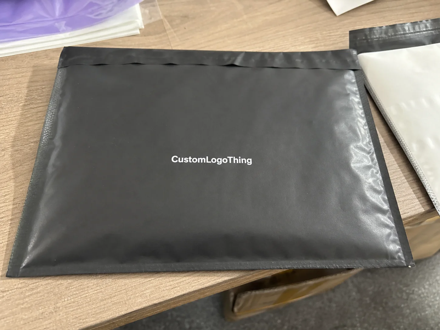
When I first started walking factory floors in Dongguan and Newark, I noticed something that still catches new brands off guard: some of the strongest shelf performers use the fewest visual elements. That lesson sits right at the center of how to create minimalist Custom Packaging Design, because clarity often sells faster than clutter in retail and e-commerce environments. A clean box with a precise logo lockup, one restrained accent color, and a well-made board can do more brand work than a loud carton covered in five fonts and nine claims. I’m not kidding. I’ve watched a buyer in Los Angeles choose the quiet box over the “look at me” one more times than I can count, especially when the packaging was built on 350gsm C1S artboard with matte lamination and a 1-color black print.
Honestly, a lot of people confuse minimalism with “doing less” when it should really mean doing the right things, with discipline. In packaging plants from Shenzhen to New Jersey, I’ve seen minimalist Custom Packaging Design win because every millimeter was planned: the score lines were sharp, the ink coverage was controlled, and the tactile finish matched the brand story. That’s the difference between plain packaging and premium minimalism. One looks forgotten. The other looks intentional. And yes, the one with the better die-cut and tighter registration usually gets the order.
What Minimalist Custom Packaging Design Really Means
How to create minimalist Custom Packaging Design starts with understanding that minimalism is not an absence of design; it is intentional reduction. The package communicates through hierarchy, whitespace, restrained color, and typography that is clean enough to read at a glance. In practice, that means the customer sees the brand name first, the product name second, and any required detail third, without visual noise fighting for attention. That kind of order sounds simple. It isn’t, especially when you’re fitting it onto a 120 x 80 x 35 mm carton with a barcode, recycling mark, and legal copy.
I’ve stood at a finishing line in Shenzhen watching operators pack luxury skincare cartons with almost no graphics at all, yet those boxes looked more expensive than brightly printed alternatives because the paper stock was heavier, the fold quality was tighter, and the varnish was controlled to the point of looking soft to the eye. That’s a classic example of how product packaging can feel premium through structure and finish instead of decoration. A minimalist box is not “empty”; it is edited. There’s a difference, and the factory floor will expose it fast. A 2 mm corner crush or a sloppy glue flap will ruin the whole illusion in ten seconds.
Here’s what most people get wrong: they think a plain white box with a logo is minimalist packaging. Sometimes it is, but often it is just unfinished. Thoughtful minimalist custom packaging design still depends on the right board grade, precise print registration, and a finish that supports the brand. A 350gsm C1S artboard with matte lamination feels very different from a flimsy 250gsm stock, even if the art on both is reduced to a single wordmark. One feels considered. The other feels like a rushed afterthought from a budget meeting nobody enjoyed. If you want that subtle premium feel, the material spec matters just as much as the logo size.
Minimalist branding works especially well for skincare, apparel, specialty food, electronics, subscription boxes, and luxury goods. I’ve seen candle brands use a simple kraft wrap with a single black foil logo and sell better in boutique retail because the package felt calm, modern, and giftable. That kind of package branding communicates confidence, which is exactly what many customers want before they open the box. It says, “We know who we are,” without shouting it from the rooftop like a nervous intern with a megaphone. A 1-color print on 48# natural kraft can do more than a noisy 6-color design ever will.
“The cleanest pack on the shelf is not always the easiest one to make. Minimalism exposes every tiny flaw, from a 0.5 mm type misalignment to a weak glue flap.”
That exposure is why minimalist custom packaging design can actually increase perceived value. When the structure is engineered properly and the print accuracy stays tight, the package reads as intentional, not cheap. I’ve watched buyers in a retail packaging meeting pick up a simple two-piece rigid box, tap the lid, and immediately say it felt “expensive” before they even saw the product inside. They don’t need a speech. They can feel it. And when that rigid set is wrapped in 157gsm specialty paper with a soft-touch coating, the tactile cue does half the selling.
How Minimalist Custom Packaging Design Works
How to create minimalist custom packaging design also means understanding the mechanics behind the look. The outer package usually carries one dominant message, one focal point, and very little secondary information. That restraint creates hierarchy, so the customer’s eye moves exactly where you want it to move. If the brand name is the hero, then the font weight, spacing, and placement need to support that role without distraction. Otherwise the whole thing just feels like it forgot its job. A 14 pt logo on a 220 x 140 mm front panel behaves very differently from a 9 pt mark jammed near a flap.
Production choices shape the final result just as much as artwork does. Kraft paperboard gives a natural, earthy feel. Folding cartons are efficient for mass distribution. Rigid boxes add structure and perceived value. Corrugated mailers are the backbone of e-commerce. I’ve seen minimalist custom packaging design look excellent on a computer screen and then fall apart on press because the chosen board absorbed ink unevenly or because the fold scores were too tight for the stock caliper. The screen lies. The press never does. A 300gsm SBS board might look perfect in PDF form and still crack at the crease if the score depth is off by 0.3 mm.
Print method matters too. Offset lithography gives excellent detail and consistent color at scale, especially for custom printed boxes with fine typography. Flexographic printing is often a better fit for corrugated shipping cartons and higher-volume runs where speed and cost control matter. Digital printing is useful for short runs, fast prototypes, or seasonal updates. Screen printing can produce bold, tactile marks on specialty surfaces, although it is less common for complex packaging design. Each method changes the sharpness of lines, the saturation of blacks, and the final unit cost. And yes, the wrong method can make a gorgeous concept look like it was assembled during a power outage. For example, a 5,000-piece offset run can hold fine rules at 0.25 pt, while a digital short run might soften edges a bit depending on the machine and substrate.
Structure supports design in a big way. A tuck-end carton may suit a lightweight cosmetic tube, while a two-piece rigid box can elevate a small fragrance set or an accessory kit. Magnetic closure boxes, sleeves, and inserts let you create a premium unboxing without filling the exterior with graphics. In my experience, the best minimalist custom packaging design often uses the inside of the box as a quiet reveal space, not a billboard. The outside whispers. The inside gets the little “oh, nice” moment. A 2 mm EVA insert wrapped in black paper can make a small product feel like a much bigger purchase.
Prepress discipline is where many projects succeed or fail. Exact dielines, controlled ink coverage, and careful trapping become critical because small flaws are easy to see on a minimal layout. A 1 mm misaligned logo on a busy design may go unnoticed; on a minimalist one, it stands out immediately. That is why I always tell clients that minimalist packaging has a shorter forgiveness margin, especially when the pack includes thin rules, small legal copy, or a precise centered mark. Minimalism is polite right up until it isn’t. On a pack with a 3 mm bleed and a 5 mm safe zone, every decision has to be deliberate.
Key Factors in Minimalist Custom Packaging Design
Typography sits near the top of the list when planning how to create minimalist custom packaging design. Clean sans-serif fonts, generous letter spacing, and a disciplined hierarchy help the buyer read the package in seconds. I often recommend keeping the brand name, product name, and functional details in separate visual tiers, with enough breathing room that the layout feels calm rather than crowded. Thin fonts can look elegant, but on textured boards they may break up or disappear under low contrast. I’ve had to say “no” to beautiful-but-useless type more times than I’d like. Gorgeous on screen. Tragic on stock. A 0.75 pt hairline on a natural kraft mailer is just asking for trouble.
Color strategy matters just as much. Monochrome palettes, muted neutrals, and one accent color used sparingly can produce strong recognition without visual overload. A black logo on natural kraft, a warm gray on white SBS board, or one deep green accent against off-white stock can carry a whole brand system. When I visited a cosmetics converter outside Chicago, the client had narrowed a 12-color concept down to two inks and a matte coating, and the package looked more expensive as soon as the excess was removed. Honestly, it was a relief. Twelve colors on a minimal box can start looking like a design team’s cry for help. Even a single Pantone 419 C mark on 350gsm board can feel premium if the spacing is right.
Whitespace is not empty space. It is a design tool that improves luxury perception, reduces visual fatigue, and helps the consumer focus on the product itself. In retail packaging, whitespace also helps the item stand out from neighboring packs that scream for attention. In e-commerce photography, that same calm surface creates a cleaner crop and usually improves the product image on a white background. I’ve seen buyers choose the simpler box because it photographed better for online product pages. That matters. A package that looks good in person and online is doing double duty. A 10 mm margin on the front panel can be the difference between “premium” and “crowded” in a product photo shot on a 24-inch lightbox.
Materials and finishes strongly influence pricing. Premium uncoated boards, FSC-certified paper stocks, specialty coatings, and textured wraps can all shape the final feel. FSC-backed sourcing is worth considering if your brand wants a sustainability story that can be documented properly; the Forest Stewardship Council has clear guidance at fsc.org. For brands wanting a broader look at packaging sustainability and recovery systems, the U.S. EPA’s packaging resources at epa.gov are also useful references. I know, paperwork is thrilling. But buyers and retailers do ask. A white uncoated 325gsm stock with soy-based ink can support both the aesthetic and the story if the print coverage stays low.
Branding consistency across touchpoints matters more than many teams expect. A minimalist shipping carton, a matching retail box, a coordinating insert, and a clean tissue wrap should all feel like they belong to the same system. That includes the label style, the barcode placement, and the way the logo appears on secondary packaging. If your branded packaging looks restrained on the outside but busy inside, the whole experience feels inconsistent. It’s like showing up in a perfectly tailored jacket and then wearing three different shoes. People notice. I’ve seen that happen with brands that used a 1-color outer carton, then stuffed the inside with a loud printed card because “we had space.” No, you had a design opportunity, and you missed it.
| Packaging option | Typical look | Common use | Indicative starting price |
|---|---|---|---|
| Folding carton with matte lamination | Clean, light, efficient | Skincare, supplements, small retail items | $0.38 to $0.78/unit at 5,000 pieces |
| Kraft mailer with one-color print | Natural, simple, e-commerce friendly | Apparel, subscription boxes, direct-to-consumer shipping | $0.52 to $1.10/unit at 5,000 pieces |
| Rigid setup box with soft-touch wrap | Premium, quiet, tactile | Luxury goods, gift sets, electronics accessories | $1.65 to $4.25/unit at 3,000 pieces |
| Custom printed boxes with foil accent | Minimal artwork, refined highlight | High-end retail launches, limited editions | $0.95 to $2.40/unit at 5,000 pieces |
Those numbers vary by size, stock, and freight, but they give a realistic starting point for budgeting. I’ve seen brands get surprised because the box looked “simple” during design review, then the quote came back higher than expected once they added rigid construction, custom inserts, and soft-touch lamination. Visual simplicity does not always equal manufacturing simplicity. That’s one of those lovely little truths nobody wants to hear until the estimate lands on their desk. A 5,000-piece folding carton in Qingdao might land around $0.15 per unit for a very basic specification, while a similar concept with foil and embossing can jump fast.
How to Create Minimalist Custom Packaging Design Step by Step
The first step in how to create minimalist custom packaging design is defining the brand story and the one emotion the package should communicate. Is the brand supposed to feel clinical, warm, natural, premium, modern, or discreet? You need that answer before artwork begins. A minimalist design built on the wrong emotional direction can look technically clean but still feel off-brand, and that mismatch is expensive to fix later. I’ve seen a “luxury” box accidentally come out looking like pharmacy shelf stock. Not ideal. If your target price point is $24 to $48, the package should support that range in both finish and structure.
Next, audit the shelf or the e-commerce context. Pull photos of competitors, place them side by side, and decide what to remove rather than what to add. I’ve sat in client meetings where the marketing team wanted four badges, two icon rows, and a slogan on the front panel, and the design only became stronger after we stripped the layout back to one logo and one product descriptor. Minimalist packaging is often subtraction with purpose. If you can’t explain why something is there, it probably shouldn’t be there. On a shelf in New York or online in a 1,200-pixel product tile, every extra line competes for attention.
After that, build the hierarchy. Place the logo, the product name, and the key compliance copy in order of importance. Keep margins consistent, and make sure the elements have enough space to breathe. On a small carton, a 6 mm margin can feel generous, while on a rigid box you may want 10 mm or more depending on the size. The goal is to make the eye settle immediately without hunting for information. A package should guide, not interrogate. If the front face is 180 mm wide, give the logo enough room to feel deliberate instead of cramped.
Then choose the structure and material based on protection and presentation. A folding carton may be ideal for light products, while a rigid box fits premium sets or fragile items. Corrugated mailers do the heavy lifting in shipping environments, especially for direct-to-consumer brands. I always advise clients to request sample prototypes before approval, because board stiffness, surface texture, and closure feel matter more than most people expect. A box can look perfect and still feel weird in the hand. And weird in the hand is a problem. A prototype in 300gsm CCNB with an A-flute mailer insert can save you from a very expensive surprise later.
Once structure is set, prepare production artwork carefully. That means clean dielines, correct bleeds, approved fonts, and verified barcode zones. I’ve seen a project get delayed two weeks because the barcode was too close to the fold and failed scan testing on the first run. For minimalist custom packaging design, even a small compliance block can ruin the layout if it is placed without discipline. Tiny detail, giant headache. My favorite kind of headache. (Not really.) If you are printing in Mexico City or Ningbo, send native files early and confirm the dieline version before prepress touches anything.
Press proofing and sampling deserve real attention. Check color against your master reference, review print sharpness, and inspect how the finish behaves in different lighting. A soft-touch laminate can mute colors slightly; a matte coating can deepen blacks; an uncoated board can absorb ink and make pale shades look dusty. None of that is bad, but it must be accounted for in the proof stage. I remember one job where the “clean white” stock looked cream under warehouse lights in Atlanta and the client panicked like we’d changed the whole brand. We hadn’t. The bulbs were just lying to everybody. A press proof approved under D50 lighting will often save you from that kind of drama.
- Write the brand brief with product, audience, and price point.
- Choose the visual restraint level by deciding what the package will not say.
- Select material and structure based on shipping weight and shelf presentation.
- Build the artwork hierarchy with logo, product name, and required copy.
- Check prepress and samples before committing to production.
That five-step flow sounds simple, but the discipline behind it is where the work lives. In one supplier negotiation I handled in Ningbo, the client wanted to save money by skipping the prototype stage on a rigid box run of 8,000 units. We pushed back, made two sample rounds, and caught a lid fit issue that would have caused a real headache in fulfillment. Minimalism looks effortless only after the factory work has been done correctly. Before that, it’s just wishful thinking with a Pantone swatch. If the sample takes 12-15 business days from proof approval, that’s usually time well spent.
Cost, Pricing, and Timeline for Minimalist Custom Packaging Design
How to create minimalist custom packaging design is sometimes assumed to be cheaper because the graphics are simpler, and sometimes that is true. If you reduce ink coverage, avoid multiple specialty finishes, and keep the structure standard, you may save money. But if you choose rigid construction, custom inserts, or premium wraps, the cost can rise quickly. Simplicity in appearance does not guarantee simplicity in production. If anything, minimal work can make every production flaw more visible, which is rude but true. A basic folding carton in one color might start around $0.15 per unit for 5,000 pieces, while a two-piece rigid box can jump to $2.10 per unit depending on wrap and insert choices.
The main pricing drivers are order quantity, box style, board grade, print method, finishing, inserts, and whether structural engineering is required. A run of 2,500 folding cartons in digital print will price very differently from 10,000 rigid boxes wrapped in specialty paper with foil stamping. From what I’ve seen on the factory floor in Guangdong and New Jersey, the biggest cost surprises usually come from finish changes, not from the base print. Somebody always thinks the “little matte thing” won’t matter. Then the quote arrives and reality enters the room. Add a magnetic closure or an EVA tray, and the unit price can move faster than anyone expected.
Timelines generally move from concept and dieline development to artwork approval, sample production, and final manufacturing. Straightforward projects may move quickly when the structure is already established. Custom rigid packaging with inserts, specialty coatings, or multiple proof rounds usually adds more time. I’ve had projects approved in under two weeks when the client had a clean brief, and I’ve had others take over a month because the team kept changing type placement by a few millimeters. A few millimeters sounds harmless until you’re on the third round of proofs and everyone is pretending not to be tired. For many suppliers in Shenzhen or Dongguan, final production typically lands at 12-15 business days from proof approval, then freight adds another 3-10 days depending on the route.
Here’s a practical budgeting rule I use with clients: leave room for prototype revisions, freight, and packaging tests before you sign off on the full run. That extra cushion matters because shipping damage, barcode issues, or a poor color match can force a rerun. If the box has to hold up during warehouse handling, palletization, and final delivery, the budget should reflect those real conditions. The box doesn’t care that the spreadsheet is optimistic. I usually tell clients to reserve 8% to 12% of the packaging budget for sampling, rework, and last-minute freight changes.
| Project stage | Typical duration | What happens | Main risk |
|---|---|---|---|
| Brief and concept | 2 to 5 business days | Brand goals, references, size targets | Unclear messaging |
| Dieline and artwork | 4 to 10 business days | Layout, copy placement, structural setup | Typography or fold errors |
| Sampling and proofing | 5 to 12 business days | Color review, fit checks, assembly tests | Fit mismatch or finish variation |
| Production and dispatch | 12 to 25 business days | Printing, converting, packing, shipping | Freight delays |
Those durations depend on plant load, seasonality, and material availability, so I always tell clients not to treat them as guarantees. The honest answer is that minimalist packaging can move faster only if the team makes decisions early and sticks to them. Every late change to a logo, a foil color, or a board finish adds time. And yes, somebody always wants “just one more tweak” right after approval. Every single time. If the factory is in Foshan and the carton uses specialty wrap sourced from Shanghai, material lead time alone can add 3-7 business days.
Common Mistakes to Avoid in Minimalist Custom Packaging Design
One major mistake is making the package so sparse that it looks unfinished. I’ve seen brands remove too much, then wonder why their box felt generic instead of premium. Minimalist custom packaging design needs an intentional focal point, a confident material choice, and enough structure to make the product feel considered. If the box looks like a blank sample, it has gone too far. Minimal doesn’t mean lazy. A white box with a lone logo in the middle and nothing else can work, but only if the board, finish, and proportions are doing real work.
Another common issue is choosing trendy fonts or ultra-thin type that fail on textured surfaces. On a kraft board or a soft-touch coated carton, a hairline font can break up badly. That problem gets worse with small packaging sizes. For that reason, I usually favor fonts with clear stroke contrast and sturdy letterforms when the package has to survive transport, handling, and print variation. Pretty type that vanishes is just decorative disappointment. If your type is under 7 pt on a 60 mm panel, test it twice before anyone signs off.
Too much whitespace without visual anchoring can also be a problem. Whitespace should frame the focal point, not abandon it. In retail packaging, a box that is too empty may disappear beside competitors, while in e-commerce photos it can feel oddly detached. The trick is making the emptiness feel deliberate, not accidental. White space is not a permission slip to ignore composition. A 12 mm clear zone around a centered mark can look sophisticated; 30 mm with no anchor can look like the artwork file never got finished.
Material choice can sink an otherwise strong design. Low-quality board, weak coatings, or poor adhesive control will show scuffs, dents, and corner wear very quickly. I’ve watched a premium-looking carton lose its appeal after a single pallet move because the coating had no abrasion resistance. That is why package design and manufacturing quality have to be planned together, not separately. I mean, sure, the mockup looked beautiful. Then reality showed up with a forklift. A 250gsm board with a weak aqueous coating is not going to survive a warehouse in Dallas in August.
Finally, some teams overcomplicate the back panel with too much copy, compliance text, or barcode clutter. Yes, regulatory information matters. But it still needs order. The best approach is grouping the essentials cleanly, keeping them readable, and protecting the front panel from becoming a legal document. That balance is one of the quiet skills behind good custom printed boxes. If your back panel reads like a tax form, we have a problem. Keep the barcode in a 25 x 15 mm safe zone and the legal copy in one readable block.
Expert Tips for Better Minimalist Packaging Results
If you want a stronger result, use one tactile feature rather than stacking several. Embossing, debossing, spot UV, or foil can add depth without abandoning the minimalist concept. I usually advise clients to pick one hero finish and let it carry the premium cue. Too many finishes start fighting each other, especially on small cartons. Minimalism likes restraint. Shocking, I know. A single 1.5 mm emboss on a logo can do more than a whole parade of effects.
Test the design under real conditions. Put it under warehouse light, fluorescent retail light, and a camera flash. Rub samples against another box for abrasion checks. Run a few units through carton handling and drop testing if the product is fragile. Standards like ISTA and ASTM matter because attractive packaging still has to survive transit, and the International Safe Transit Association offers useful testing references at ista.org. The box can be beautiful. It also needs to survive being treated like a box. A 1-meter drop test on a packed sample will tell you more than a polished render ever will.
Keep the unboxing sequence intentional. The exterior box, interior insert, tissue, and label should all feel like parts of one calm story. I’ve seen brands win repeat customers because the first tear-open moment felt neat, quiet, and precise. That kind of experience is often better than a flashy reveal with too many moving parts. People remember smooth. They also remember when the tissue paper sticks to the tape like it’s personally offended. A 2-color belly band and a single branded sticker are usually enough.
Work with packaging engineers and print technicians early. They can tell you whether a magnetic flap will hold, whether a score line needs adjustment, or whether a glue area will interfere with artwork. In one client project for a small electronics accessory line in Suzhou, the designer wanted a centered foil mark over a closing flap. The press team flagged the fold tension immediately, and we moved the mark by 4 mm to save the job. Four millimeters. Tiny change, giant save. That’s the kind of boring heroics packaging lives on. The supplier quoted 18 business days, and we kept it to 14 because the decision got made before plates were burned.
Brand recognition should remain obvious even in a stripped-back system. Keep logo placement consistent, repeat a signature color carefully, and use the same proportion rules across every box size. That is the quiet power of minimalist packaging: the product stays unmistakably yours, even when there is very little on the surface. Consistency does the heavy lifting. Minimalism just makes it look elegant while it does. If your 250 ml, 500 ml, and gift set cartons all follow the same 8 mm margin rule, the line feels like a family instead of a random pile of boxes.
For brands building out a broader line, I often suggest reviewing Custom Packaging Products to compare materials, formats, and finishing options before locking in the final design. It helps teams think beyond one SKU and build a packaging family that holds together across sizes and channels. If you’re printing in Eastern China or the U.S. Midwest, that early comparison can also narrow freight and lead-time surprises before they hit the spreadsheet.
Actionable Next Steps for Your Minimalist Packaging Project
The most useful starting point is a one-page brief. Define the product, the target customer, the brand tone, the budget range, and the shipment method before design begins. That single page can save days of revision later. If you are working with an agency or a packaging supplier, it gives everyone a clear reference point for minimalist custom packaging design decisions. I’ve seen a sloppy brief cost more than a prototype. That should be a crime, honestly. Include exact pack size, target run quantity, and whether the project needs retail-ready packaging or e-commerce protection.
Gather three references you like and three you dislike. Then write down exactly what works and what fails: type size, panel balance, board finish, or structure. I’ve watched teams learn more in a 20-minute comparison session than in a full week of vague discussion. Good packaging design starts with specific taste, not broad adjectives. “Modern” is not a design brief. It’s a shrug wearing a blazer. Be blunt about what you want: one logo, one accent, one finish, and no unnecessary clutter.
Request dielines and prototypes early. A clean mockup reveals scale, proportion, fold depth, and material feel in a way a screen never can. If your product is sold online, place the sample next to a phone or a hand to judge how it will appear in images. That one small check often prevents oversized logos or awkward empty zones. The photo will expose what the rendering politely ignored. A sample approved in 12-15 business days is usually a lot cheaper than a production mistake.
Build a revision checklist before sample approval. Include typography, spacing, compliance text, barcode placement, finish selection, and any sustainability claims. For brands that care about environmental messaging, check whether claims are documentable and whether the material choices match them. If you want an FSC story or a recycling claim, make sure the supply chain paperwork is ready before print. Otherwise you end up with a nice-looking box and a very awkward email thread. I’ve seen that email thread last six days and cost a reprint in Jiangsu.
Then move from concept to sample review to pilot run. A small pilot is especially helpful for e-commerce packaging because it lets you watch the box travel through actual fulfillment, not just a studio table. Handling, photography, and customer feedback can all inform the final version. That is how to create minimalist custom packaging design that performs in the real world instead of only looking polished in a presentation deck. Real-world performance is the whole point, even if it ruins the romance a little. A 300-unit pilot can save you from 30,000 units of regret.
If you are planning your next launch, this is the point where Custom Packaging Products can help you compare board types, box styles, and finishing routes before you commit. A little upfront comparison usually saves time, money, and headaches later. It also helps you decide whether a folding carton in 350gsm C1S or a rigid box in 2 mm chipboard is the better fit for the launch date you actually have.
What Minimalist Custom Packaging Design Really Means
To wrap this up, how to create minimalist custom packaging design comes down to restraint with purpose. Minimalism is not about stripping away identity; it is about editing the package until every line, color, and material choice has a job to do. I’ve seen minimalist custom packaging design outperform louder competitors because it felt clearer, more premium, and easier to trust. And yes, sometimes that quiet confidence is exactly what sells. A box from Guangzhou with one foil logo, one clean typeface, and one thoughtful board choice can beat a loud imported carton every time.
If you remember only one thing, remember this: a minimalist box still has to earn its place through structure, print accuracy, and tactile quality. The cleanest-looking package can be the hardest to execute, but when the details are right, it sends a sharp brand signal that customers feel almost immediately. That is why how to create minimalist custom packaging design is really about disciplined packaging design, not just a stripped-back look. Pretty is nice. Precise is better. A 0.5 mm shift, a 4 mm margin, or a slightly better coating can be the difference between “simple” and “cheap.”
How do I create minimalist custom packaging design without making it look plain?
Focus on one strong brand message, then support it with premium materials, clear hierarchy, and intentional whitespace. Subtle finishes like embossing or matte lamination can add depth without adding clutter, and the design should always be tested on the actual package size so it still feels polished when printed and assembled. If it feels too empty on the table, it probably needs one more pass. A 120 x 80 mm sample can look very different from the same artwork on a 200 x 140 mm box.
What materials work best for minimalist custom packaging design?
Kraft paperboard, coated paperboard, rigid chipboard, and corrugated mailers are common choices depending on product weight and shipping needs. Uncoated and textured stocks often suit minimalist branding because they feel natural and refined, but the material still has to protect the product and support the visual style. The fanciest stock in the world won’t save a box that crushes in transit. A 350gsm C1S artboard or a 2 mm rigid chipboard wrap usually gives a good balance of structure and presentation.
Is minimalist custom packaging design cheaper to produce?
It can be cheaper if the design reduces ink usage, color counts, and decorative print steps. However, custom structures, premium boards, and special finishes can raise the price, so the final cost depends more on quantity, print method, and finishing choices than on visual simplicity alone. “Simple” and “cheap” are not twins. They barely speak. A 5,000-piece one-color folding carton might start at $0.15 per unit, but a rigid box with foil and insert work can move into the $2.00-plus range fast.
How long does minimalist custom packaging design usually take?
A basic project may move from concept to approval relatively quickly if dielines and artwork are straightforward. Custom Rigid Boxes, insert development, and specialty finishes usually add extra sample and production time, so it is wise to allow room for proofing, structural testing, and revisions. The fastest projects are the ones where nobody changes their mind three times before lunch. For many factories in Shenzhen or Dongguan, final manufacturing typically takes 12-15 business days from proof approval, plus freight.
What should I include on minimalist custom packaging design labels?
Include the brand name, product name, required compliance information, barcode, and any legally mandated copy. Keep the layout clean by grouping secondary details on the back or bottom panel, and use spacing and typography to keep required information readable without disrupting the minimalist look. If the label starts feeling crowded, move, reduce, or re-group before you print regret. A clear barcode zone and a readable 6 pt legal block can save you from a reprint in the last mile.