Buyer Fit Snapshot
| Best fit | create minimalist custom packaging design buyer review for packaging buyers comparing material specs, print proof, MOQ, unit cost, freight, and repeat-order risk where brand print, material, artwork control, and repeat-order consistency matter. |
|---|---|
| Quote inputs | Share finished size, material target, print colors, finish, packing count, annual reorder estimate, and delivery region. |
| Proofing check | Approve dieline scale, logo placement, barcode or warning zones, color tolerance, and any recyclable or compostable wording before bulk production. |
| Main risk | Vague material claims, crowded artwork, or missing packing details can create delays even when the unit price looks attractive. |
Fast answer: Create Minimalist Custom Packaging Design Buyer Review: Dieline, Finish, Proof, and Buyer Review should be specified like a repeatable production item. The safest quote includes material, print method, finish, artwork proof, carton packing, and reorder notes in one written spec.
What to confirm before approving the packaging proof
Check the product dimensions against the actual filled item, not only the sales mockup. Ask for tolerance on folds, seals, hang holes, label areas, and retail display edges. If the package carries a logo, QR code, warning copy, or legal claim, reserve that space before decorative graphics fill the panel.
How to compare quotes without losing quality
Compare board or film grade, print process, finish, sampling route, tooling charges, carton quantity, and freight assumptions side by side. A lower quote is only useful if the supplier can repeat the same color, closure quality, and packing count on the next order.
If you are trying to figure out how to create Minimalist Custom Packaging Design, start with a simple truth that gets missed a lot: quiet packaging does not win because it is shy. It wins because it looks intentional. On a shelf crowded with loud claims, shiny effects, and too many colors, a restrained box reads like a brand that knows exactly what it is doing. That signal lands fast. Sometimes in under a second. And once it lands, it tends to stick.
Minimalist Custom Packaging design is not a blank box with a logo dropped on top and a hopeful smile. It is a designed system where every element has to earn its space. Type, structure, stock, finish, and spacing all carry part of the message. That is why how to create minimalist Custom Packaging Design is really a question about editing. What belongs, what distracts, and what should never make it past the first draft?
There is also a commercial reason this style keeps showing up in luxury packaging, DTC shipping, and subscription packaging. Fewer design elements can mean fewer proofing issues, simpler production, and fewer places where a job can go sideways. I have watched a project lose a week because someone wanted one more foil detail on a panel nobody would ever see. That kind of decision is small on a deck. On press, it is not small at all.
What minimalist custom packaging design really means
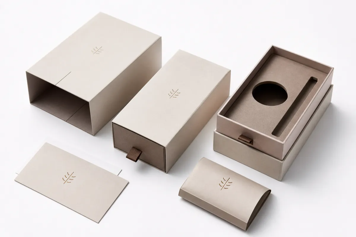
Minimalism is discipline, not emptiness. A strong box uses less, but the less has to work harder. The logo sits where the eye expects it. The type hierarchy is obvious without squinting. The material choice reinforces the price point. If those pieces are aligned, the package feels calm. If they are not, it just looks underdeveloped.
For anyone learning how to create Minimalist Custom Packaging Design, the first move is subtraction with judgment. Remove clutter, yes, but do not remove identity. A box does not need six fonts, three illustration styles, and a glossy badge on every side. It needs one point of view, one readable front panel, and one material choice that supports the story. A kraft mailer can feel honest and grounded. A rigid box can feel premium without being ornate. A folding carton can look sharp if the proportions are disciplined and the print is clean.
Minimal packaging works because people process it faster. Less clutter means the brand mark and product name are easier to find, and that matters more than most teams admit. Research on attention and visual processing has been saying variations of this for years: people make snap judgments very quickly, sometimes before they can explain why. A clean package can raise perceived value before the product is even opened. That is not magic. It is design meeting psychology halfway.
How to create minimalist Custom Packaging Design also depends on the tone you want to set. A skincare brand may need softness and air. A technology accessory may need precision and sharp edges. A candle brand may want warmth without visual noise. Same principle, different accent. The less the package says, the more each decision has to say it well.
A minimal box only feels expensive when spacing, type, and material point in the same direction. If one of those three looks off, the illusion cracks immediately.
That is why minimalism is rarely a shortcut. It is a harder brief than it first appears. There is nowhere to hide a weak font choice, a clumsy fold, or a stock that feels cheap in the hand. I kind of like that about it. Minimal packaging forces honesty.
For teams that want a clearer sense of structures, materials, and packaging terminology before asking for quotes, Packaging School / Packaging.org is a useful reference point. Knowing the difference between a folding carton, a mailer, and a rigid set-up box saves a lot of time once the conversation shifts from inspiration to production.
How do you create minimalist custom packaging design that still feels premium?
The answer is not “add more stuff.” It is “make each choice feel inevitable.” How to create minimalist custom packaging design that still feels premium comes down to proportion, contrast, texture, and typography. When a visual system is sparse, every detail carries more weight. Generous whitespace, crisp alignment, and one tactile finish can do more for perceived value than a crowded surface full of decorative tricks. A premium unboxing experience usually starts long before the lid opens.
Typography does a surprising amount of the work. A single type family is often enough. Two at most, if the system is tightly controlled. The hierarchy should be obvious at a glance: brand first, product second, supporting copy third. Keep spacing open so the text can breathe. Tiny type crammed into a big blank panel looks unfinished, not refined. One practical check I use: if the logo loses meaning when it gets smaller, it probably started too large.
Color carries similar responsibility. One or two core colors usually outperform a busy palette that tries to explain too much. High contrast improves legibility, but contrast does not need to be loud on every surface. Warm white on kraft can feel elegant if the type is dark enough. Black on uncoated white paperboard can feel crisp if the ink coverage is even. A restrained color system often supports how to create minimalist custom packaging design better than a palette that keeps shouting for attention.
Finishes add depth without piling on decoration. Soft-touch coating can make a box feel velvety, though it is not ideal for every product because scuffing can show up quickly. Blind embossing is subtle and effective on premium product packaging. Foil works best as a small accent instead of a headline. Textured stock can give branded packaging character with almost no extra ink. Used with control, these details make the package feel considered rather than busy.
Use materials as part of the design
One of the easiest ways to strengthen how to create minimalist custom packaging design is to let the material do more visual work. A 350gsm C1S artboard with matte aqueous coating prints very differently from natural kraft board carrying a single-color logo. A rigid board wrapped in printed paper feels entirely different from a folded carton. That difference is not trivia. It changes how the package is held, opened, photographed, and remembered.
Material restraint is also a good defense against overdesign. Texture in the stock can reduce the need for decoration. Soft-touch finish can let the typography stay sharp. A custom insert can provide the reveal, which allows the outer shell to stay quiet. That is the logic behind strong package branding: each element supports the next instead of fighting for the same moment.
Build the premium feel without decoration overload
Think in layers, not ornaments. For how to create minimalist custom packaging design, the premium impression usually comes from structure, surface, and spacing working as one system. A clean front panel. A flap that closes with precision. A subtle coating. A crisp die line. Not five special effects competing for attention. Too many finishes can make a package feel nervous, and nervous packaging rarely feels expensive.
For teams comparing paper and finish options, the Custom Packaging Products page is a practical place to study which structures can support minimalist branding. The box style matters more than most people expect. If the frame is wrong, the design ends up trying to fix a structural problem that should never have been there in the first place.
Key factors that affect cost, materials, and pricing
If you want how to create minimalist custom packaging design to stay within budget, do not begin with artwork. Start with the cost drivers. The big ones are board grade, structure, print complexity, special finishes, insert type, and quantity. Everything else usually sits underneath those six.
Lower-cost packaging often relies on standard dielines, fewer inks, and simpler finishing. Folding cartons and kraft mailers tend to sit lower on the price ladder because they use less material and require less labor. Rigid boxes cost more because they are heavier to build, more involved to wrap, and slower to assemble. Add die-cut foam, molded pulp, or custom paperboard trays, and the price rises again. That is not a flaw. It is the physics of packaging.
Minimal design can lower costs, but only if the structure cooperates. Fewer colors usually reduce setup time. Cleaner artwork usually reduces proofing friction. Straightforward typography often means less prepress work. Yet once blind embossing, foil, spot UV, or a special coating enters the conversation, the savings from simplicity can disappear. The real question is not whether premium packaging costs money. It does. The real question is whether that money is visible where customers will notice it.
One buying rule saves brands from expensive surprises: request quotes at multiple quantities. A run of 1,000 units may look manageable, but the unit price can drop sharply at 3,000, 5,000, or 10,000 because setup and plate costs spread across more pieces. How to create minimalist custom packaging design is not only a creative problem. It is a unit-economics problem with a visual face.
| Packaging option | Typical use | Approx. unit cost at 5,000 pcs | Notes |
|---|---|---|---|
| Kraft mailer | DTC shipping, light products | $0.45-$0.90 | Good for simple branding and low print coverage |
| Folding carton | Retail packaging, lightweight goods | $0.18-$0.55 | Best when you want custom printed boxes without heavy labor |
| Rigid box | Luxury product packaging, gift sets | $1.20-$3.50+ | Strong premium feel, but material and assembly costs add up fast |
| Carton with insert | Cosmetics, electronics, kits | $0.35-$1.10 | Insert material and die-cut complexity change the price a lot |
Those ranges are not guarantees. Size, board thickness, print coverage, and handwork all change the final number. They are still realistic enough to keep a project honest. If someone quotes a highly finished rigid box for pocket change, something in the math is missing.
Material selection also shapes the sustainability story. If recycled content, FSC-certified paper, or reduced ink coverage fits the brand position, say that early instead of retrofitting the story later. For sourcing and certification language, FSC.org is a good place to review chain-of-custody basics. A clean story is easier to tell when the materials can back it up, especially for sustainable packaging.
Shipping deserves the same scrutiny. If the package has to survive parcel delivery, test it instead of guessing. Transit testing standards published by ISTA help brands validate package performance before a weak carton turns into a customer complaint or refund.
How to create minimalist custom packaging design step by step
If you want a process that actually holds together, treat how to create minimalist custom packaging design as a sequence rather than a mood board. Order matters. Start with the message, then the structure, then the visual system, then the sample. Reverse that sequence and you will end up polishing boxes that do not fit the product or the budget.
1. Define the message in three seconds
Ask one direct question: what should the box communicate before anyone opens it? Premium? Natural? Technical? Playful? Giftable? Pick one main job. That decision shapes type, finish, and structure. A clean skincare brand should not be competing with itself through multiple visual ideas. How to create minimalist custom packaging design begins with editing the message, not decorating the surface.
Write down what the package must say and what it must never imply. Phrases like “high-end but accessible,” “clinical but not cold,” or “gift-ready but not ornate” give the designer a useful filter. Without that filter, proof rounds become taste debates, and taste debates are expensive.
2. Audit the product and shipping needs
Before any artwork begins, check the real dimensions, product weight, protection requirements, shelf display needs, and shipping method. A box for a glass bottle is not the same thing as a box for a flat accessory kit. A subscription box does not need the same structure as a retail sleeve. How to create minimalist custom packaging design gets easier once the object inside is understood precisely.
Use actual production units if you can. A sample bottle or prototype insert can prevent a later disaster. Even a 2 mm difference can throw off a neat insert or make a tray fit too tightly. That sounds small. It is not. Small differences are exactly what cause the ugliest packaging headaches.
3. Choose the structure before polishing graphics
The dieline is not a technical footnote. It is the frame of the experience. Decide whether you need a folding carton, mailer, tuck-end box, sleeve, or rigid set-up box. That choice affects cost, brand space, and how the package opens. How to create minimalist custom packaging design becomes much easier once the structural rules are fixed.
If the product is heavy or fragile, the structure should carry more of the protection load. If the product is light, the structure can stay simpler and the visual system can focus on proportion and surface. A beautiful front panel means little if the corners crush in transit or the product rattles inside.
4. Build a tight visual system
Now the creative part, though it still needs discipline. Choose one logo placement. Set one primary type scale. Limit the palette. Decide how much whitespace belongs around the main message. Leave room for required copy, barcodes, warnings, or ingredient lists. That becomes the skeleton for how to create minimalist custom packaging design that still feels complete.
Keep the front panel clean. A product name, a logo, and one supporting claim are often enough. Use side panels for functional details. Put practical information on the back. Minimal does not mean blank on every side. It means information is ordered so the customer never has to search for it.
5. Prototype and print a real sample
Screen mockups are flattering. They make almost everything look cleaner than it will in the hand. Print the sample and check contrast under normal light. Hold it at arm’s length. Open and close it multiple times. Stack it with other items. Put it on a shelf. Photograph it. That is the real test for how to create minimalist custom packaging design, because a polished mockup can still fail once it becomes a physical object.
Inspect the folds, cut lines, registration, and ink edges. A tiny misalignment on a highly minimal box is more visible than on a busy one. There is nowhere for error to hide. That is why the sample stage matters more than the average spreadsheet-minded project manager expects.
After that, revise only what the physical sample proves needs attention. Not every opinion deserves a redesign.
Process and timeline for minimalist custom packaging design
The production path for how to create minimalist custom packaging design usually follows a clear sequence: brief, concept, dieline, proofing, sample, revisions, production, and delivery. That looks orderly on paper. In real projects, the delay usually appears at approval points rather than inside the printer’s machine.
For a simple job with standard structures and limited print complexity, the move from brief to approved proof can happen in a few days. Add custom inserts, special coatings, or structural sampling, and the timeline stretches into several weeks. If the project needs a Custom Rigid Box with multiple revision cycles, it can take longer. That is normal. Packaging is physical work, not instant art.
Late artwork causes avoidable delays. So does changing dimensions after the dieline is already built. So does deciding halfway through production that the finish should be soft-touch instead of matte. Those are not cosmetic tweaks. They affect cost, sampling, and sometimes the structure itself. If you are serious about how to create minimalist custom packaging design, lock the major decisions early.
Typical timeline ranges
Here is the pace I would expect for a straightforward launch:
- Brief and measurements: 1-2 days if the product specs are ready
- Concept and layout: 2-5 business days
- Proofing and revisions: 2-7 business days depending on stakeholder feedback
- Sampling: 5-10 business days for many standard projects
- Production: often 10-20 business days after approval, depending on quantity and finishing
- Shipping: varies by destination and freight method
A clean, well-managed project can finish in a couple of weeks. A more complicated one can run much longer. If the box is tied to a launch date, build a buffer. Minimalist packaging tends to look effortless only when the schedule is not in chaos behind the scenes.
Timelines also affect cost. Rush orders usually reduce flexibility, and reduced flexibility usually costs money. Early approval, standard materials, and fewer midstream changes protect both the budget and the final result. That is one of the least glamorous parts of how to create minimalist custom packaging design, which is probably why so many teams ignore it until the schedule starts slipping.
Custom Packaging Products can help you compare structure choices against the timeline, especially if you are deciding between a simple mailer, a folding carton, or a more premium rigid option. The right structure can save both time and unnecessary revisions.
Common mistakes that make minimalist packaging look cheap
Minimalism goes wrong quickly. Empty space without hierarchy feels unfinished. Thin stock feels flimsy. Low-contrast type disappears. A white box with a tiny logo is not automatically premium, even if the room is full of people insisting that it is. How to create minimalist custom packaging design only works when the minimal decisions are deliberate.
The biggest mistake is treating whitespace like decoration. Whitespace should guide the eye, not leave it stranded. If there is no focal point, the box feels undecided. If every panel is equally quiet, the package has no structure. The customer needs one clear visual anchor. Without that, the design can look like the process stopped too early.
Weak materials create another problem. A thin folding carton can absolutely work when it suits the product, but a flimsy carton around a premium item can drag down the entire experience. Inserts matter too. A loose tray, an undersized insert, or a rattling product immediately breaks the premium signal. Good product packaging protects the item and reassures the buyer. Bad packaging just makes noise.
Typography can ruin the effect as well. Tiny letters, awkward spacing, or a logo that sits badly on the panel produce a low-value impression. The customer does not think, “What restraint.” They think, “Why does this feel unfinished?” That is why how to create minimalist custom packaging design has to be checked in real light, at real size, and in real hands.
Do not trust mockups alone
Digital renders flatter almost everything. Many weak custom printed boxes look decent in a mockup and awkward on the table. Test the box on a shelf, in a hand, and inside an unboxing video frame. That three-point check catches problems fast. Does the logo still read from a meter away? Does the finish catch light in an odd way? Does the inside feel as controlled as the outside? Those answers matter.
It helps to compare the package against nearby competitors. If every other box on the shelf is loud, a quiet box can win. If the category is already quiet, the package still needs one distinct point of difference or it disappears into the crowd. A design that blends in with all the other minimalist boxes is not minimalist brilliance. It is category blur.
Another common error is leaning on “natural” materials to do all the work. Kraft is useful, yes. Kraft alone does not equal quality. If the typography is weak or the proportions are off, the box still feels cheap. Material choice helps, but it cannot rescue a bad layout. That is the hard truth behind how to create minimalist custom packaging design: every choice has to carry its own weight.
Expert tips and next steps for a cleaner launch
If I had to reduce how to create minimalist custom packaging design to one principle, it would be this: use one hero idea per box. One message. One focal point. One detail the customer remembers. If the package tries to do six jobs at once, it will do none of them well.
Ask your printer or packaging supplier about material and finish options before you lock the artwork. That sounds basic, yet plenty of brands design first and ask production questions later. By then, the artwork has emotional momentum and every change feels painful. It is far easier to Choose the Right stock, structure, and finish first, then build the visual system around those limits.
For minimalist packaging, I like to test three views before final approval: on a shelf, in an unboxing video frame, and beside the actual product. Those views reveal different failures. Shelf view checks recognition. Video view checks motion. Product view checks scale and fit. If all three work, the package is probably ready.
Here is the launch checklist I would trust:
- Gather exact dimensions, product weight, and shipping needs.
- Set a budget range before asking for quotes.
- Choose a structure that supports the product without overbuilding.
- Limit the palette, type system, and finish choices.
- Request samples or proofs before production.
- Check the physical sample in normal light.
- Approve only after the sample matches the brand feel.
If you follow that sequence, how to create minimalist custom packaging design turns into a controlled process instead of a guessing game. That is the real payoff: cleaner visuals, tighter costs, fewer surprises, and a package that helps sell the product instead of competing with it.
One more point worth keeping in view: packaging should feel calm, but the buying process should not. Request multiple quotes, compare unit pricing at several quantities, and make sure the sample reflects the final finish. That is how brands avoid paying luxury prices for a box that only looks good in a render. A disciplined approach to how to create minimalist custom packaging design can improve both the launch and the margin, which is usually what matters after the first round of design praise fades.
How to create minimalist custom packaging design comes down to fewer choices, but better ones. Keep the structure honest, the materials thoughtful, and the message clear. If the box feels calm, functional, and premium in hand, the design has done its job. The next step is simple: check the sample against the product, the shelf, and the shipping lane, and only approve what survives all three.
FAQ
How do I create minimalist custom packaging design without making it look empty?
Use a clear visual hierarchy so the eye lands on one primary element first. Keep the spacing generous, but anchor it with strong typography, material texture, or a subtle finish. If the box still feels bare, improve the structure before adding decoration. That is usually the cleaner fix.
What is the most affordable way to create minimalist custom packaging design?
Choose standard box sizes or dielines to avoid custom tooling costs. Limit the design to one or two ink colors and skip expensive finishing unless it supports the brand story. Request quotes at multiple quantities, because setup costs can distort the unit price at low volumes.
How long does minimalist custom packaging design usually take?
Simple artwork and standard structures can move quickly, but sampling adds real time. Expect extra time for proof rounds, material selection, and production scheduling. Build in buffer time if the packaging is tied to a launch date or retail shipment.
Which materials work best for minimalist custom packaging design?
Uncoated or lightly coated paperboard works well for clean branding and strong print readability. Kraft can look premium when the branding is restrained and the palette is intentional. Rigid board fits luxury positioning, while thin stock is usually a bad idea if you want a premium feel.
What should I give a designer or printer before starting?
Send product dimensions, shipping needs, and any protection requirements first. Share brand rules for logo use, colors, typography, and tone so the packaging stays consistent. Provide examples of packaging you like, but also examples of what you want to avoid.