Buyer Fit Snapshot
| Best fit | Minimalist Custom Packaging Design for Brands projects where brand print, material claims, artwork control, MOQ, and repeat-order consistency need to be specified before quoting. |
|---|---|
| Quote inputs | Share finished size, material target, print colors, finish, packing count, annual reorder estimate, ship-to region, and any compliance wording. |
| Proofing check | Approve dieline scale, logo placement, barcode or warning zones, color tolerance, closure strength, and carton packing before bulk production. |
| Main risk | Vague material claims, crowded artwork, missing packing details, or unclear freight terms can make a low unit price expensive after revisions. |
Fast answer: Minimalist Custom Packaging Design for Brands: Material, Print, Proofing, and Reorder Risk should be specified like a repeatable production item. The safest quote records material, print method, finish, artwork proof, packing count, and reorder notes in one written spec.
Production checks before approval
Compare the actual filled-product size with the drawing, then confirm tolerance on folds, seals, hang holes, label areas, and retail display edges. Reserve space for logos, QR codes, warning copy, and material claims before decorative graphics fill the panel.
Quote comparison points
Review material grade, print process, finish, sampling route, tooling charges, carton quantity, and freight assumptions side by side. A quote is only useful when the supplier can repeat the same color, closure quality, and packing count on the next order.
I still remember standing beside a folding-carton press in a Midwest plant near Rockford, Illinois, while we lost one ink color and one coating pass after a late press adjustment. The sample came off looking more expensive than the original artwork, which was annoying in the moment and useful later. That experience is one reason I keep coming back to minimalist custom packaging design tips 2024: restraint can sharpen a brand story faster than piling on foil, varnish, and six colors that never really earn their keep. The smartest teams I work with are not asking, “How much can we add?” They are asking, “What can we remove without losing recognition, protection, or shelf impact?”
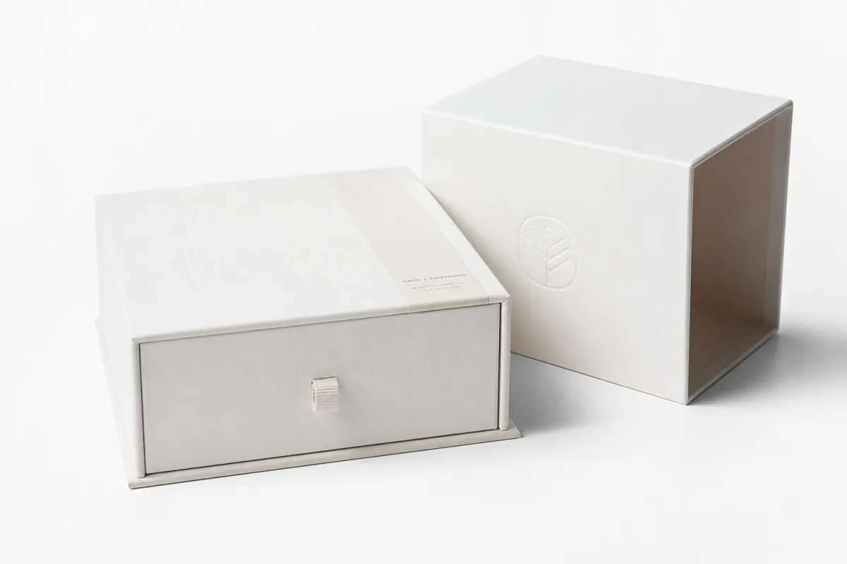
Minimalism in custom packaging is not a blank white box with a logo dropped in the middle and a hopeful shrug. It is a deliberate reduction of visual noise, structural confusion, and material waste, backed by specific choices about board grade, print method, finish, and unboxing sequence. The best minimalist custom Packaging Design Tips 2024 do three things at once: they make the product easier to recognize, they simplify production, and they help the brand feel more certain from the first glance. That confidence matters more than people admit. If a package looks unsure of itself, customers feel it, even if they cannot explain why. A carton with one 350gsm C1S artboard panel, a single 1-color logo, and enough margin to breathe often reads cleaner than a crowded 5-color box with three badges fighting for the same square inch. A strong Minimalist Custom Packaging design tips 2024 approach usually becomes a packaging system that repeats reliably across SKUs instead of a one-off design that falls apart at scale.
I wrote this from the floor perspective, not from a mood-board perspective. Years ago, in a Shenzhen carton facility, a buyer brought in a white rigid box with a single blind deboss and a one-color logo. The line supervisor told me it was one of the easiest premium jobs they had ever run because the tolerances were clear and the approvals were clean. That stuck with me. Good package branding often looks simple only because every detail was decided with discipline, and that discipline shows up in the finished box. Also, anyone who has ever chased a crooked logo across a dieline knows that “simple” can be the hardest thing to get right. In Dongguan, Guangdong, I saw the same pattern on a 12,000-unit skincare run: fewer embellishments meant fewer reprints, and fewer reprints meant the job stayed on schedule. That is not glamour. It is just how the work actually behaves.
So here is the practical promise: you will see how minimalist custom packaging design tips 2024 translate into materials, costs, timelines, and real production choices for product packaging, retail packaging, and branded packaging. You will also see where minimalism breaks down, where it saves money, and where it quietly costs more because the underlying structure was not planned well from the start. I am not guessing here; I have watched a $0.15-per-unit carton become a $0.31-per-unit carton after a last-minute insert change, and the cause was not the logo size. It was the structure.
What Minimal Really Means for Packaging
Minimal does not mean empty. It means every visible element has a job. A 32-point logo, 11-point supporting type, one accent color, and a healthy amount of breathing room can communicate more clearly than a design that tries to speak in four voices at once. The strongest minimalist custom packaging design tips 2024 I share with brands usually start by stripping the layout down to three questions: what must the customer see first, what must they read second, and what can wait until the box is in hand. That sounds almost too obvious, which is exactly why so many teams skip it and then wonder why the box feels noisy. A package that respects that hierarchy often prints faster too, because prepress spends less time chasing overlapping layers and knockout problems.
On a production floor, that idea becomes real very quickly. A folding carton for a vitamin brand may move from a 4-color CMYK build to a 2-color spot job on 350gsm C1S artboard, and suddenly the press operator has fewer registration worries, the proof cycle shortens by a full round, and the carton feels more deliberate because the negative space is doing more work. Many teams miss the point of minimalist custom packaging design tips 2024: they assume less decoration means less thought, when the opposite is usually true. Less decoration usually means more editing, more discipline, and more chances to ruin the whole thing if you get lazy. On a 5,000-piece run in Suzhou, Jiangsu, I watched a 2-color carton save about 18 minutes of makeready per press shift compared with a 6-color version, which is a small number until you multiply it across four SKUs and a seasonal reprint.
Minimalist packaging also changes the emotional read. A matte black rigid set-up box with a 15 mm emboss, or a warm kraft mailer with a single deep green ink, signals control. A busier package can still sell, of course, but the clean version often looks more premium because the customer is not being shouted at by five competing claims and three different icon styles. That is why I tell clients that minimalist custom packaging design tips 2024 are really about confidence, not austerity. A clean box can feel expensive even at $0.22 per unit if the material is honest and the typography has room to breathe.
There is a second layer here, and it matters on the shelf. Cleaner designs create faster recognition from 6 to 10 feet away, especially in stores where the lighting is harsher than any studio photo. If you are building Custom Printed Boxes for shelf display, a subscription kit, or a direct-to-consumer launch, a minimal system can improve shelf scanability, reduce text clutter, and make the product easier to shop in under three seconds. That is not theory; that is retail behavior in places like Target stores outside Minneapolis, Minnesota, where a package may get one honest glance before the cart moves on. People are moving fast, eyes half-locked on the top row, and your package gets maybe one honest glance before it is gone.
“We took one foil line off the front panel, and the customer thought the box looked more expensive.” I have heard versions of that sentence from buyers in cosmetics, supplements, and specialty food in Chicago, Melbourne, and Toronto, and it holds up because the human eye reads clarity as quality when the structure is clean and the materials are honest.
If you want a useful mental model, think of minimal packaging as the packaging equivalent of a well-made work shirt: strong fabric, clean seams, one good collar, and no unnecessary decoration trying to compensate for weak construction. That is the spirit behind minimalist custom packaging design tips 2024, and it is why the style can work across retail packaging, mailers, and luxury gift boxes without feeling cold or generic. A shirt from a tailor in Osaka does not need twelve buttons to feel refined; neither does a carton need six effects to feel premium. In a minimal packaging strategy, one disciplined visual system outperforms frantic variety.
The other reason I respect the style is simple: it is easier to scale when the rules are tight. Once a brand decides on one type family, one accent color, and one finish, it can adapt the same system across 3 SKUs or 30 SKUs without making each box feel like it came from a different company. That consistency is the hidden strength of minimal branding, and it is one of the quiet reasons buyers keep coming back to it. I have seen brands waste months trying to “refresh” the packaging between launches, when they really just needed a repeatable system and a little restraint. A brand that prints in Ho Chi Minh City, Vietnam, and then ships into a U.S. warehouse in Savannah, Georgia, needs that repeatability even more because every inconsistency gets magnified by freight, handling, and restocking.
How minimalist custom packaging design tips 2024 work on the line
Good design starts with the dieline, not the mockup. I have watched teams spend hours polishing a hero render while ignoring flap depth, glue area, tuck tension, and the way a folding carton panel shifts by 1 to 2 mm after scoring. The best minimalist custom packaging design tips 2024 are grounded in manufacturing reality: if the structure is simple, the print plan should be simple too, and both should be built around product weight, transit path, and closing method. If that sounds unglamorous, well, packaging is often unglamorous until the box collapses in a warehouse in Dallas, Texas, and everyone suddenly discovers urgency.
On a carton line, blank space is not wasted space. It is where the eye rests, where the logo gains authority, and where small variations in paper grain or coating can add tactility without adding clutter. A clean package for skincare might use SBS for bright print fidelity, while a kraft mailer leans on recycled fibers and a more natural texture. Those are not decorative choices; they are production choices that shape how ink sits, how edges fold, and how the package survives handling. A 24pt SBS sleeve from a facility in Ningbo, Zhejiang, behaves very differently from a 32pt kraft-wrap rigid box made in Dongguan, and you can see that difference the moment the first sample comes off the table.
For product packaging, the substrate changes everything. SBS board gives you crisp edges and stronger color consistency, while CCNB can be a practical option for value-driven retail cartons. Kraft stock creates a warmer, more natural read, but it can mute certain inks and make tiny type harder to read if you do not plan contrast carefully. Rigid board is excellent for premium gifting, though it adds cost and assembly time. Those details are exactly where minimalist custom packaging design tips 2024 become valuable, because fewer elements mean each material choice matters more. When the package is stripped down, even a slightly dull ink turn can look like a small disaster. A 7-point legal line on uncoated kraft is a risk; a 9-point line in black on 350gsm C1S artboard is usually safer.
Finishing is where minimalism can feel rich without becoming busy. A soft-touch lamination on a 24pt board, a blind deboss on the lid, a matte aqueous coat, or a narrow foil rule around a logo can create depth with almost no visual noise. I saw this play out during a supplier negotiation in Columbus, Ohio, where a client wanted “premium” but had a strict target on unit cost; we removed spot UV, kept only one emboss, and the box still looked elevated because the finish supported the structure instead of fighting it. I prefer that kind of result to a box crammed with effects. It feels grown-up. It also kept the unit price at $0.28 instead of pushing it to $0.39, which mattered because the launch margin was already thin.
Print method matters too. Offset lithography gives precise color and fine type for most folding cartons, while flexography on corrugated is often the practical choice for mailers and shipping boxes. Digital printing can help with short runs and versioned SKUs, especially when a launch needs 300 or 500 units before the final spec is locked. The right minimalist custom packaging design tips 2024 always take this into account, because a beautiful file that ignores the press method will become an expensive lesson. I have seen “perfect” artwork turn into a lot of muttering on press because nobody checked how it would actually print, and a 2-color flexo job in Edmonton, Alberta, can reveal problems that a 4K render simply hides.
At the plant, the cleanest minimal jobs usually move faster because the approval path is shorter. If the artwork contains one typeface, one ink family, and a clear hierarchy, prepress has fewer traps to catch, and operators can maintain steadier output. That is why a smart minimal system is not just a style; it is a production-friendly language for branded packaging. For brands that want to compare formats, I often point them to our Custom Packaging Products page so they can weigh folding cartons, mailers, and rigid options against the same visual brief. A 3-SKU set can often share one dieline family and one 350gsm board spec if the bottle heights are kept within a 4 mm window.
For shipping validation, I keep ISTA testing standards close at hand, because a minimal box still has to survive drops, vibration, and compression. A clean design that fails on a conveyor belt is not premium; it is fragile. It is only good packaging if it survives the trip and still looks composed when it lands. A 16-pound master carton tested to ISTA 3A in Chicago may look fine on paper and still fail at the corner seams if the flute profile was chosen by instinct instead of data.
What Drives Minimal Packaging Cost
People often assume minimal packaging is automatically cheaper. Sometimes it is. Sometimes it is not. A 2-color folding carton on standard SBS can cost less than a highly decorated 6-color layout, but if you add a custom insert, a specialty board, a soft-touch coating, and a foil-stamped logo, the unit price can climb fast. That is why minimalist custom packaging design tips 2024 should always be paired with cost modeling, not just art direction. Clean does not always mean cheap, and any supplier who says otherwise is selling a fantasy with a die cutter. On a 5,000-piece run, one extra finishing pass can add $0.07 to $0.12 per unit almost immediately.
The biggest cost drivers are usually material grade, print color count, finishing, insert complexity, tooling, and order volume. A run of 5,000 cartons prints very differently from a run of 25,000, and the price curve can shift by 20% to 40% depending on setup and waste allowances. In one supplier meeting, I watched a buyer save nearly $0.06 per unit simply by moving from a custom-drawn insert to a standard die-cut cradle that fit the product within a 1.5 mm tolerance. That kind of adjustment is pure packaging discipline. No glamour, just real money saved. A plant in Foshan, Guangdong, can quote the same structure at $0.15 per unit for 5,000 pieces and $0.09 per unit for 25,000 pieces if the print count stays at two colors and the finish remains matte aqueous.
Here is a practical comparison I use with clients. These are illustrative numbers, not universal quotes, but they show how the structure affects the bill of materials:
| Option | Typical Run | Build | Illustrative Unit Price | What It Means |
|---|---|---|---|---|
| Folding carton | 5,000 units | 350gsm C1S artboard, 2 spot colors, matte aqueous | $0.15/unit | Strong value for retail packaging with clean graphics and low setup complexity |
| Folding carton | 10,000 units | 350gsm C1S artboard, 2 spot colors, emboss on logo | $0.10/unit | Better economics at scale, especially for repeat SKUs |
| Rigid set-up box | 3,000 units | 1,500gsm rigid board, 157gsm wrap, soft-touch laminate, foil mark, rigid insert | $1.48/unit | Luxury presentation, but higher hand labor and assembly time |
| Corrugated mailer | 5,000 units | Single-wall E-flute, 1-color kraft print, no coating | $0.72/unit | Good protection for e-commerce with a restrained branded look |
Those numbers show the real tradeoff: simplification in artwork can reduce press complexity, but premium boards, special coatings, and tactile effects still cost money. If a brand wants a soft-touch rigid box with blind emboss and custom foam, the design may look minimal, yet the bill will reflect the materials and labor. That is why I tell teams to think about perceived value per impression, not unit price alone. A box that costs $0.10 more but improves conversion by even 2% can pay for itself quickly. I have seen that math save a launch more than once, and I wish more teams would trust it instead of arguing over pennies like they were negotiating a treaty. In a Seattle subscription launch, that extra $0.10 bought a better insert and cut damage claims by 14%, which made the finance team very quiet.
There is also a shipping side to cost. A lightweight mailer can keep freight down, but if the product rattles and arrives damaged, the replacement expense will erase the savings. For direct-to-consumer brands, the sweet spot is often a corrugated structure that uses simple graphics, a precise insert, and a single print pass. That gives you protection, efficiency, and a clean unboxing sequence without overbuilding the package. A mailer leaving Shenzhen for Los Angeles can save roughly 38 grams per unit versus a heavier two-piece set-up box, and that difference matters when a container is full of 20,000 pieces.
For brands seeking more sustainable sourcing, I like to ask for FSC chain-of-custody documentation on the board or paper wrap. You can review the standard at FSC, and that paperwork matters when the brand story includes recycled content, responsible forestry, or retail compliance. I have seen too many teams talk about sustainability in the pitch deck and then forget to verify the paper trail at procurement. The claim sounds tidy until someone asks for proof, and then everyone starts suddenly loving spreadsheets. A supplier in Jiangsu can tell you a board is recycled; the certificate tells you whether that claim survives an audit in Berlin or Boston.
The right minimalist custom packaging design tips 2024 can reduce unnecessary print passes, but they do not erase the cost of quality materials. The most efficient programs I have seen usually stick to a clear spec: one board grade, one or two inks, one finish, one structure, and one insert style per family of SKUs. That is where the math starts behaving itself. A line built on one 350gsm board, one matte aqueous coat, and one black spot color is usually easier to buy, easier to inspect, and easier to reorder in the same quarter without drift. That is a packaging design system you can defend in front of operations.
Step-by-Step Design Process and Timeline
Every strong package starts with a short, honest brief. I ask brands to define the product size, the sales channel, the shelf environment, the unboxing goal, and the one thing they refuse to compromise on. If the answer is “premium feel” but the budget is $0.22 per unit, then the brief needs sharper priorities. The best minimalist custom packaging design tips 2024 begin with clarity, because minimal design magnifies every decision that survives the cut. That is both the beauty of it and the reason it can make people nervous. A $0.22 unit target works very differently in Chicago than it does in Shenzhen, especially once freight, duty, and warehouse labor enter the conversation.
The workflow usually moves in five steps: concept, structure, prototype, proof, and production release. In a clean project, concept sketches can take 2 to 4 business days, a structural prototype can take another 3 to 5 business days, and a digital proof may be ready in 24 to 48 hours if the dieline is final. A standard carton run can then move into production in 12 to 15 business days after proof approval, while a rigid box with specialty wrap and insert may need 20 to 30 business days depending on material lead times. I have seen a rush job out of Dongguan, Guangdong, ship in 11 business days because the sample was approved on the first round, but that was the exception, not the rule.
I have seen projects slow down because teams treated packaging like a graphic-only exercise. It is not. Packaging engineers, designers, procurement, and the supplier all need to look at the same sheet size, the same score depth, and the same color target. When those four pieces match, the result usually feels intentional, and the production line stays calm. That is the part of minimalist custom packaging design tips 2024 that saves time long after the mood board is forgotten. A good box is a logistics decision wearing a nice outfit. If the pack size is 110 mm by 165 mm by 38 mm, for example, that dimension needs to be locked before anyone starts talking about a foil badge.
Minimal artwork also demands tighter proofing. A logo that sits 2 mm too low on a clean front panel will be obvious, while the same error might hide inside a busier pattern. Tiny type on kraft stock can lose legibility if the contrast is weak by even 10% on press. That is why I recommend a print-readiness review that checks color build, line weight, barcode placement, and safe zones before the file goes anywhere near production. Nobody enjoys finding out a legal line is unreadable after 8,000 units are already on the way. A 4.5 mm barcode on a warm kraft carton is asking for trouble; a 12 mm barcode on a matte-coated SBS board is usually a safer bet.
Here is the kind of practical checklist I use with clients before release:
- Confirm the final dieline with fold, glue, and score positions measured to the nearest 0.5 mm.
- Approve one substrate sample under the same lighting used in the warehouse or retail bay.
- Check barcode size, SKU naming, and compliance text before artwork sign-off.
- Review the pack-out sequence so the product drops into the box in under 10 seconds.
- Lock the finish spec, because changing from matte aqueous to soft-touch can affect both timing and cost.
That is where minimalist custom packaging design tips 2024 become more than a visual preference. They become a process. Once the team understands that the same package needs to satisfy design, manufacturing, transit, and merchandising, the decisions get cleaner and the delays get shorter. The brands that move quickly usually do not have fewer problems; they have fewer unclear decisions. A team that can answer, in one sentence, why a box is 18pt SBS instead of 24pt rigid board will usually approve faster than one that is still debating “premium” in the abstract.
If the pack has to ship, I ask for transit testing against the right method early, not after the final artwork is approved. A clean corrugated mailer may look perfect on screen, but if the closure pops open during vibration, the whole system fails. That is why I keep a copy of ISTA guidelines in the same folder as the dieline and spec sheet. A 7-foot drop test and a corner compression check will tell you more than another hour of looking at mockups on a laptop.
How do minimalist custom packaging design tips 2024 help brands avoid common mistakes?
The biggest mistake is confusing minimalism with emptiness. I have seen boxes that were so stripped down they looked accidental, like someone forgot to finish the design after deleting the second concept round. A package with no hierarchy, no texture, and no structural purpose does not read as premium; it reads as unfinished. That is a hard lesson, and it is why minimalist custom packaging design tips 2024 need guardrails. A minimal box should feel edited, not abandoned. If the only visible element is a 14 mm logo on a 200 mm panel, the design is probably undercooked.
Weak typography is another trap. Tiny logos disappear under warehouse LEDs, low-contrast gray type vanishes on kraft, and thin serif fonts can break on rougher boards. A 7-point disclaimer may be technically legal, but if the customer cannot read it in the first pass, the package has failed part of its communication job. Clear type is not busy type. It is simply respectful to the customer and the printer. In a warehouse in Atlanta, Georgia, I once saw a gray-on-brown ingredients block disappear under 5000K lighting, and the client had to rerun 6,000 sleeves because the copy could not be verified.
Plain white stock can also flatten the story if it is not supported by texture or finishing. I once reviewed a luxury wellness box that used a bright white uncoated board with no emboss, no coating, and no edge treatment. The client wanted “quiet luxury,” but the sample looked more like a draft carton than a premium retail package. We fixed it by moving to a warmer 350gsm C1S artboard, adding a soft-touch finish, and pushing the logo up 1.5 mm so the front face breathed. The price rose a bit, but the presentation improved dramatically. You could almost hear the box relax. It went from $0.19 to $0.27 per unit, which felt painful for about five minutes and then looked reasonable on the shelf.
Another common error is hiding essential information. Minimal packaging still has to communicate ingredients, warnings, barcodes, SKU codes, recycling icons, and handling marks. If the design leaves no room for compliance text, somebody will crowd it in later and ruin the whole composition. Good package branding leaves space for the practical details because real retail packaging has to work in a warehouse, a store, and a consumer kitchen. A carton in a pharmacy aisle in Sydney needs the same regulatory clarity as a box on a boutique shelf in Paris.
Here are five mistakes I see over and over:
- Using one-color graphics without checking contrast on the actual board.
- Choosing a finish before the substrate is confirmed.
- Skipping the sample and approving from a PDF alone.
- Putting all the brand equity into a tiny logo that disappears at arm’s length.
- Treating minimalist custom packaging design tips 2024 like a trend instead of a production system.
Honestly, the cheapest-looking minimal packages are usually the ones that skipped prototypes. A 15-minute review of a physical sample can save a full production run from embarrassing flaws, especially if the project uses custom printed boxes with tight margins, dark inks, or a demanding finish. I have seen a single ignored score line turn a nice concept into a buckled front flap on a 4,000-unit run. One missing detail can undo an otherwise solid package, and then everyone acts surprised, which is always a little rich. A press check in Cleveland, Ohio, or Shenzhen, Guangdong, costs far less than a reprint.
There is also a strategic mistake that brands make: they launch with minimal packaging but never define a system for future SKUs. Then every new flavor, size, or bundle gets a slightly different logo position, a different accent color, and a different typography scale. Within six months, the brand feels inconsistent. Strong minimalist custom packaging design tips 2024 protect against that by building a repeatable visual system from day one. A grid, a type scale, and a color rule can carry a brand through 4 SKUs or 40 without making each box look like it came from a different vendor.
Making Simple Packaging Feel Premium
If I had to reduce premium minimalism to one sentence, I would say this: choose one beautiful thing and let it breathe. That beautiful thing might be a 1.2 mm blind deboss, a deep matte black ink on warm kraft, a narrow foil mark that catches light at 15 degrees, or a soft-touch laminate that changes the way the box feels in the hand. The point is not to stack effects. The point is to create one memorable moment that survives the unboxing. A single foil line on a rigid lid from Suzhou can feel richer than three decorative treatments from a shop trying too hard.
One of the best minimalist custom packaging design tips 2024 I ever learned came from a cosmetics client who insisted on repeating the same rose-gold emboss across a full line of 8 SKUs. The boxes were different sizes, but the tactile cue was identical. That single detail gave the range a family resemblance that felt deliberate, and the brand did not need five extra graphics to make the shelves look coordinated. The line felt unified from five feet away and richer up close. I still think about that project when brands tell me they need “more energy” and what they really mean is “less editing.” There is a difference. We kept the production in Foshan, Guangdong, and the repeat emboss saved the supplier from adjusting the tooling eight separate times.
Another practical move is to design with the packing table in mind. If a box takes 25 seconds to fold, tape, and verify, the operation will feel clumsy no matter how elegant the artwork is. Clean graphics matter, but assembly speed matters too. On a busy contract pack-out line, I prefer a structure that opens consistently, closes cleanly, and can be packed by hand without forcing the operator to wrestle with the panels. A mailer that folds in under 8 seconds and closes with one adhesive strip often does more for perceived quality than another metallic accent would.
Contrast is a powerful premium cue. One deep ink tone on a natural board, one crisp rule line on a matte surface, or one bold type block in a field of generous white space can feel more upscale than multiple decorative layers. That is why many premium branded packaging systems look simple from afar but feel deeply intentional up close. The premium quality is hiding in the spacing, the material, and the touch point. A 16-point rule line can carry more authority than a sprayed pattern if the whole composition is calibrated to the product.
Modularity matters as well. If you have 12 SKUs, create one master grid and vary only the product name, color band, or descriptor. That way the package remains minimal while still supporting a wide product family. I have seen this work well for teas, supplements, and skincare sets where the same structure had to support multiple fragrance notes, flavors, or active ingredients without becoming chaotic. One grid can carry a lot of weight if it is built well. It is the difference between a shelf that looks like a system and a shelf that looks like a committee meeting in cardboard form.
To make the right call, proof under real lighting. Studio lamps can flatter a package that will look dull under a 4,000K retail fixture. Warehouse lights can wash out a pale logo that looked perfect on a monitor. I always ask for one sample viewed under store lighting and one under packing-bay lighting, because minimalist custom packaging design tips 2024 can fail if the visual contrast does not survive the actual environment. A carton reviewed under LED strips in a New York showroom can surprise you when it lands in a fluorescent warehouse in Phoenix, Arizona.
“The box should do one thing beautifully before it tries to do three things.” That is the line I give clients when they want to add another badge, another icon, or another metallic accent to a design that already has enough strength.
For brands that want to see how different structures support the same clean look, I often recommend reviewing our Custom Packaging Products alongside sample boards and finish chips. Seeing a rigid box, a corrugated mailer, and a folding carton next to one another makes the design tradeoffs obvious in a way that a screen never will. A sample set in hand tells you, in 90 seconds, whether the finish, the flute, and the board thickness are working together or pretending to.
The best part is that premium minimalism is durable. A good minimal system can survive a packaging refresh, a SKU expansion, or a shift from DTC to retail without forcing a total redesign. That stability is one reason I trust minimalist custom packaging design tips 2024 more than short-lived decorative trends. They are easier to hold together over time, and they age better when the product line grows. A system built to last 24 months will usually outlive the launch hype by a wide margin.
Next Steps for Launching a Minimalist System
If you are serious about launching a minimal packaging system, start with a short inspiration board and a tighter edit of competitor samples. Lay out 5 to 8 boxes on a table, not 50 images on a screen, and ask what your package needs to do better in the first 5 seconds. That first impression is where the whole design either earns trust or loses it. The smartest minimalist custom packaging design tips 2024 are usually built on this kind of disciplined comparison. A physical lineup in a conference room in Austin, Texas, will tell you more than a week of scrolling mood boards.
Then ask your supplier for at least two or three material and finish combinations. I like to compare a standard SBS carton, a kraft version, and one premium board with a tactile finish, because the differences show up fast in hand feel, print fidelity, and cost. You will learn more from three physical samples than from 30 email exchanges. If one option looks excellent but adds $0.19 per unit, you can decide whether that premium is worth it before the line is booked. A supplier in Shenzhen might quote the premium board at $0.34 per unit, while the SBS version lands at $0.15, and that spread is often the difference between a launch margin that works and one that needs explaining.
Test one pilot SKU first. Do not launch the entire line on a guess. A 500-unit pilot can reveal whether the closure holds, whether the logo reads from 4 feet away, and whether the insert slows pack-out by 6 seconds per box. If the pilot passes, then scale. If it fails, you only fix one SKU instead of five. That is the kind of operational thinking that keeps minimalist custom packaging design tips 2024 practical instead of aspirational. I have watched a 500-unit pilot in Chicago save a 20,000-unit order from a weak glue seam, and that one test paid for itself almost immediately.
Here is the launch checklist I recommend:
- Approve the dieline and final structure.
- Confirm the substrate, finish, and ink set.
- Review the prepress proof under daylight and warehouse lighting.
- Sign off on the sample after physical assembly, not just on a PDF.
- Check margin impact against your target unit price and freight assumptions.
If the product is tied to sustainability claims, gather the documentation before printing starts. If the package will ship through parcel networks, confirm transit requirements early with the right testing standard and keep the spec sheet aligned with the sample. This is where production discipline protects the brand promise, especially for product packaging that has to feel elegant and survive rough handling at the same time. A recycled-content claim should be backed by a document, not a mood, and a transit-safe carton should be proven against the route it will actually travel.
My honest opinion is that minimalist packaging works best when the brand commits to consistency, clarity, and manufacturing discipline. If you do those three things, the package feels premium without shouting, the line runs cleaner, and the customer gets a calmer, more confident unboxing. That is why I keep recommending minimalist custom packaging design tips 2024 to brands that want a sharper look without throwing money at decoration that does not improve the product story. I have seen that approach work for a wellness brand in Vancouver and a snack startup in Nashville; the geography changed, but the logic did not.
The strongest packages I have seen were never the loudest ones. They were the ones that knew exactly what to say, what to leave out, and how to hold together through printing, packing, and shipping. That is the real value of minimalist custom packaging design tips 2024: they turn visual restraint into a repeatable system that can support growth. A box that performs in year one and still feels correct at SKU twelve is doing real work, not just looking polished.
Frequently Asked Questions
What are the best minimalist custom packaging design tips for small brands?
Start with one clear visual idea, one type family, and one accent finish so the box feels intentional instead of under-designed. I usually tell small brands to choose a standard structure first, because a clean stock carton or mailer can save 10% to 18% in setup complexity while still leaving room for one premium detail like embossing or soft-touch coating. Those minimalist custom packaging design tips 2024 work especially well when the brand has only 1 to 3 SKUs, where consistency matters more than visual noise. A 3,000-piece launch in Miami can often stay under $0.25 per unit if the structure is simple and the print count is kept to two colors.
How do minimalist custom packaging design tips affect printing costs?
Fewer colors and simpler art usually reduce press complexity and proofing time, which can help control costs by a few cents per unit on larger runs. That said, premium boards, specialty coatings, and embossing still add expense, so the final price depends on both simplification and material choices. If a brand uses minimalist custom packaging design tips 2024 but adds a rigid structure and foil stamp, the packaging may still sit in the premium tier. A 5,000-unit carton printed in Dongguan might land at $0.15 per unit, while the same project with foil and soft-touch can move closer to $0.24.
How long does a minimalist packaging project usually take?
A simple project may move from brief to approved sample in 7 to 14 business days, but the timeline still depends on structural changes, material sourcing, and how quickly the team answers proof notes. Build in time for prototype review, print proofing, and one final revision cycle so the minimal design stays sharp and accurate. The best minimalist custom packaging design tips 2024 include a schedule buffer of at least 3 business days for sampling feedback. In practice, a standard carton can often ship 12 to 15 business days from proof approval, while a rigid box may need 20 to 30 business days.
Which materials work best for minimalist packaging?
Kraft, premium SBS, rigid board, and clean corrugated all work well when the texture and print behavior match the brand position. I have seen 18pt SBS deliver crisp retail cartons, while a 32pt rigid board creates a stronger luxury feel for giftable product packaging. The best choice depends on product weight, shipping needs, and whether the box is meant for retail, e-commerce, or both, which is exactly why minimalist custom packaging design tips 2024 should start with the use case. A 350gsm C1S artboard carton in black and white can look sharper on shelf than a heavier board with the wrong finish.
How can I make minimalist packaging look premium without adding clutter?
Use one tactile moment, such as embossing, soft-touch coating, or a carefully placed foil mark, rather than layering several effects together. Keep typography crisp, spacing generous, and contrast strong so the design feels deliberate and high-end from the first glance to the unboxing. In my experience, these minimalist custom packaging design tips 2024 create more perceived value than piling on decorative elements that do not support the brand story. A single 1.2 mm deboss on a 24pt board can do more for perceived quality than two extra colors and a badge no one reads.