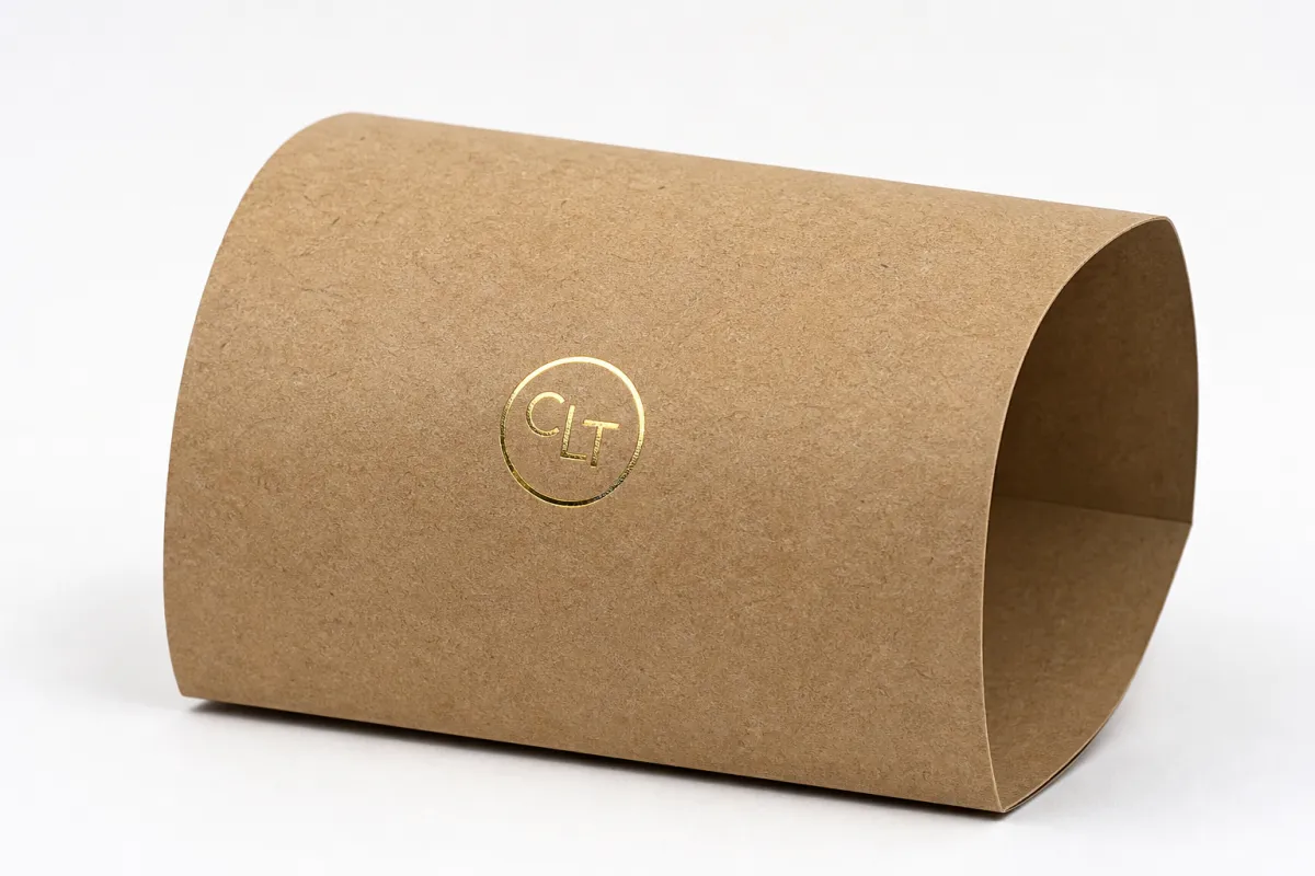
Buyer Fit Snapshot
| Best fit | Design Eco Kraft Sleeves projects where brand print, material claims, artwork control, MOQ, and repeat-order consistency need to be specified before quoting. |
|---|---|
| Quote inputs | Share finished size, material target, print colors, finish, packing count, annual reorder estimate, ship-to region, and any compliance wording. |
| Proofing check | Approve dieline scale, logo placement, barcode or warning zones, color tolerance, closure strength, and carton packing before bulk production. |
| Main risk | Vague material claims, crowded artwork, missing packing details, or unclear freight terms can make a low unit price expensive after revisions. |
Fast answer: Design Eco Kraft Sleeves: Quote Scope, Sample Proof, MOQ, and Lead Time should be specified like a repeatable production item. The safest quote records material, print method, finish, artwork proof, packing count, and reorder notes in one written spec.
Production checks before approval
Compare the actual filled-product size with the drawing, then confirm tolerance on folds, seals, hang holes, label areas, and retail display edges. Reserve space for logos, QR codes, warning copy, and material claims before decorative graphics fill the panel.
Quote comparison points
Review material grade, print process, finish, sampling route, tooling charges, carton quantity, and freight assumptions side by side. A quote is only useful when the supplier can repeat the same color, closure quality, and packing count on the next order.
How to Design Eco Kraft Sleeves: A Practical Guide
A kraft sleeve can make a jar feel like a $24 product or a $14 one before anyone reads the label. That is why how to design eco kraft sleeves matters so much: the sleeve often does the visual selling, especially when the base bottle, carton, or jar is plain and functional.
Shoppers rarely inspect packaging line by line. They notice shape, color, texture, contrast, and how the package sits among everything around it. When how to design eco kraft sleeves is handled well, the pack feels more natural, more trustworthy, and more premium without hiding the product underneath. When it is handled badly, the sleeve can look generic, crowded, or accidentally cheap. The goal is not decoration for its own sake. The goal is to earn shelf attention, support the brand story, and keep the production spec realistic.
Here is a practical look at how to design eco kraft sleeves in a way that respects print, cost, fit, lead time, and sustainability claims. The tradeoffs are not abstract. They show up in ink coverage, dieline tolerance, MOQ, and the first physical sample you hold in your hand.
How to Design Eco Kraft Sleeves for Shelf Impact
The biggest surprise in how to design eco kraft sleeves is how quickly a simple wrap changes perception. A plain jar reads as functional. Add a well-planned sleeve and the same jar can feel curated, giftable, and more expensive. That change does not require heavy embellishment. Most of the time it comes from tighter hierarchy, cleaner type, and a calmer layout.
Why do kraft sleeves work so well in crowded aisles? They add brand surface area without fully covering the base package. The shopper still sees the container, the product color, and the honest material cues. That combination matters because it signals restraint. It also feels grounded in a way gloss-heavy packaging often does not.
From a packaging buyer's point of view, how to design eco kraft sleeves is a high-value decision because the sleeve can upgrade three things at once:
- Perceived value: the package feels more intentional, even if the underlying container is simple.
- Brand recognition: the sleeve gives you more room for logo placement, claims, icons, and seasonal variants.
- Launch flexibility: you can refresh the look without redesigning the whole primary package.
That flexibility is one reason sleeves are common for soaps, candles, supplements, small food jars, cosmetics, and gift sets. A plain carton can move from generic to shelf-ready with one carefully planned sleeve. The same is true for a bottle or a rigid container. The trick is to make the sleeve feel like part of the product system, not a last-minute marketing add-on.
A sleeve earns its space in three seconds. If it does not communicate quickly, the shopper moves on.
In practice, how to design eco kraft sleeves starts with deciding what the sleeve should feel like. Earthy? Clinical? Artisanal? Premium? Minimal? Kraft can support all of those directions, but not with the same color palette or typography system. A wellness brand may need generous white space and a restrained icon. A handmade confectionery line may need warmer illustration and softer contrast. The substrate stays the same; the visual language changes completely.
For shelf impact, the most common mistake is trying to say too much. The sleeve becomes a billboard packed with badges, claims, ingredient callouts, QR codes, and decorative flourishes. The result is noise. A stronger move is to build a clear visual path: logo first, product name second, one supporting claim third, and everything else pushed into supporting positions.
That structure also helps with cost and print reliability later. When how to design eco kraft sleeves is guided by hierarchy rather than decoration, it becomes easier to keep the layout readable on rougher brown stock, easier to maintain consistency across SKUs, and easier to adjust when the dieline changes by a few millimeters.
There is also a small but useful truth here: kraft sleeves tend to reward confidence. If the brand tries to cram every available inch with copy, the pack starts to feel anxious. If the message is trimmed to what actually matters, the sleeve feels calmer and, frankly, a lot more expensive. That is kinda the whole trick.
How Eco Kraft Sleeves Work: Material, Fit, and Printing Basics
How to design eco kraft sleeves well starts with understanding the package structure. A sleeve wraps, slips, or locks around the primary container. That means the die line matters as much as the artwork. If the fold lines, seam position, and panel sizes are wrong, even a beautiful design can fail in production.
Most sleeves use kraft paperboard or kraft paper stock in a range that often lands around 250-400 gsm, depending on the product weight and the amount of structure needed. Lightweight cosmetics may need a flexible sleeve that moves cleanly over a carton. Heavier jars may need a stiffer board so the sleeve keeps its shape during shipping and retail handling. There is no universal answer, which is why sample testing matters so much.
Recycled content is another practical variable. Some buyers want high recycled fiber content for the sustainability story. Others need a cleaner surface for text and print detail. Both are valid priorities. What matters is asking for the exact spec, not just the marketing description. If a supplier says the stock is recycled kraft, ask for the percentage, the basis weight, the thickness, and whether the sheet has enough rigidity for the final use case.
Printing on uncoated kraft behaves differently from printing on coated white board. Ink absorbs into the surface. Colors often look warmer and slightly softer. Fine lines can spread. Small type can fill in. Deep black can look strong, but pale neutrals and light pastel tones may lose clarity. That is why how to design eco kraft sleeves should always be tested on the actual material, not only on a screen preview.
There are a few practical design rules that save a lot of frustration later:
- Keep type sizes generous for legal, ingredient, or compliance copy.
- Use stronger contrast than you would on coated stock.
- Avoid hairline rules and tiny decorative details that may disappear in print.
- Place critical content away from seams, glue areas, and high-wear edges.
- Check whether a barcode, batch code, or expiry field must land on a flat panel.
Fit is just as important as print quality. A sleeve that is a little too loose will rotate. A sleeve that is too tight may scuff, buckle, or crack on the fold. If the sleeve must survive e-commerce transit, think about friction, vibration, and corner abrasion, not just retail shelf placement. I have seen attractive sleeves fail simply because the design ignored how the package would be handled after it left the printer.
This is also where standards and testing matter. For shipping and distribution, packaging teams often look at ISTA-style transit thinking, and for sustainable fiber sourcing they may check FSC documentation. If you need a starting point for those conversations, the FSC site is useful for understanding certified fiber language, and ISTA is a helpful reference for transit test logic. Those are not design shortcuts. They are guardrails.
Another point that gets overlooked in how to design eco kraft sleeves: the sleeve does not live in isolation. It sits next to labels, tamper seals, shrink bands, and shipping cartons. If the overall pack system already has a lot of visual texture, the sleeve should not compete with it. Sometimes the cleanest sleeve is the one that creates breathing room.
Good fit also affects perception. A sleeve that sits squarely and lines up with the front panel looks considered. A sleeve with off-center graphics or a wandering seam looks rushed. The shopper may not identify the technical problem, but they feel it. That is usually enough to weaken trust.
One more thing from the production side: if the sleeve needs to slide over a jar or carton on a packing line, tolerances get real fast. A design that looks fine in a mockup can turn into a headache if the opening is too tight by even a couple of millimeters. Nobody wants a line operator fighting every tenth unit. That kind of thing slows a launch down in a hurry.
How to Design Eco Kraft Sleeves: Key Factors That Shape Results
Once the material basics are clear, how to design eco kraft sleeves becomes a set of strategic choices. The first one is brand story. The sleeve should reinforce what the product already claims to be. An organic snack brand, a clinical supplement, a handmade candle, and a premium pet product all use kraft differently. The stock can stay the same, but the layout, palette, and tone should not.
Think about the emotional job of the sleeve. Does it need to feel earthy and accessible, or restrained and upscale? Does it need to signal clean ingredients, artisan craft, or scientific precision? Kraft can support all of those positions, but only if the typography and spacing match the tone. A script font on brown kraft may feel charming for one product and unserious for another. A tight, condensed sans serif might look crisp for a supplement brand and too severe for a bakery line.
Contrast is a core design issue. Natural kraft lowers contrast compared with white stock, so the artwork has to work harder. Dark, saturated inks usually hold better than soft tints. Large icons read faster than detailed ones. If the product name needs to be visible from 6-8 feet away, it should not depend on delicate linework or low-opacity colors. This is one reason how to design eco kraft sleeves should start with the shelf view, not the close-up proof.
White space is not wasted space. It is often the difference between premium and promotional. On kraft, crowded layouts can become muddy very quickly. When the panel is allowed to breathe, the texture of the paper becomes part of the design. That is one of the understated advantages of how to design eco kraft sleeves well: the material does some of the visual work for you, so the art direction can be quieter and still feel intentional.
Structural elements deserve as much attention as graphics. A seam can cut through a logo if the dieline is not planned carefully. Glue areas can hide fine details. A corner wrap can distort a badge or claim. Even a barcode can become a problem if it lands too close to a fold line. In production, these issues are not rare. They are common. The smartest packaging teams review the flat artwork, the assembled mockup, and the final panel map together.
Sustainability claims are the other major factor. This is where honesty matters. If the sleeve is made from recycled fiber, say that specifically. If it uses FSC-certified paper, say that accurately. If the inks are soy-based or water-based, mention them only if the supplier can back that up. Vague language like "eco-friendly" or "green packaging" can damage credibility. A kraft sleeve is only as trustworthy as the claims printed on it.
How to design eco kraft sleeves also means choosing how much information the pack should carry. Some brands need a lot of regulatory text. Others can keep the sleeve lean and let a QR code point to more detail. The decision depends on category rules, sales channel, and the amount of information shoppers actually use. More copy is not automatically better. Clearer copy usually wins.
One useful exercise is to define the sleeve in three lines:
- What the product is.
- Why this version is different.
- What proof supports the claim.
If the sleeve cannot answer those three questions in a clean, readable way, then how to design eco kraft sleeves probably needs another round of simplification.
There is also a subtle but important connection between layout discipline and environmental credibility. A sleeve that looks intentional tends to feel less wasteful. A sleeve that feels overloaded can make the brand look like it is trying too hard to perform sustainability rather than practice it. That is a real perception issue, not just a design preference.
From experience, the projects that hold up best are the ones where the team agrees on the one thing the sleeve must say and then refuses to let everything else crowd it out. That sounds simple. It rarely is. But once that decision is made, the rest of the design starts behaving.
Eco Kraft Sleeves Cost and Pricing: MOQ, Quote, and Unit Cost
Cost is where how to design eco kraft sleeves becomes a procurement conversation. The main drivers are stock choice, print complexity, die cutting, size, finishing, and quantity. A simple one-color sleeve on standard kraft is not priced the same way as a full-color sleeve with multiple panels, special shapes, and tight tolerances. The more custom the construction, the more setup work the supplier has to absorb.
MOQ is a major factor. Smaller runs usually carry a higher unit cost because prepress, tooling, setup, and proofing are spread across fewer pieces. For a run of 5,000 sleeves, a simple design might land around $0.18-$0.28 per unit, depending on dimensions and print coverage. Add more colors, a custom cut, or a white underprint, and the range can move closer to $0.30-$0.55 per unit. Larger runs often improve the price, sometimes materially, but only if the spec stays stable.
That said, a quote is only useful if the line items are comparable. One supplier may include physical proofs and basic tooling. Another may charge separately for both. Shipping, sampling, finishing, and revision rounds can shift the final total more than people expect. If you are comparing suppliers while learning how to design eco kraft sleeves, make sure the same stock weight, same dieline, same ink count, and same delivery terms are being used across the bids.
Here is a simple comparison to show how options can change both appearance and budget:
| Option | Visual Result | Typical Use | Approx. Unit Cost at 5,000 | Notes |
|---|---|---|---|---|
| Basic recycled kraft sleeve, 1-color print | Clean, natural, understated | Soaps, candles, simple cartons | $0.18-$0.28 | Best for restrained branding and lower setup risk |
| Kraft sleeve with 2-3 color print and white underprint | Brighter color accuracy, stronger shelf pop | Supplements, cosmetics, premium food | $0.28-$0.40 | White underprint improves contrast on brown stock |
| Custom die-cut kraft sleeve with window or lock feature | More tailored, more premium, more structural interest | Gift sets, specialty launches, display packs | $0.35-$0.55 | Higher tooling and setup demands, but stronger differentiation |
Use that table as a decision tool, not a promise. The real number depends on size, country of origin, freight, and the supplier's production model. A domestic digital run can price differently from an overseas offset run. A small seasonal release may justify a slightly higher unit cost if it removes inventory risk. That is a common packaging tradeoff, and it is one reason how to design eco kraft sleeves should never be judged on price alone.
The most expensive sleeves are not always the most ambitious ones. Sometimes cost balloons because the artwork is inefficient. A full-bleed design on a natural substrate can require extra ink coverage, more testing, and more waste. A design with awkward dieline placement may produce more rejects. A better brief can reduce risk before the first sheet is printed.
There is also a hidden business question: what does the sleeve do for conversion? If a modest change in shelf impact improves perceived value, the unit cost may pay for itself quickly. If the sleeve only adds decoration, the math is weaker. I would rather see a $0.24 sleeve that improves buy-in than a $0.12 sleeve that gets ignored.
One practical way to think about how to design eco kraft sleeves is to assign value to the role it plays:
- Protection: helps the product stay aligned and presentable.
- Positioning: tells shoppers whether the product is everyday, artisanal, or premium.
- Promotion: supports launches, seasonal editions, and bundle packaging.
If a sleeve performs all three jobs, a slightly higher spend often makes sense. If it only does one job, keep the spec tighter and simpler.
There is no magic number that works across every category, and anyone who says otherwise is probably skipping a few real-world variables. Box size, ink coverage, and how the pack moves through fulfillment can swing the quote more than the marketing deck ever suggests. Budgeting gets easier once you accept that.
Process and Timeline for Eco Kraft Sleeves
The workflow for how to design eco kraft sleeves usually begins with a brief, but a good brief is more than a mood board. It should include exact package dimensions, target quantity, product weight, handling conditions, print budget, brand tone, and any compliance text that must appear. Without those basics, the supplier is guessing.
A practical production sequence looks like this:
- Measure the primary package carefully and confirm the sleeve wrap dimensions.
- Build or request the dieline and mark the seam, fold lines, and glue area.
- Place artwork on the flat template and check all critical text.
- Review digital proofing for layout, not just color.
- Approve a physical sample or mockup if the project is custom.
- Run production, inspect finished units, and pack for shipment.
That sounds simple. In real projects, delays usually show up in the middle. Missing measurements cause a domino effect. Artwork changes arrive after proofing starts. Color corrections take another round. Someone asks for a new claim field after the dieline has already been approved. These are routine delays, and they can be avoided if the team treats how to design eco kraft sleeves like a process, not just an art task.
For simple sleeve work, a realistic timeline is often 10-15 business days from proof approval, assuming the supplier has stock available and the design is already dialed in. Custom shapes, windows, locking features, or special print effects can push that to 15-25 business days or more. Freight is separate. If the order is international, add transit time and customs buffering.
Physical samples are especially useful on kraft. A screen cannot tell you how a sleeve feels in hand. It cannot show you whether a seam catches the eye or whether the type is still readable at arm's length. A mockup also reveals whether the sleeve rotates too easily or compresses in transit. That is why how to design eco kraft sleeves should include a sample stage whenever the budget allows it.
Good supplier communication helps the schedule more than anything else. Ask for a milestone plan that shows:
- Artwork due date
- Proof approval date
- Sample review window
- Production start and finish
- Shipping method and estimated arrival
If the supplier cannot give you at least a rough milestone map, the schedule is probably too loose to trust. A launch date should not be a wish. It should be backed by dates, approvals, and a little buffer for the unexpected. That is one of the least glamorous parts of how to design eco kraft sleeves, but it is often the part that protects the launch.
I have watched perfectly good artwork get stuck because the project skipped one simple check: which side was the front after assembly? That tiny oversight can move a logo off-center, force a reorder, or create a very awkward conversation. A thirty-second confirmation up front saves a lot of messy back-and-forth later.
Common Mistakes When Designing Eco Kraft Sleeves
If there is one theme that repeats in how to design eco kraft sleeves, it is that small mistakes become visible very fast. Brown stock does not hide much. That is part of its charm, and part of its risk. A few design choices can make the sleeve feel polished. A few poor decisions can make it feel accidental.
The first common mistake is low contrast. Pale gray, dusty beige, and soft yellow can vanish into the kraft background. Small type can become hard to read. Thin outlines can blur at print size. If the pack needs to communicate ingredients, usage, or compliance information, contrast should be treated as a functional requirement, not a style preference.
The second mistake is overbranding. Too many seals, badges, claims, and decorative elements make the sleeve noisy. Buyers may feel like the brand is trying too hard to prove itself. That is exactly the wrong emotional signal for a pack that wants to feel honest and premium. In how to design eco kraft sleeves, restraint usually reads as confidence.
The third mistake is ignoring the substrate. Kraft is not a neutral white canvas. It has texture, warmth, and absorbency. Those properties change how ink sits on the sheet and how edges appear after printing. If a design depends on sharp, technical precision, it may need a test run on the exact stock before approval. Skipping that step is expensive.
Fit mistakes are just as common. A sleeve that slips looks sloppy. A sleeve that binds can crack or warp. A seam that lands in the wrong place can cut through a logo or make the front panel look off-center. If the sleeve wraps around a corner, make sure the artwork still reads correctly after assembly. These are not edge cases. They are day-to-day production issues.
Another error is forgetting how the product will move through the supply chain. A sleeve that looks fine on a tabletop may scuff in a shipping carton, rub against adjacent packs, or arrive with a curled edge. If the pack is sold online, how to design eco kraft sleeves needs to account for transit, warehouse handling, and customer unboxing. Retail only is an incomplete brief.
Sustainability language deserves special care. Vague claims can erode trust fast. Do not imply compostability, recyclability, or carbon neutrality unless the material and supply chain support it. If the sleeve is made from FSC-certified fiber, say that. If it contains recycled content, state the percentage if the supplier can verify it. Good buyers are skeptical for a reason. They have seen too many brands stretch the truth.
Here are a few mistakes I would actively avoid:
- Using the same artwork for coated and uncoated stock without testing.
- Placing a barcode too close to a fold or curve.
- Building a sleeve around a future product size instead of the current one.
- Adding a green claim that is not backed by documentation.
- Assuming a digital proof is enough to approve color and texture.
One final point: a sleeve can be simple and still feel expensive. In fact, that is often the best outcome. When how to design eco kraft sleeves is done well, the design does not shout. It reads clearly, feels considered, and leaves the shopper with a sense that the product and the packaging belong to the same brand system.
Another quiet mistake is chasing a trend instead of the product's actual personality. Kraft already carries a natural, tactile signal. If the design starts piling on trend-driven flourishes that do not match the brand, the whole thing can feel off. A sleeve should help the product sound like itself, not like somebody else's brief.
Expert Tips and Next Steps for Better Eco Kraft Sleeves
The fastest way to improve how to design eco kraft sleeves is to start with a one-page brief. Keep it brutally practical. Define the audience, the shelf environment, the package dimensions, the quantity, the launch date, and the top three messages the sleeve must communicate. If that brief is clear, every downstream decision gets easier.
Ask for physical samples or a low-risk prototype before you commit to the full run. This is where a lot of packaging teams save money, not spend it. A proof can look fine while a sample reveals a weak fold, a slippery surface, or a logo that is too small once wrapped. If you want a better result from how to design eco kraft sleeves, test the reality, not just the file.
I also recommend comparing at least three quotes using the same spec sheet. If the stock weight, print count, and dieline are not identical, the prices are not really comparable. One quote may look cheaper because it excludes a step you will later need to pay for separately. That is why a disciplined request for quote matters as much as the artwork.
Try a shelf test or a photo mockup test before final approval. Put the sleeve next to its nearest competitors. Step back 6-8 feet. Then look at it again from hand distance. Does the brand name stay legible? Does the pack feel honest? Does the texture support the message? Those are the questions that tell you whether how to design eco kraft sleeves is actually working.
A good reorder checklist can also save time on the next cycle. Keep the approved dieline, file version, stock name, ink notes, barcode placement, and shipping method together. Add the supplier contact and sample reference if there was one. When the next run comes around, that record shortens the approval cycle and reduces repeat mistakes.
There is one more area worth checking: transit behavior. If the sleeve must survive distribution in secondary packaging, ask whether the supplier has any test protocol aligned with ISTA-style handling or abrasion checks. You do not need to overcomplicate the project, but you do need to know whether the sleeve can handle ordinary logistics without looking tired. That is a practical part of how to design eco kraft sleeves, not an optional extra.
Here is a compact checklist I use mentally for better outcomes:
- Design: clear hierarchy, enough contrast, no unnecessary clutter.
- Material: stock weight matched to the product and handling conditions.
- Cost: quote includes proofs, tooling, finishing, and freight assumptions.
- Timeline: approval milestones are mapped before production begins.
- Trust: every sustainability claim is supportable and specific.
That list may sound ordinary. It is. Ordinary is good in packaging. Ordinary means repeatable, controllable, and less likely to surprise you on press day. The best sleeve programs are rarely dramatic behind the scenes. They are disciplined.
If you remember one thing about how to design eco kraft sleeves, make it this: the sleeve is not only a branding surface. It is a material system, a supply chain decision, and a shelf signal all at once. Get those three roles aligned, and the pack feels much more expensive than it was to make. Get them out of sync, and no amount of visual flair will rescue it.
The most practical next move is simple: lock the dieline before artwork gets fancy, approve one physical sample on the actual kraft stock, and print only the claims you can back up. If those three things are right, the rest of the sleeve usually falls into place.
FAQ
How do I design eco kraft sleeves that still look premium?
Use strong typography, a clear hierarchy, and generous spacing so the sleeve feels deliberate rather than crowded. Premium usually comes from restraint, not from adding more decoration. Test color and line weight on the actual kraft stock, because uncoated brown paper will soften details more than a screen preview suggests.
What material should I choose for eco kraft sleeves?
Choose a Kraft stock that matches the product weight, handling needs, and print method. Ask whether the paper includes recycled content, whether it has FSC certification, and whether it can hold crisp folds and readable text. Physical samples matter here because texture and stiffness often change the final result more than buyers expect.
How much do eco kraft sleeves cost per unit?
Unit cost depends on size, quantity, print complexity, and whether the sleeve needs custom cutting or finishing. A simple 5,000-piece run may land around $0.18-$0.28 per unit, while more detailed sleeves can move into the $0.30-$0.55 range. The best quote is a line-item quote, so you can see what is included and what is not.
How long does the process for eco kraft sleeves usually take?
The timeline depends on artwork readiness, proofing speed, and whether the sleeve is a standard format or a custom build. Simple runs often take 10-15 business days from proof approval, while more custom work can take 15-25 business days or longer. A milestone schedule helps keep the project on track.
Do eco kraft sleeves need an MOQ?
Yes, many suppliers set an MOQ because setup, cutting, and proofing costs have to be recovered somehow. The MOQ changes based on size, print method, and how customized the sleeve is. If volume is uncertain, ask for tiered pricing so you can compare the cost impact of smaller and larger runs before committing.


