Buyer Fit Snapshot
| Best fit | Design Minimalist Custom Labels That Still Sell projects where brand print, material claims, artwork control, MOQ, and repeat-order consistency need to be specified before quoting. |
|---|---|
| Quote inputs | Share finished size, material target, print colors, finish, packing count, annual reorder estimate, ship-to region, and any compliance wording. |
| Proofing check | Approve dieline scale, logo placement, barcode or warning zones, color tolerance, closure strength, and carton packing before bulk production. |
| Main risk | Vague material claims, crowded artwork, missing packing details, or unclear freight terms can make a low unit price expensive after revisions. |
Fast answer: Design Minimalist Custom Labels That Still Sell: Material, Adhesive, Artwork, and MOQ should be specified like a repeatable production item. The safest quote records material, print method, finish, artwork proof, packing count, and reorder notes in one written spec.
Production checks before approval
Compare the actual filled-product size with the drawing, then confirm tolerance on folds, seals, hang holes, label areas, and retail display edges. Reserve space for logos, QR codes, warning copy, and material claims before decorative graphics fill the panel.
Quote comparison points
Review material grade, print process, finish, sampling route, tooling charges, carton quantity, and freight assumptions side by side. A quote is only useful when the supplier can repeat the same color, closure quality, and packing count on the next order.
How to design minimalist custom labels starts with a harder question than it first appears: what deserves attention, and what can quietly step aside? On a shelf, in a search thumbnail, or in a customer’s hand, a package gets only a brief glance before judgment sets in. Retail eye-tracking work and packaging research consistently point to very short dwell times during that first scan, often just a few seconds. That leaves very little room for ornament, and almost no room for confusion.
Minimalist labels often win because they look calm while doing a lot of work. The best versions do not feel bare. They feel edited. Every margin, every weight choice, every line break says the designer made a decision. That restraint can read as quality faster than a crowded label ever could. For brands refining retail packaging or tightening branded packaging for a premium tier, the job is not to empty the surface. The job is to make the surface speak with precision.
At Custom Logo Things, this request comes up constantly from brands that want less visual noise without losing practical information. A label still has to carry the product name, legal copy, barcode, and sometimes ingredient or warning information. Those elements do not disappear because the layout becomes cleaner. The real craft is making compliance look ordered instead of apologetic.
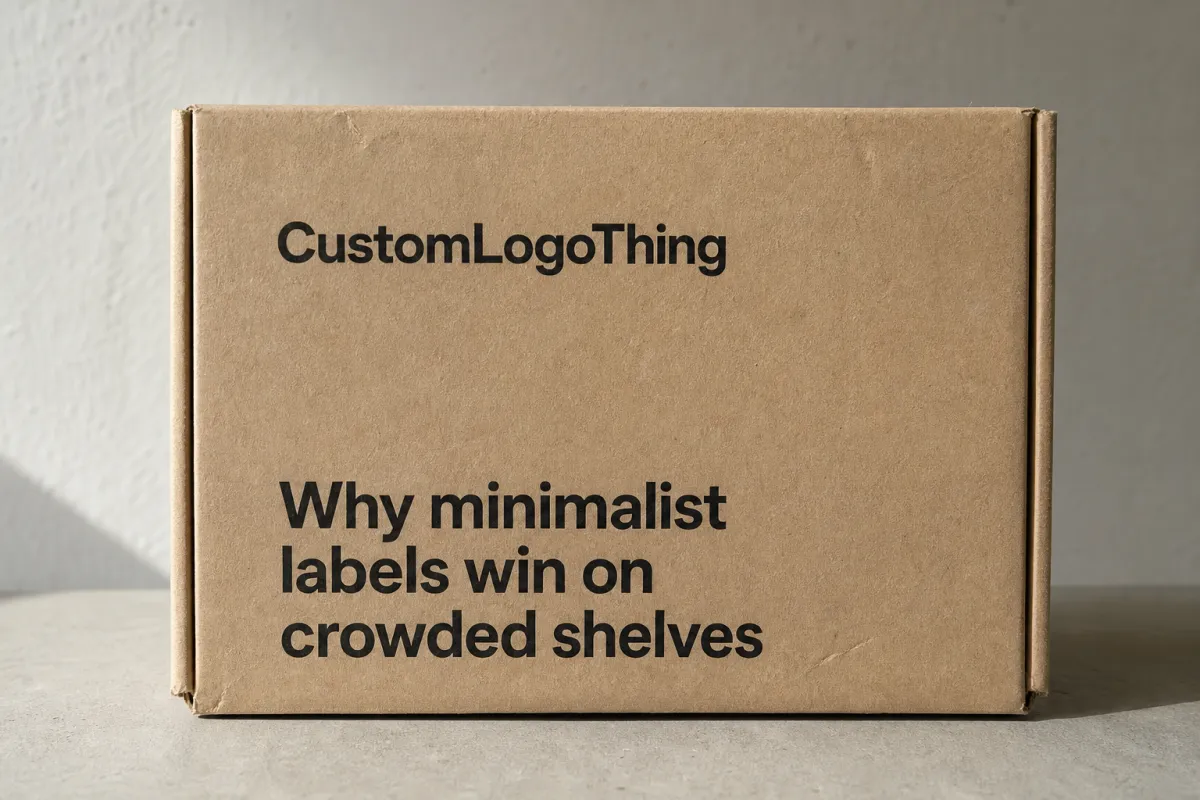
Why minimalist labels win on crowded shelves
Spend five minutes in a crowded aisle and the problem becomes obvious. Too many products are shouting at once. Bright gradients, badge clusters, script fonts, flavor banners, icons, stars, and claims stacks all compete for the same inch of attention. The shelf starts to feel loud before you even read a word. A minimalist label cuts through that static by selecting one message to lead and letting everything else fall in behind it.
That matters because shoppers do not read packaging like a novel. They scan shape, then name, then one cue that helps them sort one item from the next. If a label is overworked, the eye has to do extra labor. If it has a clear hierarchy and enough negative space, the product feels easier to understand. Easier to understand usually means easier to trust.
There is a pricing signal hidden inside that calmness. A restrained label with disciplined typography and a narrow palette often looks more expensive than a busier one, even when the print cost is nearly identical. The reason is not mysterious. Restraint suggests control. It suggests the brand knew what mattered and refused to dress up the rest.
Whitespace is not empty in product packaging. It is structure. A generous margin can elevate a product name the way a frame elevates a photograph. A wider gap between the hero message and the required copy can make a front panel feel quieter. One accent color can pull the eye toward a flavor, scent, or variant without turning the label into a billboard.
Minimal does not mean invisible. It means every visible element has to earn its place.
Food, skincare, supplements, candles, and home care all benefit from this approach for a simple reason: the container already carries identity. A jar, bottle, tube, carton, or pouch does much of the visual storytelling before the label enters the conversation. The label does not need to create drama from scratch. It needs to clarify the offer.
What minimalist custom labels are and how they work
Minimalist custom labels work best when they are treated as a system rather than a style trend. The design uses fewer elements, tighter hierarchy, and a deliberate relationship between the product name, the brand mark, and the supporting copy. Done well, the label does not feel stripped. It feels edited with purpose.
The mechanics are straightforward on paper. One focal point carries the panel. One or two type families manage the information. Color stays controlled instead of scattered. White space gives the composition room to breathe. Then the material choice changes the emotional read of the same artwork, which is why a matte paper label, a clear film label, and a soft-touch laminate can all make the same design feel like three different products.
That material choice matters more in minimalist work than in busy work. With fewer graphics on the page, the substrate becomes part of the brand language. A textured paper stock can make a wellness product feel warm and tactile. Clear film on glass can create a floating effect that feels sharp and modern. A coated stock with a matte finish can make a bottle look crisp, almost architectural. The label is carrying information, yes, but it is also compressing brand signal. Less clutter means each detail carries more weight.
Minimal is not the same thing as unfinished. A minimalist label still needs compliance text, directions, ingredients, warnings, and barcodes where required. It still needs readable type sizes and sensible line spacing. It still needs a layout that respects trim, bleed, and safe area so the important text does not drift into the cut line.
For buyers comparing Custom Labels & Tags with other Custom Packaging Products, the useful frame is simple: the label should be the quietest thing on the package except the information the shopper actually needs.
That is why minimalist custom labels can be unusually strong in package branding. They leave fewer escape routes. Weak typography shows. Loose spacing shows. A sloppy alignment choice shows. The upside is just as real: when the design is disciplined, the package looks finished quickly, and that finish reads as confidence.
Key factors that shape minimalist label design
Typography carries more of the burden in a minimalist design than almost any other element. Once graphics are reduced, the font choice, letter spacing, weight, and scale become the voice of the brand. A clean sans serif can feel modern and clinical. A refined serif can feel editorial or heritage-driven. A hybrid system can work too, but only if the contrast is intentional rather than decorative.
Small-format labels usually reward readability over cleverness. Product names often work best in a weight that is clearly stronger than the supporting copy, while legal text and directions should stay legible at close range. Many print buyers keep fine print somewhere around 5.5 to 7 point in print-ready files, though the right size depends on the typeface, the print process, and the size of the container. What looks elegant on a monitor can turn brittle once wrapped around a curved bottle.
Color should support recognition, not fight it. A dominant neutral such as white, cream, black, or gray often gives minimalist labels their calm feel. One accent color can mark a flavor, scent, or ingredient without breaking the system. Too many hues create friction. Even muted tones can fight each other if the hierarchy is unclear.
Substrate choice changes the whole experience. Paper labels often fit dry goods and certain retail packaging applications well. BOPP and other film stocks are better when moisture, oil, or refrigeration are part of the actual use case. Clear film can make a product feel sleek, but it also raises the stakes on contrast and registration because the package beneath the label becomes part of the composition. A metalized stock can add shine, though in a minimalist layout that shine can read as elegant or distracting depending on how much ink sits on top of it.
Product context matters just as much as aesthetics. A skincare jar can usually support a quieter front panel because the package is handled at close range. A beverage bottle on a shelf has less time to make its case. A supplement bottle may require more regulatory copy and therefore a stricter information hierarchy. A candle label often has to balance mood, scent, and compliance in the same small space. One system will not suit every category.
Legibility and regulation are not the dull part of the label. They are the part that keeps the design honest. If a product needs ingredients, directions, batch codes, warnings, or a barcode, those items need a home. Good minimalism solves that with structure. It does not pretend the requirements do not exist.
If the label will face condensation, freezer storage, frequent handling, or abrasion in transit, ask about adhesive performance as well as print quality. Buyers often request peel and shear testing data or reference methods such as ASTM D3330 for peel adhesion and ASTM D3654 for shear resistance. That does not replace a real-world sample, but it gives you a baseline before production starts.
How to design minimalist custom labels without losing shelf impact
The best way to approach how to design minimalist custom labels is to treat the label like an information hierarchy rather than a decorative surface. Before opening design software, decide what must be seen first, what should be seen second, and what can live quietly in the background. That decision does more for the final package than any trendy visual effect.
-
Start with the message hierarchy.
Identify the product name, the main benefit, and the essential compliance text. If a shopper only glances once, what should stick? For a body lotion, that might be the brand name plus “hand and body cream.” For a snack pouch, it might be the flavor and one key claim. Everything else is support, not star material.
-
Audit the copy with discipline.
Minimal labels collapse fast when the copy is vague. Cut any line that repeats another line, explains the obvious, or adds marketing fog. If the front panel starts feeling crowded, move ingredients, usage instructions, or longer descriptions to another panel or another piece of product packaging, if the container allows it.
-
Build a grid before adding style.
An alignment system usually does more for the label than a decorative icon ever will. Keep the edges consistent, the spacing repeated, and the relationship between the logo, product name, and detail block predictable. On a rectangular label, that might mean a centered stack. On a vertical bottle, it might mean an upper-left anchor with a narrow text column.
-
Choose typography with intent.
One strong primary font is often enough. If you add a second family, make sure it serves a real job, such as separating the brand from the descriptor or distinguishing the flavor line from the core line. Thin weights look elegant in mockups, then fail in production on textured stock or smaller label sizes. The gap between screen beauty and press reality is wider than many teams expect.
-
Prototype on the actual package.
This is the step that catches the embarrassing problems early. Wrap the label around the real bottle, jar, or pouch. View it from arm’s length, then again under the light where it will actually be used. A layout that feels balanced on a flat screen can shift once the container curves or folds.
-
Review the proof like a production buyer.
Check contrast, bleed, trim, barcode space, adhesive fit, and the placement of any critical text. Most printers want a bleed of about 0.125 inches, though the exact dieline should come from the supplier. That final review protects the calm look you planned from tiny mistakes that become expensive later.
There is a useful test for the whole process: if every decorative detail disappeared, would the package still read cleanly and confidently? If the answer is yes, the structure is doing its job. If the answer is no, the design probably depends too much on styling and not enough on hierarchy.
For brands pairing labels with Custom Printed Boxes or other retail packaging components, consistency matters more than perfect sameness. The package does not need identical artwork on every surface, but it should share the same visual language. A restrained box and a loud label can feel disconnected. A restrained box and a restrained label usually feel intentional, which is a very different thing.
Common mistakes that ruin minimalist labels
The most common mistake is crowding the label after deciding it should be minimal. Brands often begin with restraint, then add an icon, a badge, a story sentence, a claims stack, a second logo, and a decorative border. Each addition seems minor. Together they erase the very quality the design was meant to create.
Poor contrast is another frequent failure. Pale gray type on warm white stock may look tasteful in a PDF, but it can vanish under store lighting or on a glossy container. The file still looks soft. The shelf sees something else entirely. Minimal design should be easy to read first and beautiful second.
Many teams also treat negative space as if it needs to be filled. That instinct makes sense, especially for buyers used to conventional packaging design, yet empty space is often what gives minimalist labels their premium feel. It lets the eye rest. It makes the content feel more selective. It can even make a small package appear larger because the field around the message is less chaotic.
Ignoring production realities can undo a good concept in a hurry. Ultra-thin lines, tiny text, and soft color transitions may not reproduce cleanly on every print method. Some flexographic runs hold detail beautifully; others struggle with hairline rules or very light type. Digital printing handles short runs well, but substrate choice and finish still affect sharpness. If the label will live on a curved or textured surface, sample it there before approving the full run.
Skipping a physical proof is an expensive shortcut. The proof shows how the label behaves under real light, how the adhesive grips the container, and whether the finish feels right in hand. A matte paper label on a jar can feel refined. The same artwork on a glossy film may feel more clinical. Neither is automatically right. The sample tells you which one actually matches the brand.
Some brands also mistake minimal for generic. That is not a design problem so much as a branding problem. A minimalist label still needs a distinct voice. That voice may come from a custom type pairing, a narrow color system, a distinctive shape, or a carefully chosen stock. The design should be calm, not anonymous.
Cost, pricing, and MOQ for minimalist custom labels
Minimalist labels can reduce certain costs, but not all of them. Fewer colors may lower print complexity. Simpler artwork can reduce proofing time. Pricing still depends on label size, shape, stock, adhesive, finish, quantity, and whether the order needs special handling such as variable data or multiple versions.
MOQ changes the equation quickly. A small order usually carries a higher unit price because setup, plates, and finishing are spread across fewer labels. Larger runs often lower the cost per piece, but they also create more inventory risk. For many brands, the right order size is the one that matches sales velocity, not the one that looks cheapest on a spreadsheet.
| Print option | Best fit | Typical MOQ | Typical unit cost range | Notes |
|---|---|---|---|---|
| Digital label printing | Short runs, launch tests, seasonal SKUs, versioned artwork | 100 to 5,000 labels | $0.10 to $0.45 each | Fast and flexible; special finishes and larger formats raise the price quickly. |
| Flexographic printing | Repeat orders, higher volume, stable artwork | 5,000 to 50,000+ labels | $0.03 to $0.18 each | Setup takes more effort, but unit cost usually improves as volume climbs. |
| Premium stock or finish upgrade | Premium retail packaging, gift sets, DTC brands | Depends on print method | Adds about $0.02 to $0.12 each | Soft-touch laminate, textured paper, clear film, or metallic stock can raise perceived value quickly. |
| Variable data or versioned labels | Batches, flavors, regional rollouts, serialized runs | Depends on system | Usually a modest premium per label | Useful when one design system needs multiple SKUs without rebuilding the file from scratch. |
Those ranges are general, not fixed. A 2 x 3 inch matte label on plain white BOPP costs less than a custom shape on clear film with soft-touch lamination and foil accents. The quickest way to get a real number is to ask for a quote that separates setup, material, finishing, and shipping. If everything is lumped together, it becomes hard to see where the money actually goes.
If the budget is tight and the goal is still a premium feel, choose one strong upgrade rather than three weak ones. A better stock often has more impact than adding a second foil element. Cleaner typography often does more for the brand than a costly die shape. Minimalist labels reward discipline. They do not need every lever pulled at once.
Sustainability can matter too. If paper sourcing is part of the brand story, ask whether the stock is FSC-certified. The Forest Stewardship Council explains its certification system at FSC, and that signal can matter for natural, wellness, and gift categories where packaging choices are read as part of the product itself.
Production steps, timeline, and lead time
Even a simple label moves through a standard production path. It starts with the brief, then moves into design review, prepress, proof approval, printing, finishing, inspection, and shipping. Press time is only one part of the schedule. Proof cycles and material availability usually matter more than people expect.
For a straightforward digital run, a label can often move from proof approval to shipment in roughly 5 to 10 business days, depending on quantity and finishing. More complex orders, special materials, or multi-SKU sets can stretch that to 10 to 15 business days or longer. Flexographic work with tooling or custom dies can add more time still. If the artwork needs several approval rounds, the calendar moves fast even when the printer is efficient.
Minimalist artwork can sometimes speed things up because the file usually has fewer color changes, fewer embellishments, and fewer layout conflicts. That does not make production simple by default. A clear film that needs perfect registration, a metalized substrate that needs careful ink handling, or a tight label wrap on a small bottle can still require extra setup and sampling.
For brands planning broader product packaging rollouts, the timing should be coordinated with cartons, inserts, and shipping materials. If you are also ordering Custom Packaging Products for the same launch, align the proof schedule so the label, box, and outer packaging all reflect the same version of the artwork. Mismatched releases create confusion in fulfillment and can push back launch day.
Shipping performance matters too, especially for e-commerce. Labels can look perfect in the warehouse and still scuff, lift, or shift during distribution if the adhesive and substrate are not matched to the application. If your product will travel through multiple handling points, shipment testing standards from ISTA can help you think beyond the press sheet and into the trip the package will actually take.
Build a buffer into the timeline for small corrections. A spelling fix, barcode move, or spacing adjustment can add days if it triggers a fresh proof. The smoothest projects slow down before approval and speed up after it. That is a far better shape than trying to repair a rushed label after production has already started.
Expert tips and next steps for your label brief
A strong label brief saves more time than most brands expect. One page is often enough if it clearly states the product, package type, audience, dimensions, required text, target finish, and the mood the design should create. A designer cannot make useful hierarchy decisions without knowing what the product is, where it will sit, and what the package has to say legally.
Ask your supplier for material recommendations based on the actual use case, not only the visual preference. A label for a refrigerated beverage needs different adhesive behavior than a label on a dry pantry jar. A cosmetic jar in a bathroom faces different conditions than a candle sold in a gift box. Moisture, friction, and storage temperature change the right choice faster than most mood boards do.
Order a physical proof whenever the budget allows it. That is the easiest way to judge contrast, surface feel, and how the label wraps around the container. If the package has a curve, shoulder, taper, or textured surface, the proof is not optional in practical terms. It is the moment when the label stops being an idea and becomes a product.
If the design still feels too empty, add depth through structure before adding decoration. Increase the type contrast. Adjust the line spacing. Expand the margin. Move the support copy lower. Change the stock to something with more tactile character. Minimalist work usually improves more from better spacing than from more graphics.
- Confirm spelling and copy hierarchy. Small type errors are easy to miss and costly to fix once printed.
- Check barcode placement. Leave enough quiet space around the code so scanners can read it without interference.
- Verify adhesive fit. Match the label to glass, plastic, paperboard, or coated surfaces instead of guessing.
- Review carton compatibility. If the item ships in a box, the label should not fight the panel layout or packing line.
- Compare sample versions under real light. Store lighting, warehouse light, and natural light can each change how the design reads.
If you are still deciding between format options, start with Custom Labels & Tags and compare them with your other packaging components before you commit. A label that looks excellent by itself can still feel off beside the rest of the system. Package branding works best when the pieces speak the same visual language.
The practical answer to how to design minimalist custom labels is simple: choose one clear message, support it with disciplined typography and spacing, match the material to the environment, and proof the label on the real container before ordering the full run. Do that, and the label can stay restrained without losing its ability to sell.
How do you design minimalist custom labels without making them look empty?
Keep one clear focal point, usually the product name or the main benefit, and make every other element support that hierarchy. Use white space on purpose so the label feels calm rather than unfinished, and check the design at arm’s length to see whether the product still reads quickly. If the package explains itself in one glance, the layout is probably doing enough.
What colors work best for minimalist custom labels?
Neutral bases such as white, black, cream, gray, and muted tones usually create the cleanest result. One accent color can help if it reinforces the brand or highlights a key detail, but too many hues weaken the minimal feel. Always check contrast under store lighting, because subtle palettes can disappear faster than they do on screen.
How much text should a minimalist custom label include?
Keep the visible copy tight: product name, short descriptor, and only the required compliance text. If the package allows it, move long ingredient lists, directions, or brand stories to another panel. A label with too many words usually needs a stronger hierarchy, not a smaller font.
What material is best for minimalist custom labels on jars or bottles?
Choose the material based on the surface and the environment, not only the look you want in the mockup. Matte paper can feel soft and premium, while clear film or coated stock may perform better in moisture-prone settings. Ask for samples on the actual container shape so you can judge adhesion and finish before ordering.
How do I know if my minimalist label is too plain?
If the package no longer tells the shopper what the product is at a fast glance, it is too stripped back. Add clarity through typography, spacing, or material contrast before adding decorative elements. A good minimalist label feels specific, not generic, and that is usually the difference between a quiet design and one that fails to sell. That final check is the core of how to design minimalist custom labels with confidence.

