Buyer Fit Snapshot
| Best fit | Design Packaging for First Impressions projects where brand print, material claims, artwork control, MOQ, and repeat-order consistency need to be specified before quoting. |
|---|---|
| Quote inputs | Share finished size, material target, print colors, finish, packing count, annual reorder estimate, ship-to region, and any compliance wording. |
| Proofing check | Approve dieline scale, logo placement, barcode or warning zones, color tolerance, closure strength, and carton packing before bulk production. |
| Main risk | Vague material claims, crowded artwork, missing packing details, or unclear freight terms can make a low unit price expensive after revisions. |
Fast answer: Design Packaging for First Impressions: Artwork Proof, Packing Count, and Landed Cost should be specified like a repeatable production item. The safest quote records material, print method, finish, artwork proof, packing count, and reorder notes in one written spec.
Production checks before approval
Compare the actual filled-product size with the drawing, then confirm tolerance on folds, seals, hang holes, label areas, and retail display edges. Reserve space for logos, QR codes, warning copy, and material claims before decorative graphics fill the panel.
Quote comparison points
Review material grade, print process, finish, sampling route, tooling charges, carton quantity, and freight assumptions side by side. A quote is only useful when the supplier can repeat the same color, closure quality, and packing count on the next order.
How to Design Packaging for First Impressions
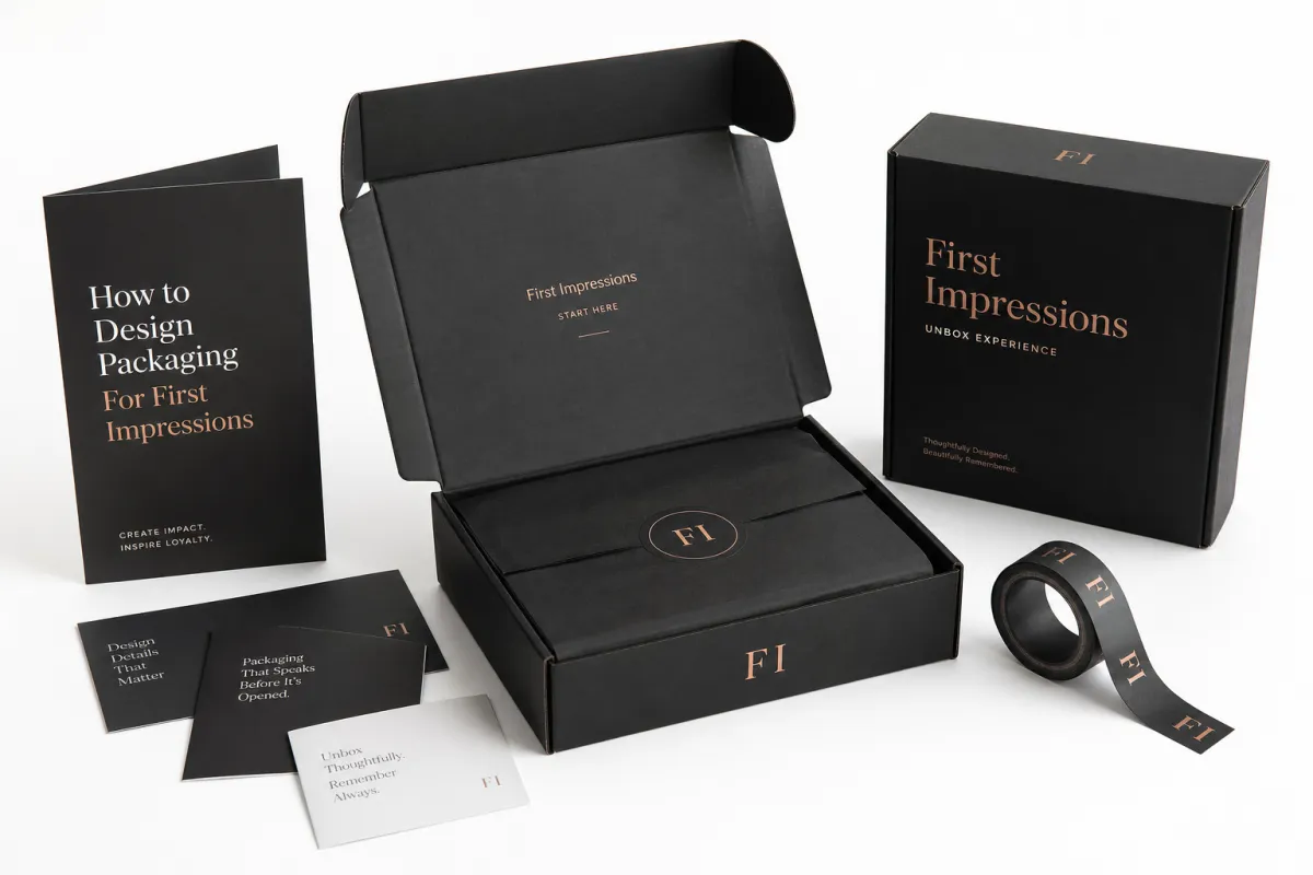
how to design packaging for first impressions is not about dressing up a carton and hoping the customer fills in the blanks. It is about shaping the reaction that lands in the first three seconds, before the insert is lifted, before the tissue is folded back, and before the product gets a single word of explanation. I still remember standing beside a packing line in Shenzhen while a rigid box sample came off the stack under harsh 6500K factory lights that exposed every misaligned edge and every slightly off-center foil mark. It was only a prototype, built from 2.0 mm greyboard wrapped in 157 gsm coated art paper, but the client approved it on the spot because it looked expensive the moment it hit the table. That is the quiet power behind how to design packaging for first impressions: the package starts speaking before the product does.
People underestimate packaging because they assume the item inside carries the whole sale. That is a costly assumption, especially for products priced above $25, where a small change in perception can nudge conversion in a real way. Shape, finish, color, print quality, and the way a lid opens all send signals at once, and those signals arrive long before anyone reads the back panel. A customer may not be able to explain why one box feels premium, yet they know it immediately, the same way they can tell the difference between a 350 gsm C1S artboard and a flimsy 250 gsm stock with no backbone. That gut-level reaction is the first impression, and it is why how to design packaging for first impressions matters so much for branded packaging, Custom Printed Boxes, and Product Packaging That has to earn trust quickly.
E-commerce made that reaction harder to ignore. On a shelf in Chicago or Milan, lighting, spacing, and a salesperson can help carry the message. In an online order, the retail packaging becomes the handshake, the display table, and the closing pitch all at once. That is a lot to ask from corrugated board or rigid construction, but a well-built mailer with E-flute board, a tight tuck, and a clean one-color exterior can still do the job beautifully for a product shipping 5,000 units out of Dongguan or 20,000 units out of Ho Chi Minh City. If you care about how to design packaging for first impressions, treat the package like a sales tool, not a shipping afterthought.
I have watched buyers change their minds in a conference room because one sample felt tidy, firm, and intentional, even though the other sample had a more expensive print treatment. I have also watched a $4 product get dressed down to bargain-bin status because someone saved $0.12 per unit on a weak insert made from thin 1.2 mm pulp instead of a properly cut molded tray. That still makes me wince. It is not theory. It is packaging math, and it gets even less forgiving when freight from Ningbo to Los Angeles adds another 11 to 16 days on the water. How to design packaging for first impressions comes down to controlling what the customer sees, feels, and expects in those opening moments.
Plainly put, a box that says premium in six different fonts is not premium. It is nervous. It usually means the brand did not decide whether it wanted to look luxurious, technical, playful, or eco-conscious. Good package branding usually feels calmer, sharper, and more disciplined than people expect, especially when it uses one foil accent, one strong type family, and a 1.5 mm reveal gap that feels deliberate instead of decorative. If you want how to design packaging for first impressions to work, decide what the package should make the customer believe: luxury, technical precision, eco-consciousness, playfulness, or durability. Then build for that belief, not for a random mood board somebody assembled at 11:40 p.m. and called strategy.
How do you design packaging for first impressions?
The short answer is to align structure, material, print, and unboxing flow around one clear customer emotion. Start with a fit that protects the product, choose a format that matches the price point, then use one tactile finish, one clear visual hierarchy, and one calm reveal so the package feels intentional the moment it is opened. That is the fastest path to how to design packaging for first impressions that reads as premium instead of merely decorated.
How the First-Impression Packaging Process Works
how to design packaging for first impressions begins long before the final print run. It begins the moment a shipper is opened, because the customer is already judging the product journey when they see the outer label, the kraft mailer, and the first layer of protection inside. A typical custom order might move from sample approval in Guangzhou to final export packing in 12 to 15 business days, but only if the dieline, copy, and insert layout are already locked. Every layer sends a cue, and if one layer feels careless, the whole experience drops in value like a box built with the wrong board grade.
On a folding carton line in Suzhou that ran coated paper from Sappi and white kraft from Mondi, a production manager showed me something that has stayed with me: the order of operations matters almost as much as the artwork. Structural approval comes first, then print, then inserts, then finishing, and only after that do you think about case packing and pallet counts. Let artwork outrun the dieline and the job turns into a repair shop, usually with a reprint bill in the range of $300 to $800 for a small run. I have seen that movie more times than I care to admit. That is why how to design packaging for first impressions has to include process, not just aesthetics.
Production usually moves in a familiar sequence: concept, dieline, sampling, revisions, mass production, then shipping. For simpler branded packaging such as a straight-tuck folding carton printed on 400 gsm SBS board, I have seen clean runs finish in 2 to 3 weeks when artwork and dimensions are locked early and the factory is already in rotation. Fully custom builds with rigid construction, specialty finishes, magnetic closures, and EVA or paper pulp insert engineering often take 4 to 8 weeks from proof approval, and ocean freight from Shenzhen to Long Beach can add another 14 to 21 days. Anyone promising much faster is usually selling optimism in a glossy folder, and I say that with respect for the folder.
The emotional lift tends to happen in three moments. First, the outer package looks organized, usually with a clean logo lockup and one strong color field. Second, the opening mechanism feels deliberate, like a lid that lifts with a 3 to 5 mm thumb notch instead of a random tear strip. Third, the product sits in the box without rattling like hardware in a junk drawer, which is exactly what a well-cut insert from a plant in Dongguan or Xiamen is supposed to prevent. That sequence matters if you care about how to design packaging for first impressions. The customer is not just opening a box. They are reading a story about the brand.
Delays usually show up in the same places. Artwork gets approved late, legal asks for one more icon line, or someone requests a structural change after the sample is built and the die is already mounted. I once watched a client lose nine business days because the barcode shifted 14 millimeters and the printer had to rebuild the plate file, recheck registration, and rerun the proof. Nine days for 14 millimeters. I still get annoyed thinking about it, especially because the rerun cost another $180 in setup fees. That is why how to design packaging for first impressions is also a discipline problem. Design with the calendar in mind or pay for the delay later.
“The best packaging does not shout. It arrives prepared.”
If you want to compare formats before you lock a structure, our Custom Packaging Products page is a useful place to start. A lot of teams skip the structural side and rush straight into decoration, which is how a $2.10 box starts acting like a $0.70 box after the first transit cycle. That order is expensive, and the invoice has a way of reminding everyone.
Key Design Factors That Shape the First Impression
Visual hierarchy is the first test. If the logo is buried, the front panel is crowded, and the copy is trying to entertain everyone at once, the customer gets confused in the same way they would when a carton from Shenzhen arrives with six callouts and no clear product name. Confusion is the enemy of how to design packaging for first impressions. The front of the box should answer a simple question fast: what is this, and why should I care? Place the logo where the eye lands naturally, usually the top third or center-left on a vertical carton. Use one main message. Give the design room to breathe.
Color matters, though not in the lazy blue-means-trust way people love to repeat at brand meetings. Color works through contrast, brand fit, and finish, which is why a deep black box with matte lamination feels different from the same black printed on glossy 300 gsm stock. A white box with a blind emboss and 1.0 mm raised detail can feel cleaner than a full-color illustration that tries to cover every inch of paper. That is why how to design packaging for first impressions is never only about choosing a palette. It is about controlling perception with a specific ink system, a specific coating, and a specific manufacturing finish.
Tactile cues do serious work. Soft-touch lamination feels warmer and more premium to many customers, while uncoated stock can signal honesty, sustainability, or a handmade feel if the artwork stays restrained and the print density is controlled. Embossing adds depth, especially on a 157 gsm art paper wrap or a rigid lid with 2.0 mm board underneath, and foil can add drama when it is used on a logo only instead of flooding the whole panel. I have seen a $0.22 upgrade in matte coating create more perceived value than a $1.10 decorative add-on, and that kind of irony keeps packaging people humble. That is the useful part of how to design packaging for first impressions: small details can hit harder than expensive extras.
Structure and proportion matter just as much as graphics. A mailer box, folding carton, rigid box, or pouch each sends a different message because each one uses a different wall thickness, closure method, and shipping behavior. A folding carton might be built from 350 gsm C1S artboard with a tuck flap, while a rigid box in a gift set might use 2.2 mm greyboard wrapped in printed art paper for a more substantial hand feel. Choose the structure that matches the product and the promise. If the box is oversized and the product rattles inside by more than a few millimeters, the customer hears cheapness before they see it. That is bad how to design packaging for first impressions math.
Insert design is the piece many teams ignore until the final stretch. Poor inserts make premium product packaging feel sloppy fast, especially if the bottle leans, the tray flexes, or the cavity is cut too deep and leaves an ugly shadow line. Good inserts hold the item in place, protect edges, and create a centered reveal that looks planned rather than accidental. I have seen a cosmetic client move from a loose paper tray to a precision-cut molded pulp insert in a factory outside Xiamen and instantly look more organized. Same bottle. Same print. Different feeling. That is how to design packaging for first impressions doing quiet, practical work.
For brands that care about sustainability, I like to see FSC-certified paperboard and right-sized structures rather than eco theater. If a package is overbuilt and ships half empty, nobody earns a medal for being green, especially if the freight bill climbs by $0.40 to $0.60 per unit because the carton footprint is too large. The FSC standards site at fsc.org is a useful reference if your team needs proof that material sourcing matters beyond the marketing line. In the same spirit, how to design packaging for first impressions should include real performance, not just a recycled-content badge glued to the surface.
The practical rule I use is simple: one strong visual idea, one strong material choice, one strong structural decision. That is enough to make how to design packaging for first impressions feel intentional, whether the package is being built in Dongguan, printed in Suzhou, or assembled in a smaller finishing shop in Ho Chi Minh City. Everything after that becomes decoration, and decoration without discipline turns noisy fast.
How to Design Packaging for First Impressions on a Budget
Budget packaging is not the same as cheap packaging. That distinction saves money, and I learned it the hard way after a brand insisted on saving $0.09 per unit on board thickness, then paid freight on crushed corners for three straight shipments from a plant near Ningbo. The so-called savings vanished into replacement costs, customer complaints, and one awkward Zoom call with a retail buyer who noticed the damage immediately. If you want how to design packaging for first impressions on a budget, spend where it changes perception and protect the product first.
The strongest low-cost upgrades usually live in three places: structure, print, and fit. A well-fitted mailer made from E-flute corrugated board with one-color print and a clean insert can look more premium than a noisy box with five inks and no discipline, especially if the inside uses a crisp 120 gsm tissue or a single branded sticker at the reveal point. A custom sticker helps only when it is used with restraint, and a better inner tray can transform the reveal without blowing the budget. That is why how to design packaging for first impressions should start with the bones of the package, not with glitter.
Pricing needs to stay honest, or the conversation drifts into wishful thinking. A basic branded mailer might add $0.12 to $0.35 per unit at 5,000 pieces depending on board choice and print coverage, while a rigid box can jump to $1.50 to $4.00+ per unit depending on the paper wrap, board thickness, finish, and order size. I have quoted 3,000-unit runs at $1.68 per box FOB Shenzhen using 2.2 mm greyboard with 157 gsm art paper, and I have also seen 500-unit runs land at $3.92 because setup cost had to be spread across fewer pieces and the manual labor in the finishing room was higher. That is not the printer being dramatic. That is manufacturing. If you are serious about how to design packaging for first impressions, ask for tiered quotes at 500, 1,000, and 5,000 units.
| Packaging option | Typical unit cost | Best for | Perception level | Typical lead time |
|---|---|---|---|---|
| Branded mailer box | $0.12-$0.35 | Subscription, apparel, small goods | Clean, practical | 2-3 weeks |
| Folding carton | $0.18-$0.60 | Cosmetics, supplements, retail packaging | Polished, retail-ready | 2-4 weeks |
| Rigid box | $1.50-$4.00+ | Luxury, gifting, premium product packaging | High-end, substantial | 4-8 weeks |
| Custom pouch | $0.10-$0.50 | Lightweight products, food, samples | Modern, efficient | 2-4 weeks |
Minimum order quantities change the calculation. A smaller run may cost more per unit, but it reduces risk if the artwork is still evolving or the launch date is uncertain, and that matters a lot when a 1,000-piece test batch can reveal a lid problem before you commit to 10,000 units. I would rather see a brand place a 1,000-piece test order and learn something real than commit to a full shipment of packaging that nobody likes once it lands in a warehouse in Los Angeles or Rotterdam. That is a practical way to handle how to design packaging for first impressions without gambling the quarter.
False savings are easy to spot once you have spent enough time on a factory floor in Shenzhen, Dongguan, or Xiamen. Too-thin board. Oversized cartons that waste freight space. Inserts that do not lock the product. Cheap adhesive that fails in cold storage at 5 degrees Celsius. A box that looks acceptable on a desk but caves in a warehouse is not a bargain. It is a future complaint with a tracking number. Good how to design packaging for first impressions decisions should protect margin and reduce damage, not just lower the quote line.
If you need a simple spending priority list, use this:
- First: size and structure that fit the product correctly, ideally within 2 to 4 mm of the item dimensions.
- Second: print clarity and brand consistency across the front panel, lid, and insert.
- Third: one tactile finish that supports the concept, such as matte lamination or a spot UV logo.
- Last: decorative extras that do not change the customer’s reaction much, especially if they add more than $0.10 to $0.20 per unit.
That order keeps how to design packaging for first impressions grounded in reality instead of design theater.
Step-by-Step Guide to Building the Right Unboxing Experience
Start with the feeling you want the customer to have. Premium. Playful. Technical. Calm. Eco-conscious. Loud branding without emotional clarity turns into clutter, and clutter is a fast way to fail at how to design packaging for first impressions. I ask clients one blunt question before I touch a dieline: what should the customer believe about the brand after opening this 350 gsm carton or 2.0 mm rigid box?
Choose the format next. A mailer box works well for layered reveals and subscription kits shipping from a fulfillment center in Dallas or Tilburg. A folding carton suits shelf-ready retail packaging in a pharmacy aisle. A rigid box signals higher value, especially for a $120 gift set or a skincare duo that needs more ceremony. A pouch may fit lightweight products or sachets that need low freight cost. Lock the dieline before the artwork gets too precious. Once the structure shifts late in the process, everything else slides around it, and that is a painful way to learn that how to design packaging for first impressions is as much about discipline as design.
Build the unboxing sequence from outside to inside. Shipping label. Outer shipper. Brand reveal. Protective layer. Product reveal. Insert. Final message. Each step should earn its place, and each layer should have a job, whether that job is protection, orientation, or a small moment of delight. If a layer does not protect, inform, or delight, remove it. I once saw a client remove a printed thank-you card and replace it with a better insert that held the bottle straight and cut the movement gap from 7 mm to 2 mm. Sales did not miss the card. Customers noticed the better fit. That is real how to design packaging for first impressions work.
Create samples and inspect them in real lighting. Fluorescent office lights lie, especially the cold ones around 5000K that flatten texture and hide register issues in a way that can make a matte box look duller than it really is. I always want to see a sample in daylight and under warm indoor light, and I want to see it on a plain table as well as inside the shipper it will actually travel in. On one project, a white box looked crisp in the office and slightly cream in the warehouse under sodium lighting. The team caught it because we checked both environments. That saved a frustrating argument later. If you care about how to design packaging for first impressions, test in the same conditions your customer will actually see.
For technical validation, I like to see packaging tested against shipping abuse, not just admired on a conference table. The ISTA test standards are a solid reference if your package needs to survive drops, vibration, compression, and carrier handling across routes like Shenzhen to Phoenix or Ho Chi Minh City to Toronto. A beautiful box that fails transit is a bad joke. Good how to design packaging for first impressions should survive the journey and still look composed at the end.
Here is the checklist I use before pre-production approval:
- Confirm final dimensions and product weight to the nearest gram.
- Approve the dieline and fold orientation.
- Check copy, barcode placement, and legal text.
- Review color targets under real lighting.
- Verify insert stability and product fit.
- Confirm finish choice, such as matte lamination or soft-touch coating.
- Check shipping carton count, carton marks, and pack-out instructions.
That list keeps how to design packaging for first impressions from getting wrecked by last-minute surprises. And yes, surprises show up, usually the day before the PO is due, which is a deeply annoying tradition across the packaging industry from Dongguan to Dallas.
If your team needs a starting point, our Custom Packaging Products catalog can help you compare formats before you commit to the final build. I have seen more projects rescued by one sensible sample than by six expensive slide decks with glossy renderings and no board spec attached.
Common Mistakes That Kill the First Impression
Overdesign is one of the fastest ways to ruin a box. People think more graphics means more impact, but usually it means less confidence, especially when the panel is packed with icons, gradients, taglines, and five font sizes on a 180 mm front face. A package crowded with visual noise starts to feel desperate. That is the opposite of how to design packaging for first impressions. Clean, deliberate, and slightly restrained usually reads more expensive.
Vague branding is another killer. If the logo is tiny and the product name could belong to twenty other products, the box feels borrowed, like it came from an off-the-shelf template with a logo swapped in at the last second. Package branding needs a clear identity. Your customer should not need a detective kit to figure out what the package is. I once watched a supplement brand spend real money on a beautiful box that still felt anonymous because the typography was random and the hero message was buried under three secondary claims. Pretty and forgettable is still forgettable. That is bad how to design packaging for first impressions.
Poor fit destroys trust fast. If the product rattles, shifts, or arrives with dented corners after a 12-day transit route, the customer immediately assumes the brand cut corners elsewhere too. That judgment happens in seconds. It is blunt, but it is real. Smart product packaging earns its keep here. Fit, cushioning, and structural support matter more than a fancy print finish when the carton lands on a porch and gets tossed around by a carrier. If you are serious about how to design packaging for first impressions, do not let the item move.
Timeline mistakes create avoidable pain. I have seen teams approve artwork on a Friday, then ask the factory to just speed it up on Monday, as if ink drying, die cutting, and glue cure times can be bullied into submission. Speeding up a bad file just produces a faster bad file. Production calendars are not magic either, and a printer in Suzhou still needs time for proofing, plate setup, and quality checks. If your launch date is fixed, work backward with real margins. That is how to avoid embarrassing shortcuts in how to design packaging for first impressions.
Consistency failures are sneaky. The box may look good, but then the tape, tissue, label, and insert tell a different story, and suddenly the package feels patched together. That mismatch makes even strong retail packaging feel cheap, especially if the outside says premium and the inside uses a weak 70 gsm filler sheet or a noisy sticker. I pay close attention to the small stuff here because customers do too, even if they cannot explain it. If you want how to design packaging for first impressions to hold up, the entire kit has to sing the same tune.
One more mistake: treating sustainability like a sticker instead of a system. If you claim eco-conscious packaging, the board, ink, finish, and shipping efficiency should support that claim, whether the package is being printed in Hangzhou or assembled in Monterrey. Otherwise it feels like packaging greenwashing with a nice logo. Nobody needs that. Use FSC-certified materials where they make sense, keep the structure right-sized, and avoid empty space that wastes freight. That is cleaner, smarter, and more believable.
Expert Tips and Next Steps for Packaging That Actually Lands
Order one physical sample before you approve a full run. I know procurement teams hate hearing that because it adds a step and a line item, usually around $35 to $120 depending on the prototype complexity and whether the factory in Shenzhen needs a mock insert or a full printed wrap. I also know what happens when a team skips it: they discover the finish looks wrong, the insert is too tight, or the lid feels flimsy after 5,000 units are already in motion. One sample is cheap insurance for how to design packaging for first impressions.
Test the package with real customers, not just internal staff. Five people are enough to reveal a pattern if you ask the right question: what did you feel before you opened it? That answer matters more than looks nice. People can be polite in meetings and blunt with packaging at home, especially if they are opening the box on a porch after a two-day shipment from a fulfillment center in Ohio. If three out of five say the box felt premium, you are probably on track. If they say it felt busy or generic, listen. That feedback is gold for how to design packaging for first impressions.
Build a cost ladder before you sign off. Show the team what changes cost $0.15, what changes cost $0.50, and what changes add $2.00 or more, because otherwise everyone will ask for the expensive option as if it is free. A clear ladder keeps the conversation sane and helps the brand choose upgrades that actually move perception, like spending an extra $0.18 on a better insert instead of $0.40 on decorative foil nobody notices. That is one of the simplest ways I know to improve how to design packaging for first impressions without turning the budget into confetti.
I also recommend negotiating with the factory in terms of goals, not vanity features. A supplier will happily quote foil, emboss, and a specialty coating all at once, and sometimes that is smart, but sometimes it is just a bloated invoice with sparkle on it. I once shaved $0.14 per unit from a premium mailer by switching from a full flood print to a restrained two-color layout and moving the value into a better insert and matte finish. The client got a stronger package and a lower landed cost, which is the sort of trade I like. It is also the sort of trade that makes how to design packaging for first impressions more effective.
Use this simple launch checklist:
- Review brand goals and the exact customer emotion you want.
- Confirm budget, MOQ, and freight assumptions.
- Approve dimensions, material, and finish.
- Request and inspect a physical sample.
- Check production timing against your launch window.
- Set one person to own final sign-off.
That is the practical version of how to design packaging for first impressions: clear goals, tight structure, honest costs, and no sloppy surprises. If you keep the package intentional, the customer feels it. They may not know the exact board spec or print process, but they will know the brand cared enough to get it right.
That is the point. Good branded packaging is not decoration. It is evidence. It tells the customer they are buying from a brand that thinks ahead, pays attention, and respects the moment, whether the order was printed in Suzhou, packed in Dongguan, or shipped through a fulfillment center in Dallas. If you are mapping how to design packaging for first impressions for your own product line, start with a sample review, a realistic budget, and a timeline that leaves room for revision. Pick one structure, one finish, and one clear reveal sequence, then hold the line on fit and clarity. That is the move that makes the first impression feel earned instead of accidental.
How do you design packaging for first impressions without overspending?
Prioritize structure, fit, and one strong brand cue before adding premium extras. Use one or two high-impact upgrades, like matte finish or embossing, instead of stacking every embellishment, and ask for a sample quote at 500, 1,000, and 5,000 units so you can see where pricing drops from $3.92 to something much more workable.
What makes a packaging first impression feel premium?
Clean structure, tight product fit, and intentional negative space do most of the work. A tactile finish such as soft-touch or uncoated stock can raise perceived value fast, especially on a 350 gsm C1S carton or a 2.0 mm rigid box wrapped in 157 gsm art paper. Consistent branding across the box, insert, and tissue tells the customer the brand pays attention.
How long does it take to create packaging for first impressions?
Simple branded packaging can move in 2 to 3 weeks if artwork and dimensions are ready. Custom structural packaging often takes 4 to 8 weeks once sampling, revisions, and production are included, and a typical proof-to-shipment window from a factory in Shenzhen or Suzhou is 12 to 15 business days for straightforward jobs. Shipping time and vendor backlog can add another week or two, so plan backward from your launch date.
What packaging mistakes hurt first impressions the most?
A product that rattles, shifts, or arrives damaged instantly lowers trust. Overcrowded graphics or weak typography can make even a good product look cheap, and a wrong size can waste material, increase freight costs by $0.40 per unit, and make the unboxing feel careless. A carton that looks polished but fails in transit is usually the most expensive mistake of all.
Should small brands invest in custom packaging for first impressions?
Yes, but start with the highest-return pieces: mailer box, insert, and branded outer layer. Small brands often benefit more from a smart, simple package than from expensive decoration, especially if they are launching in a single region like California, the UK, or Southeast Asia and need to control cash flow. A polished unboxing can help justify a higher price point and improve repeat purchase rates.


