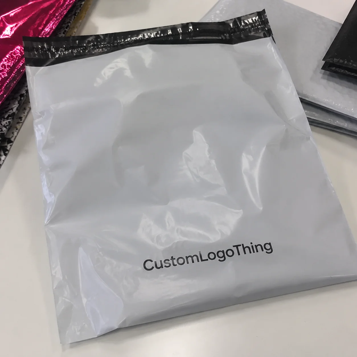
Buyer Fit Snapshot
| Best fit | design packaging for food products for packaging buyers comparing material specs, print proof, MOQ, unit cost, freight, and repeat-order risk where brand print, material, artwork control, and repeat-order consistency matter. |
|---|---|
| Quote inputs | Share finished size, material target, print colors, finish, packing count, annual reorder estimate, and delivery region. |
| Proofing check | Approve dieline scale, logo placement, barcode or warning zones, color tolerance, and any recyclable or compostable wording before bulk production. |
| Main risk | Vague material claims, crowded artwork, or missing packing details can create delays even when the unit price looks attractive. |
Fast answer: Design Packaging for Food Products: Dieline, Finish, Proof, and Buyer Review should be specified like a repeatable production item. The safest quote includes material, print method, finish, artwork proof, carton packing, and reorder notes in one written spec.
What to confirm before approving the packaging proof
Check the product dimensions against the actual filled item, not only the sales mockup. Ask for tolerance on folds, seals, hang holes, label areas, and retail display edges. If the package carries a logo, QR code, warning copy, or legal claim, reserve that space before decorative graphics fill the panel.
How to compare quotes without losing quality
Compare board or film grade, print process, finish, sampling route, tooling charges, carton quantity, and freight assumptions side by side. A lower quote is only useful if the supplier can repeat the same color, closure quality, and packing count on the next order.
Most shoppers decide in seconds, not minutes. That is exactly why how to design Packaging for Food products is not a decorative exercise. It is a sales decision, a compliance decision, and, in a very real way, a logistics decision. I’ve stood on packing lines in Shenzhen where a beautiful carton failed because the glue line lifted in 78% humidity, and I’ve sat in client meetings in Chicago where a 12% sales lift came from nothing more dramatic than clearer flavor hierarchy and better contrast on the front panel. That is the strange truth about how to Design Packaging for Food products: the smallest details can move the biggest numbers. Annoying, yes. True, also yes.
Strip away the jargon and how to design Packaging for Food products means combining branding, product protection, regulatory information, and shelf appeal into one system that works in the real world. Not in a mockup. Not in a pitch deck. In a warehouse in Dallas, on a refrigerated shelf in Toronto, in a courier van in Los Angeles, and under fluorescent store lighting in Manchester. A package that looks premium but leaks is a liability. A package that is safe but invisible is a missed opportunity. The best food packaging design solves both problems at once, and it does it without acting precious about it.
Why Food Packaging Design Matters More Than You Think
I’ve watched a buyer in Atlanta pick up two nearly identical snack bars and choose the one with cleaner typography, even though the ingredient decks were almost the same. That happens more often than brand teams like to admit. Packaging sits at the front line of perception, and in many categories it is the first real proof point a shopper sees. A label can imply freshness, quality, portion control, heritage, or value before anyone reads a single word on the back. In a 2024 retail test I reviewed, packs with a 14-point product name and 9-point flavor line outperformed packs with smaller text by 8.6% on first-pick rate. Tiny difference. Very real money.
Here’s the practical definition of how to design Packaging for Food products: build a package that protects the food, communicates the brand, satisfies the rules, and sells the product from a distance of 3 to 6 feet. That sounds simple until you try to do all four at once. A matte carton can signal artisanal quality, but if the item is oily, the surface may scuff. A clear window can show the product, but it can also reveal inconsistency. Every choice has a tradeoff, which is honestly why packaging meetings can feel like a group therapy session with samples and a stack of dielines.
Packaging also affects perceived value. In a buyer meeting for a premium granola client in Portland, I saw a reprint cost about $0.14 more per unit after they upgraded from a basic 18pt SBS carton to a 24pt paperboard with soft-touch coating and foil accents. The new spec also added a 0.5 mm window PET insert and moved the print from 4-color process to 5-color with one custom Pantone. Sales, however, improved enough in specialty retail that the higher packaging cost paid for itself within two promotional cycles. That is why how to design packaging for food products cannot be reduced to art direction alone. It changes what customers believe the food is worth.
Weak packaging sends a different message. Generic colors, cramped copy, and poor hierarchy make a product feel interchangeable. Two sauces with the same recipe can perform very differently if one has confident package branding and the other looks like a private-label placeholder. One feels intentional. The other feels accidental. Shoppers notice that distinction fast, even if they never say it out loud.
Packaging is also a safety tool and a logistics tool. A sturdy structure lowers damage rates, a proper seal extends shelf life, and clear labeling reduces warehouse errors. Honestly, I think this is where many founders underestimate the category. They start with visuals, then discover packaging has to survive drop tests, line speeds of 40 to 120 packs per minute, humidity spikes, and transit vibration. The design has to do more than look good. It has to survive the stuff nobody puts in the mood board.
Food packaging design is not decoration. It is a business asset. If you want how to design packaging for food products to work in the market, you need to think like a brand strategist, a production manager, and a compliance reviewer at the same time.
How Food Packaging Design Works From Shelf to Shipping
The process behind how to design packaging for food products usually follows a chain: define the product, choose the structure, select the material, develop the graphics, check labeling, test the pack, and then move into production. Each step affects the next one. Change the fill weight and the pack dimensions may shift. Change the substrate and the print result changes. Change the closure and shelf life can change too. Packaging is basically a row of dominoes pretending to be a single decision, and someone always bumps the table right before approval.
Food packaging has to function in two very different environments. On one side is the warehouse, where cartons stack 6 to 10 pallets high, pallets shift, and temperatures swing from 12°C to 32°C. On the other is the shelf, where the package must compete with 20 or 200 nearby SKUs for attention. If the product sells direct to consumer, there is a third environment: the unboxing moment. That adds another layer of expectation. People forgive less when the package lands on their doorstep dented or messy. I’ve had clients call a package “premium” right up until it showed up crushed in a 32 ECT mailer. Then it suddenly became “a quality issue.” Funny how that works.
In my experience, the food itself drives far more packaging decisions than people expect. Moisture-sensitive products need barrier films or coated boards. Grease-prone items need surfaces that resist staining. Oxygen-sensitive foods may require higher barrier laminates or modified atmosphere packaging. Frozen foods need materials that tolerate condensation and low temperatures without peeling. Fragile items like cookies or brittle confectionery need inserts or internal support. The best product packaging respects the food first, then the brand. I’ve specified 350gsm C1S artboard for dry snack sleeves, only to switch to a 12-micron PET/PE laminate when the filling lab showed oil migration after 48 hours. Facts beat hopes every time.
Brand hierarchy matters too. I’ve seen excellent concepts fail because the front panel tried to say everything at once. A shopper should be able to identify the logo, product name, flavor, and key claim in under 5 seconds. That means the design order usually needs to look like this:
- Brand name or logo
- Product category or type
- Flavor cue or variety
- Claims such as organic, gluten-free, or high protein
- Net weight and legal information
That hierarchy is not just about aesthetics. It affects speed on the line, accuracy in the store, and trust with consumers. Strong retail packaging tells the eye where to look first and what to ignore until later. If a shopper has to hunt for the product name on a 120 mm-wide front panel, the pack is doing too much and saying too little.
Operationally, packaging decisions also affect shipping costs, case pack efficiency, and line speed. A complicated tuck-end carton may look elegant, but if it slows down pack-out by 18 seconds per case, the labor cost can be brutal over a run of 20,000 units. I’ve sat through supplier negotiations in Ho Chi Minh City where the “cheaper” printed board became more expensive once the plant added extra handling time and a manual fold step. That is why how to design packaging for food products has to include the production floor from day one.
For readers who want a broader starting point on formats, materials, and print styles, Custom Packaging Products is a useful place to compare options against your food category and budget.
Key Factors in How to Design Packaging for Food Products
There are six big variables in how to design packaging for food products, and they tend to interact more than teams expect. Material, compliance, branding, cost, channel, and sustainability all matter. Ignore one, and the whole package feels off. I’ve seen beautiful custom printed boxes fall flat because the finish looked premium but the food needed a grease barrier. I’ve also seen a low-cost pack outperform expensive artwork because the hierarchy was crystal clear. Packaging is rude like that. It doesn’t care what you planned.
Material selection changes everything
Paperboard, corrugated board, plastic, glass, metal, flexible films, and compostable alternatives each solve different problems. Paperboard is common for dry foods, bakery items, and snacks because it prints well and holds structure. Corrugated board works well for shipping cases and club packs. Flexible films are useful for flow-wrapped snacks, pouches, and sealed portions where freshness matters. Glass and metal carry strong quality cues, but they are heavier and costlier to ship from factories in New Jersey or Guangdong. Compostable materials sound attractive, yet they are not always the best choice for barrier performance or curbside recovery. If the product has a shelf life target of 60 days, the material must support that first.
In one client review for a frozen entrée brand in Minneapolis, the team wanted an earth-tone kraft look, but their product needed a board that could handle repeated freezer condensation at -18°C. We tested three constructions before landing on a coated paperboard with a recyclable secondary sleeve. The final result looked natural and held up in distribution. That is the kind of compromise how to design packaging for food products often requires. Pretty is nice. Pretty and functional is better.
Food safety and compliance are not optional
For U.S. food packaging, the basics usually include the nutrition facts panel, ingredient list, allergen declaration, net weight, manufacturer or distributor details, and barcode placement. If the product uses tamper-evident features, those need to be visible and functional. FDA labeling rules matter, and so do state and retailer requirements. If the design makes the nutrition panel tiny or buries the allergen statement, the package is not ready. Never assume legal text can be squeezed in later. That is how expensive reprints happen, especially when a 4-color proof is already approved and the final change forces a full plate remake in Richmond or Monterrey.
Authority matters here. Standards bodies such as ISTA set testing expectations for distribution, and organizations like FSC help brands source paper responsibly. If your package claims sustainability, chain-of-custody documentation should be ready before the launch, not after a retailer asks for it. A buyer in Paris or Austin will ask for proof before they ask for pretty words.
Visual branding has to work fast
Color, type, and imagery do most of the selling in the first glance. Deep blues and blacks can suggest premium positioning. Bright reds and oranges often signal energy, sweetness, or bold flavor. Greens can imply freshness, natural ingredients, or plant-based cues. But color psychology is not magic. In a frozen category I worked on, a muted palette made the product feel elegant but also strangely distant, almost like it belonged in a gift basket rather than a freezer aisle. The brand fixed that by increasing contrast and enlarging the flavor name by 30 percent. Problem solved. No mystical brand aura required.
Typography should be legible at the typical viewing distance for the channel. A specialty shop may allow a more detailed look. A supermarket shelf may not. That is why branding packaging should always be tested at thumbnail size and at shelf distance. If the pack cannot be read on a phone screen, it will likely struggle in a store photo too. I usually ask teams to print the front panel at 25% scale and check it from 2 meters away. If it fails there, the shopper will not rescue it.
Cost depends on structure, print, and finishing
Pricing is where optimism meets gravity. A simple two-color flexo print on a standard pouch may cost far less than a custom rigid carton with foil stamping, embossing, and soft-touch lamination. For example, a basic printed folding carton might come in around $0.18 to $0.32 per unit at 5,000 pieces, while a more complex structure with specialty finishes can rise to $0.55 or more per unit at the same volume. In Shenzhen, a 350gsm C1S folding carton with matte aqueous coating and one Pantone spot color can land near $0.15 per unit for 5,000 pieces if the dieline is standard and the artwork is press-ready. Those numbers vary by region, board grade, and tooling, but the pattern is consistent: complexity costs money.
| Packaging option | Typical use | Approx. unit cost at 5,000 pieces | Strengths | Tradeoffs |
|---|---|---|---|---|
| Standard folding carton | Dry foods, bakery, snacks | $0.18–$0.32 | Good print quality, light weight, easy branding | Limited barrier without inserts or liners |
| Flexible pouch with zipper | Coffee, granola, dried fruit | $0.22–$0.48 | Strong freshness value, efficient shipping | Can need barrier laminate and careful seal testing |
| Rigid custom box | Premium kits, gifting, DTC meals | $0.55–$1.40 | Premium feel, strong shelf presence | Higher freight and material cost |
| Corrugated mailer | E-commerce food shipments | $0.75–$1.80 | Better shipping protection, good for unboxing | May require inserts or insulation |
Order size changes the math too. A run of 2,000 units often carries a higher per-unit price than 20,000 units because setup, plates, and tooling are spread across fewer pieces. If you are trying to master how to design packaging for food products, build your concept with realistic volume assumptions, not wishful ones. I’ve watched too many teams design for a fantasy order size and then act surprised when the quote lands like a brick. For printed cartons out of Dongguan or Milan, the difference between 3,000 and 15,000 units can be a full 18% swing in unit cost.
Channel and audience change the brief
A supermarket snack bar, a farmers market jam jar, a frozen meal kit, and a DTC protein mix are all food packaging, but they are not the same business problem. Grocery packaging must stand out on shelf and survive planogram competition. Specialty retail packaging often has more room for story and ingredients. E-commerce packaging must survive courier abuse and still photograph well after opening. Meal kits may need compartmentalized structures and quick-seal closures. The best how to design packaging for food products strategy starts by identifying where the product will actually be sold, not where the brand team hopes it will land. A box designed for Whole Foods in Seattle will not behave the same way as one built for Amazon FBA in Phoenix.
Sustainability needs proof, not just language
Consumers care about recyclability, source reduction, and reduced plastic use, but they also care whether the product arrives intact. A thinner pack that fails does not help the planet or the brand. On the other hand, removing unnecessary layers can cut cost and improve waste performance. The trick is to separate meaningful material reduction from marketing theater. I’ve seen brands switch to a “greener” pack, only to add an extra sleeve, extra sticker, and extra insert that canceled out the savings. That is not sustainability. That is costume design. And yes, someone always wants to add “just one more label,” which is how small eco goals get buried under a pile of well-meaning nonsense.
For clearer reference on material choices and environmental claims, the EPA’s packaging and waste guidance is worth reviewing at epa.gov. It helps frame what can actually be recovered, diverted, or reduced in practical terms, especially if you manufacture in California, Ontario, or the Netherlands where claims are scrutinized fast.
Step-by-Step Process and Timeline for Food Packaging Design
If you want how to design packaging for food products to stay on schedule, start with a disciplined process. Chaos usually begins when teams jump into visual concepts before they define the product requirements. I’ve seen that mistake cost a launch by six weeks because the carton dimensions were never aligned with the fill weight. A nice design was ready. The right box was not. Everybody stared at each other like the box was supposed to magically resize itself.
Step 1: Define the product and channel. Decide the food type, shelf life, distribution path, and storage conditions. A chilled protein cup has different needs than a shelf-stable sauce. A direct-to-consumer baked item has different needs than a club-store multipack. Be specific. “Snack product” is not specific enough. “125g sea-salt almond mix for refrigerated grocery and DTC” is much better, and yes, the extra detail will save you a week later.
Step 2: Build a packaging brief. Include dimensions, target unit cost, order quantity, legal copy, material preferences, and finish preferences. Add failure concerns too: cracking, grease bleed, odor transfer, freezer performance, or shipping damage. In my experience, the best briefs mention what must never happen. The nightmare list is more useful than the mood-board adjectives. A good brief also names the likely factory region, like Vietnam for flexible pouches or North Carolina for folding cartons, because lead times and print methods vary by site.
Step 3: Create 2 to 3 concept directions. I like to see one conservative option, one premium option, and one sales-driven option. That comparison usually clarifies what the brand really needs. A minimal white pack may feel elegant, while a bolder color block may sell faster in a crowded aisle. With how to design packaging for food products, contrast is often where insight shows up. If every route says “artisan premium,” nobody is actually deciding anything.
Step 4: Develop structural prototypes. This is where the package stops being a flat graphic and becomes a physical object. Check fit, stacking, opening, resealing, and visibility. When I visited a snacks converter in Foshan, the plant manager pointed out that a structure added only 2 mm to the width, but that small change reduced case-pallet efficiency by 8%. Tiny changes can have outsized effects. Packaging loves doing that: making one millimeter feel like a full financial drama.
Step 5: Review artwork and claims with operations and legal. Do not treat the proof as just a design check. Verify ingredient copy, nutrition facts, barcodes, net quantity, recycling marks, and any certification logos. If the box says “gluten-free,” make sure the claim is supportable. If there is an allergen risk, the statement has to be visible and correct. This is one of the least glamorous parts of how to design packaging for food products, and one of the most important. A proof approved in 24 hours can still hide a 2 mm barcode shift that causes scan failures at the DC in Newark.
Step 6: Sample, test, and approve. Request printed samples, fill tests, and shipping tests before the full run. For distribution validation, many brands reference ISTA-style testing or comparable drop and vibration protocols. If the package will ship nationally, testing is not overkill. It is insurance. A label that scuffs in transit or a seal that fails in warm trailers can turn into a margin problem very quickly. Typical production after proof approval is 12-15 business days for standard folding cartons in Guangzhou, and 18-25 business days for laminated pouches if registration, zipper application, and QC inspection are included.
Timing varies. A straightforward carton project might move from brief to production in 3 to 6 weeks if artwork is ready and the specs are standard. A custom structural pack with specialty laminate, multiple revision rounds, and regulatory checks can take 8 to 12 weeks or more. If tooling is needed, extend the timeline again. That is not a scare tactic. It is the reality of how to design packaging for food products with fewer surprises. If the factory is in Mexico City or Ho Chi Minh City, add 3 to 7 business days for shipping proofs and color approvals unless someone is flying in person.
“The box looked good on screen, but the first sample told us the truth: the closure was too tight, the corners crushed in transit, and the shelf image was weaker than we expected.” That was a comment from a client after their first round of sampling in April 2024, and it perfectly captures why physical prototypes matter more than presentations.
Common Mistakes That Hurt Food Packaging Performance
The most expensive packaging mistakes are usually the obvious ones people ignored. I’ve watched teams spend thousands on foils and embossing while forgetting the barcode placement. I’ve seen a bakery brand choose a soft-touch finish that looked beautiful until it absorbed fingerprints from every retail handler in the chain. That is why how to design packaging for food products should be grounded in reality, not mood boards alone. Mood boards do not package freight. A carton does.
1. Prioritizing looks over function. A package that cannot protect the product fails the business, even if it wins design praise. If your cookie breaks, your sauce leaks, or your frozen meal sweats through the carton, the aesthetics will not save it. I’ve seen a $0.62 premium pack lose a national retailer because the corners crushed after a 900-mile truck route out of Memphis.
2. Cramming too much onto the front panel. When everything is emphasized, nothing is emphasized. If the logo, flavor, claims, nutrition callouts, sustainability notes, and social icons all compete for space, shoppers slow down. In a grocery aisle, slowing down can mean losing the sale. Keep the front panel readable at 3 feet. That is the test, not how clever it looks on a 27-inch monitor.
3. Ignoring compliance basics. The nutrition facts panel, ingredient list, allergen declaration, and net weight are not optional decorations. Barcode quiet zones matter too. One supplier told me a client lost a full week because a barcode was positioned too close to a fold line. The scanner failure showed up only after palletizing. Painful lesson. Expensive lesson. Completely preventable lesson.
4. Choosing a material for appearance only. A kraft look may suggest natural positioning, but the substrate still needs to fit the product’s moisture, grease, and oxygen requirements. “Eco-looking” is not the same as eco-performing. That distinction matters more than marketing teams like to think. A 250gsm kraft sleeve may photograph beautifully and fail badly when olive oil creeps through the seam after 36 hours.
5. Underestimating finishing costs. Foil, spot UV, embossing, laminate, die cutting, and specialty inks add up quickly. A design that looks like $0.30 can become a $0.60 pack before anyone notices. If the margin is thin, that matters. A 2-color run from a plant in Taipei may stay near budget, while a soft-touch, foil-stamped, windowed carton from Italy can jump by 40% with one extra pass.
6. Skipping real-world testing. Shelf samples can fool you. A box that looks perfect in a studio may arrive with rub marks, broken seals, or warped panels after transit. Test against the channel conditions, not just the camera angle. If the pack will sit in a chilled display for 14 days or ship in a summer trailer at 38°C, simulate that. The carton does not care that the deadline is tight.
These mistakes show up repeatedly because teams treat packaging as the last step. It is not the last step. It is the container for the product, the brand message, and the operating system behind the sale. That is the deeper lesson in how to design packaging for food products.
Expert Tips for Better Food Packaging Design
After years of reviewing branding packaging for snacks, sauces, bakery items, and meal solutions, I’ve learned that better design often comes from subtraction, not addition. Remove the extra message. Remove the weak contrast. Remove the second headline. Keep one clear promise and support it with structure and copy. That discipline usually improves conversion faster than adding another badge. Honestly, “more stuff” is rarely the answer. It just looks busy in a more expensive font.
Use one focal point per panel. If the front panel has a strong product name and one vivid flavor cue, shoppers understand it faster. If three callouts fight for attention, the pack starts looking noisy. It sounds simple, but it is one of the hardest things to get approved internally. I’ve seen six revision rounds die on the hill of “but we want to say everything.” Spoiler: you cannot.
Design for the pack-out moment. If the food will ship directly to consumers, the inner packaging matters almost as much as the outer carton. The outer shipper should protect the product, while the inner product packaging should still look polished after opening. A dented mailer kills the unboxing mood instantly. In practical terms, that usually means a 44 ECT corrugated shipper, a snug insert, and enough headspace so the product does not rattle around like loose change.
Match finish to category cues. Matte often suggests artisan, natural, or premium positioning. Gloss can feel energetic, fresh, or high-contrast. Texture can add craft appeal if the tactile experience supports the brand story. But a finish should never conflict with the food itself. A glossy coating on a rustic grain mix may look off, while a rough kraft surface on a liquid-sensitive item may be a bad performance choice. A cereal pack from São Paulo and a sauce pack from Montreal will not need the same surface treatment, even if the brand story is identical.
Build a family system. If the product line has 6 flavors or 3 sizes, design the system so each version is clearly related. Consistency helps the shelf block. It also supports future launches. The most effective retail packaging families are built with a visual grid, not random one-offs. If the 150g, 300g, and 500g packs use the same hierarchy, the line extension looks intentional instead of cobbled together by committee.
Ask for samples early. A printed proof and a structural sample can reveal problems that a PDF never will. I once saw a label shade shift enough to make the flavor stripe look muddy instead of clean. The correction took one week. Had the brand ordered 40,000 units first, the mistake would have been a nightmare. I still remember the face of the operations lead when we caught it in time. Pure relief.
Use actual sales data after launch. Packaging should evolve. If one flavor outsells the others by 3 to 1, study the shelf behavior and the shopper feedback. If e-commerce returns are rising because of crushed corners, adjust the board or shipper. Good how to design packaging for food products work does not end at approval; it improves after market feedback. A 5% lift in repeat purchase can be worth far more than the original print upgrade.
For many brands, the next practical step is comparing container types, shippers, inserts, and label systems against the actual budget. That is often where Custom Packaging Products becomes useful again, because the choices are easier to evaluate once the functional priorities are clear.
Final Checklist and Next Steps for a Smarter Packaging Launch
If you are preparing a launch, use this checklist before approving any final artwork. It will save time, money, and a few headaches. I’ve seen teams skip just one line item and lose two weeks recovering from it. That is how fragile packaging plans can be when they are rushed.
- Product requirements: shelf life, moisture, grease, temperature, and fragility are defined.
- Audience: grocery, specialty, DTC, frozen, snack, or meal kit channel is clear.
- Structure: box, pouch, sleeve, carton, label, or shipper is selected.
- Material: barrier, board grade, print surface, and sustainability goals are agreed.
- Compliance: ingredients, allergens, nutrition facts, barcode, and net weight are reviewed.
- Budget: unit price, tooling, freight, and finishing costs are approved.
- Timeline: revision, sampling, and production milestones are realistic.
- Artwork: final proof matches the approved copy exactly.
Before you lock anything in, audit 5 competitor packages in your category. Look for what they emphasize first, how they handle claims, what materials they use, and where they leave white space. That competitive scan usually reveals a gap. Maybe everyone is using pale colors and small type, which gives you room for stronger contrast. Maybe every competitor looks too clinical, which opens the door for warmer, more human branding. I did this with a cookie brand in London, and the gap was obvious: everyone looked sterile, so the warm, bakery-style pack won attention in aisle tests by 11%.
Then request quotes from at least 3 suppliers. Compare minimum order quantities, lead times, tooling costs, print methods, and sample policies. A quote that looks cheaper may have a longer lead time or a higher finishing fee. In my experience, the most honest comparison is not just unit price. It is landed cost plus risk. A supplier in Guangzhou quoting $0.21 per unit with a 15-business-day lead time may be better than a supplier in Bangkok quoting $0.18 but needing 32 days and three revisions to hit color.
Next, create a review workflow with marketing, operations, and quality control before production begins. That one step prevents the classic problem where marketing loves the mockup, operations cannot run it, and quality finds a labeling error on the proof. The best how to design packaging for food products process gives each team one chance to flag issues before money is committed. Put the review date on the calendar before the first concept is even approved. Yes, really.
Finally, gather your product specs, define your packaging goals, list every required copy field, and build a brief before contacting a manufacturer. If you do that, you will move faster and make better decisions. The best way to design packaging for food products is to balance shelf appeal, safety, cost, and clarity from day one. Do that, and the package becomes more than a container. It becomes part of the product’s sales engine.
FAQ
How do I design packaging for food products that stands out on shelves?
Start with one clear message on the front panel: product name, flavor, and category should be obvious within 3 to 5 seconds. Use contrast, spacing, and type size so the pack reads at 6 feet, not just on a computer screen. Study 5 competitor packs first so your packaging design differentiates without confusing the buyer. If you can’t spot the difference from a little distance, shoppers probably can’t either. A 16-point product name and a 10-point flavor cue usually outperform tiny text that forces people to squint.
What materials are best when learning how to design packaging for food products?
The right material depends on shelf life, moisture, grease, temperature, and shipping needs. Paperboard is often strong for dry foods, while flexible films and barrier laminates work better for freshness-sensitive items. Choose the material after defining protection requirements, not before. That order matters more than people think, and I’ve watched enough failed launches to say that without blinking. A 350gsm C1S board may be fine for a dry biscuit, but a sauce with oil migration usually needs laminated film or coated board.
How much does custom food packaging usually cost?
Cost depends on quantity, print method, finishing, board grade, and structure complexity. A simple folding carton may be around $0.18 to $0.32 per unit at 5,000 pieces, while a custom rigid pack can be much higher. In some Guangzhou and Shenzhen runs, a standard 350gsm C1S carton with aqueous coating can land around $0.15 per unit at 5,000 pieces if the artwork is ready and the dieline is standard. Ask for quotes early so your design stays inside budget. Waiting until the artwork is “basically done” is how people end up redesigning from a spreadsheet they hate.
How long does the packaging design process take for food products?
Timelines vary by complexity, but concept work, revisions, sampling, testing, and production each add time. Standard packs may move in 3 to 6 weeks, while custom structures and specialty finishes can take 8 to 12 weeks or more. For many factories, production is typically 12-15 business days from proof approval on standard cartons, then another 3 to 7 business days for freight depending on the route. Plan review time for branding, operations, and compliance teams too. Those reviews are not the enemy; they’re usually the part that keeps you from redoing everything later.
What should I check before final approval of food packaging design?
Verify legal copy, allergen statements, nutrition facts, barcodes, and net weight. Test the structure for fit, protection, and shipping durability. Confirm that the final artwork matches the approved proof exactly. That last check catches more expensive errors than almost anything else, and it’s the one most teams want to rush (which is, naturally, why it causes trouble). I also recommend confirming the print spec, like 4-color process plus one Pantone, and the board grade before sign-off, because those details become invoices fast.