Buyer Fit Snapshot
| Best fit | Design Packaging for Food Products projects where brand print, material claims, artwork control, MOQ, and repeat-order consistency need to be specified before quoting. |
|---|---|
| Quote inputs | Share finished size, material target, print colors, finish, packing count, annual reorder estimate, ship-to region, and any compliance wording. |
| Proofing check | Approve dieline scale, logo placement, barcode or warning zones, color tolerance, closure strength, and carton packing before bulk production. |
| Main risk | Vague material claims, crowded artwork, missing packing details, or unclear freight terms can make a low unit price expensive after revisions. |
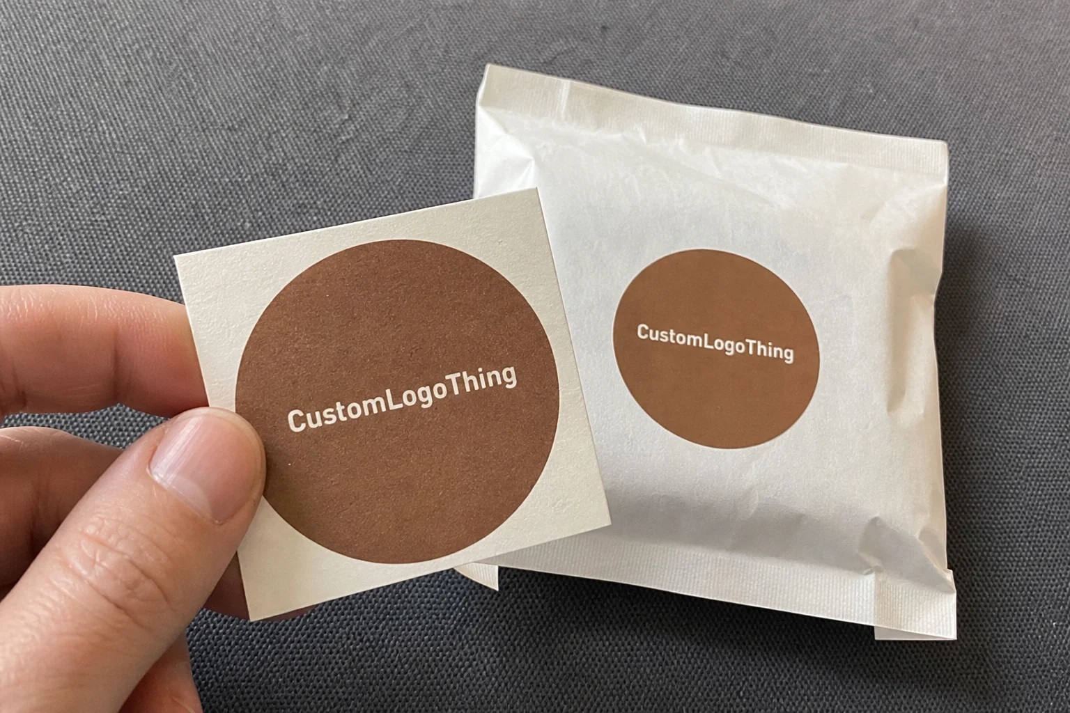
Fast answer: Design Packaging for Food Products: Retail Fit, Compliance Space, Print, and Cost should be specified like a repeatable production item. The safest quote records material, print method, finish, artwork proof, packing count, and reorder notes in one written spec.
Production checks before approval
Compare the actual filled-product size with the drawing, then confirm tolerance on folds, seals, hang holes, label areas, and retail display edges. Reserve space for logos, QR codes, warning copy, and material claims before decorative graphics fill the panel.
Quote comparison points
Review material grade, print process, finish, sampling route, tooling charges, carton quantity, and freight assumptions side by side. A quote is only useful when the supplier can repeat the same color, closure quality, and packing count on the next order.
How to Design Packaging for Food products is one of those subjects that seems straightforward right up until a real filling line gets involved and politely proves otherwise. I’ve spent enough time on factory floors in Guangdong, Illinois, and Ohio to know the difference between a package that looks lovely in a render and one that actually survives a seal jaw running too hot, a pouch that refuses to stand upright in case packing, or allergen copy that gets squeezed out by an overconfident flavor burst. I still remember a late-night press check at a converter outside Chicago where a carton looked perfect on the sample table, then turned into a tiny, expensive drama on the line because the glue flap was off by 1.5 millimeters, which in packaging can somehow become a whole personality. In my experience, the best packaging design is never just about appearance; it has to protect the food, tell the truth, and keep production moving without creating a headache for the operator at 6:30 a.m.
If you are learning how to design Packaging for Food products, you have to think like a brand manager, a compliance checker, and a plant supervisor all at once. That sounds like a lot, and it is, yet the work becomes manageable once you break it into the same sequence used in real packaging projects: define the product, choose the structure, match the materials, build the artwork, test the sample, and approve the final files only after the line has had its say. A typical project might move from brief to first proof in 3 to 5 business days, then from proof approval to sampled cartons or pouches in 12 to 15 business days, depending on whether the job is running in Shenzhen, Dongguan, or a domestic plant in Texas. People fall in love with the mockup and forget that the mockup does not have to survive a pallet wrap machine, a cold dock in January, or a rushed Tuesday shift. That is how branded packaging becomes real product packaging instead of a polished file sitting on a designer’s desktop.
How to Design Packaging for Food Products: Why It Matters
Here’s the factory-floor truth that tends to surprise first-time buyers: many food packages do not fail because they look bad, they fail because they confuse shoppers, slow production, or miss the practical details that matter once they hit the line. I once visited a bakery co-packer in Columbus, Ohio where a new carton looked polished in the marketing room, then the top flap collided with the auto-loader by 3 millimeters. Three millimeters. That tiny gap turned into a line-stop parade, and one operator ended up stopping the line every 20 minutes to clear jams. Nobody enjoys that kind of day. It’s the packaging equivalent of a chair with one short leg: you can admire it, but you still can’t sit down.
How to design Packaging for Food products starts at the intersection of shelf appeal, food safety, and manufacturing practicality. A package has to survive shipping, seal correctly, and still communicate flavor, ingredients, and trust in a crowded aisle. I’ve seen dry pasta in a matte laminated folding carton lose market traction because the front panel looked premium but the product name was too small at a 6-foot retail viewing distance in a Midwestern grocery chain. The package was technically fine, yet the shopper’s eye moved on in half a second. That’s the brutal little secret nobody wants to say out loud: if shoppers cannot read it quickly, they may as well not be holding it.
Good food packaging also has to deal with real product behavior. Moisture, grease, odor, oxygen, and temperature swings all change the job. A snack mix needs a different barrier than a frozen bread item, and a granola bar wrapped for club stores needs more puncture resistance than a small bakery cookie pouch sold locally. I’ve seen a coffee brand in Portland, Oregon learn this the hard way when aroma loss turned a premium product into something that smelled, frankly, a little tired before it ever reached the shelf. That is why how to design packaging for food products is really a business decision dressed up as a design project.
When teams treat package branding like a last-mile decoration exercise, they usually pay for it later in rework or scrap. The smarter path is to build packaging design around the actual product, the actual machine, and the actual customer. That means asking practical questions early: Will this sit on a shelf or hang on a peg? Is it going through a vertical form-fill-seal machine, hand packing, or cartoning? Does it need a barrier liner, tamper evidence, or freezer-grade adhesive? Those answers shape everything, and they shape it fast, especially on lines running 80 to 220 units per minute.
“The package is not just the wrapper; it is the product’s first salesperson, its shipping container, and its compliance document all in one.”
How Packaging Design for Food Products Works
When clients ask me how to design packaging for food products, I usually walk them through the same workflow used in production plants from Shenzhen to Chicago and from Guadalajara to Manchester: define the product, choose the format, draft the dieline, select the material, place the artwork, proof it, sample it, and then test it on the actual equipment. Skipping one of those steps may save a few days, but it often creates a problem that costs weeks later. I learned that lesson years ago while helping a spice brand move into custom printed boxes for a retail launch in New Jersey; the box looked elegant, yet the spice shaker neck finish made the insert sit crooked, and the inner tray had to be reworked after the first 500 samples. That project still lives in my memory like a cautionary tale with very crisp typography.
Different packaging formats behave very differently in manufacturing. A stand-up pouch gives you strong shelf presence and good material efficiency, but it needs precise seal geometry and enough headspace for filling. Folding cartons deliver premium shelf presence and remain common in retail packaging, yet they demand accurate folding, gluing, and panel registration. Corrugated shippers protect goods in transit, though they can be overbuilt if you do not optimize case count and pallet patterns. Labels, sleeves, wraps, and flexible films each bring their own constraints, especially on high-speed lines running 60 to 400 units per minute. That speed sounds impressive until a misaligned label starts acting like it has somewhere else to be.
How to design packaging for food products also depends on the actual factory process. If the product is hot-filled, the film and adhesive need to tolerate 80°C to 95°C. If it is heat-sealed, the sealant layer must match dwell time and jaw temperature. If the package is glued, you need the right coating and fiber direction. If it is cartoned, panel scores and board caliper matter. I’ve watched a line in a biscuit plant in Puebla, Mexico where a slightly oversized carton blank caused a cascading feed issue, and the operator had to slow the line from 180 cartons per minute to 140 just to keep the packs square. You could feel the frustration in the room before anyone said a word.
Material selection changes performance more than most first-time buyers expect. Barrier films protect snacks from oxygen and moisture, coated paperboard works well for dry goods, and grease-resistant liners are essential for bakery items, fried foods, and some frozen applications. If the product gives off aroma, the package must help contain it. If it needs freezer storage, the substrate and adhesive must stay stable through temperature cycling. In many carton jobs, a 350gsm C1S artboard with a water-based aqueous coating is enough for dry shelf-stable foods, while heavier packs may use 400gsm SBS or a 24pt solid bleached sulfate board. This is where product packaging turns technical rather than decorative, and frankly, that’s a good thing. Decorative packaging that fails is just expensive confetti.
Common formats and where they fit best
- Stand-up pouches: Best for snacks, powders, and dry mixes where shelf visibility and light weight matter.
- Folding cartons: Strong for cereals, tea, frozen foods, and premium retail packaging that needs more surface area for branding.
- Corrugated cases: Essential for shipping, club-store multipacks, and ecommerce-ready protection, often in 32 ECT or 44 ECT board.
- Labels and sleeves: Useful for jars, tubs, bottles, and containers with odd geometry.
- Flexible wraps: Common for confectionery, bakery, and single-serve items where speed and cost control matter.
Prototyping is where real packaging teams separate themselves from guessing teams. A 2D PDF tells you almost nothing about how a package feels in the hand, how the ink sits on the substrate, or whether a gusset lets the pouch stand straight under warehouse lighting. That is why sample reviews matter. I have seen more than one project saved because the prototype exposed a barcode placement issue that would have failed scanning at a chain retailer’s receiving dock in Atlanta or Toronto. And yes, I have also seen a beautiful mockup that folded like a disappointed accordion. Design is humbling that way.
For teams ordering branded packaging or exploring Custom Packaging Products, the sample stage is also where you check whether the package opens cleanly, closes as intended, and presents the right face on shelf. A package can be technically compliant and still underperform if the shopper cannot quickly understand the flavor, pack size, or benefit. I’d argue that this is where a lot of good ideas quietly win or lose without anyone throwing a dramatic meeting about it. On smaller test runs of 1,000 to 2,500 units, even a modest die adjustment can save a full production rerun later.
Key Factors in How to Design Packaging for Food Products
There are six factors I always come back to in how to design packaging for food products: compliance, shelf appeal, protection, sustainability, channel fit, and cost. Leave one out, and the whole project starts leaning. The best package is not the fanciest one; it is the one that protects the food, passes the regulatory review, and still earns its keep on the shelf. A matte-soft-touch finish on a $0.12 margin biscuit pack may look refined in the studio, but it can make very little sense once the volume hits 50,000 units. The fancy one often creates the most trouble.
Food safety and compliance come first. You need enough space for ingredients, allergens, nutrition panels, net weight, storage instructions, and any required handling statements. If the product is frozen, refrigerated, or shelf stable, the labeling must match reality. I have sat in client meetings where the marketing team wanted a cleaner front panel, but the legal team needed more room for allergen disclosure and recycling marks. The right answer was not “make it smaller”; it was to redesign the hierarchy. The design had to be smarter, not louder, especially on labels printed in facilities certified to BRCGS or SQF standards.
Shelf appeal is where branding does its job. Logo placement, flavor cues, typography, and contrast all matter at retail distance. On a 5-foot grocery shelf, a shopper has only a moment to understand the difference between roasted garlic, sea salt, and spicy chili. That is why package branding should support fast recognition rather than hide the product story behind decoration. Color psychology matters, but readability matters more. A dark navy pouch with low-contrast silver copy may look premium on screen and disappear under store lighting. The render doesn’t get to buy the product; the shopper does.
How to design packaging for food products also means protecting the product from the environment. Moisture barriers, oxygen resistance, light protection, and tamper evidence all help preserve freshness and trust. For nuts, chips, jerky, coffee, and some baked goods, barrier performance can determine shelf life more than the recipe itself. A simple paperboard sleeve might work for a dry shelf-stable item, but if the product is greasy or highly aromatic, you often need coated stock, film lamination, or a liner structure. I’ve watched a bakery project in Ontario, Canada fail a humidity test at 72% relative humidity because the uncoated board absorbed enough moisture to curl at the corners by 4 millimeters. That is why the structure has to be chosen with real storage conditions in mind.
Sustainability is not just a marketing phrase; in packaging plants, it usually means right-sizing the pack, reducing unnecessary layers, and selecting structures that fit the recycling stream where possible. The EPA’s packaging and waste guidance is a useful reference point for teams evaluating material impact and disposal behavior, especially when comparing paper, plastic, and hybrid structures. You can review federal guidance at EPA recycling resources. FSC certification also matters if your project uses paperboard and you want chain-of-custody confidence from source to finished carton; you can learn more at FSC. For paperboard sourced from mills in North Carolina or British Columbia, that paperwork can make procurement conversations much easier.
Channel fit changes the design brief more than many people expect. Retail packaging needs fast shelf communication. Ecommerce packaging needs crush resistance, corner protection, and shipping efficiency. Club store packs often need larger panels and stronger stacking. Food service packaging may care more about speed, portion control, and grease performance. If you are selling across multiple channels, the best answer is often a family of formats rather than one universal box. I know that sounds like extra work, but one “universal” package usually ends up being universally awkward, especially once it has to fit both a 6-pack club tray and a single-unit retail shelf.
Cost sits underneath all of it. Material type, print method, order quantity, finishing, and structure complexity all affect price. I always tell clients that a clean front panel, a reliable seal, and a sensible footprint are worth more than three extra embellishments nobody can see from 8 feet away. If you want to know where to spend, spend on clarity, barrier, and fit. Save on hidden decoration that does not improve conversion. My unpopular opinion? Foil everywhere is rarely the answer, and neither is embossing a logo so deeply that the carton has to be re-engineered around it.
| Option | Typical Strength | Typical Tradeoff | Common Use |
|---|---|---|---|
| Matte laminated folding carton | Premium shelf presence, strong print clarity | Higher finishing cost, more setup time | Tea, cereals, specialty snacks |
| Stand-up pouch with barrier film | Lightweight, good moisture protection | May need testing for seal strength | Granola, coffee, powdered mixes |
| Corrugated shipper | Strong transit protection, pallet stability | Less consumer-facing branding space | Ecommerce, club packs, bulk food |
| Paperboard sleeve with liner | Good branding, moderate cost | Limited barrier unless engineered carefully | Bakery, frozen, dry shelf goods |
How to Design Packaging for Food Products Step by Step
If you want a practical path for how to design packaging for food products, use the same sequence experienced plants use, because it reduces surprises. The temptation is to start with artwork, yet the smarter approach is to start with product facts. I have seen more budgets blown by early design decisions than by print costs themselves, especially when the team locks into a format that cannot handle the actual fill weight, closure type, or shelf-life target. That kind of mistake has a long tail, and it loves to show up right before launch.
-
Define the product requirements.
Document shelf life, serving size, storage condition, target shopper, distribution channel, and whether the product is dry, oily, frozen, chilled, or fragile. If you know the food’s behavior, you can design packaging around it instead of guessing. A dry soup mix in a Midwestern warehouse behaves very differently from a chilled dessert pack moving through Phoenix in July.
-
Choose the packaging format.
Select the structure that fits the line equipment and display needs. A pouch, carton, sleeve, wrapper, or label can all work, but the best choice depends on fill speed, sealing method, and how the product should appear at retail. For a high-speed VFFS line in Illinois, a pouch might be the fastest path, while a shelf-ready carton in Atlanta may better suit a premium gift set.
-
Select the right materials and finishes.
Do not pick substrate based on looks alone. Ask what barrier the food needs, what print quality you want, and what your budget can support. In one supplier meeting I attended, a brand wanted soft-touch lamination on every carton, but the actual product was a low-margin dry mix; we switched to a well-printed 350gsm C1S artboard with spot varnish and saved nearly $0.11 per unit at 10,000 pieces. Nobody complained once they saw the margin math.
-
Create the artwork hierarchy.
Place the brand name, product name, flavor, and key claims in order of visibility. Make sure there is room for ingredients, allergens, barcode, lot code, and recycling marks. The package should tell the shopper what it is in less than two seconds, ideally from 1.2 to 1.8 meters away on a shelf.
-
Produce mockups and samples.
Test the package in hand, on shelf, and on the line. Check whether the pouch stands correctly, whether the carton folds cleanly, and whether the label centers properly at machine speed. Mockups reveal things a screen file never will, and a physical prototype from a converter in Shenzhen or Ho Chi Minh City can save thousands in rework.
-
Approve final production files.
Confirm registration, bleed, folds, glue areas, barcode contrast, and machine tolerances before release. If the package is for food products, add a final compliance review so the regulatory copy and the visual hierarchy agree. A clean release package should include a PDF proof, dieline, color target, and production notes in one file set.
That sequence is simple on paper, yet the details matter. On a recent client project for a frozen snack line in Wisconsin, the initial pouch mockup looked perfect until we ran it under freezer condensation and discovered the ink finish dulled the flavor panel by nearly 20 percent. We changed the coating, tested again, and the final package held up. That is the sort of thing that only shows up when you test under real conditions. Packaging has a knack for revealing the truth late, which is incredibly rude, but there it is.
How to design packaging for food products is also about timing. A good workflow leaves room for revision. If the first proof comes back with a barcode issue, you should not be at the mercy of a shipping deadline that forces a bad decision. In a healthy process, you can move from concept to proof to prototype to final approval without rushing the last two steps, because that is where packaging failures usually hide. I’d rather spend an extra afternoon fixing the proof than spend a week explaining why the retailer’s scanner hates us.
If your team is sourcing packaging design support or comparing Custom Packaging Products, ask for dielines early. A reliable dieline lets the designer work around folds, seals, and glue areas instead of discovering them after the layout is already approved. On a carton run of 25,000 units, getting the dieline right at the start can save days of press downtime and a few boxes of stress-eating granola bars.
Cost and Pricing Factors in Food Packaging Design
One of the biggest questions in how to design packaging for food products is cost, and the honest answer is that price depends on more moving pieces than people expect. Material type, print complexity, structure size, finishing, quantity, and whether the package needs barrier or tamper-evident features all influence the final number. A simple structure with clean graphics can be efficient, while a heavily decorated package with foil, embossing, and specialty varnish can move the budget quickly. A short run of 5,000 cartons in a plant near Nashville might quote at $0.15 to $0.28 per unit depending on board grade and print coverage, while a 50,000-unit order can drop the unit cost sharply if the specs stay stable. Sometimes the design budget gets eaten alive by the shiny stuff before anyone has even argued about the barcode.
Here is the plain truth from years of floor-level quoting: one extra spot color can change press time, make-ready waste, and ink inventory. Embossing adds tooling and setup. Foil stamping adds both cost and risk if the art is too detailed. Specialty coatings can improve appearance, but they can also slow down production if drying or curing is not tuned to the line. In a carton plant I worked with in Monterrey, a brand wanted a metallic effect across the whole front panel, yet the additional finishing time would have pushed the lead time from 12 business days to 19. We ended up using a printed metallic ink in a smaller area and kept the launch on schedule.
Volume matters, too. Larger runs typically lower unit price because setup cost is spread over more pieces. Smaller runs can be the right fit for seasonal items, local products, or test launches, but they often carry a higher per-unit cost. Artwork changes also matter. If the package design changes every few months, your setup expense and waste can climb quickly. This is one reason many brands create a stable master layout and only swap flavor panels or color accents. It saves money and a few headaches, which are surprisingly valuable line items.
There are hidden costs that do not show up in the first quote. Compliance revisions, sampling, freight, warehouse storage, and reprints from file errors can add up quickly. I once saw a late-stage allergen edit trigger a full plate change on a carton order, and the extra cost was more than the original prototype budget. That is why approval discipline matters just as much as creative energy. If a team rushes the last proof, it can feel like saving time while quietly ordering future regret.
Where to spend and where to save
- Spend on: front-panel clarity, barrier performance, seal integrity, and barcode readability.
- Save on: decorative details that do not improve recognition or shelf conversion.
- Spend on: physical samples and line trials.
- Save on: overly complex structures if a simpler one performs equally well.
A useful rule from the plant floor: if a feature does not protect the product, improve the shopper’s decision, or help the line run better, question it twice. That mindset keeps food packaging design practical instead of ornamental. It also keeps procurement from chasing a low quote that turns expensive after the first production correction.
Common Mistakes to Avoid When Designing Food Packaging
People often ask me about the biggest errors in how to design packaging for food products, and the list is pretty consistent across categories. The first mistake is designing for the mockup instead of the production line. A package may look great in a render with perfect lighting and no folds, but if it cannot survive filling, sealing, carton loading, or pallet stacking, it is not a good package. It is just a nice-looking problem.
Another common error is overcrowding the layout. If the product name, flavor, claims, ingredients, and nutrition panel all compete for the same front face, the shopper gets tired before they even understand what they are buying. I once reviewed a granola pouch that had seven callouts on the front, including two organic claims, three benefit claims, a flavor banner, and a recipe suggestion. The brand owner loved it. The shelf test said otherwise: people could not find the actual flavor name fast enough. The package was doing a sales pitch, a lecture, and a yoga class all at once.
Material selection mistakes are just as costly. A package with weak barrier properties can shorten shelf life, create stale flavor, or let grease migrate through the surface. That is especially risky for oily snacks, crunchy items, aromatic blends, and moisture-sensitive bakery goods. If the substrate is wrong, the design can be gorgeous and still fail the core job. I’ve seen that happen more than once, and it never gets less annoying. A 28-day shelf-life target can collapse fast if the film lets oxygen creep above spec.
Logistics are another blind spot. Ecommerce shipping, palletization, and shelf stacking all put stress on the package. A retail carton that looks crisp in a display tray may crush when loaded into a master case with 24 units. A pouch that stands beautifully on shelf may tip if the gusset is too narrow. How to design packaging for food products means thinking through the route from filling line to distributor to store to customer’s kitchen table. The path is longer than people think, and it tends to be bumpier too.
The last major mistake is bringing printers and converters into the process too late. Once artwork is locked, changes become expensive and slow. The best projects involve production experts early, before the dieline is finalized and before the designer has spent hours arranging text in impossible spaces. Here is a simple truth from the factory side: the earlier you invite manufacturing into the conversation, the fewer surprises you pay for.
“A beautiful package that jams the line is not a beautiful package. It is a future overtime bill.”
Expert Tips and the Final Next Steps
If I had to reduce how to design packaging for food products to a few practical habits, I would start with this: begin with the product facts, not the artwork. Know the fill weight, shelf life, storage environment, and distribution channel before a designer places the first element. That simple discipline prevents a lot of expensive backtracking and saves everybody from the lovely chaos of redesigning a package after someone has already fallen in love with it. A good brief written on day one is often worth more than a week of creative revisions.
Second, compare two or three packaging structures before committing. I have seen teams fall in love with one premium option only to discover a simpler version delivers better shelf life, lower freight cost, and fewer line issues. A pouch, a carton, and a sleeve might all be viable, but the best answer is the one that fits your actual product and budget. I know that sounds unromantic, but packaging rarely pays the bills by being dramatic. A line running in Indianapolis or Monterrey will reward the format that feeds cleanly and stacks straight.
Third, insist on physical samples. Screen renders do not show texture, board stiffness, seal feel, or how light hits a matte surface versus a gloss surface. In a supplier review I attended for a snack brand, the screen mockup looked calm and upscale, but the actual sample under retail LEDs made the silver typography disappear. The team adjusted the contrast, and sales later told us the package read much better at shelf distance. That was a very good day, and honestly, everyone looked a little relieved when the sample finally behaved.
Fourth, keep a packaging approval checklist. Include artwork, dieline, copy, barcodes, closures, transport testing, and any required compliance review. For food products, that checklist should also cover ingredients, allergens, nutrition facts, net weight, storage statements, and lot coding space. If you want less stress at launch, check those items before release, not after the truck has left. I can tell you from experience that “we’ll fix it later” is not a strategy; it’s a dare.
One more practical point from the floor: if the design is headed into a humid market, a freezer chain, or a long distribution route, test it under the worst likely condition, not the best-looking one. A package that behaves nicely in a climate-controlled conference room can get weird in transit, and packaging has no shame about showing you the ugly version first. That is part of the job, honestly, and it’s better to find out before the launch truck is already rolling.
My practical next steps
- Gather product specs, shelf-life goals, and distribution details.
- Request a dieline from your packaging supplier or converter.
- Build one working prototype before approving final artwork.
- Review samples with production, compliance, and sales together.
- Test the package for fit, sealing, stacking, and shipping.
That sequence keeps how to design packaging for food products grounded in reality, which is where good packaging actually wins. It also makes branded packaging and package branding feel less like guesswork and more like a disciplined process tied to the product itself. If you are comparing formats or looking for Custom Packaging Products, the smartest move is to evaluate function first and decoration second. A launch that ships on time in 15 business days with a clean proof trail is usually worth more than a prettier concept that misses the production window.
Honestly, I think the best food packaging teams are the ones that respect both the shopper and the factory. They care about color, hierarchy, and visual appeal, but they also care about seal strength, case count, and line speed. That balance is what turns packaging design into a business asset instead of a production problem. If you remember one thing from this guide, remember this: how to design packaging for food products is really about making one package do five jobs well, and doing it without making life harder for the people who have to fill, ship, and sell it.
Frequently Asked Questions
How do you design packaging for food products that stay fresh longer?
Choose materials with the right barrier properties for moisture, oxygen, grease, or light, depending on the food. Make sure seals, closures, and liners match the product and the filling process. Then test the package in real storage and shipping conditions before approving production, because a package can look perfect and still fail under humidity, freezer cycling, or transit vibration. For example, a metallized OPP film with a low oxygen transmission rate can outperform plain paperboard by a wide margin on nuts and coffee.
What should I include when learning how to design packaging for food products?
Include the brand name, product name, flavor or variety, ingredients, allergens, nutrition information, net weight, and handling instructions. Leave room for the barcode, lot code, and any required recycling marks. The hierarchy should help shoppers identify the product quickly from a distance, especially in crowded retail packaging environments where speed matters. If the structure is a carton, plan around the fold panels and glue flap from the start.
How much does it cost to design food packaging?
Cost depends on material choice, print method, structure complexity, quantity, and finishing details. Prototype samples, compliance edits, and special features like foil or embossing can increase the total. Simple, efficient structures usually reduce unit cost without sacrificing performance, especially when the package is designed around the actual line and not just the visual concept. A basic folding carton might land around $0.08 to $0.22 per unit at 10,000 pieces, while specialty finishes can push it higher.
How long does the food packaging design process usually take?
The timeline depends on how quickly the team finalizes product specs, artwork, dielines, and compliance copy. Sampling and revisions often add time, especially if the package needs barrier testing or line trials. A smooth process moves from concept to proof to prototype to final approval before full production, and in many plants that can mean several rounds of review even on a straightforward item. In practical terms, many projects take 2 to 4 weeks from concept brief to signed-off production files.
What are the biggest mistakes in food packaging design?
Common mistakes include choosing the wrong material, overcrowding the layout, and ignoring production requirements. Another major issue is designing without considering shipping, shelf stacking, or ecommerce handling. Bringing manufacturing experts in early helps prevent expensive rework, especially on food packaging projects where the line speed, seal quality, and compliance text all have to work together. A 2-millimeter panel error can become a full pallet of problems if nobody catches it at proof stage.