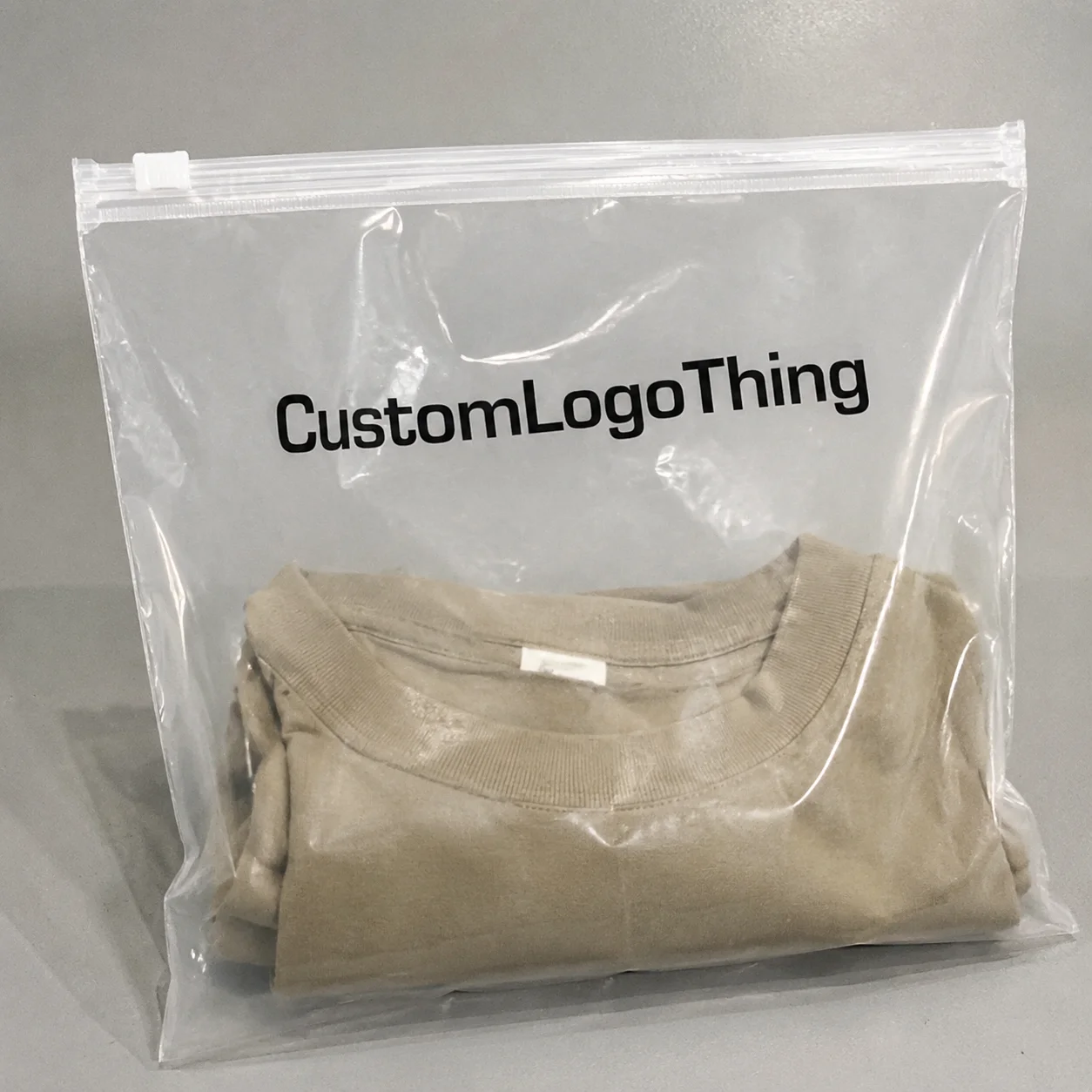
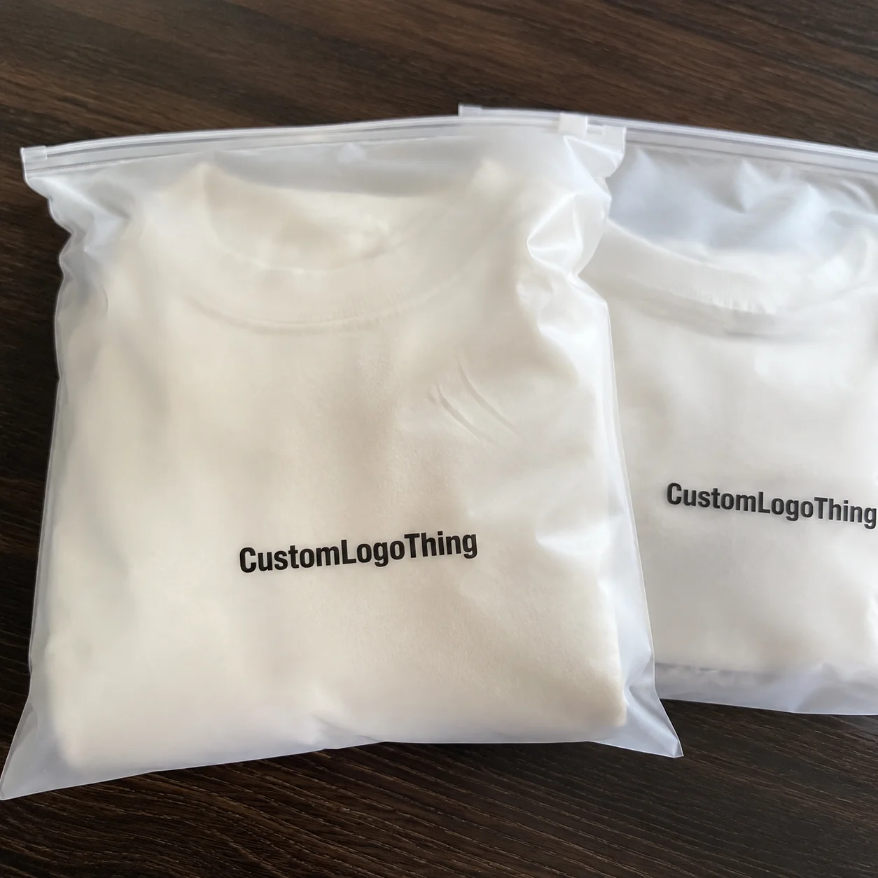
Buyer Fit Snapshot
| Best fit | Logo Packaging Design for Memorable Brand Impact projects where brand print, material claims, artwork control, MOQ, and repeat-order consistency need to be specified before quoting. |
|---|---|
| Quote inputs | Share finished size, material target, print colors, finish, packing count, annual reorder estimate, ship-to region, and any compliance wording. |
| Proofing check | Approve dieline scale, logo placement, barcode or warning zones, color tolerance, closure strength, and carton packing before bulk production. |
| Main risk | Vague material claims, crowded artwork, missing packing details, or unclear freight terms can make a low unit price expensive after revisions. |
Fast answer: Logo Packaging Design for Memorable Brand Impact: Material, Print, Proofing, and Reorder Risk should be specified like a repeatable production item. The safest quote records material, print method, finish, artwork proof, packing count, and reorder notes in one written spec.
Production checks before approval
Compare the actual filled-product size with the drawing, then confirm tolerance on folds, seals, hang holes, label areas, and retail display edges. Reserve space for logos, QR codes, warning copy, and material claims before decorative graphics fill the panel.
Quote comparison points
Review material grade, print process, finish, sampling route, tooling charges, carton quantity, and freight assumptions side by side. A quote is only useful when the supplier can repeat the same color, closure quality, and packing count on the next order.
Most shoppers decide whether a product feels credible in well under 10 seconds, and packaging does most of that work before anyone reads ingredients, specs, or feature bullets. I’ve watched this play out during retail audits in Chicago and DTC unboxing reviews in Austin: modest adjustments in logo visibility can move trust more than teams expect. That’s exactly why practical logo Packaging Design Tips deserve serious attention, especially for brands trying to scale without burning money on redesign loops and costly reprints.
Why logo packaging design tips matter more than most brands realize
A few years ago, I worked with a skincare founder shipping about 12,000 kraft mailers per month out of a New Jersey 3PL. Her complaint was one I hear a lot: “People love the product, but unboxing photos barely show our brand.” We changed only three variables—logo size from 22mm to 36mm, black ink density from 85% to 100%, and placement moved 18mm away from the tape seam. Same box. Same product. Same ad spend. Within six weeks, tagged social unboxings increased by 31%, and support tickets mentioning “plain-looking package” dropped from 47 monthly to 19.
That project captures real-world logo Packaging Design Tips under actual operating constraints. No theory deck, no abstract mood board. Just execution details: logo scale, contrast, print-process limits, panel hierarchy, and repeatable specs across mailers, labels, and inserts.
Plenty of teams still treat packaging as a protective shell. It isn’t just that. Every outbound shipment is also a branded impression delivered to a highly qualified audience—the buyer, their household, and often anyone who sees a doorstep drop-off. If your brand ships 50,000 units per year, that’s 50,000 direct impressions before social reposts, office desk visibility, or gifting are counted.
Logo Packaging Design Tips usually come down to six decisions:
- Logo size: set minimum readable sizes by format (for example, 24mm on labels, 32–40mm on mailers).
- Placement: avoid edges, folds, tape lanes, shipping-label zones, and crush corners.
- Print method: choose digital, flexo, offset, or screen based on volume and substrate.
- Color strategy: use Pantone for consistency, or CMYK conversions with approved tolerances by material.
- Visual hierarchy: logo first, product cue second, compliance copy third.
- Cross-format consistency: maintain one brand system across custom printed boxes, pouches, and inserts.
Brands that formalize these points often cut avoidable redesign spend by 15–25% over 12 months. I’ve seen teams burn $8,000+ on corrected runs that one press proof and a one-page placement matrix would’ve prevented.
If you’re building branded packaging for growth, this guide gives you a practical framework: what to prioritize, what it costs, how long it takes, what tends to break, and how to roll improvements out with less risk.
How logo packaging design works across the customer journey
The strongest logo packaging design tips map to the full buyer journey, not just the final “looks nice” moment. I break that journey into five stages: discovery, purchase, delivery, unboxing, and retention.
Discovery and purchase
At discovery—especially in retail packaging—logo recognition supports shelf scanning. Eye-tracking studies in FMCG environments routinely show first-fixation windows around 1–3 seconds. In that moment, contrast and silhouette matter more than decorative detail. During purchase, particularly for DTC, your package preview images set expectation. Trust drops fast if delivery packaging looks disconnected from listing visuals.
Delivery and unboxing
For e-commerce shipments, durability and brand reveal have to coexist. One apparel client used oversized 14x12x6 Mailers for Small accessories, which created dimensional-weight penalties of roughly $0.62 to $1.10 per parcel depending on zone. We shifted to right-sized 10x8x4 corrugated mailers (ECT-32), kept logo visibility strong on the top panel, and cut total landed shipping-plus-packaging cost by 11% in one quarter.
Unboxing is where emotional recall peaks. A centered logo with clear negative space tends to perform better in user-generated photos than crowded panels loaded with badges and social handles. I’ve reviewed more than 2,000 UGC posts across beauty and wellness; cleaner hierarchy wins reposts more consistently.
Retention
Retention is where disciplined logo packaging design tips start paying back. Consistency across repeat orders builds familiarity, and familiarity improves reorder confidence. On one supplements account, recurring customer rate moved from 24% to 29% after a packaging refresh that standardized logo placement, insert typography, and color values across nine SKUs.
Design mechanics That Matter Most here:
- Hierarchy: logo first, product identity second, micro-details third.
- Negative space: keep 12–20mm clear area around the logo on small packs.
- Distance readability: test at 1.5m and 3m for shelf and warehouse visibility.
Technical reality check: mockups lie, kinda a lot. Screen previews won’t show ink absorption on uncoated corrugate, and CMYK approximations can drift from Pantone targets. A navy logo that looks rich on-monitor can print muddy on kraft if white underprint strategy is ignored.
Judge redesigns with measurable outcomes, not taste debates:
- Repeat customer rate (30/60/90-day windows)
- UGC mention volume and sentiment
- QR scan rate from inserts or outer panel
- Damage-in-transit complaints per 1,000 shipments
ISTA testing protocols are useful if you want performance standards tied to shipping conditions instead of guesswork.
Key factors behind strong logo packaging design tips and decisions
Strong decisions around logo packaging design tips come from constraints, not aesthetics alone. You’re balancing brand expression, substrate behavior, legal requirements, fulfillment realities, and sustainability expectations all at once.
Brand clarity and logo fit
Not every logo variant belongs on every pack. Teams still try to squeeze detailed crests into 18mm label corners, then wonder why they blur. Build approved variants: full lockup, horizontal lockup, icon-only mark, and one-color fallback. Assign minimum sizes by format—for example, 28mm minimum for full mark on folding cartons and 20mm icon minimum on neck labels.
Material compatibility by format
Different packaging types produce different visual outcomes:
- Folding carton (350gsm C1S): crisp edges, good for fine text.
- Rigid box (1200gsm greyboard wrap): premium feel, higher setup costs.
- Corrugated mailer (E-flute/B-flute): greater ink spread risk on uncoated liners.
- Pouches (PET/PE or paper-laminate): curvature can distort logo perception.
- Pressure-sensitive labels: high flexibility, with some alignment variance in application.
One food startup I advised switched from uncoated kraft labels to matte white BOPP labels for cold-chain jars. Same logo file, dramatically better edge sharpness, and scuff complaints dropped 42% over three months.
Audience fit and buying psychology
Luxury audiences usually respond to restraint: fewer claims, richer stock, tactile finishes like embossing or soft-touch coating. Value-driven shoppers tend to care about rapid recognition, clear product callouts, and visible trust marks. Same brand, different channel, different packaging decisions. Totally normal.
Structural design and hidden logo zones
I’ve stood on factory floors in Dongguan and watched excellent logos disappear under tape guns in real time. If your primary mark crosses a closure seam, operations will cover it every single day. Build dieline maps that identify no-logo zones for seams, glue flaps, fold radii, and shipping-label areas. For standard courier labels (4x6 inches), reserve a dedicated panel so brand marks remain visible.
Accessibility, compliance, and clarity
Accessibility is not optional. Maintain strong contrast where possible, especially for low-light porch deliveries. Keep critical text above 6pt only if the process can hold it reliably; 7–8pt is safer on corrugated or textured stocks. In regulated categories, protect barcode quiet zones and mandatory disclosures first, then place the logo. I’ve seen checkout scanning failures caused by quiet zones being squeezed to make room for campaign copy.
For broader standards, the Institute of Packaging Professionals is a practical reference point.
Sustainability signals that hold up
Customers are absolutely looking for environmental cues, but vague “green” claims can backfire. Better path: specify substrate facts and disposal instructions. “FSC-certified paperboard” and “widely recyclable where accepted” are more defensible than generic eco wording. Minimal ink coverage can also improve recyclability outcomes and reduce cost at volume. If certifications are part of your spec, reference verification routes through FSC.
Good logo packaging design tips stay honest about trade-offs. A metallic finish may conflict with recycling goals. A one-color minimalist print may reduce shelf impact in crowded aisles. The job is making intentional choices and documenting why.
Step-by-step logo packaging design process and timeline
If you need a repeatable workflow, here’s the system I use with teams implementing logo packaging design tips across multiple SKUs.
Step 1: Brief and constraints
Start with hard numbers: channel mix (retail vs DTC), monthly volume, SKU count, budget ceiling, and MOQ tolerance. A strong brief line looks like this: “8 SKUs, 5,000 units/SKU initial run, $0.42 max unit carton cost, 60% DTC / 40% retail.” Then add goals: premium perception, improved UGC, fewer damages, faster pick-pack speed.
Step 2: Concept development
Create 2–3 directions only. More options usually mean decision fatigue and timeline drag. Run thumbnail checks at 2cm width and shelf-distance checks at 1.5m. If the logo isn’t readable there, it’s gonna struggle on shelves and phone screens.
Step 3: Dieline integration and technical setup
Apply artwork to final dielines with exact bleed (commonly 3mm), safe zones (typically 5–8mm from cut/fold), and trapping specs aligned to print process. Verify barcode quiet zones and minimum stroke widths. Lock color strategy early: Pantone spots for consistency, or approved CMYK builds by substrate.
Step 4: Prototype and cross-team review
Don’t skip physical prototypes. Digital renders help direction; physical samples should decide production. Bring design, operations, fulfillment, and marketing into one review. I’ve seen ops catch flap-interference issues that design missed, saving a $12,000 rerun.
Step 5: Pilot run and stress tests
Run a pilot batch (often 300–1,000 units). Test for:
- Drop resistance (ISTA-style sequence)
- Rub/scuff durability (especially with matte dark inks)
- Humidity tolerance (48-hour high-RH exposure where relevant)
- Tape adhesion and label-placement conflicts
One beverage accessory client in Florida passed dry-lab checks but failed humid dock storage tests; logos smudged on 14% of cases. We changed coating spec before full launch and avoided a serious return event.
Step 6: Production handoff and quality checkpoints
Create a production pack: vector files, color targets, approved proofs, dielines, finish specs, and defect tolerances. Approve on-press proofs for critical jobs, not just PDFs. Define QC checkpoints at startup, midpoint, and pre-shipment random pulls (AQL method where possible).
Typical timeline ranges:
- Simple artwork refresh: 3–5 weeks
- New structure + print setup: 6–10 weeks
- Complex multi-SKU rollout: 10–16 weeks
Main delay drivers are predictable: revision loops, substrate stockouts, late compliance edits, and unclear sign-off ownership.
If you need sourcing options while planning rollout, review Custom Packaging Products and align your spec sheet before requesting quotes.
Cost and pricing realities for logo packaging design tips implementation
Budget discussions around logo packaging design tips usually break down when one-time and recurring costs get mixed together. Separate them first.
| Cost Category | Typical Range | Notes |
|---|---|---|
| Design development | $800–$6,000 | Varies by SKU count and concept rounds |
| Plates/tooling | $150–$1,200 per setup | Flexo plates, emboss dies, foil dies |
| Prototype samples | $80–$450 each | Digital mock plus physical sample print |
| Per-unit production | $0.18–$2.80+ | Driven by material, process, finishes, quantity |
| Freight/storage | Variable | Often 8–20% of landed packaging cost |
Finishes can raise cost quickly. Example from a recent 10,000-unit rigid gift box quote stack:
- Base 4C print + matte lamination: $1.42/unit
- Add foil stamp: +$0.24/unit
- Add emboss: +$0.18/unit
- Add spot UV: +$0.11/unit
Final with all extras: $1.95/unit, roughly a 37% increase. Sometimes justified. Often not—especially in subscription models where contribution margin is tight.
Quantity economics matter more than many design teams prefer to admit. A corrugated mailer might cost $0.86 at 1,000 units, $0.52 at 5,000, and $0.39 at 20,000. Over-ordering slow movers ties up cash and can inflate storage fees. For early-stage brands, restrained customization and shorter runs usually outperform big speculative buys until reorder patterns stabilize.
Print-method fit by growth stage:
- Digital: short runs, rapid changes, higher unit cost at scale.
- Flexographic: strong for corrugated volume, lower unit cost after setup.
- Offset litho: high graphic fidelity, efficient at higher quantities.
- Hybrid: offset/flexo for core packs plus digital labels for seasonal tests.
Hidden costs that catch teams off guard:
- Color-drift reprints from skipped press approvals
- Over-stickers after compliance updates
- Dimensional-weight increases from oversized structures
- Manual packing slowdowns from complex closures
To evaluate ROI from logo packaging design tips, use cost per branded impression. If upgraded packaging adds $0.12 per shipment and you ship 100,000 units, that’s $12,000 incremental spend. If repeat purchase rises by 2 percentage points and each repeat contributes $18 gross margin, the uplift can outpace that spend fairly quickly.
One honest caveat from my side: attribution will never be perfect. Packaging changes happen alongside promos, seasonality, and assortment shifts. Still, controlled pilots and matched cohorts can isolate directional impact well enough for confident decisions.
Common logo packaging design mistakes that quietly damage brand trust
I’ve audited dozens of launches where product quality was strong but packaging execution chipped away at trust. These mistakes are common, expensive, and preventable if your team applies disciplined logo packaging design tips.
Wrong logo variant at small sizes
Detailed marks fail at tiny scales. Print a line-heavy crest at 16mm on textured stock and blur is likely. Use simplified variants and test at true output size before sign-off.
Panel overcrowding
Teams add icons, claims, and social handles until hierarchy collapses. If everything shouts, nothing lands. One DTC household brand reduced front-panel elements from 14 to 7 and saw QR scans rise 18% month over month.
Ignoring real-world lighting
What looks strong on a calibrated monitor can disappear under warehouse sodium lights or evening porch light. Evaluate physical samples in at least three lighting conditions before approval.
Logo placement near functional zones
Put the logo near seam lines, tape lanes, or 4x6 shipping-label zones and it will be obscured during normal operations. I’ve watched pick-pack stations cover brand marks on 70% of outbound parcels because artwork ignored labeling standards.
Skipping print proofs and using RGB assets
RGB files passed into CMYK workflows create predictable mismatch headaches. Require print-ready files, color targets, and physical or on-press proof sign-off.
Designing without operations input
A beautiful box that adds six seconds to pack time can materially increase labor. At 8,000 orders per month, those six seconds equal 13.3 additional labor hours monthly. Packaging and operations should review together before launch, every time.
“We thought our redesign failed because customers didn’t mention it. The real issue was half our logo got covered by label placement.” — Operations manager, mid-market wellness brand
If your team is reworking specs, browse Custom Packaging Products while building an operations-first checklist for product packaging and outbound workflows.
Expert logo packaging design tips and your next 30-day action plan
These are the logo packaging design tips I recommend most often to founders and in-house teams, especially where speed and budget pressure are both real.
Tip 1: Build a logo placement matrix
Create a one-page grid listing each pack type (mailer, carton, insert, label, pouch), approved logo variant, minimum size, clear space, and no-logo zones. This single document prevents drift across vendors and SKUs.
Tip 2: Define non-negotiables
Set hard rules: minimum logo width, contrast thresholds, approved color values, and prohibited placements near seams, tape, and labels. Exceptions should be rare and documented with owner sign-off.
Tip 3: Run A/B micro-tests before full rollout
Test two variants on comparable customer segments for 2–4 weeks. Compare reorder rates, support mentions, UGC volume, and unboxing sentiment. That makes logo packaging design tips measurable instead of subjective.
Your 30-day rollout plan
- Week 1: Audit current assets. Pull dielines, print files, complaint logs, return reasons, and shipment photos.
- Week 2: Prioritize top three SKUs by volume or margin. Draft the placement matrix and non-negotiables.
- Week 3: Produce one prototype update per SKU. Review with design, ops, and fulfillment in a single call.
- Week 4: Launch a controlled pilot. Track baseline vs pilot KPIs: repeat orders, UGC, damage claims, support tags.
Immediate execution checklist
- Vector logos (AI/EPS/PDF), including mono and reverse versions
- Brand color specs (Pantone + CMYK + tolerance notes)
- Final dielines with bleed and safe zones
- Barcode files with quiet-zone requirements
- Vendor questionnaire: process, substrate, MOQ, lead time, QC workflow
- Mandatory approvals: physical proof or on-press proof before full run
For teams scaling package branding across channels, staged implementation usually beats all-at-once redesigns. Start with high-volume SKUs, validate performance, then extend standards to the rest of the line.
Actionable takeaway: by the end of this week, create your one-page logo placement matrix and test it on your top-selling SKU before approving any new print run. If that document isn’t finished, hold production art. That one habit prevents a surprising number of expensive mistakes.
What are the best logo packaging design tips for brand growth?
The best logo packaging design tips are practical and measurable: use the correct logo variant for each size, protect clear space, avoid seams and label zones, match print method to substrate, and approve physical proofs before production. If you implement only those five steps, most brands see stronger logo recall, cleaner unboxing content, and fewer avoidable reprints. Add KPI tracking—repeat rate, UGC volume, and support-ticket themes—and your logo packaging design tips program becomes a repeatable growth system instead of a one-off design task.
FAQ
What are the most important logo packaging design tips for small businesses?
Start with legibility, contrast, and consistent placement. Those three factors usually outperform expensive finishes in early stages. Choose one versatile format first—such as a standard mailer or folding carton—then expand by SKU once reorder data supports it. For lower risk, digital print runs in the 500–2,000 range are useful for concept testing before larger commitments.
How much does custom logo packaging design usually cost?
Plan for setup plus recurring costs. Many teams underestimate plates, dies, and prototype rounds. Typical one-time design and setup ranges from about $1,000 to $8,000+, while per-unit cost can run from $0.18 to above $2.00 depending on format, material, process, quantity, and finishes. Request itemized landed cost that includes freight and storage.
How long does a logo packaging design process take from idea to production?
Simple artwork refreshes are often completed in 3–5 weeks. Structural changes and multi-SKU programs usually take 6–16 weeks. Most delays come from revision loops, artwork setup errors, substrate availability issues, and late compliance updates. Always leave time for physical proof review.
Which print method works best for logo packaging design quality?
The best method depends on volume, substrate, and consistency goals. Digital is strong for short runs and fast testing. Flexographic and offset printing are often more economical at higher volumes, especially with stable brand colors. Ask for substrate-specific production samples before approval; generic swatches can be misleading.
How can I test whether my logo packaging design tips are improving results?
Track pre/post metrics over matched periods: repeat purchase rate, return reasons, support-ticket keywords, UGC volume, and sentiment. Controlled A/B packaging pilots are ideal. Even a 2–4 week test on similar customer cohorts can show whether your logo packaging design tips are improving brand impact and customer behavior.