Buyer Fit Snapshot
| Best fit | Logo Packaging Premium Quality projects where brand print, material claims, artwork control, MOQ, and repeat-order consistency need to be specified before quoting. |
|---|---|
| Quote inputs | Share finished size, material target, print colors, finish, packing count, annual reorder estimate, ship-to region, and any compliance wording. |
| Proofing check | Approve dieline scale, logo placement, barcode or warning zones, color tolerance, closure strength, and carton packing before bulk production. |
| Main risk | Vague material claims, crowded artwork, missing packing details, or unclear freight terms can make a low unit price expensive after revisions. |
Fast answer: Logo Packaging Premium Quality: Material, Print, Proofing, and Reorder Risk should be specified like a repeatable production item. The safest quote records material, print method, finish, artwork proof, packing count, and reorder notes in one written spec.
Production checks before approval
Compare the actual filled-product size with the drawing, then confirm tolerance on folds, seals, hang holes, label areas, and retail display edges. Reserve space for logos, QR codes, warning copy, and material claims before decorative graphics fill the panel.
Quote comparison points
Review material grade, print process, finish, sampling route, tooling charges, carton quantity, and freight assumptions side by side. A quote is only useful when the supplier can repeat the same color, closure quality, and packing count on the next order.
Logo Packaging Premium quality sounds simple until you open the box. I’ve seen $3.20 rigid boxes that felt cheap because the foil cracked at the fold, and I’ve seen $0.42 folding cartons that looked expensive because the paper, print, and structure were done right. That’s the real lesson: logo packaging premium quality is not about throwing money at shiny stuff. It’s about making sure the packaging matches the brand, the product, and the customer’s expectations the second they touch it. I still remember one launch where the client kept saying, “It just needs to feel premium.” Then we opened the sample and everybody went quiet. Not the good kind of quiet.
In my years visiting factories in Shenzhen, Dongguan, and Ningbo, and sitting through too many supplier negotiations over coffee that tasted like regret, I learned one thing fast: premium is measurable. It shows up in print sharpness, material feel, corner alignment, color accuracy, finish consistency, and whether the box survives ISTA-style handling instead of collapsing like a bad sales pitch. If you want logo packaging premium quality, you need more than a pretty mockup. You need specs, process control, and a little common sense. Honestly, I think common sense is rarer in packaging meetings than foil that doesn’t crack.
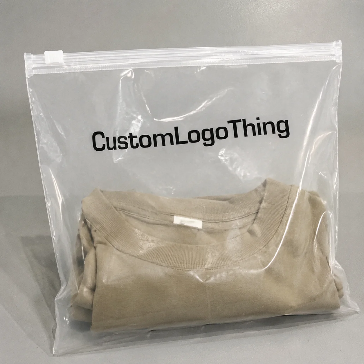
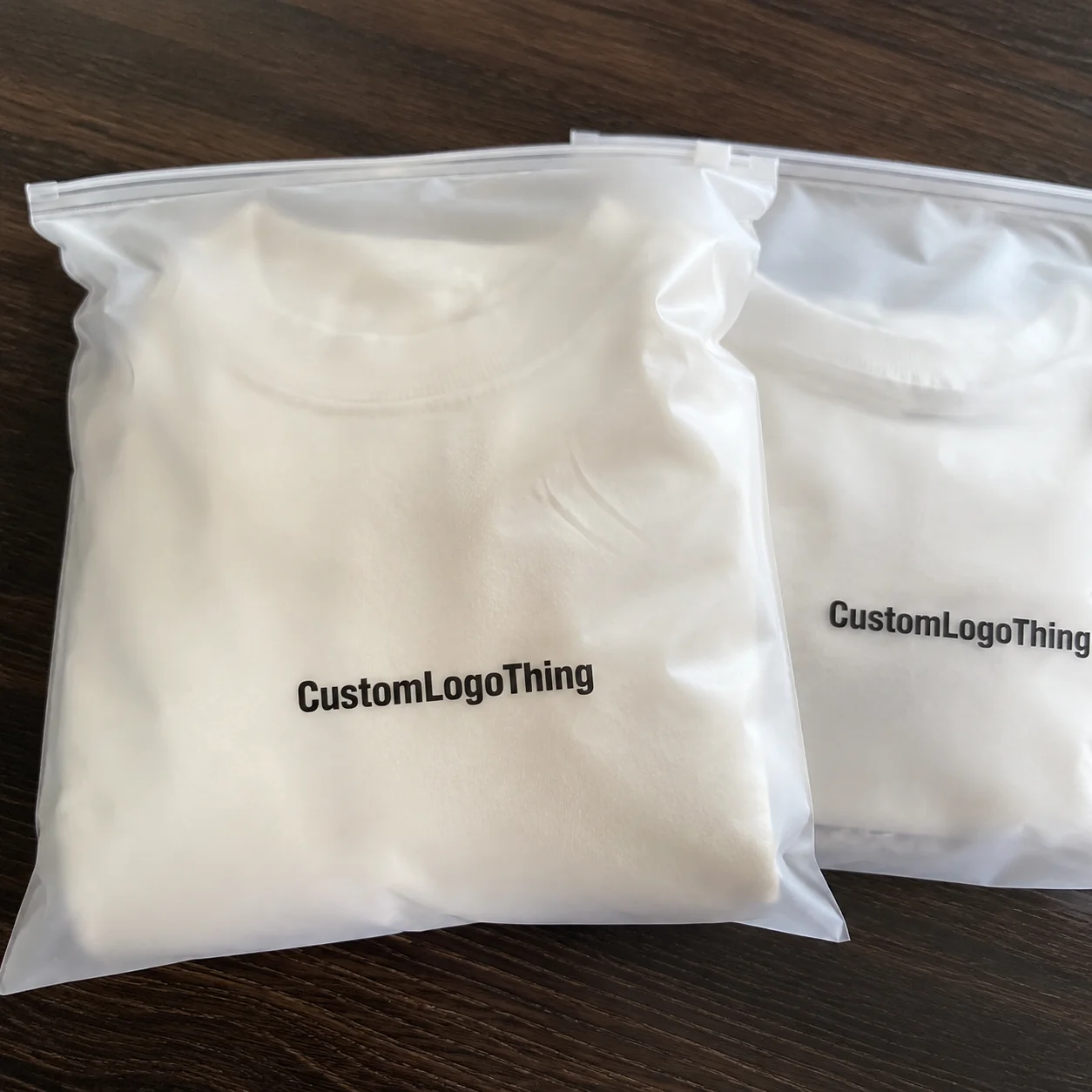
For brands building branded packaging, product packaging, or Custom Printed Boxes, the difference between “looks nice on screen” and “feels premium in hand” can decide whether a customer keeps the box, shares the unboxing, or tosses it in ten seconds. That gap is where most projects go wrong. And honestly, it’s avoidable. I’ve watched teams spend weeks obsessing over a gradient only to miss the fact that the logo was drifting off-center by 1.5 mm. A very expensive hair.
What Logo Packaging Premium Quality Really Means
Logo packaging premium quality means the packaging performs like it was designed by people who understand both brand psychology and production reality. It doesn’t just look expensive. It feels intentional. The logo is crisp at close range, the paper or board has the right stiffness, the finish is even across the run, and the structure supports the product without sagging, warping, or rubbing off ink in transit. If any one of those pieces fails, the whole thing drops a level. I’m blunt about this because I’ve seen too many brands confuse “luxury-looking” with “actually premium.” They’re related. They are not twins.
I remember standing at a press line in Dongguan and watching a client’s luxury skincare carton come off the machine. On the render, it looked stunning. In hand, it was a mess. The soft-touch lamination was fine, but the logo had been built too close to a fold line, so the foil broke after die-cutting. That carton screamed “premium” online and “please send a replacement” in person. That’s why logo packaging premium quality has to be judged from the factory floor, not just a mood board. The mood board never has to ship anything, which is its biggest advantage and its worst trait.
Here’s the clean distinction: high-end aesthetics are about the visual language; true production quality is about repeatability. A package can look luxury and still fail because the color drifts by 8 Delta E across the batch, the emboss depth is inconsistent, or the lid doesn’t close square. Real logo packaging premium quality means the first sample and the 10,000th piece still look like they belong to the same brand. That consistency is what customers feel, even if they couldn’t explain it over lunch.
Premium also has to fit the market. A matte black rigid box with gold foil may work for fragrance, but the same look can feel wrong for a clean-tech accessory brand that wants technical precision and sustainability cues. I’ve seen brands blow $6,000 on “luxury” details that contradicted their audience. Fancy is not the same as right. Logo packaging premium quality works when the design, materials, and finish support the actual brand position. Otherwise, you get a very expensive identity crisis in cardboard form.
For trustworthy sourcing and performance standards, I often point brands to industry references like the Packaging Machinery Manufacturers Institute for broader packaging context and to testing bodies such as ISTA for transit-related expectations. Not every package needs full certification, but the standards help you think like a professional instead of a hopeful buyer. If a supplier can explain drop testing, compression testing, or vibration testing in plain language, that is a better sign than a glossy brochure from a trade show in Shanghai.
How Logo Packaging Premium Quality Is Created
Logo packaging premium quality starts long before ink hits paper. It starts with structure. A good manufacturer turns a brand idea into a workable dieline, then checks the artwork against the fold lines, glue areas, and bleed margins. If the layout is wrong at this stage, everything downstream becomes expensive very quickly. I’ve watched a team lose two weeks because the logo sat 2.5 mm too close to a score line. That tiny mistake became a pile of reproofs, rushed calls, and a production slot nobody wanted to pay for. If you’ve never seen grown adults argue over 2.5 mm, consider yourself lucky.
The production flow is usually straightforward, even if the people running it are not. First comes the brief. Then the die line. Then artwork setup, where the files are prepared for print with proper resolution, color mode, and overprint settings. After that, the factory produces a sample or proof. Once approved, the order moves into printing, finishing, cutting, glueing, and final packing. Each step affects logo packaging premium quality. Each one. In a factory outside Guangzhou, I once watched a 350gsm C1S artboard job fail because the artwork had not been adjusted for the glue flap, and the logo landed half a centimeter off the panel edge. One small miss, one very visible problem.
- Brief and specs: size, material, closure style, logo location, and finish goals.
- Dieline creation: structural layout with fold, glue, and trim allowances.
- Artwork setup: print-ready files built at 300 dpi, usually in CMYK, with spot colors defined if needed.
- Sampling: white sample, digital proof, or full production sample depending on complexity.
- Printing: offset, digital, flexographic, or screen depending on volume and finish requirements.
- Finishing: foil stamping, embossing, debossing, UV, lamination, or edge paint.
- Die-cutting and assembly: cutting, gluing, folding, and box forming.
- Quality check: visual inspection, alignment checks, and random pull testing.
- Packing and shipping: carton packing, palletizing, and freight preparation.
Logo placement matters more than most people think. A centered logo with clean white space can look richer than a full box covered in effects. Ink density matters too. Too light and the logo looks washed out. Too heavy and small details fill in. One cosmetics client asked me why their gold logo looked “dull.” The answer was ugly but simple: they had chosen a foil color that matched their screen render, not one that worked against their paper stock and matte coating. The printed result was technically correct and visually wrong. That kind of mistake is maddening because it’s so easy to prevent once you know to ask the right questions.
Finishing is where logo packaging premium quality often gets made or broken. Foil stamping can sharpen a brand mark instantly, but it needs pressure control and a properly chosen paper surface. Embossing adds tactile value, but if the die is too aggressive, it can distort nearby artwork. Spot UV works beautifully on dark boards, yet it can look greasy if overused. Lamination changes feel, reflection, and durability, so a soft-touch film on a rigid box can increase perceived value without screaming for attention. That’s usually a better move than piling on three finishes at once and hoping for magic. Hope is not a finishing method, no matter how many presentations pretend otherwise.
One thing people misunderstand: approval of a sample is not a guarantee for the full run. It’s just one controlled piece. On a factory line, humidity changes, operator adjustments, and machine wear all affect output. A proper supplier controls these with process checks, not hope. That’s why I like to ask for run-at-start pull samples and mid-production photos. It’s not paranoia. It’s how logo packaging premium quality survives scale. If you are working with a plant in Suzhou in July, when humidity can sit above 75%, you want those checks even more.
Key Factors That Affect Logo Packaging Premium Quality
If you want logo packaging premium quality, the material choice is the first decision that will either save you or haunt you later. Rigid board gives structure and weight, which is why luxury gift boxes and high-end retail packaging often use it. SBS paperboard is lighter and cleaner for folding cartons. Corrugated board is better for shipping protection, though you can still make it look premium with the right print and insert system. Kraft gives an honest, natural look, but it can clash with ultra-refined luxury positioning if you don’t build the rest of the design carefully. Specialty papers can raise perceived value fast, but yes, they cost more. That’s not shocking. Paper companies also enjoy paying their own bills.
For a concrete example, many cosmetic cartons use 300gsm to 350gsm SBS or C1S board with a matte aqueous coating, while a rigid presentation box may use 1.5 mm to 2.0 mm greyboard wrapped in art paper. That difference is not cosmetic; it changes how the box holds shape, how the lid sits, and how the logo reads in hand. I’ve seen a premium tea brand in Hong Kong move from 250gsm card to 350gsm C1S artboard and immediately gain better fold definition and cleaner edge compression. Same artwork. Better substrate. Better result.
Print method is the next big lever. Offset printing is the workhorse for sharp detail, color consistency, and premium results at scale. Digital printing is excellent for shorter runs, fast proofs, and variable data. Flexographic printing works well for certain cartons and labels, especially in larger runs where speed matters. Screen printing can create thicker ink deposits and striking effects, but it’s not the right answer for every logo. I’ve had clients ask for a “luxury” effect on a surface that only supported basic digital output. My answer was simple: the machine does not care about your Pinterest board. It barely cares about your deadline.
Finishing details are the loudest part of the conversation, but they’re only powerful when the base is right. Soft-touch coating gives a velvet-like feel. Matte finish reduces glare and usually feels cleaner than high gloss for premium presentation. Foil stamping adds metallic contrast and can make a logo pop hard if the linework is thick enough. Embossing and debossing create tactile depth. Spot UV can highlight specific marks or patterns. Edge paint is a small detail that can make rigid packaging look expensive from the side, especially in jewelry and presentation boxes. Inserts also matter, because a product rattling inside a box kills the entire premium effect in one stupid little sound. I have an irrational grudge against rattly packaging, and I stand by it.
Brand consistency is where many teams get sloppy. Logo scale should stay balanced across box face, side panels, and inserts. Typography must remain readable at the final printed size. Spacing should feel intentional, not cramped because someone kept shrinking elements to fit “one more message.” Color matching needs to be approved against physical swatches, not just a monitor. I’ve sat in meetings where a client approved a Pantone on screen, then complained in production because the magenta looked warmer on coated paper. Well, yes. Paper is physical. Screens are lying little rectangles.
For brands trying to tie together package branding across branded packaging, shipping cartons, and shelf displays, consistency matters more than decoration. A well-built design system for logo packaging premium quality keeps the visual language aligned across every touchpoint. That includes mailers, inserts, tissue, and product labels. If the box says luxury but the insert looks like office stationery, customers notice. They may not say it out loud, but they notice. Very quickly. A packaging set produced in Shenzhen for the box, then finished in Dongguan for the inserts, can still look unified if the color targets and board weights are locked from day one.
| Material / Finish | Typical Use | Perceived Value | Common Cost Range per Unit |
|---|---|---|---|
| Rigid board + soft-touch lamination | Luxury gift and presentation boxes | Very high | $1.80–$4.50 at 1,000 units |
| 350gsm C1S artboard + matte print | Cosmetics, supplements, retail boxes | High | $0.28–$0.95 at 5,000 units |
| Corrugated + high-quality print | E-commerce and ship-ready product packaging | Moderate to high | $0.65–$2.10 at 3,000 units |
| Kraft + one-color logo | Natural, eco-forward branding | Moderate | $0.22–$0.78 at 5,000 units |
And yes, sustainability can still fit logo packaging premium quality. The FSC chain of custody matters for brands that want verified fiber sourcing. I’ve had buyers ask for “eco-looking” packaging and then get frustrated when recycled stock doesn’t behave exactly like virgin board. Different fibers, different print behavior. That’s normal. Good package branding is about making the right choice visible, not pretending every material performs the same. If someone promises identical behavior across every substrate, I’d keep my hand on my wallet. In practice, recycled board in a plant in Foshan may need slightly heavier ink coverage and tighter drying control than virgin stock from a mill in Zhejiang.
Logo Packaging Premium Quality: Cost and Pricing Basics
Logo packaging premium quality usually gets expensive for five reasons: material, print complexity, finishing, tooling, and freight. That’s the short version. The longer version is that every one of those items changes with order size. A 500-piece run carries a heavy setup burden, so the unit price can look ridiculous. A 5,000-piece order spreads the same setup across more boxes, which usually drops the unit cost fast. I’ve quoted rigid boxes at $3.40 each for 500 units and $1.28 each for 3,000 units using nearly the same spec. Same supplier. Same structure. Different math. Same headache, just arranged differently.
Here’s what most people get wrong: they compare the unit price without looking at total project cost. A box quoted at $0.62 can become $0.88 after sampling, freight, carton packing, and a small rush fee. Meanwhile, a “more expensive” $0.74 quote from a supplier with better control and lower defect rates may save you money because you avoid reprints. Cheap can be expensive. I know, shocking. Nobody puts that on a quote sheet, probably because it would ruin the mood.
To get specific, a basic folding carton made from 350gsm C1S artboard with one-color print might land around $0.15 per unit for 5,000 pieces in a factory in Guangzhou, while the same box with foil stamping and matte lamination could move closer to $0.24 to $0.32 per unit. A rigid box with a custom insert can easily start at $1.10 to $1.60 per unit at 1,000 pieces and drop materially at 3,000 or 5,000 pieces. Those are not fantasy numbers; they are the kind of ranges you hear when quoting across Shenzhen, Dongguan, and Ningbo in the same week.
Finishes are where budgets get blown up. Foil stamping on every panel, embossing on the logo, spot UV on the pattern, and edge paint on all sides can double the cost in a hurry. A smarter move is to choose one hero detail. For example, use foil only on the lid logo and keep the rest of the box matte. Or use a premium paper stock with a clean one-color print and skip the extra decoration. In my experience, logo packaging premium quality comes from restraint as much as from effects. That sentence has saved more budgets than any “luxury upgrade” deck ever did.
Supplier negotiation matters more than people admit. Minimum order quantities can be 1,000 units for some rigid styles and 3,000 or 5,000 for more complex custom printed boxes. Sampling fees can run from $35 for a basic digital proof to $180 or more for a fully assembled production sample. If a vendor hides those costs until the end, you’re not “saving money.” You’re just finding out later. I usually ask for three things up front: sample cost, production lead time, and whether tooling is reusable on repeat orders. That alone clears up half the nonsense.
Shipping also affects the final price, especially for bulky packaging. A lightweight folding carton can be economical to freight. A rigid box with inserts, wrapped trays, and magnetic closures can eat space fast. One client saved $1,200 on production and then lost $1,600 on air freight because the cartons were oversized by 12 mm. That is the kind of math that makes brand teams stare at the ceiling. Logo packaging premium quality should be built with logistics in mind, not bolted on after the fact. Otherwise, your “premium” box becomes premium freight damage, which is not what anyone wants.
If you’re sourcing Custom Packaging Products, ask for an itemized quote. You want the material grade, printing method, finish, insert type, carton count, and shipping terms broken out clearly. When a supplier gives you a single vague number and a smile, that’s not confidence. That’s a future argument. If the quote does not specify whether it is FOB Shenzhen, EXW Dongguan, or DDP Los Angeles, you do not yet have a real number.
Step-by-Step Process and Timeline for Premium Logo Packaging
Logo packaging premium quality takes time because quality has checkpoints. A typical project starts with a brief, where the manufacturer needs exact dimensions, product weight, target market, and finish preferences. After that, the dieline is prepared and the artwork is fitted to the structure. If the files are messy, the timeline stretches. If the files are clean, everything moves faster. I’ve seen a professional brand lose five days because their illustrator file had hidden layers and no outlined fonts. That is not a design issue. That is a cleanup issue. And yes, I sighed loudly when I saw it.
From brief to final shipping, a standard custom packaging timeline can look like this:
- Brief and quote: 1–3 business days
- Dieline and artwork setup: 2–5 business days
- Sample or proof: 3–8 business days depending on complexity
- Revisions and approval: 1–4 business days
- Production: 10–18 business days after approval
- Quality check and packing: 1–3 business days
- Shipping: varies by air, sea, or courier
For most projects, the full cycle is typically 12-15 business days from proof approval when the structure is straightforward, the artwork is ready, and the finish list stays short. A simple folding carton in Guangzhou can move faster; a rigid box with foil, embossing, and inserts in Dongguan usually takes longer, especially if the insert must be die-cut separately. If you want premium quality and a hard launch date, plan for the sample stage to take 3 to 8 business days and the production stage to take another 10 to 18 business days. That is the rhythm of the industry, not a wish list.
Delays usually come from three places: missing artwork specs, slow sample approval, and last-minute design changes. I’ve sat in a supplier office in Shenzhen while a buyer tried to change foil color after production had already started. That request didn’t “just add a little time.” It added a second proof, machine reset time, and a new batch of waste. Nobody was thrilled. Especially not the person paying for the rework. I was not thrilled either, and I wasn’t even the one writing the check.
Planning around launch dates matters. If your retail packaging needs to hit a trade show in Las Vegas or a seasonal drop in London, build in buffer time. For a smoother project, I like to give brands at least 2 weeks of cushion beyond the stated manufacturing lead time. That buffer protects you from weather, customs issues, and the occasional surprise from a die maker who decided to take a long lunch. Premium packaging is not an emergency item. If you rush, logo packaging premium quality usually pays the price.
Testing also belongs in the schedule. A good supplier should be willing to show a white sample, a printed proof, or a fully assembled sample before mass production. If the box includes inserts, magnets, or specialty closures, test the actual opening and closing action. A luxury box that pops open too hard or requires both thumbs and a prayer is not premium. It’s annoying. It’s also the kind of annoyance customers never forgive because they feel it every time they use the box. A 2.0 mm greyboard rigid box with a magnetic flap should close with a soft click, not a slam.
Common Mistakes That Ruin Logo Packaging Premium Quality
The fastest way to ruin logo packaging premium quality is to hand a printer a low-resolution logo and expect a miracle. If the file is 72 dpi and saved from a screenshot, that artifact will show. So will the fuzzy edges, weird gradients, and unclean typography. Print wants clean vector artwork or high-resolution raster files built properly. A screen mockup is not production art. It’s a suggestion. A very optimistic suggestion.
Choosing the wrong substrate is another common failure. A heavy product in thin paperboard will cause warping and crushing. A luxury item in rough kraft with the wrong ink coverage can look like a budget mailer. Even the best print cannot save the wrong material choice. I once saw a client insist on a glossy paper for a product that shipped in humid environments. Two weeks later, the cartons curled at the corners. That was predictable from day one. Predictable, avoidable, and somehow still approved, which is the part that always gets me.
Overdesign is a quiet killer. Too many effects, too many fonts, too many claims, too many colors. The box ends up shouting instead of speaking. If you want logo packaging premium quality, hierarchy matters. The logo should lead. The supporting copy should support. Everything else should get out of the way. I’ve watched brands clutter the entire front panel with benefit bullets, icons, seals, and a QR code the size of a postage stamp. The result was not premium. It was anxious. Anxiety is not a brand asset.
Skipping sample testing is the last big mistake. Screen mockups do not reveal texture, glare, thickness, or how the packaging behaves under store lighting. They also don’t show fold cracking or the way foil can shift on dark stock. If you approve from a monitor alone, you’re basically guessing with more confidence than the situation deserves. And yes, that usually costs money. More money than the sample would have, which is always the part people resent most.
One more thing: don’t ignore tolerances. A 1 mm shift might sound tiny until the logo lands too close to the fold or the insert doesn’t hold the product square. Packaging is physical. A little sloppiness becomes very visible very quickly. That’s why logo packaging premium quality depends on disciplined production, not wishful thinking. Wishful thinking belongs in marketing decks, not die-cut lines. I’ve seen a lip balm carton fail because the tuck flap was 1.8 mm too short for the board thickness. That is the sort of mistake nobody notices until 4,000 pieces are already printed.
Expert Tips to Improve Logo Packaging Premium Quality Fast
If the budget is tight, focus on one or two premium details instead of trying to buy every finish in the catalog. That’s the first rule. A beautiful material plus a well-placed foil logo often outperforms a box overloaded with spot UV, embossing, and edge paint. I’d rather see a brand spend $0.18 more per unit on a better board than scatter that money across three weak effects. One strong decision beats five noisy ones. That’s not just design advice; it’s damage control.
Test samples under real lighting. Not just under a desk lamp. Put them in retail lighting, next to the product, and during unboxing. I had a personal care client in Los Angeles who loved their packaging on the studio table, then hated it under bright store LEDs because the silver foil looked cold and the matte film swallowed contrast. That’s the kind of issue you catch only when you examine the package in context. Logo packaging premium quality depends on how people actually see it, not how it photographs. Cameras are flattering; fluorescent lights are not.
Ask suppliers for swatches, finish references, and real production photos before you place a large order. A good partner should be able to show you samples of soft-touch coating, foil shades, embossed depth, and board thickness. When I negotiate with factories, I always ask for comparisons side by side. A 1.5 mm rigid board can feel very different from a 2.0 mm board even if the quote difference looks small. Those details matter in the hand. They matter more than the sales rep who keeps saying “very luxury” with a straight face.
Another useful trick is to simplify the logo area. Give the mark room to breathe. Increase margins by 2–4 mm if the structure allows it. Reduce extra copy near the brand name. Use consistent typography weights. Premium design often looks calm because it isn’t fighting itself. That calm is part of logo packaging premium quality. Calm packaging tells the customer, “We know what we’re doing.” Chaotic packaging says, “We added all the things and hoped for the best.”
Finally, use process control as your silent quality control layer. Ask for start-up approvals, mid-run images, and final carton photos. If the supplier has quality standards aligned with ISO-style inspection habits or transit testing references like ISTA, that’s a good sign. Not every job needs the same testing depth, but professional vendors should be able to explain how they prevent batch variation. If they can’t explain that clearly, keep shopping. A factory in Shenzhen that can show AQL checks, final carton counts, and photo records is far more reassuring than one that only says “don’t worry.”
My blunt advice? Don’t chase “luxury” by piling on decoration. Chase logo packaging premium quality by making the structure, material, print, and finish all agree with each other. I’ve watched brands waste thousands on expensive extras that did nothing for perception. Then I’ve seen a simple two-color box on great paper look far more expensive because it was executed cleanly. That happens more often than marketers like to admit. It also happens often enough that I’ve stopped being surprised, which is probably the saddest part.
Action Plan: Next Steps to Lock In Premium Quality
If you want logo packaging premium quality without the usual chaos, start with a one-page packaging brief. List your product dimensions, target unit price, desired material, logo placement, finish preference, shipping method, and launch date. That single page will save you more time than a week of vague emails. I’ve seen suppliers turn around quotes in 24 hours when the brief was clean. I’ve also seen them stall for a week because the buyer said “make it feel premium” and offered nothing else. Helpful? Not really. More like packaging as performance art.
Next, shortlist materials and finishes before asking for quotes. A clean comparison between rigid board, SBS, kraft, and specialty paper will help you decide what matters most. Then request samples or swatches. If you’re comparing multiple vendors, ask each one for the same spec so the quotes are actually comparable. Otherwise, you’re comparing apples, oranges, and one mysterious fruit nobody can identify. I’ve done that comparison. It never ends well. Ask for the same board caliper, the same print method, and the same shipping term, whether the supplier is in Shenzhen, Dongguan, or Ho Chi Minh City.
Create a checklist for approval. It should include size, structure, logo scale, color accuracy, finish type, insert fit, print clarity, carton strength, and timeline. Add a line for packaging design files too. If the artwork isn’t print-ready, fix it before production starts. That alone prevents a surprising amount of pain. Most expensive packaging mistakes are not dramatic. They are tiny errors repeated across thousands of units. Which is, somehow, worse.
Also, keep your eyes on the total cost, not just the quote. Sampling, tooling, freight, reprints, and storage all affect the real number. A supplier with a slightly higher base price might still deliver better logo packaging premium quality because the process is tighter and the defect rate is lower. I’ve negotiated with plants that looked expensive on paper but saved money in practice because they missed fewer details. That matters. A lot. The spreadsheet rarely tells the whole story.
Here’s the move I’d make this week: define the brand goal, pick the core material, decide on one premium finish, request physical samples, and compare quotes using the same spec sheet. Then approve a controlled proof, not a screen image, before production begins. If you do those five things, you’re already ahead of most buyers hunting for logo packaging premium quality. And yes, that includes the brands with beautiful decks and terrible cartons.
At Custom Logo Things, that’s the standard I’d push for every time: clear specs, honest pricing, and packaging that looks as good in the hand as it does in the mockup. Logo packaging premium quality is absolutely achievable, but only if you treat it like a production discipline, not a decoration contest. Get the structure right. Get the print right. Get the finish right. Then your logo packaging premium quality will actually earn the name.
What does logo packaging premium quality actually mean?
It means the packaging looks and feels intentional, durable, and brand-appropriate. Premium quality comes from material choice, print accuracy, and finish consistency, not just expensive decoration. A 350gsm C1S carton with crisp registration can feel more premium than a heavier box with sloppy foil and a misaligned fold.
How much does premium logo packaging usually cost?
Cost depends on quantity, material, print method, and finishes like foil or embossing. Small runs can have much higher unit prices because setup and tooling are spread across fewer pieces. For example, a simple folding carton might be around $0.15 per unit at 5,000 pieces, while a rigid box with inserts can start near $1.10 per unit at 1,000 pieces.
How long does it take to produce premium logo packaging?
Typical timelines include design setup, sampling, revisions, production, and shipping. Delays usually happen when artwork is not print-ready or sample approvals take too long. For many projects, production is typically 12-15 business days from proof approval, plus shipping time by air, sea, or courier.
Which materials are best for logo packaging premium quality?
Rigid board and specialty paper are strong options for luxury presentation. The best material depends on product weight, shipping needs, and the brand’s visual style. In practice, many premium folding cartons use 300gsm to 350gsm C1S artboard, while presentation boxes often use 1.5 mm to 2.0 mm greyboard.
How can I improve premium quality without blowing my budget?
Prioritize one standout finish, like soft-touch coating or foil on the logo only. Use a cleaner design and better material before adding expensive extras that don’t improve perception much. A well-executed $0.24 carton with one strong finish can outperform a cluttered box that costs twice as much.