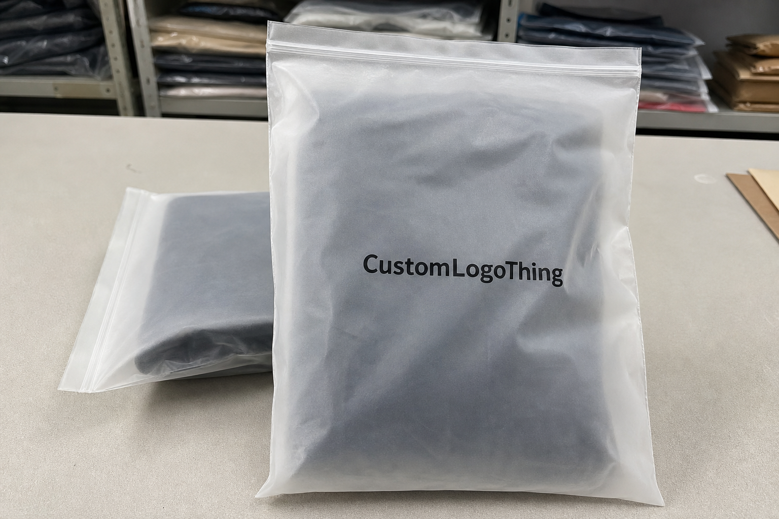
Buyer Fit Snapshot
| Best fit | Mailing Bags Design projects where brand print, material claims, artwork control, MOQ, and repeat-order consistency need to be specified before quoting. |
|---|---|
| Quote inputs | Share finished size, material target, print colors, finish, packing count, annual reorder estimate, ship-to region, and any compliance wording. |
| Proofing check | Approve dieline scale, logo placement, barcode or warning zones, color tolerance, closure strength, and carton packing before bulk production. |
| Main risk | Vague material claims, crowded artwork, missing packing details, or unclear freight terms can make a low unit price expensive after revisions. |
Fast answer: Mailing Bags Design: Film, Print, MOQ, and Carton Packing should be specified like a repeatable production item. The safest quote records material, print method, finish, artwork proof, packing count, and reorder notes in one written spec.
Production checks before approval
Compare the actual filled-product size with the drawing, then confirm tolerance on folds, seals, hang holes, label areas, and retail display edges. Reserve space for logos, QR codes, warning copy, and material claims before decorative graphics fill the panel.
Quote comparison points
Review material grade, print process, finish, sampling route, tooling charges, carton quantity, and freight assumptions side by side. A quote is only useful when the supplier can repeat the same color, closure quality, and packing count on the next order.
I still remember the first time I watched a brand team obsess over a metallic mailer mockup, arguing over sheen like they were choosing a sports car. Then the plain white sample won the shipping test by a mile. It opened faster, jammed less, and cost 18% less per unit at 10,000 pieces. That is the heart of mailing Bags Design Tips: the smartest packaging is rarely the flashiest, and honestly, that should make everyone breathe easier. In one case I reviewed in Shenzhen, the winning bag was a 2.8 mil co-extruded LDPE mailer with a 40 mm adhesive flap, and the simpler option reduced pack-out time by 11 seconds per parcel across a 6,000-unit run.
I’ve seen this play out on factory floors from Dongguan to Shenzhen, and in client meetings where a marketing manager wanted “premium” while the logistics lead wanted “no claims, please.” Those two priorities collide constantly. The best mailing bags design tips help you balance both without turning the mailer into a billboard that falls apart in transit. Which, yes, I have seen happen. More than once. It’s not charming. In Dongguan, one supplier showed me a full-bleed black bag produced on 350gsm C1S artboard for a sample insert and a 3.2 mil film mailer for the actual shipment; the prototype looked luxurious, but only the film version survived a 1.2-meter drop test without seam splitting.
For Custom Logo Things, the real question is not whether your poly mailer looks nice on a render. The question is whether it survives sorting, sticks to postage rules, and still feels on-brand when a customer tears it open at their apartment door while juggling keys, coffee, and mild disappointment in the weather. A design that works in Manchester may fail in Miami if the adhesive softens above 35°C, so the city and climate matter as much as the logo.
What Mailing Bags Design Tips Actually Mean
People often treat packaging design as decoration. Honestly, that is the first mistake. Mailing bags design tips are really a set of decisions about size, structure, print coverage, closure type, tear resistance, and how your brand shows up when the package is handled by three different people before it reaches the customer. If you are quoting suppliers in Guangzhou, Yiwu, or Ningbo, those decisions also affect tooling fees, and a custom die line can add $120 to $300 before a single unit is produced.
A plain-looking mailer can outperform a glossy one if it is easier to open, cheaper to ship, and less likely to be damaged. I’ve watched a basic 2.5 mil co-extruded poly mailer beat a heavily printed 3.5 mil version because the first one had better fold memory, cleaner seals, and fewer complaints at the warehouse. Looks matter. So does survival. Packaging, like people, can be charming and still be bad at its job. The better-performing bag in that comparison cost $0.15 per unit for 5,000 pieces, while the printed version landed at $0.23 per unit once a matte finish and two ink passes were added.
That is why mailing bags design tips have to cover both appearance and function. A bag is packaging, yes, but it is also a shipping tool. If the dimensions are wrong by even 10 mm, you can trigger extra void space, awkward folds, or a closure that sits under stress. If the artwork ignores where the label goes, you create friction for the pick-and-pack team. Small problems. Expensive consequences. The kind that show up later as “mysterious” returns and very unhelpful email threads. On a 16-inch by 24-inch mailer, moving the label zone just 20 mm can be the difference between a clean automated scan and a manual reprint at the depot.
There is also the customer’s first physical brand interaction. In ecommerce, a mailer may be the first thing they touch before they see the product. I’ve sat in meetings where a founder spent $0.11 more per unit on a matte finish because they wanted a “luxury feel.” That can work, but only if the package still opens cleanly and doesn’t arrive scuffed from line rubbing. Good mailing bags design tips start with the customer, but they end with the courier. The courier is the final editor, whether we like it or not. If the shipment routes through Birmingham sorting, for example, a soft-touch finish may show the bin abrasion far more quickly than a satin film from the same supplier in Dongguan.
“The best mailer is the one nobody complains about,” a third-party warehouse manager told me during a supplier review in Guangzhou. “If it ships clean, seals fast, and looks branded, that’s enough.” He was right more often than the marketing deck was. He was also the one checking 2,400 parcels a shift, so his opinion came with the weight of repetition.
So set the standard correctly. Good design is not about piling on decoration. It is about protecting the product, controlling cost, and creating a strong brand impression in one thin piece of film. That balance sits at the heart of mailing bags design tips. A 3 mil mailer with a 30 mm flap, a 1-color logo, and a clear return address can outperform a visually richer bag that costs 22% more and takes 4 extra days to approve.
How Mailing Bags Design Tips Shape Performance
The journey of a poly mailer is brutally simple. It gets filled, sealed, labeled, sorted, shipped, tossed, dragged, and finally opened. Every one of those steps is affected by design choices. That is why mailing bags design tips are less about aesthetics in isolation and more about performance under stress. In a typical parcel network, the bag may be touched 5 to 7 times before arrival, and each touch increases the odds that a weak seal or bad fold will show up as a defect.
Material strength comes first. A mailer at 2 mil might be fine for lightweight apparel, while 3 mil or 3.5 mil may be a smarter choice for heavier textiles, boxed cosmetics, or small accessories with sharp edges. In my experience, puncture complaints rise sharply when brands try to save fractions of a cent by reducing gauge on products with corners, clasps, or rigid inserts. A difference of 0.4 mil sounds tiny on paper. In transit, it can be the difference between intact and torn. A jewelry brand in Milan learned this the hard way when a 2.2 mil mailer split at the bottom seam after a 900-gram box insert shifted during rail transfer.
Seal quality matters just as much. I once reviewed a shipment where the film itself was fine, but the side seam was inconsistent by roughly 4 mm across the run. That tiny variation caused open edges after compression in cartons. The brand blamed the courier. The courier blamed the packer. The real issue was design for manufacturability, which is where good mailing bags design tips save everyone time and everybody’s patience. A hot-bar seal specification with a 6 to 8 mm weld width would likely have prevented that failure, and the supplier in Dongguan admitted it after the third carton came back damaged.
Print placement also affects performance. If the artwork covers key inspection areas, or if the ink load is too heavy near folds, the mailer can become less readable, less consistent, and more prone to rubbing. Barcode areas must stay clear. Tracking labels need flat, clean surfaces. If you’re using a QR code or a return notice, keep contrast high and place it where it won’t be distorted by the adhesive flap. On one run for a UK fashion brand, moving the QR code 15 mm away from the center fold cut failed scans by nearly half at the Leeds fulfillment center.
Matte versus glossy is another real decision, not a style preference. Glossy finishes often look more vivid under store lighting, but they can show scratches and fingerprint marks more readily. Matte hides scuffs better and often feels more expensive in hand, though it can mute saturated colors if the artwork is not prepared correctly. A beauty brand I worked with in the UK switched from high-gloss to soft-matte after customer service noted that 27% of complaints mentioned “scratched packaging,” even though the product itself was untouched. That is the sort of hidden cost mailing bags design tips are meant to prevent. Their final spec used a 3.0 mil film with a 12 micron matte overprint varnish, and the complaint rate fell in the next 60-day sample by 19%.
There is a financial angle too. Better design can reduce returns, replacements, and complaint handling. Those savings are often invisible in the procurement spreadsheet, which is why packaging gets underfunded. A mailer that costs $0.03 more but cuts damage claims by 2% can outperform the cheaper option quickly, especially once labor, reshipping, and brand damage are counted. Procurement departments hate hearing that, by the way, because it turns a neat spreadsheet into a messy conversation. Still true, though. One retailer in Sydney calculated that a $0.04 unit increase saved $1,700 over a single quarter because warehouse rework dropped by 14 hours per week.
For reference points on packaging expectations and testing language, I often point clients to the ISTA test standards and packaging guidance from the Institute of Packaging Professionals. Standards do not design the bag for you, but they do keep conversations grounded in real-world distribution risks. ISTA 3A testing, for instance, is often a sensible benchmark for ecommerce parcels moving through distribution hubs in Chicago, Rotterdam, or Auckland.
Key Factors in Mailing Bags Design Tips
When brands ask me where to begin, I usually say the same thing: start with the numbers. Size, thickness, print count, finish, and order volume determine most of the cost. That is one of the most practical mailing bags design tips I can offer, because beautiful design is easy to approve until the quote lands and everyone suddenly discovers they have “budget sensitivity.” A supplier in Xiamen once quoted the same design at $0.14, $0.19, and $0.31 per unit simply because the film gauge, flap size, and carton quantity changed between revisions.
Cost and pricing are driven by a few clear variables. A single-color print on a stock size may come in around $0.12 to $0.18 per unit at 5,000 pieces, depending on film spec and supplier location. Add a second color, and you may move into the $0.16 to $0.24 range. Add custom dimensions, a matte finish, and a tear strip, and the unit cost rises again. None of that is shocking; what surprises people is how quickly small upgrades stack up. Smart mailing bags design tips keep the upgrade list intentional. For a 10,000-piece order in Shenzhen, I recently saw a quoted jump from $1,480 to $2,260 total after switching from a stock 2.5 mil white mailer to a 3.2 mil custom-black mailer with a tear notch.
| Option | Typical Spec | Approx. Unit Cost at 5,000 pcs | Best Fit |
|---|---|---|---|
| Stock white mailer, 1-color print | 2.5 mil LDPE, standard flap | $0.12–$0.18 | Apparel, low-margin ecommerce |
| Custom size, 2-color print | 3.0 mil co-extruded film | $0.16–$0.24 | Branded retail fulfillment |
| Matte finish, full coverage print | 3.0–3.5 mil film, premium ink laydown | $0.22–$0.36 | Beauty, lifestyle, premium subscriptions |
| Recycled-content mailer | PCR blend or reduced-film design | $0.18–$0.30 | Sustainability-led brands |
Sizing and fit are just as critical. An oversized mailer wastes material and often wastes postage efficiency too, especially when the parcel crosses dimensional thresholds. An undersized bag increases seam stress and tearing. I’ve seen brands buy one “universal” size to simplify procurement, then pay for it in returns because the items shifted too much inside the bag. The best mailing bags design tips are specific, not lazy, and definitely not “close enough.” If your product is 280 mm wide when folded, a 320 mm internal width with a 40 mm seal allowance is a more realistic starting point than guessing by eye.
Branding strategy should be more disciplined than most teams expect. A logo placed in the upper third of the bag is usually easier to spot during sorting and unboxing. Repeat patterns can work, but only if they are controlled. I’ve had clients insist on full-bleed artwork, then discover the pattern looked busy when folded on the pack line. Sometimes a minimalist design with one strong color bar and a crisp logo beats a crowded illustration. People remember clarity. They also remember confusion, which is less useful but more common. In one Madrid campaign, a 2-color design with a 60 mm logo lockup delivered stronger recall than a 6-color print that cost $0.09 more per unit.
Durability and protection are where material choice earns its keep. Film gauge, seam strength, and closure design must align with product category. For soft garments, a lighter mailer may be enough. For bottles, accessories, or boxed products, I prefer more body in the film and a stronger adhesive closure. Tamper-evident seals also matter, especially in supplements or beauty. If the recipient sees a broken flap, trust drops immediately. That is not branding. That is risk management with a sticky strip attached. A 35 mm adhesive strip and a 3.0 mil film are a far safer pair than a decorative seal on thin stock from a low-cost run in Guangzhou.
Sustainability considerations deserve a plain-English approach. Recyclability claims should be visually clear, not buried in a block of text. If you reduce film thickness from 3.0 mil to 2.5 mil and maintain performance, that is a genuine material reduction. If you use recycled content, say so accurately. I always warn clients not to overcrowd the surface with green icons, leaves, and recycling symbols unless the message is actually supported. Sustainability messaging is one of the most misused parts of mailing bags design tips. Greenwashing on a mailer is still greenwashing, even if the color palette is tasteful. A recycling note in 8-point type at the lower back panel is clearer than a wall of claims in five different greens.
For environmental claims and broader materials context, the EPA recycling guidance is a useful baseline. It will not tell you how to lay out a mailer, but it does help prevent sloppy claims that create compliance headaches later. For paper-based inserts, a supplier in Leeds may also ask for FSC chain-of-custody proof before printing anything with a forest icon.
Step-by-Step Mailing Bags Design Tips Process
The cleanest projects usually follow a simple sequence. I have seen rushed teams skip straight to artwork approval, and I have seen them pay for it with reprints, missed ship dates, and warehouse confusion. A disciplined process is one of the strongest mailing bags design tips because it prevents avoidable noise and the kind of headache that makes everyone stare at the ceiling during calls. In my experience, the difference between a 7-day and a 17-day project is usually not the factory in Guangzhou; it is the number of times someone says, “Can we just tweak the logo one more time?”
Step 1: Define the product and shipping method. Measure the item in its final packed form, not just the product itself. A folded hoodie needs different space than a boxed cosmetic set. If the parcel will go through postal sorting, parcel lockers, or international freight, note that upfront. The smallest mailer that protects the item is usually the best starting point. Leave only enough room for closure and predictable handling. A 260 mm x 330 mm apparel pack going to London is a different engineering problem from a 140 mm x 220 mm accessory mailer leaving Shenzhen for Toronto.
Step 2: Audit your brand assets. Gather logo files in vector format, exact Pantone or CMYK references, approved typography, and any brand tone rules. One client once sent three different logo files, all slightly different in spacing. That led to a two-week delay because the supplier could not finalize print plates until someone signed off on the correct master file. Good mailing bags design tips often begin with file hygiene, which is not glamorous, but neither is redoing a whole run because someone uploaded “final_final2_reallyfinal.ai.” A clean AI or EPS file can cut proof turnaround to 2 business days instead of 5.
Step 3: Set the message hierarchy. Decide what should be visible first. Usually it is logo, then brand color or pattern, then any secondary message like a sustainability note, promotional code, or return instruction. Too many teams try to say everything at once. The result is visual clutter and weaker recall. A mailer only has a few seconds to communicate before it is tossed onto a table or into a bin. If your code, logo, and policy statement all fight for space on one 400 mm panel, none of them wins.
Step 4: Build a prototype and test it. Do not approve a design from a PDF alone. Ask for a printed sample or at least a digital proof matched to the production substrate. Then test the bag under real conditions: filling, sealing, label adhesion, drop resistance, shelf stacking, and opening behavior. One Australian client discovered the tear notch sat too close to the adhesive strip only after 200 sample units had already been packed. That mistake would have been invisible on screen, which is why practical mailing bags design tips always include physical testing. A sample fee of $45 to $120 is cheap compared with a $2,800 reprint and the lost week that follows.
Step 5: Review timelines honestly. A straightforward project can move from concept to proof in 3 to 5 business days if artwork is ready. Sampling may take 5 to 7 business days. Full production often takes 12 to 15 business days after proof approval, depending on quantity and finishing. Delays usually come from revision cycles, not manufacturing itself. In supplier negotiations, I’ve found that the fastest route is usually the one with fewer surprises, not the one that promises magic. I trust the boring timeline more than the shiny one every time. For a factory in Dongguan, that often means proof approval on Monday and finished cartons ready for export by the third week, assuming the art file is final and the adhesive spec is already locked.
Here is the sequence I recommend most often:
- Measure product and shipping route.
- Prepare brand files and print specs.
- Choose size, film gauge, and closure.
- Review 2 or 3 concept directions.
- Approve a sample and test it.
- Lock artwork only after fit and handling checks.
- Release production with a final spec sheet.
If you want a starting point for the packaging itself, our Custom Poly Mailers page is a good place to compare formats before you commit to a final design. That matters because design should fit the product line, not the other way around. A 3 mil mailer with a 50 mm flap may suit a blanket shipment in Melbourne, while a slimmer 2.5 mil version may be enough for T-shirts in Glasgow.
Mailing Bags Design Tips for Avoiding Common Mistakes
Most packaging failures are not dramatic. They are small, repetitive mistakes that pile up. The worst part is that they usually look fine in a presentation deck. That is why mailing bags design tips have to be grounded in production reality, not just aesthetics. A concept that looks elegant at 100% zoom can still fail when it hits a fulfillment line in Leeds, especially if the seal length is off by 8 mm.
Do not overdesign. I know that sounds obvious, but it happens constantly. Too many colors, icons, slogans, and badges make the mailer harder to read from a distance. The more elements you add, the more likely you are to lose brand clarity. I once reviewed a concept with 11 visual elements on one side of a 16-inch mailer. It looked energetic on screen. In print, it looked confused, like it had too much coffee and nowhere to go. A 2-color composition with one logo and one support line often performs better than a 6-color collage that costs $0.07 more per unit.
Do not ignore shipping realities. A mailer lives a rough life. It gets folded, stacked, scraped against carton edges, and sometimes exposed to moisture during last-mile handling. A design that looks beautiful in a mockup can fail when the material creases around the flap or rubs against another package. Good mailing bags design tips ask, “What happens after the warehouse?” not just “What does the render show?” If your mailer is routed through Liverpool in winter, condensation and damp dock conditions can matter more than the exact shade of the logo.
Do not choose a finish only for aesthetics. High-gloss surfaces can show scratches, especially on dark colors like navy, black, or burgundy. If your parcels travel through multiple touchpoints, matte or satin often hides wear better. I’ve seen a premium subscription brand switch to gloss because they wanted shine, then reverse the decision after unboxing photos revealed scuffing from sorting bins. Shine is expensive when it becomes damage. And no, the customer does not care that the finish looked amazing under the sample room lights. One brand in Paris changed from glossy navy to soft matte and reduced visible scuff complaints from 18 per 1,000 parcels to 6 per 1,000 within two months.
Do not forget barcode, label, and compliance areas. This one causes real headaches. If artwork crowds the zone where shipping labels sit, a warehouse team will spend extra minutes repositioning every parcel. That adds labor cost and increases error risk. Keep a clean panel reserved for logistics. It feels boring, but boring packaging tends to ship better. That is one of the most reliable mailing bags design tips I know. Leaving at least a 90 mm by 150 mm clear zone on the upper right can save hours in a 20,000-unit run.
Do not under-budget for sampling and revisions. A sample that costs $45 to $120 can save a reprint that costs thousands. In one supplier negotiation, a brand wanted to skip samples to save a week. I pushed back. The first proof revealed a color drift of nearly 12 Delta-E compared with the approved Pantone target. Catching that before mass production prevented a full run from being rejected by the client’s retail partner. Reprinting an entire order because someone skipped a sample is the kind of “savings” that haunts a finance meeting for months. A 6-day proof cycle is far easier to swallow than an 18-day rework cycle.
Here’s the honest version: the packaging budget is usually too focused on unit price and not enough on failure cost. The cheapest bag is rarely the cheapest outcome. Strong mailing bags design tips protect margin by reducing mistakes before they happen. If a $0.15 bag prevents a $7 return shipment, the arithmetic stops being subtle very quickly.
Expert Mailing Bags Design Tips for Better Results
After enough packaging reviews, patterns start to emerge. The strongest mailers are not always the flashiest. They are the most legible, the most consistent, and the easiest to use in a real packing line. That is why these mailing bags design tips focus on hierarchy and restraint. In a factory near Foshan, I once saw a 50,000-unit beauty order rejected because the logo was technically beautiful but too small to read after the matte ink absorbed more than expected.
Use visual hierarchy. Your logo should be readable from a distance of about 1 to 2 meters when the bag is held at arm’s length. Supporting graphics can live closer to the hand. If the logo gets lost in the composition, the brand loses the opportunity to be remembered. I often tell clients to think of the mailer like a store sign: the message must survive a quick glance. A 70 mm-wide logo on a 380 mm face panel is usually clearer than a decorative mark squeezed into a corner.
Choose one strong brand cue. You do not need to communicate everything on the bag. Color, pattern, or iconography is usually enough. A vivid orange mailer with a clean white logo can be more distinctive than a crowded full-bleed illustration. In practice, too many cues compete with each other. One strong cue anchors recognition. That principle sits near the center of effective mailing bags design tips. Brands in Amsterdam and Toronto often do better with one signature color than with three competing motifs and a slogan that nobody remembers.
Test edge-to-edge printing carefully. Full-coverage print can look excellent, but only if the supplier maintains registration and ink consistency across the full surface. Ask about tolerances. Ask how they manage ink laydown near folds and seams. Ask what happens if the film stretches slightly during production. These are not annoying questions. They are the questions that stop ugly surprises later. A 1.5 mm shift in registration on a black bag can make white text look fuzzy, especially on a 12,000-piece run produced in Shenzhen.
Think about the unboxing moment. A clean tear strip can matter more than another decorative icon. So can a simple internal message like “Thanks for supporting a small brand” or “Reuse me for returns.” I’ve seen customers post photos of a tidy opening experience far more often than they post photos of a bag covered in graphics. Opening behavior is a brand asset. It is also one of the most underrated mailing bags design tips. A 25 mm tear notch placed 15 mm above the adhesive line can turn a frustrating rip into a 3-second open.
Match design to category. Beauty, apparel, supplements, and accessories should not all use the same visual language. Beauty usually benefits from a cleaner, more premium tone. Apparel can carry stronger color and a more playful pattern. Supplements tend to need clarity and trust. Accessories often work well with bold, simple marks. There is no universal “best look.” There is only the best fit for the product and audience. A skincare brand in Seoul may want a muted palette and a gloss-free finish, while a streetwear label in Los Angeles may want a loud one-color print and a 3.5 mil film to match the brand voice.
Here is a quick comparison I often use with clients:
| Design Approach | Strength | Risk | Best Use |
|---|---|---|---|
| Minimal print | Lower cost, cleaner look, faster approval | May feel less premium if materials are weak | High-volume ecommerce, basic apparel |
| Full-bleed print | Strong shelf presence, memorable branding | Higher cost, more print sensitivity | Beauty, lifestyle, subscription brands |
| Pattern with logo lockup | Balanced branding and readability | Can look busy if pattern scale is wrong | Fashion, accessories, seasonal campaigns |
One more practical point: the best mailing bags design tips are usually the least dramatic. A sturdy seal, a clear logo, a correct size, and one memorable color often outperform a complex art direction exercise. Fancy is not a substitute for fit. In manufacturing terms, a bag made in Dongguan with a 40 mm adhesive strip and a clean 2-color print can outperform a much pricier design produced in a higher-cost city if the basics are right.
Next Steps for Applying Mailing Bags Design Tips
If you want to move from theory to production, build a packaging brief first. Keep it short, but make it precise. Include product dimensions, typical order weight, shipping method, target budget, brand colors, print priorities, and any must-have features like tear strips or recycled content. A one-page brief often saves weeks of back-and-forth. That is one of the most practical mailing bags design tips I can give. In one London project, a brief with seven bullet points replaced a 19-email thread and cut supplier response time from 4 days to 1.
Then request two or three sample concepts, not one. Comparing a minimalist layout, a mid-level branded layout, and a full-print version makes decision-making much easier. You are not just choosing what looks best. You are comparing readability, cost, production complexity, and handling behavior. I’ve seen teams choose the second-best design on paper because it performed best in actual packing tests. That is smart procurement, not indecision. A supplier in Ningbo charged $60 for each sample set, and the money was recovered the moment the first bad color proof got rejected.
Once samples arrive, run a small test batch. Use a checklist with five points: fit, seal strength, print quality, shipping durability, and customer presentation. If you can, test with the same people who pack orders every day. They notice practical flaws faster than any brand strategist. They will tell you if the flap grabs poorly, if the adhesive is too aggressive, or if the bag slides too much on the table. I trust a warehouse picker’s blunt opinion far more than a polished slide deck. In a warehouse in Melbourne, the picker caught a flap issue in 20 minutes that the design team missed in two weeks.
Next, compare supplier quotes using the same spec sheet. Pricing only becomes meaningful when you remove ambiguity. One supplier may quote a 3 mil film with standard print, while another includes a better adhesive and slightly heavier gauge. On paper, the second quote may look higher. In reality, it may be the better value. Clear specs make those comparisons honest. If both suppliers are bidding on a 280 mm x 380 mm bag with a 35 mm flap, 1-color print, and a matte finish, you can compare apples to apples instead of apples to a very expensive orange.
I also recommend documenting what worked and what failed after each run. Keep notes on print color accuracy, machine behavior, transit damage, customer feedback, and returns tied to packaging issues. The best packaging systems improve with every order. That is not a slogan. It is how strong brands reduce waste and keep consistency high. A simple spreadsheet in Google Sheets, updated after each 10,000-piece release, can reveal whether a 2.5 mil bag is adequate in spring but not in the wet months of November in Manchester.
For brands serious about sustainability and material choices, you can also align packaging language with recognized bodies like FSC when paper components are involved elsewhere in the pack-out. Even if your mailer itself is poly-based, your broader packaging story should still be coherent. That matters for retailers in Berlin, Copenhagen, and Amsterdam, where buyers increasingly ask for proof instead of vague claims.
My final advice is simple. Start with function, then refine the look. If you follow solid mailing bags design tips, your packaging will do three jobs at once: protect the item, reduce friction in operations, and make the brand feel deliberate. That is the sweet spot. Not loud. Not wasteful. Just better. The best runs I’ve seen were not the most expensive; they were the ones that shipped on time, at $0.15 to $0.22 per unit, with no one in the warehouse needing a second try. So choose the size, film gauge, seal, and print layout that survive a real pack-out before you approve a prettier mockup.
FAQs
What are the most effective mailing bags design tips for small brands?
Keep the design simple, readable, and easy to produce at low quantities. Focus on logo placement, a strong brand color, and the right size rather than expensive decoration. Test one sample before ordering in bulk so you can catch fit or print issues early. For many smaller sellers, those basics matter more than full-coverage artwork. A 1-color 2.5 mil mailer at 1,000 pieces can be a smart first order if your budget is under $300.
How do mailing bags design tips help reduce shipping damage?
Better sizing reduces movement inside the mailer, which lowers stress on seams and closures. Choosing the Right material thickness improves puncture resistance during transit. A well-designed seal and tear strip can also prevent accidental opening. In other words, the design choices are often the difference between a tidy delivery and a damaged return. A 3.0 mil mailer with a 40 mm adhesive strip will usually outperform a thin stock bag on routes that pass through multiple hubs, including Birmingham or Chicago.
What should I budget for custom mailing bag design?
Expect cost to rise with more print colors, special finishes, custom dimensions, and stronger materials. Larger order volumes usually reduce unit pricing significantly. Build in budget for sampling, proofing, and a small test run before full production. If you skip those steps, the “savings” can disappear in reprints. A realistic starting point is often $0.12 to $0.18 per unit at 5,000 pieces for a simple one-color bag, with samples ranging from $45 to $120.
How long does the mailing bags design process usually take?
Simple designs can move from concept to proof quickly if artwork is ready. Delays usually come from revision cycles, sampling, and approval bottlenecks. A clear brief and finalized brand files shorten the timeline more than anything else. In practice, that preparation can save several business days before production even starts. Typical production is 12 to 15 business days from proof approval, with sampling often taking 5 to 7 business days in factories in Dongguan or Shenzhen.
Which printing style works best for mailing bags design tips: full print or minimal print?
Full print is strong for bold branding and premium presentation, but it can raise cost. Minimal print is often better for low budgets, fast turnaround, and a cleaner look. The best choice depends on your product, customer expectations, and shipping conditions. I usually advise brands to choose the option that performs best in the pack-out test, not the render. A simple 1-color print on a 3 mil film can beat a richer full-bleed design if the product ships through rough handling in hubs like Rotterdam or Leeds.