Buyer Fit Snapshot
| Best fit | Matte Laminated Carton Branding projects where brand print, material claims, artwork control, MOQ, and repeat-order consistency need to be specified before quoting. |
|---|---|
| Quote inputs | Share finished size, material target, print colors, finish, packing count, annual reorder estimate, ship-to region, and any compliance wording. |
| Proofing check | Approve dieline scale, logo placement, barcode or warning zones, color tolerance, closure strength, and carton packing before bulk production. |
| Main risk | Vague material claims, crowded artwork, missing packing details, or unclear freight terms can make a low unit price expensive after revisions. |
Fast answer: Matte Laminated Carton Branding: Board, Finish, Dieline, and Unit Cost should be specified like a repeatable production item. The safest quote records material, print method, finish, artwork proof, packing count, and reorder notes in one written spec.
Production checks before approval
Compare the actual filled-product size with the drawing, then confirm tolerance on folds, seals, hang holes, label areas, and retail display edges. Reserve space for logos, QR codes, warning copy, and material claims before decorative graphics fill the panel.
Quote comparison points
Review material grade, print process, finish, sampling route, tooling charges, carton quantity, and freight assumptions side by side. A quote is only useful when the supplier can repeat the same color, closure quality, and packing count on the next order.
Matte laminated carton branding works because it quiets the surface without making the package disappear. It cuts glare, steadies the typography, and lets the structure do more of the talking. Put the same artwork on glossy board and matte film, then place both under harsh retail LEDs. The matte version usually looks more composed. That sounds minor until you are standing in a store aisle with ten seconds to make the right choice. Packaging has to protect the product and shape the first impression before the box is even opened.
For a brand, matte lamination is not just a finish. It is a visual decision with very real downstream effects: how the carton photographs, how the color reads, how the logo holds up across SKUs, and how the unboxing moment feels in hand. The tradeoff is real. Matte can soften some colors, expose weak typography, and raise the unit price if the spec is sloppy. Carton programs that get this right treat finish, structure, and print as one system, not three separate files passed around by people who all claim to be the final authority.
A carton does not need to shout to get noticed. Under ugly lighting, calm often reads louder than gloss.
Matte Laminated Carton Branding: The Shelf Effect
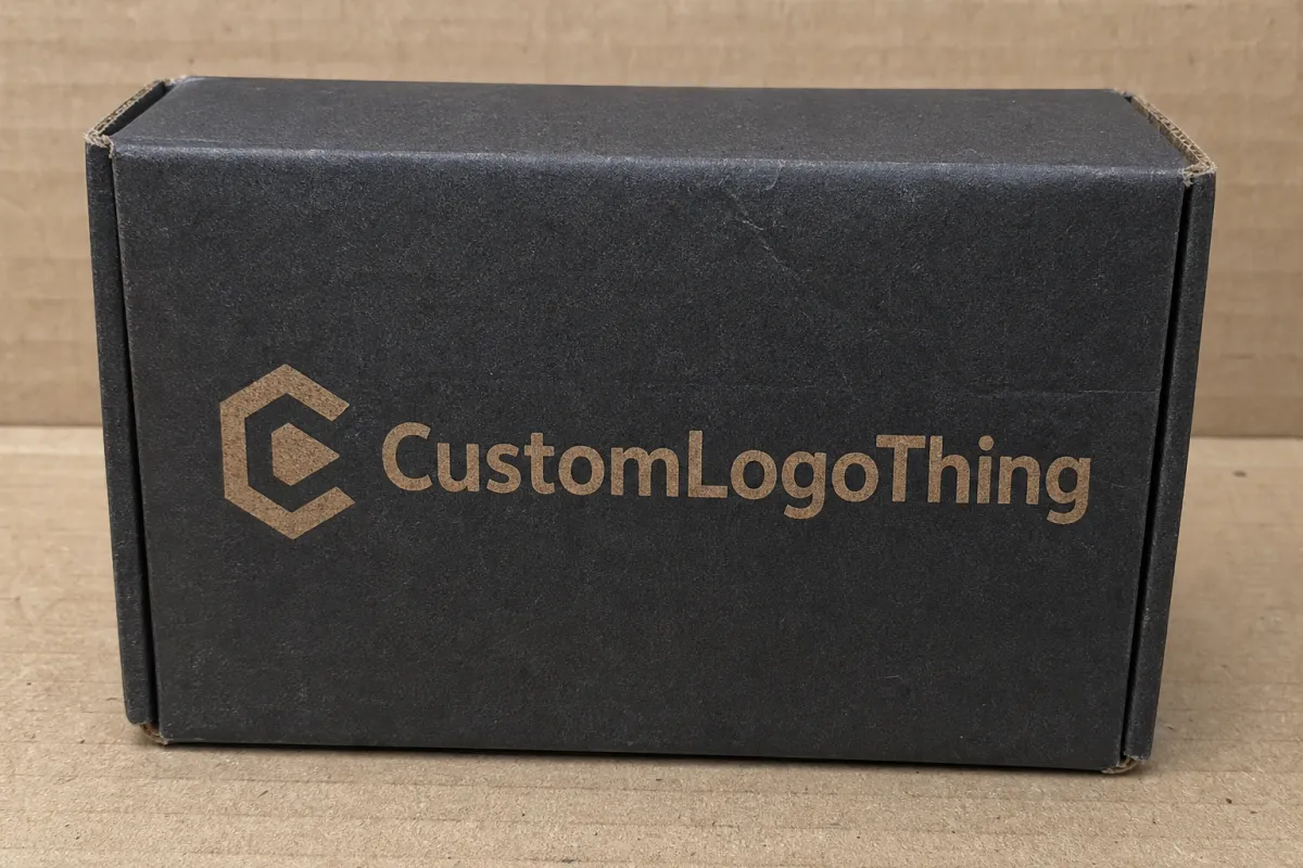
Walk through a pharmacy aisle, a cosmetics display, or a premium snack section and the pattern shows up fast. Glossy cartons catch the light first. Matte cartons often hold the eye longer. That is the practical edge of matte laminated carton branding. It trims glare, so text stays readable at arm's length and the composition feels more deliberate. In a crowded set, that steadiness can beat a burst of reflection.
Start with the basic definition. Matte lamination is a thin film applied over printed board to create a low-sheen surface. It does not flatten the design in a bad way. It controls the surface so the color, type, and structure can do the work without visual noise getting in the way. Brands that want a premium carton without the obvious shine of gloss usually land here for a reason.
The comparison with other finishes matters. Gloss pushes saturation and throws back store lighting. Soft-touch adds a velvety feel that signals luxury, but it costs more and can wear differently. Uncoated stock feels natural and paper-like, though it offers less protection from scuffs and fingerprints. Matte sits between them. More polished than uncoated. Less showy than gloss. Easier to fit into a modern brand system without making the package look like it is trying too hard.
From the buyer's side, the finish changes the whole shelf read. Matte makes typography feel steadier. Grids, icons, and fine rules look more deliberate. If the packaging needs to communicate order, ingredient quality, or clinical clarity, matte fits the brief cleanly. If the brand wants instant energy and oversized visual volume, the finish can feel too quiet unless the design brings real contrast. That is not a flaw. It is just the finish doing exactly what it should do.
The finish also carries meaning. A matte carton can suggest craftsmanship, restraint, or ingredient honesty before anyone reads the claims. Beauty, wellness, premium food, supplements, and specialty retail all benefit from that kind of signal. A carton is not only a container. It is a shorthand for the kind of brand holding it together. That shorthand gets read faster than most teams expect.
One practical example: a vitamin line sold under bright pharmacy lighting can look washed out in gloss and more controlled in matte. A fragrance carton with a strong logo and minimal copy can feel expensive in matte because the finish supports the negative space instead of fighting it. On the other hand, a high-energy snack brand that depends on loud color blocks and bold motion may need more contrast in the artwork so the matte surface does not mute the message.
If you want to see how those choices show up in finished work, our Case Studies page is a useful reference point. For programs that need bundled inserts, accessory labels, or matched secondary items, Custom Labels & Tags can keep the system tight.
How Matte Lamination Changes the Print and Feel
Matte lamination changes more than the shine level. It changes how light lands on the carton, which changes how the print reads. Dark colors can look deeper because they are not flashing under store lighting. Light colors can feel softer and more editorial. Fine typography on narrow panels often looks cleaner because the eye is not fighting reflected highlights.
Think of the laminate as a thin optical filter. It does not rewrite the artwork. It changes the way the artwork is seen. A navy printed on coated board under matte film often looks more settled than the same navy under gloss. Warm ivory can feel calmer and more expensive. Red can lose some punch if the color build is not tuned properly. None of that is a defect. It is material behavior, and it should be planned for instead of discovered after the order ships.
The tactile side matters too. Matte often reads as restrained, crafted, and editorial. That is why it shows up so often on premium beauty cartons, wellness supplements, and products trying to escape the over-branded look that clogs up shelves. Consumers may not describe it in production terms, but they feel it immediately. A matte carton can feel designed instead of merely printed.
There is also a handling benefit. Lamination reduces fingerprints and hides minor rub marks better than many uncoated cartons. For cartons touched repeatedly in distribution, on shelf, or during an unboxing moment, that matters. It does not make the box indestructible. Deep abrasion, edge crush, and moisture still call for the right board and proper shipping protection. Matte film just gives the package a better shot at arriving and staying presentable.
Packaging teams sometimes ask whether matte is only about looks. It is not. The finish can support practical goals: less glare for photography, fewer smudges in fulfillment, and a cleaner appearance under bright LEDs. Small improvements add up fast, especially when brand consistency is being measured across thousands of units and multiple retail environments.
One detail that gets overlooked: not every matte laminate behaves the same. Film thickness, adhesive system, and curing method can change scuff resistance and surface softness. A sample from one supplier can look slightly warmer or flatter than a sample from another, even when both are called matte. If color fidelity matters, ask what film is being used and whether the supplier can show a finished sample on the actual board stock. Otherwise you are comparing names, not results.
Key Factors That Shape the Final Look
No two matte cartons land the same way if the substrate, print method, and structure change. That is why quote comparisons get messy when they ignore board grade or the order of finishing steps. Matte film on a 350gsm folding carton behaves differently than the same film on a heavier SBS board or a coated kraft alternative. The more detailed the surface and the tighter the fold geometry, the more those differences show up.
Substrate and board choice
Board thickness affects stiffness, edge quality, and how crisp the panel lines look after folding. A lighter board may save money, but if the carton feels flimsy, matte finish will not rescue it. For many folding cartons, 300gsm to 400gsm board is a common working range, though product weight, shelf life, and structural needs should drive the final spec. Heavier products and premium presentations may need a stronger board to support the visual branding story.
The board surface matters too. A coated board gives the laminate a smoother base and usually produces a cleaner print presentation. A natural or kraft-style stock can look excellent, but the texture changes how the film reads. Buyers often fall in love with a mockup and then wonder why the production sample looks a touch different. The answer is usually substrate, not bad luck.
Print method matters as well. Offset printing usually gives the most refined result for higher-volume runs because it handles fine detail and consistent color well. Digital print can make smaller runs practical and reduce setup friction, though the final appearance depends on the press and how well it plays with the laminate. If tight color matching matters, ask how the print method interacts with the matte film before signing off.
Color palette and design density
Matte surfaces reward discipline. Crowd the layout with too many icons, claims, callouts, and accents, and the carton can start to feel muted instead of premium. Strong contrast, clear hierarchy, and confident typography usually outperform busy layouts. The matte carton that wins is often the one that says less and says it more clearly.
That does not mean matte only works for minimalism. It can support rich artwork, but the palette has to be chosen with the finish in mind. Saturated jewel tones, deep neutrals, and restrained metallic accents often look stronger than washed-out colors or delicate gradients. If the brand has a signature color, test it in the laminate before mass production. Perceived saturation can shift enough to matter, and nobody enjoys finding that out after thousands of units have already been printed.
Photographic imagery needs the same attention. Skin tones, botanical illustrations, and soft gradients can all look slightly different once matte is applied. A design that looked crisp on a monitor may feel quieter in hand, which is fine if that was the plan. If it was not the plan, the package will feel underpowered. That is a creative issue, not a print defect.
Structure, panels, and windows
Carton structure changes the rhythm of the design. Large front panels create more room for type and imagery. Smaller panels force the layout to work harder. Fold lines can interrupt artwork, and window placements can create a tug-of-war between what the box reveals and what it protects. Matte film should support those decisions, not hide weak planning.
Window cartons need extra attention. Because the matte finish lowers glare, the opening can look cleaner, which helps when the product inside is part of the sale. The exposed board and inner print still need to be considered. If the inside panel is unfinished or low contrast, the whole thing can feel inconsistent. Brand consistency is a system, not a front-panel-only hobby.
Fold types matter too. Straight tuck, reverse tuck, auto-lock bottom, and sleeve styles all change how much visual interruption the carton has. A matte finish on a clean sleeve can feel elegant. The same finish on a carton with crowded side panels and weak folds can feel like it is doing too much labor for the design. That is usually a sign that the spec was built from the finish backward.
For teams working to industry standards, it is worth checking packaging guidance from the Institute of Packaging Professionals and shipping-test protocols from ISTA. Those references help align the visual spec with performance expectations, especially if the carton will ship in master cases or be tested for transit durability. For fiber sourcing, FSC documentation can also matter when sustainability claims are part of the brief.
One more practical point: matte lamination can hide minor visual imperfections, but it will not fix bad file prep. Low-resolution images, fragile type, thin reverse rules, and poorly placed barcodes will still look weak. The finish helps. It does not erase design mistakes that were obvious before print. If anything, a matte surface can make sloppy hierarchy more noticeable because the eye has fewer reflective distractions to hide behind.
Production Process, Timeline, and Lead Time
A well-run carton project usually follows a predictable sequence. Concept review and dieline setup come first. Then artwork prep, proofing, printing, lamination, cutting, folding, and final packing. Each step affects the next one. A wrong dieline slows the artwork. A vague proof stalls production. A matte film that does not match the intended tone can force a rework. Packaging has a way of punishing loose planning.
Delays usually show up early. Artwork corrections, missing bleed, low-resolution logos, and late color changes can burn days before a press starts moving. The finishing stage can slow things down too if the matte film needs to be confirmed against a specific board or print profile. That matters even more when a brand wants a carton to match an existing line instead of merely looking good on its own.
A realistic lead-time framework keeps everyone honest. For simpler projects, once files are approved, production can move in roughly 10-15 business days, depending on quantity and the factory schedule. Custom carton programs with special finishes, more complex folds, or stricter color matching often need 15-25 business days or more, especially if physical samples are required before mass production. Shipping time sits outside that window, and it can be the hidden variable that turns a solid schedule into a late launch.
Lead time changes with order size too. A small run may print quickly, then slow down if the converter has to set up custom tooling or handle multiple short orders in the queue. Larger runs usually benefit from better press efficiency, but they also need more coordination for packing and freight. Seasonal demand, promo packs, and retail launch windows deserve extra buffer. Packaging does not care that the calendar is tight.
There is a difference between a sample timeline and a production timeline. A flat proof can be approved fast, but it does not show how matte lamination will behave on a finished carton under real light. A folded sample gives more confidence, especially when the brand needs color accuracy or wants to judge the tactile finish. For premium launches and strategic rollouts, that extra step usually earns its keep.
Some buyers also ask about sustainability checks during production. If that matters to the brand, request FSC chain-of-custody details for paper sourcing and ask whether inks, coatings, or adhesives line up with the company's environmental targets. If the carton needs shipping validation, ask about drop or vibration testing against ISTA methods before the order is released. Those questions sound operational because they are. They also save money later.
Cost, Pricing, MOQ, and Quote Drivers
Pricing for matte cartons comes from several moving parts, and the board spec is only one of them. A quote can shift based on print coverage, film type, carton style, finishing complexity, quantities, tooling, and packing requirements. Add foil, embossing, or spot UV and the numbers move again. That is normal. What is not normal is comparing quotes line by line without checking that they include the same scope.
MOQ, or minimum order quantity, matters because setup costs get spread across the run. Smaller batches usually cost more per unit because the press, finishing, and die-cut work do not shrink at the same rate as the volume. Larger runs often improve the economics of matte laminated carton branding because fixed costs are diluted. That is one reason brands with steady demand plan carton buys in larger lots instead of treating every reorder like a fresh emergency.
| Option | Typical use | Approximate unit cost at 5,000 pcs | Main advantage | Main tradeoff |
|---|---|---|---|---|
| Matte laminated folding carton | Beauty, wellness, specialty food, premium retail | $0.22-$0.48 | Low glare, refined print presentation | Can soften color if artwork is not tuned |
| Gloss laminated folding carton | High-impact shelf display, bold consumer goods | $0.21-$0.45 | Bright reflection and stronger color pop | Fingerprints and glare are more visible |
| Soft-touch laminated carton | Luxury beauty, gift sets, premium launches | $0.30-$0.70 | Tactile, high-end feel | Usually higher cost and can show scuffs differently |
| Uncoated premium stock | Natural, artisanal, eco-forward branding | $0.18-$0.40 | Paper texture and lower finishing complexity | Less surface protection and more visible wear |
Those are working ranges, not promises. A small carton with limited print coverage may come in below them, while a large carton with heavy ink coverage, special inks, or strict finishing tolerance may cost more. The useful way to read a quote is the same way a procurement team reads freight: check what is included, what is optional, and what can sneak in later as an extra charge.
Here is the cleanest way to compare vendors:
- Confirm whether the price includes dieline support, plates, tooling, and finishing setup.
- Ask if proofing is flat only or if a finished sample is part of the quote.
- Check whether freight, customs handling, and packaging inserts are included.
- Verify the board grade, laminate type, and any coating layers so you are comparing like with like.
- Clarify whether the quoted MOQ is flexible or tied to the pricing break.
Unit cost and total project cost are not the same thing. A carton that looks cheap on paper can turn expensive once revisions, sample shipping, extra freight, and delay-driven reprints show up. For a brand that cares about launch timing and consistency, the lowest line item is not always the cheapest decision. That is the kind of math that gets people promoted in theory and blamed in practice.
Common Mistakes That Undercut Matte Laminated Cartons
The first mistake is assuming matte automatically means premium. Sometimes it does. Sometimes it just means matte. If the logo is too small, the typography is timid, or the contrast is weak, the carton can look flat instead of refined. Matte cuts glare. It does not create hierarchy. That still comes from the layout.
The second mistake is skipping color proofing. Matte lamination can shift perceived saturation, and some brand colors read softer than expected once the film is applied. That matters most for delicate colors, skin-tone imagery, and dark artwork where subtle changes disappear on a screen. Proofing under the light where the package will actually be seen is the safest way to avoid an unpleasant surprise.
The third mistake is ignoring the back and side panels. A carton is rarely judged from one angle. Barcodes, ingredient panels, regulatory copy, and small claims need enough contrast and enough breathing room. Matte surfaces are forgiving in terms of glare, but they do not fix a messy structure. If the hierarchy is off, the finish will not save it.
The fourth mistake is choosing a finish before the brand goal is clear. A company may want a natural look, a clinical look, a luxury look, or a retail-first look. Those goals do not all lead to the same finish. Matte can support all of them in different ways, but the spec has to follow the message. Starting with the finish and working backward usually ends with either budget pain or a watered-down brand story.
Another issue is forgetting how cartons behave in the supply chain. Warehouse handling, cartoning lines, and retail stocking all create surface wear. If the product will be touched often, shipped in bulk, or displayed under strong light, the carton should be chosen with that reality in mind. A finish that looks beautiful in a sample room can behave very differently after 2,000 units have passed through a distribution center.
Finally, some brands overbuild the design because they expect the matte film to do the aesthetic heavy lifting. It will not. One strong typographic move, one clear focal point, or one carefully placed accent often does more for shelf appeal than a dozen extra details. Good matte laminated carton branding is usually disciplined. Crowded designs tend to look like someone lost an argument with the layout.
Expert Tips and Next Steps for Better Specs
If the goal is a carton that performs in market, test the finish where it will actually live. Bright retail LEDs, warehouse lighting, and customer phone cameras can make the same carton look different. Matte often performs well in mixed light because it cuts flare, but the only reliable answer is a real sample reviewed in the intended environment.
Pair the matte surface with one strong design move. That could be foil on the logo, a small emboss, a heavier typographic system, or a high-contrast panel layout. The point is not decoration for its own sake. The point is to keep the carton from disappearing. When matte is paired with one confident visual anchor, the package usually feels more mature and easier to remember.
Request two kinds of proof if you can: a flat proof for content accuracy and a finished sample for surface judgment. The flat proof tells you whether the copy, dieline, and color values are heading the right way. The finished sample tells you whether the film, texture, and handling quality match the intended brand identity. That dual check helps with premium launches, subscription products, and anything that lives or dies by the unboxing moment.
Use the quote request to force clarity instead of collecting vague numbers. Send the dieline, dimensions, board type, artwork files, finish notes, quantity, shipping destination, and any add-ons such as inserts or special effects. If you need separate packaging for a family of products, say so early. If you are also buying accessories like labels or tags, bundle the request with a clear spec so the vendor can align the systems instead of guessing and then billing you for the privilege.
Before approval, ask four blunt questions:
- Does the finish support the brand story we want customers to remember?
- Will the carton survive normal handling without looking worn too early?
- Does the proof match the way the package will be seen in stores and online?
- Are we comparing true total costs, not just unit prices?
Those questions keep the project grounded. They also reduce the risk of paying for a finish that looks impressive in isolation but underperforms in the market. If a brand gets those basics right, matte can become a quiet advantage: less glare, cleaner type, stronger perceived quality, and a more coherent shelf presence.
The next steps are simple. Define the target buyer, confirm the carton structure, gather the artwork files, request multiple quotes, and review a finished sample before release. That sequence takes discipline, which is usually the point. For most products, matte laminated carton branding works best as part of the packaging strategy, not as an afterthought. Handle it that way and the finish supports the product, the shelf, and the brand story at the same time.
FAQ
What is matte laminated carton branding, and when should a brand choose it?
It is a carton finishing approach that adds a matte film over printed board to reduce glare and create a softer, more premium look. Choose it when readability, understated elegance, and fingerprint resistance matter more than a shiny, high-reflection presentation. It is especially useful for products sold in bright retail lighting or for brands that want a modern, controlled visual tone.
Does matte laminated carton branding protect cartons from scuffs and fingerprints?
Yes, the laminate layer can help reduce minor surface marks and make handling wear less visible than on uncoated cartons. It is not indestructible, so edge crush, deep abrasion, and heavy moisture still need structural and shipping protection. For high-touch products, pair the finish with stronger board specs and careful packing so the carton arrives looking consistent.
How does matte laminated carton branding affect color accuracy?
Matte often softens contrast and can make colors look slightly less vibrant than they appear on screen or on gloss finishes. That makes proofing essential, especially for brand colors, skin tones, and dark artwork where subtle shifts are easy to miss. If accuracy is critical, request a print proof or sample and review it under the lighting where the package will be seen.
Can matte laminated carton branding be combined with foil, embossing, or spot UV?
Yes, and that is often where the finish really earns its keep. Matte gives the carton a restrained base, then foil, embossing, or spot UV can create a focal point without making the package feel loud. The trick is moderation. One or two accent effects usually look stronger than stacking every finishing trick on the same box.
What should I include in a quote request for matte laminated carton branding?
Provide dieline, dimensions, board type, artwork files, finish notes, quantity, shipping destination, and any special effects. State whether you need samples, packaging assembly, inserts, or rush timing so the quote reflects the full project scope. Ask the vendor to separate unit cost, tooling, setup, and freight so you can compare offers line by line.
How long does matte laminated carton branding usually take from artwork to delivery?
Timing depends on proof cycles, quantity, finishing complexity, and whether a physical sample is required before production. Simple projects move faster once files are approved, while custom programs with special finishes or strict color matching take longer. Build extra time for revisions, shipping, and final approval so the carton launch does not slip because of avoidable delays.
For brands that want packaging to look sharper, feel more deliberate, and hold up better in retail handling, matte laminated carton branding remains one of the most practical finish choices. It rewards good design, punishes sloppy hierarchy, and can elevate a carton without pushing it into flashy territory. That combination is why it keeps working across categories like wellness, beauty, and specialty food.
The practical takeaway is simple: lock the board, print method, and finish together, then approve a finished sample under real lighting Before You Order at scale. If the carton still reads clean from a few feet away and holds its character in hand, the spec is doing its job. If it only looks good in a mockup, keep working.


