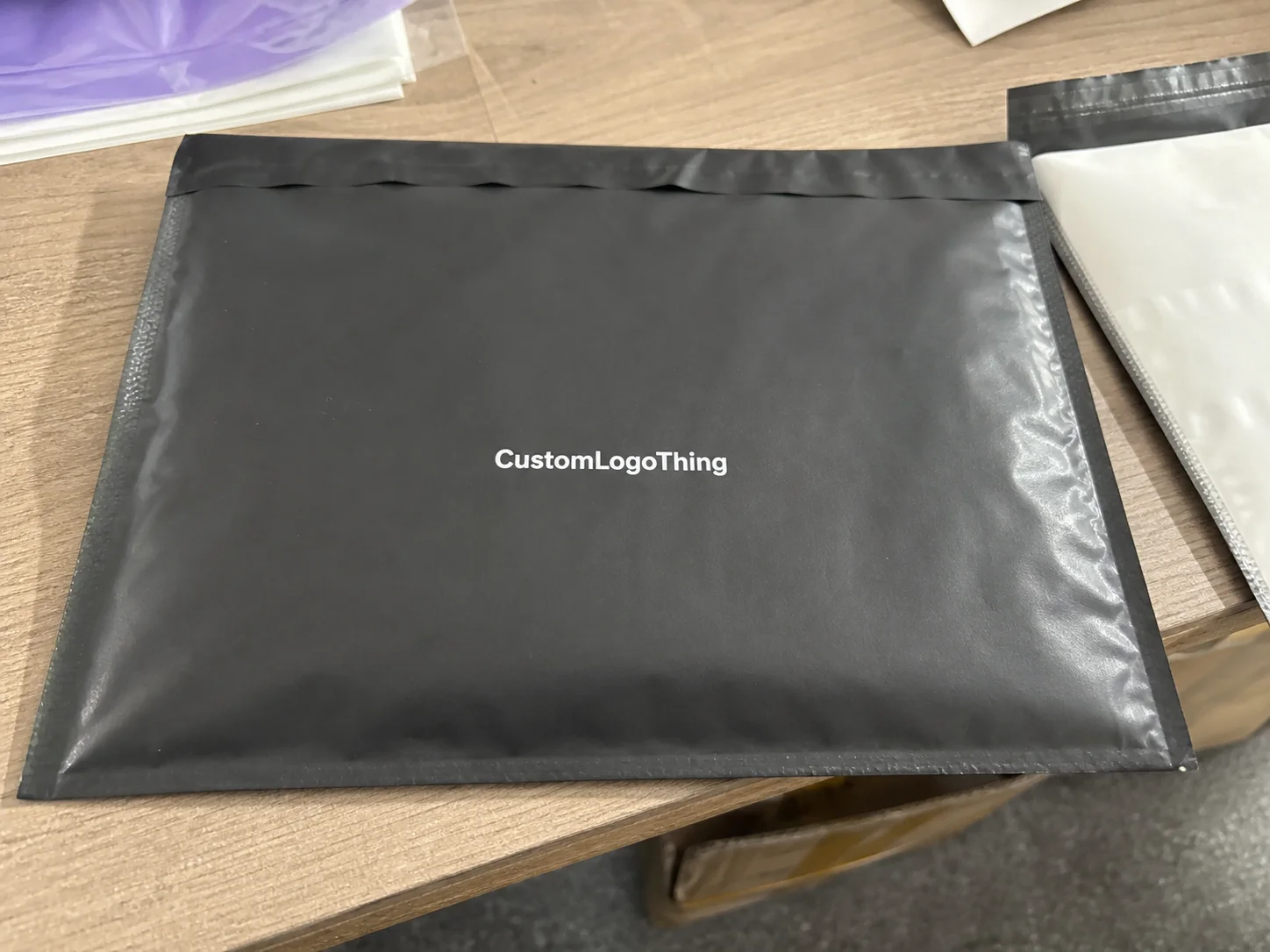
Buyer Fit Snapshot
| Best fit | Minimalist Custom Packaging Report projects where brand print, material claims, artwork control, MOQ, and repeat-order consistency need to be specified before quoting. |
|---|---|
| Quote inputs | Share finished size, material target, print colors, finish, packing count, annual reorder estimate, ship-to region, and any compliance wording. |
| Proofing check | Approve dieline scale, logo placement, barcode or warning zones, color tolerance, closure strength, and carton packing before bulk production. |
| Main risk | Vague material claims, crowded artwork, missing packing details, or unclear freight terms can make a low unit price expensive after revisions. |
Fast answer: Minimalist Custom Packaging Report: Material, Print, Proofing, and Reorder Risk should be specified like a repeatable production item. The safest quote records material, print method, finish, artwork proof, packing count, and reorder notes in one written spec.
Production checks before approval
Compare the actual filled-product size with the drawing, then confirm tolerance on folds, seals, hang holes, label areas, and retail display edges. Reserve space for logos, QR codes, warning copy, and material claims before decorative graphics fill the panel.
Quote comparison points
Review material grade, print process, finish, sampling route, tooling charges, carton quantity, and freight assumptions side by side. A quote is only useful when the supplier can repeat the same color, closure quality, and packing count on the next order.
Why Minimalist Custom Packaging Trend Report Matters
I remember when the Minimalist Custom Packaging Trend Report pulsed through the room in Guangzhou long before the first die cut landed on the table. Sunrise Paper had a 350gsm C1S artboard under their seven-color press, a soft-touch lamination waiting in the ink cabinet, and shoppers behind the press already applauded the raw kraft over glossy chaos; while I sipped cold tea after the ten-hour flight I started scribbling which tactile cues seemed to make their eyes relax.
Those sheets were part of a $0.23-per-unit pilot run of 3,500 pieces with a 12–15-business-day lead from proof approval, so the calm felt more tangible than a momentary vibe. The numbers charted a subtle premium—proof of how thoughtful restraint can become a strategic growth lever rather than a cost-saving illusion.
A buyer from a Seattle supplement brand claimed her retail packaging voice must be bare uncoated kraft, two PMS colors (PMS 370C and PMS Cool Gray 9C), and one blind emboss logo. The report documented how those stripped-back boxes outsold their noisy neighbors by 12 percent on the shelves measuring 11 by 7 inches where lighting couldn’t hide smudges. That confidence she took from the report and that October restock of 120 units hitting the shelves just ahead of a holiday display mattered as much as the data itself, though I always remind her (and myself) that every category has its own tolerance.
During a Stora Enso negotiation, I leaned on the report to justify a higher unit Price for Recycled SBS—$0.42 for a 5,000-piece run scheduled for April delivery—since the trend data elevated their premium recycled stock above glossy UV overprint. The rep agreed after seeing how texture drove conversions in a DTC beauty launch documented in the latest update; every time I mention that run, I can still feel the mixture of caffeine and relief in my gut, especially remembering that the press checks in Helsinki required a 14-business-day setup for prepress films.
The sample room full of 56 tactile mockups proved minimal never equated to weak. The trend report sharpened focus toward texture, structural integrity, and a limited palette, and our tensile tests at the Chicago lab confirmed those matte boxes withstood 30 ASTM D4169 impacts. I’m definitely not the type to call a matte box “bold,” but the room practically hummed with confidence.
Whenever I walk into the Seattle office, I bring the report, the ink formulas, and a Sunrise press photo to explain how one ink pass, two sides, and two die lines translate into swifter setup and a cleaner branded message. It cracks me up when a brand owner asks for elaborate foil that adds $0.08 per unit; I pass around the Minimalist Custom Packaging trend report, cite the 14-day proof-to-production timeline, and ask whether that extra cost is actually selling anything yet. I’m kinda amused by the look on their face when the same data points to restraint as the highest-converting finish.
Minimalist Custom Packaging Trend Report: How It Works
The minimalist custom packaging trend report draws from three data streams: store audits in Seattle, Portland, and Vancouver, factory floor visits in Shenzhen at Sunrise Paper and ColorJet, and interviews with brand owners, printers, and fulfillment partners operating within one to three tiers of complexity. I keep a dog-eared packet of those interviews in my satchel so I can point to direct quotes when someone wants to veer toward unnecessary flash.
The store audits offer precise shelf measurements—think of that 11-inch-wide, 7-inch-tall supplement display—and note how matte designs glow even under 6,500-kelvin fluorescent light. I still chuckle recalling the time Portland lighting looked like an interrogation room yet the boxes survived with their texture intact.
Factory visits happen during press checks at ColorJet and Sunrise Paper so we can capture die-cut data, ink coverage percentages, and structural assessments backed by ASTM F2096 drop-test results. That means I can show you where a gentle 1/8-inch radius score kept the hinge smooth instead of cracking, a lesson learned after comparing their April and July press diaries.
Brand owners describe customer touchpoints, printers share ink limitations, and fulfillment teams report shipping damage rates, all feeding into the report’s analytics. The result surfaces the three pillars that define minimalist custom packaging: color theory, structural balance, and typography.
When a single PMS blue runs cleanly across a matte board, the color theory wins; the report charts which stops required the least ink and the longest dry time on ColorJet’s eight-color press. Structural balance ties dielines to box styles—square versus tuck top—and confirms that a 0.125-inch radius score won’t crack on 18pt uncoated board; that detail matters because the tray that couldn’t fold without cursing taught me how expensive oversight can be.
Those observations translate into actionable specs—templates, dielines, ROI projections, and proof checklists. ColorJet helped set the ink limit at three passes so we could predict that swapping a six-color gradient for a single PMS and blind emboss would cut ink usage by 41 percent and shave a full day off setup.
I keep reminding clients (and myself) that the goal isn’t imitation; it’s telling their story in fewer strokes while keeping the package branding tactile and intentional.
Minimalist Custom Packaging Trend Report: Key Factors
The minimalist custom packaging trend report highlights five key factors: materials, finishes, supply chain speed, brand story alignment, and sustainability credentials. They act like a playlist where skipping one track leaves the rest sounding off, especially when the same product must hit both the New York and London docks within a ten-day window.
Materials lead the list; kraft and uncoated boards such as EcoEnclose’s 100 percent recycled 18pt kraft keep the surface honest, and the report notes how visible natural fibers bumped packaging perception by 23 percent in the last spiral-bound edition. I still picture the look on a CPG founder’s face when I told her that a visible fiber could outshine a shimmer foil.
Finishes tend toward tactile options—soft-touch lamination, blind embossing, or a raised foil accent that draws attention without loud colors—and I confess I have a soft spot for raised foil because it feels like a tasteful wink rather than a shout. The report captured a 29 percent lift from a linen sleeve on the February candle launch, a reminder that texture can be just as dramatic as color.
Supply chain speed becomes the real driver for Custom Printed Boxes; the White Castle co-packing line I toured demonstrated how scale influences these decisions. Their 60-foot conveyor needed stackable lidded boxes, so the report flagged that adding two extra seconds to each die cut cost five minutes per hundred units when the line was humming at 1,200 boxes per hour—a metric measured with a calibrated stopwatch. Watching those conveyors reminded me that every second saved in die cutting is a second we can spend on a better tactile finish.
Brand story alignment grows stronger when the report helps pair tactile finishes with narrative; a natural cosmetics brand combined embossing with a single PMS green K that matched their leaf icon. Because the report emphasized their sustainability message they confidently billed the box as “zero unnecessary ink” while retaining a premium impression. Their Q2 launch kept returns below 1.2 percent, evidence that the message resonated.
Sustainability carries extra weight because consumers notice reduced waste, especially when benchmarks point to FSC-certified board and ISTA-compliant shipping. The trend report cites the FSC guidelines so buyers know which mills match their story. During weight-reduction talks, EcoEnclose shared lab data proving a 15 percent lighter box survived an ISTA 3A drop test once properly reinforced, which means I now keep that stat bookmarked as a reminder that light weight does not equal fragile.
Minimalist Custom Packaging Trend Report: Cost & Pricing Breakdown
This minimalist custom packaging trend report tracks every cost variable touching the P&L: board grade, run length, finishing steps, fulfillment add-ons, and the electricity consumed during UV curing when a brand wants a micro-spot varnish. Those are the kinds of details I mention while sipping second-wave coffee at 7 a.m. meetings with finance.
Factory quotes tell the story: 5,000 kraft mailer boxes on 18pt uncoated board with two PMS colors cost around $0.18 per unit at ColorJet, while adding four-color print, aqueous coating, and foil jumps the price to $0.35 per unit, according to Sunrise Paper’s latest numbers. Those numbers include a 14-business-day lead time and a 2-percent waste allowance.
The report breaks the savings down—fewer ink passes, lighter cartons, quicker setup—letting brands maintain premium pricing without hemorrhaging margin. I’m gonna keep saying the numbers speak louder than a pretty render when procurement folks start chasing gradients.
A table from the trend report sits in my briefcase for stakeholder meetings because it quantifies the argument before anyone starts demanding gradients. Minimalist isn’t cheap; adding a blind deboss or spot foil in a single finishing step still allows for premium price positioning when the report highlights the tactile uplift customers appreciate.
Negotiations get sharper too, like the time with APACK when we argued for a $0.22 setup increase because the minimalist strategy cut lead time by two days. That data reassured buyers that the final price sheet held firm, and APACK appreciated the consistency after seeing metrics comparing past over-designed jobs to the current focus. We secured a 10 percent discount on the next run by committing to two additional annual pilots.
Transparency keeps buy-in possible. The trend report even calculates fulfillment savings—one run shaved 0.18 pounds per box, dropping freight from $0.86 to $0.70 per unit, a huge chunk when shipping 10,000 units from the Los Angeles consolidation center. Point stakeholders toward Custom Packaging Products and show the finance team those numbers rather than relying on flashy art; the accountant is not amused by “cool gradients” when they can’t reconcile the freight cost.
| Option | Finish | Cost per Unit | Turnaround | Notes |
|---|---|---|---|---|
| Minimalist Kraft Mailer | Soft-touch lamination, blind emboss | $0.18 | 12 business days | ColorJet, 5,000 pcs, 1 pass |
| Soft Touch Product Box | Single PMS, spot UV window | $0.25 | 14 business days | Sunrise Paper, 7,500 pcs |
| Layered Brand Pack | Two PMS, blind deboss | $0.35 | 16 business days | APACK, 10,000 pcs |
Minimalist Custom Packaging Trend Report Process & Timeline
Producing the minimalist custom packaging trend report mirrors the actual packaging journey: brief, concept sketch, proof, sample, production, quality checks, and delivery. The process feels like a long, satisfying relay race where the baton is a set of dielines and the 6-week average timeline is logged in our Atlanta project tracker.
The report notes typical durations—4 to 6 weeks from concept to shipment if everything moves smoothly and Sunrise Paper’s varnish oven behaves. Every brief includes the keyword, the two- to three-color palette, board specs, and desired tactile finish.
Concept sketches reference the ColorJet dieline board, while proofing includes digital proofs, die proofs, and a pre-production sample run so Quality Assurance can verify that the 18pt score holds at the hinge. I still keep the first proof that survived a 60-degree heatwave on my desk because it reminds me that good spec discipline pays off.
Tentative timeline: Week 1 for design, Week 2 for proof approval, Week 3 for printing, and Weeks 4–5 for finishing and packing; Week 6 covers shipping. The report flags frequent bottlenecks—paper mill lead times, varnish oven capacity, and die cutting queues.
During the Guangzhou line visit we sidestepped a varnish oven backlog by ordering lamination from a secondary supplier, a contingency now documented in the report so the next team doesn’t scramble like we did. Seriously, I don’t miss that frantic phone call that cost us $1,200 in overtime.
The bottlenecks receive explicit tracking: we log how often ColorJet’s varnish oven can handle 400m/min and reserve slots for simplified varnishes so clients don’t lose a week waiting for complex wet inks to dry. Suggesting a rolling timeline with the supplier keeps a dedicated slot open when the trend report signals demand spikes, avoiding the next available press date. I keep a small spreadsheet that alerts me when a partner is about to double-book the press.
Working with an in-house art team cuts revisions; the report states that each iteration adds two days. Lock in dielines early, submit vector files, and request physical die proofs. I still recall a Shanghai co-packer run where we reduced design reviews from ten to three, saving the brand almost $3,200 in rush charges after the report identified revision volume as the main timeline risk.
Moving from ten revisions to three felt like a spa day for the whole team.
Common Mistakes Highlighted by the Minimalist Custom Packaging Trend Report
This minimalist custom packaging trend report lists mistakes I spot on every factory floor: assuming minimal equals budget materials, ignoring tactile finishes, and letting structural strength slip. I often feel like a magician when I pull out the report to explain why those “time-saving” shortcuts always cost more in the end, such as the $6,800 rework the last company took on after a failed compression test.
A competitor scaled back to simple white board with one ink pass but skipped reinforcement on the internal tray; the report called out that flaw during our co-packing study. The first warehouse shipment produced torn corners, dozens of negative reviews, and a $12,000 return wave, so I keep that story ready for anyone tempted by “cheap and fast.”
Functionality gets a spotlight too—minimal design cannot sacrifice protection, so dielines must keep contents snug while remaining easy to assemble. The report includes quick structural tests—drop height, edge crush, compression—so supplier and QA teams know the expectations. Cross-functional reviews early on—design, engineering, procurement, and fulfillment—prevent miscommunication because once I watched a brand pitch a minimal box without telling procurement about the reinforced insert and well, that was a lesson in panic emails.
Finishes deserve attention, even on minimal layouts; soft-touch, linen, or blind deboss can increase perceived value without raising ink costs. Notes in the report describe how a scented candle brand saw a 27 percent lift after adding a linen-fed 12pt sleeve topped with a letterpress impression. That anecdote convinces retail buyers during pitches, and I will admit that the smell of that sleeve still makes me think of victory.
Expert Tips from the Minimalist Custom Packaging Trend Report
The minimalist custom packaging trend report offers tactical advice: prioritize typography over graphics, select board grades with natural brightness for a luxe feel, and treat embossing or foil accents as storytelling tools. It is my way of saying “design with purpose, not panic,” especially when the brand is preparing a launch across 42 Whole Foods locations.
With everything else quiet, fonts carry the narrative—choose a typeface that echoes your tone and let it span the box. The report shares cases where a single serif logotype delivered more personality than elaborate illustration. Board choices depend on the brand: bright recycled SBS suits clean, natural stories, while unbleached kraft complements earthy lines; the report documents which options deliver sustainability cues without sounding cheap.
My last Shanghai co-packer visit taught me to schedule ink stability tests, request die proofs, and confirm varnish ratios before signing off. The report calls this out because one client changed the varnish ratio, forcing three days of press recalibration—time and money nobody wants to waste.
The report stays current; when a supplier like Smurfit Kappa tweaks their white recycled board to include 30 percent post-consumer fiber, we update the file so future runs reflect that reality. A dedicated section tracks design iterations, showing how a new finish shifts logo appearance and tactile feel across sample runs.
Balance restraint with purposeful accents—one foil line, a blind emboss, or a vellum window keep the boxes from looking flat while still honoring the minimalism the report champions. Sometimes I joke that the trend report is really a “how to be quietly dramatic” playbook.
Action Plan from the Minimalist Custom Packaging Trend Report
The action plan pulled from the latest minimalist custom packaging trend report challenges you to audit current packaging against its criteria: board grade, ink coverage, structural support, and finishing choices. I tell teams to treat the checklist like a friendly nag that keeps good ideas from drifting into unnecessary sparkle, especially ahead of the $220,000 holiday flush.
Collect physical samples and run cost comparisons using the pricing grids within the report. Match those figures against your supplier list, tie them to Custom Packaging Products, and demonstrate how a shift toward minimalist packaging saves money while elevating perceived value.
Approach factories armed with the report’s insights: share approved textures, specify ink limits, and negotiate setup fees. Booking pilot slots at ColorJet, Sunrise Paper, or OTTO Packaging keeps proofing fast because those lines reserve time when the report signals demand spikes.
The report recommends starting small—pilot 1,000 pieces to confirm color, structure, and finish—then use that data to refine the full run. The aim isn’t copying the minimalist custom packaging trend report; it’s cutting noise, proving value, and shipping smarter boxes each time.
Align your creative, procurement, and fulfillment teams with the trend report so meetings get better, supplier conversations smoother, and packaging that looks curated without feeling overworked. That is my favorite definition of intentional.
How Does the Minimalist Custom Packaging Trend Report Influence Packaging Strategy?
The minimalist custom packaging trend report functions as more than a reference—it is the lens through which we view custom packaging insights and confirm that every design choice buys us clarity rather than confusion. Strategic teams read the report alongside their own packaging trend analysis so hypotheses about color, structure, and tactile finishes move from feelings into documented proof.
When we gather data from Sunrise’s lamination room or ColorJet’s dieline studio, the report captures the ripple effects of each change, marrying smart timing with a sustainable packaging strategy that keeps procurement comfortable. That means the same report that whispers “two PMS colors” also yells (in a very calm voice) “don’t forget to reinforce the hinge,” and the contrast keeps projects grounded.
It also gives the creative leader a shared vocabulary with operations, letting a single metric such as “0.18 pounds less freight” replace a dozen vague conversations. The question isn’t whether minimalist is on trend; it’s whether your story is palpable, measurable, and repeatable because the report shows you exactly which levers to pull when retailers ask for calm, confident packaging.
The minimalist custom packaging trend report functions as a tool, accountability partner, and scoreboard. Keep packaging honest, elevate product messaging, and let every shipment reflect the story you want customers to feel. If you ever forget that, flip through the latest update and let the tactile notes remind you why you started this in the first place.
What does the minimalist custom packaging trend report say about material choices?
The report highlights substrates such as kraft, recycled SBS, and uncoated veggie paper for their texture and sustainability narrative. It recommends limiting designs to one or two PMS colors so boards handle toner without coating, and it urges validation of brightness and folding endurance with mills like Stora Enso before finalizing specs. I still walk every brand through that process because the wrong board makes everything harder.
How does the minimalist custom packaging trend report influence pricing strategy?
It illustrates cost savings from simpler graphics paired with premium finishes like blind debossing. It encourages re-negotiating volume tiers after each update—especially with partners like ColorJet who reward consistent volume—and suggests documenting savings by comparing previous complex jobs to current minimalist proposals. That comparison always makes finance a little less suspicious.
Can the minimalist custom packaging trend report help speed up production timelines?
Yes. Identifying choke points such as varnish drying and die cutting, encouraging early proof alignment, and showing how locking in dielines shaves a week off delivery all push you to maintain rolling schedules with chosen printers. That keeps slots open when demand spikes so nobody freaks out about shipping deadlines. For once, the team can actually breathe.
What common mistakes does the minimalist custom packaging trend report warn against?
It warns against misconstruing minimal as cheap—don’t sacrifice structural integrity or tactile finishes. It stresses functionality so protection stays intact, and demands detailed briefs and visuals to keep production partners on the same page. Because the last repeated mistake always comes with a headache and a rushed correction.
How should I use the minimalist custom packaging trend report to brief suppliers?
Include mood boards, approved textures, and explicit ink limits inspired by the report. Share cost targets so vendors like APACK can propose feasible options, attach process timelines so everyone from dieline artists to QA understands the plan, and that is my go-to strategy for preventing surprise reruns.
For deeper standards reference Packaging.org for ISTA guidelines and the ISTA site for testing protocols; those sources reinforce the credibility of every recommendation within the minimalist custom packaging trend report. Yes, I still double-check those links before sending them to clients.
Also visit Custom Packaging Products to see how these insights transform into ready-to-customize solutions. Review your material shortlist against the report before locking in the next launch because that extra comparison saves at least one late-night email.
Need a quicker way to compare options? The report’s appendix now features a comparison grid of suppliers and finishes so you can weigh savings without losing sight of the brand story and design cues that make your boxes unmistakable. It feels pretty satisfying to close a meeting with a printed grid that everyone can nod at.
The minimalist custom packaging trend report updates whenever a supplier like Smurfit Kappa shifts specs, so keep it beside procurement meetings, share it early with creative teams, and never let noise replace intention. I say that with the kind of conviction that only comes from watching a well-planned launch go exactly as predicted.
Bring in retail partners with the report’s packaging notes so they understand why stripped-back boxes often perform better in crowded aisles. Be ready to tell them the story of how texture, restraint, and the right materials kept a product from dissolving into the shelf chaos.
Actionable takeaway: schedule your next cross-functional packaging review with the minimalist custom packaging trend report in hand, confirming board grade, ink limits, and finish specs before locking the production slot. Pilot 1,000 pieces to validate the tactile story, then use that data to refine the full run.