Buyer Fit Snapshot
| Best fit | Minimalist Pantry Product Box Branding projects where brand print, material claims, artwork control, MOQ, and repeat-order consistency need to be specified before quoting. |
|---|---|
| Quote inputs | Share finished size, material target, print colors, finish, packing count, annual reorder estimate, ship-to region, and any compliance wording. |
| Proofing check | Approve dieline scale, logo placement, barcode or warning zones, color tolerance, closure strength, and carton packing before bulk production. |
| Main risk | Vague material claims, crowded artwork, missing packing details, or unclear freight terms can make a low unit price expensive after revisions. |
Fast answer: Minimalist Pantry Product Box Branding: Board, Finish, Dieline, and Unit Cost should be specified like a repeatable production item. The safest quote records material, print method, finish, artwork proof, packing count, and reorder notes in one written spec.
Production checks before approval
Compare the actual filled-product size with the drawing, then confirm tolerance on folds, seals, hang holes, label areas, and retail display edges. Reserve space for logos, QR codes, warning copy, and material claims before decorative graphics fill the panel.
Quote comparison points
Review material grade, print process, finish, sampling route, tooling charges, carton quantity, and freight assumptions side by side. A quote is only useful when the supplier can repeat the same color, closure quality, and packing count on the next order.
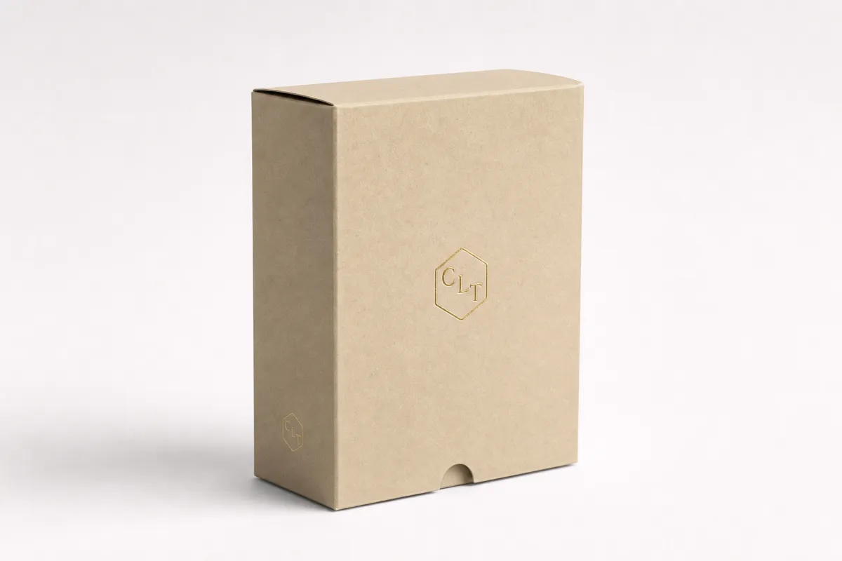
Minimalist Pantry Product Box Branding Tips That Sell
Learn minimalist pantry product box branding tips that make labels feel premium, speed up shelf recognition, and keep packaging simple without drifting into bland territory.
One thing I keep seeing on crowded shelves is that the box with fewer distractions usually gets read first. The eye grabs contrast, spacing, and shape before it fully processes the copy, which is why minimalist pantry product box branding tips matter so much for cereal, granola, spices, baking mixes, coffee, tea, and shelf-stable snacks.
Minimalism is not a decorative mood or a style shortcut. It is a working system. Every color, font, icon, and blank area has to earn its place, and that is what makes minimalist pantry product box branding tips useful in a practical sense. The box has to tell a shopper what it is, why it belongs in the cart, and how it fits into a kitchen routine, all in a few seconds.
Brands sometimes think “clean” means “easy,” but the truth is closer to the opposite. A restrained package asks for sharper decisions, cleaner copy, and a lot more discipline around hierarchy. If you get that part right, the result feels calm instead of empty, and a little more premium without trying too hard.
Minimalist Pantry Product Box Branding Tips: Why Small Changes Sell Fast
Minimal packaging works especially well for pantry products because repeat buyers do not want to decode a box every time they shop. They want clarity, trust, and fast sorting. A pasta box, spice carton, or granola sleeve is often picked up by habit, which means minimalist pantry product box branding tips should support recognition rather than demand attention.
Step back three to six feet and look at the shelf the way a shopper does. Nobody is reading a paragraph from that distance. They are scanning shapes, color blocks, and hierarchy, then deciding whether a box looks familiar, premium, or easy to trust. Good minimalist pantry product box branding tips reduce visual noise so the brand can be understood faster. That usually means one dominant brand cue, one product cue, and one proof point at most on the front panel.
The most useful way to think about it is simple: minimalist packaging is not about removing personality. It is about editing with intent. If a package has six messages, four icons, three color families, and two competing focal points, the buyer has to work too hard. Strong minimalist pantry product box branding tips make the decision easier by lowering friction and strengthening brand recall.
In packaging reviews, I have watched a box with less copy outperform a louder competitor simply because it was easier to sort in a split second. That does not mean every category behaves the same way, but pantry goods usually reward clarity. If a shopper buys oats every two weeks, they are not looking for a lecture; they are looking for the right box fast.
- Fewer front-panel claims usually improve readability, especially under mixed store lighting and on mobile product pages.
- One clear hero color helps a SKU family stay connected while still allowing flavor or variety cues.
- Generous spacing makes a box feel more considered, which often improves customer perception before the product is even opened.
The biggest mistake is assuming minimal means plain. It does not. Minimal can feel expensive, organized, and confident. The trick is to let spacing do part of the selling. That idea shows up again and again in minimalist pantry product box branding tips: white space, margin control, and type scale become part of the brand language.
A minimal box is not empty. It is edited. The difference lives in the gap between clean and forgettable.
That distinction matters because pantry products live in a repeat-purchase category. The customer may buy once out of curiosity, but the second and third purchase depend on trust and recall. In practice, the best minimalist pantry product box branding tips create packaging that looks calm on the shelf and still feels easy to spot in a kitchen cabinet later.
And yes, a minimalist carton can still have attitude. It just needs the right kind. A simple grid, a sharp type choice, and one strong accent can carry more personality than a crowded box trying to shout over everybody else.
How Minimalist Pantry Product Box Branding Works on Shelf
Minimal design improves shelf scan speed because the eye can sort information more quickly. Instead of fighting through a dense layout, the shopper gets a clean sequence: brand name, product name, variant, and one proof point. That order is central to minimalist pantry product box branding tips, and it works because people do not read packaging like a brochure.
Hierarchy is the hidden engine. If the brand name is strong but the product name is tiny, the box may look stylish while still failing at the retail job. If the variety cue is louder than the product itself, shoppers can confuse SKUs. The best minimalist pantry product box branding tips build a strict hierarchy so the package can be understood without effort.
Negative space changes customer perception in a useful way. It suggests confidence. A box that leaves breathing room around the logo, the product name, and the key claims often feels more premium than a crowded design, even when both use the same stock and print method. That is one reason minimalist systems can outperform louder packaging in busy aisles: they look composed, and composition signals quality.
Busy packaging tries to say everything at once. Minimal packaging usually says the right thing once, then repeats it consistently across the line. That repetition is what creates recognition. A shopper should be able to identify the brand from a glance, then confirm the product type, then move on. Strong minimalist pantry product box branding tips support that flow without asking for extra attention.
Shelf tests are humbling. A layout that looks restrained on a screen can disappear beside louder competitors, while a simpler system with better contrast often wins in the real aisle.
Contrast matters more than decoration. A muted palette can work beautifully, but only if the tone difference is strong enough to read under store lighting and on phone cameras. In many cases, the most effective minimalist pantry product box branding tips are not about adding more design; they are about tightening contrast, spacing, and type weight so the message lands immediately.
There is also a home-use benefit. Pantry items often live in drawers, baskets, and deep shelves, so the box has to remain legible at a glance. Clear panel structure and restrained visual branding make that easier, which is one reason these packaging choices can improve the unboxing experience even for grocery items that seem simple on paper.
The same logic helps online too. Product photos that use a quiet, well-structured carton usually crop better for thumbnails, marketplace cards, and retailer detail pages. If the front panel can stay readable at small size, the packaging is doing more than just looking nice in person.
Key Factors Behind Minimalist Pantry Product Box Branding Tips
Color is the first factor most teams overcomplicate. The strongest minimalist pantry product box branding tips usually start with one dominant neutral or muted base color and one controlled accent color. That could be cream with sage, charcoal with oat, or off-white with a single saturated flavor color. The goal is not variety for its own sake; it is disciplined brand consistency across the line.
Typography does more work than most buyers realize. One primary type family, a clear weight hierarchy, and enough letter spacing for small text often outperform decorative fonts in pantry categories. A condensed display face can look elegant in a mockup and still fail at shelf distance. Better minimalist pantry product box branding tips use type that stays legible at small sizes, especially on side panels and ingredient callouts.
Material choice matters too. A matte aqueous coating can soften glare and help the box feel calm. Soft-touch lamination can push the premium feel further, though it adds cost and should be tested on the physical sample rather than assumed from a render. Uncoated stock can work for earthy, natural products, but only if print contrast stays strong. These are the kinds of tradeoffs that separate cosmetic minimalism from packaging that performs.
Finishing should stay restrained. A small foil mark, a subtle emboss, or a single spot UV detail can add texture without breaking the quiet feel. The mistake is stacking effects until the box starts competing with itself. Good minimalist pantry product box branding tips usually treat finishes like seasoning: one accent is enough.
Structural consistency across the product line is another quiet advantage. If one SKU uses a different panel grid, different logo placement, or a different claim order, the family starts to feel fragmented. For pantry brands with several flavors or sizes, consistent structure makes the shelf read like one system instead of a pile of disconnected products. That consistency strengthens brand identity and speeds recognition.
Here is a simple checklist I use for minimalist pantry cartons:
- Choose one primary brand color and one support color for the full range.
- Lock the front-panel hierarchy before artwork begins.
- Keep the logo position consistent across every SKU.
- Use one finish, then add a second only if it has a clear purpose.
- Print a physical proof before approving the final contrast balance.
Material sourcing can also shape customer perception. If the line claims sustainability, that claim should be backed by the stock and the supply chain. FSC-certified board is a sensible choice for many brands, and the certification should be visible only if it truly matters to the buyer. For brands that want to verify responsible material options, FSC information is available at fsc.org.
One more practical detail: if a carton is going to sit inside a shipper, get stacked in a warehouse, or travel through retail distribution, the structure needs to survive handling before the design gets credit for looking good. That is why a plain-looking sample sometimes outperforms a fancy render once production starts. The real test is whether the box still feels crisp after transit, storage, and a few rough hands on the line.
Minimalist Pantry Product Box Branding Tips: Process, Timeline, and Production Steps
The process should start with a shelf audit, not a design file. Gather competitor cartons, look at the aisle or marketplace grid, and note what repeats across the category: color blocks, claim order, flavor labeling, and icon usage. That audit reveals where your minimalist pantry product box branding tips need to be sharper than the market, not just prettier.
Next comes the content hierarchy. Before anyone opens a design program, decide what must be seen first, second, and third. A one-page hierarchy sheet can prevent weeks of revisions later. It should state the brand name, product type, flavor or formula, net contents, and one trust signal. Everything else has to earn its way onto the front panel. This is where minimalist pantry product box branding tips become a business tool, not just a visual exercise.
A practical timeline often breaks into five checkpoints:
- Discovery: review the current packaging, competitors, and price position.
- Layout concept: test a few hierarchy options and color directions.
- Dieline setup: place copy and art on the actual carton structure.
- Proofing: check color, text size, barcode placement, and fold panels.
- Approval: sign off only after the physical proof matches the intent.
For pantry cartons that will ship through distribution or e-commerce, transit testing matters. If the box needs to survive corrugated shipper packing, pallet movement, or repeated handling, look at guidance from the packaging industry and distribution test standards such as the programs linked through ISTA. That step is not glamorous, but it protects the visual branding you worked hard to create.
Turnaround depends on revision volume, custom finishes, substrate availability, and whether a structural sample is required before mass production. A straightforward carton with ready artwork may move from proof approval to production in roughly 12 to 15 business days, though custom finishes and line-wide SKU updates can extend that window. The more disciplined your minimalist pantry product box branding tips are, the fewer last-minute changes usually appear.
Production also affects design choices in ways that are easy to underestimate on screen. Thin gray text can vanish. Very small reversed type can fill in. Fine foil lines may shift slightly on the fold. That is why a clean, high-contrast layout often prints better than a delicate, highly edited artboard. Strong minimalist pantry product box branding tips leave some breathing room for real-world manufacturing variation.
One more operational detail: ask the printer what their preferred proofing method is. Digital proofs are useful for content, but they are not enough for final color and finish decisions. A press proof or physical sample gives you a far better read on the final unboxing experience, especially if the box will be seen under warm kitchen lighting rather than on a glossy studio monitor.
If the brand is building a full pantry line, the packaging system should be set up so future SKUs can slot in without rethinking the whole framework. That saves time later and keeps the assortment from drifting into visual chaos. In other words, good minimalist packaging planning is not just a launch task; it is a line-management tool.
Minimalist Pantry Product Box Branding Tips for Cost, Pricing, and MOQ
Cost is where minimalism quietly pays off. The main price drivers are ink coverage, number of colors, specialty finishes, board type, die complexity, and order quantity. Because of that, minimalist pantry product box branding tips often reduce unit cost by limiting print layers and avoiding embellishments that do not improve shelf performance.
For example, a simple one- or two-color carton on standard folding board can be much more economical than a box with multiple spot colors, foil stamping, embossing, and soft-touch lamination stacked together. The goal is not to make the packaging cheap. The goal is to make every dollar visible on the shelf. That is a subtle but important difference in packaging strategy.
MOQ tradeoffs matter too. Smaller runs are useful for launch testing, market validation, and early retail conversations. Larger runs typically reduce per-box pricing, but they also increase inventory risk. A brand that is still refining its visual branding may be better off starting with a lower MOQ and tightening the system before scaling. Good minimalist pantry product box branding tips support that flexibility.
| Packaging approach | Visual effect | Typical unit cost at 5,000 units | Best use |
|---|---|---|---|
| Single-color print with matte aqueous finish | Clean, calm, highly readable | $0.18-$0.28 | Launches, core pantry lines, value-conscious premium brands |
| Two-color print with controlled accent | More SKU distinction without clutter | $0.24-$0.38 | Multi-flavor families and retail sets |
| Two-color print with soft-touch lamination | Premium feel, low glare, stronger tactility | $0.32-$0.52 | Upscale pantry products, giftable items, specialty assortments |
| Minimal layout with foil accent or emboss | High-end detail, still restrained | $0.40-$0.70 | Flagship SKUs where shelf impact justifies the finish cost |
Those ranges shift with size, stock, and press setup, but they are useful as a planning baseline. If a quote seems unusually low, check whether it includes the same board thickness, coating, proofing method, and finishing steps. Comparing quotes fairly is part of minimalist pantry product box branding tips, because a cheaper quote on a different spec is not really the same packaging.
Use a pricing review like this:
- Confirm the exact carton size and board grade.
- Check whether the quote includes prepress and proofing.
- Ask if the price changes at 1,000, 3,000, and 5,000 units.
- Verify whether finishing is quoted as a single pass or multiple passes.
- Compare pallet, carton pack-out, and freight assumptions separately.
This is also where related packaging can affect the final budget. If the pantry product line uses matching inserts, secondary cartons, or shelf-ready labels, it helps to align the system with Case Studies from prior launches and with Custom Labels & Tags for add-on pieces that share the same brand language. That consistency protects brand recognition while keeping the overall package family coherent.
From a packaging buyer's point of view, the most expensive mistake is paying for decoration that does not improve sell-through. A restrained system can actually save money because it concentrates budget on the parts shoppers see first. That is one reason minimalist pantry product box branding tips are often smarter than elaborate, trend-driven packaging.
There is also a planning benefit that gets overlooked. Simpler systems are easier to quote across multiple vendors because the specs are clearer and the finishing stack is lighter. That means fewer surprises when a second production round rolls around, which is usually where a lot of brands get burned.
Common Mistakes in Minimalist Pantry Box Branding
The first mistake is over-minimizing. A box can become so stripped back that shoppers cannot tell what it is or why it belongs in the cart. Minimal does not mean vague. The best minimalist pantry product box branding tips still leave enough information on the front for quick identification, especially in categories where the difference between products is subtle.
Weak contrast is another problem. Pale type on a pale background may look elegant in a deck, but it often disappears in a pantry aisle. Store lighting, glare, and distance all reduce legibility. If a box looks beautiful only on a bright monitor, the design is unfinished. Strong minimalist pantry product box branding tips always assume a real shelf, not a presentation slide.
Variant confusion creates problems fast. If the apple-cinnamon SKU, the original SKU, and the protein-rich SKU all share the same layout without a strong color system, customers may misread the line. That mistake hurts both customer perception and operational accuracy in retail, because the shopper needs to sort products quickly. Good minimalist pantry product box branding tips build a SKU code that is obvious at a glance.
Another common trap is copying a luxury look without matching the production budget. A smooth, restrained aesthetic can fall apart if the board is flimsy, the print is muddy, or the finish is inconsistent. That mismatch makes the box feel unfinished rather than refined. Packaging buyers notice that immediately. Minimal design only feels premium when the print quality, structure, and finish support it.
The quickest way to lose trust is to promise restraint and deliver a box that looks underbuilt.
There is also a practical unboxing issue. Even pantry products can disappoint if the carton opens awkwardly, tears at the seam, or hides product information in the wrong place. A clean exterior should be matched by a functional interior. That is why minimalist pantry product box branding tips should always include opening behavior, panel placement, and the secondary print details that help the buyer after purchase.
One more issue: teams sometimes think minimal design needs to be static. It does not. It needs a rule system. Without a rule system, every flavor becomes a reinvention, and brand consistency disappears. The fix is to standardize the grid, then vary only the elements that actually need to change. That keeps the line coherent and protects brand identity as the assortment grows.
Finally, do not let the package become so trend-aware that it ages out before the product has earned repeat purchase. Some minimalist cartons are too tied to a single moment in design culture. The better move is to build a calmer system with enough restraint to stay useful for a few years, not just one season.
Expert Tips and Next Steps for Minimalist Pantry Product Box Branding Tips
Start with a one-page packaging hierarchy before design work begins. It should define what must be seen first, what must be seen second, and what can move to the side panel or back panel. That single page can save rounds of revisions and keeps minimalist pantry product box branding tips anchored in business priorities rather than personal taste.
Next, print a shelf test with competitors nearby. Put the sample at real viewing distance, then step back three to six feet and ask a blunt question: does the box still stand out, or does it vanish into the category? That test often reveals whether the contrast, type size, and spacing are working. If not, tighten them before you approve the artwork.
Build a mini style system for future SKUs. That system should include logo placement, title case rules, variant color rules, finish rules, and panel hierarchy. Once that framework is in place, expansion becomes easier. You are not rebuilding the package each time; you are extending the same visual branding language. Good minimalist pantry product box branding tips make growth easier, not harder.
If your line needs supporting packaging, secondary cartons, or matching identifiers, tie the system back to the front-facing carton and extend it through the rest of the package family. That is where brand consistency starts to compound. The same restraint that helps the box sell on shelf can also improve the brand's online product pages and retail sell sheets.
Before release, gather five competitor boxes, draft the content hierarchy, request two print quotes with matching specs, and review one physical sample under normal light. If the product is intended for multiple channels, check that the carton still reads clearly in photos, on a retailer page, and in a kitchen drawer. Those are the moments where minimalist pantry product box branding tips either prove themselves or fall apart.
For brands wanting deeper reference material, packaging benchmarks and testing guidance can be a useful filter. Industry education from packaging.org can help frame material and production decisions, while standards-based thinking from ISTA can keep the structure honest. That combination keeps the design elegant without turning it into guesswork.
If you want the cleanest version of the strategy, think in this order: legibility first, consistency second, premium finish third. That sequence is the spine of minimalist pantry product box branding tips, and it is the reason restrained packaging often sells better than louder alternatives. It looks simple, but the thinking behind it is exacting.
The actionable takeaway is pretty straightforward: choose one shelf test, one hierarchy sheet, and one physical proof before you lock the design. If the carton can be understood at a glance, stays consistent across flavors, and still feels good in the hand, you are on the right track. That is the kind of minimalism that holds up after launch, not just in the mockup stage.
FAQ
What colors work best for minimalist pantry product box branding?
Use one dominant neutral or muted base color, then add one accent color for flavor, category, or emphasis. Keep contrast strong enough to read under store lighting and on phone cameras, not just in design mockups. The safest approach is a controlled palette that stays consistent from SKU to SKU, because that supports brand recognition and keeps the full line visually connected.
How much information should a minimalist pantry box include?
Include the essentials: brand name, product name, key variant, and one or two trust signals. Put secondary details on side panels or the back so the front stays calm and fast to read. If a detail does not help a shopper identify, compare, or trust the product, it usually belongs off the front panel. That is one of the most useful minimalist pantry product box branding tips for keeping the design focused.
What finishes feel premium without ruining a minimalist look?
Matte or soft-touch coatings usually support the cleanest premium look because they reduce glare and visual clutter. Use embossing, spot UV, or foil sparingly so one detail gets attention instead of competing with the whole layout. A physical sample matters here, because subtle effects can look very different in real light than on a screen.
How long does a minimalist pantry box project usually take?
Simple projects can move quickly if the dieline is ready, the content is approved, and revisions are limited. Add time for sampling if you need custom finishes, structural changes, or line-wide SKU consistency checks. Build in review time for print proofs so small spacing or contrast issues can be fixed before production. Those process steps are part of practical minimalist pantry product box branding tips, not afterthoughts.
What is a realistic MOQ or budget for minimalist pantry packaging?
MOQ depends on size, materials, and printing method, but simpler packaging usually gives you more flexibility than heavily embellished boxes. Budgeting is easier when you compare unit cost, setup fees, and finishing costs together instead of looking at one number alone. If you are testing a new product, ask for a quote at multiple quantities so you can see the savings curve clearly and choose the smartest launch point.
Used well, minimalist pantry product box branding tips help a brand look sharper, sort faster on shelf, and scale without visual drift. That is a useful combination, especially for pantry products that rely on repeat purchase and quick recognition.


