Buyer Fit Snapshot
| Best fit | minimalist white poly mailer design buyer review for packaging buyers comparing material specs, print proof, MOQ, unit cost, freight, and repeat-order risk where brand print, material, artwork control, and repeat-order consistency matter. |
|---|---|
| Quote inputs | Share finished size, material target, print colors, finish, packing count, annual reorder estimate, and delivery region. |
| Proofing check | Approve dieline scale, logo placement, barcode or warning zones, color tolerance, and any recyclable or compostable wording before bulk production. |
| Main risk | Vague material claims, crowded artwork, or missing packing details can create delays even when the unit price looks attractive. |
Fast answer: Minimalist White Poly Mailer Design Buyer Review: Film, Closure, Print, and Fulfillment should be specified like a repeatable production item. The safest quote includes material, print method, finish, artwork proof, carton packing, and reorder notes in one written spec.
What to confirm before approving the packaging proof
Check the product dimensions against the actual filled item, not only the sales mockup. Ask for tolerance on folds, seals, hang holes, label areas, and retail display edges. If the package carries a logo, QR code, warning copy, or legal claim, reserve that space before decorative graphics fill the panel.
How to compare quotes without losing quality
Compare board or film grade, print process, finish, sampling route, tooling charges, carton quantity, and freight assumptions side by side. A lower quote is only useful if the supplier can repeat the same color, closure quality, and packing count on the next order.
Minimalist White Poly Mailer Design Tips: Why Less Often Wins
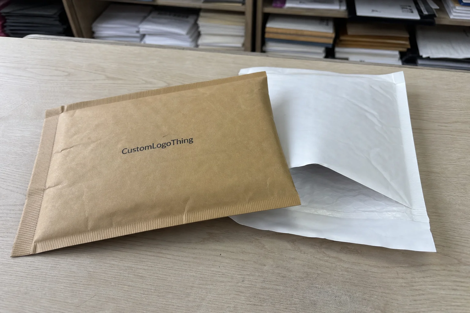
I’ve watched a hundred mailer samples come off press, and the funniest thing is this: the ones that look the most expensive are usually the ones with the least going on. I remember one brand owner staring at a one-color sample and saying, “That’s it?” Then the final shipment arrived from a plant in Dongguan, and suddenly that same bag looked like it belonged on a very expensive dressing room chair. That’s why minimalist white poly mailer design tips matter so much. White film is brutally honest. If your logo is off by 1.5 mm, if your ink is thin, if your type is too delicate, everyone sees it. No glitter. No busy pattern. No distraction. Just the truth.
Minimal means one clear brand mark, a restrained color palette, generous spacing, and no visual clutter fighting for attention. That’s the heart of minimalist white poly mailer design tips. It is not lazy design. It’s controlled design. A white poly mailer gives you a clean base that can read premium across beauty, apparel, wellness, and subscription brands without screaming for attention like a neon sign outside a karaoke bar. In a lot of supplier quotes I’ve reviewed from Shenzhen and Ningbo, the simplest white mailers are also the easiest to keep consistent across 5,000 to 50,000 pieces. That restraint is what makes a package feel expensive before anyone even opens it.
I visited a Shenzhen film-printing line a few years ago where a client wanted six colors on a white mailer. The press operator looked at the artwork, sighed, and told me, “This will look cheaper than one black logo.” He was right. The final approved version used a single charcoal logo, 18 mm of clear space around it, and a tiny URL on the back. The result looked sharp, and the production loss rate dropped because we weren’t fighting ink buildup or registration drift. The supplier’s first-pass approval time fell from four rounds to two, and that saved about a week on the schedule. I still think about that job whenever someone tells me minimal design is “too simple.”
That’s the part many brands miss. minimalist white poly mailer design tips are not only about style. They affect print quality, unit cost, production speed, and how people feel when the package lands on their doorstep. A clean white mailer can look custom, premium, and intentional even if the actual design has just two elements. Too much design, and the package feels confused. Too little, and it feels generic. The sweet spot is strategic restraint, especially when the mailer is being printed in a city like Guangzhou or Wenzhou where press runs are measured by the pallet and every extra plate adds labor.
I also want to clear up one thing: minimal is not boring. Boring is when a brand slaps a tiny logo in the center and calls it a day. Minimal is when every millimeter has a reason to exist. Strong spacing. Tight typography choices. Ink contrast that survives real production. If you want packaging that looks expensive without trying too hard, minimalist white poly mailer design tips are where you start. And yes, I’m biased here. I’ve seen enough overdesigned bags to last me a small lifetime.
How Minimalist White Poly Mailer Design Works in Printing
Printing on Poly Mailers is a different animal than printing on coated paper or folding cartons. Most mailers are printed by flexographic methods, and some larger programs use gravure-style cylinders. That means your artwork has to respect plate limits, ink behavior, and the reality of polyethylene film. If your design depends on razor-thin serifs or hairline gradients, the press will humble you fast. A typical flexible packaging film spec might be 60 to 80 microns of co-extruded polyethylene, while premium mailers often use 2.5 mil to 3.5 mil film for better puncture resistance. That’s why minimalist white poly mailer design tips usually point toward bold shapes, clean edges, and fewer variables.
On white film, a single-color design often looks cleaner because it reduces setup complexity. Fewer colors usually mean fewer plate changes, less chance of misregistration, and less muddy overlap at the edges. I’ve seen 3-color designs turn into a soft gray blur after the second proof because the white substrate reflected light differently than the designer expected. That kind of thing makes you want to bang your head gently on the sample table (not recommended, but emotionally understandable). When a brand wants a polished result, minimalist white poly mailer design tips often favor one strong ink tone instead of multiple decorative colors that fight each other.
Ink opacity matters too. Black is the easiest path because it covers well and stays legible from arm’s length. Charcoal works if the film finish is matte and the line weights are thick enough. Metallics can look beautiful, but only if the supplier knows how to hold them on film without streaking. On glossy white mailers, tiny type can wash out under overhead lighting. On matte film, the same artwork may read twice as clean. So yes, the finish changes everything. Anyone pretending otherwise probably hasn’t stood on a factory floor at 6 a.m. in Suzhou watching test pulls come off the press.
Here’s a simple way I explain layouts to clients using minimalist white poly mailer design tips:
- Centered logo — calm, classic, and easy to recognize. Best for brands that want quiet luxury.
- Corner logo — modern and understated. Good for fashion or DTC brands that want a more editorial look.
- Repeat pattern — still minimal if the pattern is tiny and sparse. Useful if you want brand presence without loud visuals.
- All-over print — can still work, but it stops being truly minimal if the repeat is dense or the contrast is too high.
Minimalist designs also reduce sample rejections. I’ve had factories in Dongguan and Ningbo approve a one-color logo in the first round because there was simply less to go wrong. No tiny icons. No gradients. No fuss. That is one reason minimalist white poly mailer design tips often help brands move faster from proof to production. Which, frankly, saves everyone from another round of “just one more tiny tweak” emails. I can feel my blood pressure rise even typing that.
Key Factors for Minimalist White Poly Mailer Design Tips
If you want minimalist white poly mailer design tips that actually hold up in production, start with logo size. Too small and your brand disappears when the courier tosses the bag onto a porch at a weird angle. Too large and the mailer starts looking like an advertisement from a discount outlet. I usually tell clients to reserve at least 20 to 30 mm of breathing room around the logo on standard apparel mailers. On a 10 x 13 inch bag, that spacing usually keeps the layout from feeling cramped, and on a 12 x 15.5 inch bag it gives the logo room to breathe without looking lost.
Color choice is the next big one. Black, charcoal, and deep navy are the safest choices because they give you high contrast on white film. If you want an accent color, pick one and stop there. I once negotiated a run for a skincare brand in Seoul that wanted sage, blush, and copper on the same white poly mailer. We killed two colors, kept one copper-toned logo, and the result looked more expensive. Sometimes the best minimalist white poly mailer design tips are basically a polite form of “no.”
Typography is where people get themselves into trouble. Thin script fonts look cute on a screen and then vanish on a film press. Bold sans-serif fonts hold up far better, especially at smaller sizes. Keep copy short. If your mailer says “Thanks for shopping with us” in 18-point script plus five social handles, it stopped being minimal a while ago. Strong minimalist white poly mailer design tips usually mean one brand line, one URL if needed, and maybe a discreet tagline only if it adds recognition. I’ve seen 8 pt type disappear on white poly in one proof cycle, while 11 pt bold sans held up cleanly from 18 inches away.
Finish matters more than most designers want to admit. A matte white poly mailer feels softer and more premium in the hand. Glossy white can look brighter and cleaner, but it shows scuffs more readily in transit. If your brand is in fashion, wellness, or gifts, matte often feels more elevated. If you’re shipping sportswear or promotional kits, glossy may look sharper under retail lighting. Either way, finish changes perceived value, and good minimalist white poly mailer design tips should account for that before artwork is approved. A matte 3 mil mailer from a factory in Haining will read very differently than a glossy 2.5 mil version from Yiwu.
Brand consistency is the last piece, and it’s the one people forget because they’re too focused on the mailer itself. Your insert card, packing tape, tissue, and shipping label should all tell the same story. I saw a DTC brand spend $0.22 per unit on beautiful white poly mailers, then ruin the whole effect with neon green thank-you cards and generic brown tape. Brutal. If the mailer is calm and refined, the rest of the unboxing should not look like a garage sale. Strong minimalist white poly mailer design tips always look at the full package, not just the exterior shell.
| Design Approach | Visual Effect | Print Risk | Best Use Case |
|---|---|---|---|
| Centered single-logo layout | Clean and balanced | Low | Premium basics, skincare, apparel |
| Corner logo with spacing | Subtle and modern | Low | Fashion, boutique brands, editorial DTC |
| Small repeat pattern | Brand presence without clutter | Medium | Lifestyle brands, subscription orders |
| Dense all-over print | Louder and less restrained | Higher | Promotional campaigns, seasonal drops |
What Are the Best Minimalist White Poly Mailer Design Tips for Premium Packaging?
The best minimalist white poly mailer design tips for premium packaging start with a simple truth: the eye trusts clarity faster than complexity. A white mailer can signal luxury if the logo placement, negative space, and ink choice are disciplined. The quickest path to that look is not adding more. It is removing almost everything that does not earn its place.
A strong premium layout usually uses one of three structures: centered logo, corner logo, or a sparse repeat pattern. The centered version feels classic and quiet. The corner version feels more editorial. The repeat pattern adds subtle brand visibility without crowding the bag. All three can work, but the strongest minimalist white poly mailer design tips keep the logo legible and the background calm. In practice, that means avoiding thin lines, busy icons, and tiny copy that disappears once the mailer is in motion.
For premium packaging, the finishing details matter as much as the graphic design. Matte film usually reads more refined than glossy because it diffuses light and hides scuffs. High-contrast ink, especially black or charcoal, tends to look sharper on camera and in person. If you want a more upscale feel, use one accent color sparingly, then let white space do the rest. That is one of the most dependable minimalist white poly mailer design tips for brands that want a polished unboxing moment without turning the package into a billboard.
Production quality also shapes the premium effect. If the print is slightly off-center, or the adhesive flap wrinkles under pressure, customers notice immediately. That is why minimalist white poly mailer design tips should always include sample approval, not just digital mockups. A design can look luxurious on screen and still fail on film if the spacing is too tight or the color is too faint. Real samples show you what the package actually communicates.
Finally, think about the whole system. The mailer, insert card, tape, and label should speak the same visual language. If the bag feels calm but the rest of the order looks improvised, the premium effect collapses. The best minimalist white poly mailer design tips are not really about the mailer alone. They are about building a brand presence that stays consistent from warehouse to doorstep.
Step-by-Step Process and Timeline for Minimalist White Poly Mailers
Good minimalist white poly mailer design tips are useless if the workflow is chaotic. My typical process starts with a packaging brief. Size, material thickness, logo files, quantity target, and print finish. If the client sends me a blurry PNG and says “make it premium,” I already know we’re going to burn time. A proper brief saves days. Sometimes even weeks, especially if the factory is in Dongguan, the designer is in Los Angeles, and the merch team is still waiting on final Pantone references.
Here’s the order I like to follow: concept, dieline review, artwork setup, proofing, sample approval, production, and delivery. For a standard white poly mailer order, a realistic timeline is 12 to 15 business days from proof approval if the factory has the film in stock and the art is clean. If you need special dimensions, a matte finish, or a custom adhesive strip, expect that number to stretch to 18 to 22 business days. Clean minimalist white poly mailer design tips help because simple artwork usually needs fewer revisions.
- Build the brief — include dimensions like 10 x 13 inches or 12 x 15.5 inches, plus your target quantity.
- Review the dieline — check seal zones, flap edges, and label placement.
- Set artwork in vector format — AI, EPS, or PDF with outlined fonts.
- Request a digital proof — confirm spacing, logo size, and color callouts.
- Approve physical samples — check ink coverage, seam integrity, and closure performance.
- Release production — once approved, the line can move without constant interruption.
I had one client whose brand team kept sending PDF logos with embedded shadows. The factory kept asking for clean vector art, and everyone acted confused, which is always entertaining until you’re paying for delays. We flattened the files, moved the logo 8 mm upward, and the proof approved on the second round. That’s the value of clean minimalist white poly mailer design tips: they often reduce the number of moving parts in the approval chain.
Sampling checkpoints matter too. Don’t just glance at the front. Check the seal. Check seam placement. Check whether the mailer tears cleanly or splits in the wrong place. If you’re shipping under ASTM or ISTA-related transit expectations, you should care about handling durability, not just appearance. For packaging industry references, I keep a close eye on standards and testing guidance from ISTA and material guidance from EPA packaging resources. Design is cute. Transit damage is expensive.
Rush jobs happen, sure. But rush jobs with complex artwork usually produce more headache than value. I’ve seen a $1,200 sampling order turn into a $3,600 rework because the brand kept changing font weights after the first proof. A minimalist layout with one logo and one color often gets approved faster because there are fewer ways to mess it up. That’s not just a designer’s opinion. It’s factory reality, and it shows up in the invoice as clearly as a freight line from Shenzhen to Long Beach.
Cost and Pricing Considerations for Minimalist White Poly Mailer Design Tips
Let’s talk money, because someone always dances around it and I’m not that person. Minimalist white poly mailer design tips can absolutely help reduce setup cost. Every extra ink color adds complexity. Every extra print location adds labor. Every special finish adds cost. Simplicity can save you real dollars, and in packaging, real dollars are the only kind I’ve ever met. I wish there were a prettier way to say that, but there really isn’t.
The biggest cost drivers are material thickness, size, quantity, print method, finish, and custom features. A 2.5 mil white poly mailer with one-color print will usually cost less than a 3.5 mil mailer with two-sided print and a matte finish. For example, in factory quotes I’ve seen from Guangdong and Fujian, a simple one-color run at 5,000 pieces might land around $0.15 to $0.21 per unit depending on dimensions and film spec, while the same job at 20,000 pieces can drop closer to $0.10 to $0.15 per unit. If the bag uses a 350gsm C1S artboard insert or a reinforced flap, the price can move again. That’s the boring math behind good minimalist white poly mailer design tips.
White mailers can actually be cost-efficient for premium branding because the background does part of the work for you. Darker substrates often require more ink coverage to get strong visibility. White gives you a clean base, which means a single logo can already feel deliberate and high-end. That’s especially useful for brands that want a premium look without paying for full-coverage artwork. In other words, the package gets to do some of the heavy lifting so your budget doesn’t have to.
Here’s the pricing mindset I use with clients:
- Low MOQ test run — good for design validation, but higher unit pricing.
- Mid-volume order — usually the best balance if you’re still refining demand.
- Bulk order — best unit economics, but only if storage and cash flow make sense.
I’ve had brands save $700 to $1,400 on one order just by removing a second ink color and dropping a decorative back-print that no customer ever noticed. I know, shocking. People rarely inspect the backside of a mailer like they’re judging a museum exhibit. If your design is minimal and focused, you can usually spend the budget where it matters: better film, stronger adhesive, or a nicer finish. That is one of the smartest minimalist white poly mailer design tips I can give anyone.
Don’t forget hidden costs. Sampling freight, proof revisions, plate fees, and color matching can stack up quickly. One client thought the order was $0.15 per unit all-in, then discovered three sample shipments and two artwork revisions added another $280. Not catastrophic. Just annoying. Ask suppliers for tiered pricing at 3,000, 5,000, 10,000, and 20,000 pieces. That way you see where the unit economics actually improve instead of guessing. If you’re sourcing from a factory in Shenzhen, ask whether the quote includes export cartons, 2% spares, and customs-ready packing lists.
For brands building a full packaging system, check out Custom Poly Mailers and the broader Custom Packaging Products range so the mailer, insert, and shipper all feel like they belong to the same brand family. That kind of consistency often makes a $0.17 mailer look like a $0.40 one.
Common Mistakes People Make With Minimalist White Poly Mailers
The biggest mistake I see is treating empty space like a substitute for design. Empty space is powerful, yes. But empty space without a focal point just looks unfinished. Strong minimalist white poly mailer design tips use spacing to emphasize the logo, not to abandon the rest of the layout. If your mailer feels like a blank school worksheet, you’ve gone too far. On a 12 x 15.5 inch mailer, a centered logo with 25 mm margins usually looks considered; a tiny mark floating in the middle of 300 mm of blank film does not.
Low-contrast logos are another problem. Light gray on white? Cute in a mockup. Painful in production. Pale beige, dusty rose, and faint silver often look washed out once they hit poly film and move through the press. White is merciless. Use it to your advantage, not against yourself. A good rule from practical minimalist white poly mailer design tips: if the brand mark can’t be read from about one arm’s length away, it needs stronger contrast.
People also overstuff the back side. A tiny logo on the front, then a giant block of social handles, QR codes, care instructions, icons, and a slogan on the back. That’s not minimal. That’s a hostage note with branding. I’m only half joking here, because I’ve actually seen it on a 10,000-piece run out of Ningbo. If you want a refined look, keep the back side calm. One URL or one concise line is usually enough.
Shipping compatibility gets ignored too often. You need contrast for labels, space for barcodes, and enough clean area so tape or courier stickers don’t interrupt the visual hierarchy. I’ve seen brands place their logo right where the shipping label always lands. That’s not “integrated design.” That’s bad planning. Strong minimalist white poly mailer design tips account for the real-life path of the package from warehouse to doorstep, including the 4 x 6 label that every fulfillment center seems to love.
Brand inconsistency is the last killer. If the mailer is refined but the insert card is pixelated and the tape is generic, customers feel the disconnect immediately. Their brains may not say it out loud, but they notice. I’ve seen a polished white poly mailer lose credibility because the thank-you note looked like it was designed in 2009 on a free template site. Don’t do that to yourself. A package can be one-color and still fail if the supporting pieces are sloppy.
Expert Tips to Improve Minimalist White Poly Mailer Design
If you want the practical version of minimalist white poly mailer design tips, here it is: start with one strong logo placement and test that before you get fancy. The simplest layout often performs best in customer photos, social posts, and unboxing videos. People like clarity. They also like packaging that doesn’t need a 20-second explanation. I mean, nobody wants to solve a visual puzzle before breakfast.
One accent color can work beautifully if it reinforces recognition. I’m talking about a single deep green, warm copper, or navy accent used sparingly. Don’t sprinkle multiple colors because you’re afraid of commitment. Minimalist design has a point of view. It doesn’t hedge its bets. Good minimalist white poly mailer design tips use color as a signal, not confetti. A single foil-like copper tone on a matte white mailer from a factory in Guangzhou can look sharper than three standard inks trying to do too much.
Physical samples are non-negotiable. Digital mockups lie. White film reflects light differently under warehouse LEDs, daylight, and factory fluorescents. A proof on screen can look perfectly crisp and then show a faint halo on the real substrate. I’ve had clients approve digital art, then change direction after holding the sample under natural light near the loading dock. Smart move, honestly. Real samples are where minimalist white poly mailer design tips either prove themselves or fall apart. I always recommend checking the sample at 9 a.m. and again at 4 p.m.; the same white can read warmer or cooler depending on the light.
“The white sample looked elegant, but only after we increased the logo by 12% and moved it 6 mm left. On screen, nobody noticed. On film, it was night and day.” — one of my favorite brand managers after a three-round proof cycle
Negotiation matters too. Ask suppliers for two proof setups if the first one feels too small or too crowded. I’ve done side-by-side proof comparisons with factories in Guangdong where one version had a centered logo and the other used a top-left placement. The client chose the second version in under five minutes because the spacing felt better in hand. That kind of comparison is cheap. Regret is expensive, especially if a second proof costs $35 to $80 and saves a $1,500 production mistake.
Think beyond the mailer itself. If your inserts, thank-you cards, and labels echo the same quiet confidence, the whole package feels intentional. That is the secret behind many premium-looking brands. Not louder packaging. Better-aligned packaging. If you want a clean system, explore the wider Custom Packaging Products lineup so your shipping materials don’t look like they were selected by three different people who never met. I’ve seen the difference between a coordinated set and a random assortment, and it’s the difference between “premium” and “procured in a hurry.”
What to Do Next With Your Minimalist White Poly Mailer Design
The fastest way to improve your packaging is to audit what you already have. Pull one mailer from your current stock and ask three blunt questions: Is the logo readable from arm’s length? Does the spacing feel deliberate? Would this still look premium if the warehouse light is harsh? That simple review will tell you more than a week of mood boards. And yes, minimalist white poly mailer design tips usually start with this kind of reality check.
Build a one-page packaging brief before you touch artwork again. Include dimensions, logo files, brand colors, finish preference, quantity target, and print location. If you want better supplier quotes, give them clean information. If you want fewer mistakes, stop sending seven versions of “final_final2.ai.” I’ve seen that file name more times than I care to admit. Solid minimalist white poly mailer design tips are practical, not poetic. A brief with exact specs, such as 2.5 mil film, 10 x 13 inch size, and one-color black print, will get you better answers from factories in Shenzhen or Jiaxing.
Ask for two or three sample layouts. A centered logo, a corner logo, and a repeat pattern will usually reveal what your brand really needs. Once you see them on actual white film, one option usually wins immediately. That’s the version to refine. If you keep trying to make every option work, you’re just paying to confuse yourself. Good minimalist white poly mailer design tips eliminate noise fast.
Set a budget range before revisions start. If you know your target is $0.14 to $0.22 per unit, your decisions will stay grounded. If the supplier comes back with a $0.31 quote because you added extra printing, you can cut the excess without drama. That’s how experienced buyers work. No fantasy shopping. No “let’s make it luxurious” nonsense with no numbers attached. A clear ceiling also helps when comparing a 5,000-piece trial order against a 20,000-piece bulk run.
My advice? Finalize the artwork, request a proof, and check whether the draft still holds up after printing. Then hold the sample under real light, next to your insert card and shipping label, and see if the whole system feels calm and expensive. That is the goal of minimalist white poly mailer design tips: packaging that feels effortless because a lot of effort went into getting the details right. If the supplier says proof approval takes 2 to 3 business days and production takes 12 to 15 business days after that, you can plan the launch date with far fewer surprises.
FAQ
What makes minimalist white poly mailer design different from a plain white mailer?
A plain mailer is usually unbranded or barely branded. A minimalist design uses intentional spacing, typography, and logo placement so the package looks premium without clutter. The difference is restraint with purpose, not just less ink. A one-color logo with 20 mm of clear space can look deliberate on a 3 mil white mailer from a factory in Dongguan, while a blank bag usually just looks unfinished.
Which colors work best for minimalist white poly mailer design tips?
Black, charcoal, and deep navy are the safest high-contrast choices. Metallics can work if the supplier can print them cleanly on film. Avoid pale shades that disappear on white or shift too much between samples. If you want one accent, pick a single tone and keep it consistent across the mailer, insert card, and label set.
How much should a simple custom white poly mailer design cost?
Cost depends on size, thickness, quantity, print method, and finish. Simple one-color designs usually cost less to set up than multi-color artwork. For example, a 5,000-piece order might come in around $0.15 to $0.21 per unit, while 20,000 pieces can drop closer to $0.10 to $0.15 per unit. Ask for tiered quotes at several quantities so you can compare the unit price properly.
How long does it take to produce minimalist white poly mailers?
Timelines usually depend on artwork readiness, proof approval, and the supplier’s production queue. Clean, simple designs often move faster because there are fewer print variables. A typical schedule is 12 to 15 business days from proof approval for standard runs, while special finishes or custom sizes can extend that to 18 to 22 business days. Delays usually come from missing vector files or repeated revisions.
What is the biggest mistake in minimalist white poly mailer design tips?
The biggest mistake is assuming minimal means empty. You still need a clear focal point, strong contrast, and enough white space to feel deliberate. If the brand mark cannot be read from a normal viewing distance, the design needs work. Another common miss is putting labels and logos in the same area, which creates clutter the courier will expose immediately.
If you want packaging that looks calm, premium, and production-friendly, minimalist white poly mailer design tips are a smart place to start. Keep the layout simple, the contrast strong, and the supplier brief clean. Do that, and your mailers will look intentional instead of accidental. A well-specified order from Guangzhou, Shenzhen, or Ningbo can make the difference between a sample that gets rejected and one that ships on the first approval cycle.