Buyer Fit Snapshot
| Best fit | Minimalist White Poly Mailer Design projects where brand print, material claims, artwork control, MOQ, and repeat-order consistency need to be specified before quoting. |
|---|---|
| Quote inputs | Share finished size, material target, print colors, finish, packing count, annual reorder estimate, ship-to region, and any compliance wording. |
| Proofing check | Approve dieline scale, logo placement, barcode or warning zones, color tolerance, closure strength, and carton packing before bulk production. |
| Main risk | Vague material claims, crowded artwork, missing packing details, or unclear freight terms can make a low unit price expensive after revisions. |
Fast answer: Minimalist White Poly Mailer Design: Film, Print, MOQ, and Carton Packing should be specified like a repeatable production item. The safest quote records material, print method, finish, artwork proof, packing count, and reorder notes in one written spec.
Production checks before approval
Compare the actual filled-product size with the drawing, then confirm tolerance on folds, seals, hang holes, label areas, and retail display edges. Reserve space for logos, QR codes, warning copy, and material claims before decorative graphics fill the panel.
Quote comparison points
Review material grade, print process, finish, sampling route, tooling charges, carton quantity, and freight assumptions side by side. A quote is only useful when the supplier can repeat the same color, closure quality, and packing count on the next order.
Minimalist White Poly Mailer Design Tips That Sell
I still remember a brand spending about $2,400 to strip a loud, overworked mailer down to one ink on white film, and the package looked more expensive the second it left the press in Dongguan, Guangdong. That is the strange little magic behind minimalist white poly mailer design tips: the fewer elements you allow, the more pressure lands on each decision. White film does not flatter sloppy work. It tattles on it, especially under 4,000K warehouse LEDs and a smartphone camera held at arm's length.
If you want the clean, premium look without drifting into generic shipping-supply territory, treat minimalist white poly mailer design tips as production rules, not decoration advice. The design may look simple on paper. The execution rarely is. I have seen a tiny logo turn a mailer into something that felt like a luxury subscription, and I have seen a supposedly minimal layout collapse into a plain white sack because the type was too thin, the artwork was too small, and the seam cut through the visual center like it had a grudge. One version was sampled in Chicago, the other in a plant outside Shenzhen, and the difference came down to 6 mm of placement discipline.
Here is the framework I use with clients: minimalist white poly mailer design tips work best when restraint has a purpose. You are not trying to fill the surface. You are trying to command the surface. White space, one confident brand mark, a tight type system, and a finish that supports the artwork instead of fighting it. That is the whole equation. Simple? Yes. Easy? Not even close. A 0.4 mm line weight can make the difference between elegant and invisible.
What Minimalist White Poly Mailer Design Really Means
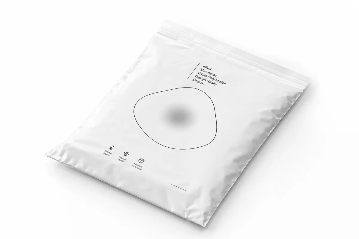
The first time I walked a brand team through minimalist white poly mailer design tips on a factory floor in Dongguan, they kept pointing at the blank area and asking what else we could put there. I told them nothing. Then I showed them a one-color sample after the flexo plate was tightened and the bag came off the line with a centered black logo, 18 mm of quiet space around it, and no decorative clutter. They finally got it. The package looked more expensive because it was not trying to perform for everyone in the room. That same logic is why white mailers with 2-color art often feel busy by comparison.
That is the core of minimalist white poly mailer design tips: generous white space, one logo treatment that feels intentional, restrained typography, and almost no extra decoration. White does a surprising amount of work. On a white poly mailer, even a small mark reads as deliberate because the background is calm. Crowd the surface with stars, badges, taglines, and four different weights of type, and that effect disappears fast. It starts looking like a yard sale with a mailing label, especially once the courier adds a 4 x 6 inch sticker.
Minimal does not mean empty. I say that plainly because plenty of founders confuse the two. An empty bag looks like supply-chain packaging. A minimal bag still has structure. It has a logo placed with care, maybe one line of copy, maybe a subtle inside print, and a sense that someone made decisions instead of deleting things at random. Good minimalist white poly mailer design tips create control, not vacancy. There is a difference, and it matters when a customer opens the parcel in Brooklyn, Berlin, or Brisbane and decides in three seconds whether the brand feels deliberate.
One client meeting in Chicago still sticks with me. A beauty brand brought in a white poly mailer mockup with no real hierarchy, just a logo floating in the middle and a tiny tagline under it. The team thought it looked modern. I asked them to hold it under showroom lighting and then under warehouse fluorescents at 3,200K. Under the harsher light, the tiny tagline vanished and the bag looked unfinished. We tightened the type, removed the tagline, and the same layout suddenly felt premium. That is why minimalist white poly mailer design tips are less about taste and more about visual discipline.
"We thought minimal meant easier. It was actually harder. Every millimeter mattered."
That quote came from a founder after their first round of proofs in Suzhou. They had expected a white bag to be a shortcut. It is not. White film exposes every weak decision: off-center artwork, sloppy spacing, text that is too light, and logos that drift once the mailer is folded. If you are serious about minimalist white poly mailer design tips, start by accepting that simplicity just reduces the number of places you can hide a mistake. Which, honestly, is both annoying and useful, especially when you are paying for 8,000 pieces at a time.
I also like to define the style this way: minimalist white poly mailer design tips are for brands that want their packaging to look edited. Not loud. Not decorated to death. Edited. That is a very different brief, and it usually saves money on ink, but it can increase the need for proofing because there is nowhere for bad registration to hide. White backgrounds are brutally honest. Great for fashion. Terrible for your ego. I have seen a one-color run on 2.5 mil LDPE look sharper than a four-color bag because the art was finally allowed to breathe.
Why Do Minimalist White Poly Mailer Design Tips Improve the Unboxing Experience?
Minimalist white poly mailer design tips improve the unboxing experience because they remove noise before the customer ever touches the product. A clean white poly mailer creates a calm first impression, which makes the brand mark feel intentional and the opening moment feel more premium. That matters more than people expect: consumers decide quickly whether packaging feels polished, and a restrained layout helps the eye land on the logo, the finish, and the material instead of getting lost in clutter. A white mailer also photographs well, which means the unboxing experience carries farther on social media, product reviews, and customer photos than a busy bag ever will.
Think of it like this: a crowded mailer asks for attention, while a well-edited mailer earns it. The best minimalist white poly mailer design tips support that shift with negative space, one strong type choice, and a print finish that feels clean in hand. Add a hidden detail if you want, such as a subtle inside print or a tone-on-tone mark, but keep the front of the bag disciplined. Customers rarely remember every graphic on a package. They remember the feeling it gave them when they opened it, and that feeling is usually shaped by restraint, not decoration.
There is also a practical side to all of this. A calm front panel makes the shipping label, the return mark, and any tamper evidence easier to read because the design is not competing with itself. I have watched a white bag with one centered logo outperform a busier competitor in customer photos simply because it looked easier to trust. That trust is not abstract; it is the little split-second judgment that says the brand probably cares about the product inside, too. And yes, that can be kinda unfair, but packaging has always been a fast read.
How Minimalist White Poly Mailer Design Works in Production
On the production side, minimalist white poly mailer design tips live or die by substrate behavior. White film changes the way print looks because scuffs, dust, and weak registration show faster on a light surface. I have seen a slightly dirty platen add a gray cast to a run of 8,000 bags, and the client noticed it before anyone on the floor did. White is clean-looking, but it is not forgiving. It is the packaging equivalent of wearing white pants on a rainy day and pretending nothing can go wrong. A plant in Ningbo can run the same file differently from one in Ho Chi Minh City if the tension and heat settings are off by even a few degrees.
Print method matters too. For larger runs, flexo usually makes sense because the setup costs are spread across quantity and the print stays consistent once the line is dialed in. For shorter runs or projects with a few fast revisions, digital can be the smarter move because it handles lighter branding without asking you to buy plates you may not reuse. The wrong choice can make even smart minimalist white poly mailer design tips look sloppy, especially if the process adds banding, dot gain, or color shift. A 5,000-piece flexo run and a 750-piece digital test should not be judged by the same price lens.
Finish changes everything. A gloss surface makes white look brighter and can help a one-color logo pop in photos, but it also shows scuffing more readily when bags are stacked or dragged across a conveyor. Matte lowers glare and gives the package a calmer feel in hand. Soft-touch effects are trickier on Poly Mailers than on paperboard, but you can still get a more tactile feel through certain matte film constructions. I always tell clients to view minimalist white poly mailer design tips through the lens of lighting, shipping abrasion, and phone-camera photos, because that is how customers actually see the bag. Not under studio lights. Not in a perfect mockup. On a couch, by a door, while someone is half-reading a text.
Seam placement, flap size, and adhesive strip location matter more than most people expect. A centered logo can suddenly feel off if the top flap eats into the safe area or a courier label lands where your artwork was supposed to breathe. I have had a designer swear the artwork was wrong, only to learn the issue was a 12 mm seal edge shifting the visual center. That is why minimalist white poly mailer design tips should always be checked against dielines, not just mockups. Mockups lie politely. Dielines are rude, but useful. On a 9 x 12 inch mailer, 2 mm of drift is enough to make the whole front feel crooked.
Proofing on the actual substrate is non-negotiable. A screen mockup lies by omission. It does not show how the white film takes ink, how the zipper or peel strip reflects light, or how the logo looks after the mailer is folded and packed 50 to a case. I prefer a physical sample in hand before approval. If the vendor can also run a transit check based on ISTA testing guidance, even better. That is where minimalist white poly mailer design tips stop being aesthetic and start becoming operational. A sample made on 80-micron LDPE tells you more than three rounds of PDFs.
Here is the ugly truth from the factory floor: a minimal design has less room for defect camouflage. If the bag is a little dusty, you see it. If the registration is off by 1 mm, you see it. If the logo color is slightly warm instead of neutral, you see it. That is not a reason to avoid minimalist white poly mailer design tips. It is a reason to demand better proofs and tighter line control. I would rather catch the problem on a sample than discover it in a pallet of 12,000 bags while everyone stares at me like I personally offended the laws of printing. A missed sample can cost $450 in reproofing; a missed pallet can cost far more.
Minimalist White Poly Mailer Design Tips for Key Choices
The best minimalist white poly mailer design tips start with palette discipline. Keep it to one logo color and, if you need a second tone, make it a neutral accent that stays quiet. A white mailer with black type and a single gray line can look expensive. A white mailer with black, gray, silver, and a random accent blue usually looks confused. I have watched brands save $0.03 per unit on ink only to lose the premium feel because they tried to cram in three messages and two decorative borders. The human eye can tell when a bag is trying too hard. It gets tired, then suspicious. In a 10,000-unit run, that tiny savings can be swallowed by one reprint.
Typography is the next trap. One strong sans serif or one restrained serif usually beats a pile of trendy fonts every time. Thin strokes can disappear on polyethylene, especially after the mailer is folded or photographed on a phone. I like type that can survive a 9-inch viewing distance and a 6-foot warehouse scan. If your logo depends on hairline weight, that is not a logo problem. That is a production problem. Good minimalist white poly mailer design tips respect legibility before style. I know, thrilling stuff. But that boring little rule saves brands from themselves, whether the file is routed to a shop in Los Angeles or a converter in Guangzhou.
Negative space is not leftover space. It is part of the design. I have had clients stare at a mockup and say, "It looks empty," when what they really meant was "I am used to clutter." Once we widened the margins to 22 mm and dropped one unused badge, the bag felt more composed. White space on a mailer gives the eye a place to rest, and that makes the brand mark feel more deliberate. If you want minimalist white poly mailer design tips that work in the real world, treat spacing like a material, not a blank. Space costs nothing on a spreadsheet and everything in perception, which is why I treat it like inventory.
Logo placement should survive folding, stacking, and the ugly reality of fulfillment. Put the mark where it does not get sliced by seams, crushed by tape, or hidden by courier labels. I like to proof artwork with a fake shipping label overlaid because that is what happens in the wild. One e-commerce client ignored this and printed a gorgeous centered logo that disappeared under a 4 x 6 label on every outbound order. That mistake cost them almost a full reprint. The best minimalist white poly mailer design tips account for the label before the customer ever sees the bag. If the carrier label wins, your brand loses. That is not a philosophy problem. That is a logistics problem with a $1,800 lesson attached.
If you want pattern at all, keep it subtle and repeatable. Think a faint micro-pattern, a barely-there tone-on-tone mark, or a small repeated icon that sits in the background instead of shouting over the logo. I have seen a faint monogram at 8% tint look elegant on a white mailer because it created depth without clutter. The moment a pattern becomes the main event, the package stops feeling minimal. That is where minimalist white poly mailer design tips cross into overdesign, which is basically design's version of stepping on stage and grabbing the microphone from yourself. A 12-repeat pattern is usually enough; a wallpaper effect is not.
- Palette: one primary brand color, one neutral if needed, and no decorative extras.
- Type: one family, two weights, and a size that survives folding and phone photos.
- Spacing: use at least 15 to 22 mm of breathing room around the logo where the dieline allows it.
- Placement: keep artwork away from seams, tear lines, and the label zone.
- Pattern: only use it if it adds texture without competing with the logo.
If you are shopping for structure, not just print, look at the build behind the bag too. Our Custom Poly Mailers are a good place to compare sizes, closures, and film options before you commit to artwork. That keeps minimalist white poly mailer design tips tied to the actual packaging format instead of a loose design file sitting on somebody's desktop. The desktop, as a rule, is where bad assumptions breed, usually right next to the half-finished approval email.
I also suggest reviewing your broader kit alongside the mailer. A white bag can look great on its own, but the whole order feels better when the insert card, tissue, sticker, or thank-you note speaks the same visual language. If you need matching pieces, our Custom Packaging Products page is useful for seeing what can be coordinated without turning the unboxing into a craft project. Good minimalist white poly mailer design tips work best when the rest of the packaging does not fight them. Nobody needs a mailer whispering elegance while the insert card is shouting in three fonts and a neon orange border.
Cost, Pricing, and Order Minimums
People assume minimalist white poly mailer design tips automatically mean low cost. Sometimes yes. Sometimes not even close. The price changes with bag size, film thickness, print colors, finish, and the supplier's minimum order quantity. A 10 x 13 inch white mailer with one-color print at 5,000 pieces might land around $0.15 per unit from a Shenzhen or Dongguan converter if the art is simple and the freight is stable, while the same bag at 20,000 pieces could drop closer to $0.10 to $0.13 depending on freight and setup. That is why the design itself is only part of the bill.
Setup costs can bite harder than the ink. Plates, die charges, color matching, and proofing can add $180 to $450 on a small project, and sometimes more if you are changing artwork across several sizes. I have had a client saved by a simple two-color decision because each extra plate would have pushed their launch budget by another few hundred dollars. That is the practical side of minimalist white poly mailer design tips: fewer print colors often means fewer headaches, but the project still needs real quoting. Budget surprises are fun for nobody except maybe the accountant, and even then I suspect only briefly. On a 3,000-piece batch, a second color can add $0.04 to $0.07 per unit.
Always ask for quotes at multiple quantities. A 3,000-piece quote can look high because setup is spread thin, while a 10,000-piece quote may only move the price a few cents if the plant is already running a similar white film. I do not trust a single number. I want three: 2,500, 5,000, and 10,000, plus a landed cost estimate with freight. That is how minimalist white poly mailer design tips turn into procurement decisions. If you only compare one quantity, you are basically guessing with a calculator, which is how people end up overpaying by 18% and calling it a strategy.
Compare landed cost, not just unit cost. The cheap quote can become expensive fast once you add ocean freight, domestic trucking, duties, palletizing, and storage. I watched one brand choose a low offshore price and then burn almost $1,100 on freight and accessorial fees they had not budgeted. Their bag still looked good, but the finance team was not impressed. minimalist white poly mailer design tips should be judged by the total number on the invoice, not the vanity number on the quote sheet. A quote from Los Angeles can look high until you compare it with a pallet leaving Qingdao and arriving six weeks later.
| Option | Typical Quantity | Approx. Unit Cost | Setup Cost | Best Use |
|---|---|---|---|---|
| Digital print on white poly | 500 to 3,000 | $0.55 to $1.10 | $75 to $250 | Short runs, testing, fast artwork changes |
| Flexo print on white poly | 5,000 to 50,000 | $0.11 to $0.28 | $180 to $450 | Repeat orders, stable branding, lower long-run cost |
| Stock white mailer with custom label | 100 to 2,000 | $0.30 to $0.75 | $0 to $25 | Very small launches, testing, emergency fills |
If you are comparing suppliers, get real quotes from a mix of sources. I usually tell clients to talk to a domestic distributor like Uline for quick checks, a sustainability-focused supplier like EcoEnclose for eco-positioned programs, a global converter like Mondi for broader manufacturing scale, and one local printer or converter that can show a sample in person. The point is not to pick a brand name because it sounds official. The point is to see how the numbers behave across minimalist white poly mailer design tips that look the same on paper but not in freight. A quote from a facility in Illinois will not behave the same as one from Vietnam once duties and pallet loads enter the picture.
For brands with paper inserts or hang tags, I also like asking for FSC-certified board when the print piece matters to the story. You can read the standard at FSC's official site. I have seen buyers pay a little more for certified inserts because it made the whole package feel more considered. A 350gsm C1S artboard insert can carry a short brand line, a QR code, and a return-policy note without feeling flimsy. That detail pairs well with minimalist white poly mailer design tips, especially when the mailer itself stays clean and the paper inserts carry the sustainability message. It is a small signal, but customers are surprisingly good at noticing small signals.
Step-by-Step Design Process and Timeline
Good minimalist white poly mailer design tips begin with the use case, not the artwork. What ships inside the bag? How heavy is it? How often does it ship? Is the customer opening it at home or in a workplace? I asked those questions during a sportswear project in Austin, and it turned out the original layout was built for retail presentation while the actual use case was warehouse shipping with a giant carrier label. That changed everything. A beautiful design built for the wrong reality is just expensive confusion, usually in the form of a 10,000-piece order nobody wants to reprint.
Before design begins, collect the specs: dimensions, product weight, closure style, seal width, film thickness, whether the bag needs a tear notch, and whether a shipping label will cover part of the front. I like to lock those down before anyone opens Illustrator. If the dieline is wrong, the design is wrong. That is one of the least glamorous minimalist white poly mailer design tips, but it saves money every single time. You can fix taste later. You cannot fix the wrong seal placement after the order lands. A 12 mm flap and a 20 mm flap are not interchangeable just because the mockup looked pretty.
- Gather the product specs and label requirements first.
- Build two or three design directions, each with a different spacing strategy.
- Review at actual size, not just on a laptop screen.
- Order a sample and inspect the seal edges, white balance, and print clarity.
- Approve production only after the sample passes real handling tests.
I once negotiated a white mailer order with a supplier in Shenzhen who kept pushing us toward a one-week turnaround on paper. The sample arrived, and the logo was technically correct but visually wrong because the white film had a slight cream cast under warehouse LEDs. We adjusted the ink density, shifted the logo 6 mm upward, and widened the safe area. The revised version was worth the delay. That is why minimalist white poly mailer design tips always include a physical sample, not just a digital file and a prayer. Prayer is lovely. It is also terrible quality control, especially when the plant is running 15,000 units a day.
A realistic schedule is usually a few days for concepting, another few days for proof corrections, and then one to three weeks for production depending on the supplier and shipping route. A simple domestic run can be quicker; an offshore run with custom film may take longer. I tell clients to build in at least 12 to 15 business days from proof approval if they want breathing room. That timeline does not include surprises, and packaging loves surprises almost as much as it loves freight delays. The best minimalist white poly mailer design tips respect the calendar, because a polished launch on March 12 is better than a rushed one on March 5.
For quality control, I like to think in three checks: visual, functional, and transit. Visual means the logo, type, and spacing look right. Functional means the seal works, the flap closes, and the label fits. Transit means the bag can handle friction, compression, and drop stress. If you want a simple reference for packaging performance, the broader packaging community at ISTA is a decent starting point for testing concepts. Minimalist design is not fragile by default, but it does need to prove itself. That is one of the most overlooked minimalist white poly mailer design tips I can give you, and it matters whether the parcel is going across town or across the Pacific.
Common Mistakes That Make a Minimal Mailer Look Cheap
Too many design elements is the first sin. I have watched a clean white mailer get wrecked by a second font, an extra icon row, a badge, and a social handle that nobody needed. The file looked busy before it even hit the press. One of the simplest minimalist white poly mailer design tips is this: remove one element before you add another. Then remove one more. I promise the page will survive, and so will your margins if you are paying for 6,000 pieces from a converter in Guangzhou.
Tiny logos are a close second. Founders love shrinking the brand mark because they think it feels subtle. On the line, subtle often translates to invisible. Once a bag moves through fulfillment, gets photographed by a customer, or is stacked under other parcels, small type disappears. A logo that looked elegant at 100 percent zoom may be unreadable at arm's length. If you want minimalist white poly mailer design tips that hold up in the real world, test the logo at actual viewing distance. A logo is not a secret. It is supposed to be seen, ideally from 3 to 6 feet away.
Ignoring sheen and scuff resistance is another expensive mistake. A glossy white bag can scratch more visibly after a few shipments. A matte film may hide small marks better but can show dull rub spots if the coating is weak. I learned that the hard way after a batch of 6,000 bags came back with surface scuffing from a poorly packed pallet. The branding was fine. The finish looked tired. That is why minimalist white poly mailer design tips should include material durability, not just layout choices. Pretty artwork cannot outvote bad handling, and a 2.8 mil film will not hide a bad pallet wrap.
Label placement causes more grief than people admit. I once sat in a meeting where the creative director loved the centered logo so much that he ignored the shipping label zone entirely. The first carrier sample covered the entire mark. The package went from premium to generic in two seconds. Good minimalist white poly mailer design tips assume the label will land somewhere annoying and plan for it. In fulfillment, annoying is not a possibility. It is a recurring theme, usually around the top right corner.
Skipping a physical proof is the fastest way to waste money. Digital screens hide registration drift, seam distortion, color shift, and the way the white film behaves under warehouse light. I have seen approved artwork arrive with the logo shifted 4 mm left because the seam took up more space than expected. If that sounds small, try staring at 10,000 bags with the same mistake. A proof is cheaper than a reprint. That is one of those minimalist white poly mailer design tips that sounds boring until it saves your quarter, and sometimes your entire launch.
- Bad idea: stacking multiple fonts and multiple badges on a white bag.
- Bad idea: placing critical artwork inside a zone that the courier label will cover.
- Bad idea: approving a mockup before checking the actual substrate.
- Bad idea: assuming a small logo will still read clearly after packing and transit.
If you want a cleaner look without paying for a redesign every season, build rules now. Set a logo-safe zone. Define one font family. Pick one finish and keep it consistent across runs. That is how minimalist white poly mailer design tips become a system instead of a one-off experiment. Systems are not glamorous, but they are the reason a brand stops reinventing the wheel every quarter, and they are why the packaging team in Toronto can repeat the same result in September that it delivered in March.
Expert Tips for a Cleaner Finish and Better Unboxing
Once the core design is right, minimalist white poly mailer design tips can get a little more interesting. Add one controlled surprise. Maybe an inside-print line that appears when the customer opens the flap. Maybe a custom tear strip. Maybe a tiny hidden mark along the seal edge that only shows up in the unboxing moment. I like a surprise that feels thoughtful, not theatrical. No confetti cannons, please. Packaging is not a graduation ceremony, and a 1-color interior print is usually enough drama for a 10 x 13 inch bag.
Pair the mailer with a simple insert card or tissue so the unboxing has a visual rhythm instead of one flat white surface after another. I watched a skincare brand use a white mailer, a single black logo, and a cream insert card with a 0.5 mm rule line. That tiny move did more for perceived value than a loud pattern ever could. Good minimalist white poly mailer design tips know when to let another piece carry the storytelling. Sometimes the smartest move is to let the package breathe and let the insert do the talking, especially if the insert is printed on 350gsm C1S artboard with a soft matte varnish.
Check the fold before you approve the final art. A logo that looks perfectly centered in a design file can drift once the mailer is sealed, packed, and stacked. I always ask for a hand-folded sample because that is where the visual center reveals itself. You can also request abrasion checks if the bags will travel through rough fulfillment environments or long carrier routes. The better the handling test, the more honest your minimalist white poly mailer design tips become. A 20-drop test may sound overkill until the first pallet hits a warehouse corner.
I also think brands should be honest about where the sustainability story lives. If the bag itself is poly, say what it is. If the inserts are paper, consider FSC-certified stock. If the bag can be recycled in store drop-off programs, explain that carefully and accurately. The eco story should not be inflated, because customers can smell fake claims from a mile away. Real trust comes from precise language and decent materials. That is the same mindset behind strong minimalist white poly mailer design tips. Accuracy beats poetry when the package is already doing enough talking.
Here is my short version, the one I repeat to clients who want the premium look without the drama: make the logo bigger than you think, the palette smaller than you want, and the proofing stricter than your mood board suggests. That mix has saved me from more ugly reprints than I can count. It is also why minimalist white poly mailer design tips work best when they are treated like a buying spec, not a trend. A spec can be measured in millimeters and dollars; a trend cannot.
When I am comparing two final samples, I ask three blunt questions. Does the logo survive one glance from three feet away? Does the finish still look clean after light rubbing? Would I be embarrassed if this arrived under a courier label? If the answer to any of those is no, the bag is not ready. Strong minimalist white poly mailer design tips are supposed to make that decision easy. Anything else is just a cute screenshot, and screenshots do not survive a route from Shenzhen to Seattle.
So if you are deciding between a noisy design and a restrained one, choose the restrained one and put the budget into testing, print accuracy, and better materials. That is the route that usually wins. It is not flashy, and it is not complicated. It just works. And yes, minimalist white poly mailer design tips can improve both cost and perceived value when you use them in the real world instead of the mood board. A clean 5,000-piece run will usually beat a fancier 2,000-piece one on both brand perception and unit economics.
What makes minimalist white poly mailer design look premium?
Strong negative space, one main color, and a finish that matches the brand tone usually do the heavy lifting. In my experience, a matte or soft-touch feel can make the bag read cleaner in hand, while a centered logo with 15 to 22 mm of breathing room keeps minimalist white poly mailer design tips from feeling empty. A premium bag does not beg for attention; it earns a second look, especially when the artwork stays crisp at 300 dpi and the film thickness sits around 2.5 to 3.0 mil.
How much do minimalist white poly mailer design tips affect pricing?
Quite a bit, but not in the simplistic way people expect. Simpler art often lowers print complexity, yet setup, plates, freight, and order quantity still drive the final number. Ask for quotes at 2,500, 5,000, and 10,000 pieces, then compare landed cost. That is where minimalist white poly mailer design tips turn into actual savings or actual noise. The difference can be a few cents per unit or a headache nobody budgeted for, especially if the bags ship from a plant in Dongguan or Vietnam.
Which print method is best for a minimalist white poly mailer design?
Digital is useful for short runs and quick revisions, while flexo usually wins on bigger repeat orders because the unit cost drops more cleanly. I would still approve a physical sample before committing, because white film can change the way color and type behave. That is the part of minimalist white poly mailer design tips that screen mockups never show well. Screens are useful, but they are not reality, and a $75 sample is cheaper than a $2,000 mistake.
How long does the minimalist white poly mailer design process usually take?
A simple concept can move fast if the dieline, size, and closure style are already locked. Proofing usually takes a few days, and production often falls into a 12 to 15 business day window after approval, depending on the supplier and route. Solid minimalist white poly mailer design tips keep the schedule realistic instead of optimistic. I would rather have an honest calendar than a heroic promise that collapses on Thursday, especially if the factory is in Guangzhou and the shipper is already booking space.
What should I avoid when designing a white poly mailer?
Avoid thin text, tiny logos, and decorative clutter that disappears once the package is folded or labeled. Also avoid placing important artwork where a courier label or seal edge will cover it. The biggest mistake is skipping the physical proof, because that is where minimalist white poly mailer design tips either prove themselves or get exposed. White mailers do not hide much, which is exactly why they can look so good, provided the sample passes under warehouse light and not just on a laptop screen.
If you want a cleaner launch, compare two samples, request one domestic quote and one offshore quote, and test the bag against real handling before you sign off. That is how minimalist white poly mailer design tips stop being theory and start improving cost, clarity, and the unboxing in actual use. Trust the sample over the render, trust the dieline over the mockup, and keep the front panel disciplined enough that the shipping label does not steal the show.
One practical takeaway: lock the dieline, choose one print method, approve a physical sample under warehouse light, and keep the front panel to one logo treatment with real breathing room. Do that, and your white poly mailer will look intentional instead of improvised.


