Black-and-white artwork has a habit of telling the truth. Custom black and white stickers expose weak packaging design faster than full color because there is no bright hue to distract from poor contrast, hairline strokes, crowded type, or a logo that was never built to shrink down to 1.5 inches wide.
That same restraint is why they can look unusually sharp. A dense black mark on a white label, or a clean white ink print on a dark or clear stock, can carry a brand across boxes, kraft mailers, jars, pouches, laptops, event handouts, service labels, and small product packaging. The sticker is small. The design burden is not.
What Custom Black and White Stickers Are Best For
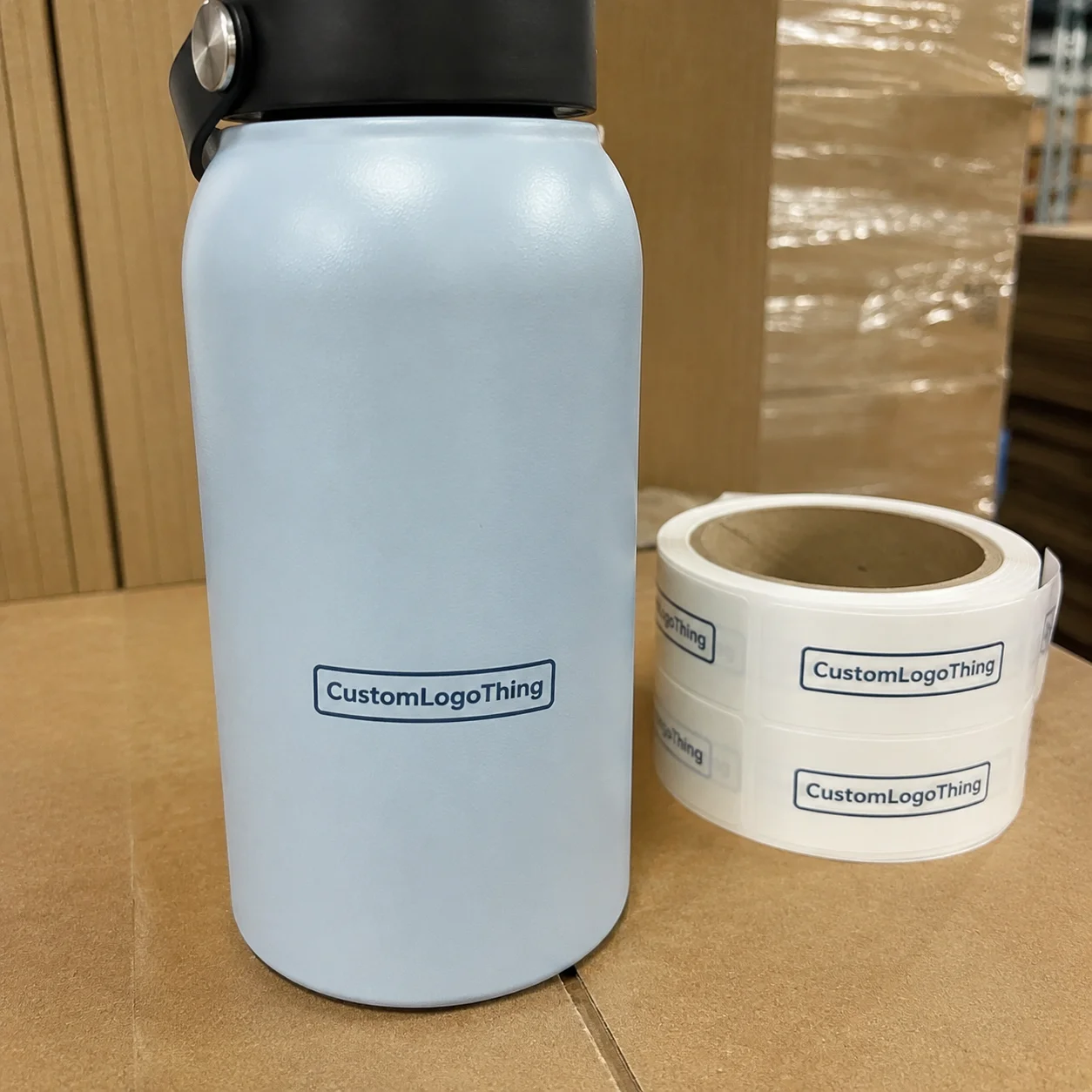
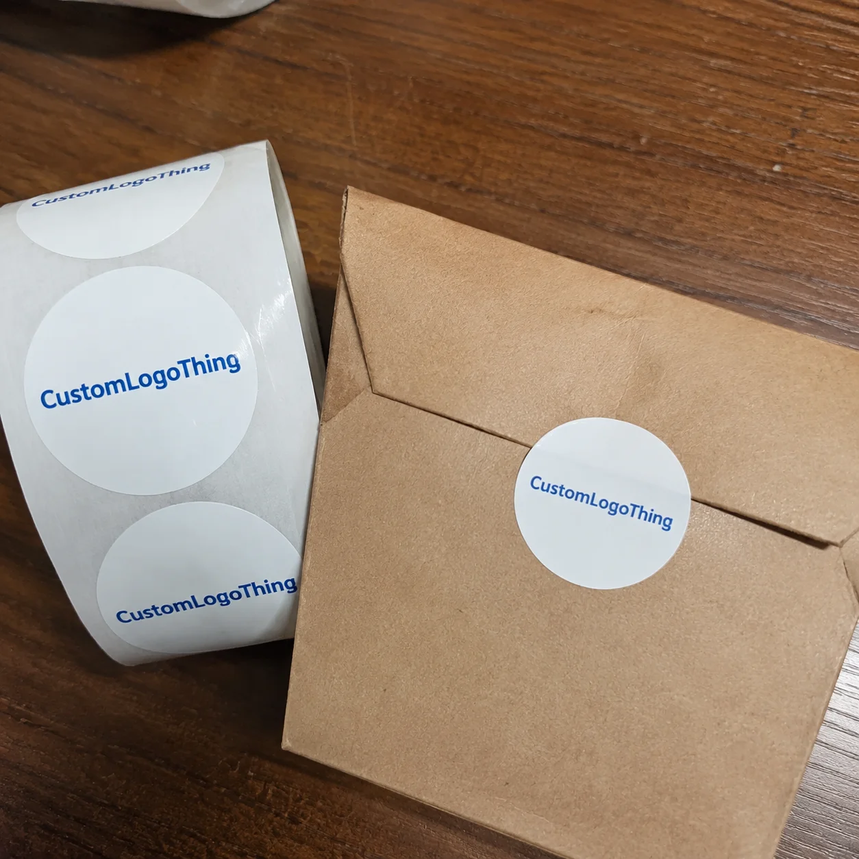
At the simplest level, custom black and white stickers are adhesive labels or decals printed with black ink, white ink, or black artwork on a white face stock. They can be made in custom shapes, sizes, finishes, and materials, from a 1-inch circle used as a closure on a paper bag to a 4-by-6-inch roll label used on a shipping carton or retail kit.
The professional version is not just “a logo on sticky paper.” Substrate, adhesive, finish, cut style, liner format, and artwork setup all affect the finished piece. A black logo on matte paper may be right for dry candle boxes. The same design on a refrigerated beverage bottle may need white BOPP, a cold-temperature adhesive, and a scuff-resistant laminate so it stays readable through condensation and handling.
These stickers work well for brands that want a controlled, minimal look. Black-and-white graphics do not fight with product photography, printed cartons, kraft textures, seasonal inserts, or color-coded product lines. They also help small businesses keep package branding consistent across mixed materials: corrugated mailers, glass jars, coated stand-up pouches, paper shopping bags, tissue wrap, and sample kits.
Production-floor rule of thumb: if a monochrome sticker looks balanced at actual size, it usually holds up well in color later. If it looks cluttered in black and white, adding color rarely fixes the structure.
For a packaging buyer, the main value is flexibility. A sticker can identify a product variant, seal tissue, add a batch code area, label a short-run promotion, or give plain stock packaging a finished retail look without committing to printed cartons or bags at higher minimums.
There is a limit. Stickers cannot solve every packaging problem. They will not make a weak shipper stronger, hide a badly scuffed pouch, or make required copy more legible if the panel is too small. They perform best when they are treated as part of the package system rather than a patch added after the carton, jar, or mailer has already been chosen.
How Black and White Sticker Printing Works
The production path is direct, but every step can improve or weaken the final result. Approved artwork is prepared for print, imposed onto the selected face stock, printed by the chosen method, coated or laminated if needed, cut to shape, weeded or sheeted, inspected, counted, and packed. On rolls, unwind direction also matters because it controls how quickly the label applies by hand, dispenser, or machine.
Black ink and white ink behave differently. Black ink prints cleanly on white paper, white vinyl, white BOPP, and many light-colored stocks because the background supplies the contrast. White ink is used on clear, kraft, metallic, black, or colored stock, and it needs enough opacity to avoid looking gray or patchy. On clear labels, white ink may be the visible art, an underbase below black, or a selective backing behind certain elements.
Digital printing is common for lower to mid-size runs, multiple artwork versions, test batches, and orders where practical flexibility matters. Flexographic production can make sense for larger repeat quantities, especially roll labels with stable specifications. The right method depends on quantity, material, finish, tolerance, lead time, and repeat needs, not simply on the artwork being black and white.
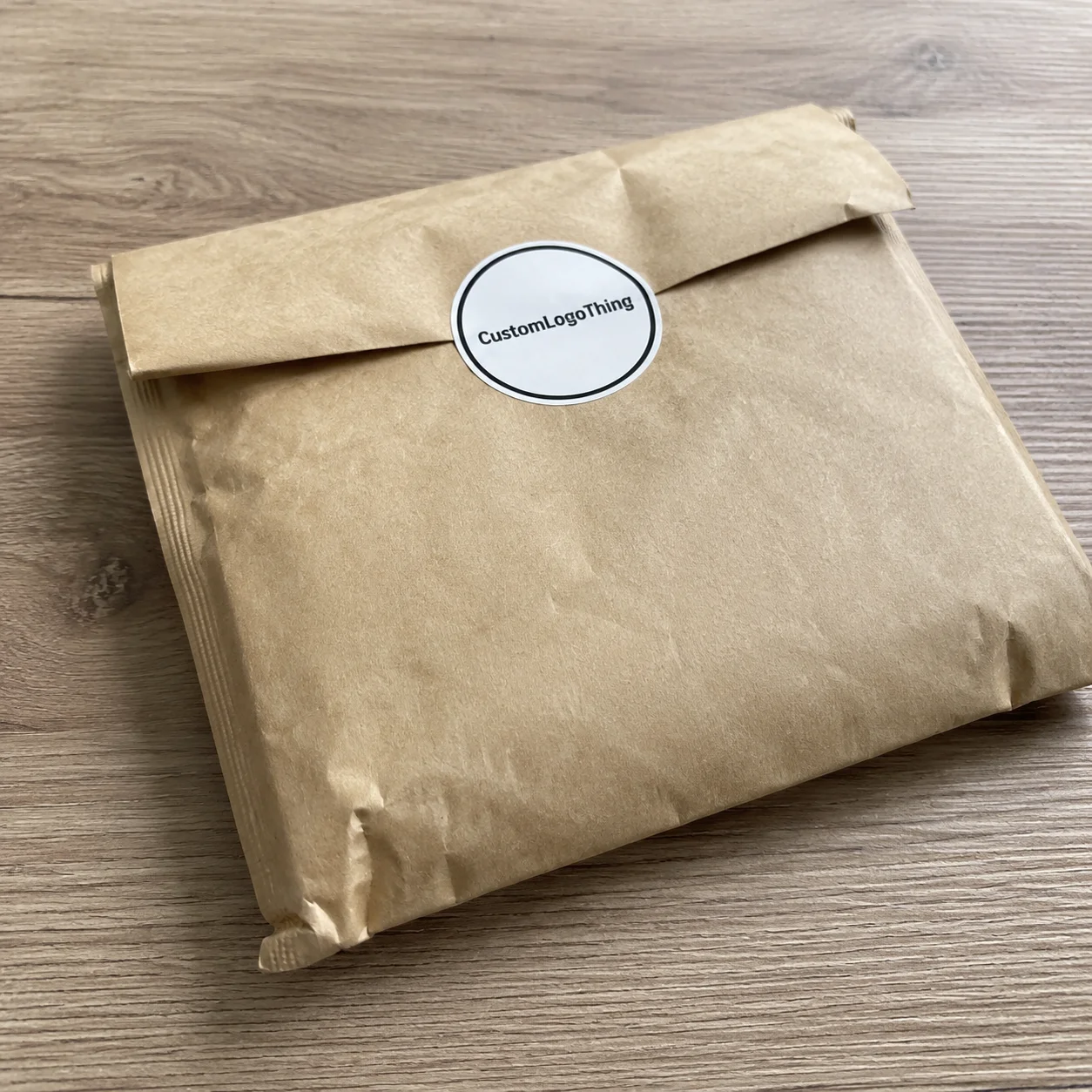
Cut format changes the user experience. Kiss-cut singles are easy to peel and hand out. Die-cut stickers follow the finished shape closely and look polished in promotional packs. Sheets keep multiple labels organized for small-batch packing. Rolls are usually best for higher-volume application because they store compactly and can feed dispensers or label applicators.
Proofing deserves extra respect on monochrome work. Thin rules under 0.25 pt, reversed type below roughly 6 to 7 pt, tight borders, small icons, QR codes, and barcodes all need a production check. Strong contrast is unforgiving. It makes small flaws visible from arm’s length.
Key Material, Adhesive, and Finish Choices
Sticker material should be chosen around the use case, not treated as interchangeable. Paper is economical and pleasant for dry indoor packaging, especially cartons, belly bands, bakery boxes, paper bags, and short-life retail labels. Buyers who care about paper sourcing can review certification programs through the Forest Stewardship Council when chain-of-custody claims are part of the packaging brief.
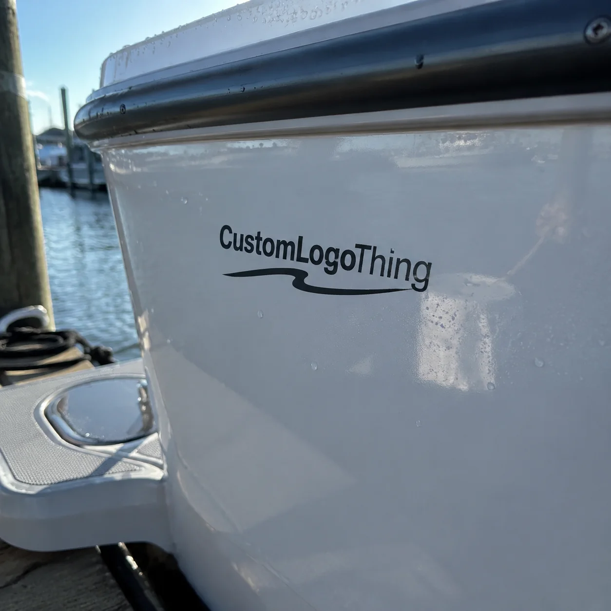
Vinyl is a durable film option often used for decals, outdoor stickers, tool labels, laptop stickers, and items that need more flexibility or abrasion resistance. BOPP, short for biaxially oriented polypropylene, is common in product labels because it handles moisture, oils, and refrigeration better than standard paper. Clear film creates a “printed-on” look for glass, plastic jars, and smooth bottles, but it usually needs careful white ink planning if the design must stay readable against a changing background.
Kraft paper gives a natural, uncoated look, though black ink can soften slightly depending on absorbency and surface texture. Specialty stocks, such as metallic films, textured papers, or black papers with white ink, can look premium. They also deserve a real proof. Ink density, surface energy, and fine line behavior are less forgiving than on standard white label stock.
Adhesive selection is just as practical. Permanent adhesive is the usual choice for product packaging and shipping-related labels. Removable adhesive works for temporary promotions, window decals, or reusable containers where residue matters. Freezer-grade adhesive is designed for cold application or cold storage, though exact performance depends on temperature, dwell time, and surface moisture. High-tack adhesive can help with textured corrugate, kraft mailers, or low-energy plastics, but it may be harder to reposition during application.
Surfaces change everything. Corrugated cardboard can be dusty. Glass is smooth but shows trapped air. Plastic jars may have low surface energy. Coated pouches can flex and wrinkle. Textured bags reduce contact area, which weakens bond strength. Adhesive testing standards such as ASTM D3330 are often referenced for peel adhesion, but real packaging trials still matter because production surfaces rarely behave like clean lab panels.
Finish affects both appearance and durability. Matte reduces glare and gives a softer, modern look. Gloss makes black artwork appear punchier, though it can reflect light into barcode scanners or cameras. Satin sits between the two. Uncoated paper feels tactile but scuffs more easily. Lamination adds a protective film layer, often useful for moisture, abrasion, oils, and repeated handling.
- Paper: best for dry indoor boxes, bags, inserts, and short-life retail packaging.
- White BOPP: strong for jars, bottles, pouches, oils, and refrigerated product packaging.
- Clear film: clean on glass or plastic, but white ink planning is usually needed.
- Vinyl: durable for decals, equipment labels, laptops, cases, and outdoor exposure.
- Kraft stock: warm and natural, though fine details may print less crisp than on coated stock.
For custom black and white stickers on clear, black, kraft, or metallic material, ask specifically about white ink opacity. Weak white coverage can make the sticker look washed out, especially under retail lighting or on a dark package. A second white pass may improve density, but it can add cost and production time. It may also affect registration tolerance on very fine details.
Cost, Pricing, and Unit Cost Factors
Sticker pricing is driven by size, quantity, material, adhesive, finish, cut complexity, artwork versions, packing format, and the amount of press and finishing time required. A 2-inch circle on standard white paper is not in the same cost lane as a 3-by-5-inch clear film label with white ink, lamination, a custom contour cut, and four SKU versions.
Unit cost usually drops as quantity increases because setup, proofing, material handling, cutting, inspection, and packing are spread across more pieces. A small batch of 250 simple paper stickers might land around $0.45 to $0.90 per piece depending on size and finish. A 5,000-piece run of standard roll labels may fall closer to $0.06 to $0.18 per piece. Those ranges are planning numbers, not a quote, and actual pricing depends on the finished specification.
| Sticker Specification | Typical Use | Common Cost Behavior | Buyer Notes |
|---|---|---|---|
| Black ink on white paper | Dry boxes, bags, inserts | Usually lowest cost | Best for indoor use with limited moisture |
| Black ink on white BOPP | Jars, bottles, pouches | Moderate cost | Better for oils, handling, and refrigeration |
| White ink on clear film | Glass, plastic, premium labels | Higher than basic paper | Opacity and backing areas should be proofed carefully |
| Die-cut vinyl decal | Laptops, cases, outdoor promos | Higher with complex cuts | Fine cut paths can slow weeding and finishing |
| Laminated roll label | Retail and handled products | Moderate to higher cost | Improves scuff resistance and print life |
A black-and-white design does not automatically mean the cheapest possible sticker. White ink, clear film, specialty adhesive, freezer-grade performance, lamination, metallic stock, or intricate cutting can raise the quote. The artwork may use one visual color, while the construction is still more technical than a basic full-color paper label.
Minimum order quantities depend on production method, material availability, and finishing. Digital singles may support short runs for testing, events, sample boxes, or early product validation. Roll labels often become more economical at higher quantities, especially if they are machine-applied. Matching the order size to the use case prevents both overbuying and the more painful problem: running out of labels halfway through a packaging build.
For the cleanest quote, send exact size, quantity, material preference, finish, adhesive need, cut style, application surface, number of artwork versions, and deadline. If the sticker must support a broader package system, compare the specification against related Custom Labels & Tags so it does not feel like an afterthought beside the box, pouch, or insert.
Process, Timeline, and Production Steps
A practical order sequence starts with use. Define where the sticker will go, how long it needs to last, what surface it touches, and whether it will face moisture, abrasion, cold storage, sunlight, or rough shipping. Then choose size and material, prepare artwork, Request a Quote, review the digital proof, approve production, print and finish, and receive the packed order.
Timeline depends on the number of variables in the job. Simple standard-material stickers may move quickly after proof approval, often within a few business days to roughly two weeks for many custom orders. Specialty stock, die-cut tooling, white ink layers, lamination, multiple SKU versions, large quantities, proof revisions, and shipping distance can extend that window. Rush work may be possible, but it is not always smart if the first proof still has unresolved artwork questions.
A production-ready file helps the process stay clean. Vector artwork is preferred because it keeps logos, type, and cut paths sharp at any size. Fonts should be outlined or embedded. Black values should be intentional, especially if the file mixes rich black, grayscale images, and flat vector art. Bleed is commonly around 0.0625 to 0.125 inch, with safe margins inside the trim so borders and small text do not ride too close to the knife line.
If the sticker uses clear material or white ink, mark those areas clearly. A separate white ink layer, often named in the file, reduces confusion. The cut line should be visible as its own path and not buried in the artwork. For barcodes or QR codes, keep enough quiet zone around the code and test the printed size. Shrinking a QR code below practical scan size looks harmless on a monitor and expensive on a packed product.
Proof approval is the handoff point. Size, copy, cut shape, orientation, material, finish, adhesive, and unwind direction should be confirmed before production starts. If the sticker is part of a larger launch with cartons, inserts, or Custom Packaging Products, build in buffer time. A delayed sticker can hold up kitting, assembly, retail shipments, or trade show prep even though the item itself is physically small.
For transit-sensitive products, brands sometimes test full package systems through procedures such as those from the International Safe Transit Association. Stickers are not the whole package, of course, but label adhesion, scuffing, and legibility during handling can become part of the bigger distribution picture.
Common Mistakes That Make Monochrome Stickers Look Cheap
The most common artwork mistake is going too fine. Hairline rules, tiny reversed-out type, distressed textures, and decorative borders near the cut edge may look elegant at 600% zoom, but they can fill in, chip visually, or cut unevenly at actual size. A safe design allows enough open space for ink gain, cutting tolerance, and normal viewing distance.
Low-resolution logos are another problem. A 72 dpi image pulled from a website may look acceptable on screen but print soft on a 3-inch label. For custom black and white stickers with type, icons, and logo marks, vector art is the safer route because curves remain clean and edges stay sharp.
Poor contrast can still happen in monochrome work. Gray tones, transparent effects, black ink on charcoal stock, and white ink without enough opacity can all produce a sticker that feels dull rather than intentional. If the stock is dark, clear, kraft, or metallic, ask whether a white underbase or adjusted artwork is needed to keep the design readable.
Sizing also trips people up. A sticker that looks balanced on a laptop screen may be too small for a jar, too large for a mailer flap, or awkward on a curved bottle. Curves steal usable width because the edges fall away from the viewer. Small boxes need careful proportions so the sticker does not crowd folds, corners, sealing tape, or required product information.
Adhesive mismatch is a classic production headache. A sticker can print beautifully and still fail if it is applied to dusty corrugate, damp surfaces, oily plastics, cold glass, or heavily textured paper. Surface cleanliness, application pressure, dwell time, and temperature all affect bond strength. If a package will be filled, chilled, wiped down, or handled with gloves, mention that before the material is chosen.
Finish mismatch is just as real. Gloss may make a black logo pop, but it can create glare on a barcode under harsh warehouse lights. Uncoated paper may feel premium on a boutique box, but it may scuff on a shipper or soften near condensation. Matte lamination can reduce glare and protect the print, though it may slightly soften the punch of solid black.
What to Check Before Ordering
Measure the actual application area before placing an order. Not the approximate panel. The actual space. On a jar, measure the flat readable window between curves. On a mailer, check folds, seams, tear strips, and closure flaps. On a pouch, leave room for gussets, heat seals, hang holes, and product bulge after filling.
Then confirm the surface material and use environment. Is it corrugated, glass, coated paperboard, flexible plastic, kraft paper, metal, or painted equipment? Will the sticker stay indoors, ride through parcel shipping, sit in a cooler, face rain, or get handled every day? Those answers guide material and adhesive choices more reliably than asking for a “standard sticker.”
- Measure the available label area in inches or millimeters.
- Confirm whether the surface is smooth, textured, coated, dusty, oily, cold, or curved.
- Decide whether the sticker needs indoor durability, outdoor durability, refrigeration resistance, or moisture tolerance.
- Choose rolls, sheets, kiss-cut singles, or die-cut singles based on application speed and presentation.
- Note any scuffing, oils, condensation, sunlight, or repeated handling the sticker may face.
Make one or two paper mockups before approving the final size. Print the artwork in black on office paper, cut it roughly to shape, and tape it onto the real package. It is a simple test, but it catches scale problems fast. A 2-inch square may look generous on a screen and cramped on a 12-ounce jar once the logo, product name, net weight, and required copy are all present.
Send the supplier the use case, not just the logo file. Tell them if the sticker seals tissue inside a box, labels a frosted glass jar, identifies a product variant on a coated pouch, or brands a corrugated subscription mailer. Useful material recommendations come from application details. That is especially true when stickers support broader product packaging or package branding systems across several SKUs.
Before approval, request a proof that shows the cut line, bleed, finished size, material, finish, adhesive notes, orientation, and any white ink instructions. If rolls are involved, confirm unwind direction. If the sticker includes a barcode, QR code, batch field, or small legal copy, review those items at actual size rather than trusting the enlarged proof view.
Good custom black and white stickers come from unglamorous decisions made early: the right stock, the right adhesive, a readable size, clean vector artwork, realistic timing, and proofing that checks more than spelling. Monochrome design does not give packaging many places to hide. That is the risk. It is also the advantage.
FAQs
Are custom black and white stickers cheaper than full-color stickers?
They can be economical, especially when printed as black ink on standard white paper or white film. Price still depends more on size, quantity, material, finish, adhesive, cut style, and packing format than on color count alone. A simple black print on white paper is usually more budget-friendly than a clear film sticker with white ink, specialty adhesive, lamination, and a Custom Die Cut.
What file type is best for black and white custom stickers?
Vector files such as AI, EPS, or editable PDF are preferred because they keep logos, type, borders, and cut lines sharp at different sizes. High-resolution PNG or TIFF files may work for simple artwork, but small text, barcodes, QR codes, and fine line art should be checked carefully before proof approval.
Can black and white stickers be waterproof?
Yes, if they are produced on a film material such as vinyl or BOPP with an adhesive suited to the application surface. For moisture, refrigeration, frequent handling, or light abrasion, a protective laminate or durable coating may improve scuff resistance and print life. Paper stickers can be useful, but they are not the first choice for wet or cold environments.
Should I order black artwork on white stock or white ink on black stock?
Black artwork on white stock is usually the cleanest and most cost-efficient option for strong readability. White ink on black, clear, kraft, or metallic stock creates a more specialized look, but opacity, fine details, and ink coverage need careful proofing. If the design includes tiny type or thin lines, the simpler construction may print cleaner.
How do I choose the right size for custom monochrome stickers?
Measure the actual application area and make a quick paper mockup before ordering, especially for jars, bottles, pouches, and curved surfaces. Keep small text, QR codes, barcodes, and borders large enough to print, cut, scan, and read cleanly after the sticker is applied. A few minutes with a mockup can prevent a full run of labels that feels slightly off in hand.