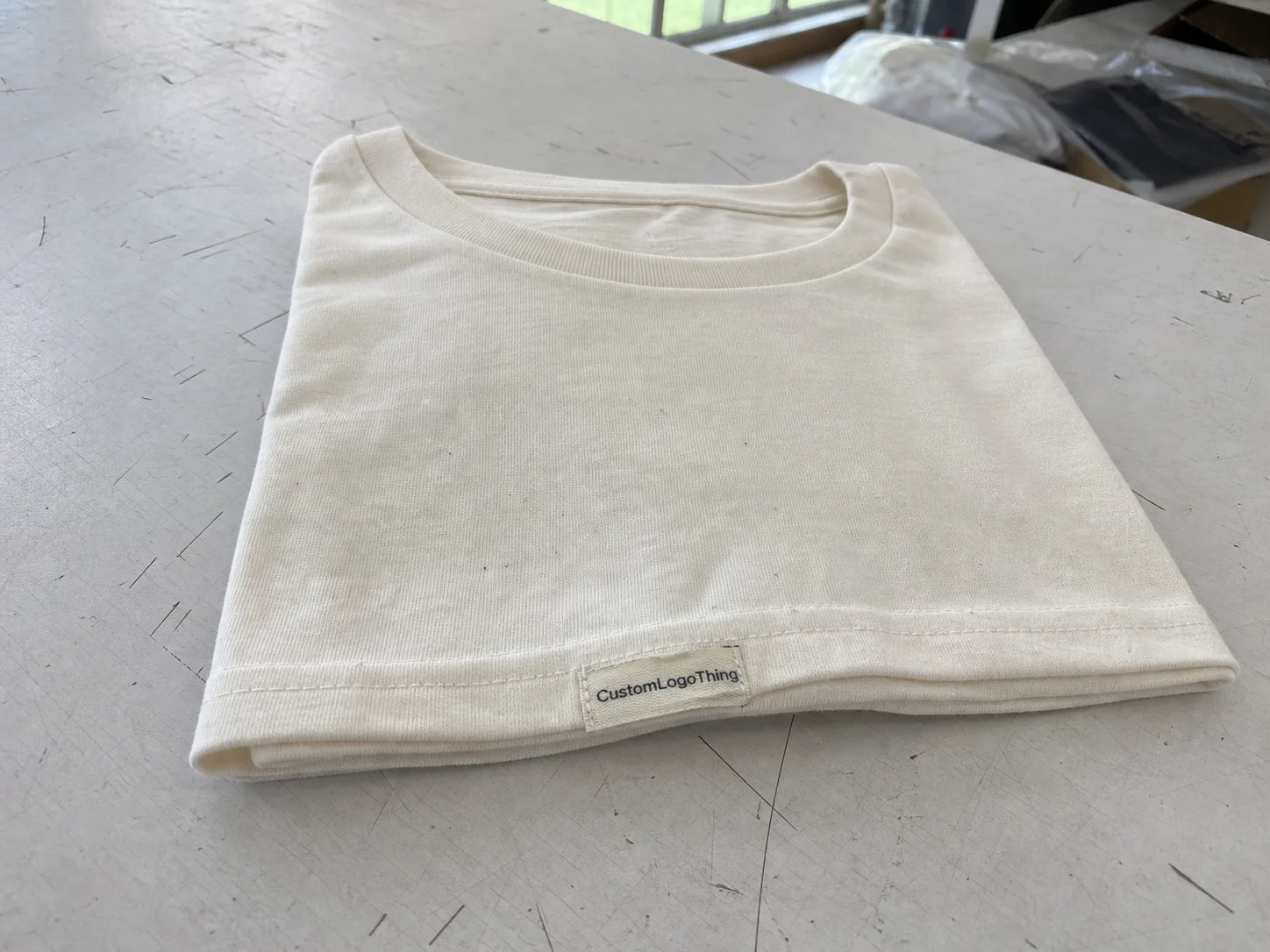
Personalized silicone bottle labels: what they are
Personalized silicone bottle labels are a good Fit for Brands that need identification and decoration to survive repeated use instead of just surviving the unboxing moment. A well-made silicone label keeps its shape, stays readable after handling, and holds up better than paper labels or thin pressure-sensitive labels that start to lift, scuff, or wrinkle once moisture and friction become part of the routine.
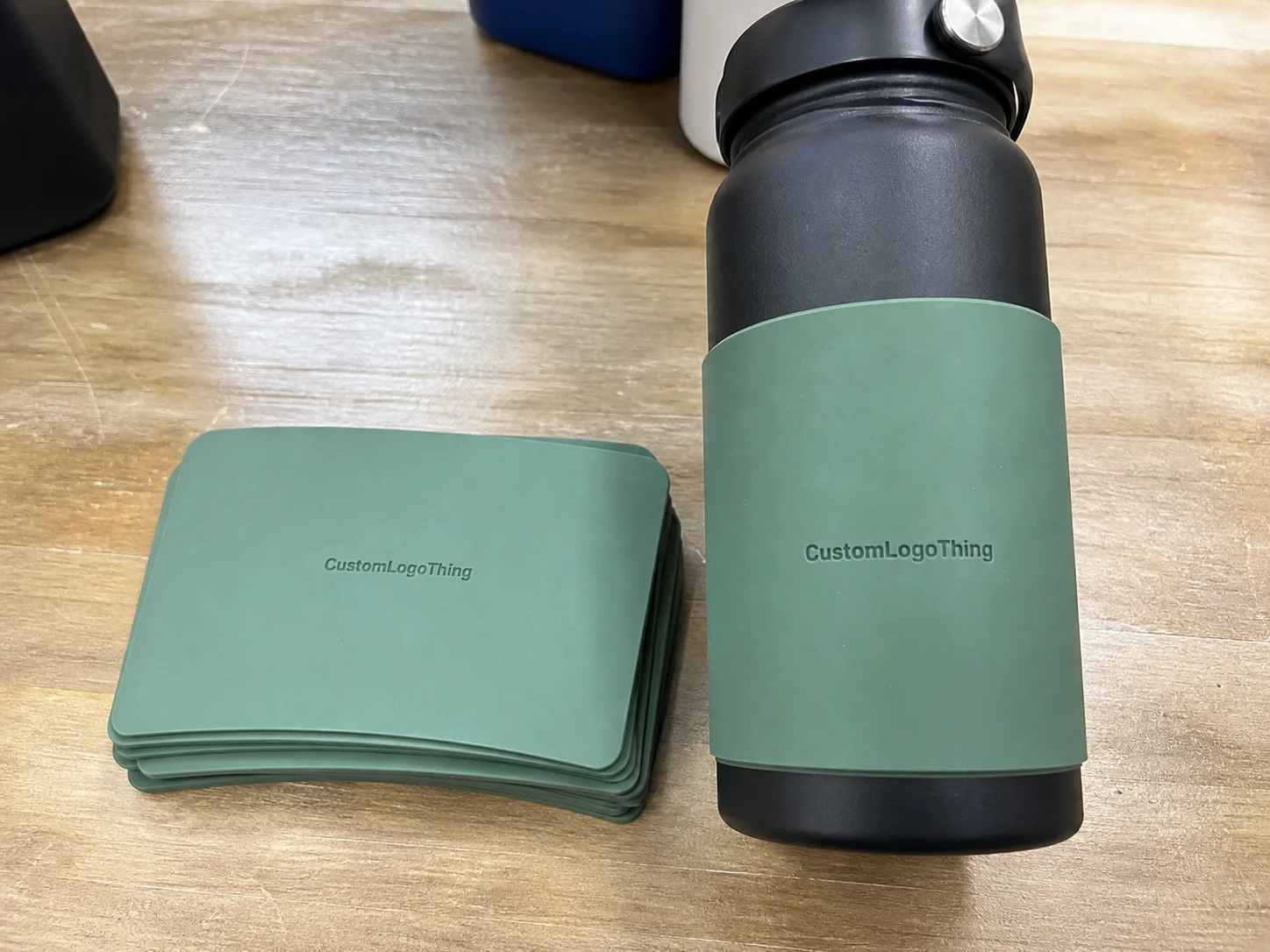
They are used on reusable drinkware, wellness bottles, refill containers, promotional bottles, and retail packaging that gets picked up constantly. The material has a soft feel, but it can still be engineered for sharp edges, clean color separation, and a premium finish. That balance is what makes silicone different from a plain sticker: it looks integrated with the bottle rather than temporarily applied to it.
The final result depends on the container as much as the label itself. Bottle material, curvature, shoulder angle, surface texture, and the way the label is attached all influence whether the piece looks crisp or awkward once it is in production. A removable label, a semi-permanent label, and a fully fixed label are not interchangeable choices. Each one behaves differently under condensation, hand washing, transport, and daily contact.
For buyers, silicone makes the most sense when the branding needs to last through use, not just photo approval. It also helps when the design should feel tactile and deliberate rather than printed-on in a generic way. The material still has limits, though, and those limits matter more than most early mockups show. Fit, prep, and the actual use environment decide whether the label performs the way it looked on screen.
A label can look right in a proof and still fail in use if the shape, surface, or attachment method was chosen before the bottle was measured correctly.
Process and timeline: how the order moves from artwork to shipment
The order flow is usually straightforward: request specs, review artwork, confirm dimensions, approve a proof or sample, then move into production and packing. The part that slows things down is almost always the missing detail. If the buyer sends only a bottle photo, the quote is only a rough starting point. If the artwork file is low resolution or the placement is unclear, production stops while the file is cleaned up or rechecked.
For personalized silicone bottle labels, the first thing that matters is the actual bottle measurement. The outer diameter, usable label area, taper, and shoulder curve all affect the final spec. If the label wraps around the bottle, wrap length matters. If it sits on a flat panel, panel width matters. If there are seams, molded grips, or a texture change on the surface, those details should be on the table before anyone approves a quote.
Lead time is driven by a few practical variables. Quantity affects how efficiently the line can run once setup is complete. Complexity matters too, especially if the design uses multiple colors, custom shaping, or special finishing. Proof approval speed also affects the schedule. A clean brief can move quickly; a vague one tends to spend days in back-and-forth before production even starts.
For standard work, a common planning window is 12 to 15 business days from proof approval. That is a useful baseline, not a promise. Sampling, unusual dimensions, or slower artwork revisions can extend the schedule. If the order is tied to a launch date, it is smarter to ask for a stage-by-stage timeline than to rely on a single date estimate.
- Send bottle measurements and photos from more than one angle.
- Provide vector artwork whenever possible.
- Confirm quantity, finish, and how the label will be applied.
- Approve a proof or sample before mass production.
- Clarify packaging needs if pieces are shipped in sets or kitted with other items.
If the bottle project also includes other branded components, such as Custom Labels & Tags, align artwork and color references early. Matching branding across different substrates is easier before production starts than after every item has already been quoted separately.
Material, adhesion, and finish choices that change performance
Most buyers look at the design first, but performance starts with the material and attachment method. Silicone is flexible, durable, and comfortable to touch, which is why it works so well on curved bottles and products that get handled all day. The actual formulation and thickness change how the label bends, how it sits on the container, and how it survives washing, storage, and regular abrasion.
Attachment method deserves as much attention as the decoration itself. A label that works on smooth PET plastic may behave differently on coated metal, glass, or a textured bottle wall. Slick surfaces usually need more careful prep. Slight texture can help grip in some cases, but it can also create edge lift if the geometry is wrong. That is why the substrate should be identified before the quote is finalized, not after the proof has already been approved.
Finish changes the feel and the visual read. A matte finish usually looks calmer and reduces glare under bright retail or gym lighting. Gloss can make colors appear brighter, but it may show smudges faster. Soft-touch surfaces feel more premium in hand, though they still need wear testing if the bottles will be washed frequently. Embossed or debossed details can add depth and improve recognition, but tiny raised elements can collect residue if the product lives in a messy environment.
Environment is where a lot of good-looking samples get exposed. Cold storage, condensation, hand washing, dishwashing, and heavy daily handling all affect what should be specified. A bottle for a fitness brand is not the same as one used in a refill program or a retail display. If the label is expected to stay readable after repeated rinsing, the print contrast, edge durability, and attachment method all become more important than they seem in a flat proof.
| Option | Best for | Performance notes |
|---|---|---|
| Matte silicone finish | Everyday branding, low glare | Readable, understated, and usually easier on the eye in bright lighting |
| Gloss finish | Bold color presentation | Higher shine, but smudges and fingerprints show more quickly |
| Soft-touch surface | Premium hand feel | Feels refined, though wear testing matters if the bottle is washed often |
| Embossed/debossed detail | High-recognition branding | Adds texture and depth, but small elements should stay simple for readability |
For transit-related quality expectations, many teams reference guidance from the International Safe Transit Association because bulk packing, vibration, and stacking can affect how a branded bottle arrives, especially if the labels are shipped pre-applied.
Cost, pricing, and MOQ: what changes the quote
Pricing for personalized silicone bottle labels comes down to a handful of variables that show up in almost every quotation. Size is one of the biggest, since larger labels use more material and often take longer to process. Color count matters too, especially if the design needs multiple passes, tight registration, or fine detail. The finish, the attachment method, the packaging format, and the total quantity all move the number.
MOQ, or minimum order quantity, is where some buyers first feel the economics of custom production. Smaller orders usually carry a higher unit price because setup time is spread across fewer pieces. That does not make a small run poor value; it simply means the fixed costs weigh more heavily. If a buyer orders 500 pieces, the setup burden per piece is naturally higher than for 5,000 pieces. That pattern is normal in custom packaging and label work.
As a rough planning range, a straightforward one-color order at a standard size may land in a lower price band than a multi-color, custom-shaped label with premium finishing. A simple run might fall around $0.18 to $0.28 per unit at 5,000 pieces, while more complex specs can move above that. Lower quantities can rise sharply on a per-unit basis. Those figures are only a planning guide, not a fixed market rate, because material choice, decoration method, and application method all affect the quote.
The details that alter budget most often are usually the ones buyers think of last. One color versus four colors changes cost. Standard size versus custom die shape changes cost. Basic packaging versus retail-ready packaging changes cost. The cleanest quotes come from buyers who send exact bottle dimensions, the intended use environment, the target quantity, and a clear note on whether the label is removable, semi-permanent, or fixed.
If sustainability is part of the sourcing brief, ask what can actually be documented for the full package. For related packaging materials, brands often review resources from the Forest Stewardship Council for paper-based components. That does not replace a material check on the silicone label itself, but it helps buyers evaluate the whole packaging system with more discipline.
Sizing, placement, and bottle shape rules that prevent failures
A label can look precise on a screen and still fail once it meets a real bottle. That usually happens because the bottle was measured loosely or the shape changed more than expected between the neck, the shoulder, and the body. Circumference, taper, shoulder curve, cap clearance, and molded features all affect whether the label fits cleanly and holds its position after use.
The most useful checks are simple: wrap length, label height, and placement relative to seams, grips, and curves. If the label is too tall, it can run into the shoulder and wrinkle. If it is too wide, the ends may overlap or buckle. If it sits too low, it takes extra wear from table contact and handling. If it sits too high, it can disappear under the cap or feel cramped.
Placement changes the customer’s impression more than most buyers expect. Center placement usually gives the most balanced look. Lower-body placement can work on taller bottles, but it sees more contact and more wear. Wraparound placement gives broad visibility, though the seam has to be planned carefully so the artwork stays readable where the ends meet. If the design includes a logo, small type, and regulatory copy, the layout needs enough breathing room to stay legible from normal viewing distance.
Measure the finished bottle. Not the catalog spec. Not a sketch. Not a guess from a supplier drawing. Real containers vary because of mold tolerance, coatings, and closure differences, and those small changes can affect the fit enough to matter in production.
Common mistakes that lead to peeling, distortion, or unreadable branding
The most common mistake is approving the artwork before it has been checked against the actual bottle. A design can be strong on screen and still fail at label size because the thin lines disappear, the type gets cramped, or the logo loses contrast. That problem shows up fast on small labels, where every fraction of a millimeter starts to matter.
Too much detail causes a second round of trouble. Thin strokes, tiny legal copy, and busy backgrounds often turn into visual noise on a compact silicone surface. This happens most often when a brand tries to force brochure-level detail into a format that performs better with bold shapes and clean typography. If the artwork depends on intricate illustration, ask for a production check and a scaled proof before approving the run.
Surface prep is another point where good labels get blamed for poor performance. Dust, oil, condensation, and residue interfere with adhesion, and even a high-quality label can struggle if the container was not cleaned first. That is especially true on smooth bottles, but it affects nearly every substrate. If the surface is not ready, edge lift and early failure become much more likely.
Vague artwork files create a different kind of loss. If the buyer sends a low-resolution logo, no Pantone reference, and no placement note, the supplier has to guess. Guessing is expensive. It creates delays, revisions, and occasionally an order that matches the file but not the brand’s intent. Clear direction saves time and avoids the kind of mismatch that is painful to correct after production has already started.
For broader packaging decisions, some buyers also review current recycling and materials guidance from the EPA recycling resources. That does not replace product-specific testing, but it can help teams think more clearly about end-of-life choices and adjacent packaging materials.
Expert tips and next steps for a production-ready order
The easiest way to get a reliable quote is to send a tight brief from the start. At minimum, include exact bottle dimensions, the finish you want, the quantity target, artwork files, and a short note on the environment the bottle will live in. If the label will see cold storage, washing, or heavy daily handling, say so early. That one detail can change the recommended material or attachment method.
If the shape is unusual or the brand depends on exact color matching, ask for a proof or sample plan. That is not caution for its own sake. Unusual geometry, small type, and premium color expectations are the kinds of things that deserve a physical or digital check before the full run starts. A little extra time up front is cheaper than discovering a fit issue after hundreds or thousands of pieces have already moved into production.
It also helps to think about the label the way the customer will experience it. What gets touched first? What wears fastest? Will condensation build up? Will the bottle be tossed into a bag, set in a car, or washed by hand every day? Those questions matter because personalized silicone bottle labels are not only visual elements; they are working parts of the bottle’s presentation and day-to-day durability.
Before requesting a quote, answer these five points clearly:
- What is the exact bottle size and shape?
- Will the label be removable, semi-permanent, or fixed?
- How many colors and what finish do you want?
- What is the expected use environment?
- What quantity are you actually ready to order?
Handled carefully, personalized silicone bottle labels can give a bottle a more durable and polished identity than a standard sticker can. The difference usually comes down to fit, surface preparation, and artwork discipline. Match the material and attachment method to the real container rather than the idealized mockup, and the label is far more likely to look good, stay put, and keep doing its job after ordinary labels would have started to fail.
How do personalized silicone bottle labels stay on curved bottles?
They depend on the right mix of flexibility, sizing, and surface prep. When the label matches the bottle diameter and curvature closely, it sees less stress during daily handling, which helps it stay stable longer.
What affects the cost of personalized silicone bottle labels most?
The biggest drivers are size, quantity, color complexity, finish, attachment method, and any special packaging or testing. Lower quantities usually raise the unit price because setup costs are spread across fewer pieces.
What is the usual turnaround for a custom label order?
Turnaround depends on proof approval speed, order size, setup complexity, and whether sampling is required. Orders move faster when the artwork is ready, measurements are exact, and the buyer responds quickly to proofs.
What artwork do I need before ordering personalized silicone bottle labels?
Vector artwork is best, along with clear brand colors, final text, and placement notes. If the design is still being refined, send the best available file and ask for a production check before quoting.
Can personalized silicone bottle labels handle washing and regular use?
Yes, but only if the material, finish, and attachment method are chosen for the actual use environment. Frequent washing, condensation, and heavy handling should be discussed up front so the label is built for that duty cycle.