Paper thickness looks like a small detail until a tag curls at the corner, bends in the box, or hangs so lightly that it reads as disposable. For coffee roasters, that detail matters more than it first appears. Roast notes, origin, processing method, and price are often competing for the same few square inches, so the substrate has to do real work. It has to print cleanly, hold its shape, and still feel appropriate next to a pouch, box, or tasting kit.
The practical version of the Printed Hang Tags for coffee roasters material thickness guide starts with one simple idea: thickness is a performance choice, not a decorative one. A tag can be beautiful and still fail if it tears at the hole, smudges under ink, or feels underbuilt against a premium package. The right stock makes the design look settled. The wrong one makes the whole product line feel provisional.
Most buyers end up balancing three forces at once. Heavier stock improves rigidity and shelf presence. Lighter stock reduces cost and makes attachment easier. The finish, meanwhile, can help or hurt both the visual tone and the durability. The job is to line those three up without overpaying for features the package does not need.
Printed Hang Tags for Coffee Roasters: Thickness Basics
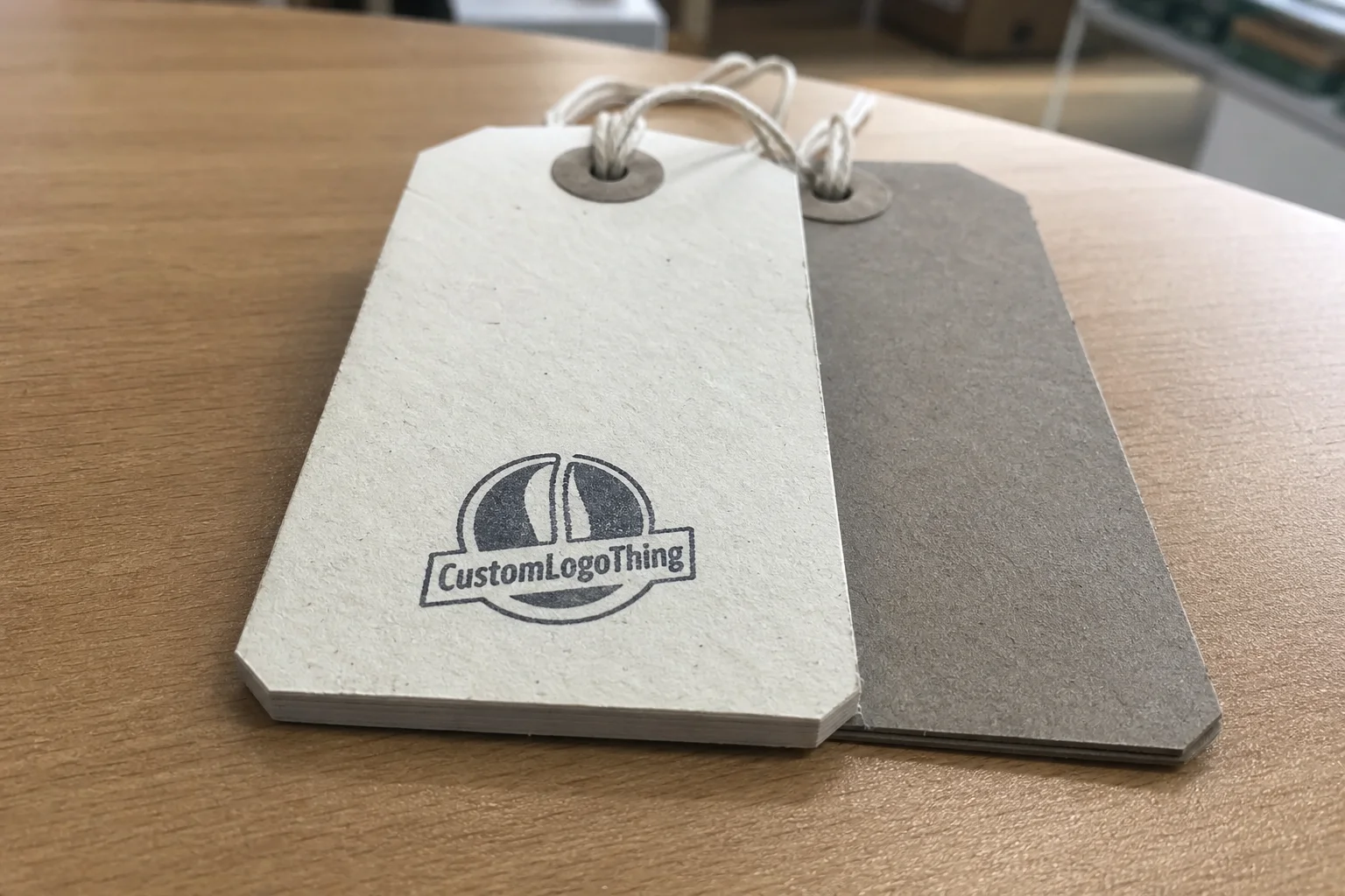
For standard coffee hang tags, the workable range is usually somewhere between 14pt and 18pt. That is not a rule, but it is the range where most roasters find a reasonable balance between stiffness, print quality, and cost. A 14pt sheet is easier to flex and cheaper to buy. An 18pt sheet feels more substantial and holds its shape better on a retail display. Move up to 24pt, and the tag starts behaving like a small premium card rather than a simple hang tag.
That difference is visible in hand. A thin tag moves more. It bends under a thumb, shifts on twine, and can look tired before the product sells. A thick tag sits flatter, resists curling, and often makes typography look more controlled. But there is a point where rigidity becomes its own problem. A tag that is too stiff on a small pouch can feel bulky, especially if the package itself is already dense or the attachment point is tight.
For most roasters, the useful decision is not “thick or thin.” It is “how much structure does this package actually need?” A lightweight seasonal bag may work well with 14pt or 16pt stock. A core retail SKU often looks better on 16pt to 18pt. A gift set, collector release, or premium box tag can justify 24pt or a specialty board if the rest of the packaging system supports that level of finish.
Paper family matters as much as point count. A recycled kraft board and a bright white SBS sheet can share a nominal thickness and still feel completely different in hand. Kraft tends to read warmer and more tactile. Coated white stock usually sharpens small type and barcode reproduction. If the brand message is built around sustainability, that visual tone needs to line up with the claim. If the package is aiming for a clean, precise, modern look, the stock has to reinforce that too.
There is also a reason buyers should look beyond the sample card. Thickness interacts with hole placement, edge shape, and attachment method. A tag that seems fine flat on a desk may behave very differently once it is tied to a bag and moved through a retail environment. The sample should be judged in context, not in isolation.
“The best stock is the one that makes the package look deliberate, not expensive for its own sake.”
That is the standard worth using. The goal is not maximum thickness. It is the right thickness for the job.
How Thickness Changes Print Quality, Rigidity, and Hang Time
Thickness changes more than feel. It changes how ink sits, how edges hold, and how the tag behaves after it is attached. Heavier board usually gives a cleaner edge and less visible distortion during printing, especially with dense solids, small typography, or barcodes that need consistent contrast. The sheet simply has more resistance to buckling, so the finished piece often looks tidier.
That advantage has limits. Textured kraft paper can mute very fine type if the coating is too absorbent or the sheet has visible fiber movement. A smooth 18pt stock may reproduce roast notes and origin details more crisply than a rougher recycled board, even when both are technically “premium.” The right stock depends on what the artwork is asking the paper to do. Not every design wants the same surface.
Rigidity also affects shelf behavior. A stiffer tag tends to hang flatter against a pouch or box, which makes the layout easier to read from a distance. A lighter tag twists, swings, and sometimes flips sideways after handling. In a busy café or retail wall, that movement matters. Customers do not spend much time parsing packaging; they glance, compare, and move on. A tag that stays readable has a better chance of being noticed.
Attachment hardware is part of the calculation. Thin stock is usually fine with a standard hole and lightweight twine. Heavier board may need a larger hole, reinforced punch, or eyelet if it will be handled often. That is not just a design preference. It is a failure point. A tear at the hanger hole can ruin an entire run faster than a printing defect because the tag may look perfect until it is actually used.
For roasters shipping through mailers or subscription boxes, hang tags also need enough structural confidence to survive repeated handling. They are not being drop-tested like industrial parts, but they do get rubbed, stacked, and unpacked. A tag that sheds ink, curls hard at the edge, or arrives bent weakens the product presentation before the coffee is even opened.
Print method compounds all of this. Digital, offset, foil stamping, and spot UV each respond differently to the substrate. A heavier stock can tolerate richer coverage and more finishing, but not every effect improves with thickness. Sometimes a simpler sheet with a cleaner surface beats a heavier, more elaborate build. The visual result is usually more honest than the quote suggests.
For broader packaging references, the packaging industry resources at packaging.org are useful because they treat material choice as a functional decision, not a styling exercise.
Cost, Pricing, and MOQ Tradeoffs by Stock and Finish
Once samples become quotes, thickness turns into a pricing issue. Paper grade, print coverage, finishing, die cutting, and quantity all push the number up or down. The lowest quote is rarely the lowest real cost if the stock curls, the finish slows production, or the tag arrives looking thin next to a premium pouch. Reprints and mismatched presentation cost more than a slightly better substrate usually would.
In general, thicker board costs more to source and can slow down finishing. A simple one-color tag on 14pt stock is usually the most economical version of the job. Add heavy ink coverage, foil, spot UV, embossing, or a custom shape on 24pt board, and the production profile changes quickly. The machine time is longer, the setup is more demanding, and the waste allowance is usually higher.
The ranges below are common on medium runs, but they are only reference points. Artwork complexity and finish choices can move them considerably.
| Stock option | Feel in hand | Best fit | Typical unit cost |
|---|---|---|---|
| 14pt C1S | Light, flexible, easy to bend | Simple bag tags, inserts, seasonal promotions | $0.06 to $0.11 |
| 16pt to 18pt FSC board | Balanced stiffness, strong shelf presence | Core retail tags, pouch tags, tasting notes | $0.08 to $0.18 |
| 18pt recycled kraft or specialty board | Natural texture, tactile, less glossy | Eco-led brands, small-batch roasts, kraft packaging | $0.09 to $0.20 |
| 24pt premium board with foil or soft-touch | Very rigid, substantial, visually elevated | Gift sets, limited releases, premium display tags | $0.18 to $0.35 |
MOQ follows a similar pattern. Digital runs can usually support lower quantities, often 250 to 500 pieces, but the unit price rises quickly if the artwork needs multiple finish steps. Offset or sheet-fed production becomes more efficient around 1,000 to 2,500 pieces and usually starts to look strongest at 5,000 pieces or more. That does not mean small runs are a bad idea. It means the cost structure changes and should be read honestly.
There is a catch buyers often miss: special finishes can limit the stock options available. A thick board with soft-touch lamination, foil, and a complex custom die line might look excellent in a mockup and still be a production headache. The quote only matters if the job can be made cleanly, in quantity, without sacrificing the finish quality that made the spec attractive in the first place.
If the tags will sit alongside labels, sleeves, or other printed components, keep the stock family consistent across the order. Matching tone and finish inside a packaging system usually does more for perceived quality than spending extra on one hero item and ignoring the rest. The mismatch is subtle, which is exactly why people notice it.
For matched packaging programs, the Custom Labels & Tags order should be planned with the same stock logic. A gloss label paired with a matte, heavily textured hang tag can work, but only if that contrast is intentional. If it is accidental, the line feels assembled instead of designed.
Production Steps and Lead Time from File Upload to Ship Date
The production workflow should be predictable: file review, proofing, stock confirmation, printing, finishing, cutting, inspection, packing, shipping. Delays usually come from indecision, not machinery. If the buyer is still choosing between 16pt and 18pt after the proof stage has already started, the schedule is not really a schedule yet.
Thickness affects turnaround in practical ways. Heavier board may require slower finishing, more careful drying, or extra scoring if the design folds. Coated stock and specialty finishes can add another layer because the surface has to be protected as it moves through the line. A plain matte kraft tag usually moves faster than a laminated, foiled, custom-cut one. That is not a quality hierarchy. It is just process reality.
As a planning range, standard stock tags often land around 7 to 10 business days after proof approval. Custom board or special-finish jobs usually need 12 to 18 business days, especially when the tag has a nonstandard shape or reinforced attachment point. Rush service can shorten that window, but only if the file is complete and the spec is locked. Changing the hole size three times rarely improves the delivery date.
For shipping-sensitive pieces that travel in mailers or subscription kits, the tag should be treated as a small packaging component, not loose printed paper. It needs to arrive flat, unwarped, and readable. That is why inspection matters. A stack of tags can look fine from a distance and still have scuffed edges, bent corners, or punch issues that become obvious only when the box is opened.
One useful internal check is to ask for a printed proof if the design uses fine type, dark backgrounds, barcodes, or dense coverage. Another is to ask for a swatch if the paper tone matters at all. Screen color and actual substrate are not reliable substitutes for one another. A file on a monitor cannot tell you how a recycled board will take ink, or whether a matte coating will dull a dark roast panel more than expected.
The more options in the quote, the longer the decision path. Two thicknesses, two finishes, and a custom hole shape can turn a straightforward order into a slow one. A clean spec sheet saves time because it reduces argument. That is not glamorous, but it works.
Choosing the Right Thickness for Bags, Boxes, and Tasting Kits
The package should drive the thickness decision. A lightweight bag and a rigid gift box do not need the same tag. A tasting kit attached with ribbon is a different problem from a roast card tied to a kraft pouch. The best spec follows the use case, not the highest point count on the sample sheet.
For bag tags, flexibility often matters more than sheer stiffness. If the pouch already has structure, a 16pt or 18pt stock usually feels balanced. For boxes, especially premium retail boxes, a heavier board can make the tag feel like part of the package architecture rather than an accessory. For subscription kits and event bundles, the sweet spot is often a stock that survives handling without overpowering the rest of the design.
The attachment method changes the equation. Twine introduces movement. Ribbon softens the look and usually suits more tactile stocks. Plastic fasteners and loops can make a thinner tag behave more rigidly than its point count suggests. A larger hole, reinforced punch, or eyelet may be worth the small extra cost if the tag will hang in a busy environment or be pulled on during packing and unpacking.
- Use 14pt for lightweight inserts, short promotional runs, and flexible tags.
- Use 16pt to 18pt for most retail coffee hang tags.
- Use 18pt to 24pt for premium kits, display tags, and box applications.
- Use kraft or recycled board when the brand story depends on a natural, low-gloss surface.
If the packaging language includes recycled content, FSC certification, or post-consumer material claims, the actual substrate should support that claim visibly. A bright coated sheet can be the right choice, but it should not imitate an uncoated kraft look unless that is genuinely the spec. The same caution applies to biodegradable packaging language. The paper, coating, and finish need to match the promise.
Sample comparison is where these decisions usually become obvious. Two sheets can look similar in a PDF and feel unrelated in the hand. Recycled board has more tooth and usually a softer visual tone. Coated SBS gives sharper color and cleaner detail, but it can also look less natural. The buyer who checks both side by side usually avoids an expensive mismatch later.
If the line also includes matching Custom Labels & Tags, keep the design system aligned. Similar paper family, similar finish level, and consistent color density give the whole set a stronger structure. It is a small change that can make a packaging range feel deliberate rather than stitched together from separate purchases.
Common Thickness Mistakes That Waste Money or Hurt Branding
The most common mistake is assuming thicker automatically means better. That is rarely true. A tag that is too rigid for the attachment method or too bulky for the package can feel awkward rather than premium. On a small pouch, a heavy tag can look like a piece of furniture tied to string. The visual message gets muddy fast.
The reverse mistake is just as common: choosing a thin stock for a premium release because the unit price looks attractive. The savings are usually modest. The downgrade in perception is not. Thin tags curl, sag, and wear down quickly, which can make excellent coffee look cheaper than it is. Buyers may not describe the problem in technical terms, but they notice it immediately.
Finish compatibility causes another set of failures. Soft-touch lamination, heavy foil, and dense ink coverage can crack, chip, or show stress when paired with the wrong stock. Heavier board can help, but it does not solve everything. The finish needs a substrate that can actually hold it without fighting the paper structure.
Design can also be undermined by the wrong thickness. Fine typography on rough kraft stock can lose clarity. Weak contrast gets weaker on matte surfaces with visible fiber. Dense layouts feel even denser on thick board because the visual weight already carries more presence. Stock and layout should be designed together. Treating them as separate decisions is how expensive rework happens.
“A good hang tag should support the package, not compete with it.”
Another oversight is trying to make one thickness solve every format. A pouch tag, a box tag, and a tasting kit insert do not behave the same way. If the brand uses multiple formats, two stock choices are often better than one compromise. That is not added complexity for its own sake. It is cleaner merchandising and usually less waste.
There is a practical quality-control check here: approve the tag in the exact environment it will live in. Put it on the bag. Hang it on the box. Drop it into the kit. Look at it under retail lighting. Then check it again after packing. A tag that passes on a white desk may still fail in the real package context.
Next Steps Before You Request a Custom Quote
Before requesting pricing, build a one-page spec sheet. Keep it blunt: size, shape, stock, finish, quantity, hole style, attachment method, and where the tag will be used. The better the inputs, the better the quote. Suppliers can only price what they can actually build, and vague requests almost always come back with vague numbers.
The most efficient buying path is usually to compare two or three stock options side by side: one lighter, one mid-weight, one premium. Judge them in the real package environment rather than from renderings alone. Check them on the pouch, on the box, in a mailer, and under the lighting the customer will actually see. A tag that looks polished in a studio image can read very differently in a shop or warehouse.
If the artwork uses small type, dense black, barcodes, or fine linework, ask for a printed proof. If paper tone matters, ask for a physical swatch. Those two steps catch more mistakes than most revisions do. They also expose whether the finish is helping or flattening the design. That is especially useful with kraft and recycled materials, where the surface character matters as much as the ink.
For roasters with several packaging formats, the smart question is not “what is the best thickness?” It is “what thickness works for this role?” Core SKU tags should be efficient and repeatable. Seasonal pieces can be more expressive. Premium presentation tags can justify heavier board, but only if the rest of the package deserves it. Once the role is clear, the spec usually gets easier to settle.
The final take on the Printed Hang Tags for coffee roasters material thickness guide is straightforward: thickness should match the package, the attachment, and the level of finish the brand can support. Get those three aligned and the tag will feel intentional. Miss them, and the cheapest option often becomes the most expensive mistake.
Frequently Asked Questions
What thickness is best for printed hang tags for coffee roasters?
For most roasters, 16pt to 18pt is the safest starting point. It gives enough stiffness for shelf presentation without making the tag overly bulky. Go lighter for simple promotional pieces and heavier only when the package or finish justifies it.
Do thicker coffee roaster hang tags always look more premium?
No. Thickness helps only when it fits the rest of the spec. A thick tag on a small pouch can feel heavy-handed, while a well-printed mid-weight tag can look sharper and more balanced. Premium comes from the full combination of stock, finish, shape, and print quality.
How does thickness affect cost and MOQ on custom hang tags?
Thicker material usually raises cost because it is more expensive to source and often slower to finish. MOQ can also rise when the tag uses specialty board, custom shapes, or multi-step finishes that need a more efficient production run.
What lead time should I expect for custom printed coffee hang tags?
Standard stock jobs often ship in 7 to 10 business days after proof approval. Custom board or special-finish jobs usually need 12 to 18 business days, depending on the artwork and finishing requirements.
Can I use one thickness for bag tags, box tags, and tasting kit tags?
You can, but it is usually a compromise. Bag tags tend to prefer more flexibility, while box tags and premium kits often benefit from extra rigidity. If the formats are very different, two stock options usually work better than one forced standard.