Organic Cotton Clothing Labels Custom Logo Orders look straightforward on a product sheet. In production, they are anything but. The logo has to stay legible at a tiny scale, the cotton has to feel soft against skin, and the finished label has to survive sewing, washing, pressing, and packaging without fraying into something that looks improvised.
That small strip of fabric does more work than most buyers expect. It sits next to the body, appears in product photography, and quietly signals whether the brand cares about details. A good label makes a garment feel finished. A weak one makes even well-made apparel look less considered. The difference is rarely dramatic in a spreadsheet, but it shows immediately in hand.
For sustainable apparel brands, organic cotton is attractive for another reason: it avoids the glossy, synthetic look that can clash with a natural product story. Still, cotton brings its own constraints. It can soften beautifully, but it can also distort, fuzz, or lose clarity if the weave is too loose or the artwork is too intricate. That is why the smartest orders start with production realities, not inspiration boards.
Why organic cotton labels feel premium before anyone reads the tag
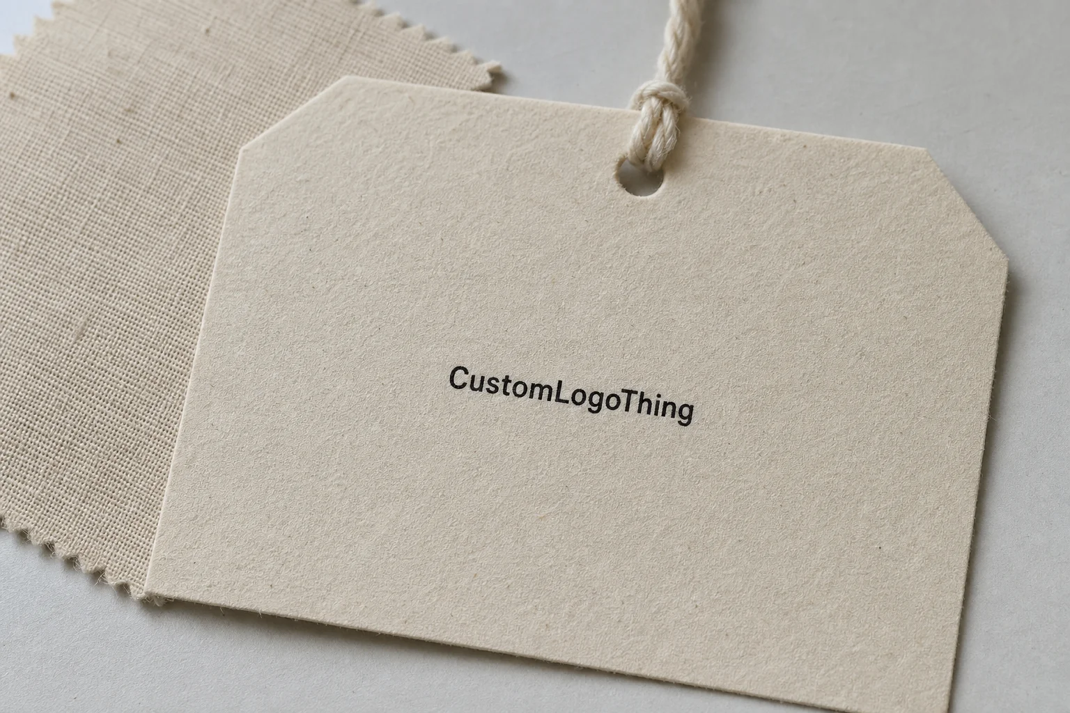
People notice texture before they read copy. A label that feels smooth, light, and integrated with the garment creates a better impression than one that scratches, bunches, or feels plasticky. That tactile reaction matters on babywear, premium basics, loungewear, artisan apparel, and capsule collections where the brand promise depends on restraint rather than loud decoration.
Organic cottOn Clothing Labels custom logo options generally fall into two practical categories. One is a woven label made from organic cotton yarns. The other is a printed cotton label, where the artwork and text are printed onto a cotton substrate. Woven versions tend to feel more integrated and durable. Printed versions often allow more flexibility with fine text, care instructions, or simple one-color layouts. Both can work well, but they solve different problems.
Labels can carry a logo, size, fiber content, care symbols, country of origin, or a short brand line. They are commonly used as neck labels, side seam labels, hem tags, and occasionally as visible patch-style elements on outerwear or workwear-inspired pieces. The right format depends on where the label sits and how much the wearer will feel it. A neck label on a lightweight tee has a different comfort threshold than a label sewn into denim or canvas.
The appeal is easy to understand. Organic cotton supports a cleaner brand story and looks less industrial than many synthetic options. But there is no special allowance for weak execution. If the logo is too detailed, the fabric too thin, or the fold wrong for the garment construction, the label becomes a liability. In this category, the spec sheet matters more than the marketing language.
“Customers rarely inspect the label first. They feel it first. That is usually the real verdict.”
How custom organic cotton labels are made and finished
The production flow is familiar, which helps. Artwork comes first. The supplier reviews the logo, dimensions, and content, then matches the material and finishing method to the design. After that comes sampling or proofing, cutting, folding, sewing or packing, and inspection before shipment. The sequence sounds simple. The trouble usually appears when the buyer sends a low-resolution logo, leaves out care text, or changes the fold after approval.
For organic cotton labels, the two most common approaches are:
- Woven organic cotton labels — good for a premium hand feel, durable branding, and a more integrated appearance.
- Printed cotton labels — useful when the design includes smaller text, simpler graphics, or information that needs high readability.
Finishing changes how the label behaves once it reaches the garment. A end fold is practical for sewing into seams. A center fold works well for neck labels because it keeps the branding centered and readable. A straight cut is common for patch-style applications or when the label is sewn on multiple edges. A loop fold may be used for hang or attachment purposes, depending on the construction. Heat-sealed edges can reduce fraying on some formats, though they are not always the best fit for pure cotton aesthetics.
Attachment method is part of the product, not a separate decision. Sew-in labels are the default for apparel because they hold up well and feel secure. Top-stitching creates a visible branding statement. Patch-style placement can work on outerwear, artisan goods, or heavyweight garments, but it needs cleaner alignment and a more durable base fabric. If you are also ordering other brand elements, such as Custom Labels & Tags, it helps to coordinate label placement with the garment pattern early instead of adjusting later.
Quality control in this category usually comes down to a handful of measurable checks:
- Thread count or print resolution
- Logo line thickness
- Backing softness
- Color contrast
- Wash durability
Those checks are not decorative. A label may look fine in a mockup and still fail in the hand if the lines are too thin or the fabric too soft to hold shape. Small-format branding punishes weak decisions quickly.
Key factors that affect quality, durability, and compliance
Material weight changes the entire feel of the label. Lighter cotton can be more comfortable on skin and usually suits babywear, tees, and garments with minimal seam bulk. Heavier cotton offers more structure and can be a better fit for jackets, denim, canvas bags, and workwear-inspired pieces. The goal is not to pick the most premium-feeling sample in isolation. The goal is to match the label to the garment and the wear pattern.
Logo readability is often the next constraint. Cotton labels are small, and small artwork leaves little room for error. Clean type, bold shapes, and a limited number of colors usually survive reduction better than gradients, fine hairlines, or stacked text. If a brand mark only works at larger sizes, the label version may need simplification. That is not a design failure. It is a production adjustment.
Compliance can be the most overlooked piece. Depending on the market and garment category, labels may need fiber content, size designation, care symbols, country of origin, or other legally required information. If the product claims to be organic, the language should match the supporting documentation. Misalignment between claim and paperwork creates avoidable risk, especially once the garment reaches retail or cross-border distribution.
For brands that want packaging, apparel, and product messaging to feel consistent, the label should match the broader presentation system. A natural cotton label paired with loud, glossy retail packaging can send mixed signals. So can a carefully styled garment label inside a box that looks rushed or generic. The customer sees the full stack, not just one component.
There are also external standards worth keeping in view. Packaging teams often reference paper traceability rules through groups like the FSC, and shipping teams may look at transport testing guidance from ISTA when products are packed in bulk or routed through fulfillment channels. Not every label order needs formal testing, but the discipline helps teams avoid guesswork.
Practical rule: if the label will touch skin, test softness first. If it must survive repeated washing, test structure and print retention first. Few label specs are equally strong on both dimensions, so the use case should decide the priority.
Cost, MOQ, and quote factors buyers should compare
Buying labels is often where the difference between a unit price and a real landed cost becomes obvious. The biggest price drivers are label size, quantity, number of colors, material choice, print or weave method, fold style, and finishing. More material increases cost. More colors typically increase setup. Special folds and extra finishing steps add labor. The final number can move more than buyers expect from those variables alone.
For rough planning, these ranges are commonly seen on smaller and mid-size runs:
| Label type | Typical use | Approx. unit range | Notes |
|---|---|---|---|
| Printed cotton label | Simple logos, care text, lightweight garments | $0.06–$0.16 | Usually the lowest-cost option; detail depends on print method |
| Woven organic cotton label | Premium apparel, visible branding, softer natural look | $0.10–$0.24 | Better brand feel, but more sensitive to artwork complexity |
| Custom folded specialty label | Neck labels, hem tags, patch-style branding | $0.14–$0.30 | Folding and finishing push costs up |
At 5,000 pieces, the unit cost usually improves sharply compared with 500 pieces because setup is spread over more units. That is ordinary production math, not hidden expertise. Lower MOQ gives more flexibility, but the price per piece rises. Higher MOQ reduces unit cost, but only helps if the brand will use the labels before the design changes. Ordering more than you can realistically deploy is how companies end up with perfectly printed inventory they no longer need.
Quote comparison should include more than the headline number. Some suppliers include only the label itself and charge separately for artwork setup, shipping, and sample production. Others bundle more into the quote. Ask what is included. Ask what is excluded. Then ask whether reorders will match the first run or carry different setup costs. Those details affect the real budget more than the initial estimate.
Sample quality should also be judged under real handling conditions, not just by price. Cheap labels can fray, twist, fade, or become uncomfortable after washing. If the label fails, it weakens the garment’s perceived value. That has a direct effect on product presentation, retail confidence, and repeat purchase behavior.
Production steps and timeline: from artwork to delivery
The usual workflow for organic Cotton Clothing Labels custom logo orders starts with artwork submission, then proof approval, then sample or pre-production confirmation, then full production, inspection, and shipment. Problems generally appear when the buyer skips one of those steps or changes the design midstream. The fewer moving parts in the approval process, the less likely the order is to stall.
Typical timing depends on complexity. Simple label orders often move in roughly 10 to 15 business days after proof approval. More detailed labels, larger runs, or projects that require sampling can stretch to 15 to 25 business days. Rush production may be available for straightforward specs, but faster work usually narrows the correction window and raises cost. That tradeoff matters more than it sounds, because the easiest time to fix a problem is before the run begins.
The most common delay points are easy to predict:
- Unclear logo files
- Missing care copy
- Late color changes
- Last-minute fold adjustments
- Approval loops that should have ended earlier
Vector artwork is the safest starting point. AI, EPS, or PDF files usually preserve edges more reliably than a raster image at label scale. A JPEG reference can be useful for color direction, but it is not enough for production if the logo has fine lines or small text. If a supplier needs to redraw the logo, the schedule usually slips and the risk of variation rises.
It also helps to think about the label in the context of the garment, not as an isolated item. A slim knit tee may not tolerate a bulky label. A heavyweight sweatshirt can handle more structure. A baby garment usually needs a softer hand and fewer layers. Matching the label to the fabric weight is one of the quiet decisions that separates a comfortable product from an irritating one.
Common mistakes with organic cotton apparel labels
The most common mistake is overcrowding the design. A logo that looks refined on screen can collapse at tag size once the text gets too small or the decorative lines become too delicate. Cotton does not forgive complexity. If the mark depends on tiny detail to make sense, the label version probably needs simplification.
Another frequent problem is choosing the label size from a mockup instead of the actual garment. On a digital layout, almost anything can look balanced. In hand, the same label can dominate a delicate tee or disappear on a heavier piece. Both outcomes create friction. Size should be judged against the real seam, fabric thickness, and intended placement.
Skipping wash testing is a costly habit. Labels that look perfect on day one can curl at the edges, soften too much, or lose clarity after laundering. That is predictable enough to test before mass production. If the line includes children’s apparel, premium basics, or any product likely to be washed often, the sample should be checked under those conditions before the order scales.
Another issue is ignoring the garment category. Babywear needs softness and low irritation. Tees need comfort and minimal bulk. Denim and outerwear can take a sturdier label and sometimes need stronger contrast. One label specification rarely works for every fabric family. A label that excels on one product can feel completely wrong on another.
Text errors are the least glamorous problem and one of the most expensive. Brand spelling, size details, country of origin, fiber composition, and care instructions should all be verified before sign-off. Reprinting is always more expensive than proofreading. Waste is waste even when the label itself looks good.
Expert tips for cleaner branding and smoother reorders
If a label needs to carry both identity and compliance information, separate the jobs. Use the main label for the brand mark and move care or size information to a secondary label. That keeps the primary piece readable and visually calm. It also stops the design from turning into a dense block of tiny text that no one can comfortably interpret.
Color restraint usually improves the result. One strong contrast pairing is often better than trying to reproduce every brand color on a tiny cotton surface. Cream cotton with deep navy or black thread reads cleanly. Natural cotton with dark ink also performs well. The fewer color variables in the label, the less likely the artwork is to lose definition after sewing and washing.
Keep approved specifications in one place for reorders. Save the dimensions, fold type, placement, color references, and final artwork file together. That sounds basic because it is basic, but it prevents small shifts from creeping into future runs. A reorder should match the first batch unless someone deliberately changes it.
For close-to-skin garments, ask for a physical sample rather than relying on digital proofs alone. A screen can show layout, but it cannot show hand feel, edge behavior, or how the label reacts when folded into a seam. If the label will sit on premium basics, children’s apparel, or products with strong photography requirements, sample testing pays for itself quickly.
Brand systems work best when the label matches the rest of the presentation. Hangtags, mailers, inserts, and branded packaging should point in the same direction. A refined organic label paired with an inconsistent carton or sleeve creates noise. The same is true if the garment uses natural materials but the packaging looks aggressively synthetic. Consistency is less about matching every item exactly and more about avoiding contradictions.
That logic extends across custom printed boxes, sleeves, and inserts too. Materials should support the brand promise and the retail position. If they fight the garment, the package feels disconnected from the product inside.
Next steps for ordering labels that actually fit your brand
Start with the garment, not the quote. Decide where the label will sit, how visible it should be, and whether comfort or brand exposure matters more. That single decision influences the material, fold, size, and attachment method.
Build a simple spec sheet before requesting pricing. Include:
- Logo file in vector format
- Label dimensions
- Fold style
- Quantity
- Required text
- Target budget
- Placement on garment
Request samples from at least two suppliers and compare them under real handling conditions. Check readability first. Then feel the backing. Then look at the edges and the fold behavior. If possible, sew the sample into an actual garment and wash it. That gives a far better picture of performance than product photos or digital proofs can provide.
Before approving production, confirm MOQ, lead time, revision costs, and what happens if you change the fold or update the copy. Those questions are not excessive; they are the cost of avoiding rework. A label order that seems inexpensive at quote stage can become expensive if changes are handled late.
If sustainability is part of the brand story, verify the supplier’s material claims and keep the wording consistent across labels, packaging, and product pages. Customers notice mismatches. They also remember them. A label, a garment, and a box should tell the same story or at least not contradict each other.
Well-specified organic cotton clothing labels custom logo orders can make a garment feel considered without drawing attention to themselves. That is usually the sign the work is right. The label is small, but it carries a disproportionate amount of trust.
For brands that are refining how labels fit into broader apparel presentation, Custom Logo Things can help with sizing, feel, and production fit before the order moves forward. Getting the specification right first is usually cheaper than reprinting the wrong thing twice.
Are organic cotton clothing labels custom logo options better than polyester labels?
Not automatically. Organic cotton usually feels softer and fits natural or eco-focused branding better, especially for close-to-skin garments. Polyester can deliver sharper detail and sometimes better abrasion resistance. The better choice depends on the garment, wash frequency, and whether tactile comfort matters more than maximum print crispness.
What is the best size for organic cotton labels with a custom logo?
The right size is the one that fits the logo and required text without crowding the space. Most brands start with a compact format that suits the seam or neckline, then adjust based on garment thickness and readability. A label that is too large can feel bulky; one that is too small can lose clarity fast.
How much do organic cotton labels with a custom logo usually cost?
Pricing depends on quantity, print or weave method, number of colors, fold style, and finishing. Printed labels are often the lowest-cost option, while woven or specialty folded labels cost more. Higher quantities usually reduce unit cost, but setup, sampling, and shipping still affect the final landed price.
How long does production usually take for custom organic cotton clothing labels?
Simple orders often take about 10 to 15 business days after proof approval. Larger runs, more detailed artwork, or extra sampling can push that closer to 15 to 25 business days. Timeline changes with the supplier’s queue, artwork readiness, and how quickly approvals are returned.
What file do I need to order organic cotton clothing labels custom logo?
Vector artwork is best because it preserves clean edges at label size. AI, EPS, or PDF formats are usually preferred. Suppliers will also need dimensions, fold style, placement, quantity, color references, and any care or compliance text before production can begin.