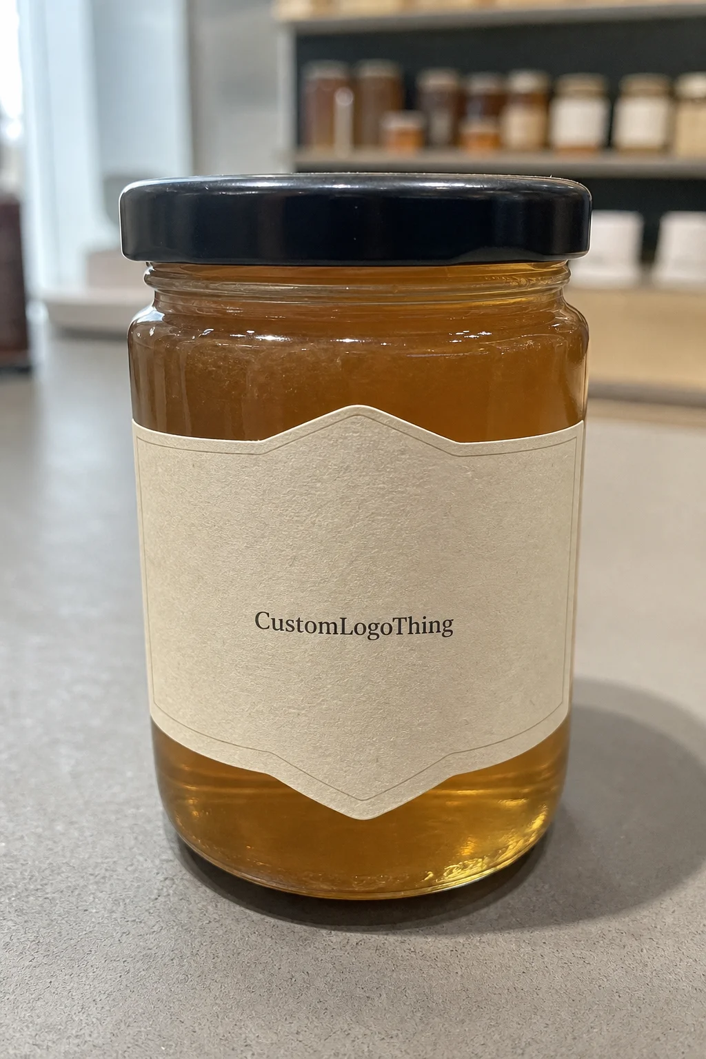
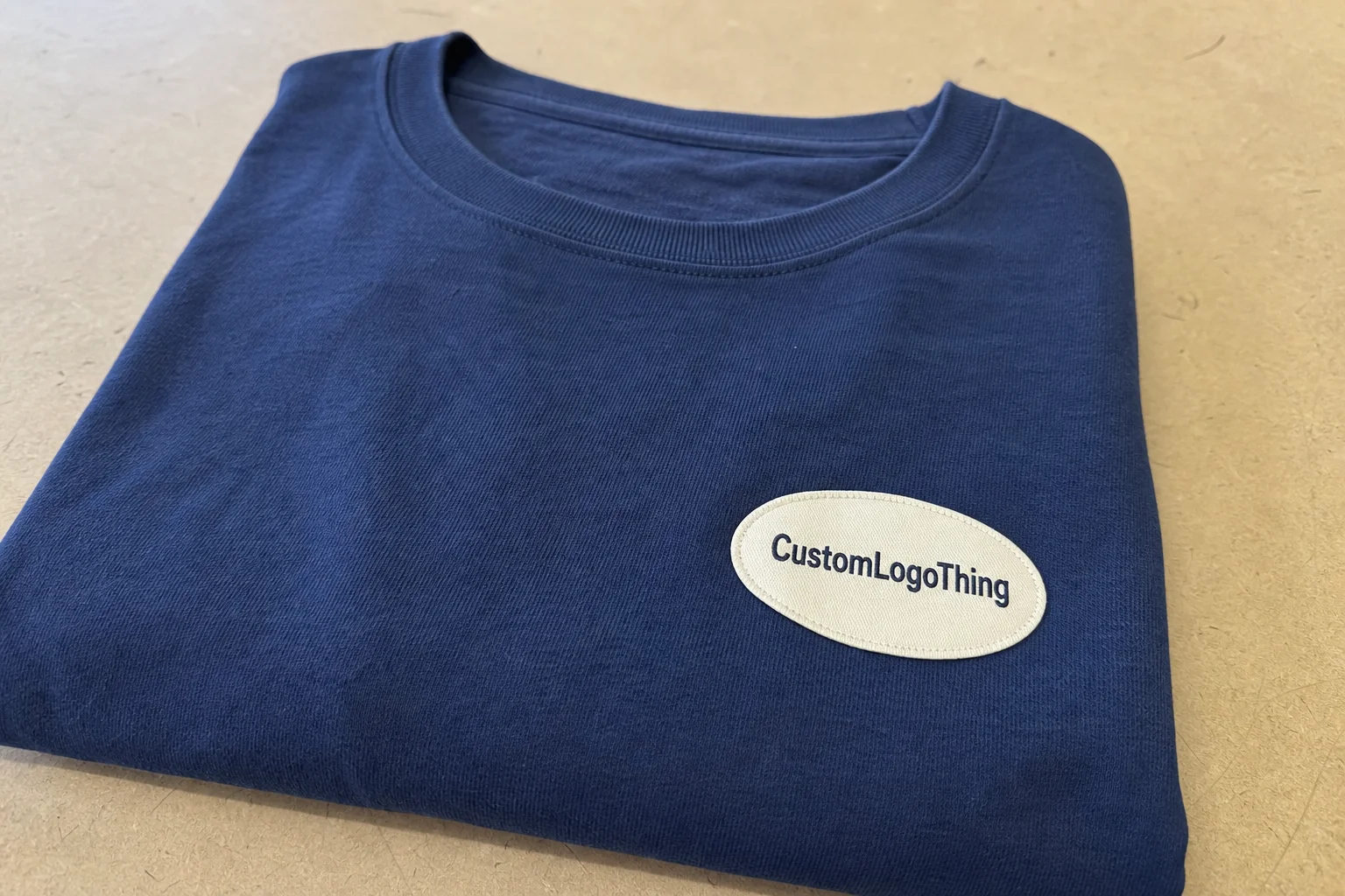
Oval labels for printing give small clothing brands a cleaner way to present a logo, a size mark, or a short brand line without fighting the space. The shape softens hard corners and makes a design feel finished faster than a plain rectangle, especially on compact hang tags, packaging inserts, and small sewn-on pieces. The shape helps, but it is not the whole job. Good results still depend on the artwork, the stock, and the print method.
That matters because a label is not just decoration. It has to read clearly, survive handling, and fit the brand without looking like an afterthought. A good label supports the product. A bad one looks like it was rushed through a template and nobody checked the trim.
What oval labels for printing solve on clothing
Oval labels for printing solve a basic layout problem: too much information in too little space. On apparel, space disappears quickly. You may need a logo, a size, a care cue, and maybe a line of brand copy on a tag that is barely large enough to hold a clear mark. An oval keeps the eye centered and reduces the visual noise that can make a small label feel crowded.
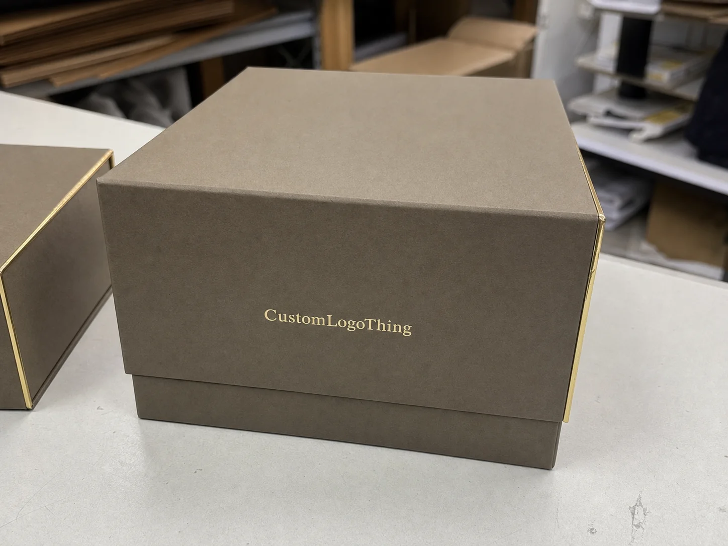
The shape also changes the tone. Sharp corners can feel rigid. An oval usually feels calmer and more polished, which is why it shows up often in boutique apparel, children’s wear, accessory packaging, and limited-run collections. The shape does not make a weak identity look expensive, but it can help a strong one look more deliberate.
Common uses include:
- Neck labels where space is tight and readability matters
- Hang tags attached to folded garments
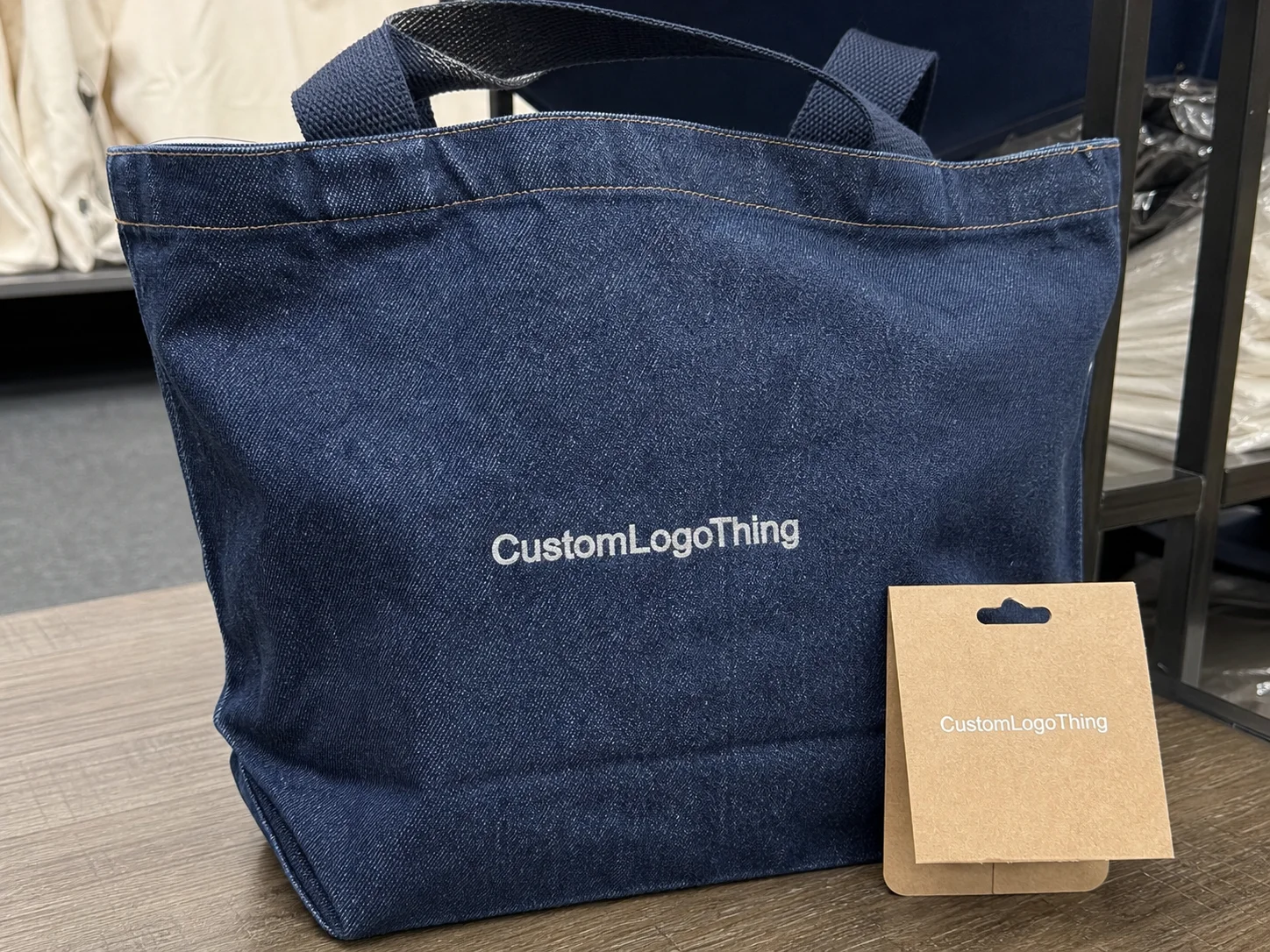
- Brand stickers for tissue wraps, garment bags, and box inserts
- Care-label accents that need to stay legible at a glance
- Small logo badges for packaging or presentation kits
The practical catch is that an oval reduces edge space. If the logo is dense, the text is tiny, or the border sits too close to the trim, the label can look cramped faster than a rectangle. This is where buyers often make a wrong assumption: they treat the shape as a style choice instead of a production choice. In reality, the shape changes how much usable area remains after bleed, trim, and safety margins are set.
So the first question is not, “Do ovals look good?” They usually do. The better question is, “Where will this label sit, what will it touch, and how far away will someone read it?” If the label is purely decorative, the build can be lighter. If it has to survive folding, shipping, retail handling, and maybe repeated contact with fabric, the material needs to do more work.
How the shape, stock, and finish affect print quality
Once the oval is set, the stock and finish decide how the label behaves in print and in use. The shape trims away the corners, which means the layout needs more discipline. Borders, logos, and text need enough room to breathe. A design that looks balanced in a mockup can feel crowded after the die line is applied, especially when the artwork depends on thin strokes or small type.
Stock choice comes next. Paper stocks are common for hang tags and packaging inserts because they print cleanly and keep cost under control. Coated paper is better when the artwork needs sharp edges and strong solid color areas. Uncoated paper gives a softer, more natural look, which suits brands trying to avoid a glossy retail feel. Synthetic films handle moisture, rubbing, and repeated handling better, but they usually cost more and can change the feel of the label in a way some apparel lines do not want.
Finish changes appearance more than most buyers expect. Matte keeps glare down and usually fits understated branding. Gloss adds brightness and makes color feel more saturated, though it can show reflections or fingerprints. Soft-touch and other premium coatings can make a label feel more refined, but they also shift the way ink sits on the surface. If the brand has strict color expectations, guessing is expensive. Proofing is cheaper.
Production method matters too. Digital printing is usually the right move for short runs, variable artwork, and quicker proof cycles. Offset printing makes more sense for larger quantities when color consistency and per-unit efficiency matter. Flexographic printing is useful for certain label constructions and repeat jobs, especially when the artwork and substrate are stable. There is no universal winner. The better method depends on quantity, material, and how much setup the job requires.
| Stock / Finish | Best Use | Visual Result | Typical Buyer Tradeoff |
|---|---|---|---|
| Uncoated paper | Simple hang tags, eco-leaning brand labels | Soft, natural, low glare | Less resistance to scuffing and moisture |
| Coated paper | Sharp logos, color-forward branding | Cleaner edges, richer solids | Can feel less tactile than uncoated stock |
| Synthetic film | Labels that may rub, fold, or ship in bulk | Sleek, durable, consistent | Usually higher unit cost |
| Matte finish | Premium apparel, subtle branding | Low glare, calm appearance | Dark solids may look less saturated |
| Gloss finish | Bolder retail presentation | Higher contrast and shine | Can show fingerprints or glare |
The table is a starting point, not a verdict. A paper hang tag that never sees moisture can get away with a lighter stock. A label that travels inside a carton, rubs against folded fabric, or sits in a warehouse for weeks needs a better durability profile. If the spec is built around the actual use case, the print usually holds up better and the buyer gets fewer surprises.
Transportation also matters more than many teams expect. Labels are not only judged at press check. They are judged after packing, shipping, unloading, and shelf handling. Industry testing groups like ISTA focus on transit performance for a reason. A scuffed label may look like a small defect, but it often points to a materials choice that was too thin for the job.
Specs that change durability, hand feel, and color
Spec work is where the job usually gets won or lost. On oval labels for printing, the main variables are finished size, trim tolerance, bleed allowance, text size, color setup, and attachment method. If the label is decorative, the spec can stay light. If it touches fabric, gets folded, or needs to hold up through handling, the requirements tighten fast.
Size sounds obvious, but it is where many buyers start too small. An oval needs room for the artwork and the safety margins. A border that looks balanced on screen may look pinched once it is cut. Text that is technically readable on a monitor may be too small in the real world, especially if the label sits on a garment that moves or folds. For apparel, readability should be judged at arm’s length, not on a design file zoomed to 400 percent.
Color control is another common issue. CMYK works for many apparel labels and is usually the simplest path for short runs. If the brand relies on a very specific navy, red, or black, spot color may be worth the setup because it gives a tighter target for reorders. The tradeoff is cost and setup time. If the identity is flexible, CMYK is often enough. If consistency is the priority, do not rely on a screen approximation and hope for the best.
Durability should be discussed in plain language. Will the label resist scuffing from folding and packing? Will it handle light moisture or skin oils? Will the edge curl after sitting in a warm warehouse? These are not academic questions. They decide whether the label still looks clean when the customer opens the package.
Hand feel matters more on clothing than on many other print jobs. A stiff label can look premium on a mockup and feel wrong on a soft garment. A softer stock may feel better but crease more easily. The right answer depends on where the label sits. A hang tag can usually tolerate more structure. A label that rests against a garment or goes into a box with folded fabric may need a lighter, smoother build.
Attachment method matters as much as face stock. Adhesive-backed labels behave differently from sewn or tied labels, and the liner or backing can change how the finished piece releases and lies flat. A label that prints beautifully can still fail in use if the adhesive is wrong for the surface or if the backing peels poorly during assembly.
Spec the use case first and the artwork second. If the label has to survive real handling, the material choice matters more than the mockup.
Practical spec checklist
- Finished size and trim tolerance
- Readable text minimums
- Color references or brand standards
- Material preference and finish preference
- Attachment method and garment contact points
If sustainability is part of the sourcing brief, paper options with FSC certification can help, provided the certification matches the actual material and supply chain. That is a procurement decision, not a design flourish. It should be set before quoting, not after the order is already moving.
Production process and timeline: from proof to shipment
The production path is straightforward, but each step exists for a reason. Artwork review comes first. Vector files, fonts, and image resolution need to be checked before anyone commits to a die, plate, or press schedule. Then comes size confirmation, proofing, material selection, printing, trimming, inspection, and packing. On oval labels for printing, centering is especially important because the shape gives less room to hide a small alignment error.
Proofing is the control point. That is where most avoidable problems are caught. Buyers Should Check logo placement, line thickness, text size, border distance, and any notes about color or finish. If a proof raises a question about bleed or trim, answer it before approving the job. A proof is not just a preview. It is the version that keeps the production run from drifting off spec.
Lead time depends on a few real variables: whether the artwork is ready, how complex the finish is, how large the quantity is, and whether the job needs custom cutting or extra inspection. A clean reorder usually moves faster because the production file already exists. A first run takes longer because the setup work is real, not decorative. That includes proofing, material confirmation, and any adjustments needed for the trim line.
For a simple apparel label order, a timeline of about 12 to 15 business days after proof approval is a reasonable baseline. More complex jobs can take longer, especially when they require specialty finishes, larger volumes, or extra setup. Rush service can shorten the schedule, but it usually adds cost and leaves less room for correction. If the brand is still changing artwork while the order is being quoted, the calendar will slip. That is usually self-inflicted.
The fastest way to keep the job moving is to send vector artwork, confirm dimensions early, and keep all decision-makers in the proof loop. One delayed approval can stall the run. One missing font can stop the file from going to press. That is why organized buyers tend to get cleaner schedules and fewer surprises.
Cost and unit pricing: what drives the quote
Pricing is driven by quantity, stock, finish, print complexity, trimming method, and whether the job needs custom setup or special packing. Oval labels for printing are not expensive because they are oval. They are priced according to the production burden behind them. A simple one-color paper run costs very differently from a coated, multi-color, die-cut job with extra finishing steps.
Quantity changes the math quickly. Small runs usually carry a higher per-piece price because setup costs are spread across fewer labels. That is not a penalty. It is basic production economics. Smaller orders reduce inventory risk for new brands and seasonal tests. Larger orders lower the unit cost, but they ask for more cash up front and more confidence in the design.
A practical way to think about run size is this:
| Run Size | Typical Unit Price Behavior | Best Fit |
|---|---|---|
| Small test run | Higher per piece, lower total spend | New brand launches, artwork testing, seasonal trials |
| Mid-size order | Better balance of setup cost and unit cost | Growing apparel lines with steady sell-through |
| Larger volume | Lowest per piece, highest total commitment | Reorders, established collections, multi-SKU rollouts |
Hidden costs are where quotes get messy. Rush fees, design revisions, extra proof rounds, special color matching, and rework caused by incomplete artwork can all change the final number. Sometimes the cheapest quote is the most expensive one after those items are added back in. Comparing vendors only works if the specs are truly identical.
That means size, material, finish, quantity, and delivery expectation need to match from quote to quote. If one supplier quotes digital printing on coated paper and another quotes offset printing on synthetic stock, the numbers are not comparable. They are different products. That sounds obvious. People still do it every week.
For brands watching margin, the cleanest move is to lock the spec before asking for final pricing. Then the quote reflects the actual job instead of a rough guess. That saves time, cuts back-and-forth, and makes it easier to decide whether the order should be a small test run or a larger production buy.
Common mistakes that cause reprints or slow approvals
The most common mistake is crowding the artwork too close to the edge. On oval labels for printing, the trim line can make a design feel tighter than expected, especially if the logo has thin strokes or small type. A border that looks balanced on a screen can look pinched once it is cut. That problem is hard to fix after approval.
Low-resolution files create a different kind of pain. Raster logos, missing fonts, and small text saved at the wrong quality can soften the image or force production to stop for cleanup. If the artwork includes fine lines, it needs to be built to hold them. A label is not the place to see whether a file “probably” works.
Color language causes more confusion than it should. “Bright blue” is not a production spec. Neither is “make it pop.” If the brand has standards, send them. If not, anchor the request to a previous product, a Pantone reference, or a known brand asset. The more specific the reference, the less time gets wasted trying to interpret taste.
Timing assumptions create another easy delay. Buyers sometimes expect a quick turnaround without leaving time for proofing or setup, then call the order late when the schedule is actually moving as planned. The fix is simple: ask separately about proof timing, production timing, and shipping timing. One question bundled into one answer is where confusion usually starts.
The last mistake is choosing the wrong finish for the garment environment. A high-gloss label can look sharp in a mockup and feel out of place on a soft, natural product line. If the brand is quiet, tactile, or minimal, the label should support that tone instead of fighting it. A label that looks technically good but visually wrong still missed the brief.
Next steps: build a clean spec before requesting samples
Before asking for a quote, gather four things: size, quantity, artwork file, and where the label will be used. Those four items eliminate most quoting friction. Once the use case is clear, the material and finish options get much easier to narrow down.
Then build a short spec sheet. Include material preference, finish preference, color references, and whether the label needs durability or mainly visual branding. If you are comparing suppliers, keep the spec identical across each quote. Otherwise, the pricing conversation becomes noise. One supplier may look cheaper simply because the material is lighter or the finish is less durable.
For a new design, request a digital proof first. If the brand is still deciding between a softer feel, stronger color, or a different attachment method, ask for a sample or a short run before committing to a larger order. That small test often prevents a bigger reprint later when the finished label behaves differently from the mockup.
Once the specs are locked, compare two or three options on the same terms. That is the cleanest way to judge value. A well-built order reduces proofing time, cuts rework, and gives the garment a label that looks like it belongs there instead of something added at the last minute.
Oval labels for printing work best when size, stock, finish, and timeline are decided before the artwork gets treated like the only variable. Get the basics right, and the label does its job quietly. That is usually the point.
Are oval labels for printing better than rectangle labels for small clothing items?
Often, yes. Oval shapes reduce visual clutter and keep the logo centered, which helps on compact apparel labels and small packaging pieces. They are a good fit when the brand wants a softer, more finished look without using extra decoration.
What file format should I send for oval label artwork?
Vector files are the safest choice because they keep text and logos sharp at any size. If only a raster file is available, send the highest-resolution version you have and expect a proof review before print.
How do I choose the right size for clothing labels with an oval shape?
Start with where the label will sit on the garment and how much readable space the artwork needs. Leave enough margin so the trim line does not crowd text, borders, or small symbols.
What MOQ should I expect for oval printed labels?
MOQ depends on material, finish, and production method. Smaller runs usually cost more per unit, so ask for the lowest workable quantity if you are testing a new brand or design.
Can oval labels for printing work as care or brand labels?
Yes, if the layout stays readable and the stock fits the use case. For anything that touches skin or fabric, confirm edge quality, durability, and attachment method before placing a full order.