Buyer Fit Snapshot
| Best fit | Packaging Branding projects where brand print, material claims, artwork control, MOQ, and repeat-order consistency need to be specified before quoting. |
|---|---|
| Quote inputs | Share finished size, material target, print colors, finish, packing count, annual reorder estimate, ship-to region, and any compliance wording. |
| Proofing check | Approve dieline scale, logo placement, barcode or warning zones, color tolerance, closure strength, and carton packing before bulk production. |
| Main risk | Vague material claims, crowded artwork, missing packing details, or unclear freight terms can make a low unit price expensive after revisions. |
Fast answer: Packaging Branding: Quote Scope, Sample Proof, MOQ, and Lead Time should be specified like a repeatable production item. The safest quote records material, print method, finish, artwork proof, packing count, and reorder notes in one written spec.
Production checks before approval
Compare the actual filled-product size with the drawing, then confirm tolerance on folds, seals, hang holes, label areas, and retail display edges. Reserve space for logos, QR codes, warning copy, and material claims before decorative graphics fill the panel.
Quote comparison points
Review material grade, print process, finish, sampling route, tooling charges, carton quantity, and freight assumptions side by side. A quote is only useful when the supplier can repeat the same color, closure quality, and packing count on the next order.
Packaging Branding: How to Choose What Really Matters
I still remember standing on a corrugated line in a New Jersey co-packer in Edison, watching two nearly identical mailer boxes roll past the glue station at roughly 180 units an hour. Same logo, same blue ink, same footprint. One was printed on a 32 ECT kraft board with a clean water-based flexo pass, and the other on a brighter white-lined sheet with tighter registration and a slightly softer hand feel. The difference in how buyers reacted was dramatic, and that is exactly why packaging branding how to choose is never just a design exercise. Honestly, I was a little irritated by how obvious the lesson became only after we had all spent time arguing about the “better-looking” sample, which was not the better-performing one.
One box looked like a bargain shipment. The other felt like a brand with standards. That’s the part many teams miss. Packaging branding is the package’s job of communicating quality, personality, and trust before the customer ever opens it, and in a lot of cases before they even decide to buy. A 12 x 9 x 4 inch mailer can do that just as effectively as a $14 rigid gift box if the board, ink, and finish are chosen well.
People often underestimate how much a package can do. It influences shelf impact in retail packaging, the unboxing experience in e-commerce, the amount of product protection you get in transit, and whether the customer feels good enough to reorder. If you’ve ever had a perfume box arrive crushed, or a subscription kit that looked elegant but exploded in shipping, you’ve seen the tradeoff firsthand. I remember one beauty launch in Secaucus where the cartons looked gorgeous on the table and then showed up at the warehouse with corner wear like they’d been through a minor war after a 260-mile freight move.
Many teams start with foil, embossing, or a fancy soft-touch finish and only later ask whether the structure can hold up. Packaging branding how to choose the right style means balancing premium appearance with real-world durability, unit cost, lead time, and how your fulfillment team actually packs cartons at 4:30 p.m. on a Friday. If you’ve ever watched someone tape up a box with the energy of a person who has deeply questioned their career path, you know why that matters. A package that saves 14 seconds per pack-out across 3,000 orders a week can matter more than a decorative effect nobody notices.
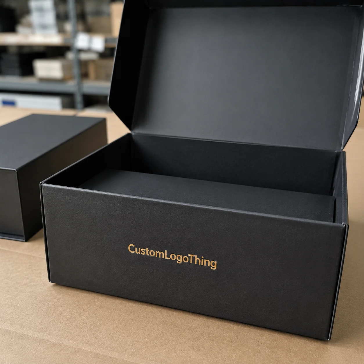
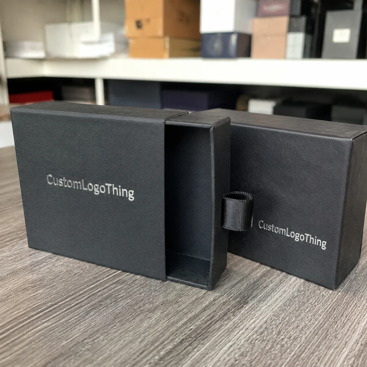
In my experience, the smartest brands treat package branding like a strategic system. The box, insert, tissue, label, outer shipper, and even the tape all work together. That’s the difference between a one-off pretty package and branded packaging that consistently supports brand identity. A 350gsm C1S artboard carton with a 15 micron aqueous coat will tell a different story than a 24pt rigid board with a wrapped paper liner, even if the logo is identical.
I’ve seen a $0.42 mailer outperform a $1.18 rigid box simply because the cheaper one was sized correctly, printed cleaner, and opened with a sharper sequence. The customer never saw the invoice; they only felt the experience.
That’s why packaging branding how to choose should start with the question, “What are we trying to accomplish?” Not “What effect looks coolest in a mockup?” That one shift saves money, avoids reprints, and usually leads to a better product packaging decision. On a 5,000-unit order, a structural change that saves $0.09 per unit adds up to $450 immediately, before you even count freight or labor.
How Packaging Branding Works Across Materials and Print Methods
Packaging production has a rhythm to it, and when you understand the chain, packaging branding how to choose becomes much easier. It usually starts with a dieline and artwork setup, then moves into proofing, print, finishing, cutting, folding, and gluing. Every one of those steps affects the final appearance of Custom Printed Boxes or cartons, and the whole process typically takes 12 to 15 business days from proof approval for a standard folding-carton run in Dongguan or Ningbo.
I’ve spent enough time in converter shops in Shenzhen and Foshan to know that a beautiful render on a monitor is only the beginning. On the floor, board grain, ink absorption, die-cut tolerance, and glue flap behavior all show up fast. If a client wants a sharp logo edge on a dark matte stock, we need to know whether the substrate can hold registration without fuzzy lines or toner cracking. That’s not a theory; that’s production reality. It’s also the sort of thing nobody mentions in the first brainstorm, because everyone is busy falling in love with a shiny deck and a Pantone chip that looks better under office LEDs than under a 5,000K warehouse lamp.
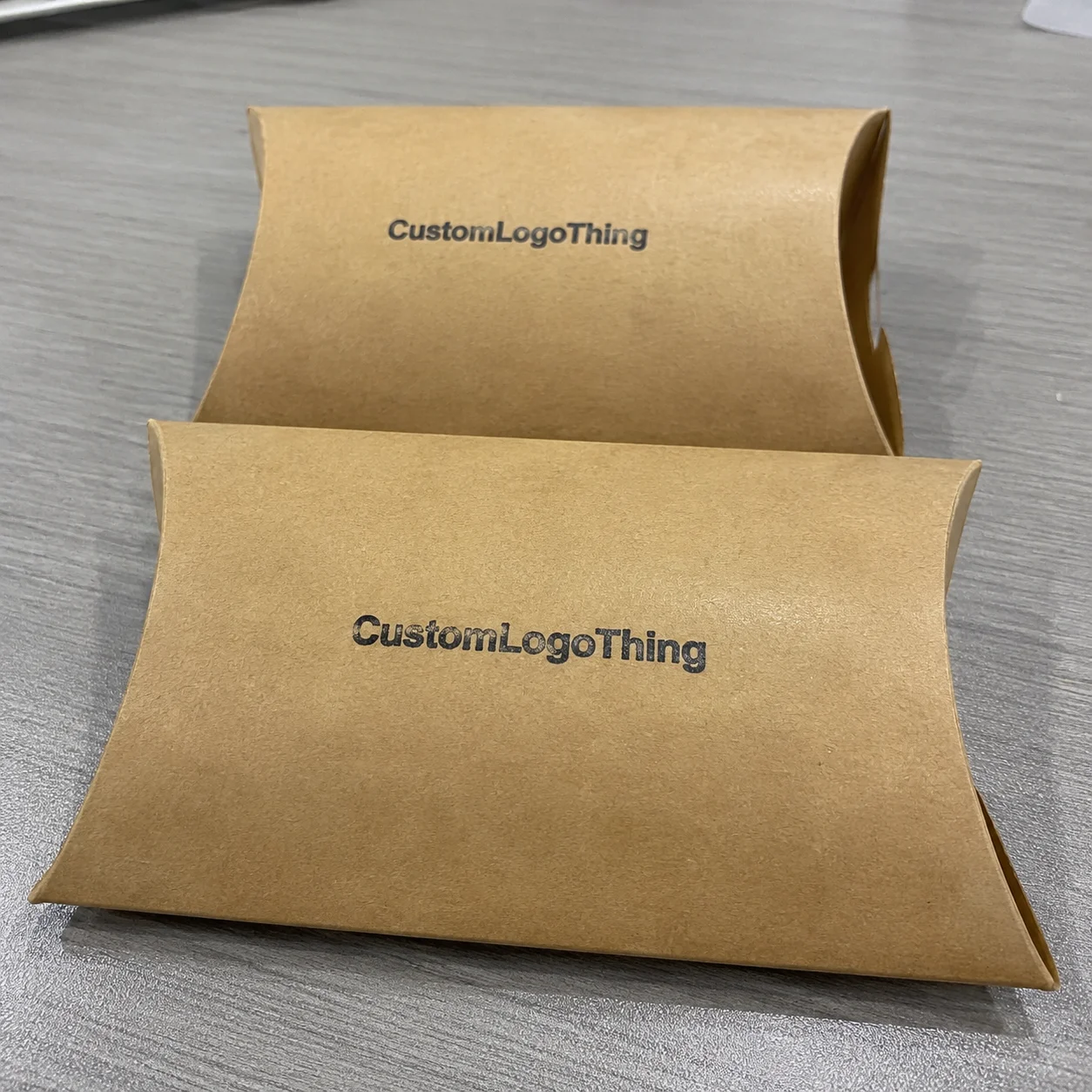
Different materials behave in different ways. Corrugated E-flute is excellent for e-commerce shipping because it cushions better than paperboard, but it also has a more textured surface that can soften tiny details. Rigid chipboard gives you a premium feel and is common in luxury retail packaging, but it costs more and takes more handling. Kraft paperboard signals natural or eco-conscious branding, while specialty stocks can give you a textured, tactile finish that pairs well with simple logos and restrained graphics. If your brand voice is “quiet confidence,” kraft can do a lot of heavy lifting without screaming for attention. A 400gsm recycled kraft board with a 1-color black print is often enough for a coffee roaster or wellness brand in Portland, Oregon.
Print method matters just as much. Offset lithography is still the workhorse for crisp detail and solid color control on medium to large runs. Digital printing is useful for shorter runs and variable data. Flexographic printing is common on corrugated, especially when speed and cost efficiency matter. Then you have foil stamping, embossing, debossing, and spot UV, each of which changes the branded effect in a different way. Foil gives you reflection and flash. Embossing adds dimensional depth. Spot UV can create contrast on a matte field, but it is not a magic fix if the underlying color management is off. I’ve seen people treat spot UV like emotional support gloss. It is not. On a 10,000-piece run in Suzhou, foil stamping can add about $0.06 to $0.12 per unit depending on coverage and die size.
Structure changes the branding result too. A mailer box tells a different story than a folding carton. Sleeve packaging feels more layered. Inserts can raise perceived value if they hold the product securely. Protective inner packaging, like molded pulp or paper crinkle, can reinforce sustainability while keeping the presentation clean. For a recent cosmetics client in Los Angeles, we tested the same rose-gold logo on a tuck-end carton, a rigid lid-and-base box, and a sleeve over a folding carton. The logo was identical, yet the perceived value shifted by nearly a full tier because the structure changed the opening pace.
Proofing is where a lot of teams learn the hard way. Color shifts happen because coated and uncoated stock absorb ink differently. Coating changes how a metallic foil reads under fluorescent warehouse lights. Registration tolerance can drift by a millimeter or two, and that may not sound like much until a fine serif font starts to blur at the edges. Handling matters as well; a design that looks pristine in a PDF can scuff on a distribution belt before it ever reaches the customer. That is the packaging equivalent of “it looked fine on my screen,” which, frankly, should be printed on a warning label. A pre-production proof in plain white light, not just on a calibrated monitor, can catch a 3 percent density shift before a 20,000-unit run.
For teams trying to compare options, it helps to look at the main combinations side by side.
| Option | Typical Use | Approx. Cost Impact | Branding Effect |
|---|---|---|---|
| Corrugated E-flute with 1-color flexo | E-commerce shipping | $0.38-$0.78/unit at 5,000 units | Clean, practical, durable |
| Folding carton with offset print and AQ coating | Retail packaging | $0.22-$0.64/unit at 10,000 units | Crisp, retail-friendly, efficient |
| Rigid box with foil and embossing | Luxury product packaging | $1.10-$3.50/unit at 3,000 units | High perceived value, premium unboxing experience |
| Kraft sleeve with digital print | Small-batch launches | $0.30-$0.95/unit at 1,000 units | Natural, flexible, easy to test |
If you want a broader view of package construction and print methods, I often point teams to industry references like the Packaging Association and the testing standards at ISTA. Those references help keep the conversation grounded in reality instead of sales language. A supplier in Atlanta may quote a different freight term than one in Milwaukee, but the board spec still has to pass the same drop and vibration logic.
Key Factors in Packaging Branding: How to Choose the Right Fit
For most brands, packaging branding how to choose comes down to a few core variables, and the order matters. I like to start with brand position because it influences everything else. A luxury skincare line wants different cues than a technical replacement part, and a playful snack brand should not look like a hospital supply carton. Your audience reads those signals in about two seconds, which is both impressive and mildly annoying if you spent weeks refining the gradient. In Seattle or Miami, the same package can signal very different things depending on whether it lands in a boutique, a warehouse, or a TikTok unboxing video.
Then there is product requirement. Weight, fragility, temperature sensitivity, retail display needs, and shipping constraints all shape the right answer. A 250-gram candle in a kraft tube is a very different problem than a 900-gram glass bottle in a shelf-ready carton. If you miss the product requirement, no amount of graphic polish will save the package. A jar with a 70 mm diameter and a 12 mm neck finish may need a custom insert die instead of an off-the-shelf divider.
Cost also has to be treated honestly. I’ve had client meetings where everyone fell in love with a soft-touch rigid box until the quote landed at $2.87 per unit before freight. That may be fine for a prestige launch, but it can crush margins on a fast-moving item. You need to compare setup fees, tooling, print complexity, finishes, and order volume together. A low unit price can be misleading if the die cost is high or the minimum order quantity is double your forecast. That quote-number whiplash is real, and nobody enjoys being the person who says, “Actually, we can’t afford the fancy one.”
Lead time matters more than people admit. A simple digital run might move in 7 to 10 business days after artwork approval, while a custom structure with foil, embossing, and a matched insert can take 20 to 35 business days depending on factory load and freight. If you are selling into a trade show, seasonal launch, or retailer deadline, the calendar can matter as much as the design. A shipment from Vietnam to Chicago can add another 7 to 12 days if ocean freight is involved, which turns a “quick” project into a very un-quick one.
Sustainability is another real consideration, not a decoration. Recycled content, FSC-certified board, water-based inks, and right-sizing can all reduce waste. I’ve watched brands cut shipping costs by 11% just by trimming carton dimensions and removing 30 grams of void fill per unit. That sort of change helps both the environmental story and the budget. For suppliers and standards, the FSC site is a useful reference when you are checking certification language, especially if your cartons are produced in Vietnam or the Pearl River Delta.
Retail and e-commerce create different tests. A package that looks beautiful on a shelf can get scuffed in parcel shipping. A shipper that survives UPS or FedEx abuse may disappear visually in a retail aisle because the branding is too restrained. This is why packaging branding how to choose is really about context. Shelf impact, box strength, and customer experience all need to be in the same conversation. A 1.5 mm increase in board caliper can be invisible on a render and decisive in a distribution center.
One food brand I worked with insisted on a high-gloss black carton because it looked expensive on the CAD render. We changed course after a transit test showed visible scuffs after just 12 drops and a little corner rubbing. The matte alternative looked less flashy on screen, but it sold better and arrived looking cleaner.
Here is a simple way to think about priorities:
- Luxury brands: prioritize tactile finishes, structured opening, and consistency in print.
- Mass-market brands: prioritize cost control, fast production, and reliable shelf visibility.
- Eco-conscious brands: prioritize recyclable substrates, FSC sourcing, and minimal coating complexity.
- Technical products: prioritize protection, legibility, and clear information hierarchy.
That priority list sounds simple, but it saves a lot of money when you are choosing between package branding options. I’ve seen companies spend more on decoration than on the actual board grade, and that’s usually the wrong direction. The material should support the story, not fight it. Otherwise the package ends up like a person wearing a tuxedo with hiking boots. Technically possible, visually confusing. A 24pt SBS carton with one foil accent can outperform a heavily decorated 18pt stock if the product and channel are matched correctly.
Packaging Branding How to Choose Step by Step
When a client asks me for packaging branding how to choose guidance, I usually break the process into seven steps. It keeps the decision from becoming emotional, which is surprisingly easy once foil samples and magnetic closures enter the room. I have watched fully rational adults lose all objectivity over a metallic swatch card from a shop in Guangzhou. No judgment. I have been one of them.
1. Define the business goal
Start with the purpose of the package. Is it meant to create premium perception, improve protection, increase shelf presence, reduce shipping damage, or make reorders easier for fulfillment? A package can do more than one thing, but it should be optimized for the primary goal first. If you can define the outcome in one sentence, you are already ahead of most teams. For example, “reduce breakage below 1% on 3,000 monthly orders” is far more useful than “make it feel nicer.”
2. Audit the product and logistics
Measure the product accurately, not just the retail unit. Include insert space, headroom, wall thickness, and carton compression if the box will be stacked. I always ask for exact dimensions in millimeters, the finished weight, and the shipping method. A glass bottle that weighs 420 grams with a 2 mm shoulder can need a very different insert than the same bottle in plastic. It sounds tedious because it is tedious, but tedious is cheaper than a carton redesign after launch. A pack-out line in Columbus, Ohio, may also need a wider glue flap than one in a manual studio assembly setup in Brooklyn.
3. Match the structure to the use case
This is where custom printed boxes begin to take shape. A tuck-end carton works for lightweight retail items. A mailer box is better for subscription kits and parcel delivery. A rigid box makes sense for luxury sets and gift packaging. Inserts, trays, and sleeves can add control and keep the opening sequence neat. The structure should serve the product, the packing line, and the customer experience all at once. For a 500 mL shampoo bottle, a corrugated mailer with a paperboard cradle may be smarter than a decorative sleeve that saves pennies and costs dollars in damage.
4. Select print and finish intentionally
Ask what the brand story actually needs. Do you need a matte look with one foil accent, or a bright full-color print with a spot gloss on the logo? Could debossing tell the story more quietly than foil? A lot of packaging design gets better when you remove options instead of adding them. My honest opinion: one strong premium detail usually beats three competing ones. On a 350gsm C1S artboard, a single gold foil logo plus an uncoated reverse side can look sharper than a crowded four-effect layout.
5. Sample before commitment
Request a structural sample or pre-production proof. Check the board feel, the closure strength, the fold lines, and the color under natural light and warehouse light. I’ve seen blue shift toward purple under LED fixtures, and that matters if your brand color is a strict Pantone match. If the sample is not right, you can still adjust before the run. If it is right, you can move forward with far more confidence and a lot less grumbling. A good sample run usually costs $75 to $250 depending on tooling and shipping from the factory in Dongguan or Dallas.
6. Compare quotes on equal specs
Never compare one supplier’s soft-touch lamination quote against another supplier’s uncoated kraft quote and call it a fair comparison. Use the same board, same size, same finish, same quantity, same insert count, and same freight assumptions. That is the only way package branding pricing becomes meaningful. For example, a 5,000-unit order may land at $0.24/unit for simple folding cartons, while the same size in rigid construction can jump to $1.40/unit. If the quotes are not built on identical specs, the cheapest number is often just the least honest number.
7. Finalize production-ready artwork
Make sure your files include bleed, safe zones, dieline alignment, and Pantone references where required. If your logo has a fine line weight, check how it reproduces on the chosen substrate. Production files that are “pretty close” can cost real time when they hit the prepress desk. A clean file package keeps the process moving and reduces back-and-forth with the factory. It also saves you from the classic “why is the barcode floating two inches to the left?” moment that somehow always happens on a Thursday. Most factories in Ningbo or Ho Chi Minh City will ask for final art in AI, PDF/X-1a, or packaged EPS before they schedule print.
Here is a practical comparison of common structure choices.
| Structure | Best For | Typical Strength | Branding Notes |
|---|---|---|---|
| Tuck-end carton | Light retail goods | Moderate | Efficient, easy to print, good for high-volume SKUs |
| Mailer box | E-commerce and kits | Good | Strong unboxing experience, ideal for interior printing |
| Rigid set-up box | Luxury and gifting | Excellent | Higher perceived value, better for premium branded packaging |
| Sleeve with tray | Mid-range retail packaging | Moderate to good | Good balance of display, cost, and presentation |
If you want to see how different packaging systems behave across real projects, our Case Studies page is useful because it shows how structure, print, and cost decisions play out in the field, not just on a mood board. A project shipped from Mexico City to Phoenix will expose weaknesses faster than a studio mockup in a climate-controlled room.
Common Mistakes When Choosing Packaging Branding
The biggest mistake I see in packaging branding how to choose conversations is starting with decoration instead of function. A foil-stamped box can look gorgeous in a pitch deck and still fail in a warehouse because it crushes at the corners or scuffs when stacked 10-high. Beauty matters, but it cannot be the only filter. A box that looks great at a sample table in Chicago but fails in a 1,200-mile freight lane is not a successful design.
Another common error is overdesigning. Too many colors, too many coatings, too many special effects, and suddenly the box is expensive, slow to produce, and harder to approve. I’ve sat in supplier negotiations where a client wanted matte lamination, spot UV, foil, embossing, and a metallic ink base all on the same small carton. The quote nearly doubled because each layer added setup time and risk. I remember the room going quiet after the fifth “and also maybe…” because everyone knew the invoice had just gotten much less cheerful. On a 2,500-unit run, that kind of feature stacking can turn a $0.58 carton into a $1.21 carton before freight.
People also forget the unboxing sequence. A package can look polished on the outside and still feel cheap if the opening force is awkward or the insert rattles. The customer should not have to fight the box to get to the product. If the closure tears, the tabs bend, or the product shifts too much, the whole brand moment gets weaker. A 3 mm gap in a tray can sound tiny and still create a very loud customer complaint.
Shipping reality deserves more respect than it usually gets. Cartons experience compression in transit, vibration on conveyors, scuffing in distribution centers, and occasional moisture exposure. A material that looks perfect in a showroom may not survive a pallet stretch wrap cycle or a hot trailer. This is exactly why ISTA testing and ASTM methods matter; they help you verify that your package branding choices hold up outside the design studio. And yes, the test lab in New Jersey is less glamorous than a mockup table, but the lab is usually right. A 15-point drop test and compression cycle can reveal damage that no render will ever show.
Skipping prototypes is another expensive habit. Screen mockups are helpful, but they do not tell you how the board folds, how the ink sits, or whether a lid will hold after repeated opening. I once saw a launch delay because the magnetic closure on a rigid gift box was off by 1.5 mm, which was enough to create a crooked front panel line. That kind of issue is far easier to catch with a sample than with a PDF. A structural sample from a factory in Guangzhou usually costs less than one hour of delayed labor at a fulfillment center in Austin.
Finally, many teams under-plan for reorders. A package that depends on an uncommon stock, a custom-made insert, or a specialty foil can become difficult to replenish if the supplier changes equipment or the raw material goes out of stock. Scalability matters. If your packaging branding how to choose decision creates a one-time hero box but no path for a second production run, that is a hidden cost. I’ve seen brands lose two weeks waiting for a replacement board grade because the original mill in South Korea had shifted its caliper lineup.
- Do not choose finishes before function.
- Do not compare quotes without identical specs.
- Do not approve color from a laptop screen alone.
- Do not skip drop testing or compression testing.
- Do not ignore reordering and storage realities.
One client meeting in Chicago sticks with me. The team had spent three weeks debating a metallic rose-gold foil, but no one had checked whether the carton could survive the retail club-store pallet load. The packaging looked elegant on the table and failed on the forklift. That was an expensive lesson, and a very common one. The funny part, if you can call it funny, is that everyone suddenly became very interested in board strength after the pallet failed. Amazing how fast priorities can change once gravity gets a vote, especially when the pallet load is 1,100 pounds and the warehouse floor is concrete.
Expert Tips for Packaging Branding How to Choose Smarter
If you want packaging branding how to choose to feel less overwhelming, focus on a few high-value moves that deliver visible impact without creating chaos on the production floor. I’m a big believer in restraint. The best package is not always the most decorated one; it is often the one with the clearest purpose. A single well-placed foil line on a 24pt chipboard sleeve in Toronto can do more than a full-cover effect that feels noisy.
My first tip is to use one premium detail well. A single emboss on the logo, a precise foil line, or a soft-touch coating can carry the design if the base structure is solid. Two or three effects can start competing with each other, especially on small cartons where the artwork area is limited. If the audience is scanning from three feet away, clarity beats ornament. I honestly think too many teams treat finishes like toppings on a pizza, and then act surprised when the whole thing gets messy. A budget of $0.08 to $0.15 per unit for one high-impact finish is often more effective than spending twice that on several weaker ones.
Second, think about the customer’s hand. The opening force, closure quality, and tactile finish are part of the brand message. A box that opens cleanly on the first pull feels more considered than one that fights back. I’ve watched buyers in a showroom ignore a beautifully printed sample because the tuck flap felt flimsy after two openings. That is the kind of feedback that only shows up when you handle samples physically. If your carton is meant to be opened 20 times, test it 20 times, not once.
Third, keep the whole system aligned. The box, insert, tissue, tape, labels, and outer shipper should all look intentional. If the outer shipper is generic brown kraft and the inside is a luxe black carton, that can work if the contrast is planned. If it is accidental, the experience feels fragmented. This is where package branding becomes a system instead of a single asset. Even a 2-inch branded tape strip can make the shipment feel more deliberate if it matches the core palette.
Fourth, ask for a production sample from the actual factory line whenever possible. A sample made on a different press or converting setup can hide variation in color and fold accuracy. The closer the sample is to the real run, the fewer surprises you get. I’ve seen differences of 3 to 5 percent in ink density between a hand sample and a production sheet, and that matters for brand consistency. A factory in Xiamen may run a slightly different coating profile than one in Taicang, so the sample should come from the same line if possible.
Fifth, build for multiple SKUs. A package family that can scale across sizes without redesigning from scratch saves time and money. If your 100 mL and 250 mL products can share the same visual system with a simple size change, you will thank yourself later. A smart packaging design system is easier to replenish, easier to explain to retailers, and easier to keep consistent across channels. One master dieline that scales across three widths can save 8 to 12 hours of design revision per line extension.
Sixth, think about the warehouse, not just the unboxing moment. Materials and finishes must be easy to store, label, and assemble at fulfillment centers. A finish that fingerprints easily might look incredible but create headaches during packing. A highly specialized box can also slow down manual packing lines, which adds labor cost you may not see in the packaging quote. If a packer in Dallas loses 6 seconds per unit on a tricky fold, that becomes a serious cost on a 4,000-order month.
Here is a compact comparison of branding features and where they make sense:
| Feature | Visual Impact | Cost Impact | Best Use |
|---|---|---|---|
| Foil stamping | High | Medium to high | Luxury branding, logos, accents |
| Embossing | Medium to high | Medium | Tactile brand marks, premium cues |
| Spot UV | Medium | Medium | Contrast on matte cartons |
| Digital print | Medium | Low to medium | Short runs, test launches, personalization |
If you’re planning labels, seals, or secondary identifiers as part of the brand system, our Custom Labels & Tags page can help you think through how those details support the main box instead of fighting it. A 2-inch round seal with a matte finish can cost as little as $0.03 to $0.07 per piece in a 10,000-piece order.
And if you need a broader starting point for packaging sourcing, our Custom Packaging Products page gives a clearer picture of what can be built around your product size, shipping method, and market position. A supplier in Guangdong, for example, may offer a different lead time than one in Ohio, but the decision process stays the same: fit, function, finish, then freight.
Next Steps for Packaging Branding: How to Choose Confidently
By this point, packaging branding how to choose should feel less like guessing and more like a practical decision tree. The fastest way to make a good choice is to write down the real constraints: what the product needs, what the budget can support, how long production can take, and what kind of brand signal you need to send. A one-page brief with the right numbers will outperform a 40-slide mood deck every time.
Start with a short checklist. I recommend including product dimensions, weight, fragility, shipping method, retail or e-commerce channel, target audience, sustainability priorities, budget per unit, and launch deadline. That list will shape almost every other decision, from board grade to finish selection. Once those numbers are on paper, it becomes much easier to see whether a rigid box is realistic or whether a smarter carton will do the job. For a launch in September, for example, you may need artwork locked by July 18 if production in Shenzhen takes 14 business days and ocean freight takes another 18.
Then gather three reference packages you like and write down what specifically works: the structure, the finish, the color palette, the opening sequence, or the perceived quality. Do not just say “I like it.” Say “I like the 18pt SBS carton with matte AQ coating and one gold foil logo.” Specificity helps your supplier quote accurately and helps your team stay aligned. A note like “soft premium feel” is almost impossible to price without a board spec, such as 350gsm C1S artboard with a 1.5 mm greyboard insert.
Prepare your files before you ask for pricing. Have the dieline, logo artwork, Pantone references, expected quantity, and insert dimensions ready. When a supplier gets clean information, they can quote more honestly. When they get vague information, you often get guesswork, and guesswork is expensive. A quote request that includes 5,000 units, 4-color CMYK, matte AQ, and a 13 x 9 x 3 inch size will usually come back faster than one that says “premium but not too premium.”
Compare samples in real conditions. Put them under the same lighting your customer will see, and if possible, test them with gloved hands, damp hands, or the actual packing flow. A sample that looks beautiful on a desk may behave differently in a warehouse. That practical test often reveals which package branding option is truly better. If the box will be packed in Atlanta and opened in Phoenix, test for heat, stacking pressure, and surface scuffing before sign-off.
Document the final standard so future reorders stay consistent. Record the board type, print method, finish, approved color values, insert spec, and any assembly notes. It sounds simple, but it prevents tiny changes from creeping in over time. I’ve seen brands lose consistency because one reorder substituted a different white board with a slightly warmer tone, and suddenly the whole line looked off by comparison. A master spec sheet can save a reprint that would otherwise cost $600 to $2,000 in waste and new setup time.
My advice, after two decades around presses, die cutters, and packing lines, is to keep the decision grounded. Packaging branding how to choose gets much easier when function, cost, and brand story are treated as one conversation instead of three separate ones. If you do that, your package will not just look good in a mockup; it will work in the real world, survive shipping, and support repeat purchase behavior. And, frankly, it will save you from those last-minute production panics that make everyone stare at the ceiling like the answer might be printed there. A well-run project can move from approved proof to dock-ready cartons in 12 to 15 business days for a standard domestic run, which is a lot more calming than waiting for a rushed remake.
The most practical takeaway is simple: choose the structure first, the print method second, and the decorative finish last. If those three decisions support the product, the channel, and the budget, the branding usually lands where it should. If they don’t, no amount of shiny foil is gonna fix it.
FAQ
How do I decide which packaging branding style fits my product?
Start with protection needs, target audience, and sales channel. Then choose a structure and finish that support those goals instead of chasing decoration alone. A fragile item, for example, may need a stronger corrugated mailer and insert, while a lightweight beauty item may do well in a folding carton with one premium accent. If your product weighs 180 grams and ships in a parcel lane, that is a very different brief from a 2 kg retail display unit.
What affects packaging branding cost the most?
Material choice, print method, order volume, and special finishes usually drive the biggest price changes. Custom structures, tooling, and low-quantity runs can also raise unit cost significantly, especially if you add foil, embossing, or custom inserts. A 3,000-piece rigid box order in Vietnam may price at $1.10 to $3.50 per unit, while a 10,000-piece folding carton in Guangdong can land closer to $0.22 to $0.64 per unit.
How long does packaging branding usually take from concept to delivery?
Timeline depends on artwork readiness, proofing, tooling, and production capacity. Simple digital runs move faster, while custom structural packaging with special finishes typically takes longer, often because die creation, sampling, and color approval add extra steps. In many cases, a straightforward carton can ship 12 to 15 business days after proof approval, while a rigid box with foil may need 20 to 35 business days.
Should I prioritize sustainability or premium branding?
You can often balance both by using recycled board, right-sized packaging, and selective premium finishes. The best choice depends on your audience and how your brand wants to be perceived, because some markets respond better to a natural, low-waste look while others expect more tactile polish. A 100% recycled kraft sleeve with one emboss can feel thoughtful without adding much material or cost.
What is the biggest mistake when choosing packaging branding?
The biggest mistake is selecting a visually attractive package that does not fit the product, shipping method, or budget. Testing a sample before mass production helps prevent costly mismatches and gives you a far more reliable read on fit, print quality, and durability. One failed carton at a 2,000-unit launch can cost more than the full sample round, especially if freight and rush production are involved.