Buyer Fit Snapshot
| Best fit | Packaging Design Comparison projects where brand print, material claims, artwork control, MOQ, and repeat-order consistency need to be specified before quoting. |
|---|---|
| Quote inputs | Share finished size, material target, print colors, finish, packing count, annual reorder estimate, ship-to region, and any compliance wording. |
| Proofing check | Approve dieline scale, logo placement, barcode or warning zones, color tolerance, closure strength, and carton packing before bulk production. |
| Main risk | Vague material claims, crowded artwork, missing packing details, or unclear freight terms can make a low unit price expensive after revisions. |
Fast answer: Packaging Design Comparison: Quote Scope, Sample Proof, MOQ, and Lead Time should be specified like a repeatable production item. The safest quote records material, print method, finish, artwork proof, packing count, and reorder notes in one written spec.
Production checks before approval
Compare the actual filled-product size with the drawing, then confirm tolerance on folds, seals, hang holes, label areas, and retail display edges. Reserve space for logos, QR codes, warning copy, and material claims before decorative graphics fill the panel.
Quote comparison points
Review material grade, print process, finish, sampling route, tooling charges, carton quantity, and freight assumptions side by side. A quote is only useful when the supplier can repeat the same color, closure quality, and packing count on the next order.
Packaging Design Comparison: How to Choose Wisely
Packaging design comparison sounds straightforward until you are standing in a factory in Dongguan with two cartons that looked identical on screen and one of them is blowing up freight by 18% because the board is thicker, the nesting is worse, and the pallet count is a mess. I watched that happen on a line near Chang'an, and nobody in the room was amused except the shipping manager, who had warned everyone three times and brought the carton spec sheet in a red folder. Honestly, I still think about that meeting whenever someone says, "They look basically the same." No, they do not. A proper packaging design comparison is a side-by-side check of structure, materials, print, cost, protection, and brand fit, usually across a 5,000-unit or 10,000-unit run with quoted lead times of 12 to 15 business days from proof approval. Not a beauty contest. Not a render war. If you Buy Custom Packaging, that distinction can save you real money, real time, and a few headaches with your fulfillment team in Los Angeles, Leeds, or Melbourne. And yes, the exact numbers vary by supplier, season, and how many times someone changes the brief after the sample stage. That part is gonna happen whether anyone likes it or not.
Packaging Design Comparison: What It Really Means
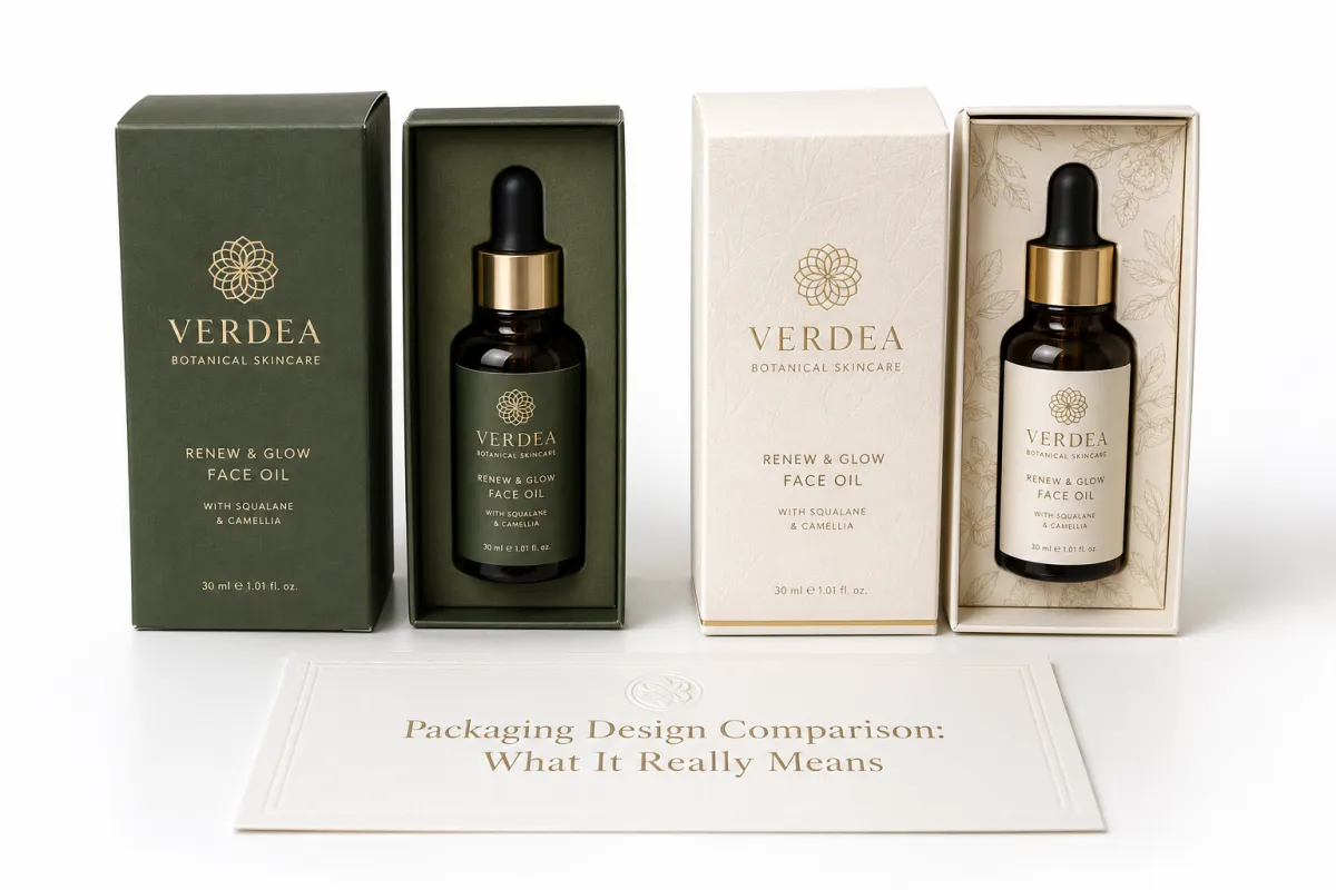
Most teams think packaging design comparison means looking at two mockups and picking the prettier one. That is how you end up with a gorgeous carton that costs $0.14 more per unit, ships 11% fewer units per master case, and takes 22 seconds longer to pack on a line in Guangzhou. I have seen product teams fall in love with a soft-touch mailer and only notice later that the extra coating pushed the quote over budget by $8,400 on a 60,000-unit run. I am not exaggerating for effect; I have the scar tissue to prove it, and so does the invoice from a plant in Foshan. The smarter version of packaging design comparison asks a different question: which option fits the product, the warehouse, the budget, and the brand all at once?
Here is the working definition I use after years of custom packaging meetings and sample reviews: compare the same product across the same criteria, then decide with numbers, not mood. That means structure, board grade, print method, finishing, inserts, assembly time, and landed cost all have to sit on the table together. If one option is a 350gsm SBS tuck-end box and another is a 1.5mm rigid setup with a tray and necker, those are not just different looks. They are different business decisions, usually with different suppliers in Shenzhen and Xiamen, different freight classes, and different cartonization outcomes. And yes, packaging design comparison should include package branding, because a box can protect a serum bottle perfectly and still feel cheap the second a customer lifts the lid. I learned that the hard way with a cosmetics client whose box performed beautifully in transit and then looked oddly flimsy in a boutique display in SoHo. The irony was almost funny. Almost.
I think a lot of people underestimate how much brand perception is tied to mechanics. On a client meeting in Shenzhen, a beauty brand insisted their product packaging needed a magnet closure. I asked for their monthly volume. It was 2,000 units, or roughly 24,000 units a year if the forecast held. The magnet alone would have added a painful amount to every piece, and the team eventually chose a friction-fit rigid box with a shaped insert instead, sourced from a converter in Dongguan. The customer still got a premium unboxing feel, and the box still closed cleanly after 50 open-close cycles in sample testing. The finance team did not have to drink cold coffee and stare at a budget spreadsheet for the rest of the quarter. That is packaging design comparison done properly. It is also one of the few times I have seen a CFO smile at a carton sample, which should probably count as a small miracle.
"The box looked elegant on the render. The freight invoice looked elegant too, if you enjoy pain."
For custom logo packaging, the point is not to crown the flashiest design. The point is to choose the one that keeps your product safe, keeps labor manageable, and still looks like it belongs to your brand in Dallas, Berlin, or Singapore. If you want to see typical formats and builds, our Custom Packaging Products page is a good place to start before you lock in a direction. I usually tell clients to study the real structures first and the inspiration boards second, because the board never has to survive a fulfillment center at 6 a.m. or a parcel sorter in Memphis.
What Should You Check First in a Packaging Design Comparison?
Start with product fit, then structure, then total cost. That sequence sounds obvious until a team reverses it and spends a week debating foil colors on a box that does not fit the bottle properly. In a packaging design comparison, the first question is whether the packaging protects the product and fits the route it will travel. A 175mm fragrance bottle, a 120mm candle jar, and a 240mm skincare set all create different stress points, even if the mockups look equally polished on a screen. The right order keeps the discussion grounded, which is handy when five people in a room all believe their favorite option is the sensible one.
If you are comparing folding cartons, mailers, rigid boxes, or sleeve-and-tray sets, ask how each structure behaves in production, in storage, and in transit. Then compare the same material, the same quantity, and the same finish tier. A packaging design comparison is only useful when the variables are controlled. Otherwise you are just comparing a nice-looking quote against a more expensive quote and calling it strategy. I have seen that movie, and the ending is always the same: surprise costs, awkward emails, and somebody quietly blaming the sample room.
One more thing that gets missed: compare the pack with the product actually inside it, not with a paper dummy unless you are still at the earliest stage. A box can seem perfect until a pump head, trigger spray, or irregular bottle shoulder changes how the inner cavity behaves. I once watched a vitamin brand spend two weeks comparing artwork options while nobody noticed the bottle cap was rubbing the side wall. The issue only showed up during a quick hand-pack test, and the fix was a 2mm insert change. Tiny, sure. Expensive anyway.
How Packaging Design Comparison Works in Practice
The cleanest packaging design comparison starts with two to four concepts, not ten. If you try to compare too many at once, the team starts voting on feelings and the spreadsheet becomes decorative. I usually ask for the product dimensions, target quantity, product weight, photos, and any handling constraints first. A 175mm fragrance bottle with a narrow shoulder does not behave like a 120mm candle jar, even if both fit in the same general carton family. The structure has to match the product, or the comparison is a waste of everyone's hour, especially if the box has to fit 24 units per master carton for a warehouse in Chicago.
Then the supplier inputs need to be consistent. You want the same dieline, the same material spec, the same finish, and the same quantity tier for every quote. If one vendor prices 1,000 units of a 250gsm kraft mailer and another prices 5,000 units of a 400gsm artboard rigid box, the numbers are not comparable. That sounds obvious, and yet I have seen teams compare them anyway. Usually right before someone says, "Why is this supplier $0.11 cheaper?" That question is how people accidentally sign the wrong PO. I have heard that question asked with complete confidence in Shanghai and Manchester, which somehow makes it more dangerous.
Prototypes matter. Digital renderings help with color blocking and artwork placement, but they do not tell you whether the tuck flap tears after three openings or whether the insert keeps the product centered in transit from Ningbo to New Jersey. I like to run a packaging design comparison with at least one physical sample in hand because folds, glue points, and closures behave differently under real pressure. If the pack is going into ecommerce, I also want to see how it handles a 3-foot drop, a shake test, and one badly packed fulfillment order. That is not paranoia. That is basic self-defense. Also, if a sample squeaks when you close it, I want to know before the whole team spends two weeks pretending not to hear it.
A simple scorecard makes the process less political. Weight the categories based on your actual priorities: 35% protection, 25% total cost, 20% brand impact, 10% assembly speed, 10% sustainability. The weights can change, but they should exist. A packaging design comparison without weights is just a room full of loud opinions pretending to be strategy. If the box is for retail packaging in Paris or Chicago, shelf impact may deserve more points. If it is for subscription product packaging, unboxing and storage footprint may matter more. I have sat through enough meetings to know that a scorecard does not remove disagreement, but it does stop the disagreement from wearing a fake suit and calling itself analysis.
One thing I learned the hard way: compare under real conditions, not in an air-conditioned conference room. Put the sample on the packing table, hand it to the fulfillment crew, and time it. I once watched a team fall in love with a sleeve-and-tray setup that looked elegant until the warehouse team in Eindhoven needed 19 seconds per unit to align the tray. On a 30,000-unit run, that is not a tiny detail. That is payroll. That is why packaging design comparison should touch the floor, the pallet, and the shipping carton, not just the render file. If the person packing the box mutters under their breath after the fourth one, trust me, your margins already know. They are already feeling it.
Key Factors That Shape a Packaging Design Comparison
Structure comes first. A tuck-end box, a mailer, a rigid box, a sleeve, and a corrugated shipper all solve different problems. A shelf display box is not automatically better than a mailer, and a mailer is not automatically cheaper once you factor in inserts, printing, and warehouse handling. In a real packaging design comparison, structure decides whether the pack protects, displays, or ships efficiently. If you force the wrong structure to do the wrong job, the whole system starts leaking money. I have seen a beautiful rigid box become a glorified storage problem because nobody planned for the extra depth on a 480mm shelf in a Toronto warehouse. Gorgeous object, terrible logistics. Packaging does not care how much you like the concept board.
Material choice changes everything. SBS artboard prints beautifully and gives you sharp color for Custom Printed Boxes, but it is not the same as a kraft board with a natural texture or a corrugated E-flute shipper that can take a beating. Chipboard and rigid board add stiffness, which helps with premium retail packaging, but they also add cost and weight. A 350gsm C1S artboard can be right for a folding carton in beauty or wellness, while a 1.5mm greyboard wrapped in 157gsm art paper is better for a gift set in Milan or Seoul. If you care about sustainability, check recycled content and FSC status. The Forest Stewardship Council publishes useful standards for responsibly sourced paper, and I look at that label more often than marketing teams expect. If you want a reference point, see the FSC site at fsc.org. A material can look beautiful and still be the wrong material for the job, which is a sentence I have had to say far too many times.
Brand impact is the part people think they understand until they see the box in a customer's kitchen, on an unboxing video, or stacked next to a competitor's package branding. A beautiful carton can still feel wrong if the typography is too light, the logo is too small, or the finish fights the product story. I remember a tea brand in London that wanted a silver foil panel and deep matte black on every face. On a swatch sheet, it looked expensive. On a crowded shelf at Selfridges, it disappeared. We changed the contrast, reduced the foil coverage by 40%, and suddenly the product popped without looking noisy. That was a packaging design comparison win that had less to do with art and more to do with visibility. It also saved the client from paying for a very expensive ghost box.
Operational fit matters more than designers like to admit. Can the warehouse store 400 flat cartons per bundle? Does the insert slow assembly by 6 seconds? Will the finished pack fit 12 units per case or only 10? These are not tiny questions. They define whether a packaging design comparison saves you money or quietly sets fire to your margins. If you are shipping through ecommerce, the final size of the pack can affect dimensional weight. A box that grows from 198mm to 204mm on one axis can change the rate class in FedEx Zone 4 or UPS Zone 6 overnight. I have seen a 2mm change behave like a small accounting prank; the invoice always gets the joke before the team does. Funny in a grim sort of way.
Sustainability needs to sit beside cost, not on top of it like a press release sticker. Recycled content, paper-only construction, plastic reduction, and lighter board all matter, but they have to be judged against product protection. There is no trophy for a recyclable box that lets a serum bottle arrive broken in Austin or Amsterdam. The EPA has practical information on packaging waste and material recovery at epa.gov, and it is worth reading before you claim a material choice is automatically better. I have seen brands spend an extra $0.09 per unit on green claims and still end up with more waste because the design used too much material. That is not sustainability. That is expensive theater. And yes, the board looked very noble right up until the returns started piling up.
There is also a trust issue here that gets overlooked: if a supplier cannot explain why a certain board or finish was chosen, they probably do not understand the pack deeply enough. I am not saying every converter needs a thesis. I am saying a good partner can tell you what the surface strength, fold quality, and scuff resistance mean in practice. That is a lot more useful than a buzzword. Packaging projects move too fast for guesswork dressed up as confidence.
Packaging Design Comparison by Cost and Pricing
Cost is where the conversation gets real. A proper packaging design comparison should break pricing into parts: tooling, plates, die-cut setup, print method, material thickness, inserts, coatings, freight, and labor. If someone sends you a quote with one line that says "box price," ask for the detail sheet. Politely, if you like. Sharp enough to make them re-open the file, but polite. I have negotiated enough runs in Shenzhen, Dongguan, and Ho Chi Minh City to know that the cheapest-looking quote often hides the most expensive surprises. That one-liner quote is the packaging equivalent of saying, "Trust me." I do not trust boxes with secrets.
Here is the mistake that burns teams most often: comparing two suppliers without matching specs. One vendor might quote a 350gsm C1S carton with aqueous coating, while another prices 400gsm SBS with soft-touch lamination and a custom insert. Of course the second one costs more. It is not a fair comparison. A real packaging design comparison starts only after the board grade, size, finish, and quantity are aligned. Otherwise you are comparing apples, oranges, and a box that someone quietly upgraded because they wanted your approval faster. I have watched this happen enough times to know the wrong buyer can get charmed by a lower number in under 30 seconds.
I had a negotiation once where a converter in Shenzhen quoted $0.18/unit for 5,000 units on a straight tuck carton, and another supplier came in at $0.24. The sales rep kept repeating "better quality" like it was a magic spell. It was not. Once I checked the board spec, the lower quote used a lighter stock and no interior print, while the higher quote had a full-color inside panel and a custom insert. After we normalized the spec, the gap shrank to $0.03. That is why packaging design comparison without a spec sheet is fantasy with a spreadsheet attached. I would rather have a boring spreadsheet than an exciting mistake every single time.
Low MOQs deserve their own warning label. A 500-unit test run might feel friendly, but the per-unit pricing can be 20% to 40% higher because setup costs are spread over fewer pieces. At the other end, extra-finishing choices like embossing, debossing, foil, and spot UV can make a premium box look gorgeous and still destroy your margin. I have seen one embossing decision add $0.12 per unit on a 10,000-piece run from a plant in Ningbo. That sounds small until you multiply it by 10,000 and realize it bought nobody anything except a shinier spreadsheet problem. Cute, but expensive.
| Option | Typical Build | Approx. Unit Cost at 5,000 Units | Best For | Watchouts |
|---|---|---|---|---|
| Mailer box | E-flute corrugate, single-color print | $0.72 - $1.10 | Ecommerce, subscription, lightweight product packaging | Can look plain unless the branding is strong |
| Tuck-end carton | 350gsm SBS, aqueous coating | $0.18 - $0.42 | Retail packaging, folding cartons, cosmetics | Needs insert support for fragile items |
| Rigid box | 1.5mm board with wrapped paper | $1.80 - $4.50 | Premium branded packaging, gifts, luxury items | Higher freight and longer assembly time |
| Sleeve + tray | Artboard sleeve, molded or paper tray | $0.55 - $1.25 | Retail display, layered presentation | More manual assembly and tighter tolerances |
That table is not a quote. It is a reality check. Final pricing changes with artwork coverage, quantity, finish, and shipping lane. A packaging design comparison should always use total landed cost, not just unit cost, because the $0.18 difference on the carton can vanish after freight, packing labor, and a larger master case change the pallet count. A supplier who looks expensive on paper can be cheaper in the warehouse if their design stacks better and ships more compactly. I have seen a cheaper box become the pricier box the moment it started hogging pallet space like it paid rent in a Sydney cross-dock.
The other reason landed cost matters is that packaging is rarely a single expense. It is a chain of little ones. One extra second in packing. One larger carton. One more pallet. One more truckload across town. None of these sounds dramatic in isolation, but together they can flip the math. I have seen finance teams get annoyed by a 3-cent print increase, then happily approve a freight plan that quietly ate twenty times that amount. That mismatch is why packaging design comparison needs operations in the room, not just marketing.
Packaging Design Comparison: Process and Timeline
The timeline usually starts with the brief: product dimensions, weight, target audience, and the channel you are selling through. Then comes concept selection, dieline prep, artwork placement, proofing, sampling, revisions, and production. For a simple folding carton, I have seen 12 to 15 business days from proof approval to shipment when the art is clean and the quantity is around 10,000 pieces. Add foil, embossing, a custom insert, or a rigid structure, and that window stretches fast to 20 or even 25 business days, especially if the plant is in Guangzhou or Ningbo. Packaging design comparison gets easier when everyone accepts that timeline is part of the design, not an afterthought. I wish more people treated schedule the way they treat color, but somehow time is the thing everyone wants to edit for free.
Delays usually show up in the same four places: missing dimensions, late artwork, slow approvals, and structural changes after the first sample. One skincare client in Shanghai once changed the bottle cap height by 4mm after we had already approved the insert. That tiny shift turned a clean fit into a wobble. We had to revise the tray, recheck the carton depth, and re-sample the whole pack. Nobody wanted that extra week, but that is what happens when packaging design comparison is treated as a one-time vote instead of a controlled process. Four millimeters. That is how a project becomes a bad mood.
Coordination matters. Marketing wants the box to look premium. Operations wants it to fold in under 10 seconds. Finance wants the per-unit price below budget by Friday. If those groups are not aligned early, the spec changes every time somebody opens a new email thread. I prefer a single approval sheet with the top three options, the board grade, the finish, the dieline revision, and the landed cost. Then the decision is documented. Less drama. Fewer "Wait, I thought we picked the other one" messages at 9:30 p.m. I have received enough of those emails to recognize the tone before I even open them.
There is also a practical order to the work. First, confirm the product. Second, confirm the structure. Third, lock the material and finish. Only then should artwork move toward final approval. I know that sounds boring. It also saves money. A packaging design comparison that starts with print colors before structure is settled usually ends with someone paying for revised plates or another sample round. That is not strategy. That is a tuition payment to the packaging gods. They are not generous, and their invoices are always due immediately.
For projects that need outside validation, I lean on the shipping rules and test standards early. ISTA protocols help you understand transit stress, and that matters if the box is meant to survive parcel networks instead of sitting pretty on a shelf. The International Safe Transit Association has good reference material at ista.org. If your sample survives a drop test, a vibration check, and a warehouse stack test, your odds improve a lot. I would rather discover weakness in a 3-piece sample than in a 3,000-unit shipment. That kind of surprise is expensive in the exact way nobody enjoys.
One subtle benefit of slowing this phase down is that it reduces the number of internal reversals. A team that compares a box only after artwork is nearly final often discovers the pack needs a new size, which then forces a new layout, which then changes the print coverage, which then changes the quote. That chain reaction is not rare. It is common. A patient comparison in week one is cheaper than a rescue operation in week five. I have had both, and the second one is much less fun.
Common Mistakes in Packaging Design Comparison
The first mistake is comparing the render only. A render can hide weak tabs, oversized inserts, and awkward closures. The second mistake is comparing the sample only. A sample might look great on a desk in New York and fail the moment it meets a mail sorter, a case packer, or an impatient warehouse associate in Louisville. Good packaging design comparison checks both the visual and the mechanical side. If either one is missing, the decision is incomplete. I have had gorgeous samples that folded like a dream and then opened themselves in a shipping carton like they were trying to escape.
The third mistake is ignoring storage and shipping constraints. I once visited a client's fulfillment area where 800 beautiful rigid boxes were taking up half a pallet bay because nobody had calculated the flat-pack footprint. The packaging looked premium. The warehouse looked angry. That is how a premium choice becomes an operational tax. If you are buying custom printed boxes in volume, pallet count and carton dimensions should be part of the conversation from day one. Otherwise you may be paying for elegance and storing inconvenience in a 120-square-meter back room.
The fourth mistake is quote shopping without a spec sheet. If every supplier is pricing a different version of the same idea, your packaging design comparison is fake math. I have seen teams get seduced by the lowest number, only to discover it excluded inserts, one color on the inside, or the coating they thought was included. That kind of surprise is not a surprise. It is a paperwork problem. Frankly, it is also the reason I keep asking for written specs like a mildly annoying detective.
The fifth mistake is deciding based on "premium" alone. Premium is not a design. It is a result. A rigid box with foil and a satin ribbon can feel expensive, sure, but if it misses the budget by $14,000 or pushes the schedule by two weeks, it is the wrong premium. I had a candle brand client in Portland who wanted a magnetic closure for 1,500 units. The package would have been lovely. Their margin would have been miserable. We landed on a wrapped board box with a textured paper and a tighter insert fit, and the product still felt upscale. Nobody cried, which I counted as progress.
The last mistake is not setting decision criteria upfront. If nobody says whether protection, price, brand, or speed matters most, the loudest person wins. That is not a strategy. It is a meeting accident. Packaging design comparison should be a controlled choice, not a group therapy session with a dieline attached. And yes, I have been in meetings where the loudest person was also the least informed. They tend to travel in packs, usually with a slide deck and a feeling.
There is one more trap worth mentioning: confusing sustainability claims with actual sustainability. A green-looking stock or a recycled label does not automatically mean the pack is better. If it tears, crushes, or increases returns, the material choice is incomplete. I have seen teams use the word eco-friendly as if it settled the argument. It does not. It just opens a second one.
Expert Tips for a Better Packaging Design Comparison
Use a weighted scorecard. I keep coming back to that because it works. Assign points to protection, cost, brand impact, assembly time, and sustainability, then score every option on the same 1-to-5 scale. If the pack is for ecommerce, give protection more weight. If it is for retail packaging, shelf presence may deserve the top slot. The point is to make the packaging design comparison explicit, not emotional. I like systems that make people slightly less dramatic, and this one usually does.
Ask for exact specs and real numbers. Not "premium paper." Not "high-end finish." I want board grade, caliper, coating, insert material, and print method. If the supplier says they can do it for $0.20/unit, make them tell you what that includes. I have spent too many afternoons untangling quotes that looked good until the paper stock or die-cut cost was revealed. A clean quote sheet is worth more than a polished sales pitch. A polished sales pitch can charm a room; a clean quote survives accounting in Chicago, Brisbane, or Rotterdam.
Order samples from at least two vendors and compare them side by side in the same room. Hold them. Fold them. Open and close them 10 times. Put the product inside. Then put the pack in a shipping carton and see how it settles. The little defects show up fast. One supplier's fold line may crack. Another may print a warmer black that clashes with your logo. Another may save 30 seconds in assembly because the insert drops in more cleanly. That is valuable information. It is also the kind of detail nobody remembers to mention after they have already voted for the prettier mockup.
Test the packaging in the real workflow. Use the actual fulfillment team. Use the real product. Drop it from 36 inches if your distribution lane includes parcel shipping. Stack it for 24 hours if it sits in storage. Check scuff resistance if the box will live on shelves for 6 weeks. I am not being dramatic here. I am being practical. A packaging design comparison that ignores the warehouse is a pretty drawing, not a plan. I have seen pretty drawings get promoted far beyond their competence.
Negotiate around constraints, not just unit price. Sometimes a tiny dieline change saves a lot of money. Reducing box height by 3mm can improve carton nesting. Switching from full flood coating to spot coverage can trim cost without hurting the look. Replacing a plastic insert with paperboard may help with recycling claims and reduce material spend. Those are the kind of moves I like because they respect both the brand and the budget. If you need a starting point for box styles and custom runs, our Custom Packaging Products page can help frame the options before you request quotes. I always tell teams that the best savings are the ones nobody notices except finance.
One more thing: keep a notes column for supplier behavior. Sounds odd, I know. But a quote that arrives in 2 hours with clean specs is different from a quote that takes 5 days and still leaves out the finish. I care about communication because packaging projects have enough moving parts without adding confusion. A vendor who answers clearly on MOQ, proofing, and lead time is often worth more than a slightly cheaper number. In my experience, the extra dollar saved on a bad communicator gets spent later as stress, delay, or both. That is the kind of hidden cost that never shows up in the first spreadsheet.
Next Steps After Your Packaging Design Comparison
Once the packaging design comparison is done, turn the decision into a one-page matrix. Keep the criteria, the weights, the score, the quote numbers, and the final choice in one place. That way the marketing lead, the operations manager, and the owner can all see why the decision was made. No guessing. No "I thought we went with the other one." Just a clean record with enough detail to defend the choice later. I love a tidy decision trail almost as much as I love not having to re-litigate the same carton twice.
Then request updated quotes from your top two or three suppliers using identical specs. Same dimensions. Same board grade. Same finish. Same quantity. If there is an insert, specify the material and thickness. If there is a coating, name it. If you are buying product packaging for a retail launch in Miami, Milan, or Manila, ask for shelf-ready samples with the actual artwork, not a bare prototype that tells you almost nothing about the finished look. That extra detail matters. Bare samples can flatter almost anything, which is rude behavior for a box.
After that, order physical samples and test them with the product inside, not empty on a desk. Check fit, protection, stacking, and the unboxing feel. If the packaging is rigid, inspect the wrapped corners and the lid tension. If it is a folding carton, check the tuck flaps and scuff resistance. If it is a mailer, check how it survives a rough handoff. Packaging design comparison only ends when the box works in the real world. If it only works in a presentation, it is still in rehearsal.
Finally, lock cost, timeline, and production details in writing before artwork reaches final approval. That means board spec, quantity, lead time, packing method, freight assumption, and any extra finishing costs. I know that sounds like paperwork. It is. Paperwork is cheaper than a surprise. I have been in too many supplier negotiations where a $0.05 add-on showed up late and everyone stared at each other like the number had fallen from the ceiling. Nobody enjoys that silence. It has a very specific smell.
If you remember one thing, make it this: the best packaging design comparison is the one that balances brand, budget, and operations without lying to any of the three. That is how you pick a box that looks right, ships right, and still leaves room for profit. Start with structure, validate with samples, and only then let the artwork have its turn. Pretty gets attention. Structure gets delivered. And if the numbers are still close, choose the option the warehouse can live with every single day.
What should I compare first in a packaging design comparison?
Start with structure and product fit. If the package does not protect the item, the rest of the packaging design comparison is decoration. Then compare material thickness, print method, and finish, followed by cost, lead time, and assembly effort so the choice reflects real business impact. I always begin there, because it is amazing how quickly "nice looking" collapses once the product does not fit a 175mm bottle or a 120mm jar.
How do I compare packaging design prices without getting fooled by low quotes?
Match the exact same specs first: dimensions, board grade, finish, quantity, and insert requirements. Ask for landed cost, not only unit cost, because freight, setup, and handling can erase a cheap-looking quote fast. Also check whether the quote includes plates, dies, sample rounds, or revisions. If the pricing sheet is vague, I assume it is hiding something until proven otherwise, usually by a second quote from Guangzhou or Ningbo.
How long does a packaging design comparison usually take?
A simple packaging design comparison can take a few days if the specs are already clear and the suppliers respond quickly. If you need custom samples, revisions, and internal approvals, expect the process to stretch into several weeks. The biggest delay is usually agreement, not production. The box can often move faster than the people making decisions about it, especially once a proof round starts in Shenzhen.
What files do suppliers need for an accurate packaging design comparison?
Send product dimensions, weight, photos, handling requirements, artwork, dielines, finishing notes, and quantity targets. If possible, include a sample or dummy product so the supplier can verify fit. Guesswork is a bad material spec, and cardboard does not care about guesses. I wish it did, but it really does not have that kind of patience, particularly at 6 p.m. on a Friday in Dongguan.
How do I know which packaging design comparison option will ship safely?
Look for compression strength, board quality, closure stability, and whether the item is immobilized inside the pack. Test the package under real conditions like drop tests, stack tests, and normal fulfillment handling. Choose the option that protects the product with the least extra material, because overbuilding gets expensive quickly. Safe packaging is the kind that disappears into the supply chain without creating drama, whether the lane runs through Memphis, Toronto, or Rotterdam.


